Supabase Storage
Clean, highly structured, and developer-centric. Near-white backgrounds framed with delicate hairline borders create a crisp, clinical workspace feel. Muted typography paired with distinct emerald accents conveys dependable infrastructure precision.
Take the vibe
Rated
6.6/ 10
From 9 analyzed sections. Two measured components and one judged by a model. Distinction is a rank within the library; the rest are scores in their own right.
- AI scorejudged
- 8.6
- Systemmeasured
- 5.1
- Distinctionmeasured
- 4.2
- on the grid
- 0%
- vertical rhythm
- 83%
- type on a scale
- 56%
- contrast passing AA
- 67%
- unlike the library
- 0.64
- model craft
- 7.6/10
- model deviation
- 2.6/10
Color
Background#fdfdfd
Text#030303
Accent#3cd08d
Surface#ffffff
Muted#696969
Typefaces
- Display
- Inter
- Body
- Inter
- Mono
- Source Code Pro
- Source
- Scale
- 11 · 12 · 13 · 14 · 15 · 16
Layout
- Grid
- —
- Container
- —
- Spacing base
- 4px
- Radius
- 6px · 8px
Capture
- Category
- tools
- Sections
- 9
- Captured
- 2026-09-15
- Rhythm
- clean white → light grey borders → consistent bright background throughout
Type rules
- display type uses sentence case with dual-tone contrast between black and muted grey
- body text maintains a strict 76-character measure for high technical readability
- code examples and technical syntax use Source Code Pro mono
Color rules
- dominant canvas remains pristine near-white (#fdfdfd) with fine hairlines
- emerald green accent (#3cd08d) is strictly reserved for primary CTA buttons and status badges
- body text uses muted grey (#696969) while primary headings use deep black (#030303)
Voice rules
- headlines use a two-tone text color split to emphasize the core premise
- subheadings provide precise technical architectural detail without marketing hyperbole
Holds it together
- headlines break into two tones with primary words in dark neutral and secondary clauses in muted grey
- card containers use rounded corners with ultra-fine subtle grey outlines on white surfaces
- code snippets and interactive examples anchor feature explanations alongside short structured lists
Contrast
text on background20.3:1 AAA
muted text on background5.4:1 AA
text on surface20.6:1 AAA
muted text on surface5.5:1 AA
accent on background1.9:1 fail
background on accent1.9:1 fail
Type, measured
- Body
- 15px / 1.5
- Measure
- 76 characters
- Display
- 46px / 1
- Tracking
- 0em display
- Scale ratio
- 1.32
Voice
- Tone
- precise, technical, developer-focused
- Sentences
- medium
- Person
- third
- Vocabulary
- technical
- Calls to action
- start, learn, apply
Built with
- Builder
- —
- Framework
- next
- Motion
- —
- WebGL
- —
- Nav
- top_bar, 7 items
- Length
- 6.6 screens
Sections in page order
- 00
hero
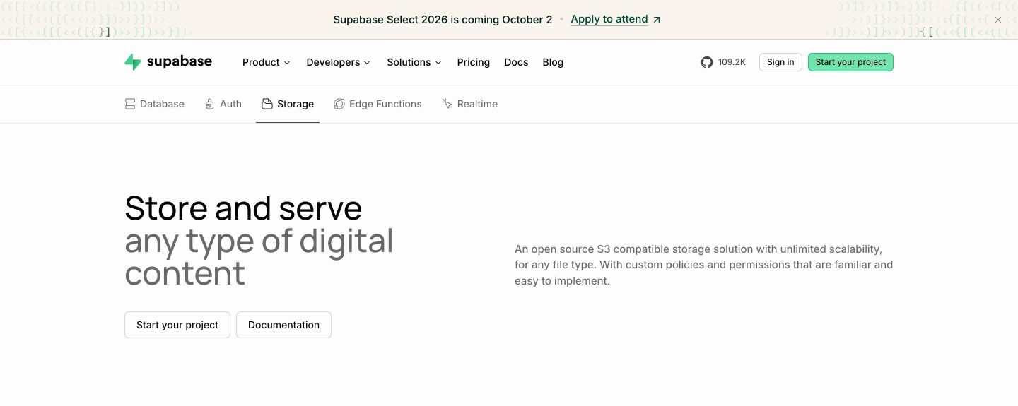
StrongA clean, developer-focused hero featuring crisp grotesque typography, structured feature tabs, and restrained monospace accents across a bright canvas.
- Mood
- clinical + serene
- Layout
- 2 col · split · airy
- 01
feature grid
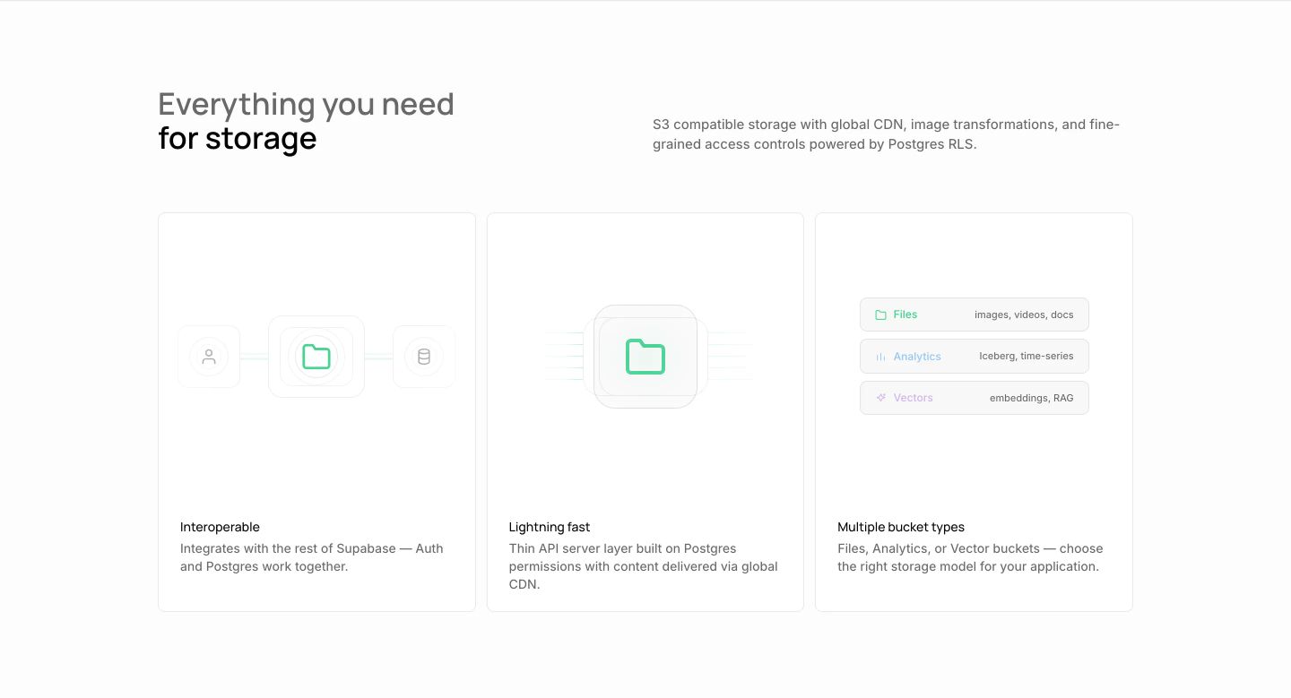
Crisp and clinical developer feature grid with delicate hairline cards and mint green accents on clean white.
- Mood
- clinical + serene
- Layout
- 3 col · grid · airy
- 02
testimonial
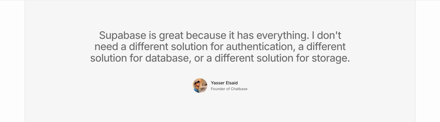
Minimal, serene quote testimonial set in muted grey type against an expansive light background.
- Mood
- serene
- Layout
- 1 col · centered · airy
- 03
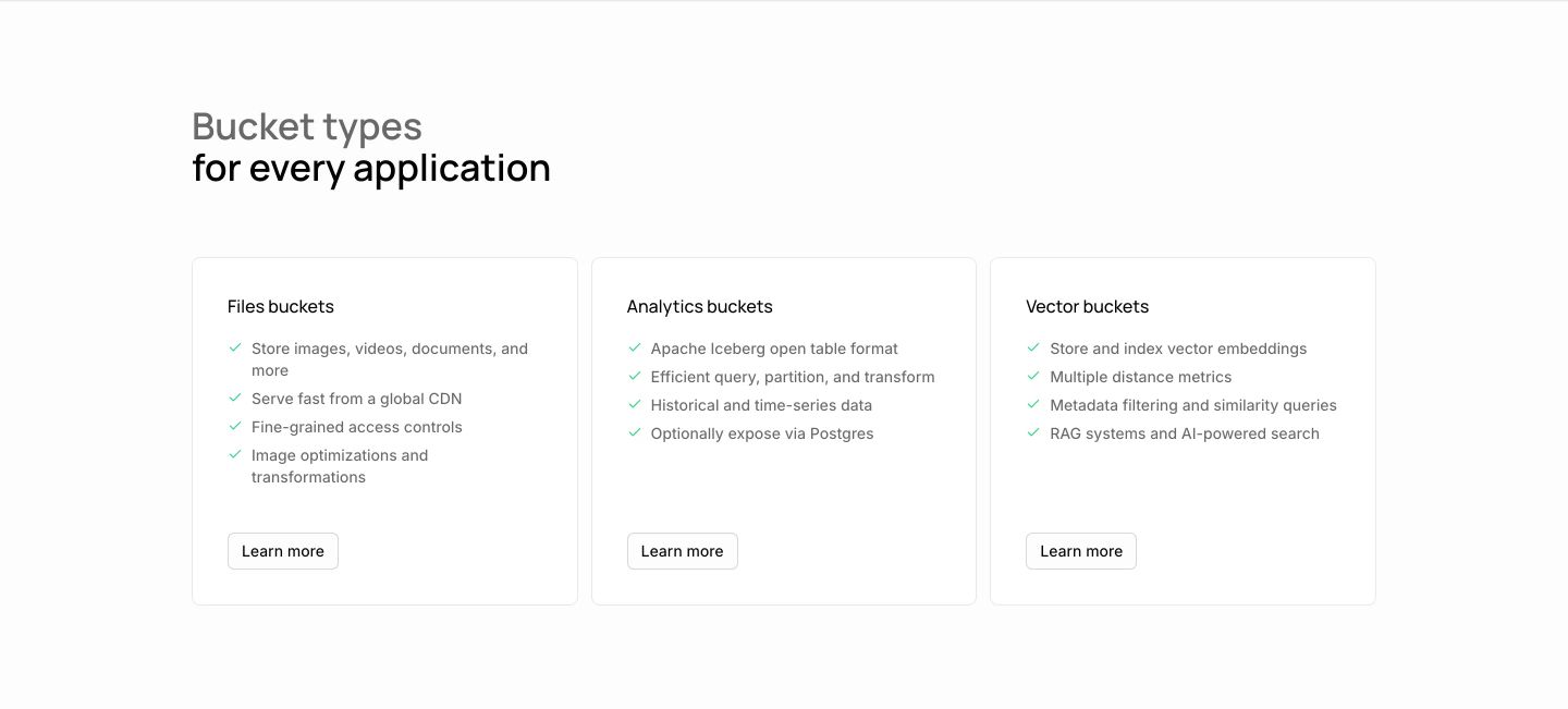
feature grid
A clean, utilitarian trio of white cards detailing storage capabilities with muted checkmarks and crisp typography.
- Mood
- clinical
- Layout
- 3 col · grid · airy
- 04
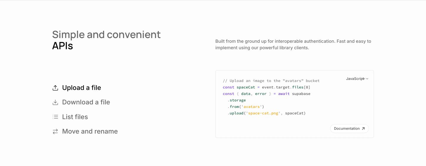
feature
A stark, minimalist developer feature section pairing an action list with an interactive code preview card on crisp white.
- Mood
- clinical + serene
- Layout
- 2 col · split · airy
- 05
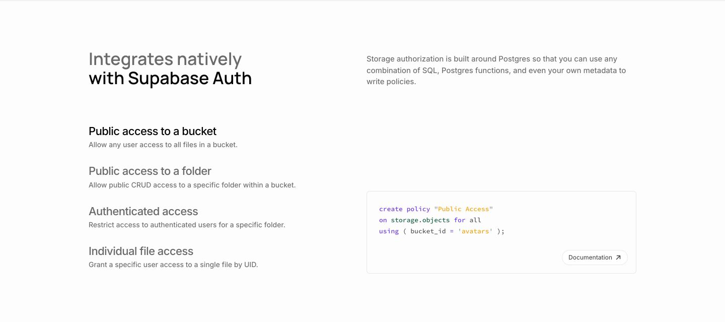
feature
A clean, clinical developer-focused feature block with crisp code syntax highlighting and structured list items on stark white.
- Mood
- clinical + serene
- Layout
- 2 col · split · airy
- 06
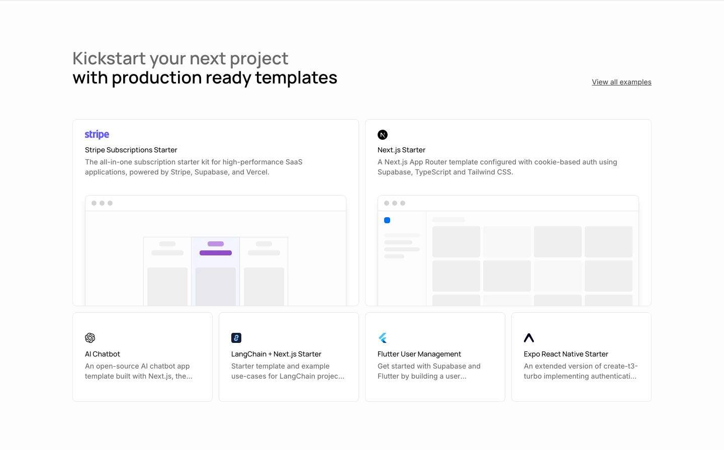
showcase
StrongCrisp and structured developer template gallery featuring wireframe mockups and clean bordered cards against a stark white background.
- Mood
- clinical + serene
- Layout
- 4 col · grid · balanced
- 07
cta
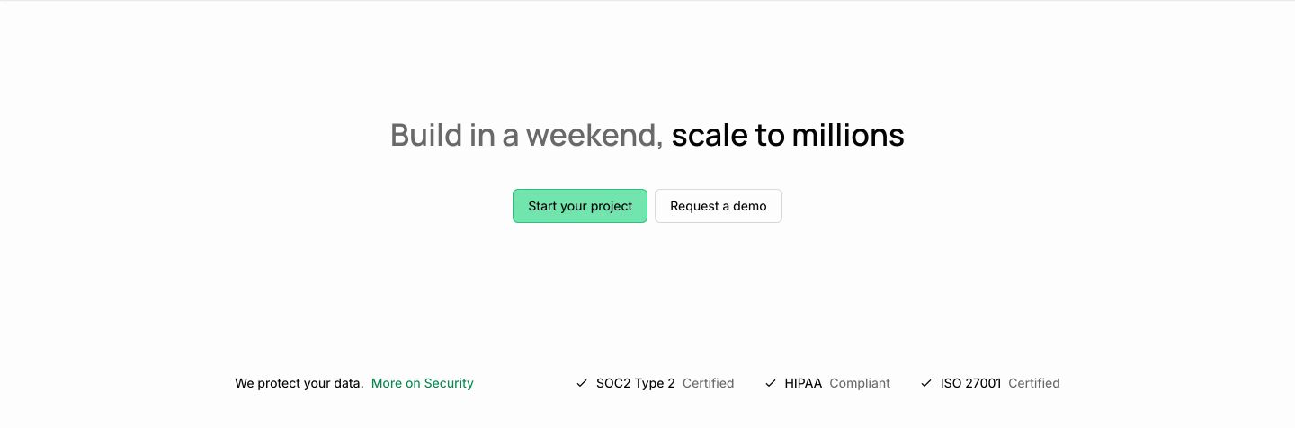
StrongCrisp, airy call-to-action section anchored by weight-contrasted typography, dual conversion buttons, and enterprise compliance badges.
- Mood
- serene
- Layout
- 1 col · stacked · airy
- 08
footer
An organized, light-mode developer footer with clean multi-column sitemap navigation and a newsletter signup block.
- Mood
- clinical
- Layout
- 7 col · grid · balanced