Dub
Clean, hyper-precise, and modern developer-first SaaS aesthetic. A subtle hairline grid and muted gray surfaces frame high-fidelity interactive product mockups. Black pill buttons and crisp typography establish technical credibility without visual clutter.
Take the vibe
Rated
7.1/ 10
From 13 analyzed sections. Two measured components and one judged by a model. Distinction is a rank within the library; the rest are scores in their own right.
- AI scorejudged
- 9.4
- Systemmeasured
- 5.9
- Distinctionmeasured
- 3.4
- on the grid
- 33%
- vertical rhythm
- 61%
- type on a scale
- 43%
- contrast passing AA
- 100%
- unlike the library
- 0.62
- model craft
- 7.9/10
- model deviation
- 3.1/10
Color
Background#ffffff
Text#171717
Accent#2563eb
Surface#fafafa
Muted#737373
Typefaces
- Display
- Inter
- Body
- Inter
- Mono
- GeistMono
- Source
- self_hosted
- Scale
- 12 · 14 · 16 · 18 · 20 · 24
Layout
- Grid
- 16 columns
- Container
- 1078px
- Spacing base
- 4px
- Radius
- 6px · 8px · 12px · 9999px
Capture
- Category
- saas
- Sections
- 13
- Captured
- 2026-09-16
- Rhythm
- white x15 → dark → white
Type rules
- display headings use sentence case with tight line height
- body text averages 61 characters per line in neutral gray
- technical details and identifiers render in GeistMono
Color rules
- predominantly white and neutral light gray canvas (#ffffff and #fafafa)
- blue accent (#2563eb) is reserved for interactive link states and focused elements
- high-contrast black buttons (#171717) for primary calls to action
Voice rules
- headlines are direct sentence-case statements
- feature descriptions paired directly with detailed product UI components
Holds it together
- contain product previews inside bordered light-gray card containers with subtle rounded corners
- use sentence case across all headings and button labels
- pair each major feature section with a single-line testimonial quote and avatar
- ground the light page with an inverted high-contrast dark CTA section before the footer
Contrast
text on background17.9:1 AAA
muted text on background4.7:1 AA
text on surface17.2:1 AAA
muted text on surface4.5:1 AA
accent on background5.2:1 AA
background on accent5.2:1 AA
Type, measured
- Body
- 16px / 1.5
- Measure
- 61 characters
- Display
- 48px / 1.15
- Tracking
- 0em display
- Scale ratio
- 1.32
Voice
- Tone
- declarative, technical, concise
- Sentences
- short
- Person
- second
- Vocabulary
- plain
- Calls to action
- start, get, explore, learn
Built with
- Builder
- —
- Framework
- next
- Motion
- —
- WebGL
- yes
- Nav
- sticky_top_bar, 6 items, sticky
- Length
- 13.5 screens
Sections in page order
- 00
hero
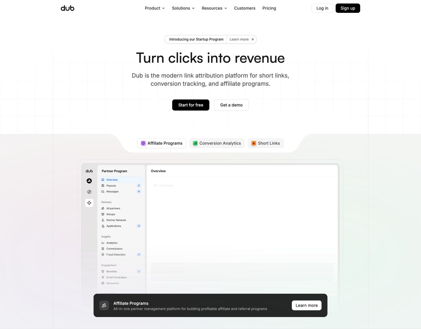
Crisp and meticulously aligned light hero with a subtle background grid, centered copy, and an interactive product UI mockup.
- Mood
- clinical + serene
- Layout
- 1 col · stacked · balanced
- 01
logo bar
A clean, balanced grid of recognizable tech brand logos establishing quiet credibility against a bright neutral canvas.
- Mood
- serene
- Layout
- 5 col · grid · airy

- 02
statement
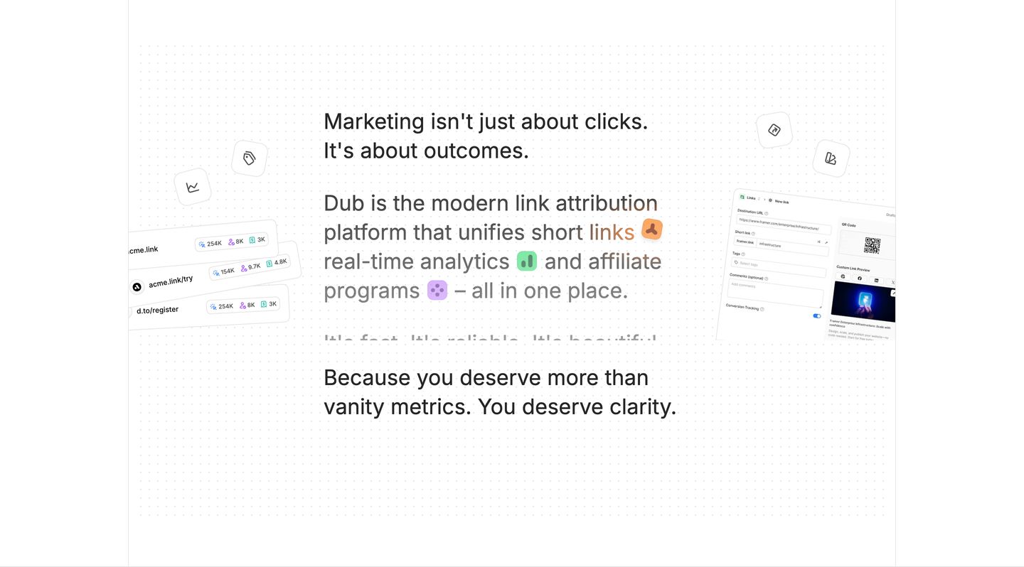
StrongClean, spacious statement section featuring centered typographic declarations flanked by floating UI cards on a subtle dot-grid canvas.
- Mood
- serene
- Layout
- 1 col · centered · airy
- 03
feature
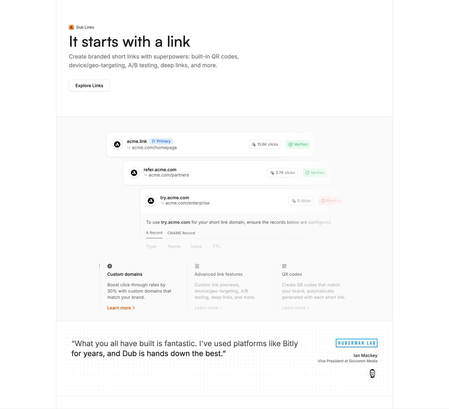
Crisp developer-focused SaaS feature section pairing modular product UI mockups with interactive capability tabs and targeted testimonial proof.
- Mood
- clinical
- Layout
- 3 col · stacked · balanced
- 04
feature
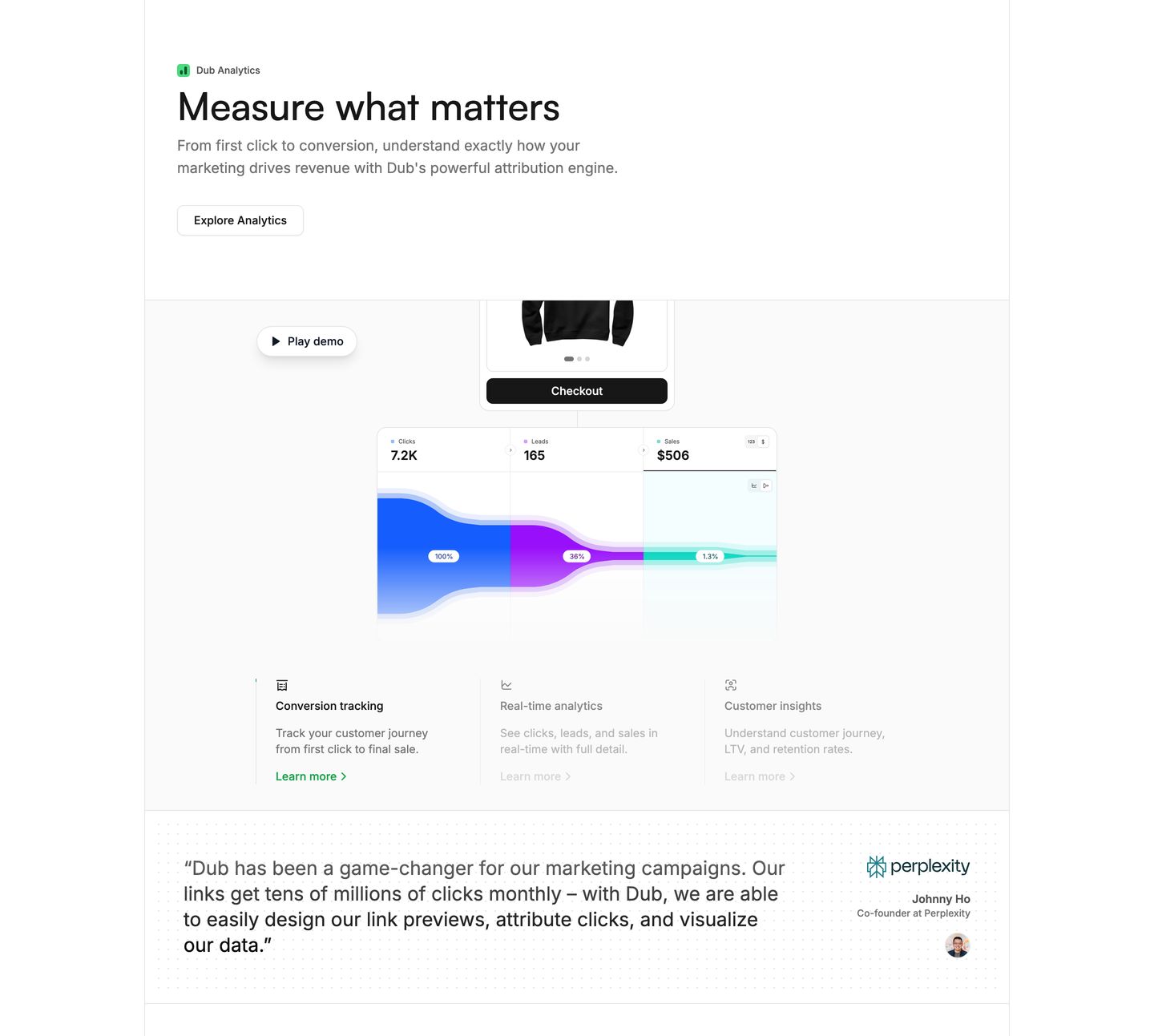
Crisp, clinical product feature showcase with sharp typography, interactive funnel analytics UI, and a structured testimonial band.
- Mood
- clinical + serene
- Layout
- 3 col · stacked · balanced
- 05
feature
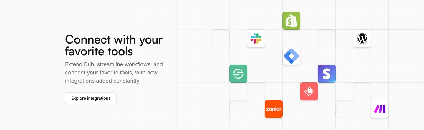
Clean and precise integration showcase with colorful app badges floating across a subtle technical grid.
- Mood
- clinical
- Layout
- 2 col · split · balanced
- 06
feature
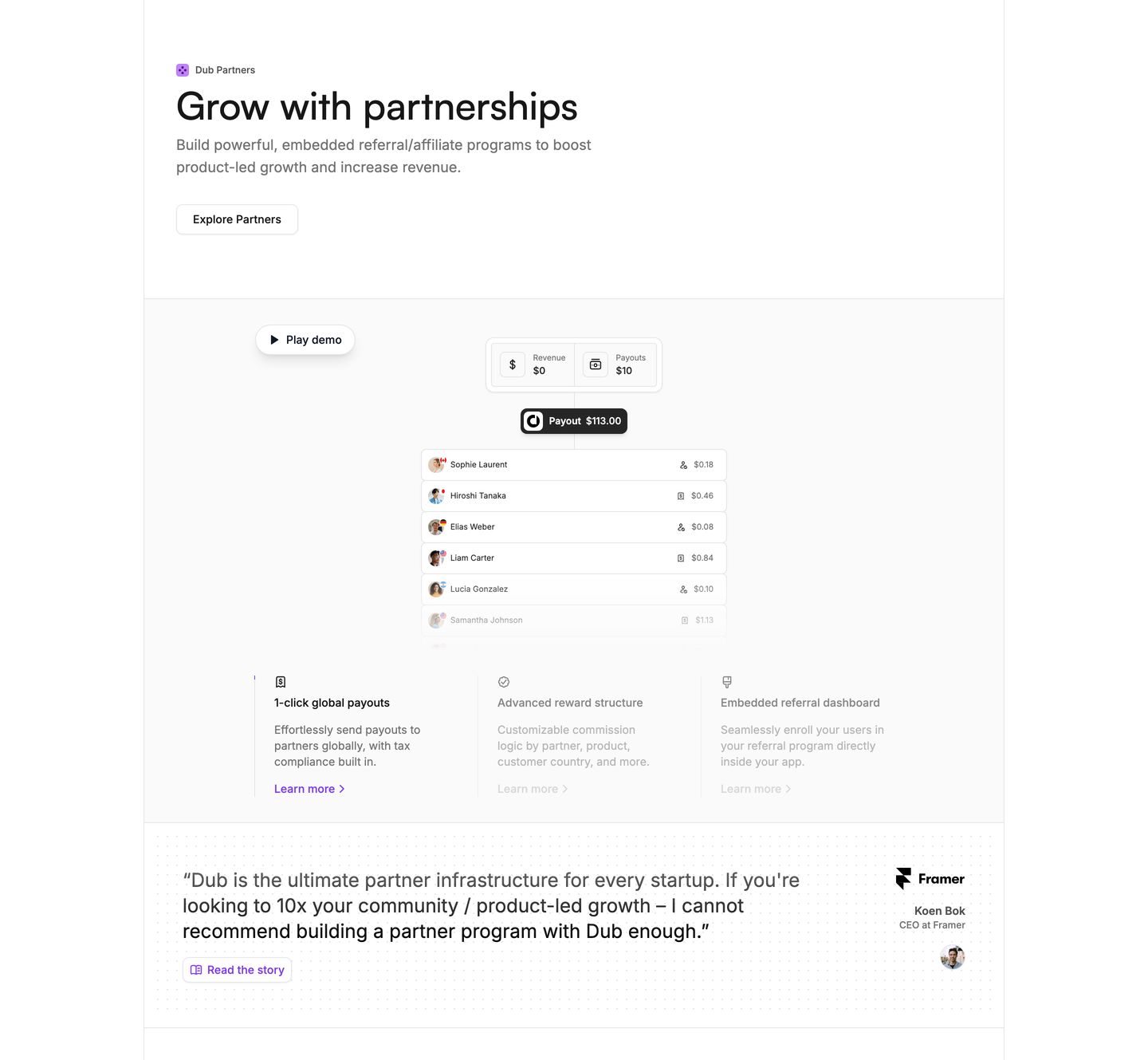
Crisp and structured light-mode SaaS feature section showcasing partnership capabilities with interactive mockups and an integrated customer endorsement.
- Mood
- clinical + serene
- Layout
- 3 col · stacked · balanced
- 07
feature
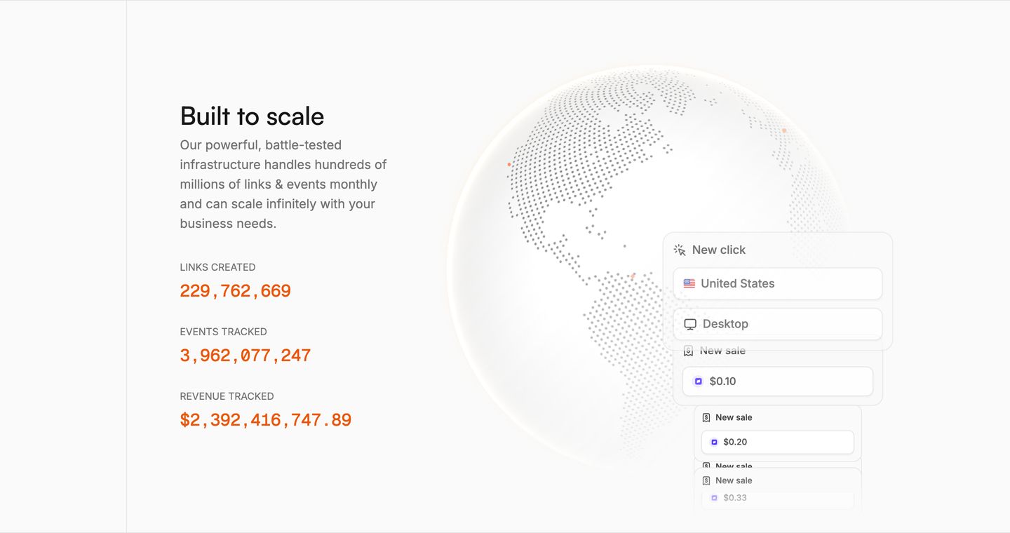
StrongQuiet, precise infrastructure feature pairing large real-time counters with an ethereal dotted globe and floating event notifications.
- Mood
- clinical
- Layout
- 2 col · split · balanced
- 08
feature
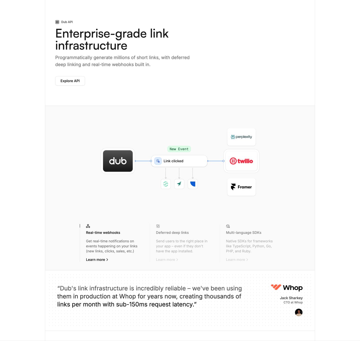
StrongCrisp developer-focused feature section with precise architectural diagrams, clean mono-accented typography, and an integrated social proof testimonial.
- Mood
- clinical + serene
- Layout
- 3 col · stacked · balanced
- 09
testimonial
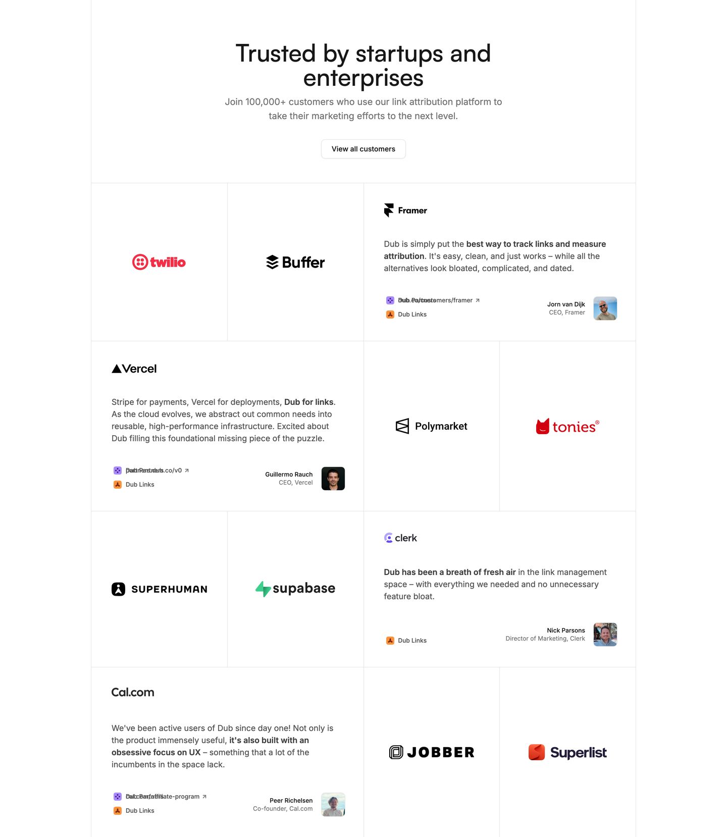
Clean, light grid of customer testimonials and tech logos that conveys immediate social proof and authority.
- Mood
- serene
- Layout
- 3 col · grid · balanced
- 10
announcement
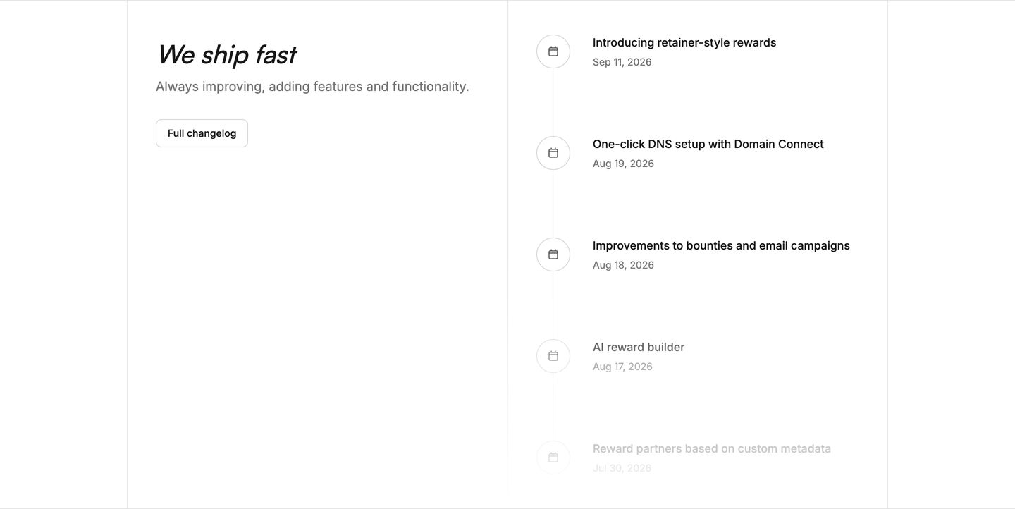
A clean, minimalist changelog timeline balancing an italicized headline with a quiet vertical feed of recent product releases.
- Mood
- clinical + serene
- Layout
- 2 col · split · airy
- 11
cta
A dark, centered call-to-action framed by a curved notch transition with high-contrast typography and review ratings.
- Mood
- serene
- Layout
- 1 col · centered · airy
- 12
footer
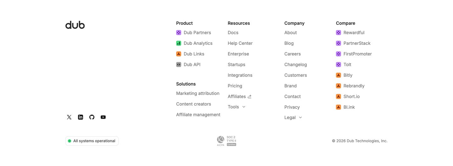
Clean and spacious white footer featuring multi-column navigation, brand icons, and a live system status indicator.
- Mood
- serene
- Layout
- 5 col · grid · airy