Cushion
Quiet, structured, and friction-free. Generous pale grey surfaces and soft rounded card containers create an uncluttered, focus-first environment. Crisp dark typography and a single bright sky blue accent signal calm efficiency without corporate heaviness.
Take the vibe
Rated
5.9/ 10
From 8 analyzed sections. Two measured components and one judged by a model. Distinction is a rank within the library; the rest are scores in their own right.
- AI scorejudged
- 7.2
- Systemmeasured
- 5.3
- Distinctionmeasured
- 3.7
- on the grid
- 30%
- vertical rhythm
- 89%
- type on a scale
- 58%
- contrast passing AA
- 33%
- unlike the library
- 0.63
- model craft
- 6.9/10
- model deviation
- 2.4/10
Color
Background#f5f5f5
Text#1f1f1f
Accent#00a6f4
Surface#fafafa
Muted#8f8f8f
Typefaces
- Display
- Inter Tight
- Body
- ui-sans-serif
- Mono
- —
- Source
- self_hosted · system
- Scale
- 10 · 11 · 12 · 14 · 16 · 18
Layout
- Grid
- 12 columns
- Container
- 1240px
- Spacing base
- 4px
- Radius
- 8px
Capture
- Category
- saas
- Sections
- 8
- Captured
- 2026-09-10
- Rhythm
- light grey → white → light grey → white → light grey
Type rules
- display headings set in sentence case with tight leading
- body text constrained to roughly 73 characters for easy legibility
Color rules
- accent sky blue (#00a6f4) reserved strictly for primary interactive actions and unread badges
- background and surface layers use soft off-whites and pale greys to reduce visual strain
Voice rules
- short declarative sentences focused on async clarity
- pair primary CTA with a low-friction secondary link
Holds it together
- encapsulate all product interface previews in rounded light containers on soft grey backdrops
- alternate feature sections in a balanced two-column zig-zag layout
- place small category pills or emoji markers above feature headings to anchor section context
Contrast
text on background15.1:1 AAA
muted text on background3.0:1 fail
text on surface15.8:1 AAA
muted text on surface3.1:1 AA Large
accent on background2.5:1 fail
background on accent2.5:1 fail
Type, measured
- Body
- 16px / 1.5
- Measure
- 73 characters
- Display
- 60px / 1
- Tracking
- 0em display
- Scale ratio
- 1.39
Voice
- Tone
- clear, calm, direct
- Sentences
- short
- Person
- second
- Vocabulary
- plain
- Calls to action
- get, talk, try, sign up
Built with
- Builder
- —
- Framework
- astro
- Motion
- —
- WebGL
- —
- Nav
- sticky_top_bar, 6 items, sticky
- Length
- 9.1 screens
Sections in page order
- 00
hero
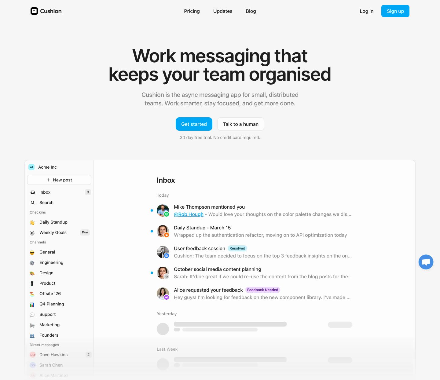
StrongSpacious and reassuring SaaS hero featuring a centered value proposition above a clean in-app product mockup.
- Mood
- serene
- Layout
- 1 col · centered · airy
- 01
statement
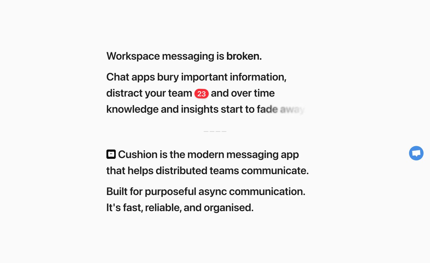
StrongA stark, minimalist manifesto using clever inline typographic effects to illustrate the chaos of modern workspace communication.
- Mood
- serene + clinical
- Layout
- 1 col · stacked · airy
- 02
feature grid
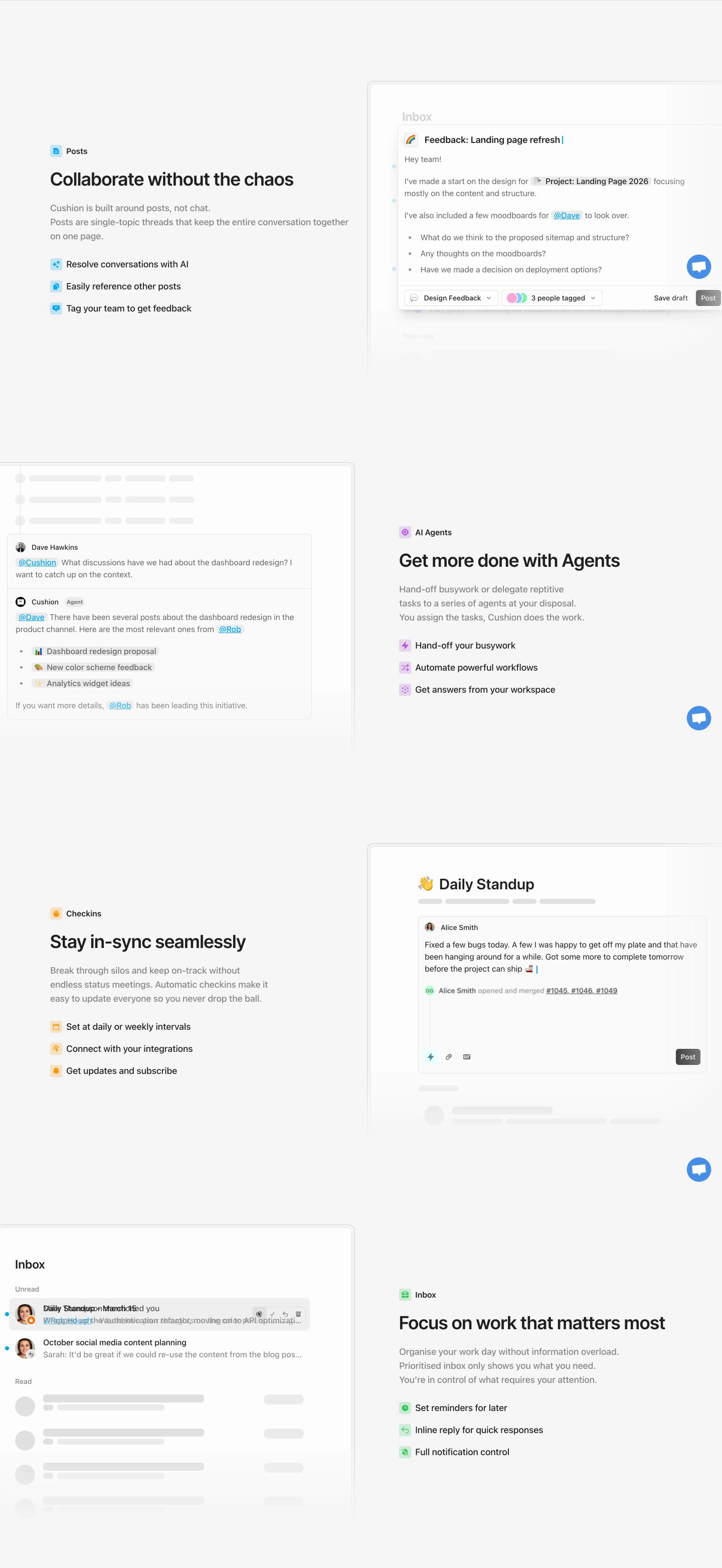
StrongCrisp alternating product feature rows showcasing modular UI mockups against airy neutral backgrounds.
- Mood
- clinical + serene
- Layout
- 2 col · split · airy
- 03
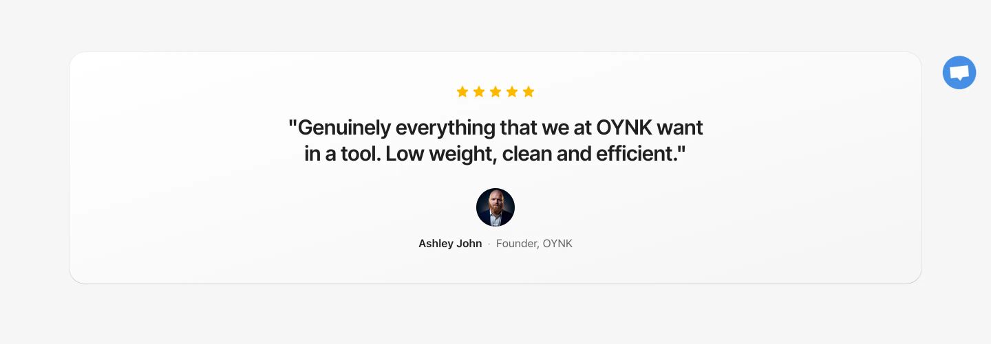
testimonial
A calm, spacious testimonial card floating cleanly against a neutral background to instill quiet trust.
- Mood
- serene
- Layout
- 1 col · centered · airy
- 04
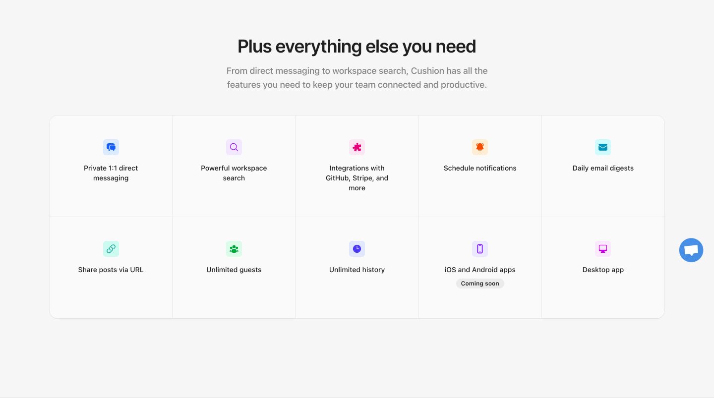
feature grid
Clean, structured feature grid with colorful pastel icons neatly distributed in a two-by-five layout over a light gray background.
- Mood
- serene
- Layout
- 5 col · grid · airy
- 05
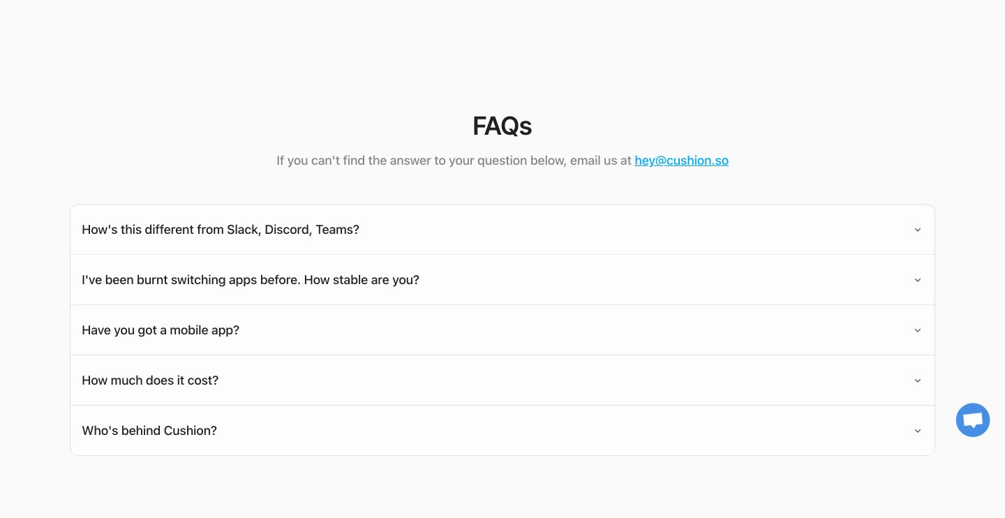
faq
A clean, spacious FAQ section featuring a centered accordion card set against a pale neutral background.
- Mood
- serene
- Layout
- 1 col · stacked · airy
- 06
cta
An ultra-clean, reassuring call-to-action floating in quiet whitespace with rounded dual buttons.
- Mood
- serene
- Layout
- 1 col · centered · airy

- 07
footer
A quiet and spacious minimal light footer with subtle grey link columns and generous empty space.
- Mood
- serene
- Layout
- 4 col · grid · airy