Amie
Clean, confident, and delightfully candid. Off-white canvas backgrounds let dense, beautifully crafted software interfaces take center stage, punctuated only by vibrant sky blue action pills and subtle coral badges. The voice is conversational and pragmatic, pairing meticulous product utility with effortless clarity.
Take the vibe
Rated
6.6/ 10
From 17 analyzed sections. Two measured components and one judged by a model. Distinction is a rank within the library; the rest are scores in their own right.
- AI scorejudged
- 8.3
- Systemmeasured
- 6.0
- Distinctionmeasured
- 3.3
- on the grid
- 48%
- vertical rhythm
- 81%
- type on a scale
- 43%
- contrast passing AA
- 67%
- unlike the library
- 0.61
- model craft
- 7.4/10
- model deviation
- 3.0/10
Color
Background#fafafa
Text#000000
Accent#11a8ff
Surface#ffffff
Muted#5c5c5c
Typefaces
- Display
- Inter
- Body
- Inter
- Mono
- —
- Source
- self_hosted
- Scale
- 12 · 13 · 14 · 16 · 20 · 40
Layout
- Grid
- 12 columns
- Container
- 976px
- Spacing base
- 4px
- Radius
- 8px · 12px · 20px
Capture
- Category
- ai
- Sections
- 17
- Captured
- 2026-09-15
- Rhythm
- light x12
Type rules
- headlines set in tight sentence case Inter at 56px with negative tracking
- body text in neutral grey #5c5c5c at 16px with relaxed 1.75 line-height
Color rules
- vibrant sky blue #11a8ff reserved exclusively for primary CTA buttons and highlighted text spans
- background rests on subtle off-white #fafafa with pure white #ffffff card surfaces
Voice rules
- write with conversational directness without corporate fluff
- use bold sentence-case headlines
Holds it together
- keep primary conversion points in solid sky blue pills with rounded corners
- structure feature walkthroughs with realistic embedded application frames rather than abstract graphics
- use sentence-case typography throughout all headings, subtitles, and CTA buttons
Contrast
text on background20.1:1 AAA
muted text on background6.4:1 AA
text on surface21.0:1 AAA
muted text on surface6.7:1 AA
accent on background2.5:1 fail
background on accent2.5:1 fail
Type, measured
- Body
- 16px / 1.75
- Measure
- 124 characters
- Display
- 56px / 1.14
- Tracking
- -0.012em display
- Scale ratio
- 1.37
Voice
- Tone
- conversational, direct, pragmatic
- Sentences
- short
- Person
- second
- Vocabulary
- plain
- Calls to action
- get started, download, start free trial
Built with
- Builder
- —
- Framework
- next
- Motion
- —
- WebGL
- —
- Nav
- top_bar, 4 items
- Length
- 15.7 screens
Sections in page order
- 00
hero
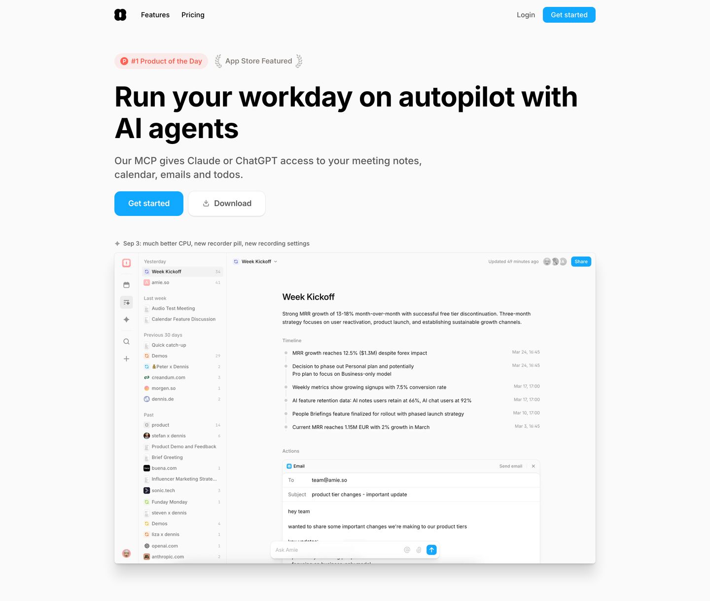
Clean, organized productivity hero with crisp sans-serif typography and a large interactive application interface mockup.
- Mood
- serene
- Layout
- 1 col · stacked · airy
- 01
logo bar
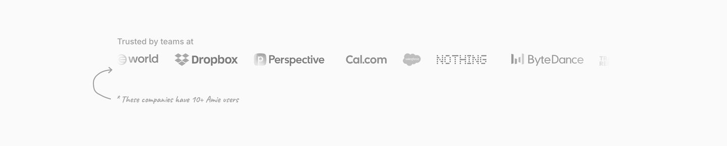
An airy, minimalist logo bar featuring a subtle handwritten footnote that injects playful transparency into typical corporate social proof.
- Mood
- playful + serene
- Layout
- 1 col · stacked · airy
- 02
cta
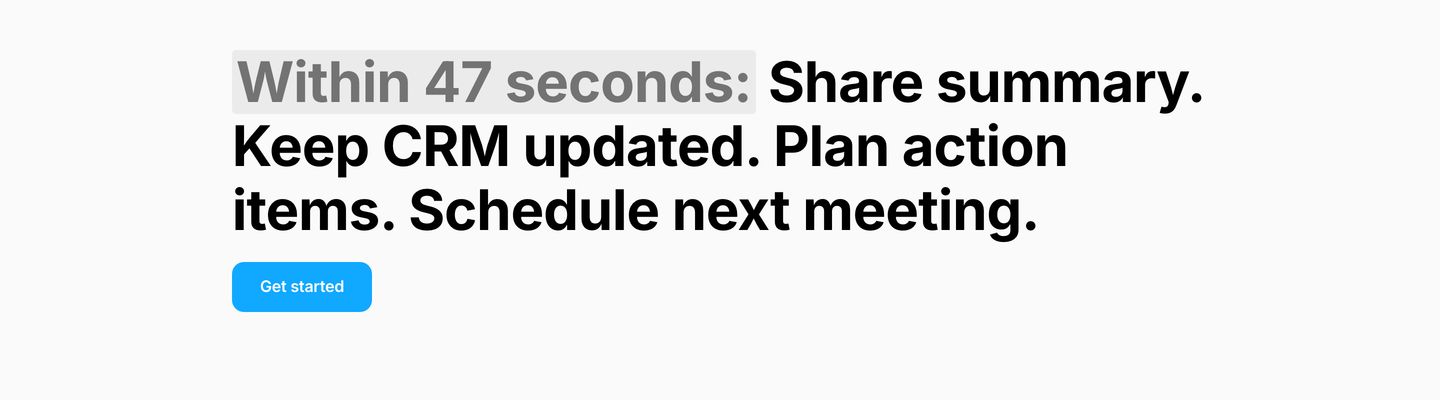
Ultra-minimalist typographic statement band highlighting workflow speed with a muted inline badge and direct blue action button.
- Mood
- clinical + serene
- Layout
- 1 col · stacked · airy
- 03
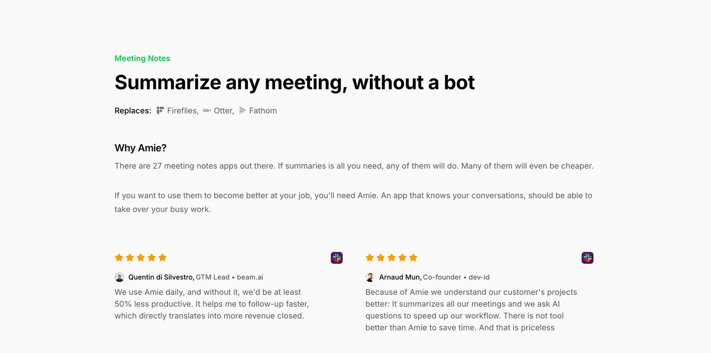
feature
Crisp and understated editorial feature breakdown with frank, conversational copywriting and paired user testimonials.
- Mood
- serene
- Layout
- 2 col · stacked · airy
- 04
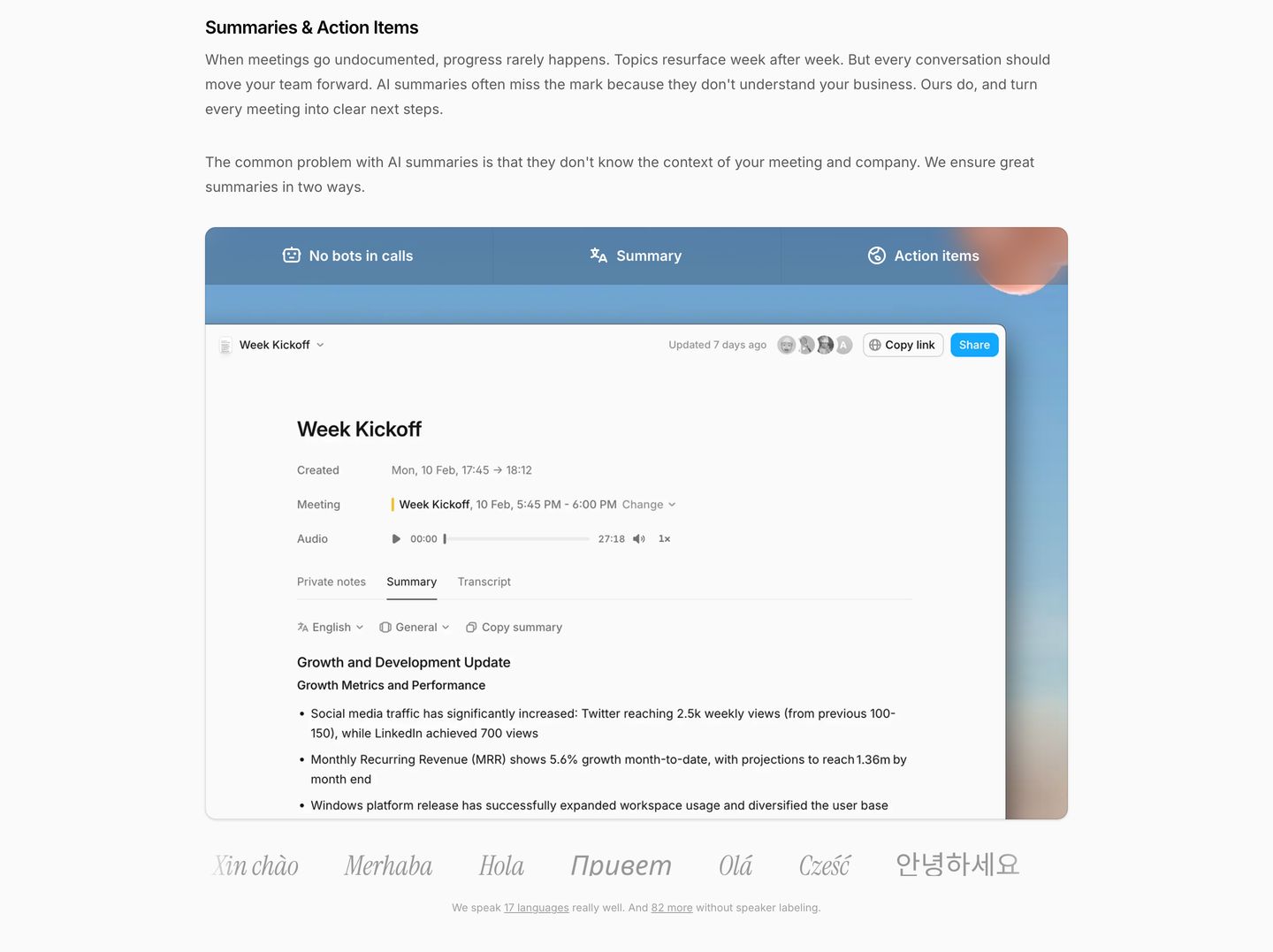
feature
Clean and orderly software feature presentation with quiet typography, a tabbed interface mockup, and a multilingual footer note.
- Mood
- serene
- Layout
- 1 col · stacked · balanced
- 05
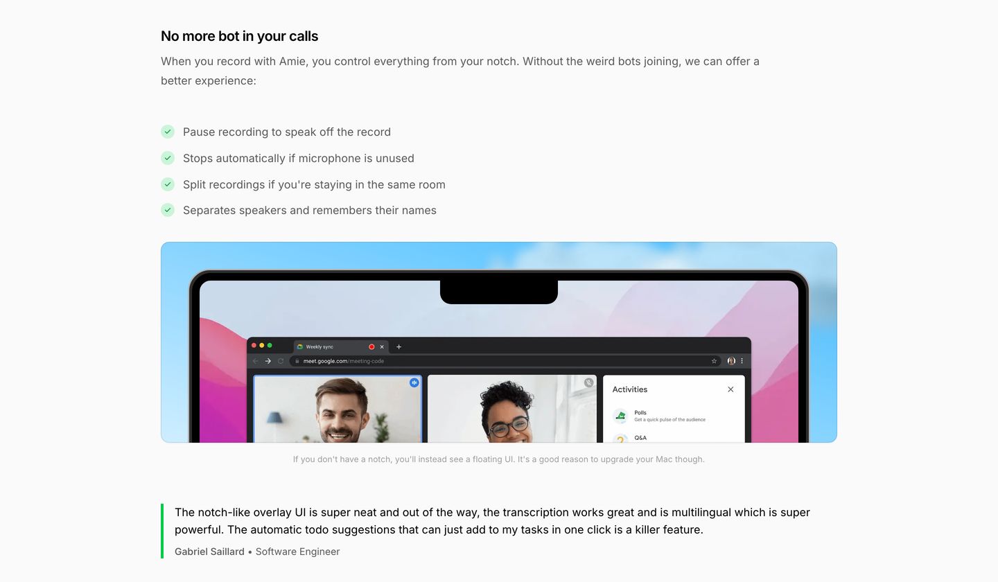
feature
Clean and understated software feature breakdown pairing a checklist and Mac notch interface mockup with an anchored user testimonial.
- Mood
- serene
- Layout
- 1 col · stacked · balanced
- 06
feature
Spacious and calm software feature section detailing meeting integrations and private notes with a clean horizontal app dock.
- Mood
- serene
- Layout
- 1 col · stacked · airy
- 07
feature grid
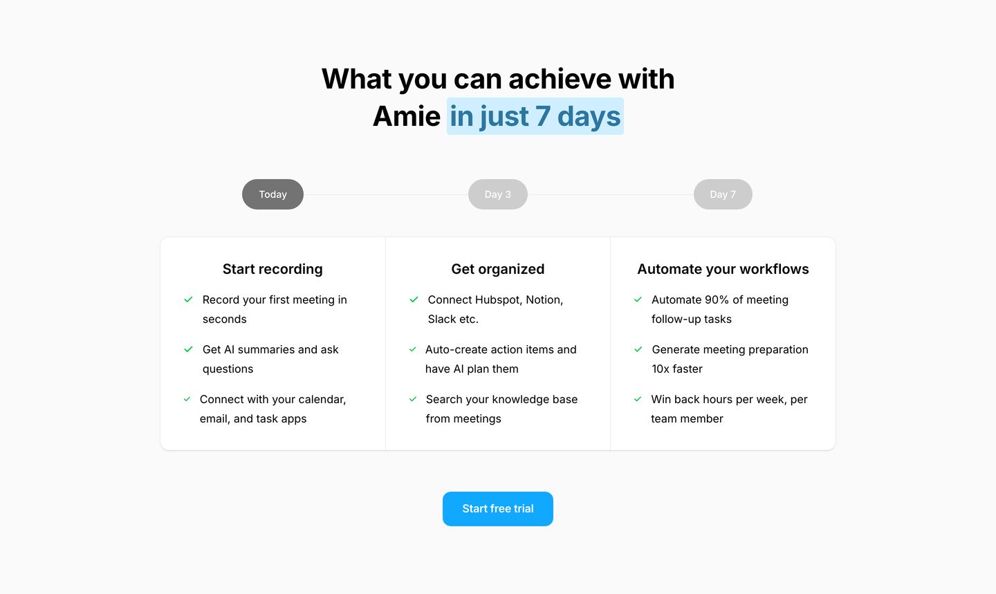
StrongCrisp and reassuring milestone timeline showcasing onboarding value across a three-column checklist card with soft rounded pills.
- Mood
- serene
- Layout
- 3 col · stacked · airy
- 08
feature
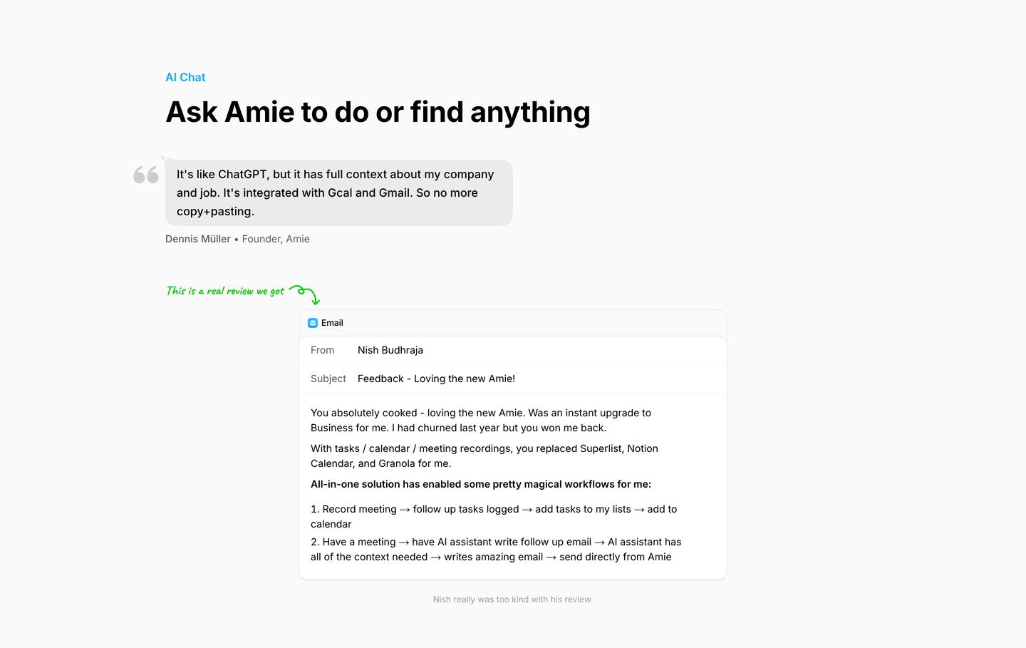
StrongClean, airy product feature showcase framed playfully with candid testimonials and informal hand-drawn annotations.
- Mood
- playful + serene
- Layout
- 1 col · stacked · airy
- 09
feature
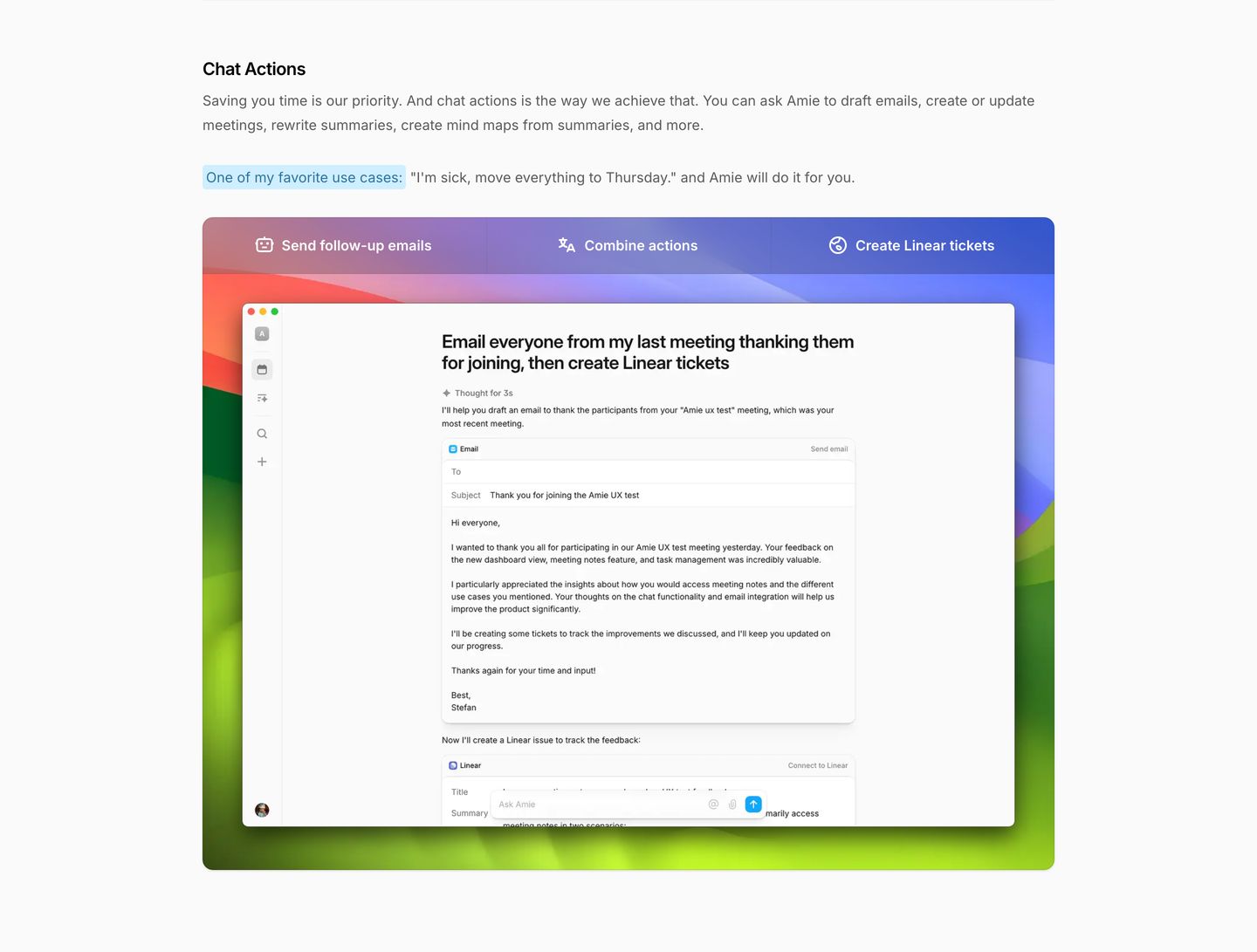
Clean productivity feature section presenting an interactive tabbed application mockup framed by a rich multi-colored desktop gradient.
- Mood
- playful
- Layout
- 1 col · stacked · balanced
- 10
feature
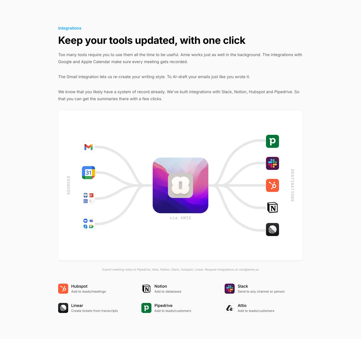
Clean, airy product integrations section featuring a central app hub diagram routing sources to destinations within generous light whitespace.
- Mood
- serene
- Layout
- 3 col · stacked · airy
- 11
feature
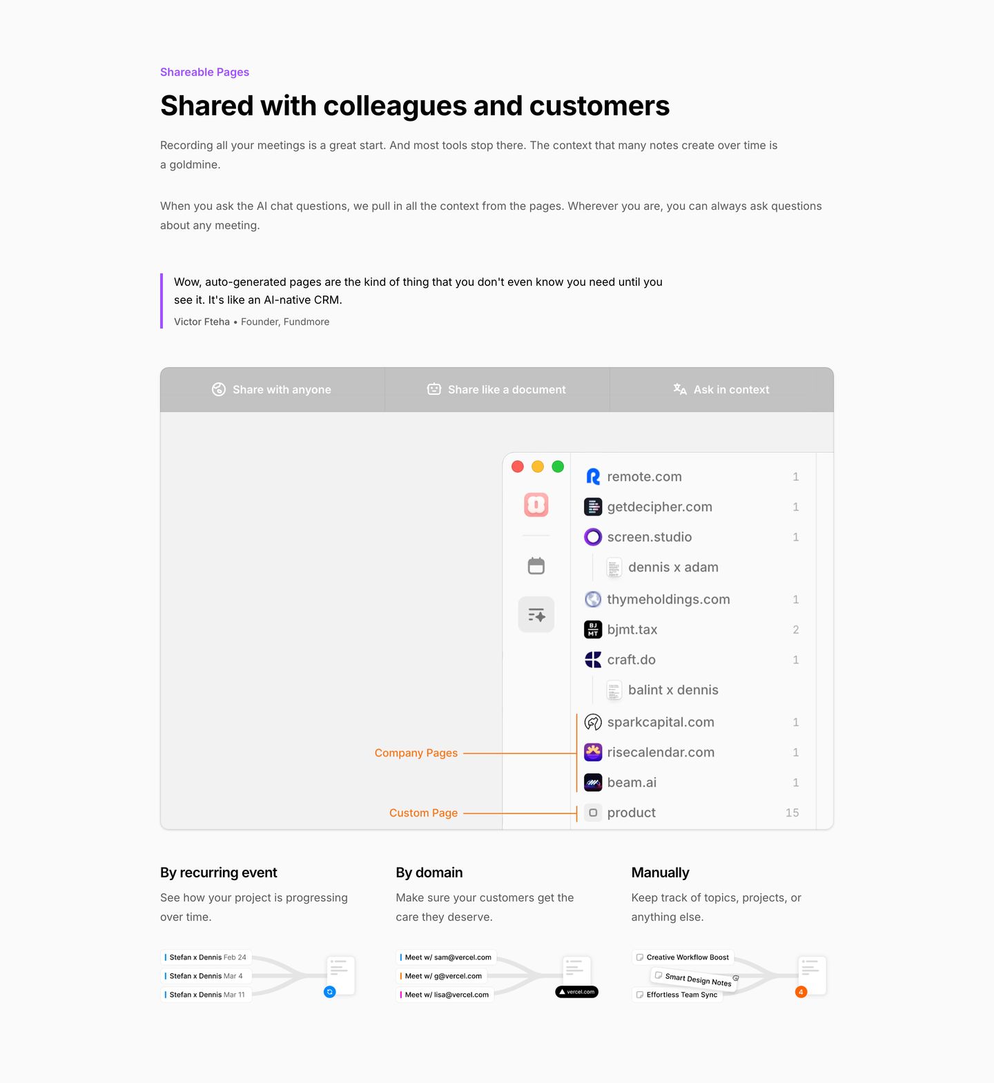
StrongStructured light SaaS feature walkthrough combining a tabbed application interface, inline customer proof, and a three-column breakdown.
- Mood
- serene
- Layout
- 3 col · stacked · balanced
- 12
feature
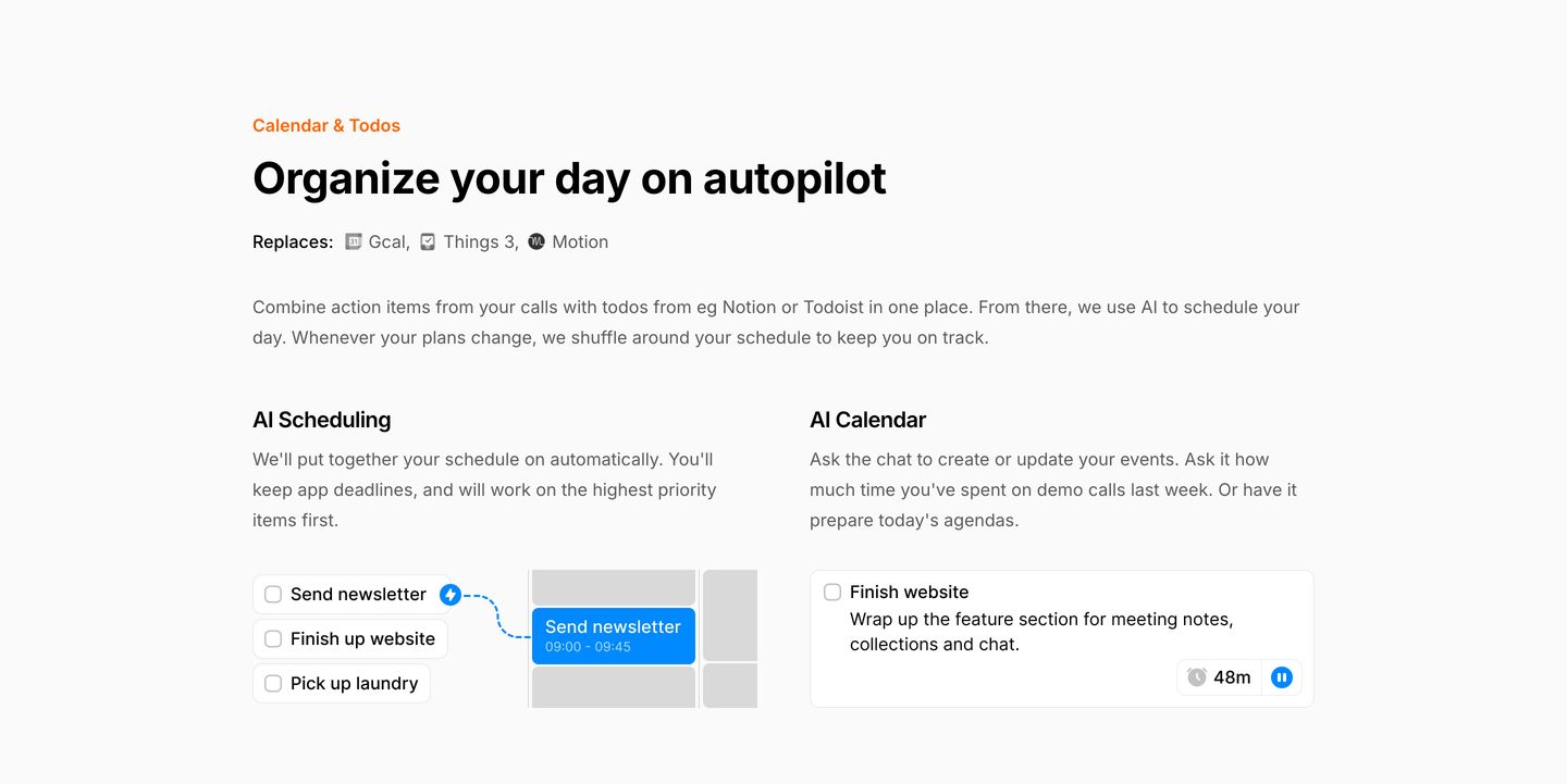
Crisp and structured productivity feature section pairing systematic copy with compact interactive UI cards on an off-white background.
- Mood
- clinical + serene
- Layout
- 2 col · stacked · balanced
- 13
testimonial
Clean, understated row of three user testimonial snippets paired with star ratings and social avatars.
- Mood
- serene
- Layout
- 3 col · grid · airy

- 14
cta
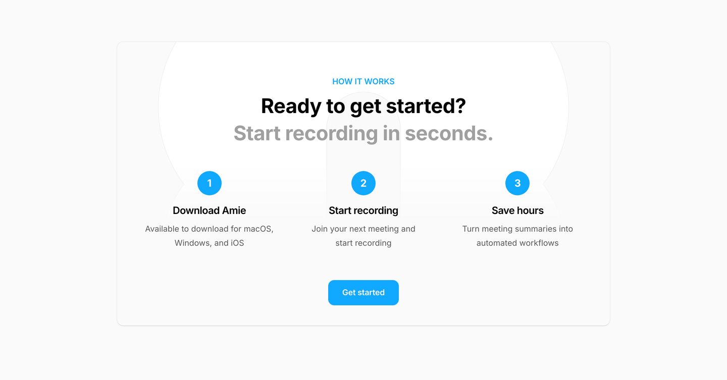
A clean, reassuring three-step onboarding card with bright blue accents and ample whitespace.
- Mood
- serene
- Layout
- 3 col · stacked · airy
- 15
faq
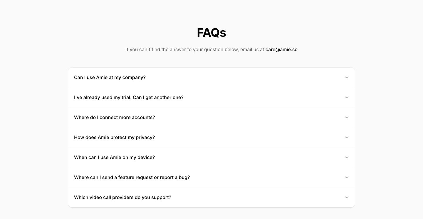
Clean and airy FAQ accordion neatly contained within a rounded card on a bright white background.
- Mood
- serene
- Layout
- 1 col · stacked · airy
- 16
footer
An ultra-minimalist, quiet footer characterized by airy whitespace, understated link columns, and calm typography.
- Mood
- serene
- Layout
- 3 col · grid · airy