Midday
Quiet, precise, and deeply refined. High-contrast serif headlines sit on pristine white fields framed by hairline borders and monochromatic product screenshots, conveying absolute calm and financial clarity.
Take the vibe
Rated
7.6/ 10
From 8 analyzed sections. Two measured components and one judged by a model. Distinction is a rank within the library; the rest are scores in their own right.
- AI scorejudged
- 9.6
- Systemmeasured
- 6.7
- Distinctionmeasured
- 4.0
- on the grid
- 37%
- vertical rhythm
- 85%
- type on a scale
- 45%
- contrast passing AA
- 100%
- unlike the library
- 0.64
- model craft
- 8.0/10
- model deviation
- 3.5/10
Color
Background#ffffff
Text#121212
Accent#18181b
Surface#e6e4e0
Muted#616161
Typefaces
- Display
- Hedvig Letters Serif
- Body
- Hedvig Letters Sans
- Mono
- —
- Source
- self_hosted
- Scale
- 10 · 11 · 12 · 14 · 16 · 18
Layout
- Grid
- 24 columns
- Container
- 1248px
- Spacing base
- 4px
- Radius
- 6px · 8px · 999px
Capture
- Category
- finance
- Sections
- 8
- Captured
- 2026-09-11
- Rhythm
- white throughout with pale gray structured panels
Type rules
- display headlines rendered in elegant serif at high sizes
- body text rendered in neutral sans-serif with comfortable line height and tight measure
- metadata and fine print strictly set at 10px to 12px
Color rules
- monochrome white and graphite palette dominates over 98% of the page
- green accent strictly reserved for system health indicators
Voice rules
- keep headlines under ten words in sentence case
- use short explanatory body sentences detailing time saved
Holds it together
- use serif typography exclusively for primary section headlines and sans-serif for all UI and body text
- contain data blocks and card interfaces inside hairline borders with subtle gray backgrounds
- keep interactive controls dark solid pills or pill-outlined badges
Contrast
text on background18.7:1 AAA
muted text on background6.2:1 AA
text on surface14.8:1 AAA
muted text on surface4.9:1 AA
accent on background17.7:1 AAA
background on accent17.7:1 AAA
Type, measured
- Body
- 14px / 1.63
- Measure
- 33 characters
- Display
- 508px / 1
- Tracking
- 0em display
- Scale ratio
- 2.45
Voice
- Tone
- understated, precise, direct
- Sentences
- short
- Person
- second
- Vocabulary
- plain
- Calls to action
- start, read, learn
Built with
- Builder
- —
- Framework
- next
- Motion
- —
- WebGL
- —
- Nav
- sticky_top_bar, 4 items, sticky
- Length
- 7.3 screens
Sections in page order
- 00
hero
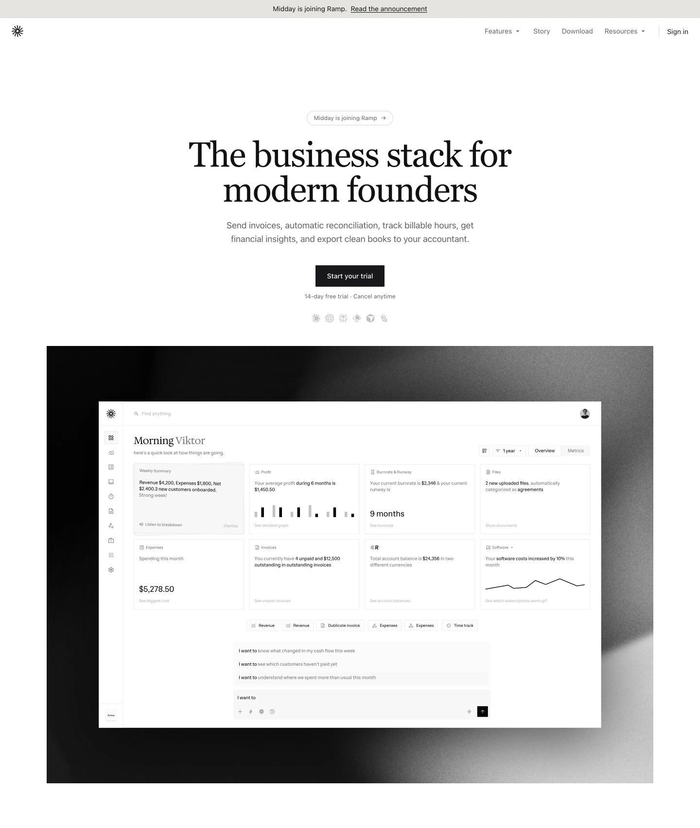
Quiet, editorial SaaS hero with classical serif typography centered above a monochrome dashboard preview embedded in a dark vignette.
- Mood
- serene + luxurious
- Layout
- 1 col · stacked · airy
- 01
feature
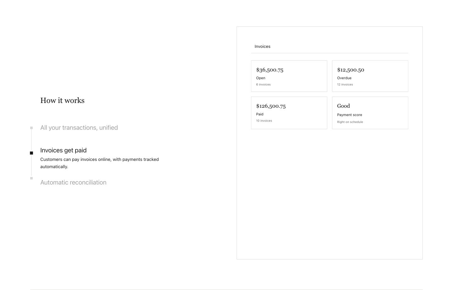
StrongAn ultra-minimalist, high-whitespace feature walk-through pairing quiet serif headings with a clean wireframe dashboard preview.
- Mood
- clinical + serene
- Layout
- 2 col · split · airy
- 02
feature grid
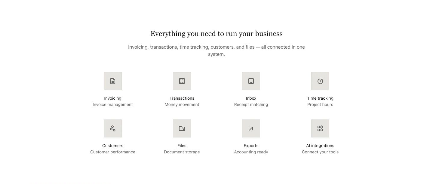
Airy, restrained feature grid with a delicate serif headline and understated icon tiles.
- Mood
- serene
- Layout
- 4 col · grid · airy
- 03
feature grid
StrongClean and understated grid of cards quantifying wasted time with quiet, editorial typographic precision.
- Mood
- serene + clinical
- Layout
- 3 col · grid · airy
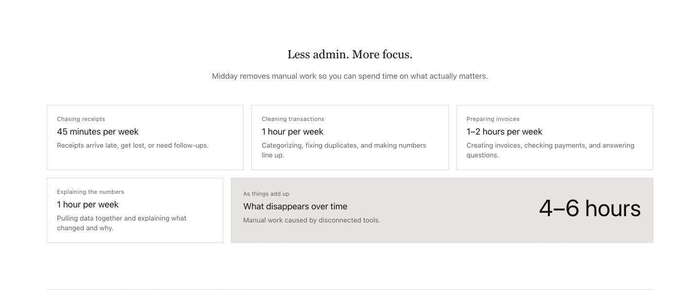
- 04
feature
A quiet, minimalist feature card with a muted checklist and refined serif typography centered in vast white space.
- Mood
- serene
- Layout
- 1 col · stacked · airy
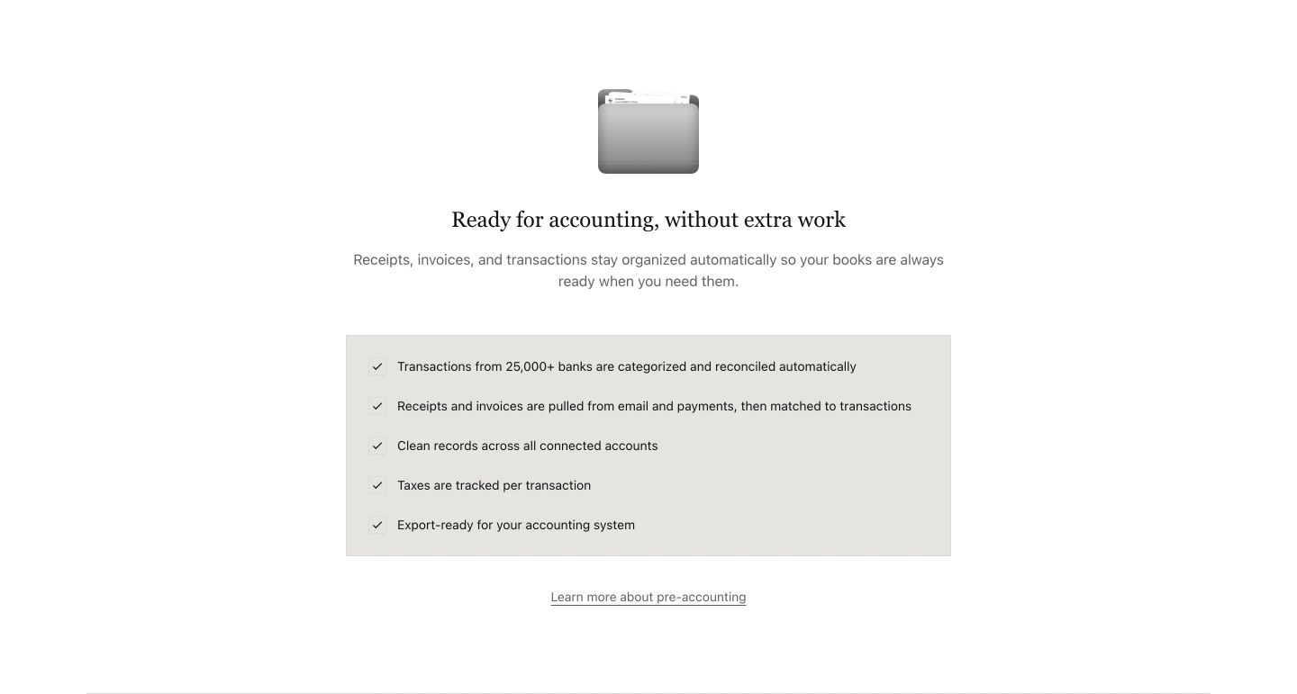
- 05
testimonial
StrongCrisp white customer testimonial band featuring subtly tilted paper-like quote cards under warm serif typography.
- Mood
- serene
- Layout
- 4 col · stacked · airy
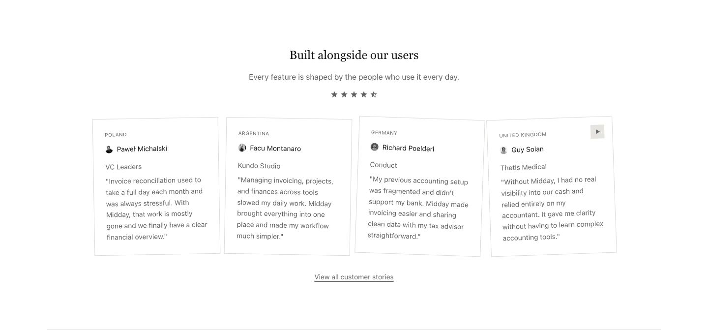
- 06
logo bar
A clean, understated integrations band featuring rounded pill badges arranged in horizontal scrolling streams beneath a delicate serif headline.
- Mood
- serene
- Layout
- 1 col · stacked · balanced
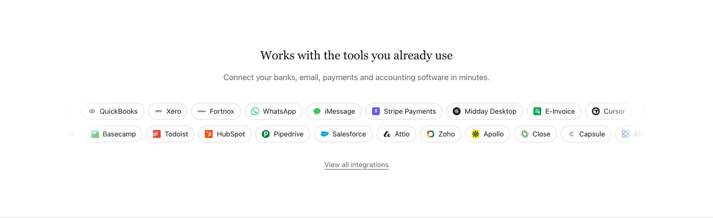
- 07
footer
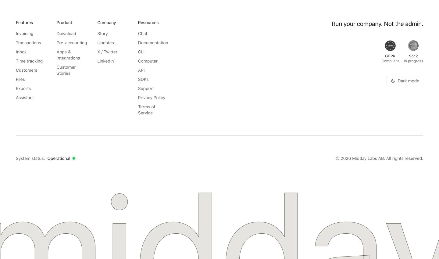
Ultra-clean, spacious white footer anchored by disciplined link columns and an enormous outlined brandmark cropping out at the bottom.
- Mood
- clinical + serene
- Layout
- 5 col · grid · airy