Basis Theory
Sterile, developer-first fintech precision balanced with crisp enterprise reassurance. Technical isometric wireframes and ASCII terminal art sit alongside high-contrast dark mode callouts and neon cyan-lime interactive accents.
Take the vibe
Rated
5.9/ 10
From 8 analyzed sections. Two measured components and one judged by a model. Distinction is a rank within the library; the rest are scores in their own right.
- AI scorejudged
- 8.0
- Systemmeasured
- 3.8
- Distinctionmeasured
- 4.9
- on the grid
- 0%
- vertical rhythm
- 58%
- type on a scale
- 44%
- contrast passing AA
- 50%
- unlike the library
- 0.69
- model craft
- 7.3/10
- model deviation
- 2.9/10
Color
Background#ffffff
Text#18181b
Accent#94faf0
Surface#f4f4f5
Muted#71717a
Typefaces
- Display
- Inter
- Body
- Inter
- Mono
- Kode Mono
- Source
- Scale
- 12 · 14 · 16 · 18 · 24 · 32
Layout
- Grid
- —
- Container
- —
- Spacing base
- 4px
- Radius
- 8px · 16px
Capture
- Category
- finance
- Sections
- 8
- Captured
- 2026-09-15
- Rhythm
- lime → light → dark → light → dark x2 → light → dark → light
Type rules
- display headlines set large with tight tracking in sentence case
- technical labels, kicker tags, and code elements set in monospace
- compliance badges and category pills use uppercase with wide tracking
Color rules
- pure white canvas dominates business narrative, switching to zinc-900 (#18181b) for developer tools and quotes
- cyan (#94faf0) and lime (#d4f796) are strictly reserved for primary CTAs and status accents
Voice rules
- lead headlines with clear infrastructure capability and business metrics
- keep CTA buttons strictly functional and action-led
Holds it together
- alternate between crisp light surfaces for merchant value and dark terminal panels for developer features
- pair every product feature with clear architectural diagrams or code interfaces
- limit bright neon fills strictly to high-priority interactive touchpoints
Contrast
text on background17.7:1 AAA
muted text on background4.8:1 AA
text on surface16.1:1 AAA
muted text on surface4.4:1 AA Large
accent on background1.2:1 fail
background on accent1.2:1 fail
Type, measured
- Body
- 12px / 1
- Measure
- 117 characters
- Display
- 80px / 0.8
- Tracking
- -0.04em display
- Scale ratio
- 1.61
Voice
- Tone
- technical, authoritative, precise
- Sentences
- medium
- Person
- second
- Vocabulary
- technical
- Calls to action
- request, start, explore, see
Built with
- Builder
- framer
- Framework
- —
- Motion
- —
- WebGL
- —
- Nav
- —
- Length
- 7.6 screens
Sections in page order
- 00
hero
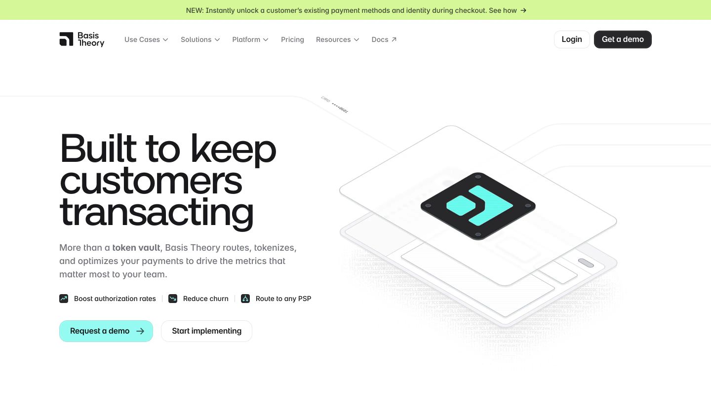
StrongCrisp and technical fintech hero pairing an authoritative headline with an intricate isometric ASCII-textured card illustration.
- Mood
- clinical + serene
- Layout
- 2 col · split · balanced
- 01
logo bar
A quiet, dark proof bar establishing institutional credibility through crisp monochrome client marks on a diagonal textured backdrop.
- Mood
- serene
- Layout
- 5 col · split · balanced

- 02
feature
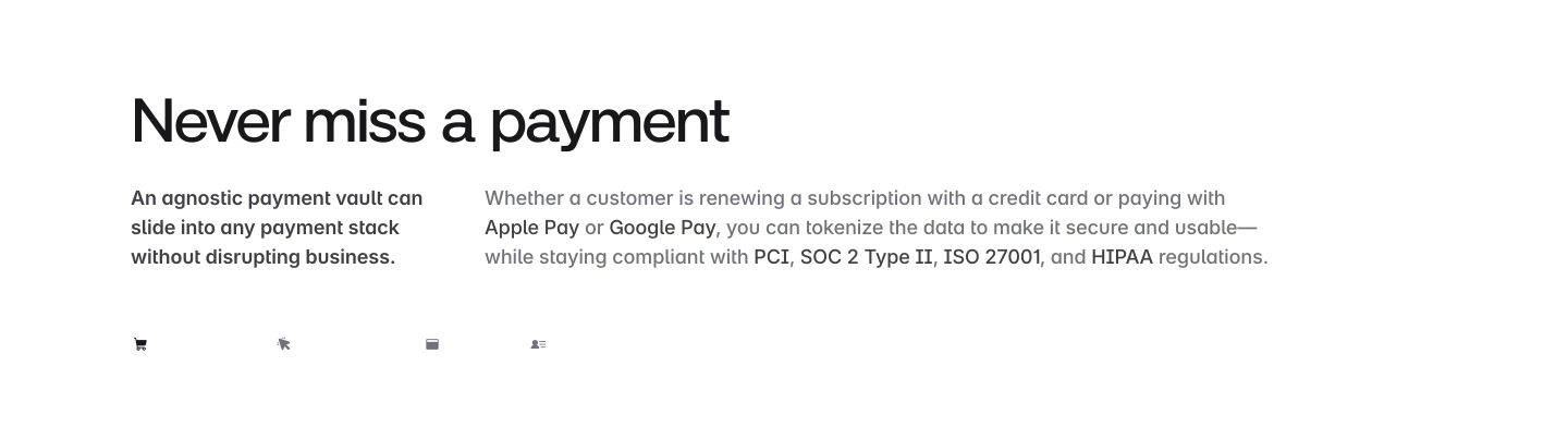
Stark, minimal feature introduction utilizing clean Swiss-inspired typography across an airy two-column layout.
- Mood
- clinical + serene
- Layout
- 2 col · split · airy
- 03
feature grid
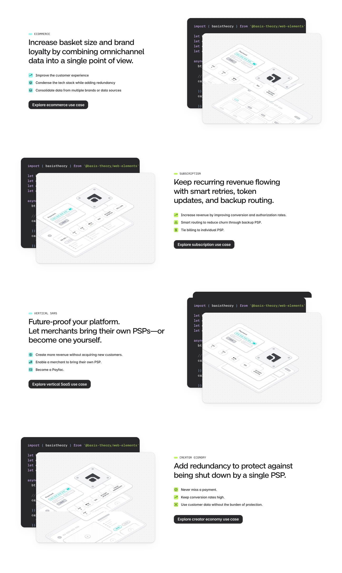
StrongCrisp developer-focused use case breakdowns alternating technical isometric diagrams with concise benefit lists.
- Mood
- clinical + serene
- Layout
- 2 col · split · airy
- 04
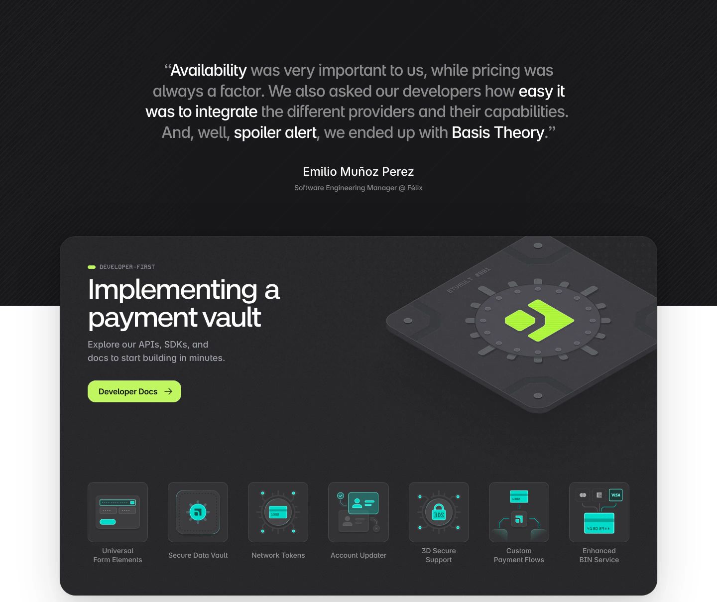
feature
StrongA dark developer-centric feature card combining an executive testimonial with technical vault capabilities and lime green accents.
- Mood
- serene
- Layout
- 1 col · stacked · balanced
- 05
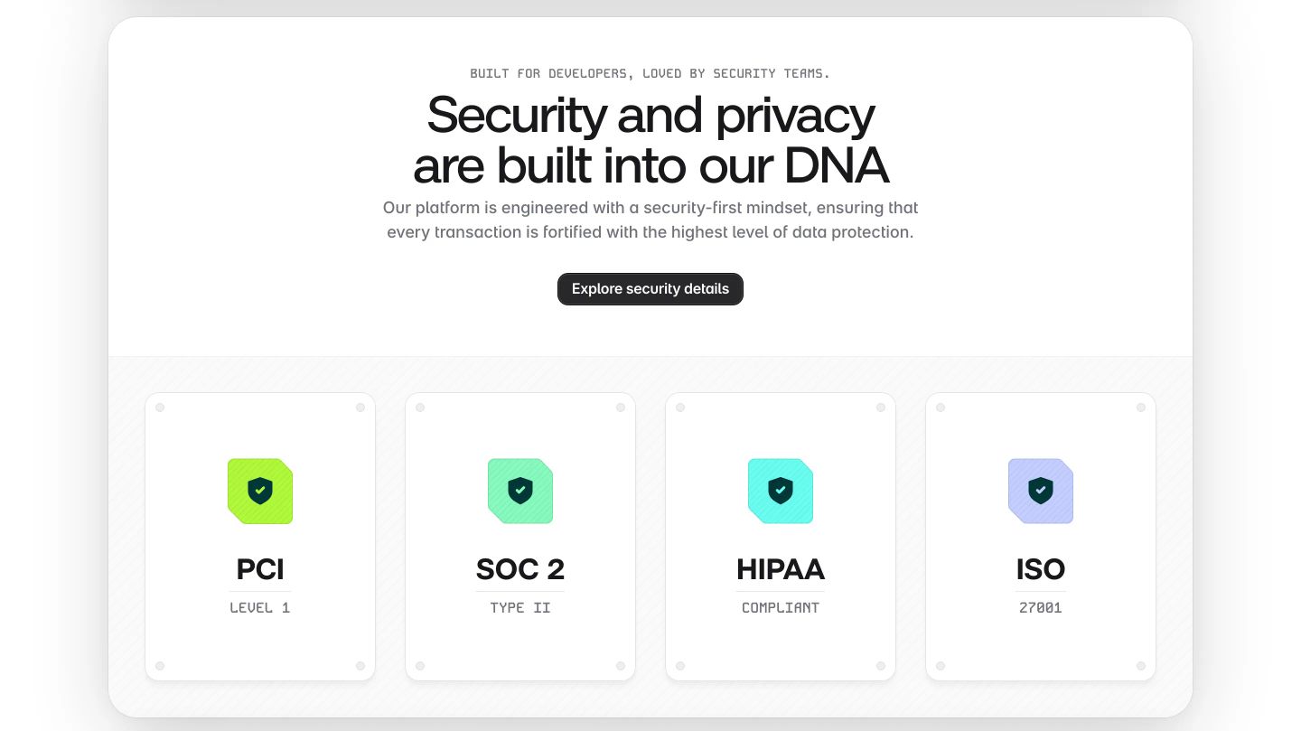
feature grid
Crisp and reassuring compliance band presenting enterprise security certifications across four neatly pinned cards on a pure white canvas.
- Mood
- clinical
- Layout
- 4 col · stacked · airy
- 06
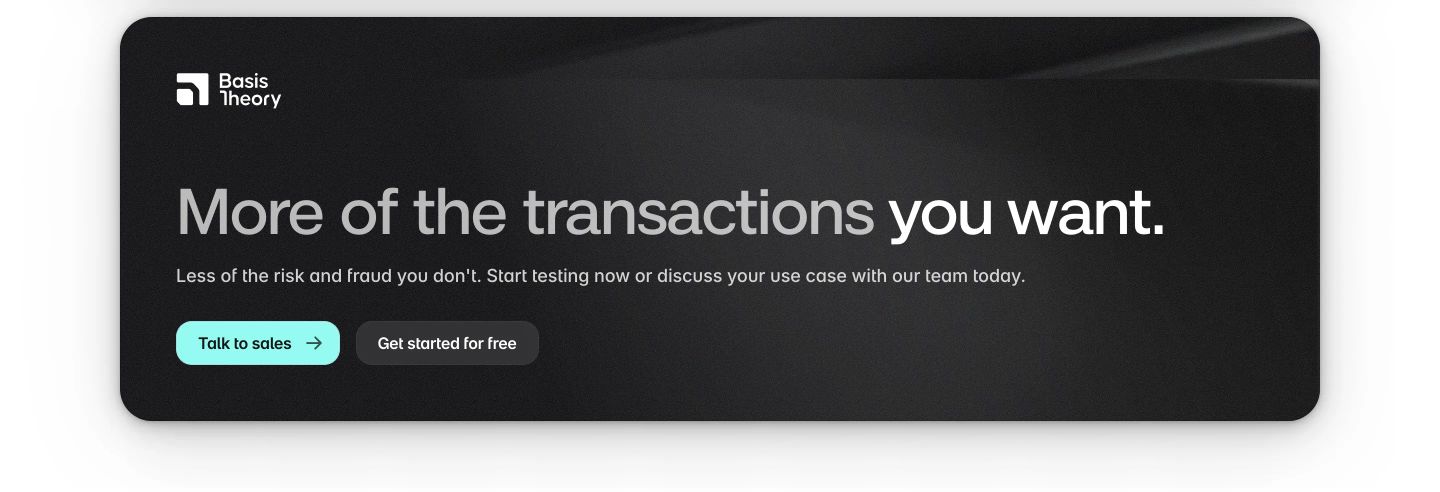
cta
Sleek dark rounded CTA banner delivering calm reassurance with crisp typography and dual action buttons.
- Mood
- serene
- Layout
- 1 col · stacked · balanced
- 07
footer
Clean, structured corporate footer with a multi-column link layout on white transitioning into a dark bottom copyright bar.
- Mood
- serene
- Layout
- 6 col · grid · balanced