Mezmo
Engineered, clinical precision tailored for DevOps and infrastructure teams. Light, low-contrast neutral surfaces provide high legibility for dense feature descriptions, while interactive terminal windows and soft iridescent gradients anchor the AI context.
Take the vibe
Rated
5.7/ 10
From 7 analyzed sections. Two measured components and one judged by a model. Distinction is a rank within the library; the rest are scores in their own right.
- AI scorejudged
- 7.8
- Systemmeasured
- 4.2
- Distinctionmeasured
- 3.8
- on the grid
- 0%
- vertical rhythm
- 88%
- type on a scale
- 45%
- contrast passing AA
- 33%
- unlike the library
- 0.63
- model craft
- 7.1/10
- model deviation
- 2.7/10
Color
Background#f4f4f4
Text#0a090c
Accent#95c1cf
Surface#ffffff
Muted#8b949e
Typefaces
- Display
- Onest Variable
- Body
- Onest Variable
- Mono
- ui-monospace
- Source
- self_hosted
- Scale
- 11 · 12 · 13 · 14 · 16 · 19
Layout
- Grid
- —
- Container
- —
- Spacing base
- 4px
- Radius
- 6px · 8px · 12px
Capture
- Category
- ai
- Sections
- 7
- Captured
- 2026-09-15
- Rhythm
- dark → light x10
Type rules
- display type in sentence case with tight 1.05 line-height
- body text constrained to roughly 68 characters per line
- monospace type strictly used for terminal simulators and code/config contexts
Color rules
- clean light gray (#f4f4f4) dominates the page with white cards for content chunks
- deep dark tones (#0b0d10) reserved for terminal/code artifact surfaces and footer accents
- soft slate cyan (#95c1cf) used sparingly for primary interactive highlights and buttons
Voice rules
- use rigorous DevOps and SRE terminology
- pair technical guarantees with operational benefits
Holds it together
- present developer interfaces (CLI, dashboards) inside structured card containers with macOS-style window frames
- structure multi-step features in numbered, bordered white cards against a light grey backdrop
- highlight critical hero phrasing using a subtle purple-to-cyan gradient
Contrast
text on background18.1:1 AAA
muted text on background2.8:1 fail
text on surface19.9:1 AAA
muted text on surface3.1:1 AA Large
accent on background1.8:1 fail
background on accent1.8:1 fail
Type, measured
- Body
- 16px / 1.5
- Measure
- 68 characters
- Display
- 48px / 1.05
- Tracking
- 0em display
- Scale ratio
- 1.32
Voice
- Tone
- technical, authoritative, precise
- Sentences
- medium
- Person
- second
- Vocabulary
- technical
- Calls to action
- get, talk, start, join
Built with
- Builder
- webflow
- Framework
- —
- Motion
- —
- WebGL
- —
- Nav
- top_bar, 29 items
- Length
- 6.2 screens
Sections in page order
- 00
hero
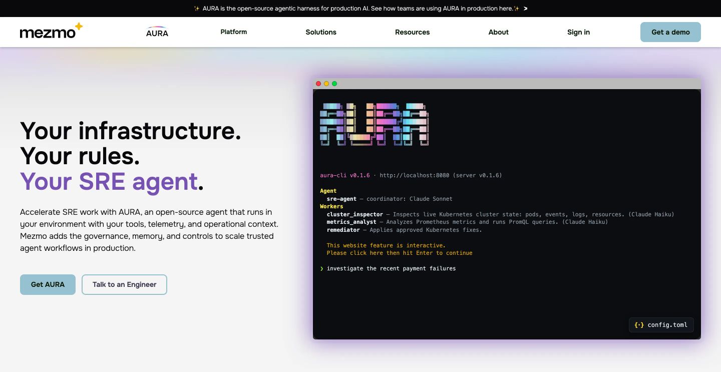
StrongA crisp developer tools hero balancing structured SaaS typography with an interactive glowing terminal emulator.
- Mood
- clinical + serene
- Layout
- 2 col · split · balanced
- 01
feature grid
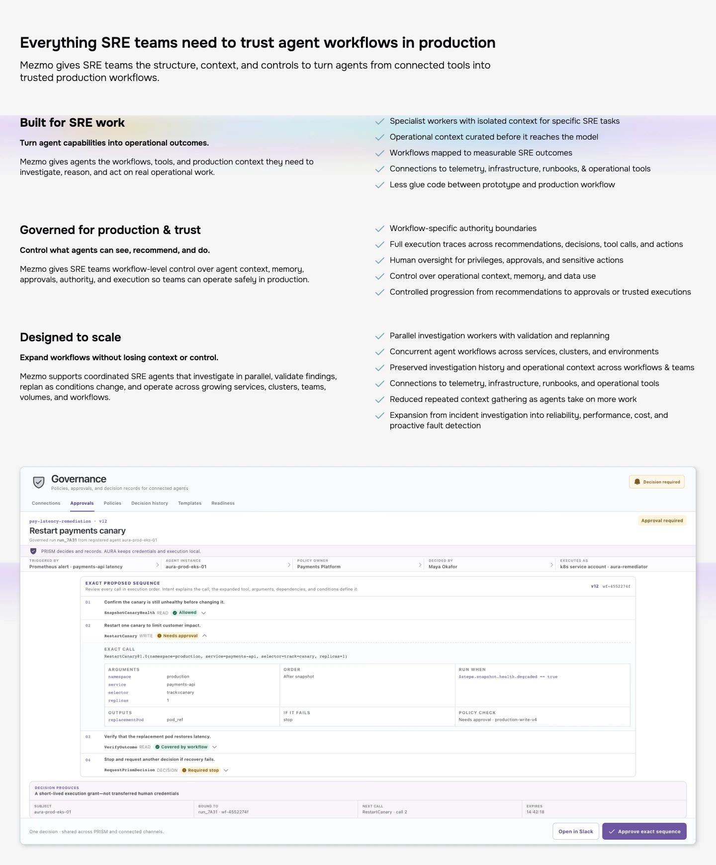
StrongA clean, structured enterprise feature section with paired benefit lists and an expansive governance dashboard preview.
- Mood
- clinical
- Layout
- 2 col · stacked · balanced
- 02
feature
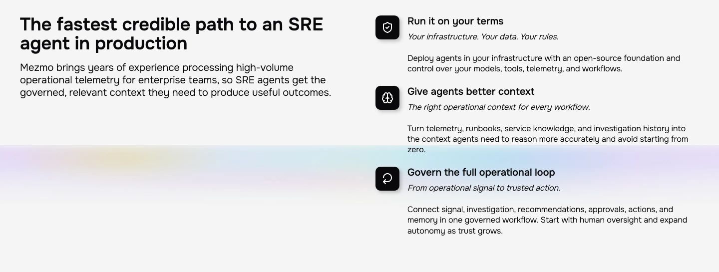
A clean split feature section pairing an enterprise headline with a three-part capability breakdown over a soft, luminous gradient.
- Mood
- clinical
- Layout
- 2 col · split · balanced
- 03
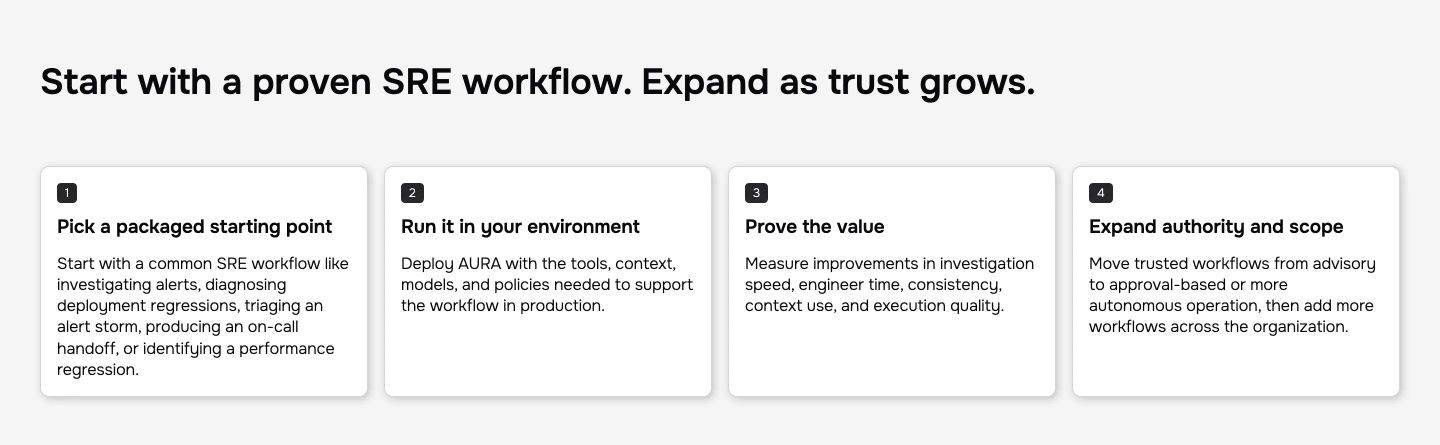
feature grid
A crisp, light-themed four-step process grid delivering structured technical guidance through clean cards and numbered tags.
- Mood
- clinical
- Layout
- 4 col · grid · balanced
- 04
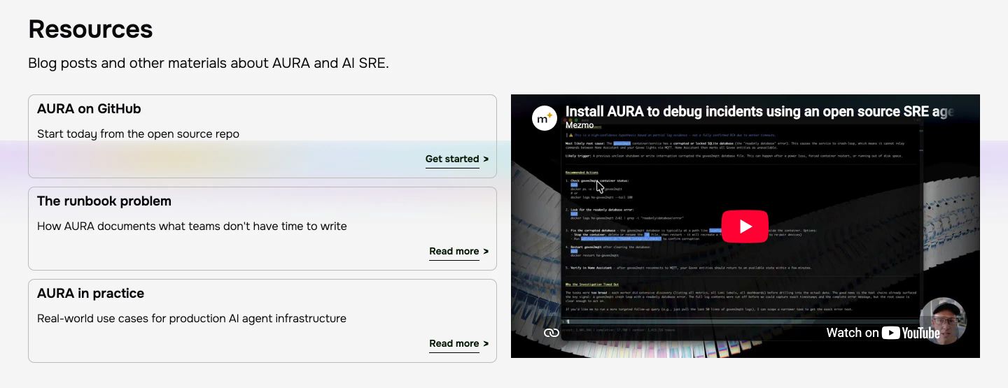
showcase
A crisp, light-themed developer resource section pairing a stack of modular text cards with an embedded technical video walk-through.
- Mood
- clinical + serene
- Layout
- 2 col · split · balanced
- 05
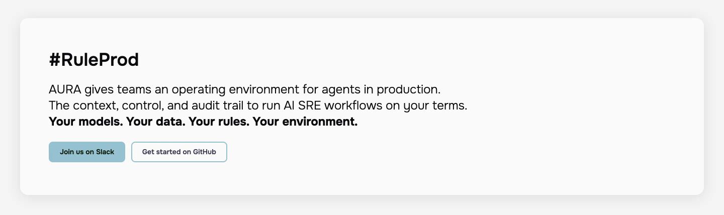
cta
A crisp, minimal call-to-action card presenting clear developer-focused copy and understated action buttons in a high-whitespace layout.
- Mood
- clinical + serene
- Layout
- 1 col · stacked · airy
- 06
footer
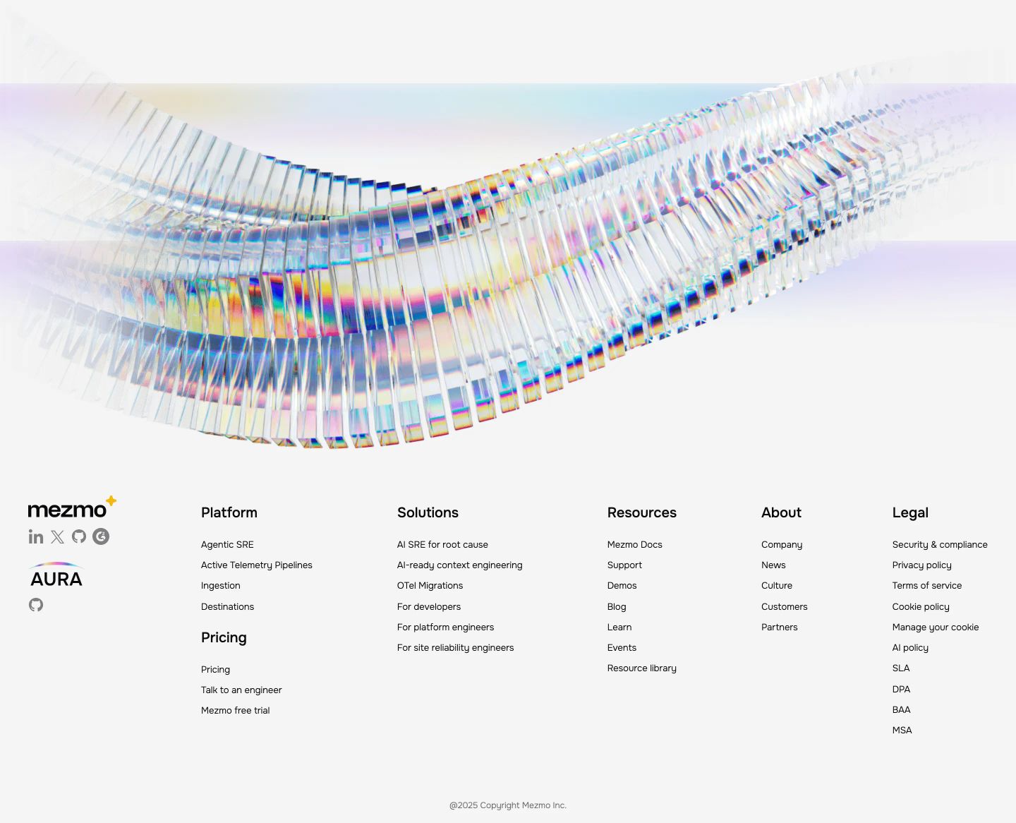
StrongAn expansive light footer crowned by a luminous, prismatic 3D glass arc floating above cleanly organized navigation columns.
- Mood
- ethereal + serene
- Layout
- 6 col · stacked · airy