Vercel
Clinical precision engineered for developer workflows. Stark monochrome layouts and a neutral grotesque typeface create an unornamented sense of speed and reliability. Subtle diffuse lighting and tactile geometric embosses provide depth without distraction.
Take the vibe
Rated
7.5/ 10
From 7 analyzed sections. Two measured components and one judged by a model. Distinction is a rank within the library; the rest are scores in their own right.
- AI scorejudged
- 9.6
- Systemmeasured
- 6.5
- Distinctionmeasured
- 3.6
- on the grid
- 60%
- vertical rhythm
- 77%
- type on a scale
- 57%
- contrast passing AA
- 67%
- unlike the library
- 0.63
- model craft
- 8.0/10
- model deviation
- 3.0/10
Color
Background#fafafa
Text#171717
Accent#0070f3
Surface#ffffff
Muted#4d4d4d
Typefaces
- Display
- GeistSans
- Body
- GeistSans
- Mono
- Geist Mono
- Source
- self_hosted
- Scale
- 11 · 12 · 14 · 16 · 24 · 56
Layout
- Grid
- 12 columns
- Container
- 1392px
- Spacing base
- 6px
- Radius
- 6px
Capture
- Category
- ai
- Sections
- 7
- Captured
- 2026-09-15
- Rhythm
- light x9
Type rules
- display type set in sentence case with tight tracking at -0.06em
- body measure kept compact around 46 characters per line
Color rules
- monochrome palette dominates over 99 percent of the page area
- accent blue is restricted exclusively to micro-status indicators and small interactive elements
Voice rules
- lead with concise declarative claims in sentence case
- present features as clear technical capabilities rather than marketing fluff
Holds it together
- anchor sections with strong sentence-case headlines and generous light whitespace
- use solid black pill buttons for primary actions paired with bordered translucent secondary pills
- display product UI mocks with minimal border treatment and soft drop-shadow separation
Contrast
text on background17.2:1 AAA
muted text on background8.1:1 AAA
text on surface17.9:1 AAA
muted text on surface8.4:1 AAA
accent on background4.4:1 AA Large
background on accent4.4:1 AA Large
Type, measured
- Body
- 14px / 1.43
- Measure
- 46 characters
- Display
- 64px / 1
- Tracking
- -0.06em display
- Scale ratio
- 1.46
Voice
- Tone
- technical, declarative, confident
- Sentences
- short
- Person
- second
- Vocabulary
- technical
- Calls to action
- deploy, talk, get, sign up
Built with
- Builder
- —
- Framework
- next
- Motion
- —
- WebGL
- —
- Nav
- top_bar, 35 items
- Length
- 6.6 screens
Sections in page order
- 00
hero
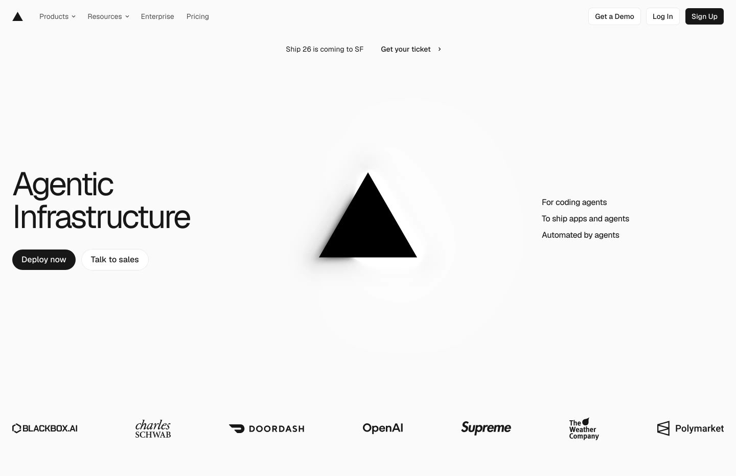
StrongStark, clinical tech hero centered around an enigmatic monochrome triangle surrounded by generous negative space and precise typography.
- Mood
- clinical + mysterious
- Layout
- 3 col · asymmetric · airy
- 01
feature
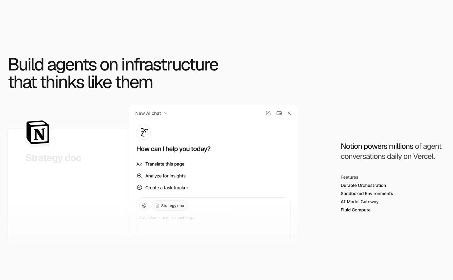
StrongUltra-clean, clinical developer showcase pairing an oversized headline with a crisp monochrome chat interface mockup and minimal feature list.
- Mood
- clinical + serene
- Layout
- 2 col · split · airy
- 02
feature
Stark, minimal split-layout feature pairing a tight grotesque headline and technical capability list with an embedded customer UI mockup.
- Mood
- clinical + serene
- Layout
- 2 col · split · airy

- 03
feature
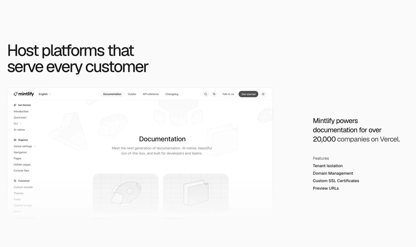
Ultra-clean technical product showcase pairing a large browser UI preview with precise typography and a quiet monochrome feature list.
- Mood
- clinical + serene
- Layout
- 2 col · split · airy
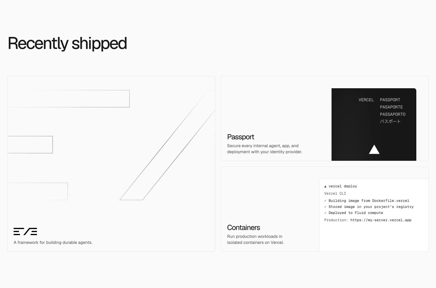
- 04
feature grid
StrongCrisp, monochromatic product updates presented in an asymmetric bento grid with hairline borders and technical minimalism.
- Mood
- clinical
- Layout
- 2 col · grid · airy
- 05
cta
An ultra-minimal call-to-action floating in vast white space with precise, restrained grotesque typography and dual pill buttons.
- Mood
- clinical + serene
- Layout
- 1 col · centered · airy

- 06
footer
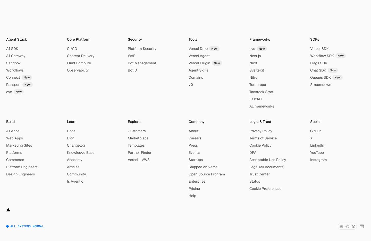
An expansive, clinical multi-column link directory laid out with meticulous typographic precision on a stark white field.
- Mood
- clinical + serene
- Layout
- 6 col · grid · airy