Lightspark
Pristine, ultra-structured fintech precision softened by weightless luminous UI elements. A bright off-white canvas and hairline grid layout convey institutional reliability, while diffuse colorful halos around interface cards evoke fluid modern money infrastructure.
Take the vibe
Rated
7.9/ 10
From 7 analyzed sections. Two measured components and one judged by a model. Distinction is a rank within the library; the rest are scores in their own right.
- AI scorejudged
- 10.0
- Systemmeasured
- 6.2
- Distinctionmeasured
- 6.1
- on the grid
- 53%
- vertical rhythm
- 79%
- type on a scale
- 57%
- contrast passing AA
- 60%
- unlike the library
- 0.84
- model craft
- 8.3/10
- model deviation
- 5.0/10
Color
Background#f8f8f7
Text#1a1a1a
Accent#0052ff
Surface#1a1a1a
Muted#7c7c7c
Typefaces
- Display
- Suisse Intl
- Body
- Suisse Intl
- Mono
- —
- Source
- self_hosted
- Scale
- 8 · 9 · 10 · 12 · 18 · 32
Layout
- Grid
- 12 columns
- Container
- 1098px
- Spacing base
- 8px
- Radius
- 8px · 24px
Capture
- Category
- finance
- Sections
- 7
- Captured
- 2026-09-16
- Rhythm
- cream x8 → dark x2
Type rules
- display type set in sentence case with tight negative tracking
- compact body type running at an extended measure up to 89 characters
- two-digit numeric indices prefixing structural grid cells
Color rules
- canvas remains consistent off-white (#f8f8f7) until a full-bleed dark (#1a1a1a) footer close
- chromatic saturation is confined exclusively to blurred glow backdrops behind interface components
Voice rules
- concise capability statements with minimal marketing hype
- action links styled uniformly with trailing arrow glyphs
Holds it together
- pair hairline-divided structural columns with soft, glowing UI product cards
- confine saturated color to atmospheric gradient backdrops behind glassmorphic interfaces
- anchor sequential lists and stat columns with two-digit index numbers
Contrast
text on background16.4:1 AAA
muted text on background3.9:1 AA Large
muted text on surface4.2:1 AA Large
accent on background5.4:1 AA
background on accent5.4:1 AA
Type, measured
- Body
- 9px / 1.3
- Measure
- 89 characters
- Display
- 43px / 1.15
- Tracking
- -0.04em display
- Scale ratio
- 1.48
Voice
- Tone
- technical, authoritative, minimal
- Sentences
- short
- Person
- second
- Vocabulary
- technical
- Calls to action
- book, get, try, learn
Built with
- Builder
- —
- Framework
- next
- Motion
- —
- WebGL
- yes
- Nav
- top_bar, 0 items
- Length
- 7.7 screens
Sections in page order
- 00
hero
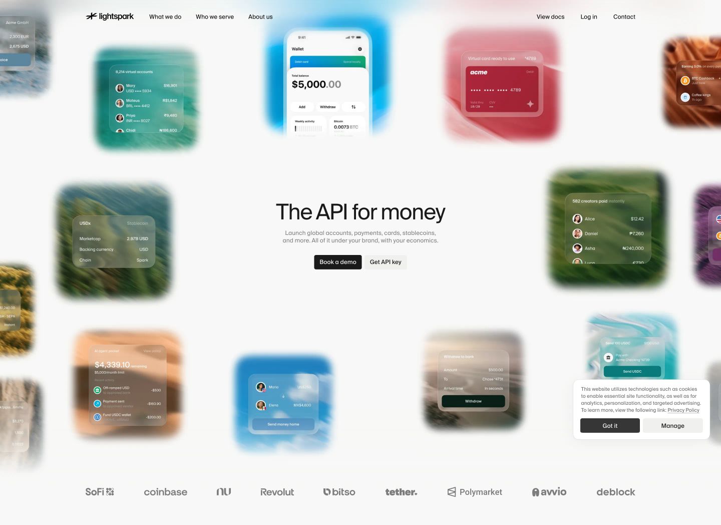
StrongA clean fintech hero surrounded by softly blurred, floating UI cards that drift across a serene off-white canvas.
- Mood
- dreamy + serene
- Layout
- 1 col · centered · airy
- 01
stats
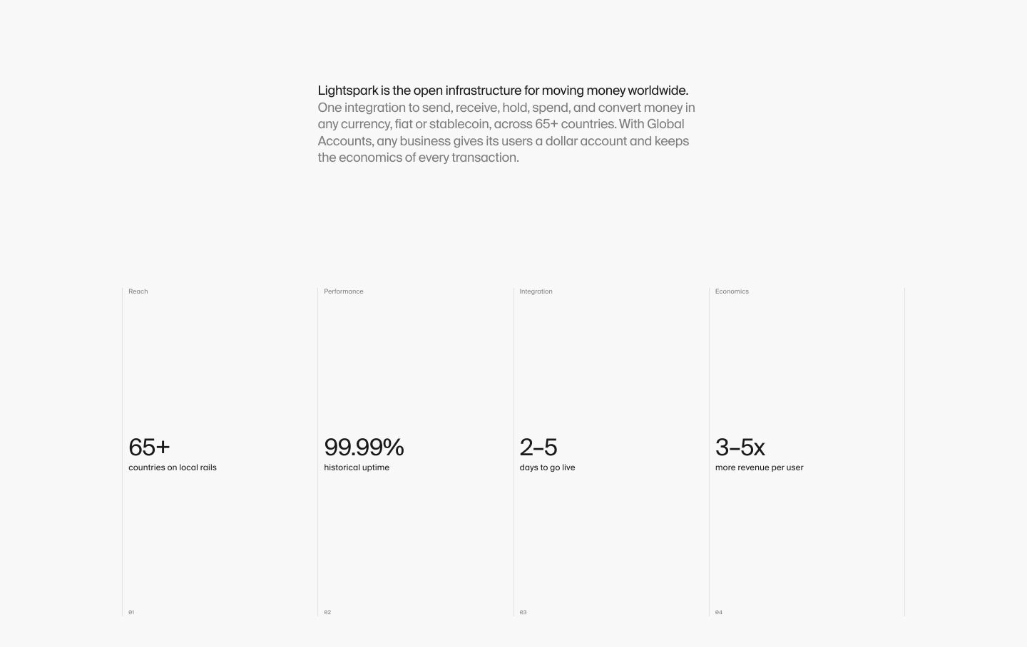
Spacious, Swiss-style typography grid combining a quiet infrastructure statement with four precise metric columns across hairline dividers.
- Mood
- clinical + serene
- Layout
- 4 col · stacked · airy
- 02
feature grid
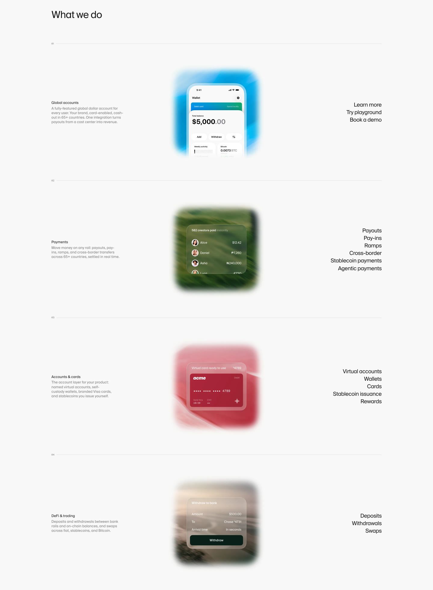
StrongSpacious and calm feature overview presenting mobile UI mockups floating on luminous gradient backdrops between structured typographic columns.
- Mood
- serene + clinical
- Layout
- 3 col · stacked · airy
- 03
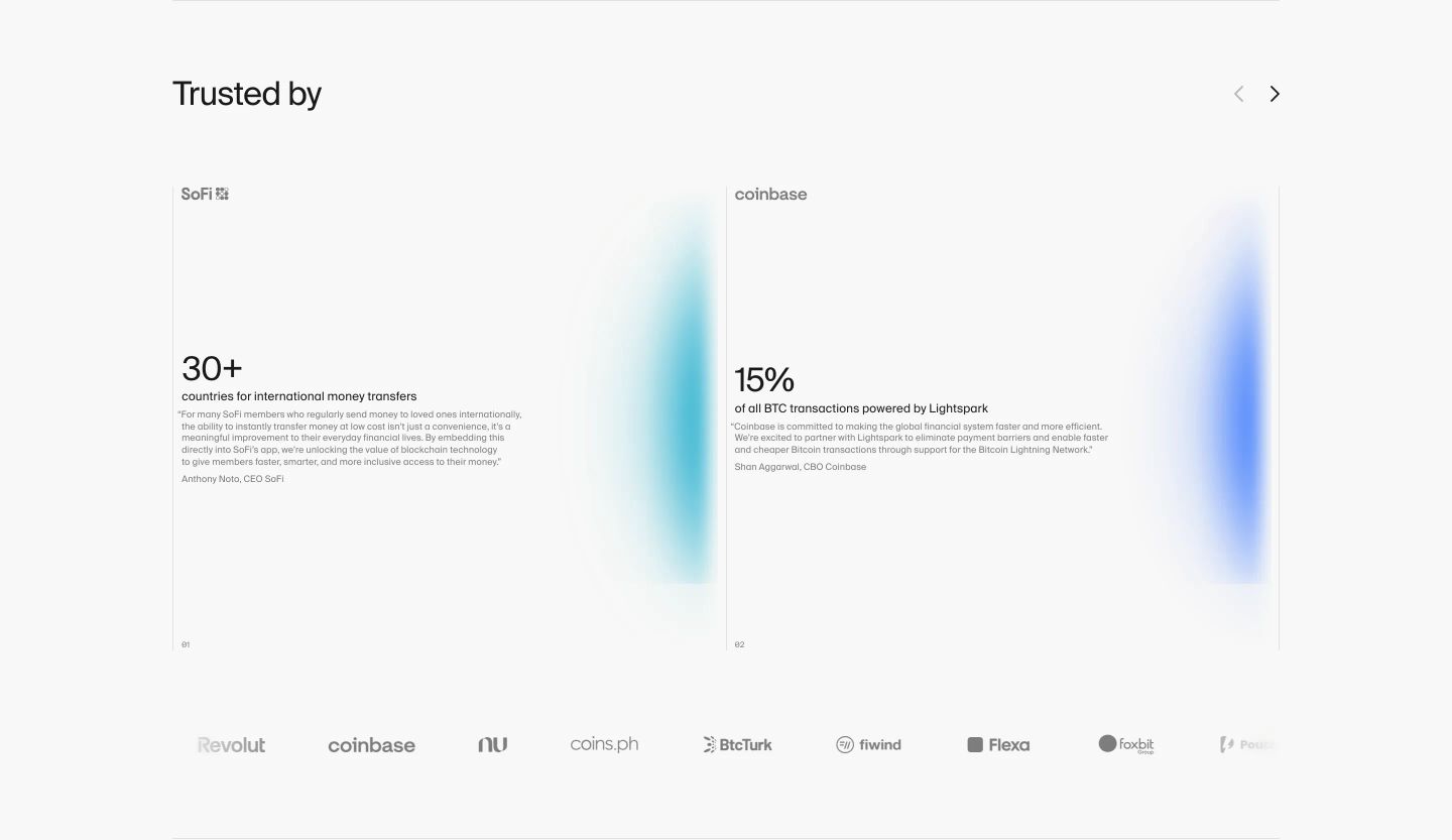
testimonial
Clean, airy social proof section combining high-impact statistical metrics and client quotes within subtle glowing cards.
- Mood
- serene
- Layout
- 2 col · grid · airy
- 04
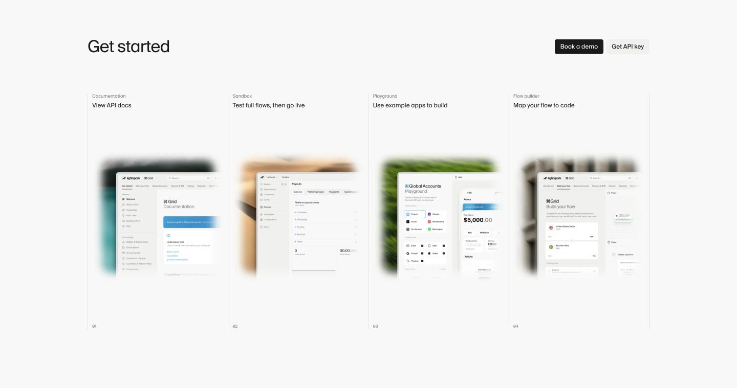
feature grid
Pristine, airy developer portal grid with hairline dividers and soft-blurred UI mockup previews.
- Mood
- clinical + serene
- Layout
- 4 col · grid · airy
- 05
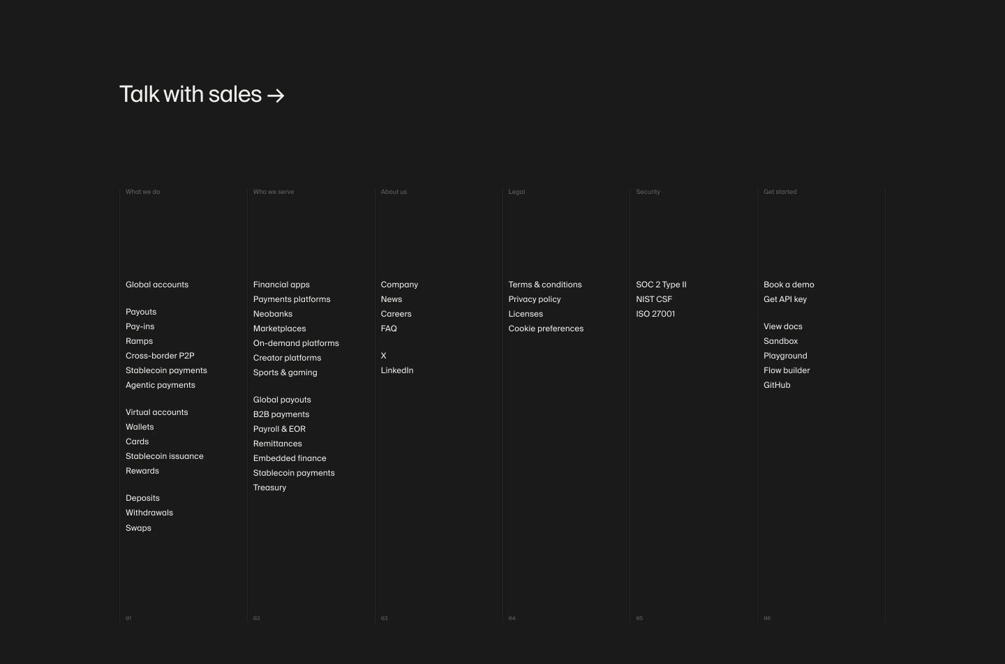
footer
Monochrome dark footer structured into six disciplined columns divided by subtle vertical hairline rules.
- Mood
- clinical + serene
- Layout
- 6 col · grid · airy
- 06
footer
StrongSubdued, near-black minimalist footer anchored by a massive low-contrast wordmark watermark and discreet copyright details.
- Mood
- mysterious + serene
- Layout
- 2 col · stacked · airy