Irene Butenko
Clinical precision meets editorial restraint. A strictly monochrome light-gray canvas structured by hairline dividers, tight grotesque type, and arrow-prefixed interactive links. All visual richness is deferred to embedded project imagery.
Take the vibe
Rated
8.0/ 10
From 8 analyzed sections. Two measured components and one judged by a model. Distinction is a rank within the library; the rest are scores in their own right.
- AI scorejudged
- 9.3
- Systemmeasured
- 8.3
- Distinctionmeasured
- 3.4
- on the grid
- 79%
- vertical rhythm
- 86%
- type on a scale
- 67%
- contrast passing AA
- 100%
- unlike the library
- 0.62
- model craft
- 7.9/10
- model deviation
- 4.1/10
Color
Background#f6f6f6
Text#191919
Surface#ffffff
Typefaces
- Display
- General Sans
- Body
- General Sans
- Mono
- —
- Source
- self_hosted
- Scale
- 14 · 16 · 20 · 40 · 53 · 122
Layout
- Grid
- 12 columns
- Container
- 1404px
- Spacing base
- 8px
- Radius
- 0px
Capture
- Category
- portfolio
- Sections
- 8
- Captured
- 2026-09-11
- Rhythm
- light x10
Type rules
- display headlines set in tight-tracked sentence case General Sans
- body text measures up to 77 characters with compact line-height
Color rules
- strict near-monochrome palette with dark charcoal #191919 on off-white #f6f6f6
- color is reserved entirely for project thumbnails and embedded client assets
Voice rules
- write in first person with confident understatement
- prefix links and sub-actions with arrow glyphs
Holds it together
- every interactive link or text action is prefixed with a right-angled arrow symbol
- divide content sections and data rows with full-width hairline borders
- restrict UI typography to a single neo-grotesque family across all display and body levels
- confine saturated colour strictly to portfolio artifact thumbnails
Contrast
text on background16.3:1 AAA
text on surface17.6:1 AAA
Type, measured
- Body
- 20px / 1.08
- Measure
- 77 characters
- Display
- 122px / 0.8
- Tracking
- -0.074em display
- Scale ratio
- 1.57
Voice
- Tone
- understated, professional, direct
- Sentences
- medium
- Person
- first
- Vocabulary
- plain
- Calls to action
- contact, view, learn
Built with
- Builder
- webflow
- Framework
- —
- Motion
- gsap
- WebGL
- —
- Nav
- top_bar, 6 items
- Length
- 6.5 screens
Sections in page order
- 00
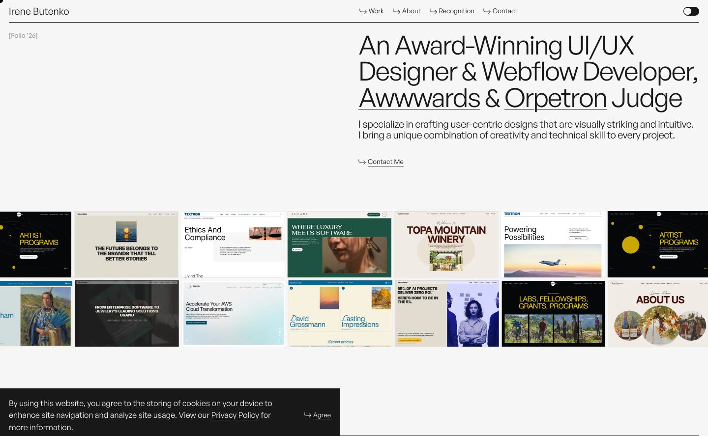
hero
StrongCrisp Swiss-style portfolio hero balancing structured typography against a horizontal mosaic strip of project previews.
- Mood
- clinical + serene
- Layout
- 2 col · asymmetric · balanced
- 01
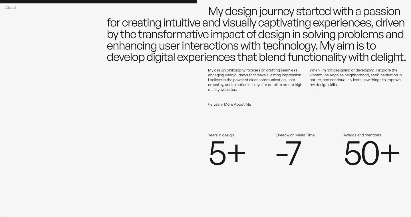
statement
StrongMinimalist typographic bio section with an asymmetric left margin, editorial narrative copy, and oversized numerical stats.
- Mood
- serene
- Layout
- 3 col · asymmetric · airy
- 02
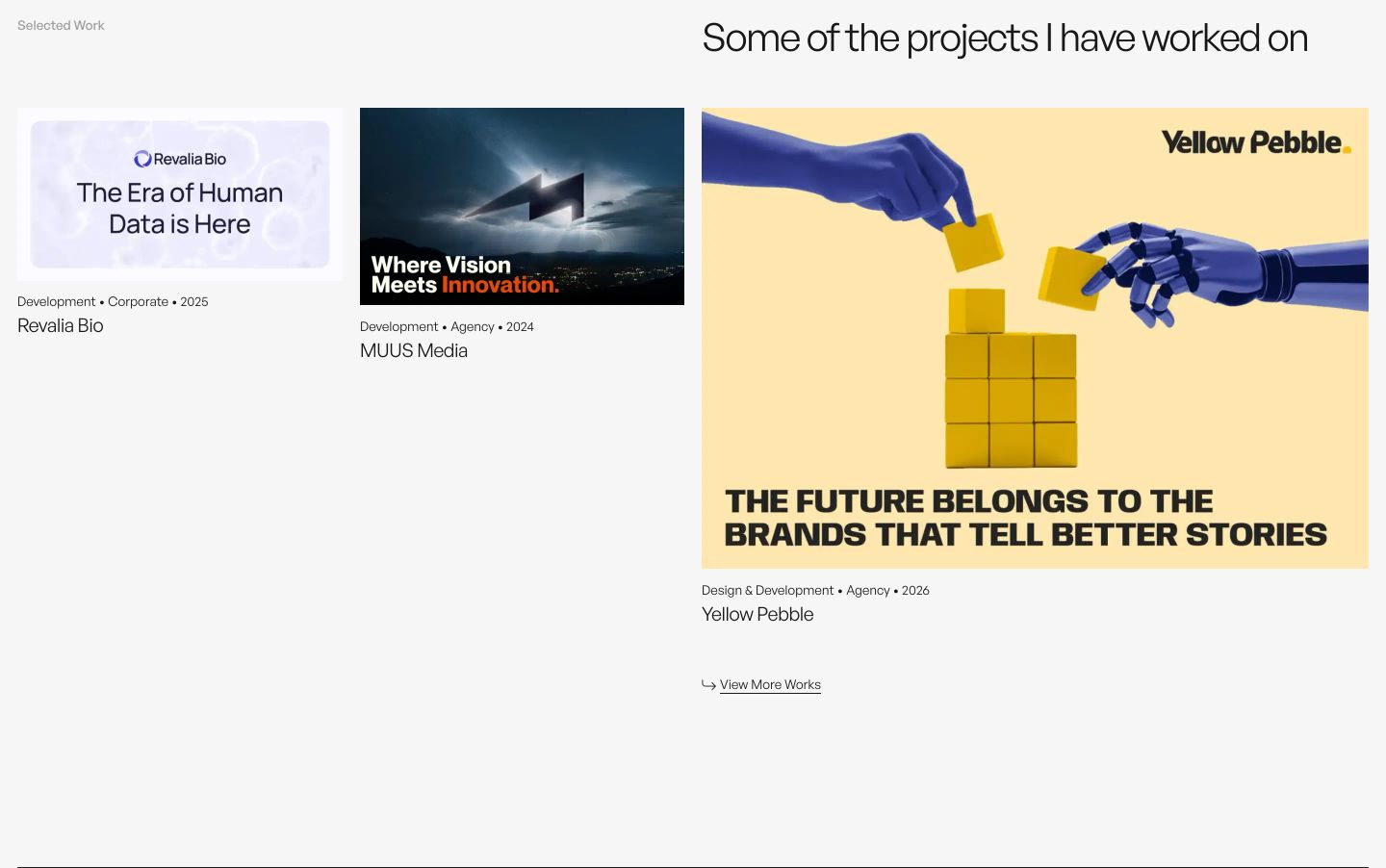
showcase
StrongAn airy, minimalist portfolio showcase balancing small project previews against an expansive featured card on a soft grey background.
- Mood
- serene
- Layout
- 3 col · asymmetric · airy
- 03
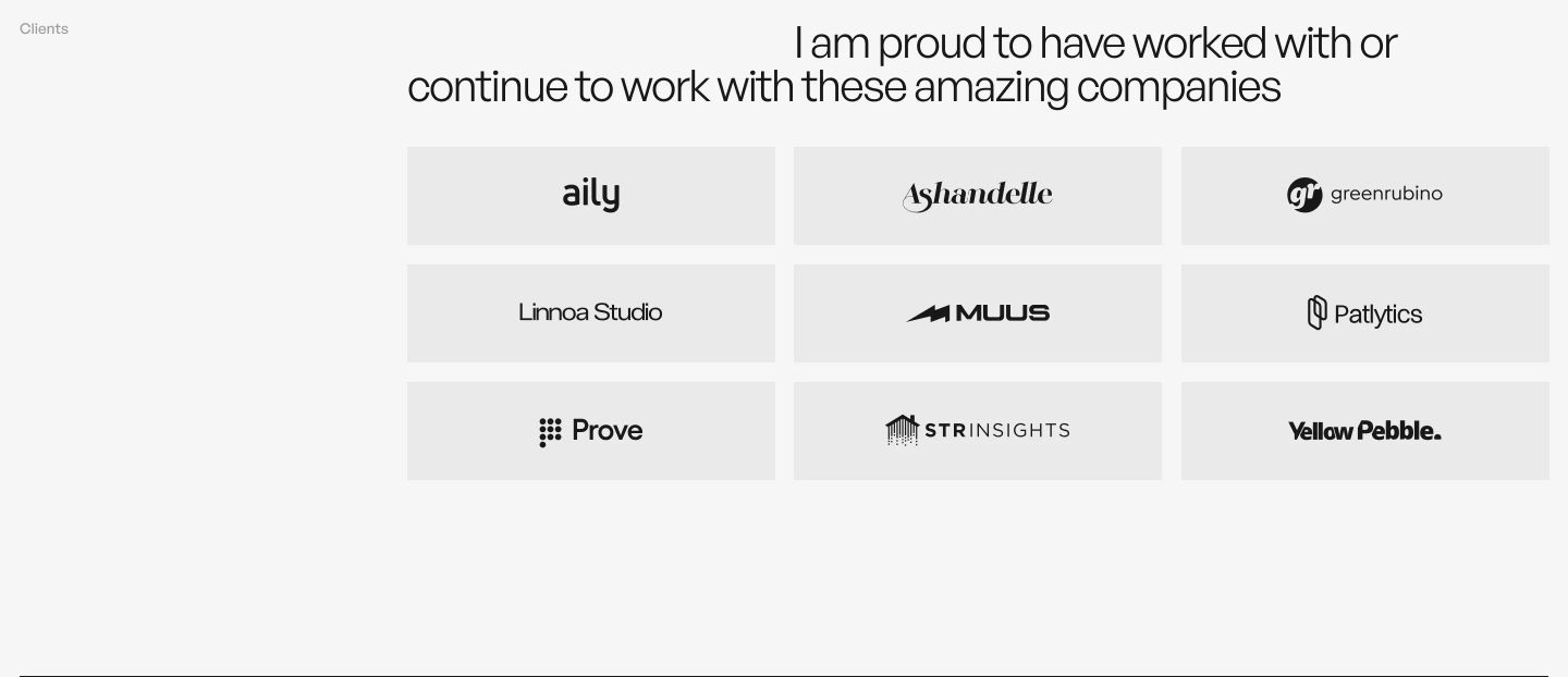
logo bar
A clean, asymmetrical client grid featuring muted monochrome logos on subtle card tiles under a right-aligned headline.
- Mood
- serene
- Layout
- 3 col · asymmetric · airy
- 04
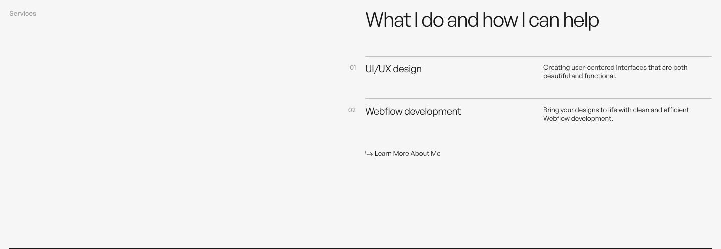
feature grid
A whisper-quiet, Swiss-style services list floating inside expansive pale grey whitespace with precise typographic hierarchy.
- Mood
- serene + clinical
- Layout
- 2 col · split · airy
- 05
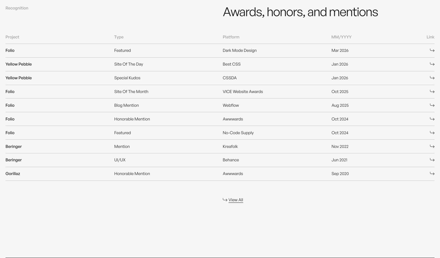
other
A crisp, minimalist recognition index neatly organizing accolades and dates into a delicate tabular layout with generous whitespace.
- Mood
- serene + clinical
- Layout
- 5 col · grid · airy
- 06
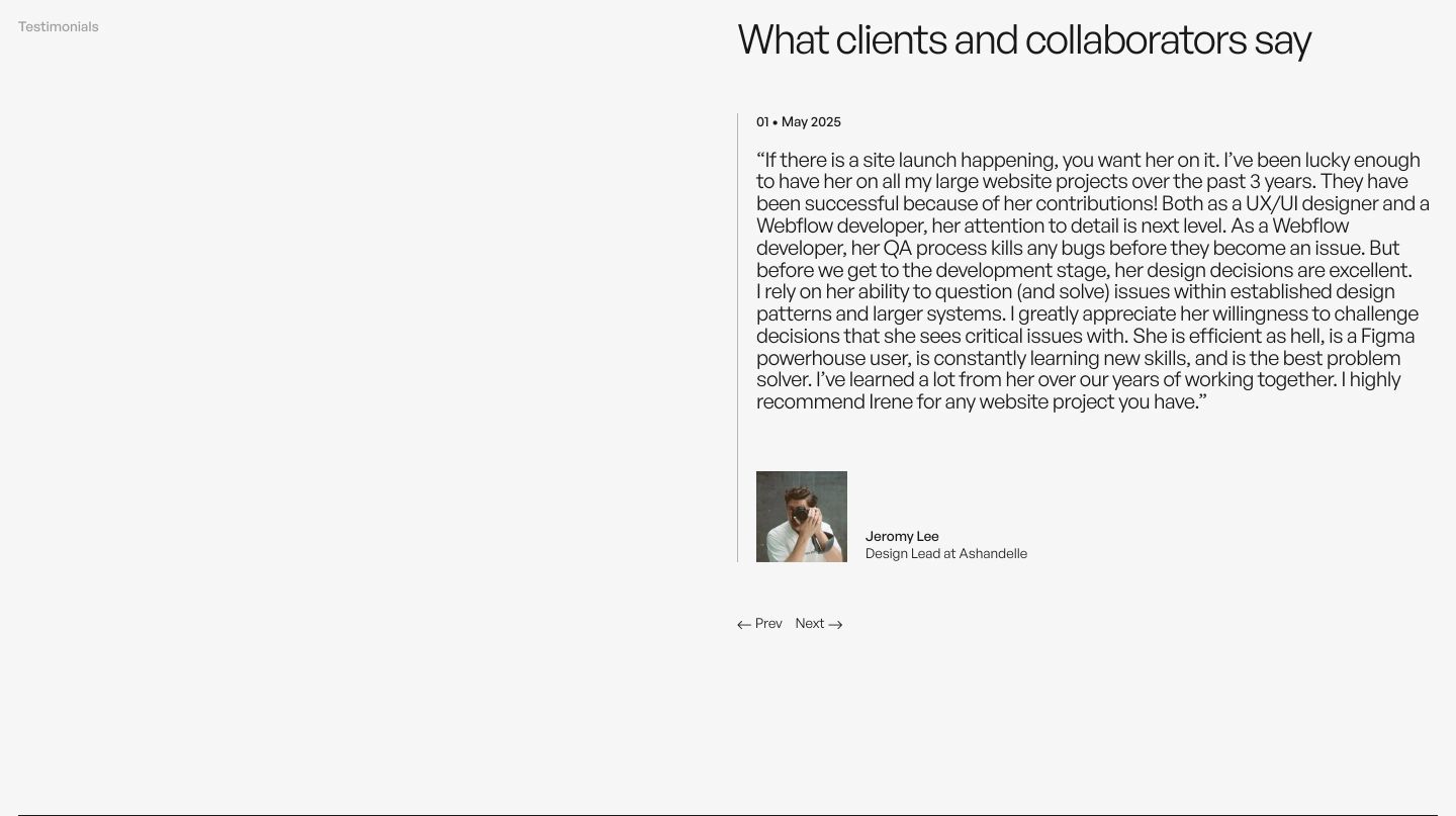
testimonial
Quietly confident and unhurried testimonial presentation anchored by airy asymmetric margins and crisp modernist typography.
- Mood
- serene
- Layout
- 2 col · split · airy
- 07
footer
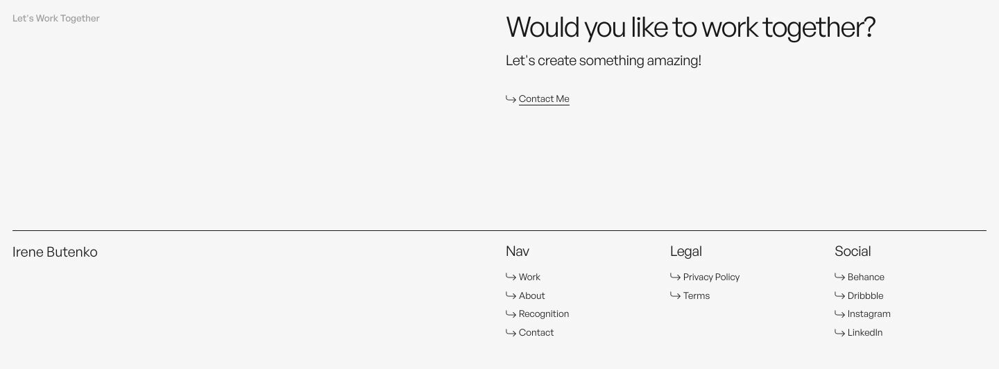
An ultra-minimalist light footer combining an unhurried work inquiry call-to-action with clean, structured multi-column navigation links.
- Mood
- serene + clinical
- Layout
- 4 col · stacked · airy