Harry Moses
Raw, irreverent, and typographically confrontational. Massive vertically stretched letterforms and heavy sans headlines collide with delicate classic serif reading copy against an unadorned light canvas. Dithered cut-out graphics and hand-drawn doodles inject a mischievous, anti-corporate charm.
Take the vibe
Rated
7.3/ 10
From 4 analyzed sections. Two measured components and one judged by a model. Distinction is a rank within the library; the rest are scores in their own right.
- AI scorejudged
- 9.6
- Systemmeasured
- 6.4
- Distinctionmeasured
- 3.0
- on the grid
- 0%
- vertical rhythm
- 75%
- type on a scale
- 80%
- contrast passing AA
- 100%
- unlike the library
- 0.60
- model craft
- 8.0/10
- model deviation
- 6.8/10
Color
Background#f7f7f7
Text#0c0a0c
Surface#f7f7f7
Muted#0c0a0c
Typefaces
- Display
- Arial Narrow Bold
- Body
- Apple Garamond Regular
- Mono
- —
- Source
- self_hosted
- Scale
- 18 · 20 · 50 · 51 · 72
Layout
- Grid
- —
- Container
- —
- Spacing base
- 8px
- Radius
- 0px
Capture
- Category
- portfolio
- Sections
- 4
- Captured
- 2026-09-15
- Rhythm
- cream
Type rules
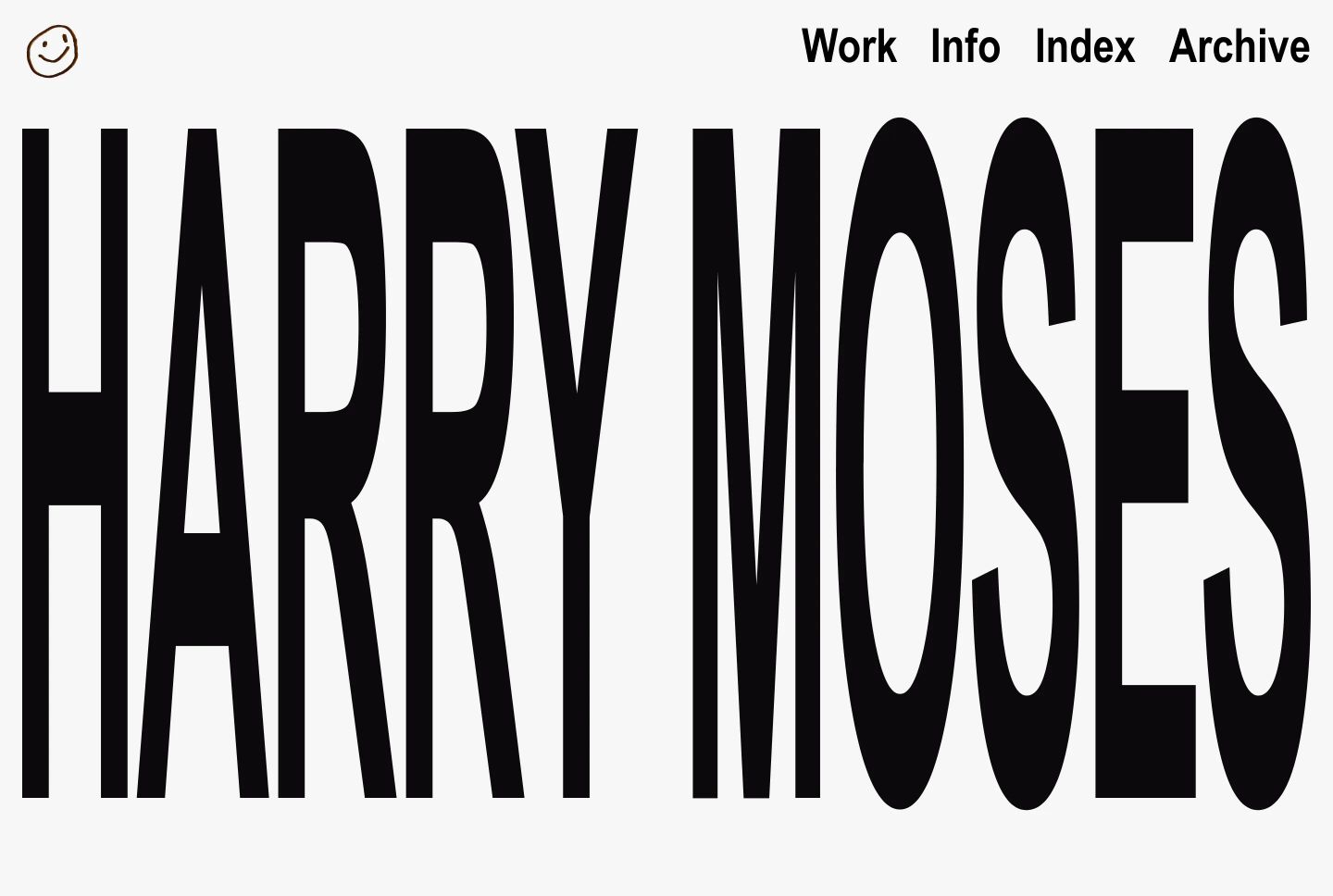
- display nameplate set in vertically stretched ultra-tall grotesque uppercase
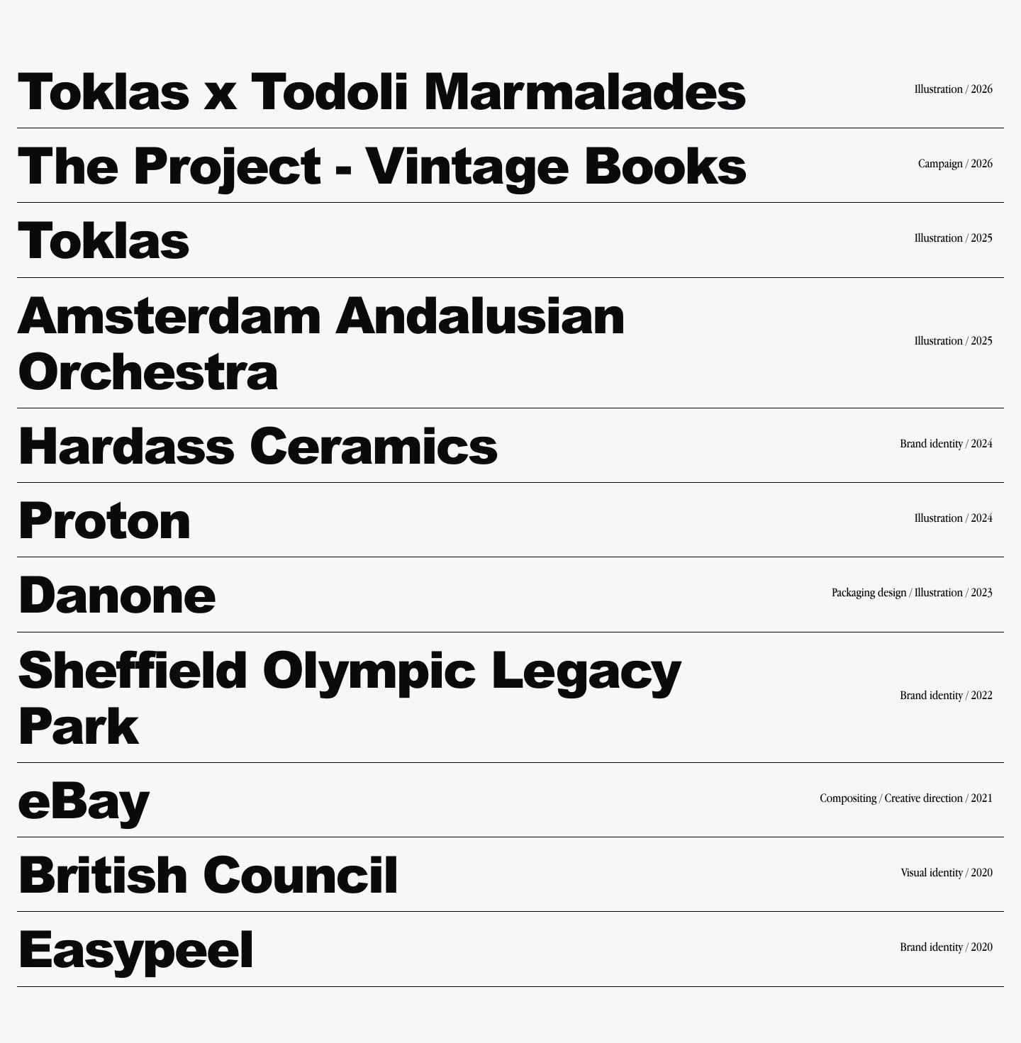
- project titles set in bold heavy grotesque with right-aligned meta tags
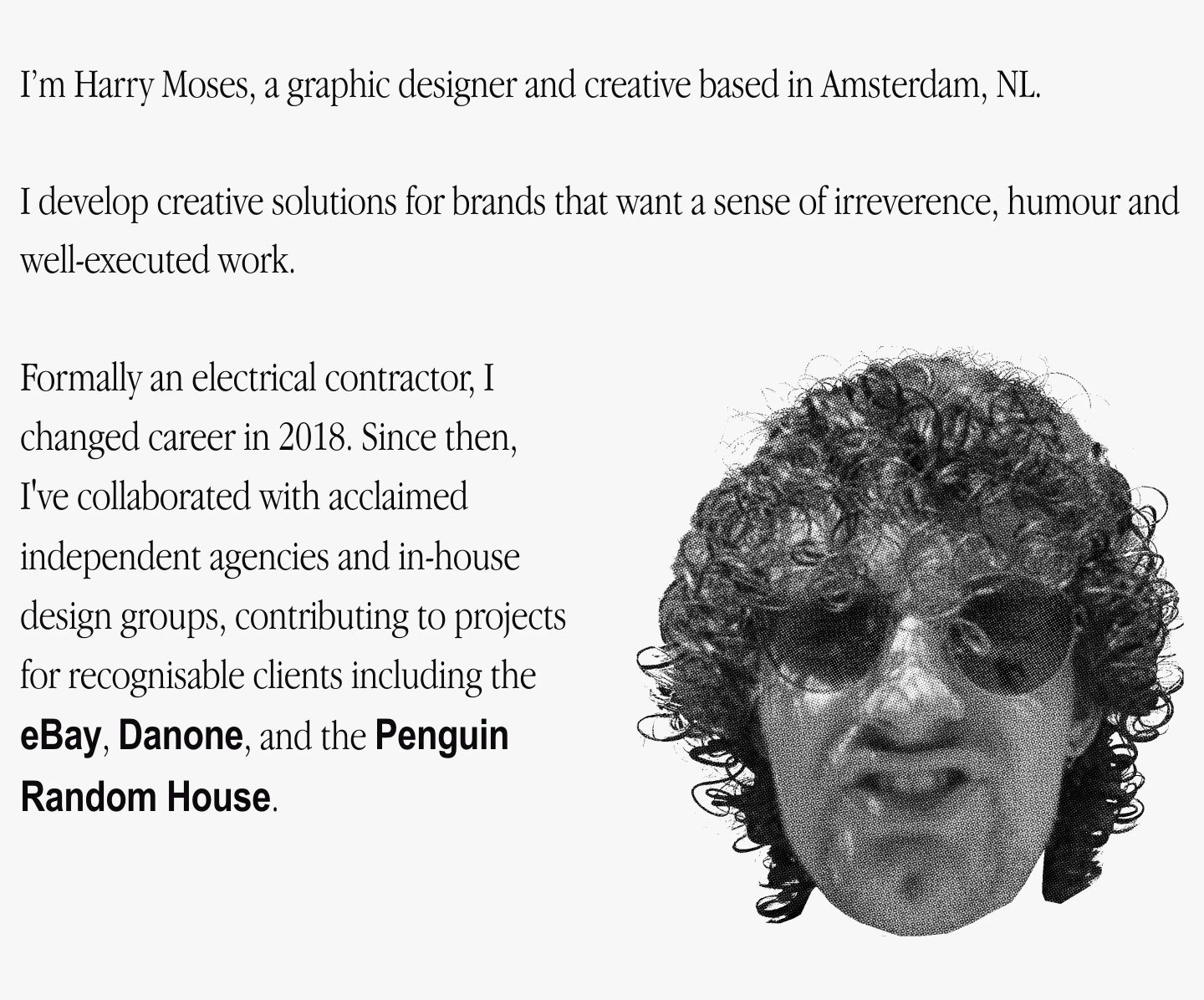
- biographical body text set in Apple Garamond at long measures
Color rules
- strict monochromatic palette of near-black text on soft light grey-white background
- no chromatic accent colors; visual contrast is driven purely by scale, weight, and density
Voice rules
- candid first-person storytelling describing background and career changes
- concise list-style project naming without promotional fluff
Holds it together
- scale the hero typography to span full viewport width using extreme vertical compression
- divide index and metadata items with crisp horizontal hairline rules spanning the container
- contrast brutalist grotesque headings with classical Garamond serif body copy
Contrast
text on background18.4:1 AAA
muted text on background18.4:1 AAA
text on surface18.4:1 AAA
muted text on surface18.4:1 AAA
Type, measured
- Body
- 18px / 1.4
- Measure
- 99 characters
- Display
- 72px / 1.1
- Tracking
- -0.04em display
- Scale ratio
- 1.41
Voice
- Tone
- irreverent, unpretentious, direct
- Sentences
- medium
- Person
- first
- Vocabulary
- plain
- Calls to action
- contact
Built with
- Builder
- framer
- Framework
- —
- Motion
- —
- WebGL
- —
- Nav
- sticky_top_bar, 4 items, sticky
- Length
- 5 screens
Sections in page order
- 00
hero
StrongHigh-impact brutalist typographic opening dominated by massive vertically-stretched lettering spanning nearly the entire screen.
- Mood
- playful
- Layout
- 1 col · full bleed · dense
- 01
showcase
StrongStark typographic project index pairing heavy black headlines with delicate serif metadata across razor-thin horizontal dividers.
- Mood
- clinical
- Layout
- 2 col · stacked · balanced
- 02
team
An irreverent editorial about section pairing classic serif typography with a gritty halftone-textured portrait cutout.
- Mood
- whimsical + nostalgic
- Layout
- 2 col · asymmetric · airy
- 03
footer
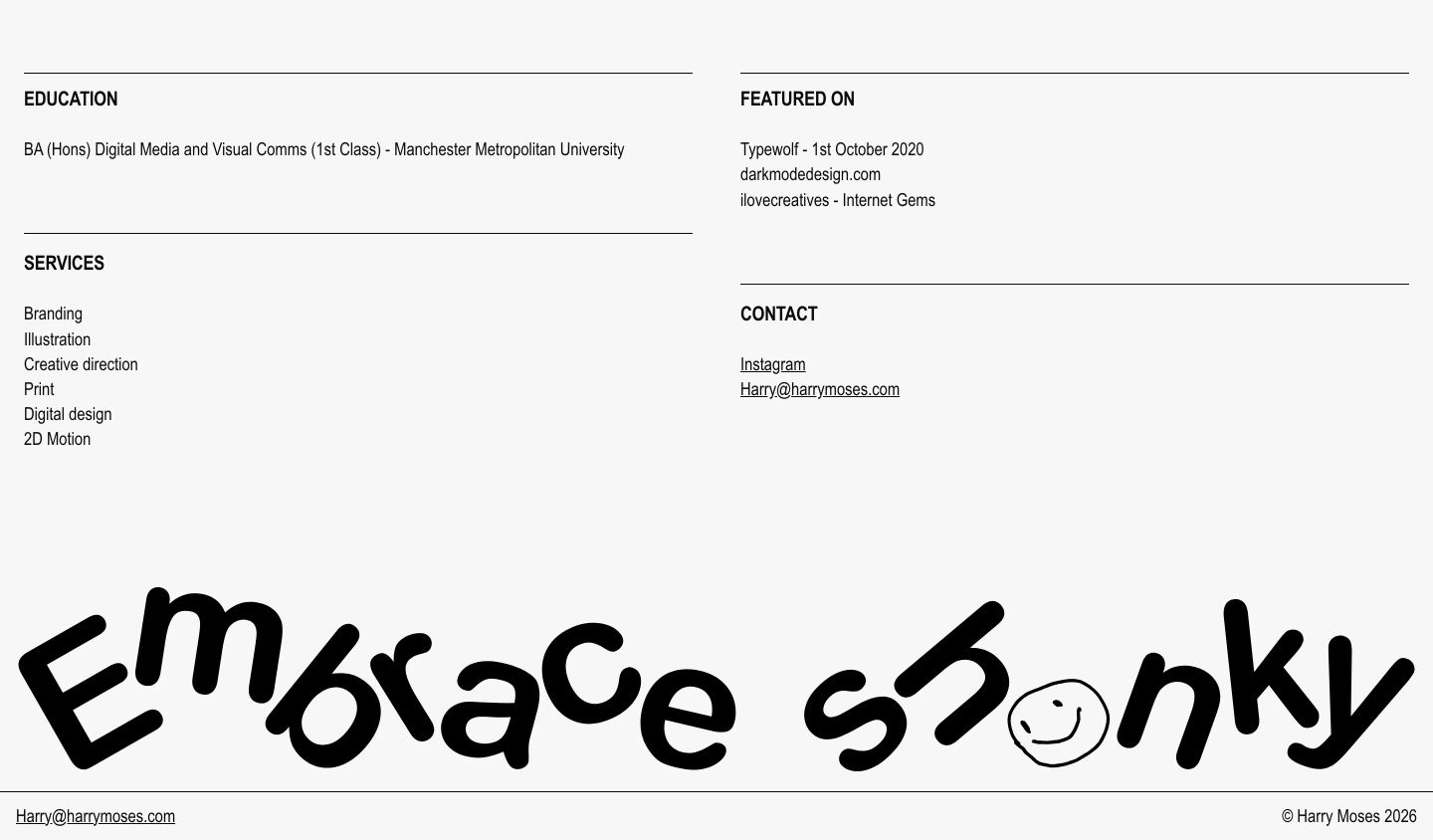
StrongA stark, utilitarian information footer anchored by an irreverent hand-drawn graphic across the lower half.
- Mood
- playful + energetic
- Layout
- 2 col · grid · airy