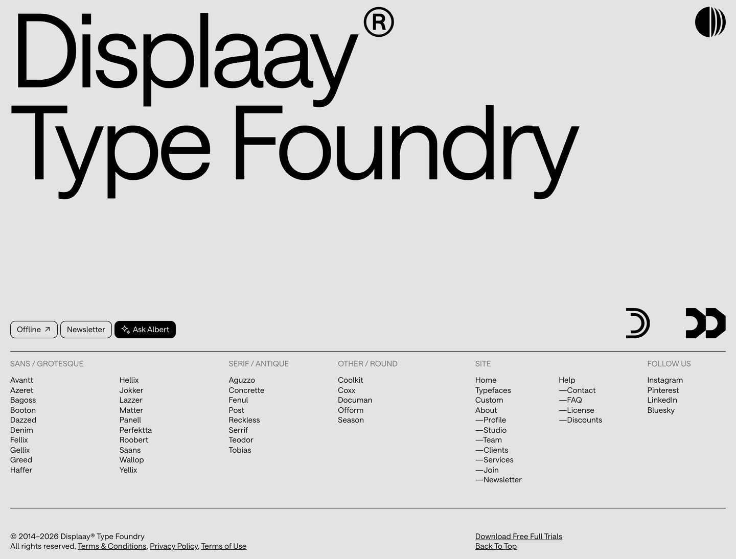
Displaay Type Foundry
Utilitarian contemporary type catalog meets witty graphic precision. Black-on-white pill badges, compact hairline borders, and tight grotesque body copy frame vibrant, tactile type specimen posters. The layout feels hyper-functional, modern, and confident.
Take the vibe
Rated
7.7/ 10
From 8 analyzed sections. Two measured components and one judged by a model. Distinction is a rank within the library; the rest are scores in their own right.
- AI scorejudged
- 10.0
- Systemmeasured
- 6.2
- Distinctionmeasured
- 4.6
- on the grid
- 77%
- vertical rhythm
- 57%
- type on a scale
- 63%
- contrast passing AA
- 50%
- unlike the library
- 0.67
- model craft
- 8.3/10
- model deviation
- 5.6/10
Color
Background#ffffff
Text#000000
Accent#ddf94e
Surface#e3e3e3
Muted#76756f
Typefaces
- Display
- Saans
- Body
- Saans
- Mono
- —
- Source
- self_hosted
- Scale
- 15 · 19 · 21 · 28 · 44 · 72
Layout
- Grid
- 12 columns
- Container
- 1400px
- Spacing base
- 5px
- Radius
- 12px
Capture
- Category
- foundry
- Sections
- 8
- Captured
- 2026-09-16
- Rhythm
- light x9
Type rules
- body text set in Saans at 21px with tight 1.15 line-height and ~76 character measure
- display headlines set tight with negative tracking up to 200px
Color rules
- stark black-and-white palette (#ffffff and #000000) for all structural UI and controls
- vivid accent hues (#ddf94e, #fc3930, #ffa0ff) strictly isolated to typographic specimen cards and illustrated features
Voice rules
- concise introductory statements leading directly into specimen visual grids
- feature descriptions explain utility in plain, unembellished terms
Holds it together
- enclose top navigation and filtering tags within rounded pill capsules with 1px black borders
- keep the UI framework strictly monochrome and let specimen imagery provide all color accents
- preface each content section with an unadorned descriptive summary line
Contrast
text on background21.0:1 AAA
muted text on background4.6:1 AA
text on surface16.4:1 AAA
muted text on surface3.6:1 AA Large
accent on background1.2:1 fail
background on accent1.2:1 fail
Type, measured
- Body
- 21px / 1.15
- Measure
- 76 characters
- Display
- 200px / 0.9
- Tracking
- -0.04em display
- Scale ratio
- 1.76
Voice
- Tone
- confident, practical, direct
- Sentences
- medium
- Person
- first
- Vocabulary
- technical
- Calls to action
- explore, visit, download, try, buy
Built with
- Builder
- —
- Framework
- —
- Motion
- —
- WebGL
- —
- Nav
- top_bar, 34 items
- Length
- 11.6 screens
Sections in page order
- 00
nav
StrongA crisp, Swiss-styled typographic header structured around modular pill buttons and precise, utilitarian spacing.
- Mood
- clinical + serene
- Layout
- 2 col · stacked · balanced

- 01
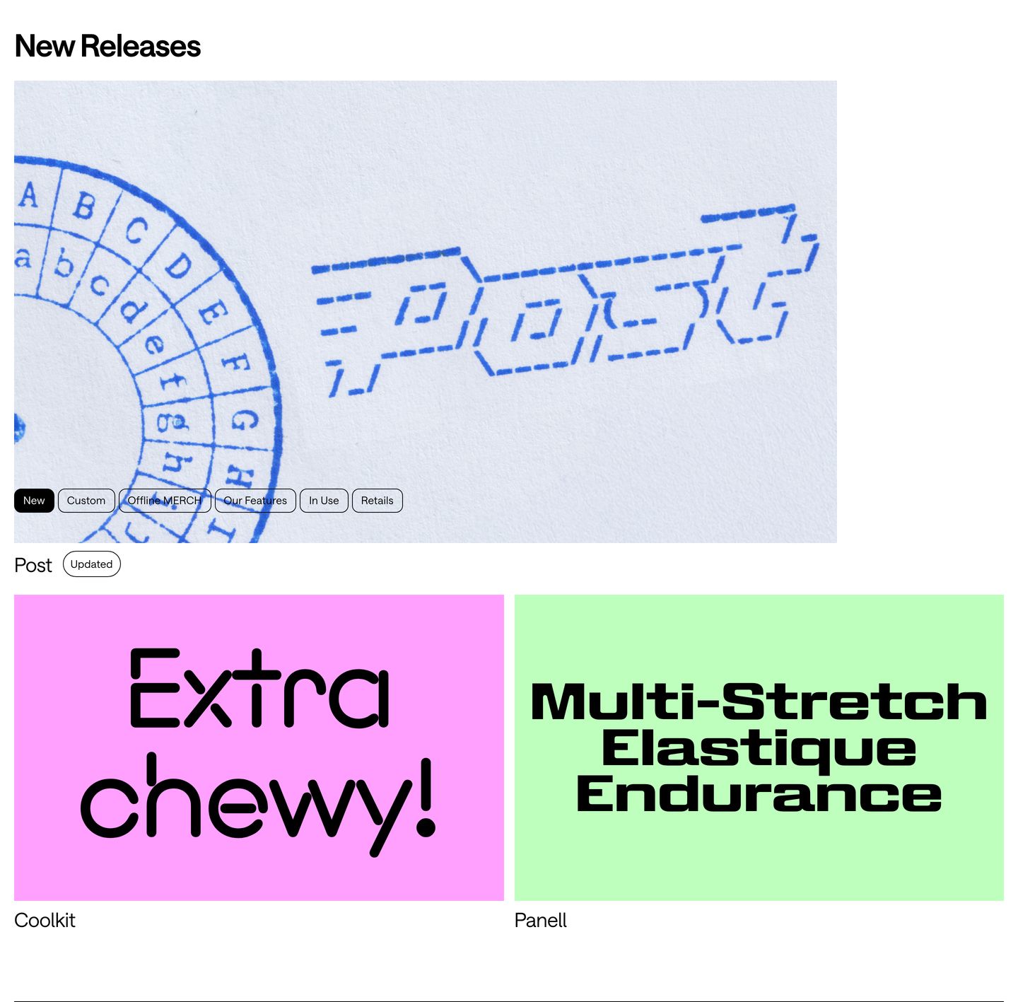
showcase
A tactile type foundry showcase pairing macro stamp-printed specimen imagery with vibrant, playful font release cards.
- Mood
- playful + nostalgic
- Layout
- 2 col · grid · balanced
- 02
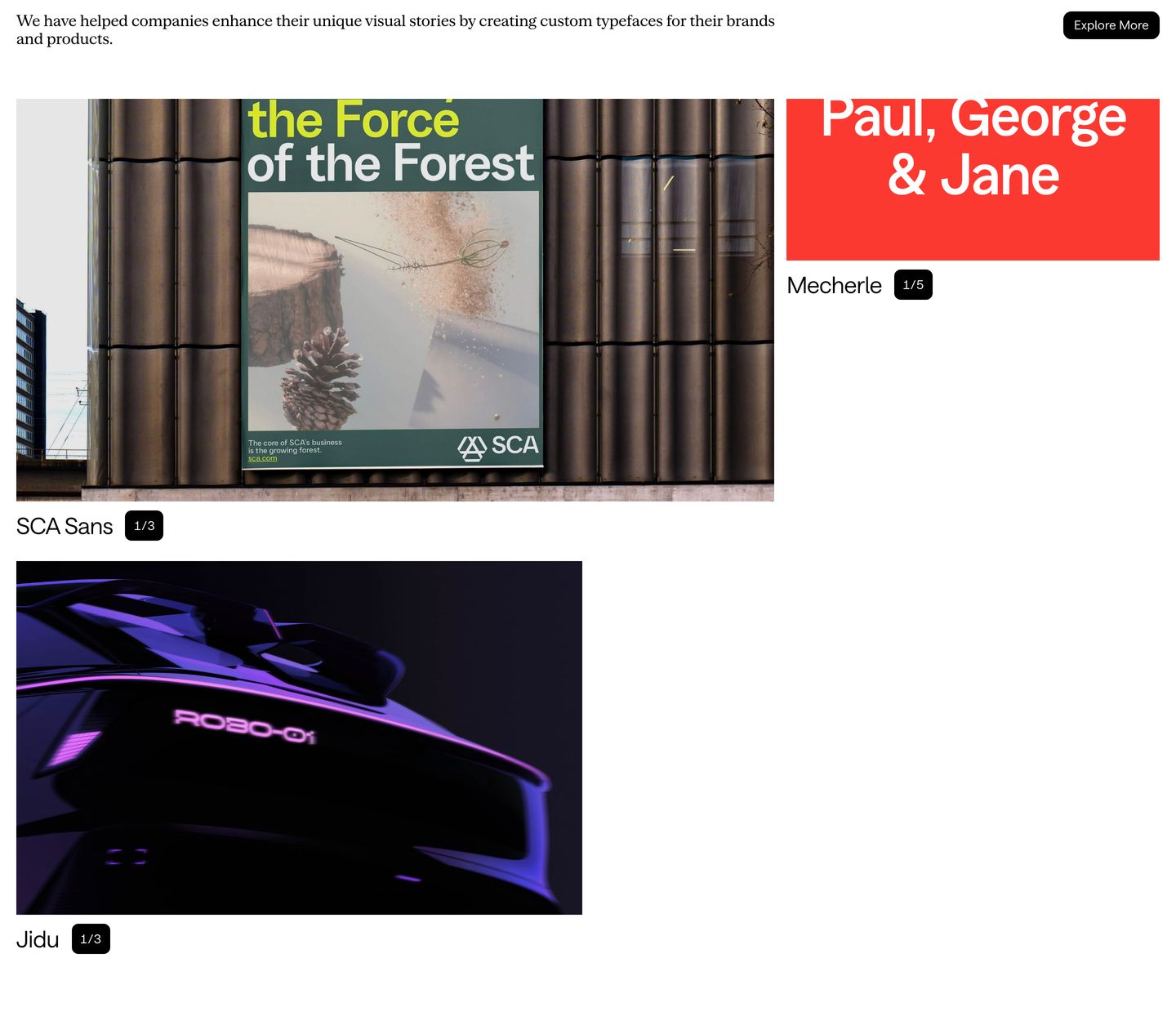
showcase
Minimal editorial showcase displaying custom font case studies with crisp previews and neat pagination pills.
- Mood
- serene
- Layout
- 2 col · asymmetric · balanced
- 03
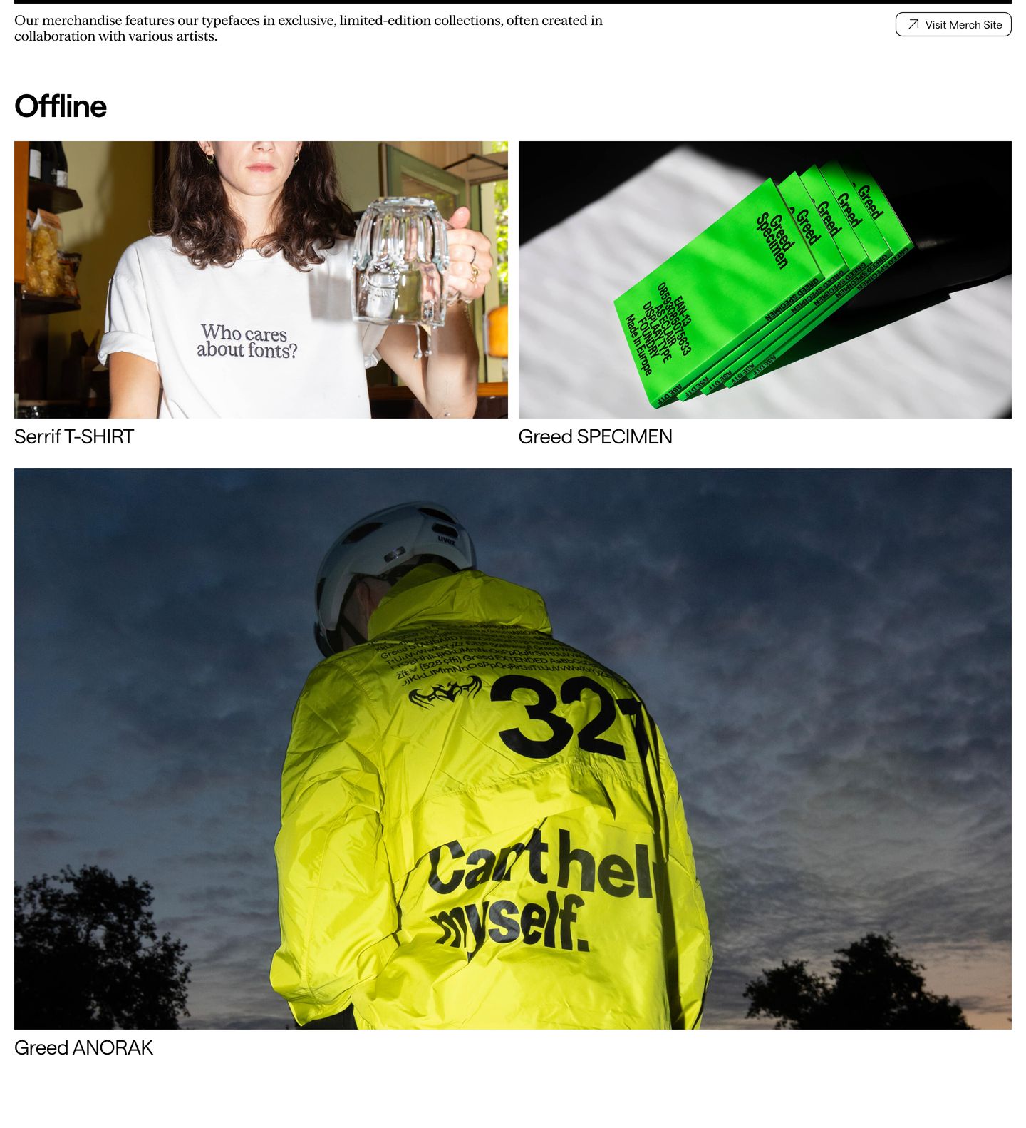
showcase
An edgy editorial merchandise showcase pairing raw street photography with crisp Swiss typography.
- Mood
- playful
- Layout
- 2 col · grid · balanced
- 04
feature grid
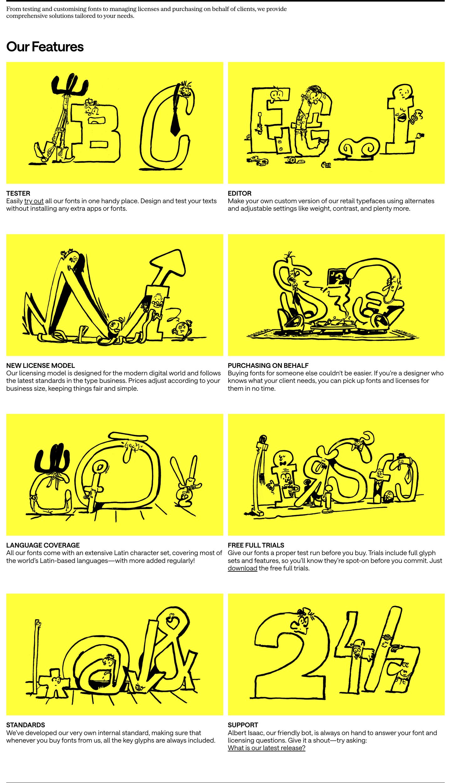
Bright yellow card illustrations filled with quirky typographic cartoon characters give this two-column feature grid a whimsical, comic-strip charm.
- Mood
- whimsical + playful
- Layout
- 2 col · grid · balanced
- 05
showcase
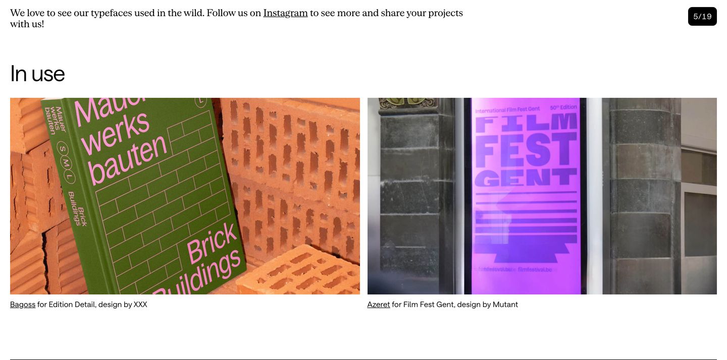
Clean and restrained typographic showcase displaying font specimen applications in a spacious two-column grid.
- Mood
- serene
- Layout
- 2 col · grid · airy
- 06
showcase
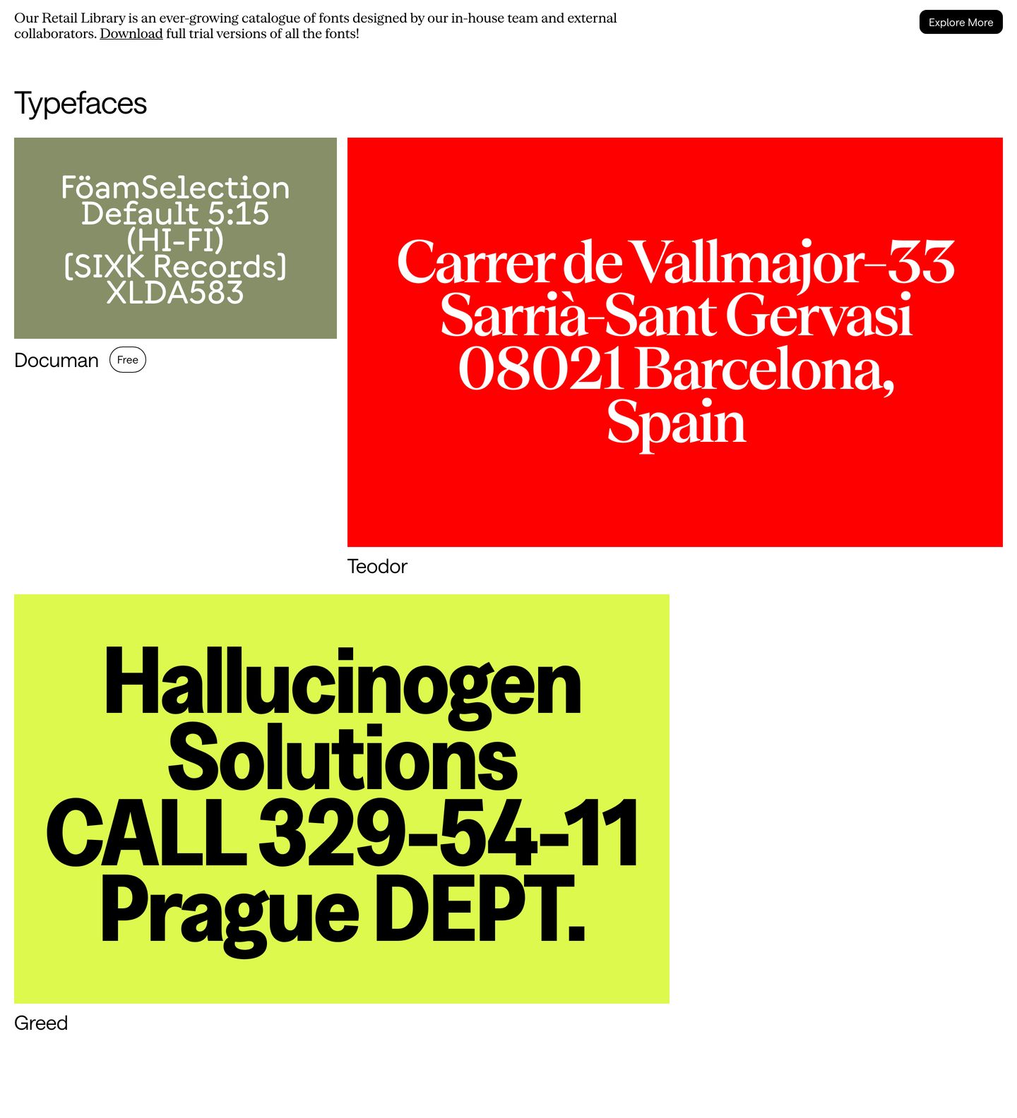
StrongVivid saturated specimen blocks present a font foundry catalog with raw graphic energy and punchy editorial scale.
- Mood
- energetic
- Layout
- 2 col · asymmetric · balanced
- 07
footer
StrongA monolithic typographic index footer defined by massive grotesque branding and an exacting, multi-column font catalogue on pale grey.
- Mood
- clinical
- Layout
- 5 col · stacked · balanced