Bündig Studio
Structured, consultative clarity tailored for mid-sized enterprise. Warm cream and soft peach cards are grounded by deep espresso anchor bands, paired with tactile architectural illustrations. The visual tone projects methodical German craftsmanship and strategic calm.
Take the vibe
Rated
7.2/ 10
From 16 analyzed sections. Two measured components and one judged by a model. Distinction is a rank within the library; the rest are scores in their own right.
- AI scorejudged
- 9.2
- Systemmeasured
- 6.9
- Distinctionmeasured
- 2.1
- on the grid
- 69%
- vertical rhythm
- 97%
- type on a scale
- 43%
- contrast passing AA
- 67%
- unlike the library
- 0.54
- model craft
- 7.8/10
- model deviation
- 3.3/10
Color
Background#fffdf9
Text#2b1911
Accent#ff8a48
Surface#fff0e5
Muted#67564d
Typefaces
- Display
- Instrument Sans
- Body
- Instrument Sans
- Mono
- —
- Source
- Scale
- 12 · 14 · 16 · 18 · 21 · 32
Layout
- Grid
- 24 columns
- Container
- 1280px
- Spacing base
- 4px
- Radius
- 4px · 8px
Capture
- Category
- agency
- Sections
- 16
- Captured
- 2026-09-15
- Rhythm
- cream x9 → dark → cream x6 → dark x2
Type rules
- display type set in sentence case with secondary emphasis emphasized in italic font style
- body text set at 16px with tight -0.02em tracking and comfortable line height
- eyebrow labels strictly in uppercase with leading bullet points
Color rules
- warm cream (#fffdf9) dominates backgrounds while espresso brown (#431b06) anchors conversion bands
- vibrant terracotta orange (#ff8a48) reserved exclusively for active CTA buttons and eyebrow tags
Voice rules
- use structured German B2B phrasing without marketing fluff
- pair concrete business rationale with direct human contact
Holds it together
- set all main section backgrounds to warm cream (#fffdf9) and switch to dark espresso (#431b06) for high-intent conversion sections
- highlight one conceptual phrase per major headline in italic style
- prefix all section category tags with a bullet and render in uppercase terracotta orange
Contrast
text on background16.5:1 AAA
muted text on background6.9:1 AA
text on surface15.1:1 AAA
muted text on surface6.3:1 AA
accent on background2.3:1 fail
background on accent2.3:1 fail
Type, measured
- Body
- 16px / 1.6
- Measure
- 74 characters
- Display
- 64px / 1.05
- Tracking
- -0.04em display
- Scale ratio
- 1.41
Voice
- Tone
- consultative, reassuring, structured
- Sentences
- medium
- Person
- second
- Vocabulary
- plain
- Calls to action
- planen, ansehen, besprechen
Built with
- Builder
- framer
- Framework
- —
- Motion
- —
- WebGL
- —
- Nav
- sticky_top_bar, 6 items, sticky
- Length
- 20.1 screens
Sections in page order
- 00
hero
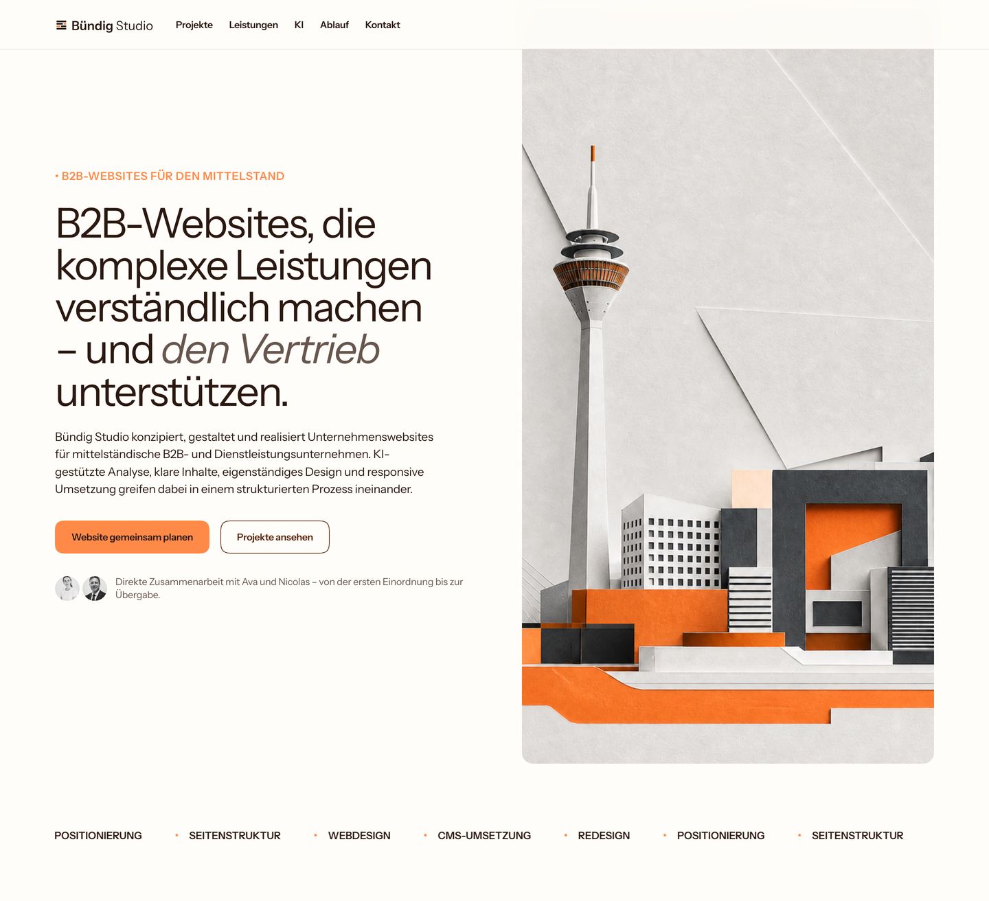
StrongWarm, precise editorial agency hero balancing clean modernist typography with an architectural paper-craft 3D collage.
- Mood
- serene + organic
- Layout
- 2 col · split · balanced
- 01
feature grid
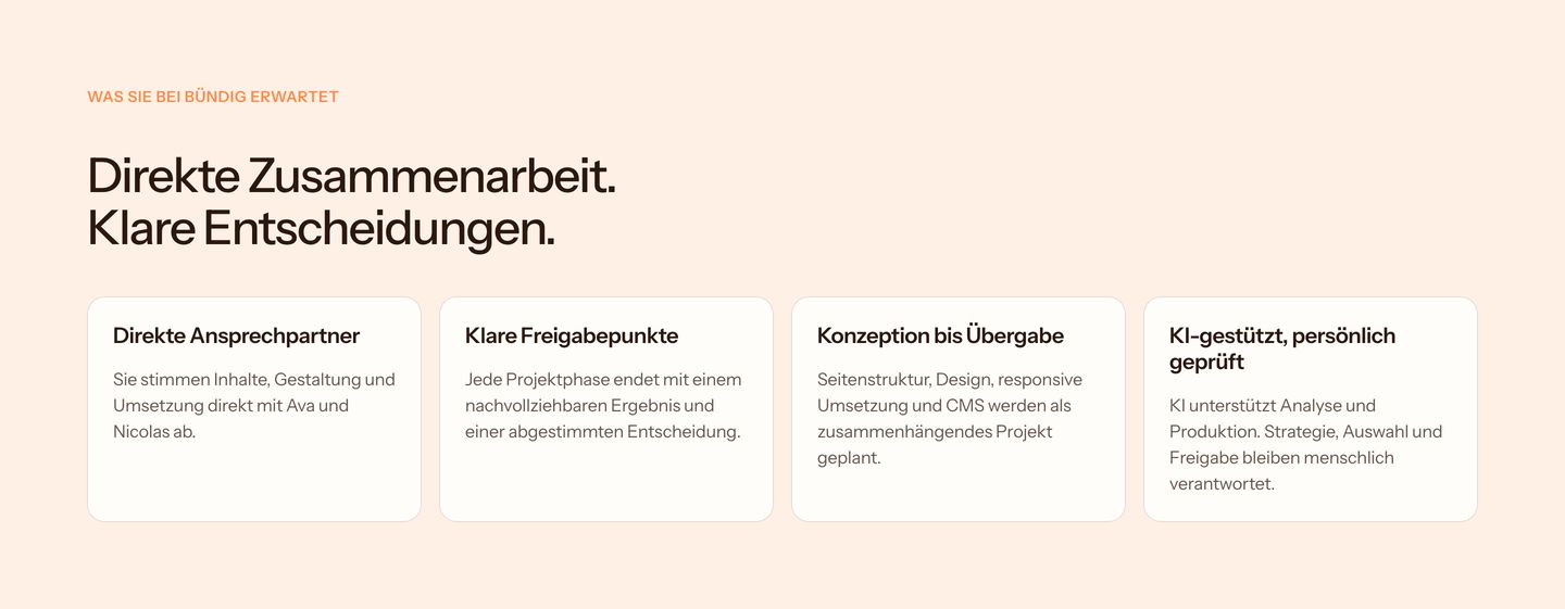
Calm and warm four-column feature grid presenting working principles on soft cream cards.
- Mood
- serene
- Layout
- 4 col · grid · airy
- 02
feature grid
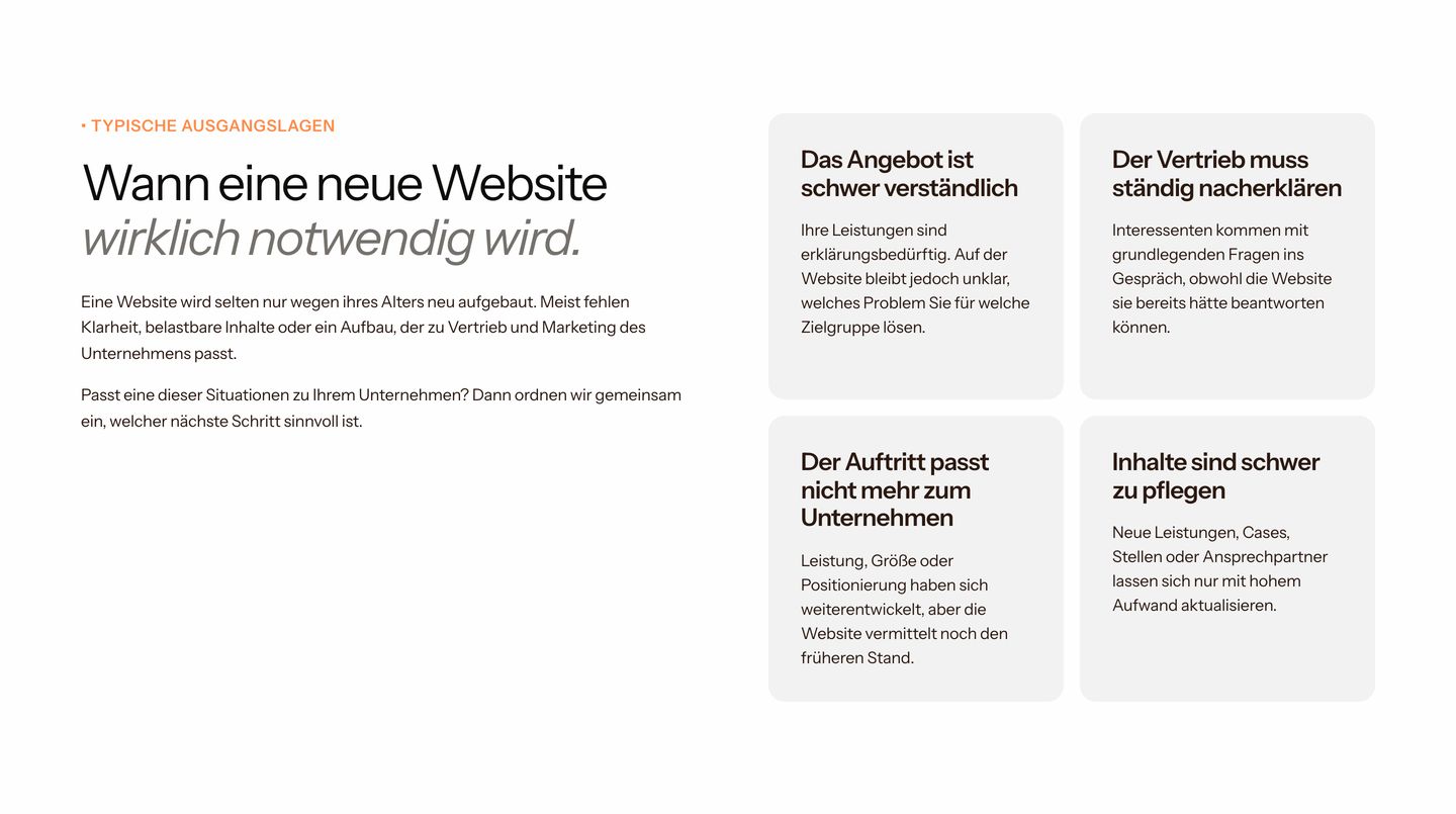
StrongClean problem-framing layout combining an editorial headline with a two-by-two grid of softly tinted cards.
- Mood
- serene
- Layout
- 3 col · split · balanced
- 03
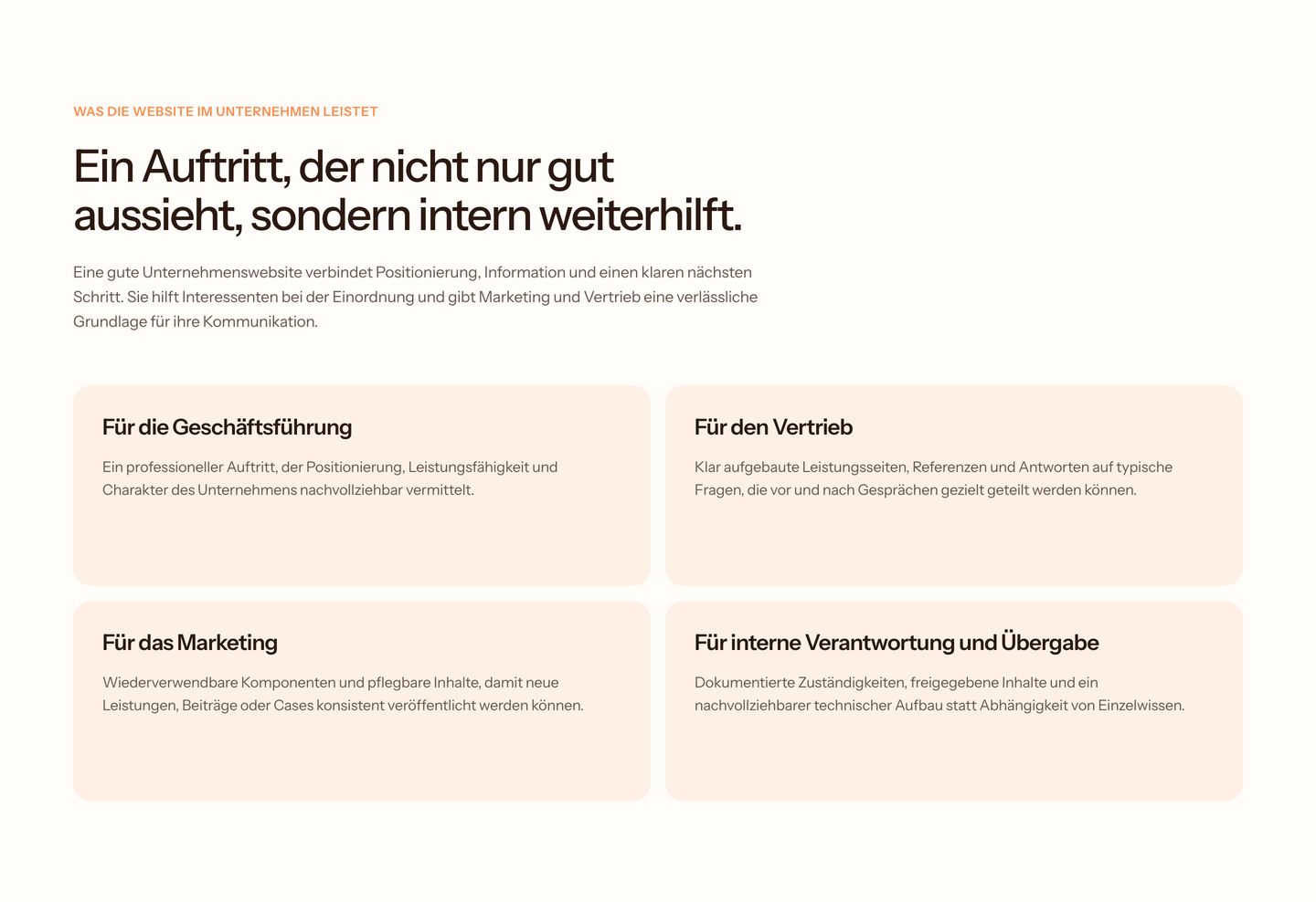
feature grid
Warm, understated corporate feature grid using soft peachy cards and disciplined typography to outline departmental benefits.
- Mood
- serene
- Layout
- 2 col · stacked · airy
- 04
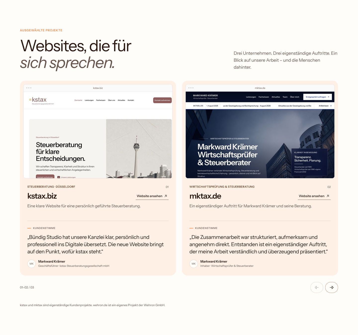
showcase
Warm, orderly project showcase pairing framed website previews with structured case study metadata and client quotes on a soft cream background.
- Mood
- serene
- Layout
- 2 col · grid · balanced
- 05
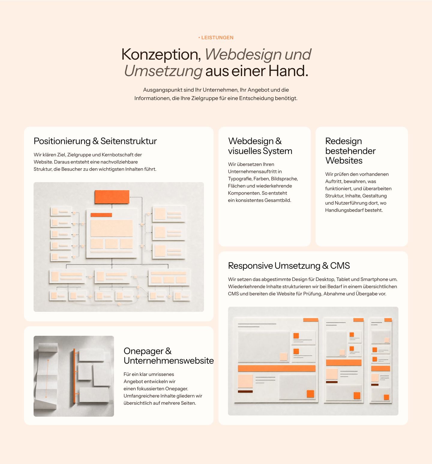
feature grid
StrongWarm, tactile agency service grid showcasing capabilities through physical papercraft wireframe models and elegant typography.
- Mood
- serene
- Layout
- 3 col · grid · balanced
- 06
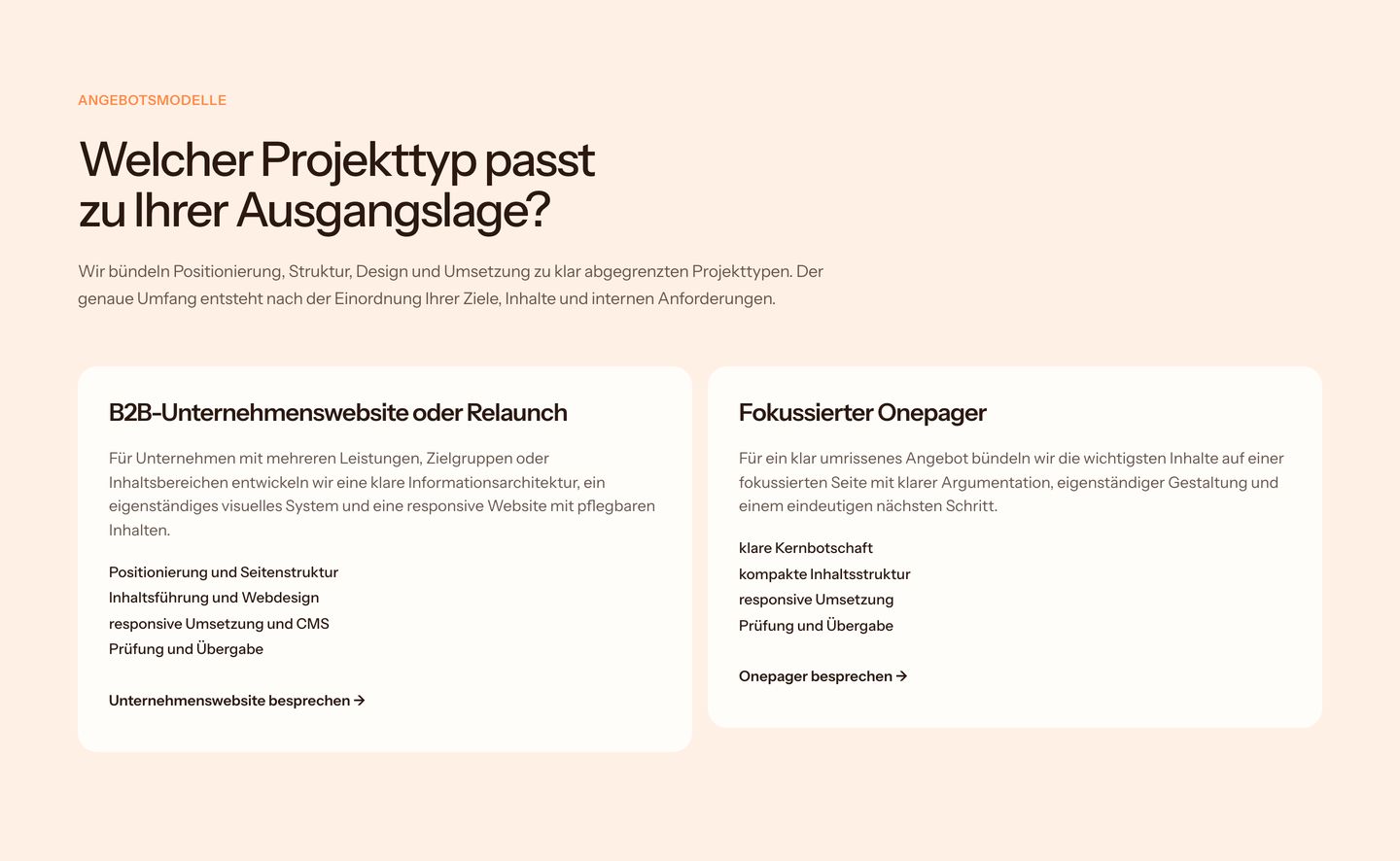
comparison
A warm, quietly structured comparison section presenting two distinct project scopes in clean white cards on a soft peach ground.
- Mood
- serene
- Layout
- 2 col · grid · balanced
- 07
feature grid
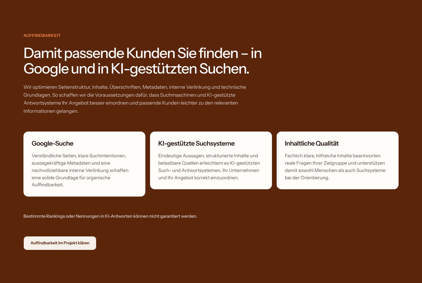
A structured and calm feature section setting three white text cards against an earthy, deep chocolate brown background.
- Mood
- serene + organic
- Layout
- 3 col · grid · balanced
- 08
feature grid
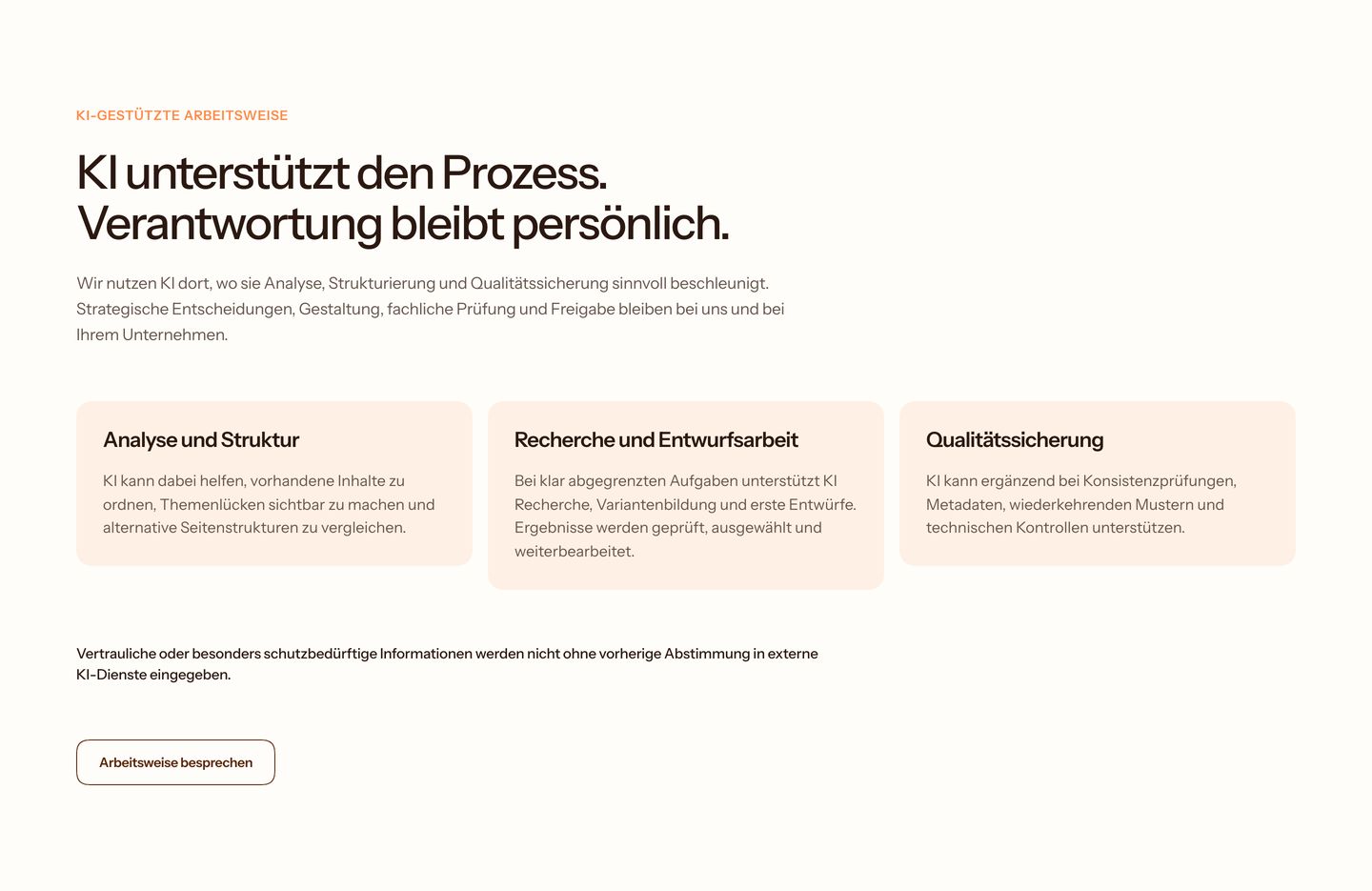
Warm, airy typographic feature section explaining human-led AI workflows across three soft peach cards with quiet authority.
- Mood
- serene
- Layout
- 3 col · grid · airy
- 09
statement
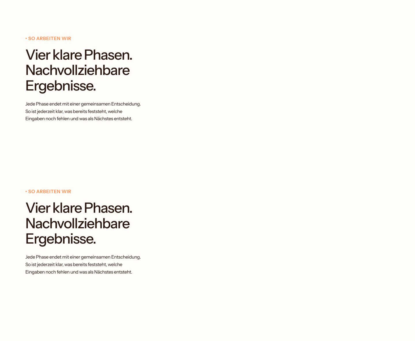
Calm and disciplined typography on warm paper tones introduces a clear, methodical four-phase design process.
- Mood
- serene
- Layout
- 1 col · stacked · airy
- 10
team
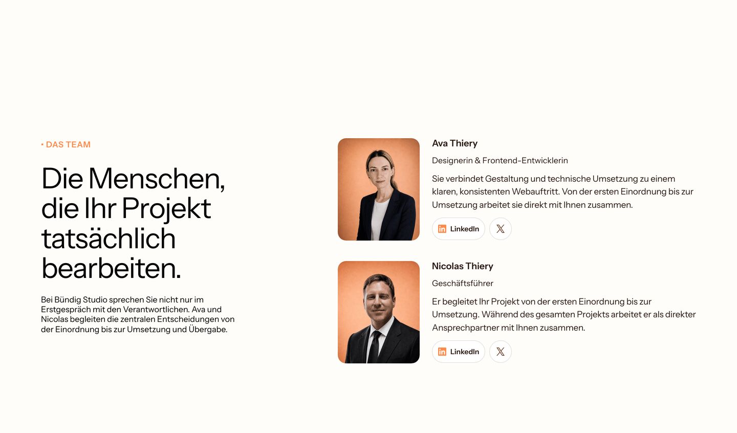
A warm, reassuring team section pairing clean typography with rounded portrait photography against an airy cream background.
- Mood
- serene
- Layout
- 2 col · split · airy
- 11
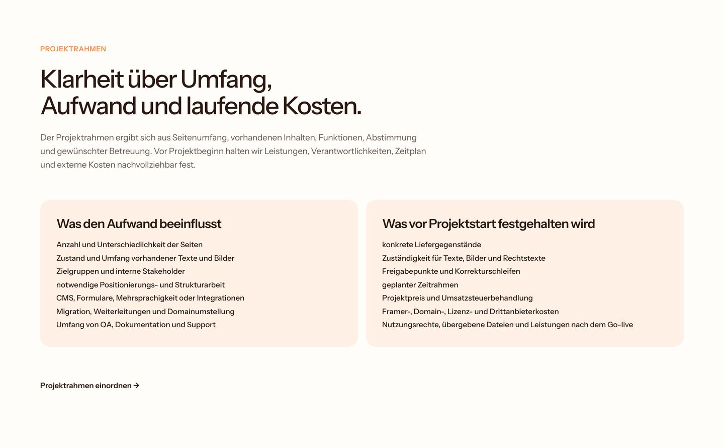
feature
Warm and airy layout detailing project scope criteria through clean typography and rounded informational cards.
- Mood
- serene
- Layout
- 2 col · stacked · airy
- 12
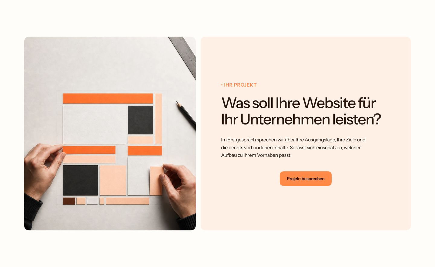
cta
A calm, warm split section pairing tactile paper-layout photography with a clear, inviting consultation inquiry.
- Mood
- serene + organic
- Layout
- 2 col · split · airy
- 13
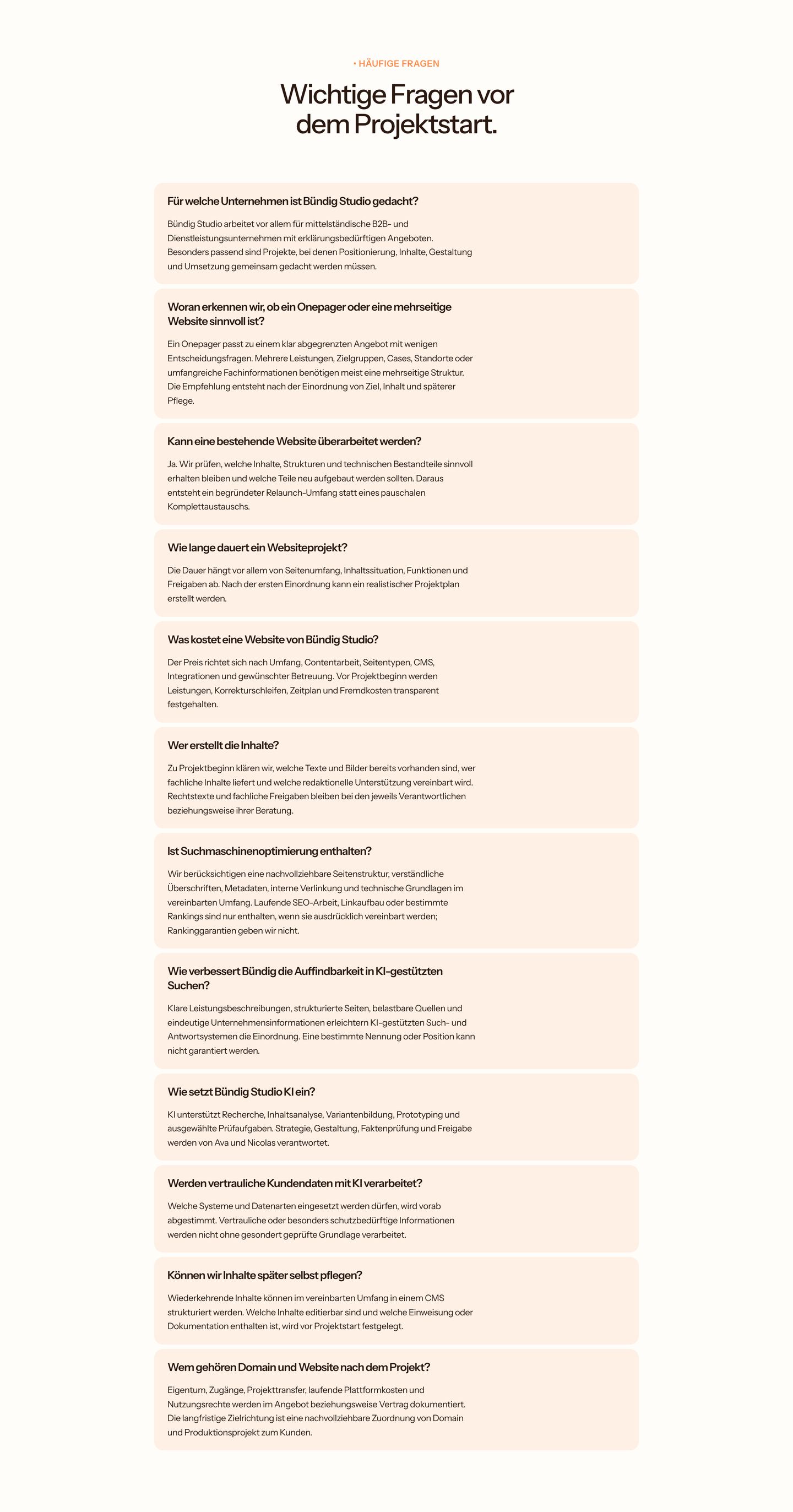
faq
A calm, warm-toned FAQ list presenting clear answers within softly tinted peach cards.
- Mood
- serene
- Layout
- 1 col · stacked · balanced
- 14
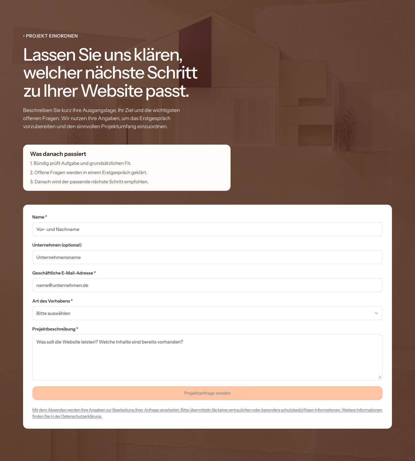
cta
A warm, earthy project inquiry section pairing structured process expectations with an approachable multi-field contact form over architectural imagery.
- Mood
- serene + organic
- Layout
- 1 col · stacked · balanced
- 15
footer
Rich earthy brown footer combining an authoritative closing statement, consultation CTA button, and clean two-column navigation links.
- Mood
- organic + serene
- Layout
- 3 col · split · balanced