OpenPhone
Modern, friendly productivity SaaS blending crisp product fidelity with playful sticker accents. High-contrast white surfaces and bold black bands frame clean UI cards, while saturated electric-lime buttons provide instant visual energy.
Take the vibe
Rated
6.7/ 10
From 8 analyzed sections. Two measured components and one judged by a model. Distinction is a rank within the library; the rest are scores in their own right.
- AI scorejudged
- 8.8
- Systemmeasured
- 5.4
- Distinctionmeasured
- 3.5
- on the grid
- 40%
- vertical rhythm
- 65%
- type on a scale
- 45%
- contrast passing AA
- 67%
- unlike the library
- 0.62
- model craft
- 7.6/10
- model deviation
- 3.0/10
Color
Background#ffffff
Text#000000
Accent#edfc47
Surface#f7f6f5
Muted#222222
Typefaces
- Display
- Roobert
- Body
- Inter
- Mono
- —
- Source
- Scale
- 12 · 14 · 16 · 18 · 20 · 24
Layout
- Grid
- 12 columns
- Container
- 1200px
- Spacing base
- 4px
- Radius
- 8px · 12px · 16px · 999px
Capture
- Category
- saas
- Sections
- 8
- Captured
- 2026-09-15
- Rhythm
- dark → white x2 → dark → white x3 → dark → white
Type rules
- display headlines use sentence case with tight negative tracking
- body text runs in short measures under 30 characters in hero copy
Color rules
- lime accent #edfc47 reserved exclusively for primary conversion buttons, badge stickers, and key UI focal points
- deep black sections alternate between clean white bands to anchor key proof points and conversion
Voice rules
- lead with customer outcome over feature mechanics
- keep CTA copy punchy and under four words
Holds it together
- highlight key inline headline words with yellow badge stickers or graphic icons
- intertwine deep black full-width sections to break up predominantly white backgrounds
- frame product features inside soft rounded cards with subtle borders
Contrast
text on background21.0:1 AAA
muted text on background15.9:1 AAA
text on surface19.5:1 AAA
muted text on surface14.7:1 AAA
accent on background1.1:1 fail
background on accent1.1:1 fail
Type, measured
- Body
- 24px / 1.2
- Measure
- 29 characters
- Display
- 88px / 1.1
- Tracking
- -0.02em display
- Scale ratio
- 1.38
Voice
- Tone
- approachable, reassuring, direct
- Sentences
- short
- Person
- second
- Vocabulary
- plain
- Calls to action
- try, talk, get, see
Built with
- Builder
- webflow
- Framework
- —
- Motion
- gsap, swiper
- WebGL
- —
- Nav
- top_bar, 65 items
- Length
- 8.3 screens
Sections in page order
- 00
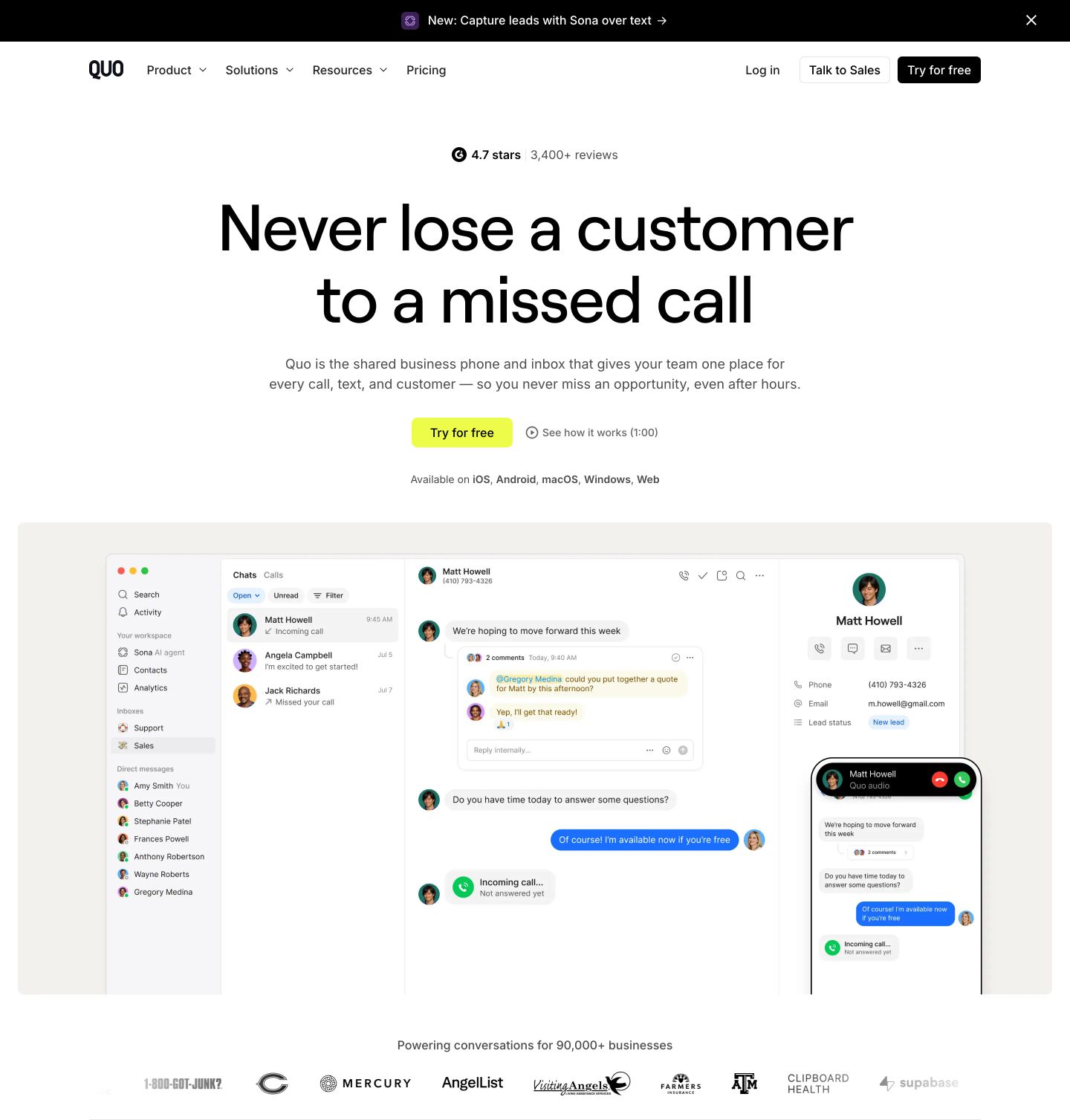
hero
Clean and spacious SaaS hero centered on an oversized headline, a bright accent call-to-action, and an expansive unified messaging interface mockup.
- Mood
- serene
- Layout
- 1 col · stacked · balanced
- 01
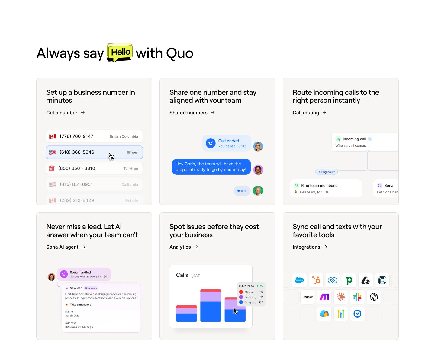
feature grid
StrongA clean, bright product capability grid displaying feature cards with micro-UI mockups and a cheerful 3D speech bubble headline.
- Mood
- playful + serene
- Layout
- 3 col · grid · balanced
- 02
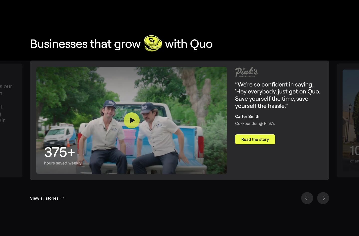
testimonial
StrongA dark testimonial carousel pairing full-bleed video thumbnails with customer quotes, key metrics, and vibrant lime accents.
- Mood
- playful
- Layout
- 1 col · centered · balanced
- 03
feature grid
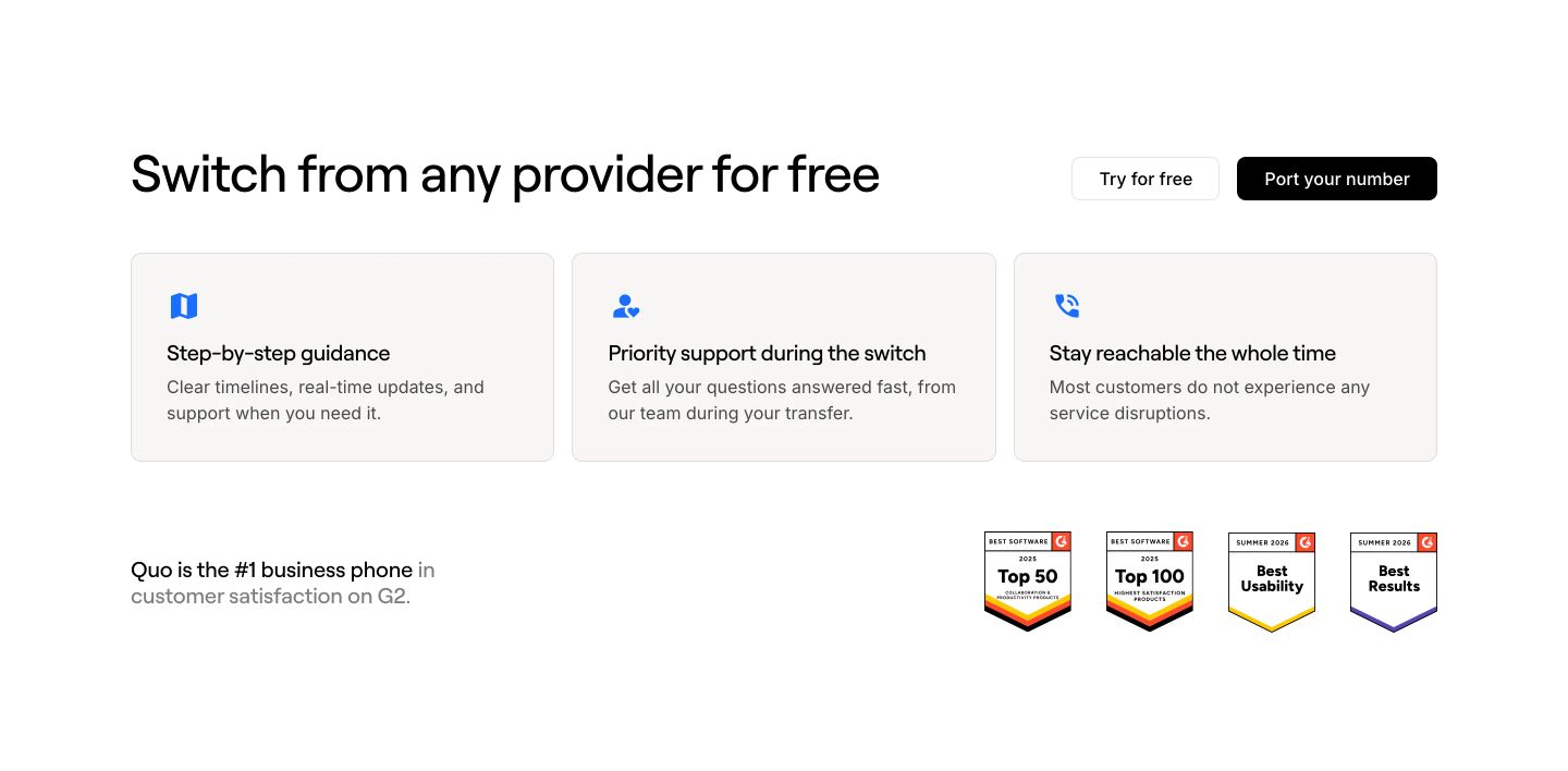
A clean, low-friction switching band offering reassurance through three structured feature cards and G2 validation badges.
- Mood
- serene
- Layout
- 3 col · grid · airy
- 04
feature
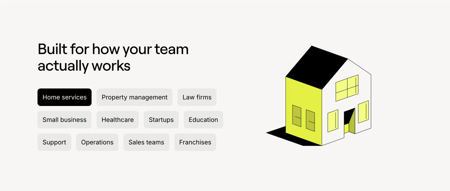
Airy feature section pairing an audience filter pill matrix with a clean isometric house illustration.
- Mood
- playful + serene
- Layout
- 2 col · split · airy
- 05
logo bar
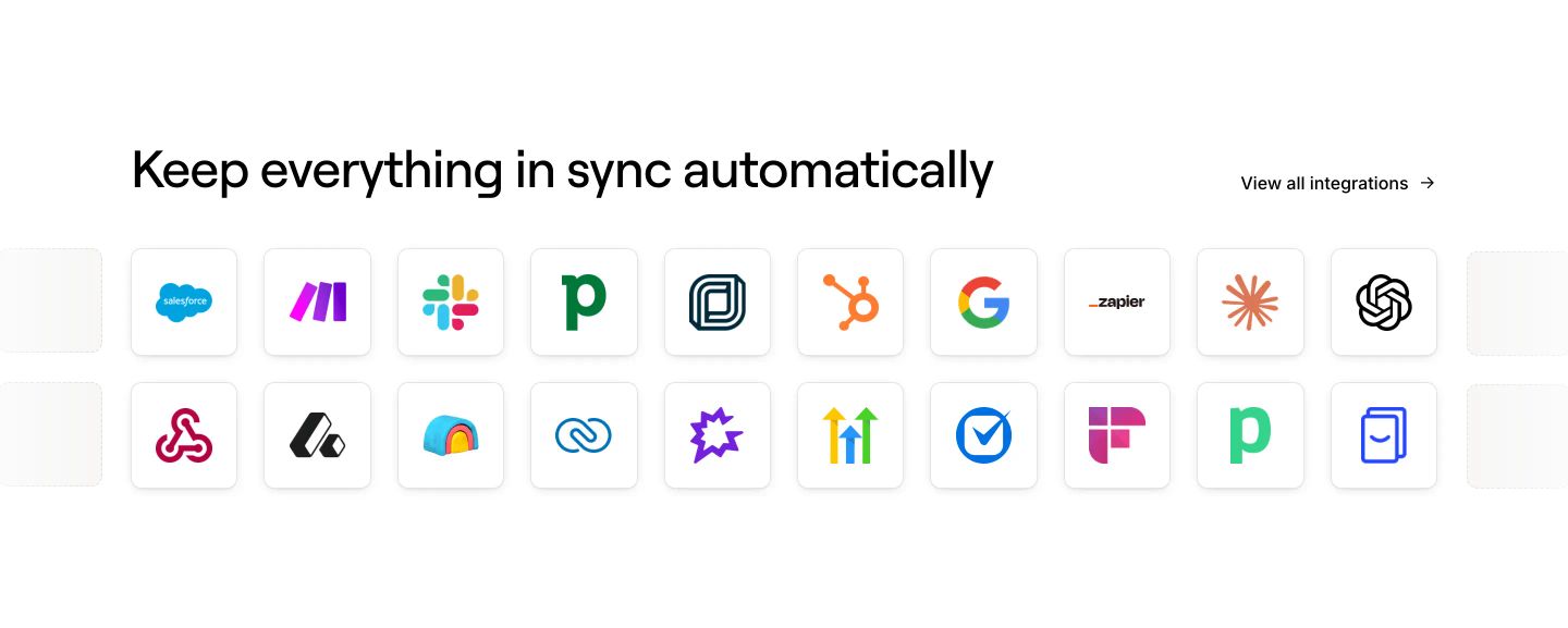
Crisp, minimal integration showcase displaying familiar software app icons inside clean rounded tiles across two horizontal rows.
- Mood
- clinical
- Layout
- 10 col · stacked · balanced
- 06
cta
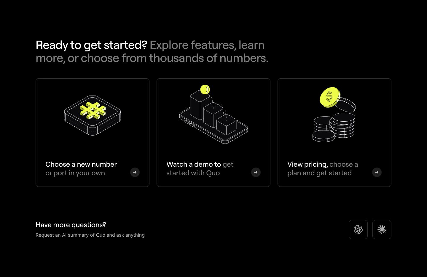
Crisp dark pathway cards with isometric line illustrations and electric yellow accents guide users toward their next steps.
- Mood
- clinical + serene
- Layout
- 3 col · grid · balanced
- 07
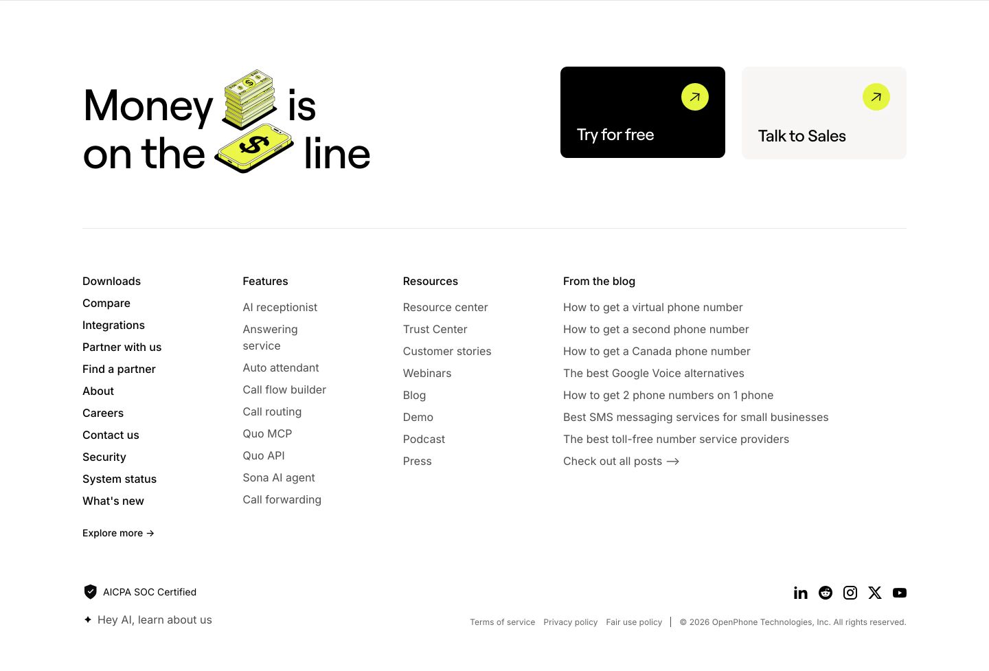
footer
StrongCrisp and spacious footer combining a playful visual CTA with structured link columns on a clean white backdrop.
- Mood
- playful + serene
- Layout
- 4 col · stacked · airy