Liveblocks
Deep black precision engineered for developers. Chromatic 3D hardware-accelerated visuals and glowing multiplayer presence tags punctuate crisp Swiss typography, creating a high-performance infrastructure aesthetic.
Take the vibe
Rated
6.6/ 10
From 8 analyzed sections. Two measured components and one judged by a model. Distinction is a rank within the library; the rest are scores in their own right.
- AI scorejudged
- 9.8
- Systemmeasured
- 5.1
- Distinctionmeasured
- 1.1
- on the grid
- 0%
- vertical rhythm
- 64%
- type on a scale
- 40%
- contrast passing AA
- 100%
- unlike the library
- 0.49
- model craft
- 8.1/10
- model deviation
- 3.8/10
Color
Background#000000
Text#ffffff
Accent#9f8dfc
Surface#21222b
Muted#918d8d
Typefaces
- Display
- suisse
- Body
- suisse
- Mono
- JetBrains Mono
- Source
- self_hosted
- Scale
- 11 · 12 · 14 · 16 · 20 · 24
Layout
- Grid
- —
- Container
- —
- Spacing base
- 4px
- Radius
- 6px · 12px · 9999px
Capture
- Category
- saas
- Sections
- 8
- Captured
- 2026-09-15
- Rhythm
- dark x10
Type rules
- display headlines use sentence case with tight tracking (-0.02em)
- body copy stays around 67 characters per line with muted grey color
- code samples and technical identifiers strictly set in monospace
Color rules
- pure black #000000 dominates over 90% of the surface area
- high-saturation pastel accents (purple, cyan) reserved for multiplayer cursor artifacts and interactive status tags
Voice rules
- use bold phrasing for key value props followed by explanatory subtext
- name recognizable design patterns to frame technical features
Holds it together
- keep all background canvases pitch black with subtle low-opacity surface cards
- use collaborative cursor badges with user names to illustrate live sync in situ
- render primary CTAs as high-contrast solid white rounded pills
Contrast
text on background21.0:1 AAA
muted text on background6.4:1 AA
text on surface15.8:1 AAA
muted text on surface4.8:1 AA
accent on background7.7:1 AAA
background on accent7.7:1 AAA
Type, measured
- Body
- 20px / 1.38
- Measure
- 67 characters
- Display
- 60px / 1.1
- Tracking
- -0.02em display
- Scale ratio
- 1.32
Voice
- Tone
- technical, confident, precise
- Sentences
- medium
- Person
- second
- Vocabulary
- technical
- Calls to action
- get, install, read, browse
Built with
- Builder
- —
- Framework
- next
- Motion
- —
- WebGL
- yes
- Nav
- top_bar, 2 items
- Length
- 10.3 screens
Sections in page order
- 00
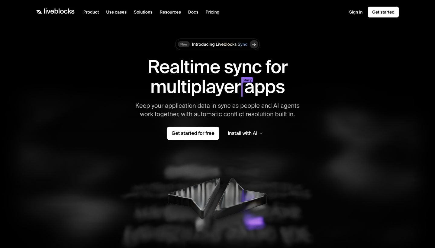
hero
StrongA dark, sleek developer hero centered around metallic 3D artifacts and collaborative cursor motifs.
- Mood
- mysterious + clinical
- Layout
- 1 col · stacked · airy
- 01
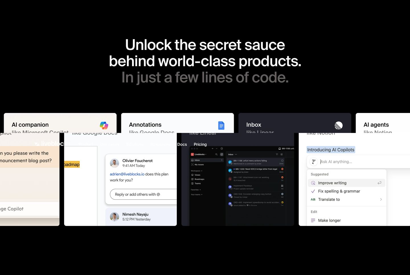
statement
StrongCrisp dark presentation showcasing multi-layered UI mockups beneath a centered, confident product declaration.
- Mood
- clinical
- Layout
- 4 col · stacked · balanced
- 02
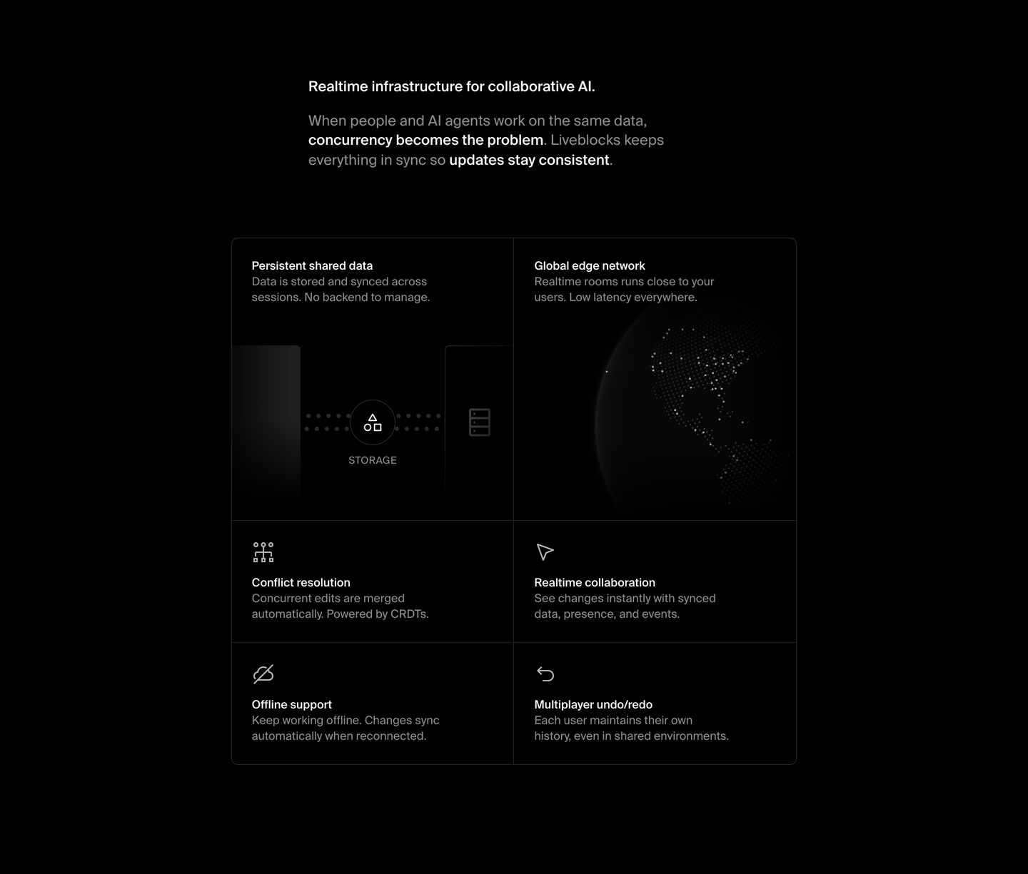
feature grid
StrongDark, disciplined developer infrastructure grid featuring subtle monochrome schematics and muted typography across structured feature cells.
- Mood
- clinical + serene
- Layout
- 2 col · grid · balanced
- 03
feature grid
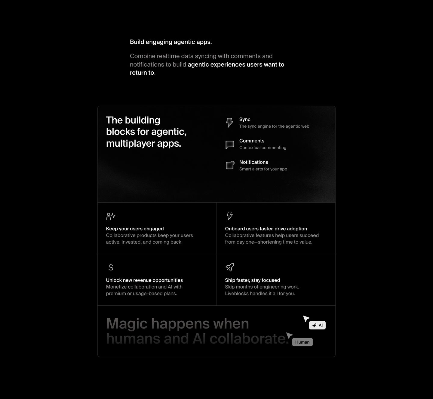
Sleek, dark-mode technical feature grid rendered with hairline borders and restrained monochrome typography.
- Mood
- clinical + mysterious
- Layout
- 2 col · grid · balanced
- 04
feature
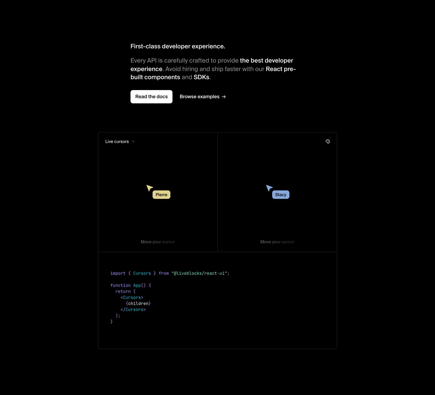
Restrained developer tool feature presentation pairing clean documentation copy with an interactive live cursor sandbox and React snippet.
- Mood
- clinical + playful
- Layout
- 1 col · stacked · airy
- 05
testimonial
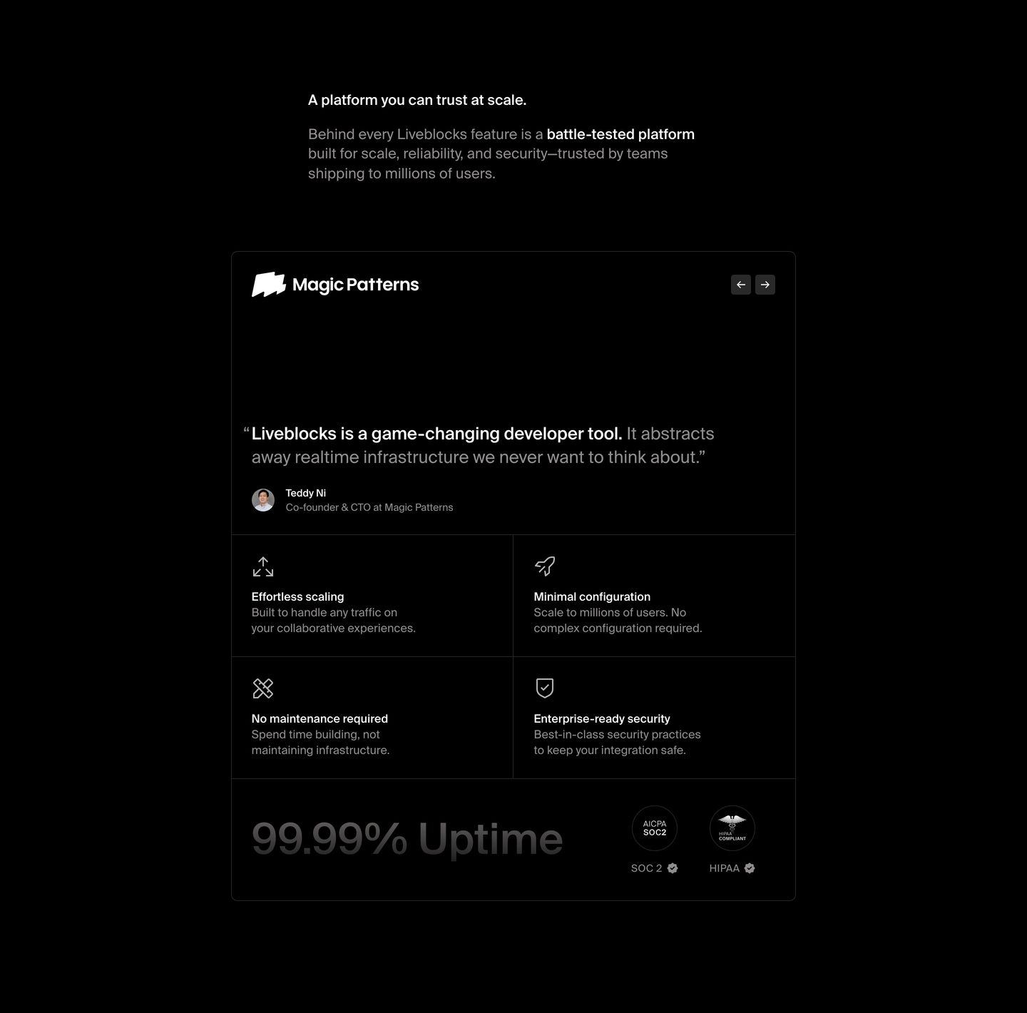
A precision-crafted dark trust section structured as a monolithic card with a testimonial header, 2x2 feature matrix, and compliance badges.
- Mood
- clinical
- Layout
- 2 col · stacked · balanced
- 06
cta
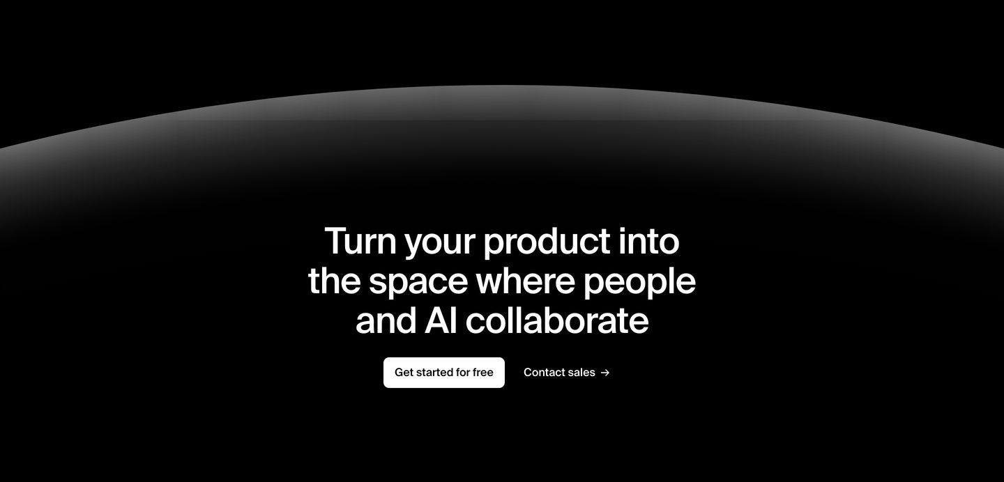
A deep black cinematic call to action with a glowing horizon dome curving softly above centered typography.
- Mood
- ethereal + serene
- Layout
- 1 col · centered · airy
- 07
footer
A comprehensive developer-tool footer structured into clean, restrained typographic columns against an absolute black void.
- Mood
- clinical + serene
- Layout
- 4 col · grid · balanced