Podspace
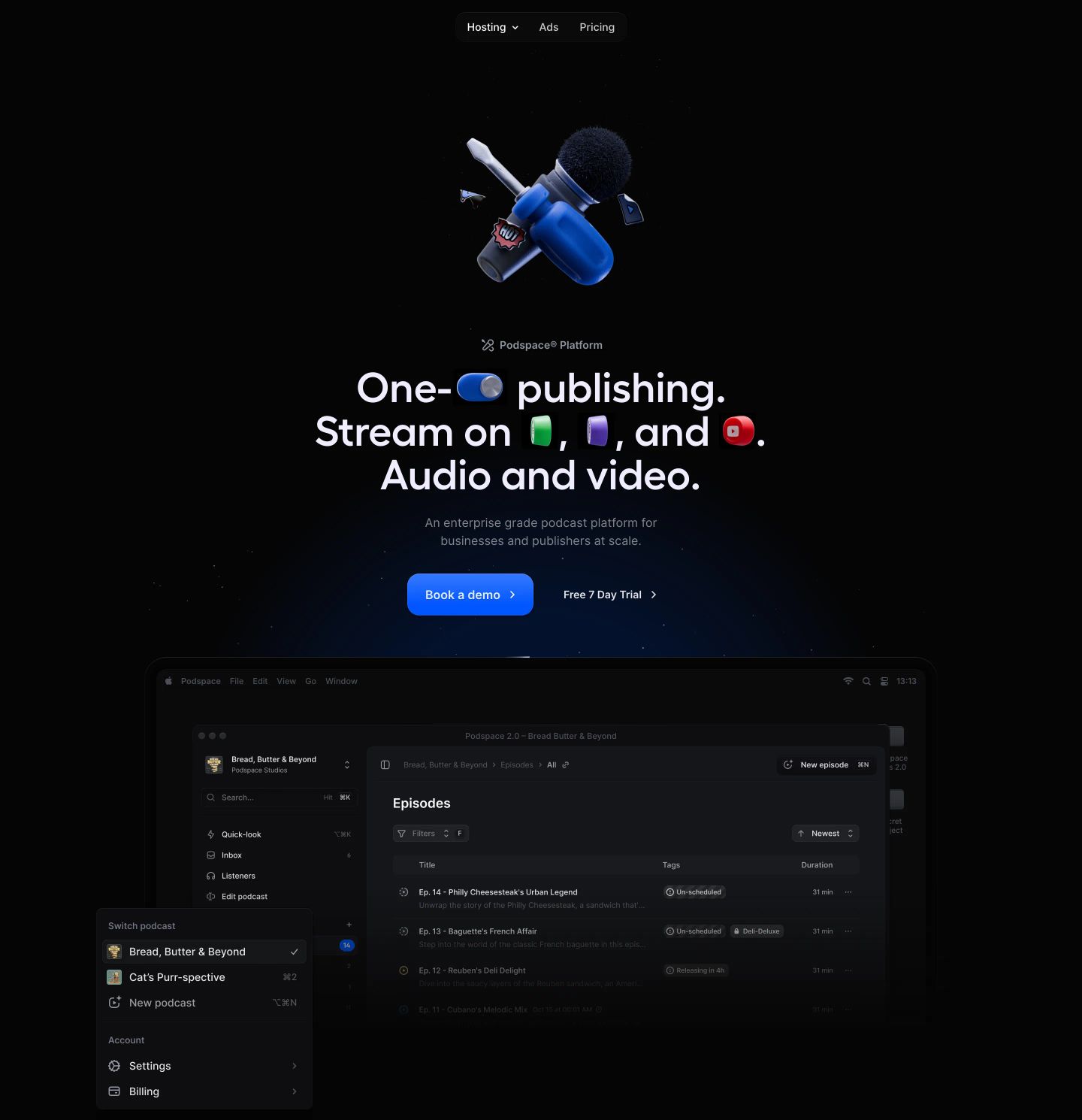
Deep-space enterprise minimalism meets playful 3D craft. The pitch-black backdrop and refined grotesque type create a modern infrastructure feel, softened by glossy 3D micro-illustrations inserted inline into typography.
Take the vibe
Rated
7.0/ 10
From 9 analyzed sections. Two measured components and one judged by a model. Distinction is a rank within the library; the rest are scores in their own right.
- AI scorejudged
- 8.4
- Systemmeasured
- 6.9
- Distinctionmeasured
- 3.0
- on the grid
- 42%
- vertical rhythm
- 70%
- type on a scale
- 63%
- contrast passing AA
- 100%
- unlike the library
- 0.60
- model craft
- 7.4/10
- model deviation
- 3.7/10
Color
Background#050505
Text#fcfdff
Accent#fcfdff
Surface#0e0e10
Muted#9194a1
Typefaces
- Display
- Inter
- Body
- Inter
- Mono
- —
- Source
- Scale
- 10 · 12 · 14 · 16 · 20 · 22
Layout
- Grid
- 24 columns
- Container
- 1056px
- Spacing base
- 4px
- Radius
- 8px · 16px · 9999px
Capture
- Category
- saas
- Sections
- 9
- Captured
- 2026-09-15
- Rhythm
- dark x11
Type rules
- display typography stays sentence case with tight zero tracking
- body text measures to 68 characters per line maximum
Color rules
- deep void black background dominates across all sections
- text hierarchy uses bright white for headings and muted slate for descriptions
Voice rules
- embed playful 3D icons directly within display headlines
- keep enterprise claims concise and grounded in user benefits
Holds it together
- use 3D dimensional badges and icons inline within hero headlines
- encapsulate feature widgets within dark elevated surface cards with rounded corners
- pair enterprise client testimonials with high-contrast pull quotes in centered layouts
Contrast
text on background20.0:1 AAA
muted text on background6.8:1 AA
text on surface18.9:1 AAA
muted text on surface6.4:1 AA
accent on background20.0:1 AAA
background on accent20.0:1 AAA
Type, measured
- Body
- 22px / 1.3
- Measure
- 68 characters
- Display
- 56px / 1
- Tracking
- 0em display
- Scale ratio
- 1.26
Voice
- Tone
- confident, concise
- Sentences
- short
- Person
- second
- Vocabulary
- plain
- Calls to action
- book, try, get, explore
Built with
- Builder
- framer
- Framework
- —
- Motion
- —
- WebGL
- —
- Nav
- top_bar, 5 items
- Length
- 7 screens
Sections in page order
- 00
hero
StrongA slick cosmic hero featuring playful 3D gadget iconography woven directly into its bold central headline above an app mockup.
- Mood
- playful + ethereal
- Layout
- 1 col · stacked · airy
- 01
logo bar
A dark, restrained social proof banner displaying clean monochrome client logos under a subtle introductory heading.
- Mood
- serene
- Layout
- 5 col · grid · airy

- 02
feature grid
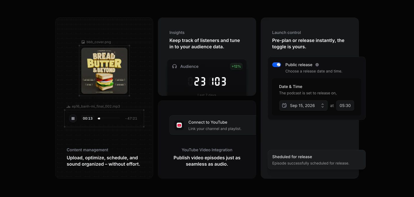
A sleek, dark-themed dashboard showcase highlighting modular podcast publishing features through refined micro-UI components.
- Mood
- clinical + serene
- Layout
- 3 col · grid · balanced
- 03
testimonial
A dark, restrained testimonial centered in vast negative space with a single authoritative quote.
- Mood
- serene
- Layout
- 1 col · centered · airy

- 04
feature
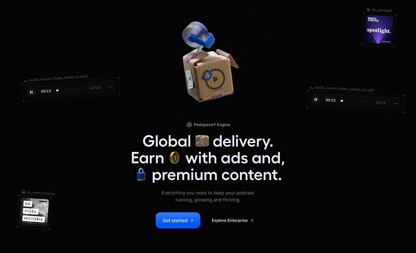
StrongPlayful dark-mode feature spotlight with a tactile 3D cardboard box illustration and floating audio UI cards surrounding inline-emoji typography.
- Mood
- playful
- Layout
- 1 col · centered · airy
- 05
feature grid
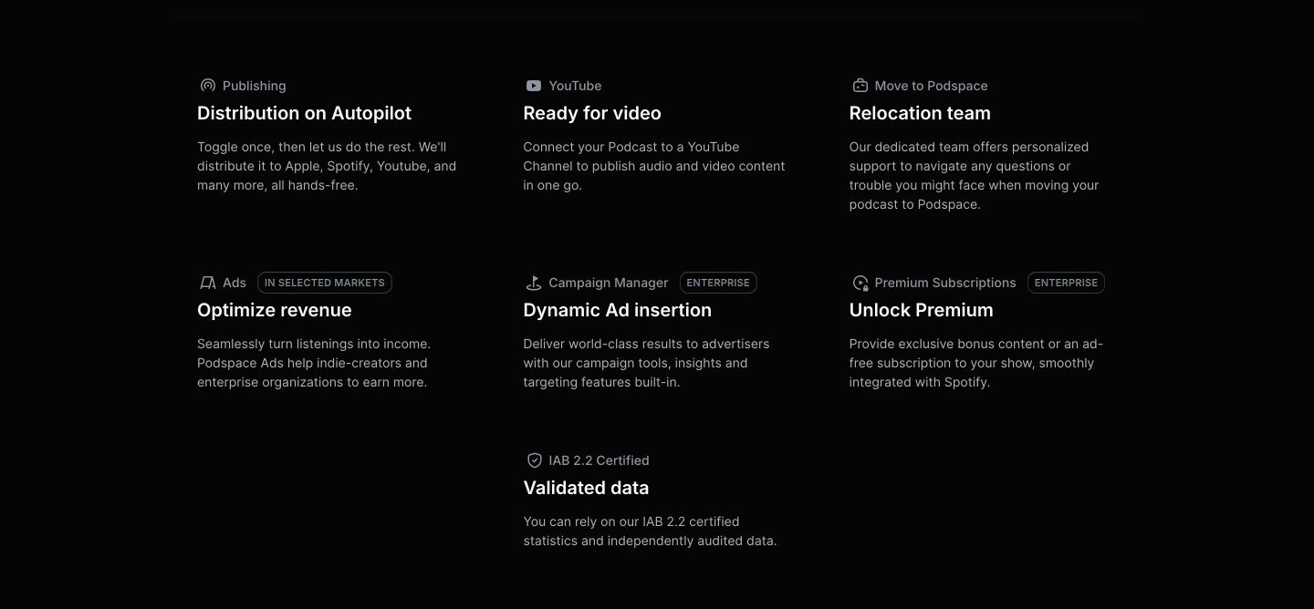
Clean and understated dark grid presenting secondary platform features through neat typographic blocks and subtle enterprise badges.
- Mood
- clinical + serene
- Layout
- 3 col · grid · balanced
- 06
feature
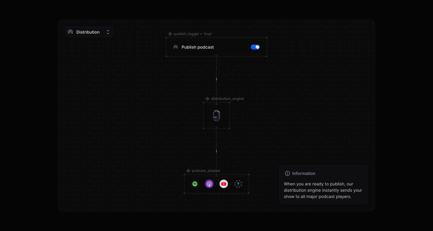
StrongDark and clinical visual schematic detailing an automated podcast distribution pipeline through a node-based interface diagram.
- Mood
- clinical + mysterious
- Layout
- 1 col · centered · airy
- 07
faq
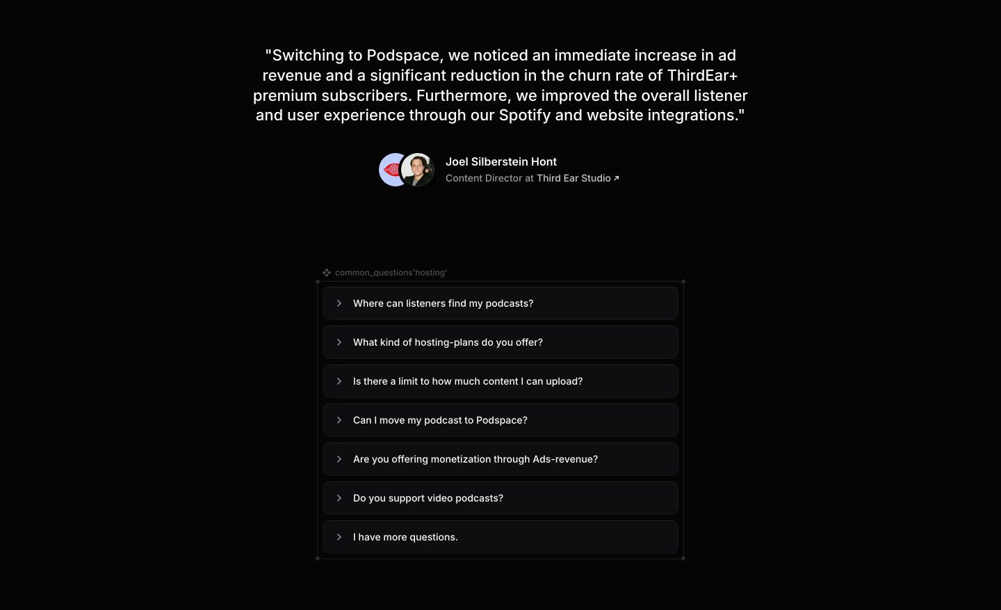
A minimalist pitch-black band combining a customer testimonial quote above a stacked dark accordion of common hosting questions.
- Mood
- clinical
- Layout
- 1 col · stacked · balanced
- 08
footer
Stark, minimal dark footer anchored by trust certifications, clean link columns, and a language selector.
- Mood
- clinical + serene
- Layout
- 3 col · split · airy