Ycode
Utilitarian, developer-focused precision on deep pitch-black canvases. Crisp Inter typography and dark hairline-bordered panels project modern open-source reliability, punctuated only by subtle release dots. The layout lets product UI captures and clean multi-step workflows take center stage without visual clutter.
Take the vibe
Rated
6.5/ 10
From 8 analyzed sections. Two measured components and one judged by a model. Distinction is a rank within the library; the rest are scores in their own right.
- AI scorejudged
- 8.8
- Systemmeasured
- 5.9
- Distinctionmeasured
- 1.3
- on the grid
- 0%
- vertical rhythm
- 88%
- type on a scale
- 50%
- contrast passing AA
- 100%
- unlike the library
- 0.50
- model craft
- 7.6/10
- model deviation
- 2.9/10
Color
Background#0a0a0a
Text#ffffff
Accent#46e64b
Surface#0a0a0a
Typefaces
- Display
- Inter
- Body
- Inter
- Mono
- Geist Mono
- Source
- Scale
- 10 · 12 · 14 · 16 · 24 · 40
Layout
- Grid
- —
- Container
- —
- Spacing base
- 4px
- Radius
- 8px · 9999px
Capture
- Category
- tools
- Sections
- 8
- Captured
- 2026-09-10
- Rhythm
- dark x9
Type rules
- display headlines set in sentence case with tight negative tracking
- body text constrained to around 77 characters for high legibility
- version numbers and release metadata formatted in lightweight monospace
Color rules
- strict pitch-black background with subtle high-contrast white text hierarchy
- neon green indicator dots reserved solely for status and active release markers
Voice rules
- lead with product capabilities over marketing hyperbole
- pair primary cloud CTAs with open-source GitHub alternatives
Holds it together
- every major action provides a dual path: one-click cloud signup and GitHub repo access
- contain supporting content blocks within rounded hairline cards on solid black
- use pill badges with icon anchors for status indicators and version pills
Contrast
text on background19.8:1 AAA
text on surface19.8:1 AAA
accent on background12.0:1 AAA
background on accent12.0:1 AAA
Type, measured
- Body
- 16px / 1.6
- Measure
- 77 characters
- Display
- 72px / 1.1
- Tracking
- -0.02em display
- Scale ratio
- 1.46
Voice
- Tone
- direct, technical, empowering
- Sentences
- medium
- Person
- second
- Vocabulary
- plain
- Calls to action
- get started, open, join, deploy
Built with
- Builder
- —
- Framework
- next
- Motion
- —
- WebGL
- —
- Nav
- —
- Length
- 7.6 screens
Sections in page order
- 00
hero
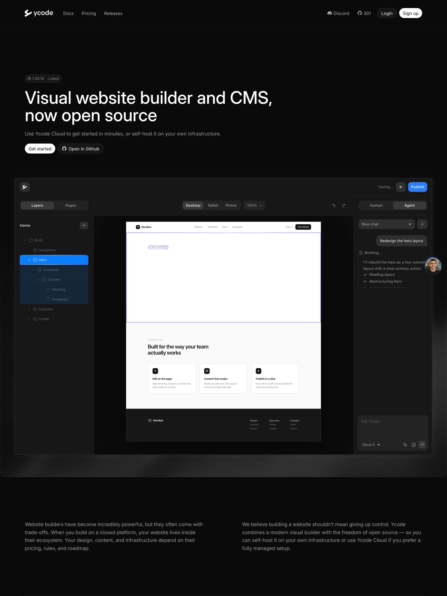
StrongSleek, dark-mode developer hero presenting a precise visual editor interface with calm, confident typography.
- Mood
- clinical + serene
- Layout
- 1 col · stacked · balanced
- 01
feature grid
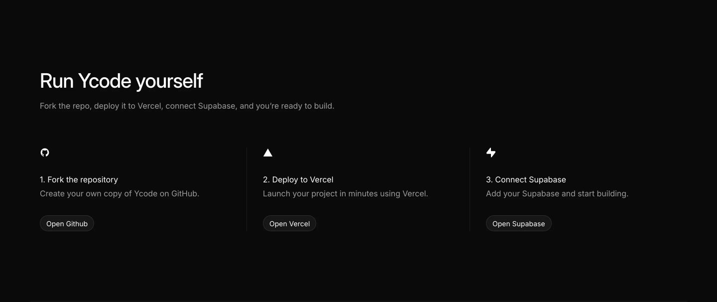
A clean, dark-mode three-step deployment guide offering developers a direct, unadorned onboarding path with minimal iconography and pill action buttons.
- Mood
- clinical + serene
- Layout
- 3 col · grid · balanced
- 02
feature
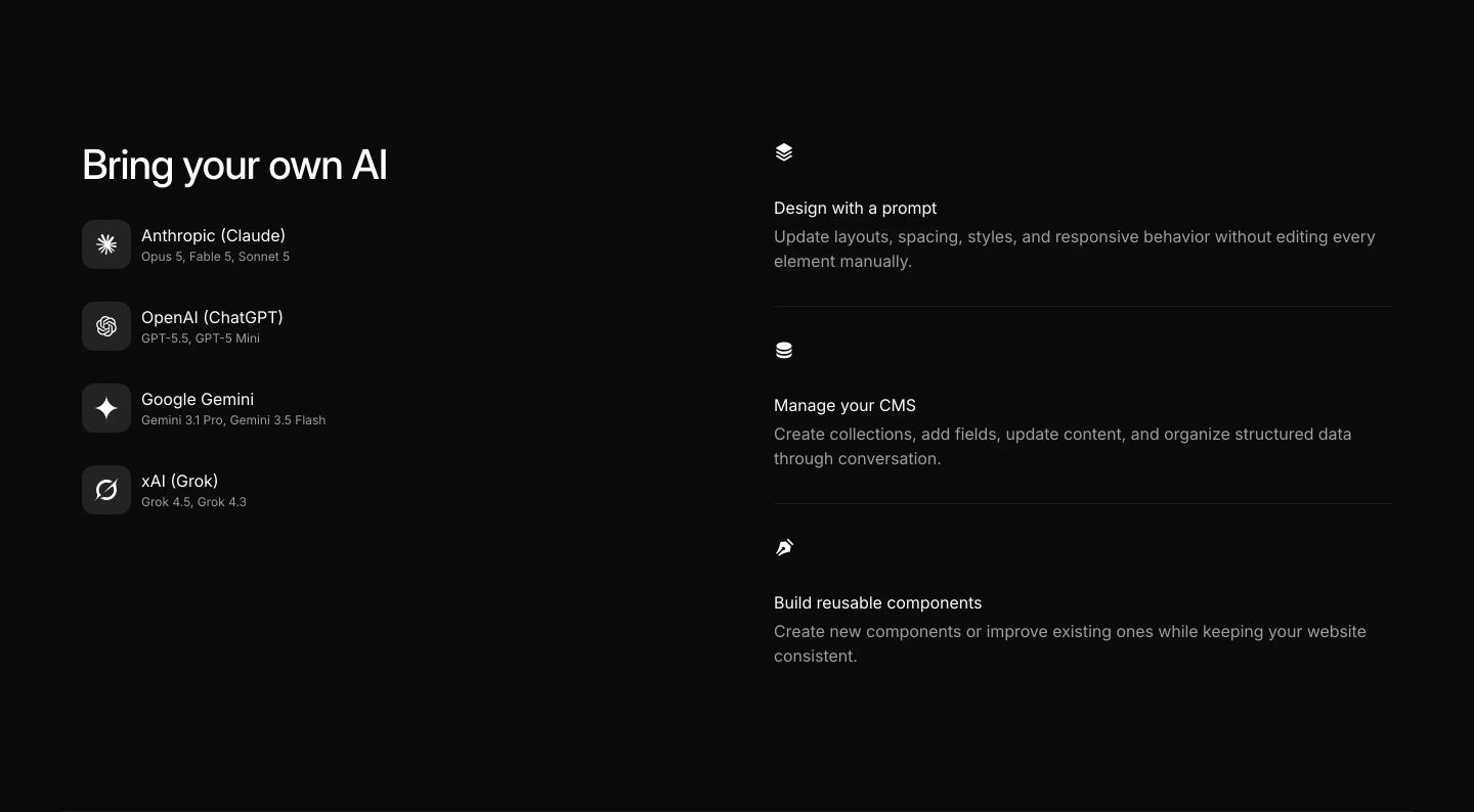
Sleek, minimalist dark-mode feature section pairing supported AI models with workflow capabilities in a clean two-column grid.
- Mood
- clinical + serene
- Layout
- 2 col · split · balanced
- 03
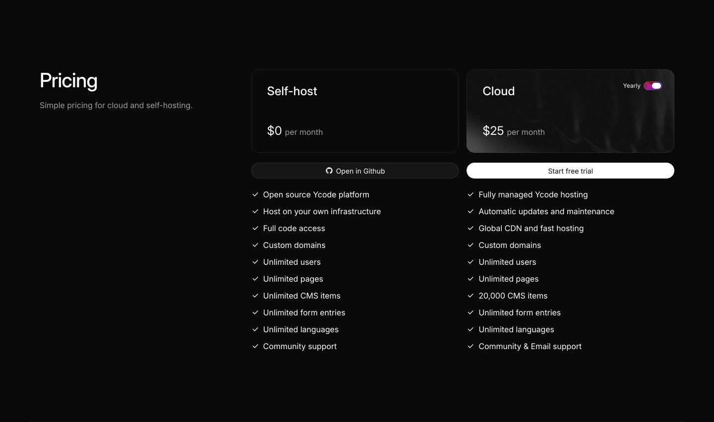
pricing
Minimalist dark-mode pricing matrix contrasting open-source self-hosting against a managed cloud tier with crisp typography.
- Mood
- clinical + serene
- Layout
- 3 col · split · airy
- 04
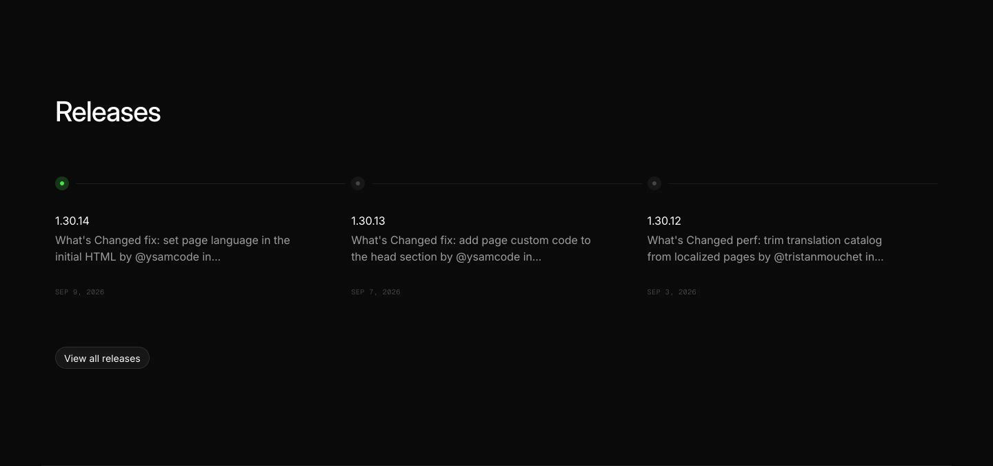
announcement
StrongMinimal dark changelog section displaying recent release notes along a subtle horizontal status line.
- Mood
- clinical + serene
- Layout
- 3 col · grid · airy
- 05
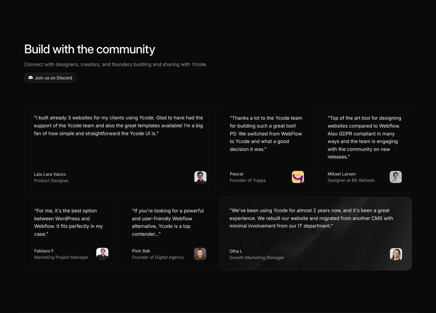
testimonial
Clean, reassuring dark-mode social proof grid showcasing community reviews with user avatars and a community Discord link.
- Mood
- serene
- Layout
- 3 col · grid · balanced
- 06
cta
StrongA pitch-black minimal call to action where subtle metallic typography emerges from the void above high-contrast pill buttons.
- Mood
- mysterious + serene
- Layout
- 1 col · centered · airy

- 07
footer
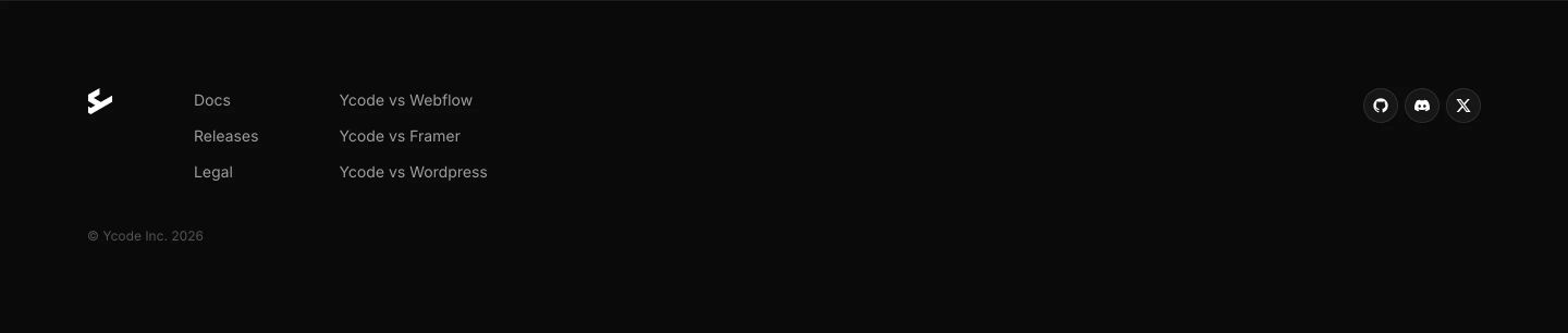
A stark, minimalist dark-mode footer with generous negative space and tidy link columns flanked by discrete social icons.
- Mood
- serene
- Layout
- 4 col · split · airy