Superset
Utilitarian, sharp, and unmistakably developer-first. The deep carbon interface is punctuated by crisp terminal mockups, monospace telemetry, and minimal rust-orange focus brackets that anchor the eye without visual clutter.
Take the vibe
Rated
6.9/ 10
From 15 analyzed sections. Two measured components and one judged by a model. Distinction is a rank within the library; the rest are scores in their own right.
- AI scorejudged
- 9.0
- Systemmeasured
- 6.6
- Distinctionmeasured
- 1.6
- on the grid
- 39%
- vertical rhythm
- 75%
- type on a scale
- 50%
- contrast passing AA
- 100%
- unlike the library
- 0.51
- model craft
- 7.7/10
- model deviation
- 2.7/10
Color
Background#111111
Text#fafafa
Accent#ce5814
Surface#171717
Muted#bdbebe
Typefaces
- Display
- Inter
- Body
- Inter
- Mono
- IBM Plex Mono
- Source
- self_hosted
- Scale
- 10 · 12 · 14 · 15 · 16 · 18
Layout
- Grid
- 12 columns
- Container
- 1216px
- Spacing base
- 4px
- Radius
- 4px · 8px
Capture
- Category
- ai
- Sections
- 15
- Captured
- 2026-09-12
- Rhythm
- dark x9
Type rules
- display headlines set in Inter with tight letter-spacing and sentence or title case
- all section labels and code indicators formatted in IBM Plex Mono uppercase
- body text restricted to a 51-character measure for high code-adjacent readability
Color rules
- deep charcoal #111111 forms the uninterrupted background across every section
- warm rust-orange accent #ce5814 is reserved strictly for focus brackets, step indicators, and terminal badges
- secondary UI elements use #171717 surface panels with hairline borders
Voice rules
- lead with developer verbs and terminal concepts
- keep explanatory copy under two short sentences per feature
Holds it together
- enclose hero keyphrases or active panels in orange corner bracket accents
- pair every feature description with a concrete terminal window or UI pane preview
- render status markers, shell commands, and metadata exclusively in monospace type
Contrast
text on background18.1:1 AAA
muted text on background10.1:1 AAA
text on surface17.2:1 AAA
muted text on surface9.6:1 AAA
accent on background4.5:1 AA
background on accent4.5:1 AA
Type, measured
- Body
- 15px / 1.63
- Measure
- 51 characters
- Display
- 72px / 1.1
- Tracking
- -0.025em display
- Scale ratio
- 1.48
Voice
- Tone
- technical, direct, confident
- Sentences
- short
- Person
- second
- Vocabulary
- technical
- Calls to action
- download, view, star, join
Built with
- Builder
- —
- Framework
- next
- Motion
- —
- WebGL
- —
- Nav
- top_bar, 3 items
- Length
- 11.6 screens
Sections in page order
- 00
hero
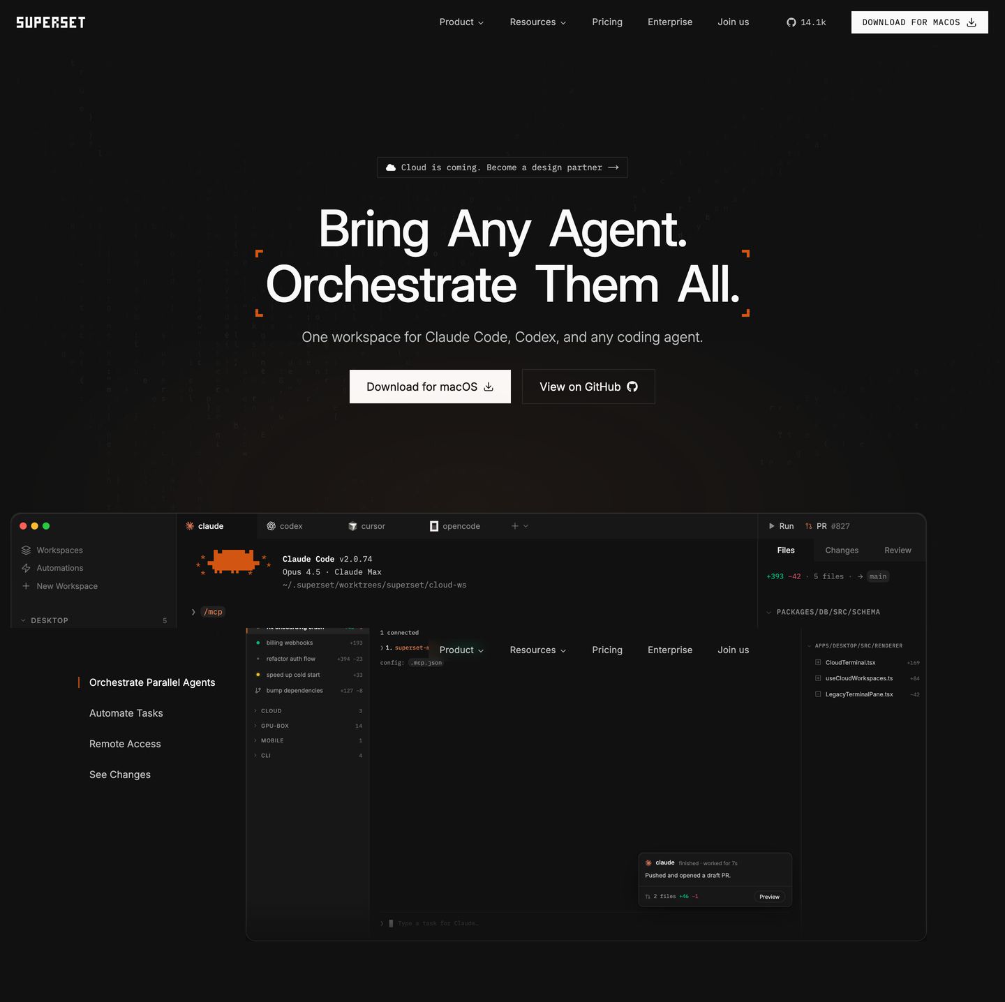
StrongA dark, precision-engineered developer hero featuring corner crosshairs, dual CTA buttons, and a detailed desktop IDE mockup.
- Mood
- clinical + mysterious
- Layout
- 1 col · stacked · balanced
- 01
logo bar
A clean, dark grid of tech company logo cards establishing immediate social proof and developer credibility.
- Mood
- serene
- Layout
- 7 col · grid · balanced
- 02
feature grid
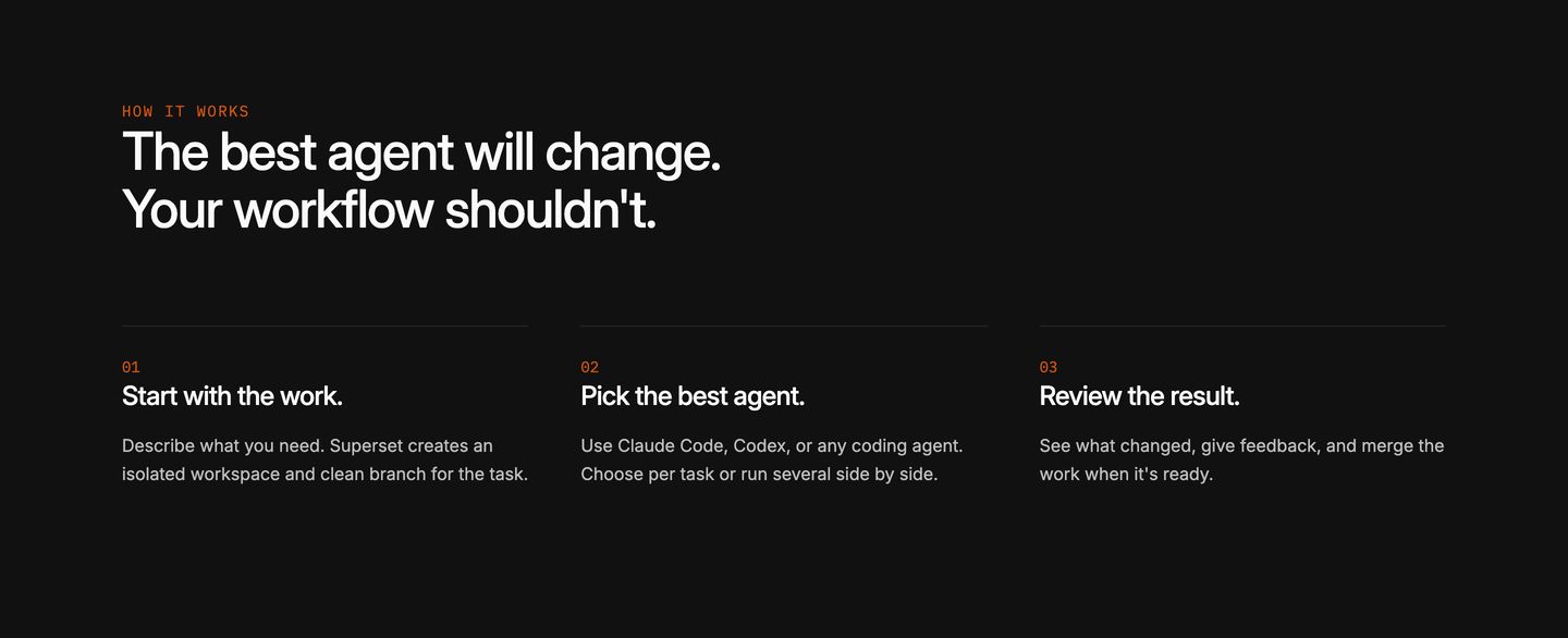
Sleek and stark dark-mode three-step process breakdown pairing clean grotesque headings with monospace step markers.
- Mood
- clinical
- Layout
- 3 col · grid · airy
- 03
feature
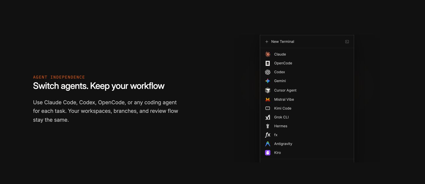
StrongDark minimalist split feature section displaying developer tool UI beside concise technical copy.
- Mood
- serene
- Layout
- 2 col · split · balanced
- 04
feature
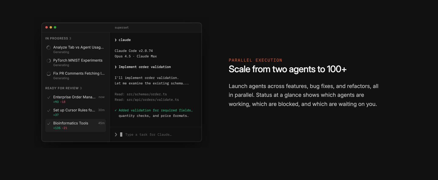
A crisp dark developer interface paired with concise copy delivers a focused, technical clarity.
- Mood
- clinical
- Layout
- 2 col · split · balanced
- 05
feature
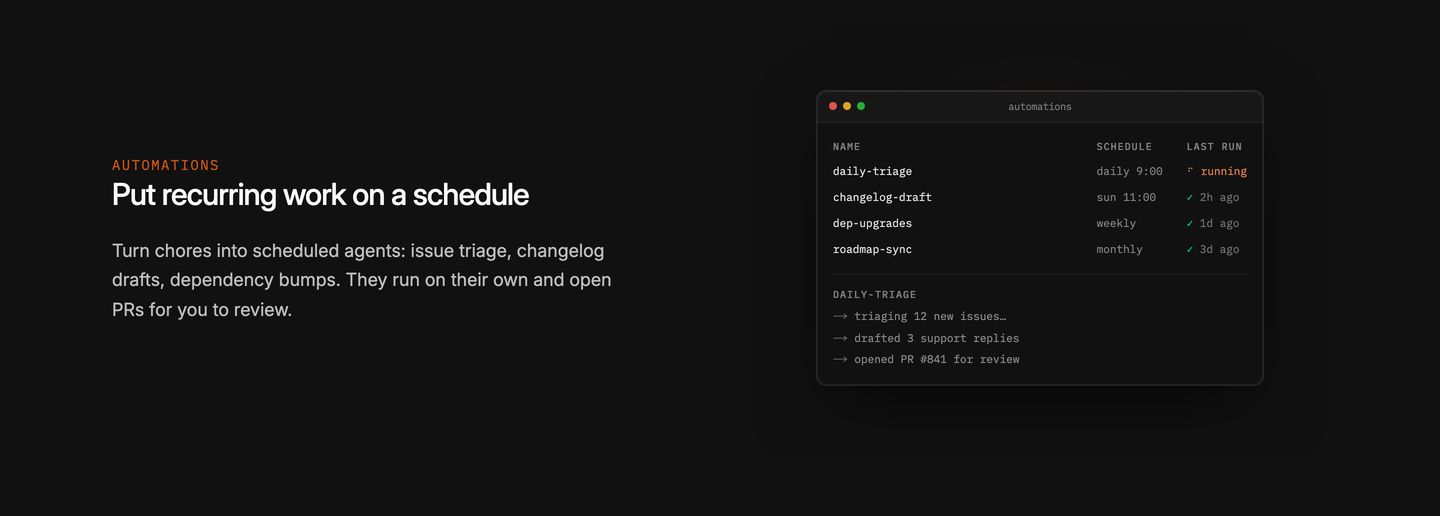
A sparse and technical feature block pairing restrained developer copy with a minimal terminal-inspired automations window.
- Mood
- clinical
- Layout
- 2 col · split · airy
- 06
feature
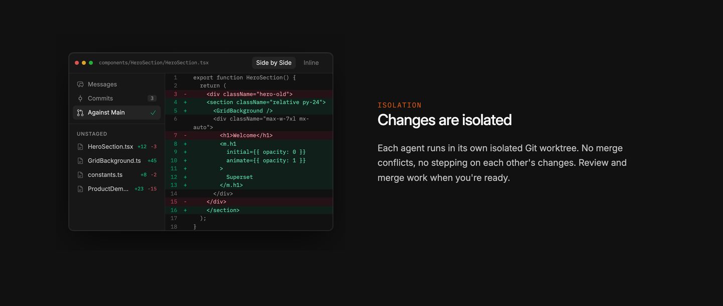
A crisp, dark split feature section pairing an authentic code diff window with concise developer-focused copy.
- Mood
- clinical + serene
- Layout
- 2 col · split · balanced
- 07
feature
Minimalist developer-focused feature section pairing concise copy with a clean dark terminal window against deep black space.
- Mood
- clinical + serene
- Layout
- 2 col · split · airy
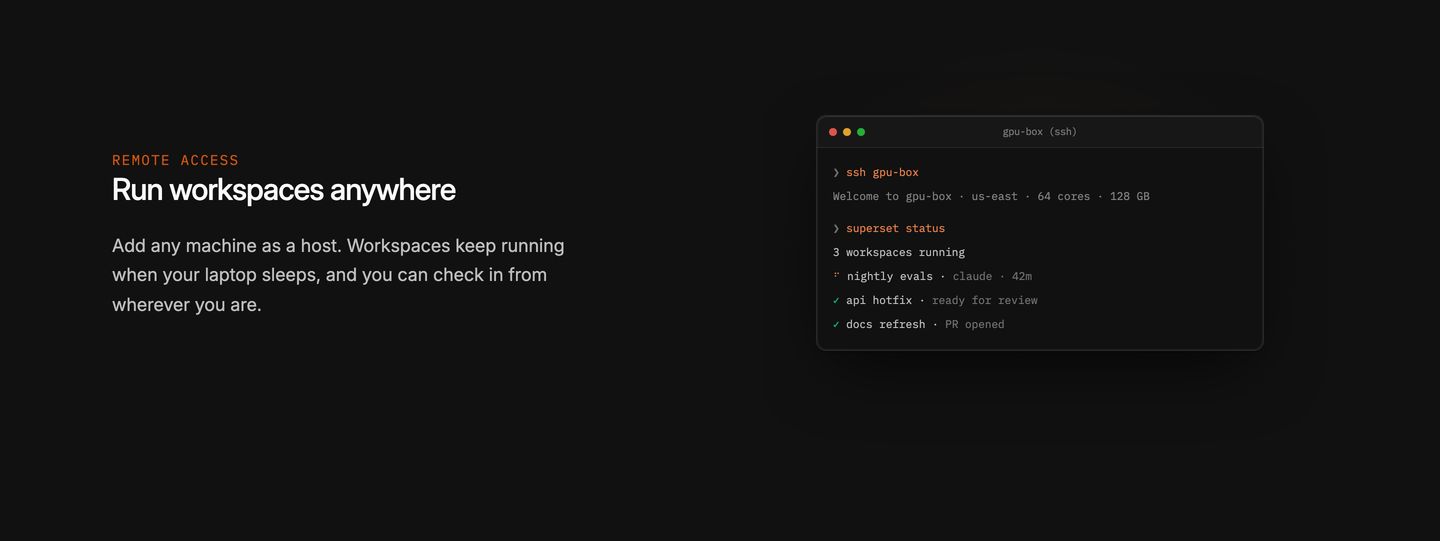
- 08
feature
A clean, dark developer feature section pairing a minimalist terminal mockup with restrained technical copy.
- Mood
- clinical + serene
- Layout
- 2 col · split · airy
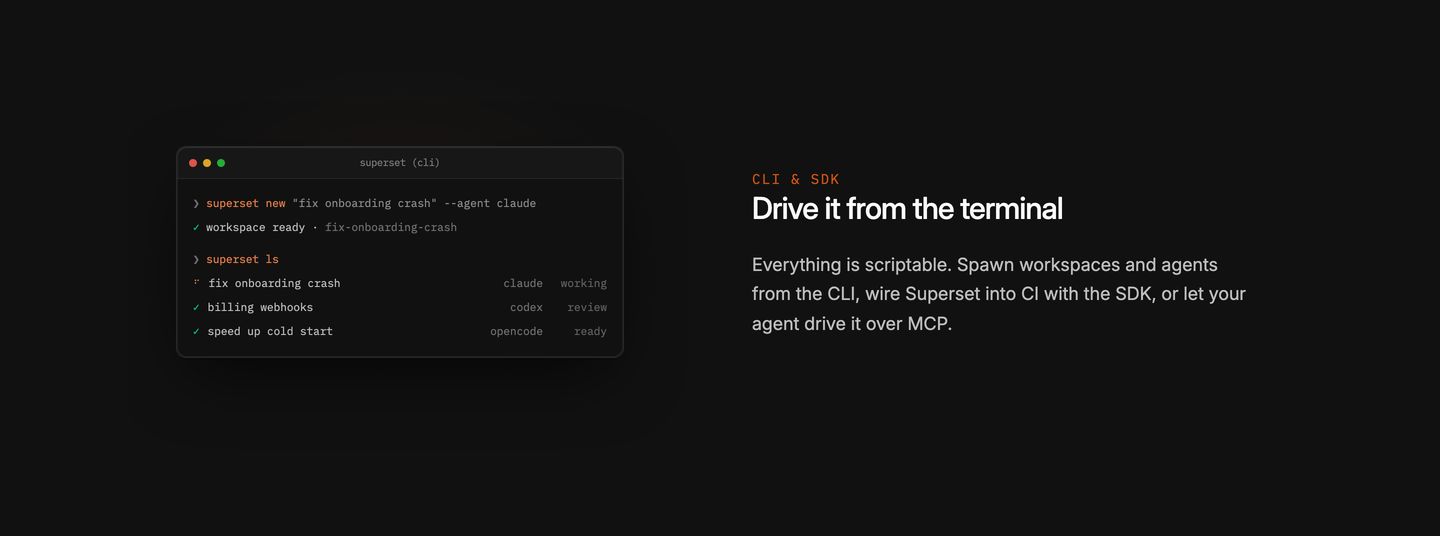
- 09
feature
Crisp and dark developer tool feature pairing minimal explanatory copy with a detailed floating IDE context menu mockup.
- Mood
- clinical + serene
- Layout
- 2 col · split · airy
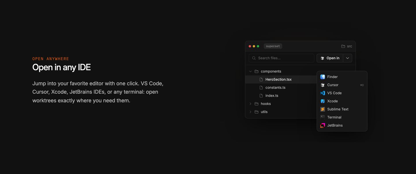
- 10
testimonial
Dense dark-mode testimonial grid presenting engineering endorsements in clean, subtly bordered cards.
- Mood
- serene
- Layout
- 3 col · grid · dense
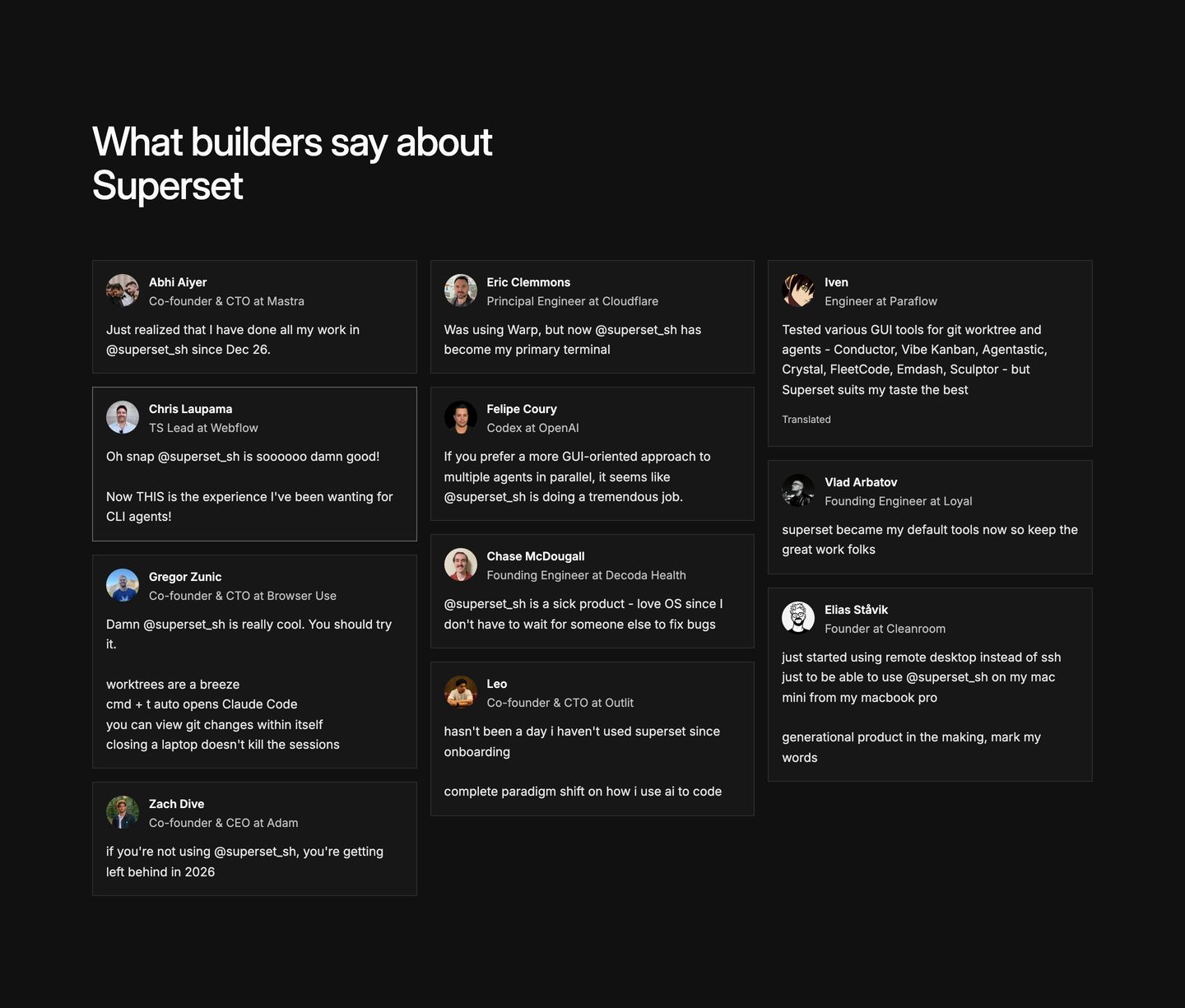
- 11
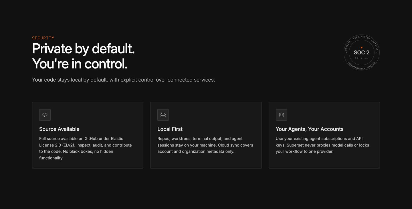
feature grid
Dark and structured security feature section communicating privacy through crisp typography, subdued card containers, and a formal compliance badge.
- Mood
- clinical
- Layout
- 3 col · stacked · balanced
- 12
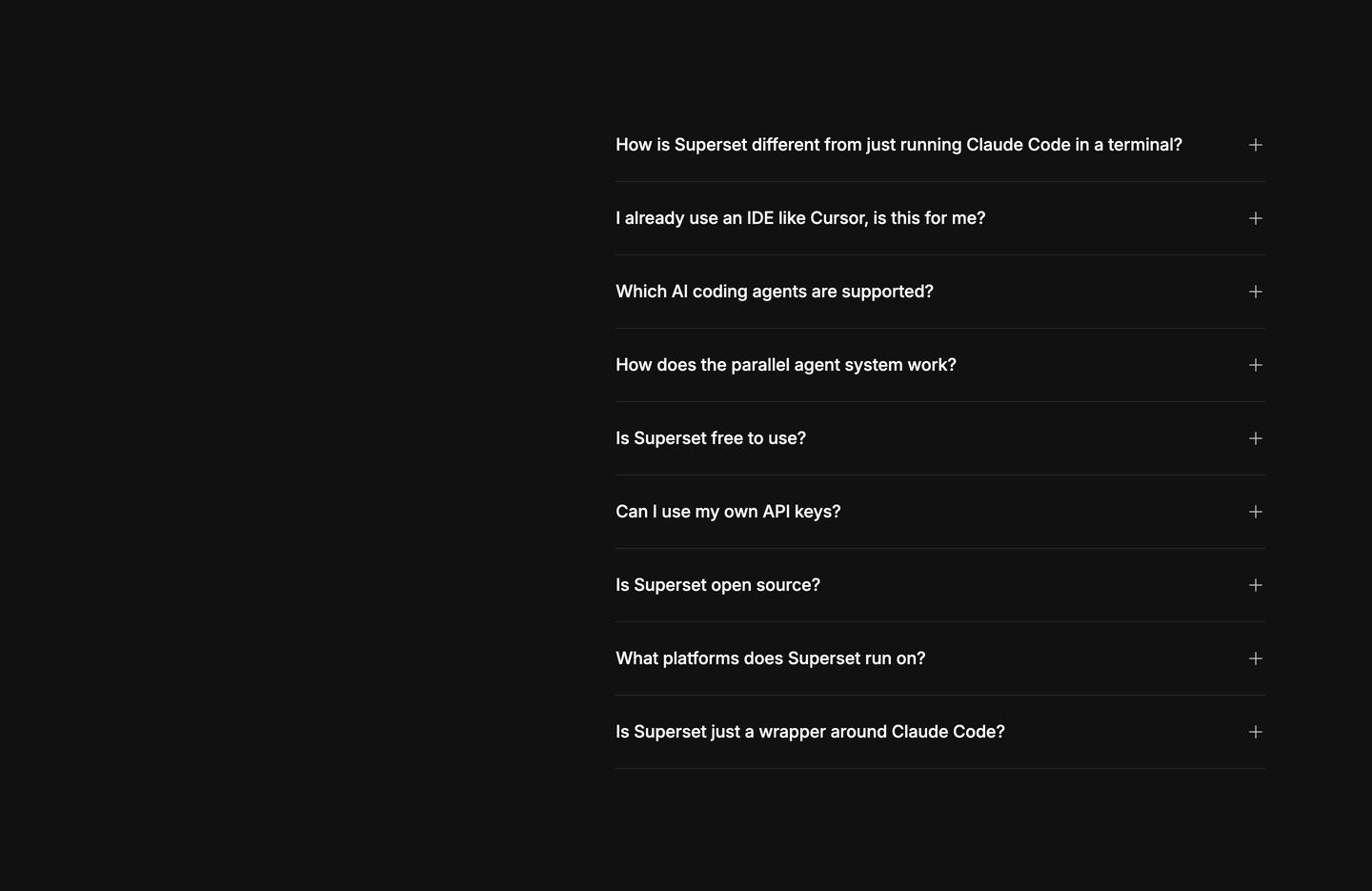
faq
StrongMinimalist dark accordion FAQ offset to the right with clean hairline dividers and quiet typography.
- Mood
- serene + clinical
- Layout
- 1 col · asymmetric · airy
- 13
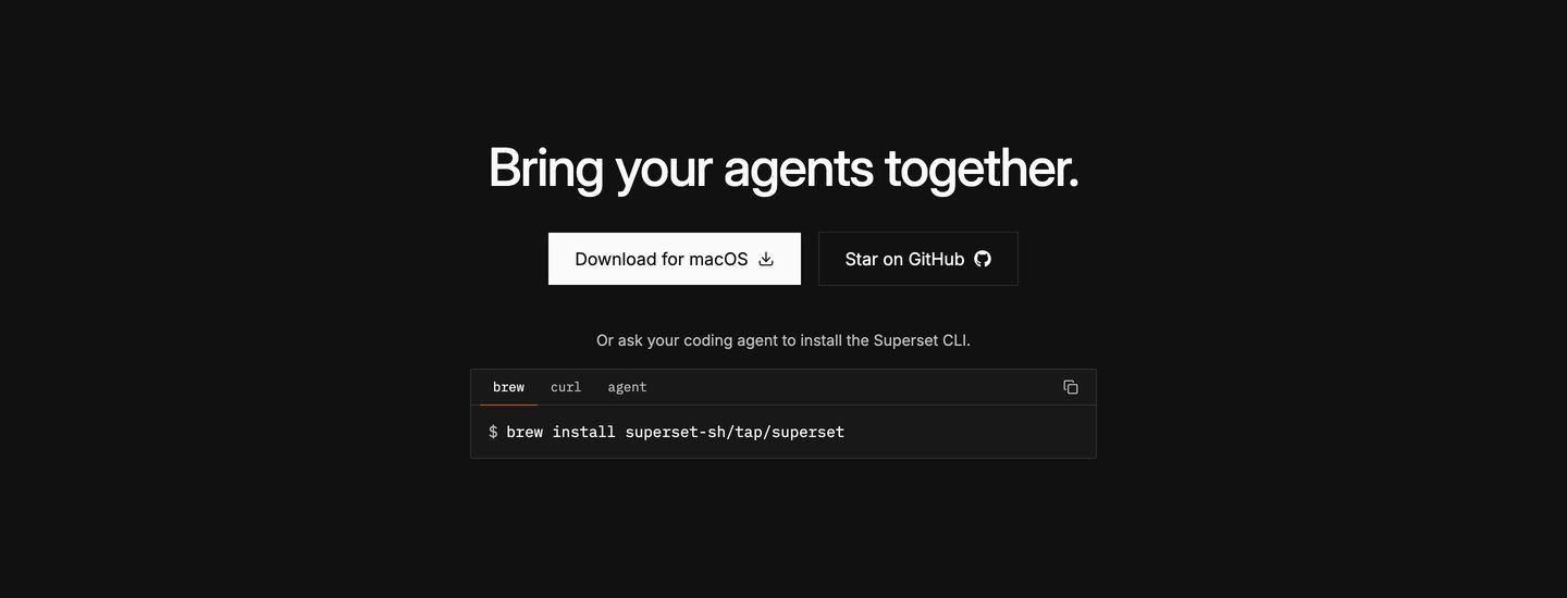
cta
A stark, minimalist dark-mode CTA band combining download action buttons with an interactive terminal snippet.
- Mood
- clinical + serene
- Layout
- 1 col · stacked · airy
- 14
footer
A stark, minimalist dark-mode developer tool footer with orderly multi-column navigation and prominent compliance trust badges.
- Mood
- clinical + serene
- Layout
- 5 col · split · airy