dhero studio
Immersive, nocturnal, and precision-engineered. Pitch-black backgrounds sprinkled with floating particles provide a cinematic atmosphere for crisp white grotesque typography and luminescent 3D shape accents. Card surfaces subtly emerge from the dark with refined hairlines and high-contrast metrics.
Take the vibe
Rated
6.4/ 10
From 10 analyzed sections. Two measured components and one judged by a model. Distinction is a rank within the library; the rest are scores in their own right.
- AI scorejudged
- 8.5
- Systemmeasured
- 6.2
- Distinctionmeasured
- 0.4
- on the grid
- 22%
- vertical rhythm
- 69%
- type on a scale
- 56%
- contrast passing AA
- 100%
- unlike the library
- 0.45
- model craft
- 7.5/10
- model deviation
- 3.2/10
Color
Background#0a0a0a
Text#ffffff
Accent#bde56c
Surface#191919
Muted#a3a3a3
Typefaces
- Display
- dhero
- Body
- dhero
- Mono
- —
- Source
- self_hosted
- Scale
- 14 · 16 · 17 · 18 · 31 · 42
Layout
- Grid
- 16 columns
- Container
- 1240px
- Spacing base
- 4px
- Radius
- 8px · 16px · 24px
Capture
- Category
- agency
- Sections
- 10
- Captured
- 2026-09-11
- Rhythm
- dark x11
Type rules
- display headlines use sentence case with tight tracking at -0.027em
- body text runs at 16px with line-height 1.5 and roughly 105 characters per line
- section badges and category tags must be set in uppercase tracked text
Color rules
- deep black #0a0a0a dominates the background with dark grey #191919 card surfaces
- luminous accents #bde56c and #d19dff appear only on 3D geometric icons, metric highlights, and pill borders
Voice rules
- lead with tangible deliverables over abstract theory
- use pill badges to contextualise sections before headlines
Holds it together
- float subtle square particle noise across the canvas to maintain atmospheric depth
- enclose category labels and section eyebrows in rounded pill tags with uppercase text
- give each service module its own distinct luminous 3D symbol and tinted surface backdrop
- style primary action buttons as high-contrast solid white pills
Contrast
text on background19.8:1 AAA
muted text on background7.8:1 AAA
text on surface17.6:1 AAA
muted text on surface7.0:1 AA
accent on background13.8:1 AAA
background on accent13.8:1 AAA
Type, measured
- Body
- 16px / 1.5
- Measure
- 105 characters
- Display
- 74px / 1
- Tracking
- -0.027em display
- Scale ratio
- 1.47
Voice
- Tone
- declarative, confident
- Sentences
- short
- Person
- first
- Vocabulary
- plain
- Calls to action
- get, see, send
Built with
- Builder
- —
- Framework
- —
- Motion
- lenis
- WebGL
- —
- Nav
- top_bar, 5 items
- Length
- 11.6 screens
Sections in page order
- 00
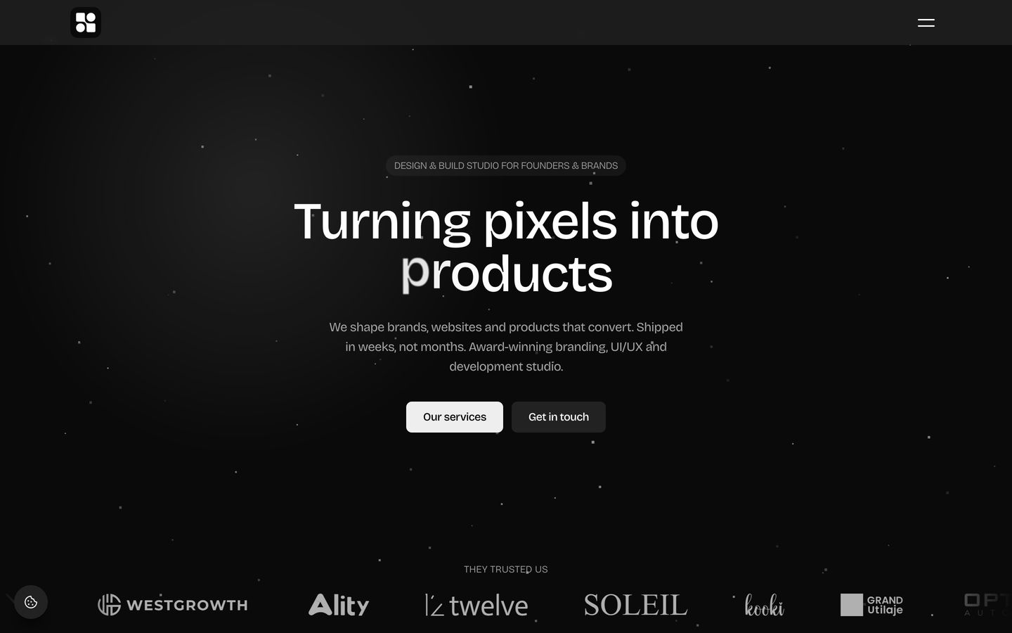
hero
Sleek dark studio hero with subtle particle ambience, centered headline typography, and an anchored client logo strip.
- Mood
- mysterious + ethereal
- Layout
- 1 col · centered · airy
- 01
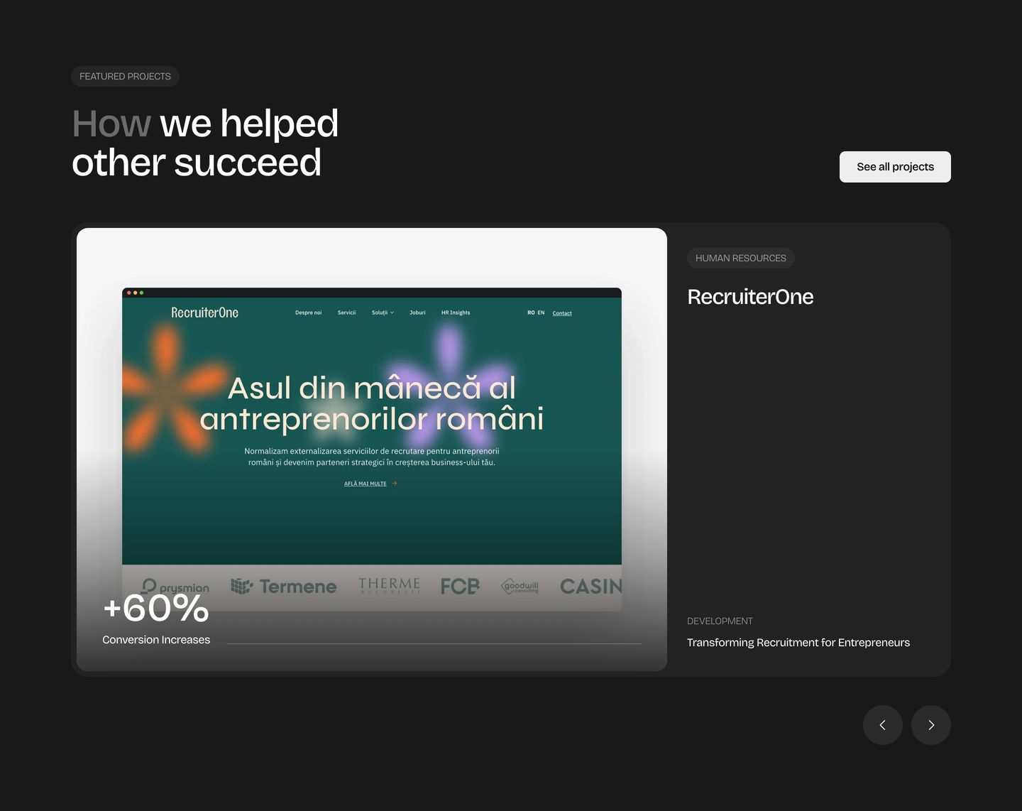
showcase
StrongPolished dark portfolio carousel presenting client work inside a rounded card with clear metric highlights.
- Mood
- luxurious + serene
- Layout
- 2 col · split · balanced
- 02
cta
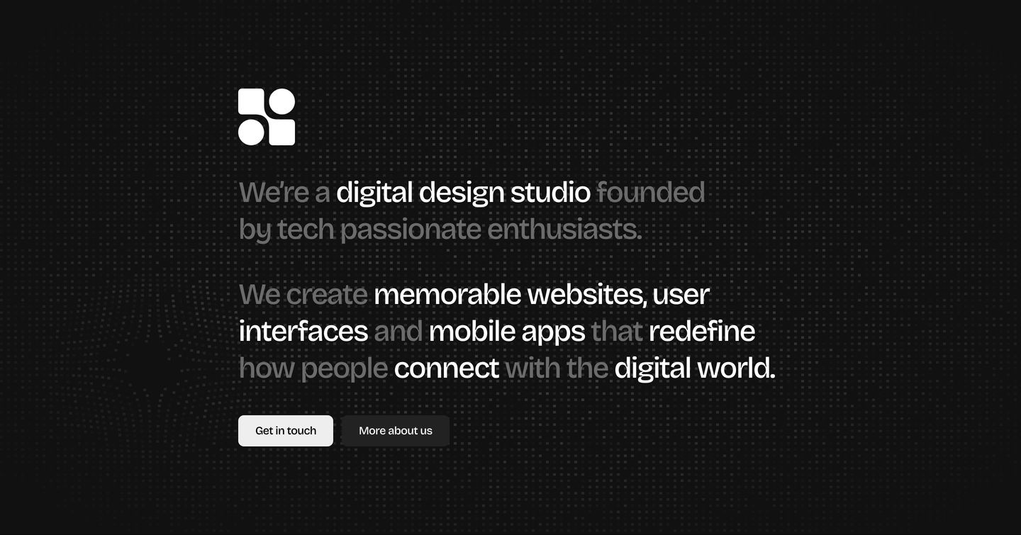
Minimal dark studio manifesto with selective word contrast over a textured dot grid.
- Mood
- mysterious + serene
- Layout
- 1 col · stacked · airy
- 03
feature grid
StrongSleek, dark agency service overview featuring stacked tinted cards anchored by luminous gradient emblems.
- Mood
- ethereal + serene
- Layout
- 1 col · stacked · balanced
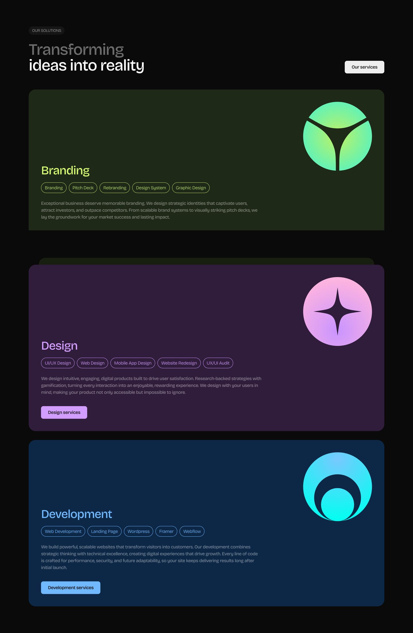
- 04
stats
Dark minimalist stats grid highlighting key performance metrics with bold oversized numerals and subtle glowing dot accents.
- Mood
- serene
- Layout
- 2 col · grid · airy
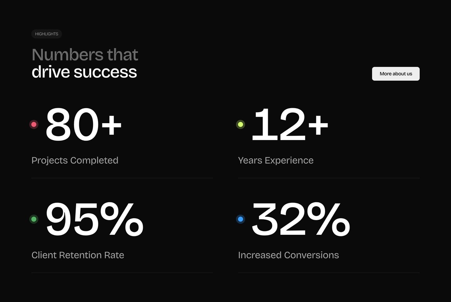
- 05
feature grid
Sleek dark feature grid with a high-contrast highlighted headline above a clean two-by-two arrangement of minimal icon-led cards.
- Mood
- luxurious + serene
- Layout
- 2 col · grid · airy
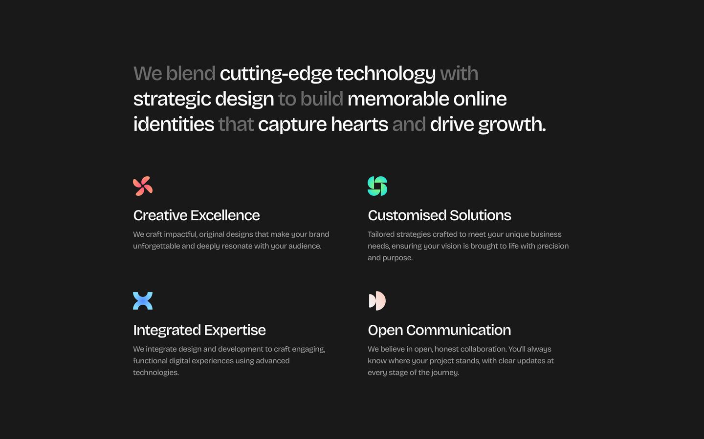
- 06
feature
A refined dark mode process carousel showcasing workflow steps with muted tonal contrast and glowing abstract geometry.
- Mood
- serene + luxurious
- Layout
- 2 col · split · airy
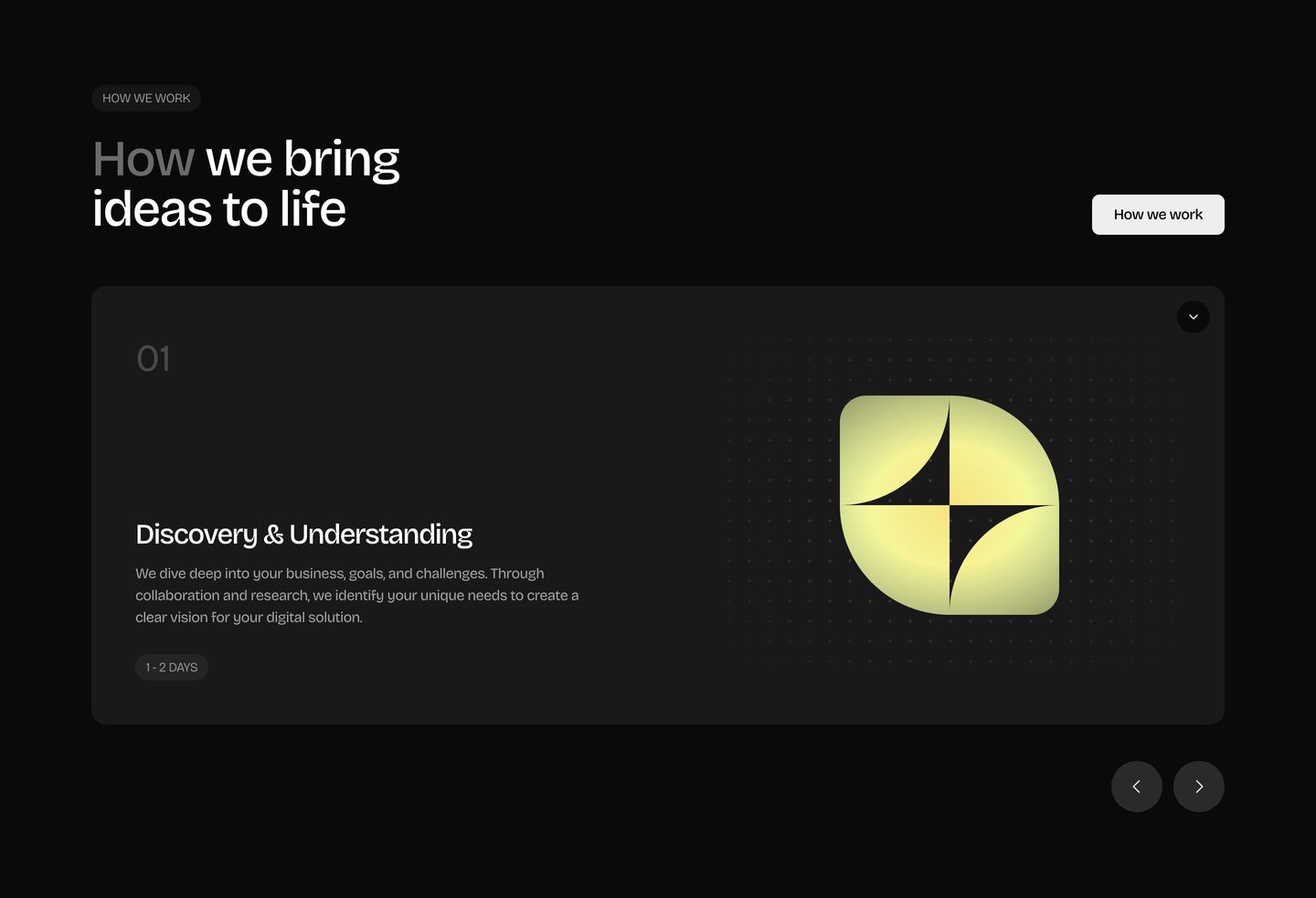
- 07
testimonial
Minimal dark testimonial section pairing a prominent left-hand title and CTA with stacked client feedback cards on the right.
- Mood
- serene
- Layout
- 2 col · split · airy
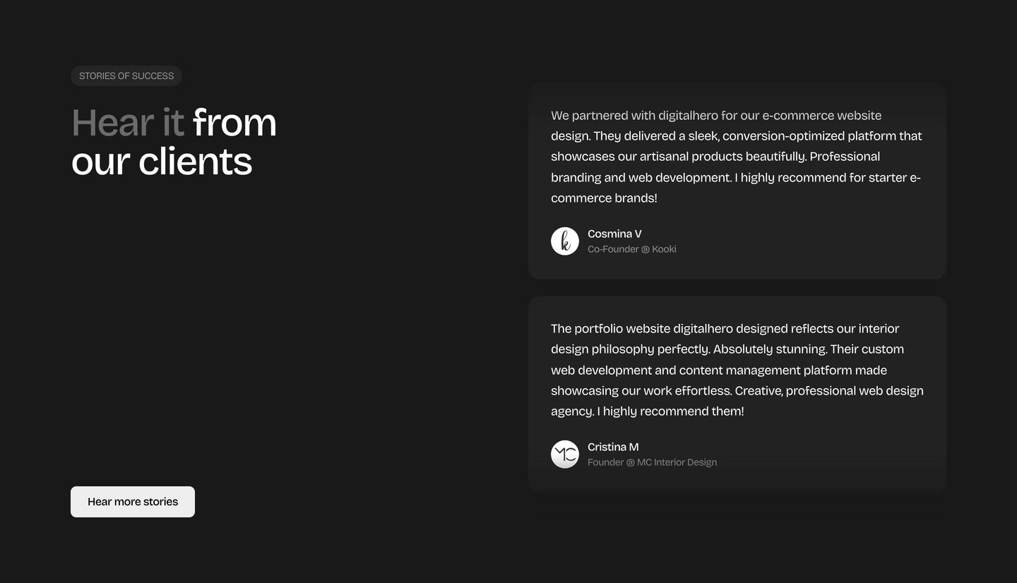
- 08
cta
Disciplined dark contact section featuring a centered form card with restrained monochrome typography.
- Mood
- serene
- Layout
- 1 col · centered · balanced
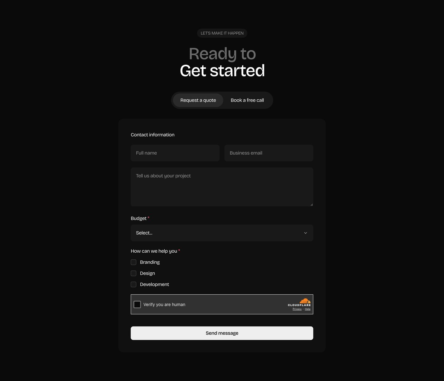
- 09
footer
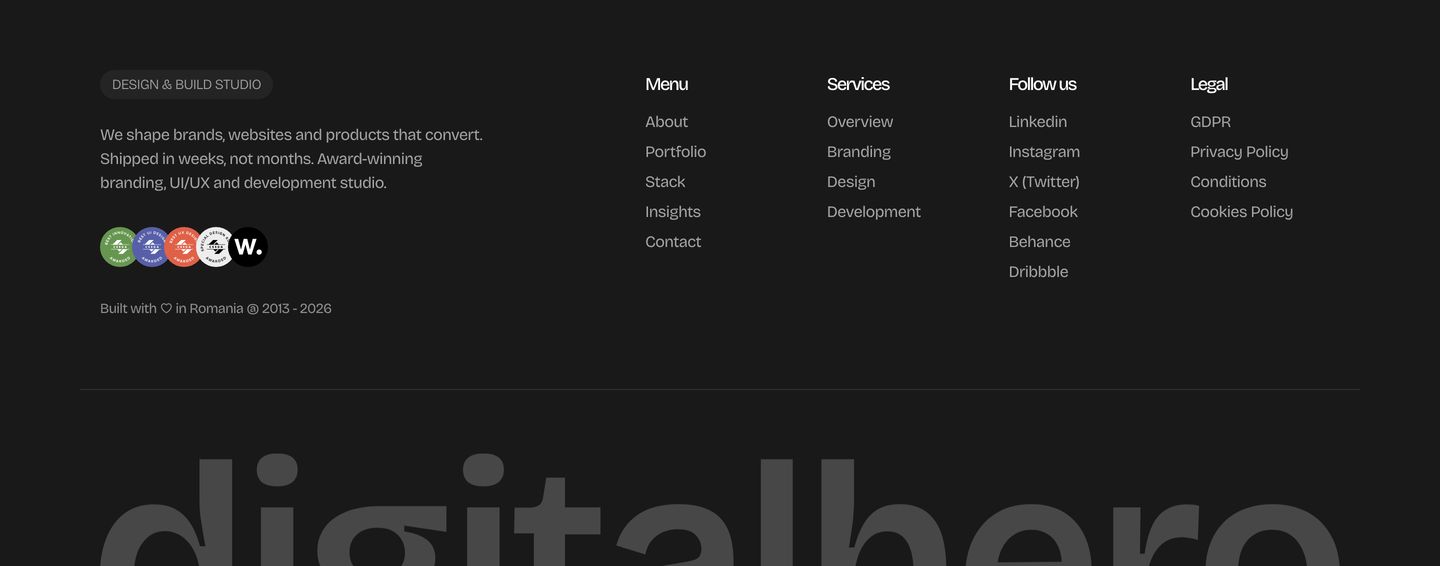
StrongA polished dark agency footer with clean multi-column navigation, subtle trust badges, and an oversized cropped watermark.
- Mood
- serene + luxurious
- Layout
- 5 col · grid · balanced