123done
Sleek and restrained dark-mode utility for digital creators. Deep obsidian surfaces with subtle hairline-bordered cards let isometric UI kit previews take center stage. Electric blue accents sparingly punctuate an otherwise disciplined monochrome workspace.
Take the vibe
Rated
6.3/ 10
From 5 analyzed sections. Two measured components and one judged by a model. Distinction is a rank within the library; the rest are scores in their own right.
- AI scorejudged
- 7.9
- Systemmeasured
- 4.3
- Distinctionmeasured
- 7.2
- on the grid
- 0%
- vertical rhythm
- 73%
- type on a scale
- 67%
- contrast passing AA
- 33%
- unlike the library
- 1.00
- model craft
- 7.2/10
- model deviation
- 2.4/10
Color
Background#0b0b0f
Text#ffffff
Accent#3259e8
Surface#12131a
Muted#696c80
Typefaces
- Display
- Manrope
- Body
- Manrope
- Mono
- Roboto Mono
- Source
- self_hosted
- Scale
- 13 · 15 · 17 · 21 · 24 · 54
Layout
- Grid
- —
- Container
- —
- Spacing base
- 8px
- Radius
- 8px · 12px
Capture
- Category
- tools
- Sections
- 5
- Captured
- 2026-09-15
- Rhythm
- dark x5
Type rules
- display headlines set in Manrope sentence case at 54px
- section category headers and metadata use uppercase Roboto Mono
- body text measures to approximately 57 characters per line
Color rules
- deep obsidian background #0b0b0f paired with elevated #12131a card surfaces
- subtle #252833 hairline borders define all interactive card perimeters
- electric blue #3259e8 is strictly confined to discount tags and primary badges
Voice rules
- section headers in uppercase mono
- short one-sentence value propositions
Holds it together
- enclose every featured product and directory item in a #12131a surface card with 1px #252833 borders
- use uppercase mono type for section eyebrow dividers and quantity counters
- confine saturated blue accenting to high-priority sale pills and primary focal points
Contrast
text on background19.6:1 AAA
muted text on background3.8:1 AA Large
text on surface18.5:1 AAA
muted text on surface3.6:1 AA Large
accent on background3.5:1 AA Large
background on accent3.5:1 AA Large
Type, measured
- Body
- 21px / 1.36
- Measure
- 57 characters
- Display
- 54px / 1.2
- Tracking
- 0em display
- Scale ratio
- 1.27
Voice
- Tone
- declarative, concise
- Sentences
- short
- Person
- second
- Vocabulary
- technical
- Calls to action
- view, save, boost
Built with
- Builder
- —
- Framework
- nuxt
- Motion
- —
- WebGL
- —
- Nav
- top_bar, 7 items
- Length
- 2.6 screens
Sections in page order
- 00
hero
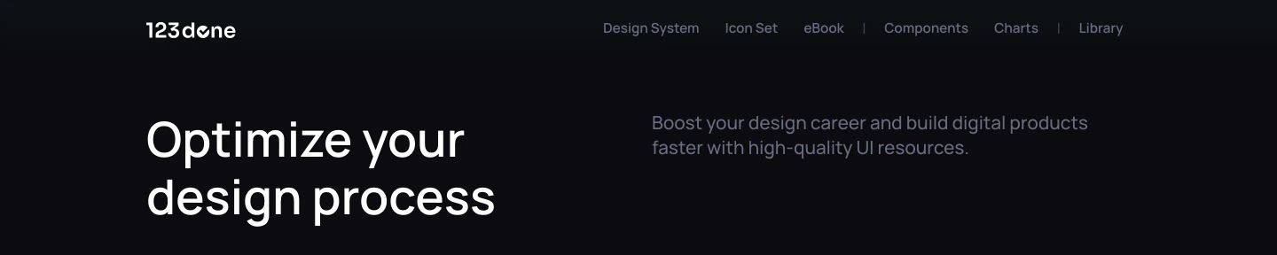
StrongA restrained dark header and opening headline pairing crisp white typography with spacious, quiet minimalism.
- Mood
- serene + clinical
- Layout
- 2 col · split · airy
- 01
showcase
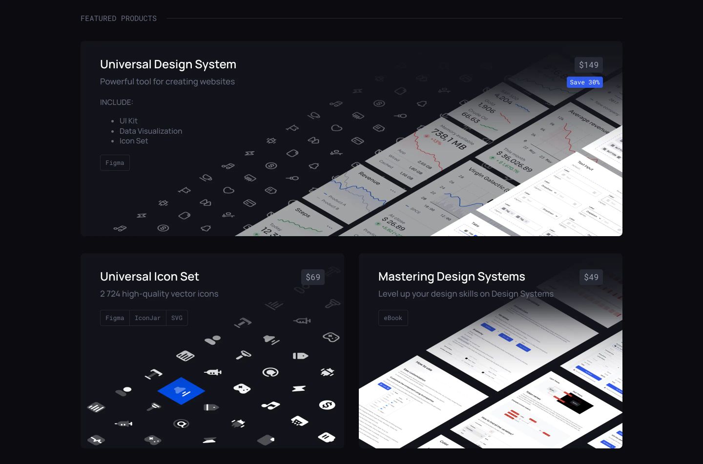
StrongA precision-crafted dark showcase featuring isometric design assets and UI templates organized in structured product cards.
- Mood
- clinical
- Layout
- 2 col · grid · balanced
- 02
feature grid
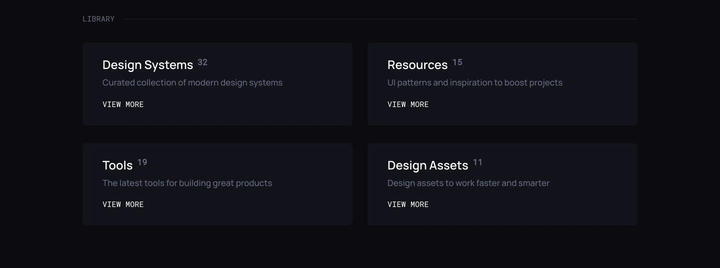
StrongSubtle dark mode category cards presenting component counts with precise typographic hierarchy and muted slate styling.
- Mood
- clinical
- Layout
- 2 col · grid · balanced

- 03
feature grid
A quiet, dark-mode directory grid indexing design resources with subtle cards and monospace accents.
- Mood
- serene
- Layout
- 2 col · grid · balanced
- 04
footer
A crisp, dark-mode footer organized into balanced columns of categorized links with quiet, understated typography.
- Mood
- serene
- Layout
- 6 col · grid · balanced