Carbon
Sleek and structured technical SaaS presentation. Deep obsidian backgrounds with subtle background gridlines give an aura of precision, while electric blue CTA pills create instant interactive focus.
Take the vibe
Rated
6.6/ 10
From 16 analyzed sections. Two measured components and one judged by a model. Distinction is a rank within the library; the rest are scores in their own right.
- AI scorejudged
- 7.1
- Systemmeasured
- 5.9
- Distinctionmeasured
- 6.9
- on the grid
- 0%
- vertical rhythm
- 85%
- type on a scale
- 83%
- contrast passing AA
- 67%
- unlike the library
- 0.96
- model craft
- 6.8/10
- model deviation
- 2.3/10
Color
Background#040507
Text#ffffff
Accent#0066ff
Surface#0c0d0f
Muted#a6a6a6
Typefaces
- Display
- Inter
- Body
- Inter
- Mono
- —
- Source
- self_hosted
- Scale
- 14 · 16 · 18 · 32 · 42 · 64
Layout
- Grid
- —
- Container
- —
- Spacing base
- 4px
- Radius
- 8px · 12px · 16px
Capture
- Category
- saas
- Sections
- 16
- Captured
- 2026-09-12
- Rhythm
- dark x16
Type rules
- display headlines set in sentence case with tight negative tracking (-0.031em)
- body text set at 16px in muted grey (#a6a6a6) with 1.63 line height
Color rules
- electric blue (#0066ff) reserved exclusively for primary CTA buttons and active states
- backgrounds strictly layered in dark neutral tones (#040507, #0c0d0f, #202229)
Voice rules
- start major headlines with action verbs
- keep descriptive subheadings to two concise lines
Holds it together
- use electric blue (#0066ff) exclusively on the single primary action per viewport
- place uppercase tracked eyebrow labels directly above main section titles
- frame product mockups inside dark rounded container cards with hairline borders
Contrast
text on background20.4:1 AAA
muted text on background8.4:1 AAA
text on surface19.4:1 AAA
muted text on surface8.0:1 AAA
accent on background4.2:1 AA Large
background on accent4.2:1 AA Large
Type, measured
- Body
- 16px / 1.63
- Measure
- 93 characters
- Display
- 64px / 1.13
- Tracking
- -0.031em display
- Scale ratio
- 1.41
Voice
- Tone
- direct, efficient, modern
- Sentences
- short
- Person
- second
- Vocabulary
- plain
- Calls to action
- get started, learn more, watch video
Built with
- Builder
- framer
- Framework
- —
- Motion
- —
- WebGL
- —
- Nav
- top_bar, 5 items
- Length
- 14.4 screens
Sections in page order
- 00
hero
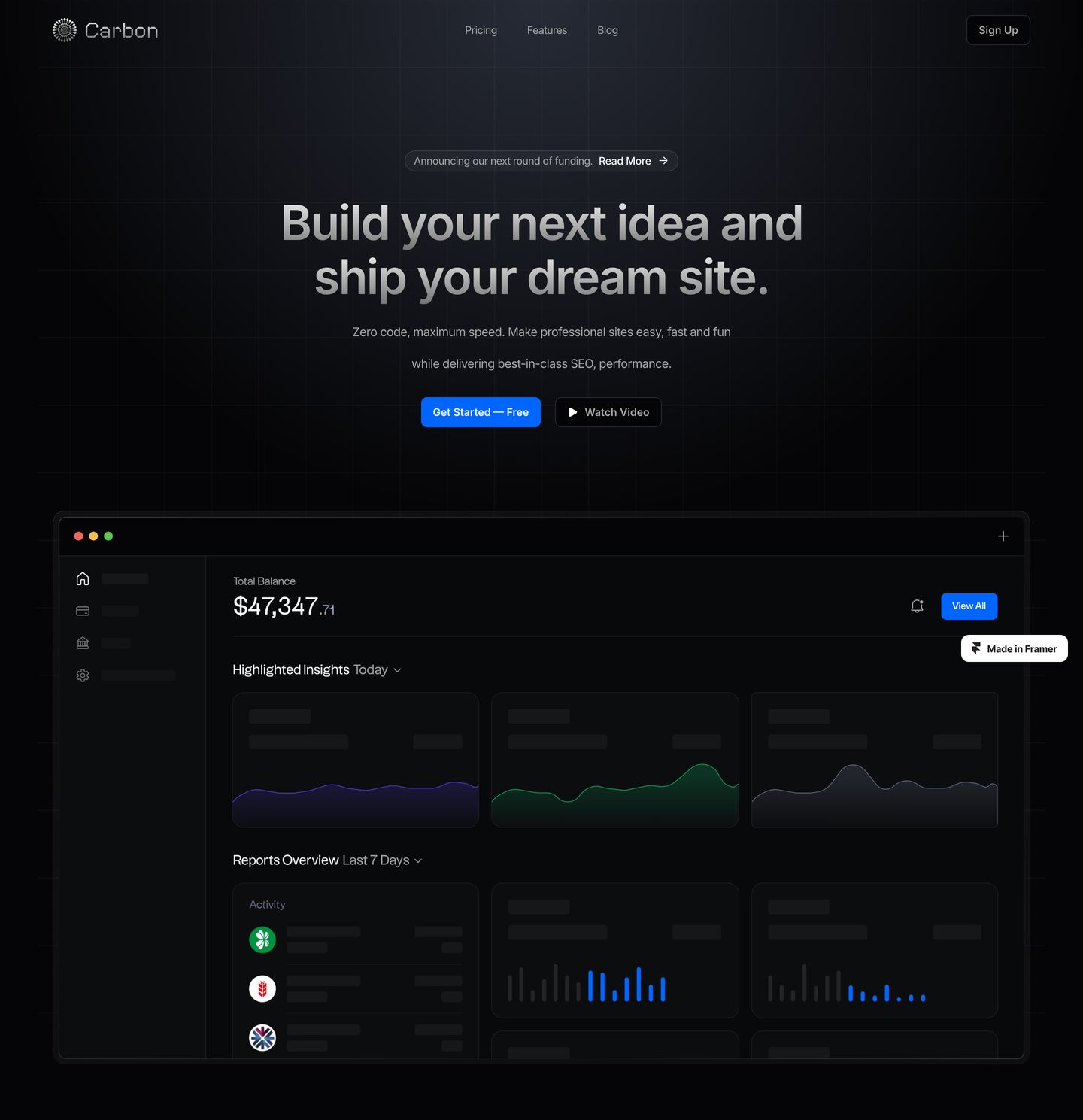
A sleek, dark SaaS hero featuring crisp typography over a subtle background grid, anchored by a detailed product dashboard preview below.
- Mood
- clinical + serene
- Layout
- 1 col · stacked · balanced
- 01
logo bar
Subdued dark logo strip featuring widely spaced uppercase micro-copy above a horizontal row of muted monochrome marks.
- Mood
- serene
- Layout
- 8 col · stacked · airy

- 02
feature
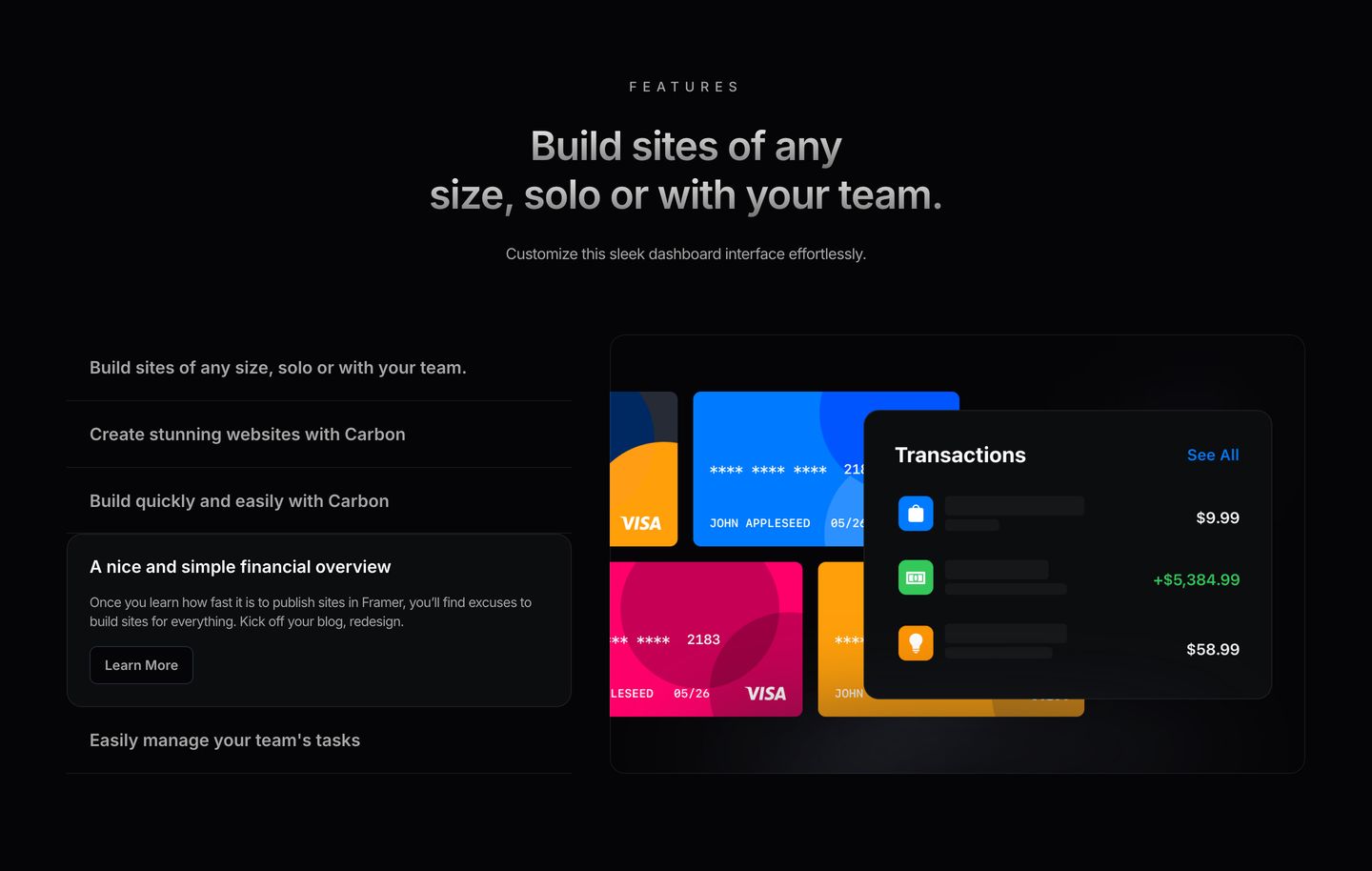
Sleek dark-mode feature section pairing vertical expandable text tabs with layered financial dashboard mockups.
- Mood
- clinical
- Layout
- 2 col · split · balanced
- 03
feature
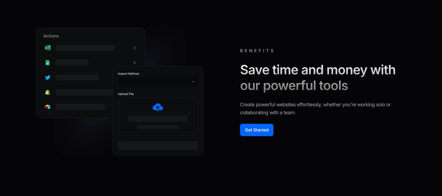
Sleek dark-mode feature section pairing layered UI component mockups with clean benefit-driven copy and an electric blue CTA.
- Mood
- clinical + serene
- Layout
- 2 col · split · balanced
- 04
feature
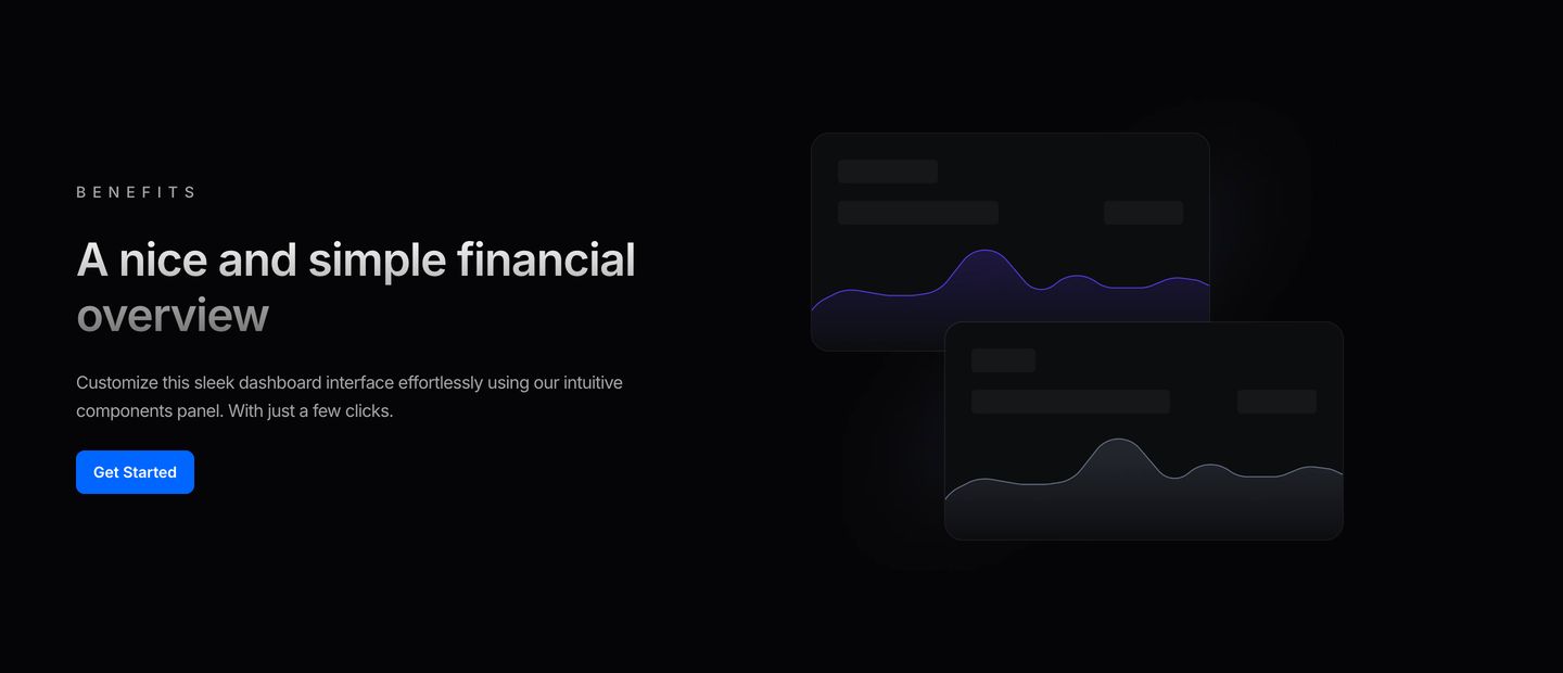
StrongMinimalist dark fintech feature split cleanly between concise value copy and layered wave-chart UI mockups.
- Mood
- serene + clinical
- Layout
- 2 col · split · airy
- 05
feature
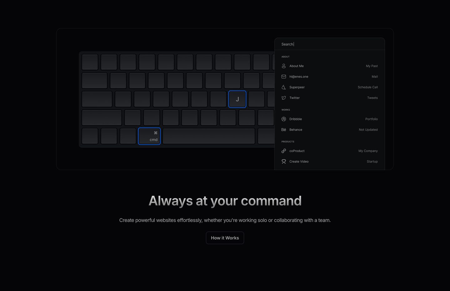
StrongA dark, sleek product feature spotlighting a tactile keyboard command palette with subtle glowing blue keycaps and crisp centered copy.
- Mood
- serene + mysterious
- Layout
- 1 col · stacked · airy
- 06
feature grid
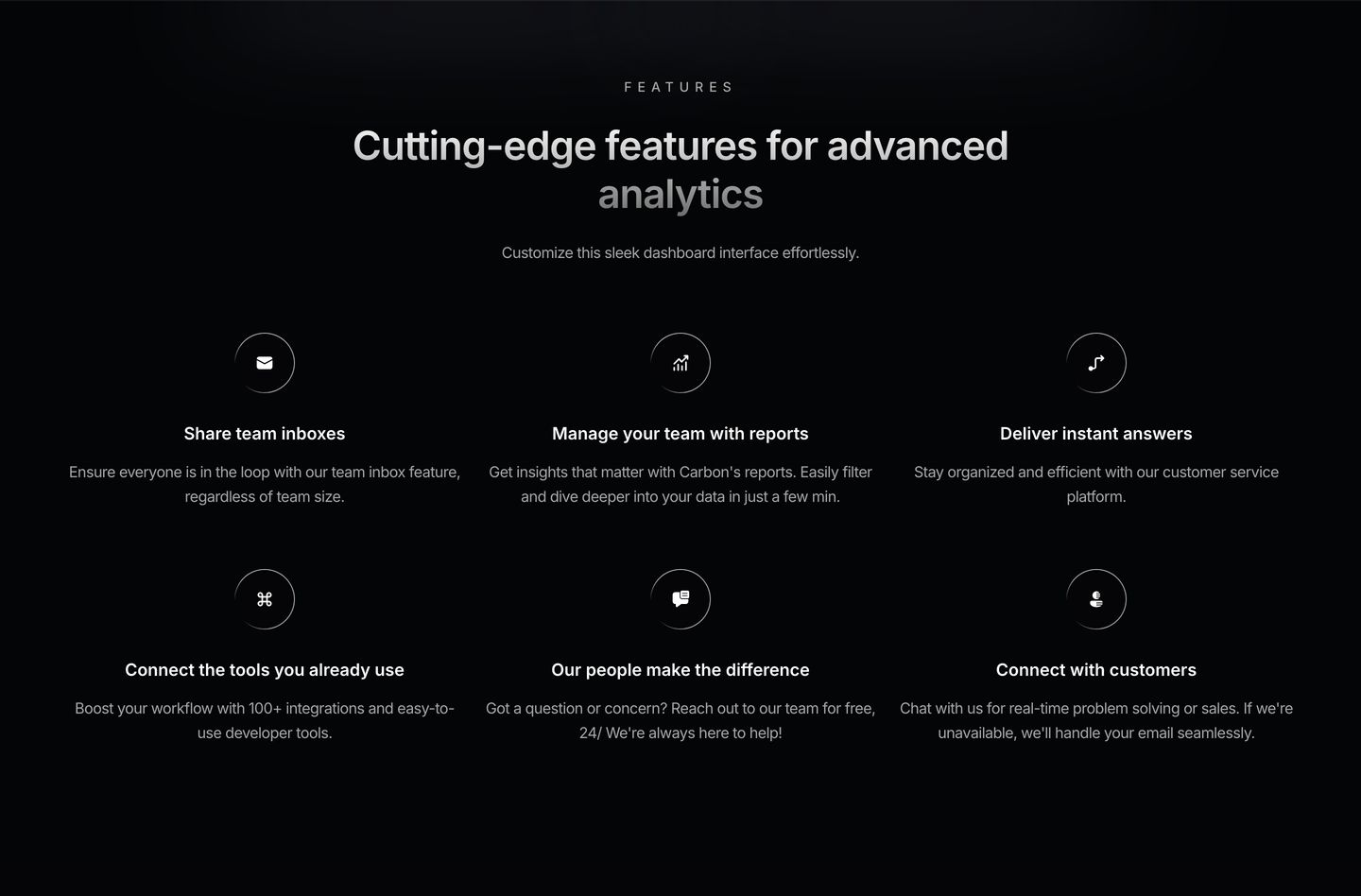
A dark-mode feature grid presenting product capabilities through centered circular icon badges and disciplined typography.
- Mood
- clinical + serene
- Layout
- 3 col · grid · balanced
- 07
cta
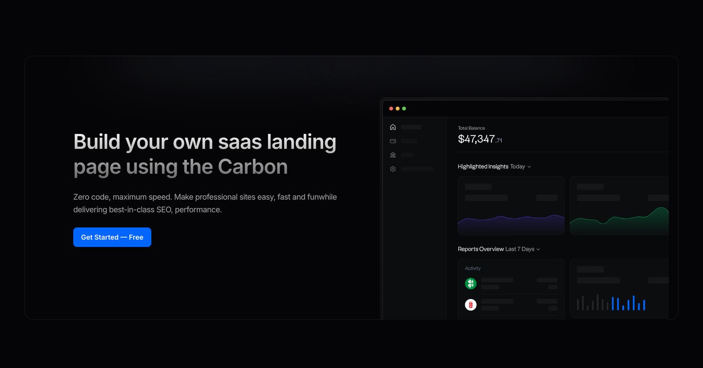
StrongA sleek dark-mode split section highlighting a product dashboard preview alongside a clear call to action.
- Mood
- clinical + serene
- Layout
- 2 col · split · balanced
- 08
feature
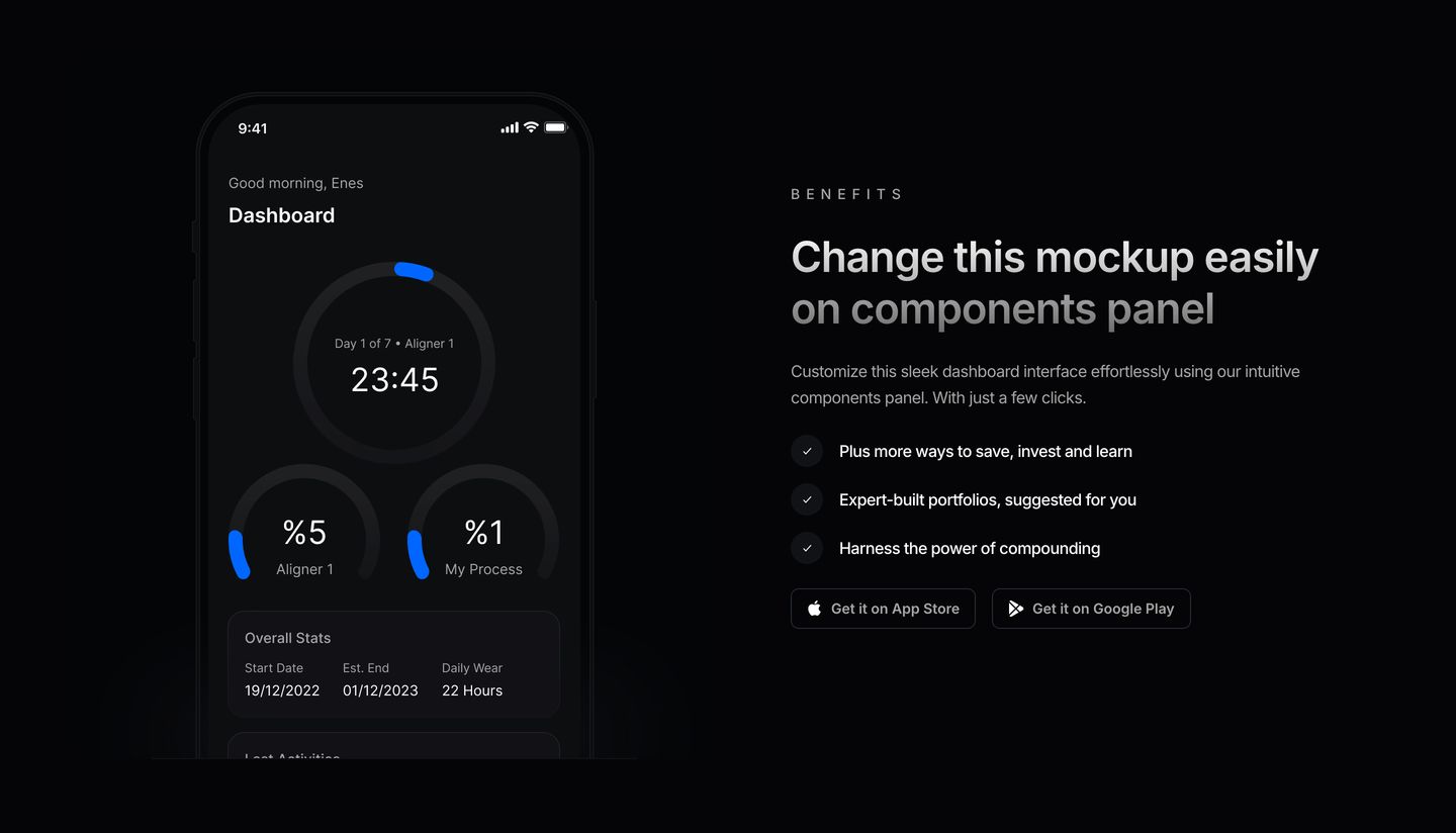
Sleek dark-mode feature band pairing a mobile dashboard mockup with bulleted product benefits and app store download links.
- Mood
- clinical + serene
- Layout
- 2 col · split · balanced
- 09
feature
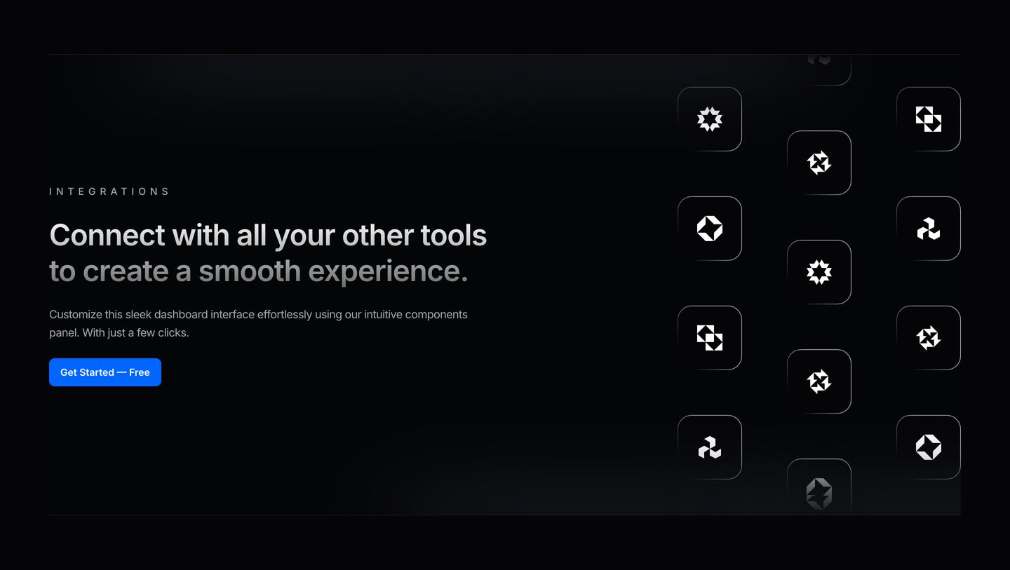
A dark, sleek integrations feature band pairing left-aligned copy with an elegant cascading grid of glowing monochrome icon tiles.
- Mood
- serene + mysterious
- Layout
- 2 col · split · balanced
- 10
testimonial
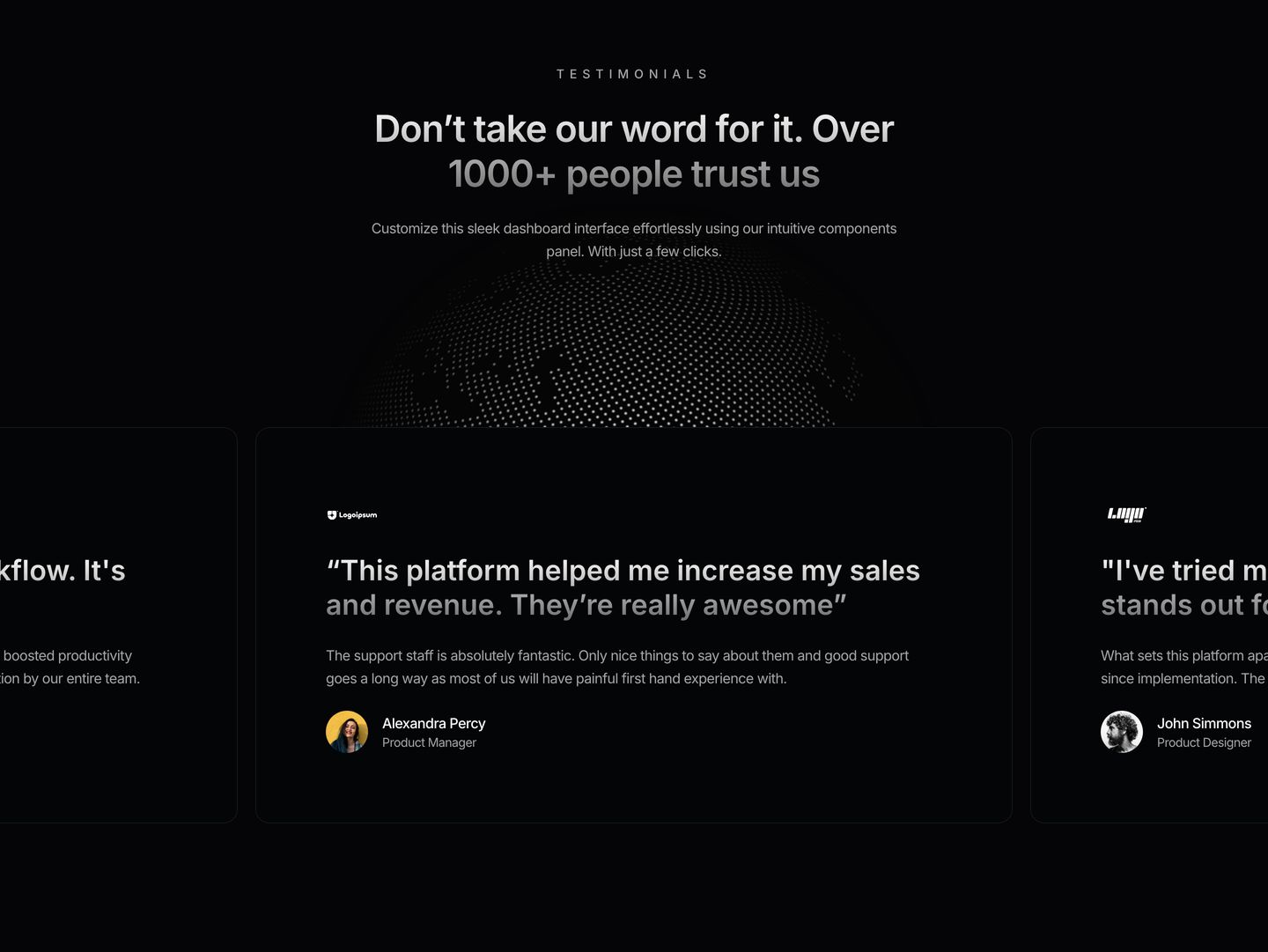
Dark and measured SaaS testimonial section featuring a subtle wireframe globe backdrop and rounded customer review cards.
- Mood
- serene
- Layout
- 3 col · stacked · balanced
- 11
pricing
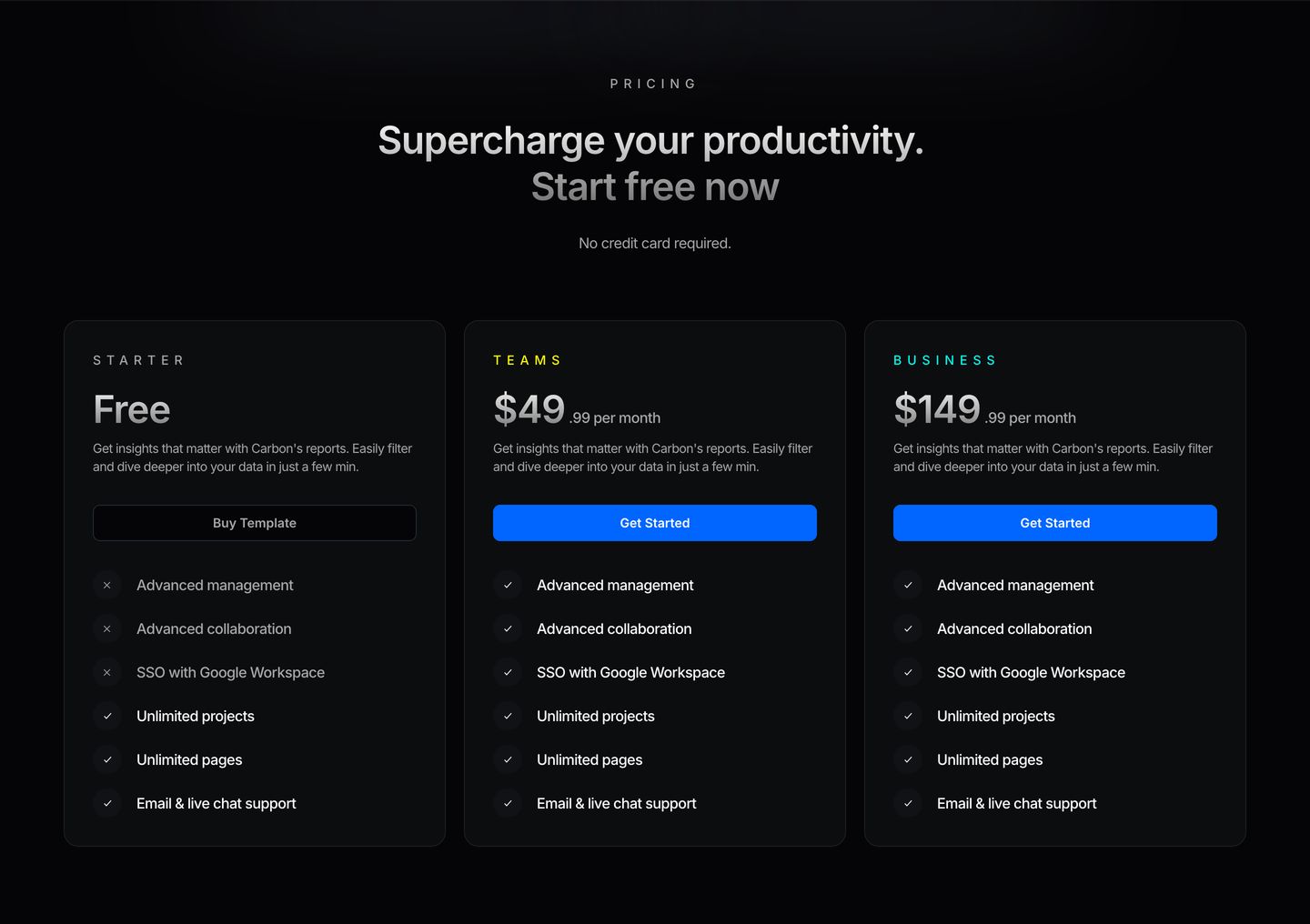
A disciplined dark-mode pricing table featuring three tiered cards with high-contrast typography and glowing electric blue call-to-action buttons.
- Mood
- clinical + serene
- Layout
- 3 col · grid · balanced
- 12
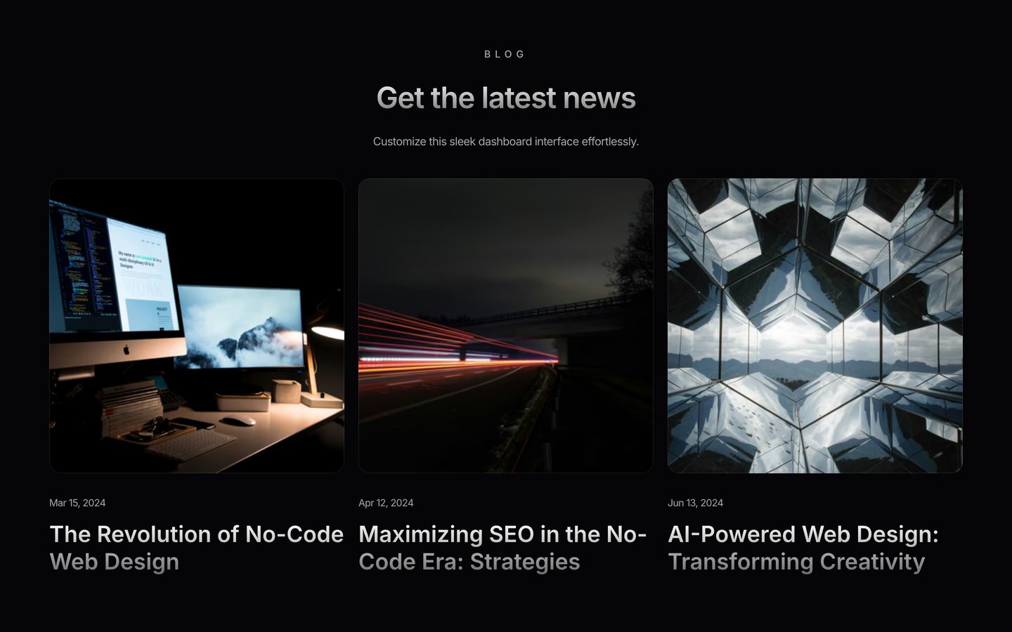
showcase
Clean dark-mode blog grid showcasing three recent articles with sleek rounded thumbnails and muted typography.
- Mood
- serene
- Layout
- 3 col · grid · balanced
- 13
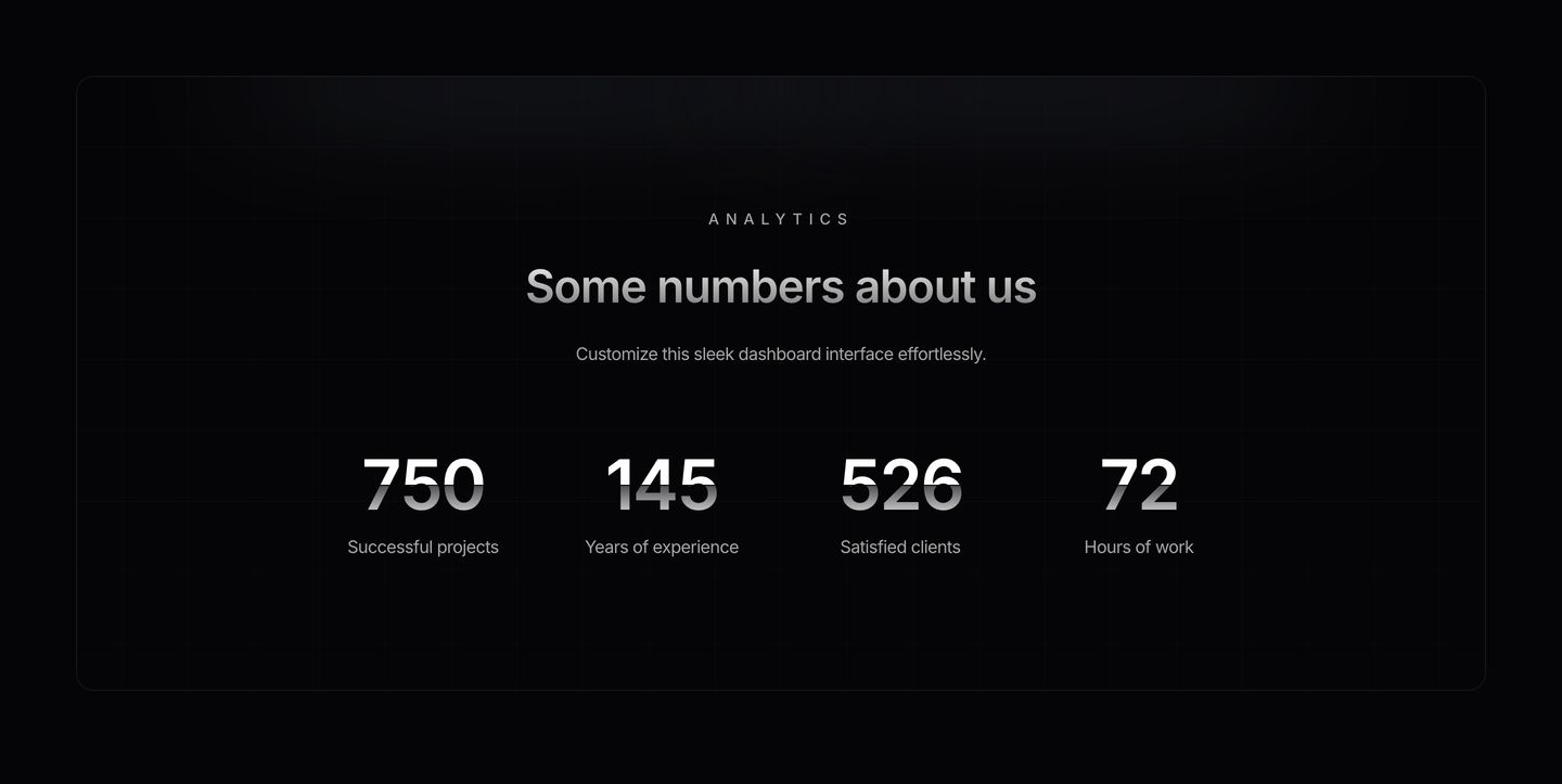
stats
Sleek, dark-mode metrics panel displaying four key statistics with subtle glossy gradient numerals inside a rounded container.
- Mood
- clinical + serene
- Layout
- 4 col · centered · airy
- 14
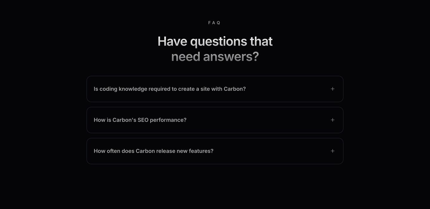
faq
A minimal dark FAQ section with a centered title and rounded accordion pills floating against deep black.
- Mood
- serene
- Layout
- 1 col · centered · airy
- 15
footer
Quiet, pitch-black footer organized into clean, spaced-out typographic columns and understated corporate attribution.
- Mood
- serene + clinical
- Layout
- 5 col · grid · airy