
Kikxle
A clean and reassuring designer portfolio structured over deep navy-black backdrops. Warm amber accents elevate primary headlines and branding, while bright white card containers create sharp focus on featured case studies.
Take the vibe
Rated
6.4/ 10
From 5 analyzed sections. Two measured components and one judged by a model. Distinction is a rank within the library; the rest are scores in their own right.
- AI scorejudged
- 6.0
- Systemmeasured
- 6.2
- Distinctionmeasured
- 8.2
- on the grid
- 0%
- vertical rhythm
- 80%
- type on a scale
- 67%
- contrast passing AA
- 100%
- unlike the library
- 1.12
- model craft
- 6.0/10
- model deviation
- 2.6/10
Color
Background#0b0d12
Text#ffffff
Accent#ffa621
Surface#12141c
Muted#abb0b5
Typefaces
- Display
- Messapia
- Body
- Open Sans
- Mono
- —
- Source
- self_hosted
- Scale
- 14 · 16 · 18 · 20 · 21 · 24
Layout
- Grid
- —
- Container
- —
- Spacing base
- 4px
- Radius
- 8px · 12px
Capture
- Category
- portfolio
- Sections
- 5
- Captured
- 2026-09-15
- Rhythm
- dark x7
Type rules
- display headline pairs warm amber with crisp white at 36px with tight line height
- body text measures at approximately 77 characters with comfortable 1.5 line height
Color rules
- warm amber accent is applied strictly to primary identity headlines and focal highlights
- high-contrast white container panels isolate project case studies from the dark background
Voice rules
- lead with clear first-person value statements
- keep action triggers polite and conversational
Holds it together
- reserve the amber accent for core headline emphasis and brand mark details
- frame primary work case studies in high-contrast white cards
- keep supporting skills and tool clusters within low-contrast dark container pills
Contrast
text on background19.4:1 AAA
muted text on background8.9:1 AAA
text on surface18.4:1 AAA
muted text on surface8.4:1 AAA
accent on background9.9:1 AAA
background on accent9.9:1 AAA
Type, measured
- Body
- 21px / 1.5
- Measure
- 77 characters
- Display
- 36px / 0.89
- Tracking
- 0em display
- Scale ratio
- 1.14
Voice
- Tone
- approachable, confident
- Sentences
- short
- Person
- first
- Vocabulary
- plain
- Calls to action
- chat, make enquiry
Built with
- Builder
- —
- Framework
- gatsby
- Motion
- —
- WebGL
- —
- Nav
- top_bar, 8 items
- Length
- 3.7 screens
Sections in page order
- 00
hero
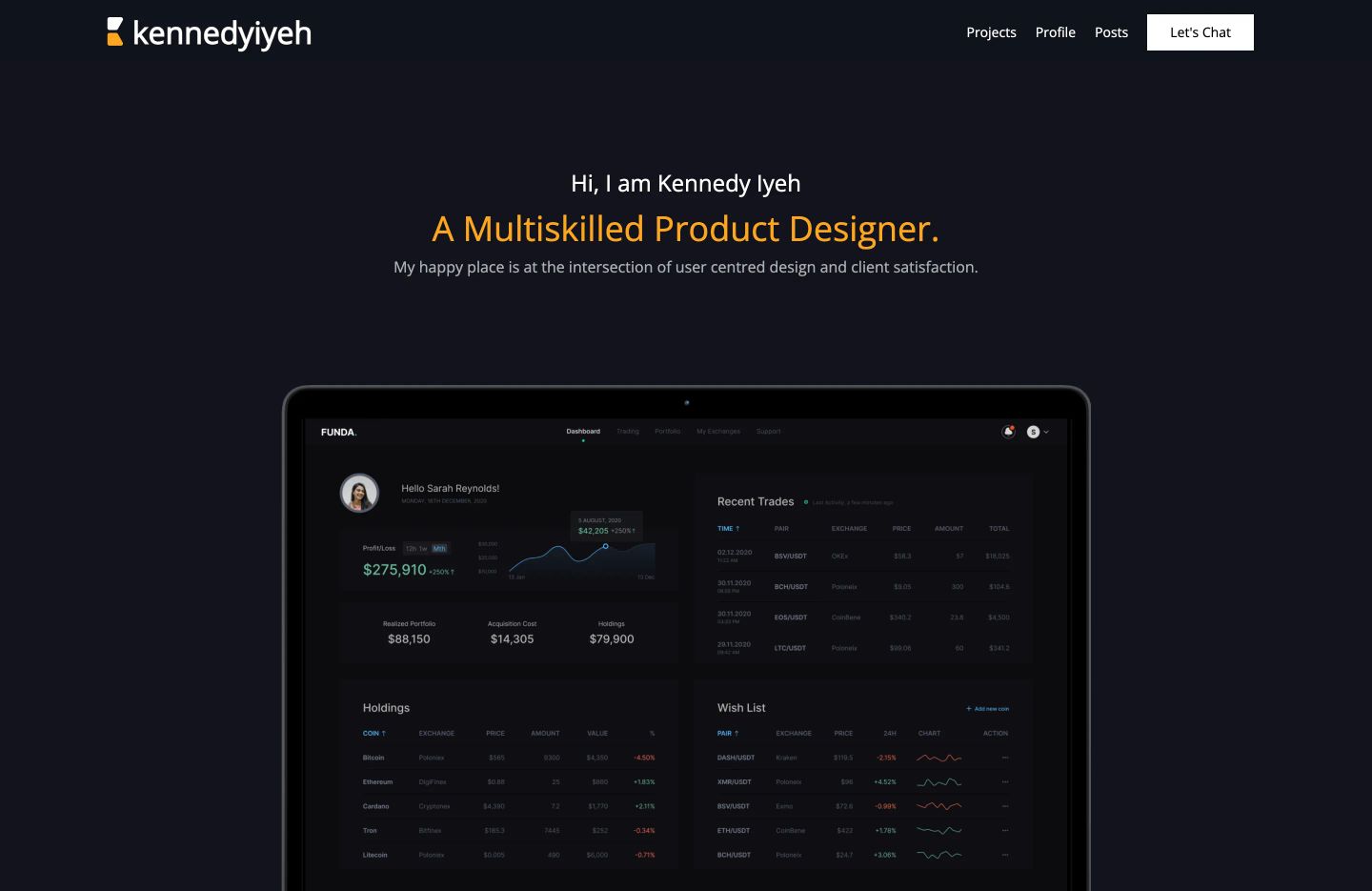
StrongQuiet, dark minimalist portfolio hero featuring centered introductory text over an anchored tablet UI preview.
- Mood
- serene
- Layout
- 1 col · stacked · airy
- 01
feature grid
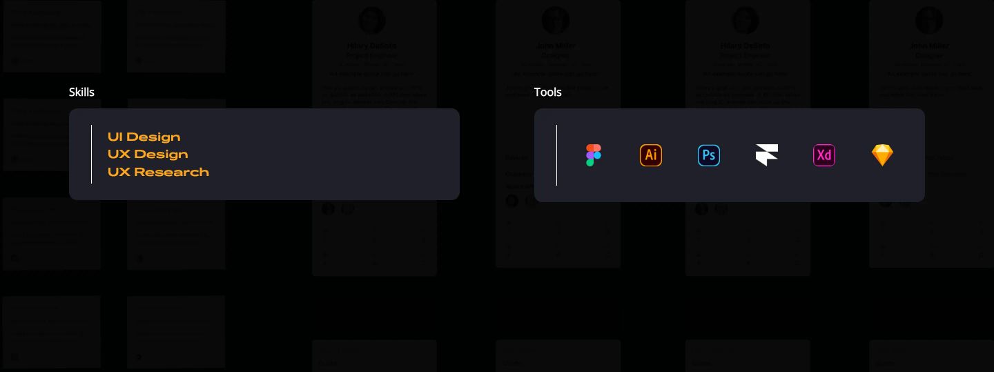
StrongA pair of sleek dark floating cards highlighting design disciplines and software tools with warm amber typography.
- Mood
- serene + mysterious
- Layout
- 2 col · split · airy
- 02
showcase
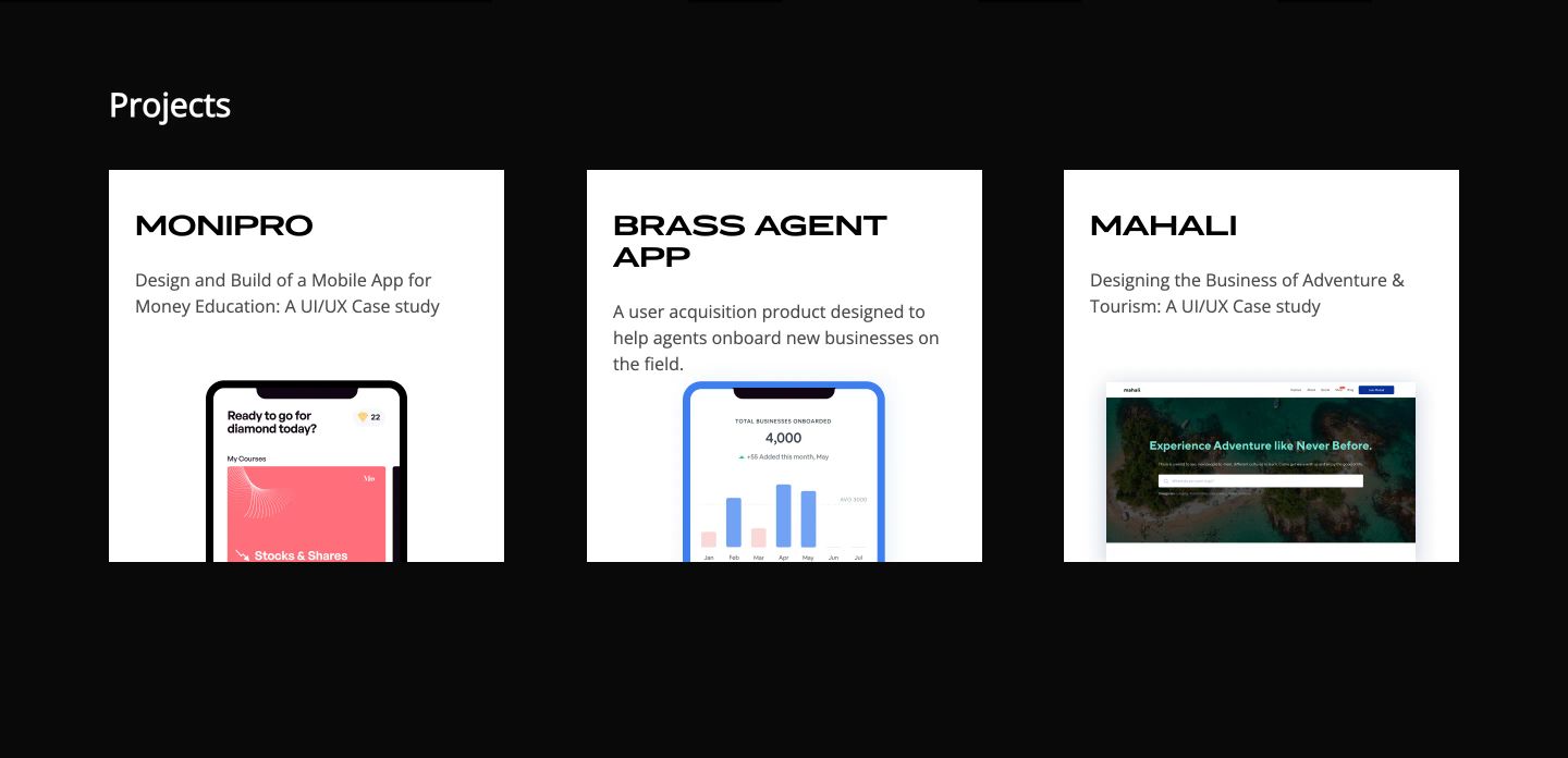
Crisp white portfolio cards punctuate a pitch-black canvas with clean typography and embedded mobile product mockups.
- Mood
- clinical + serene
- Layout
- 3 col · grid · balanced
- 03
testimonial
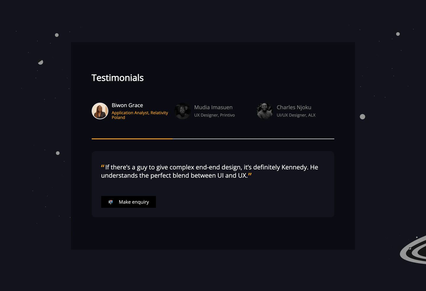
StrongA quiet, dark-themed testimonial card floating in a cosmic field with tabbed client avatars and an orange progress accent.
- Mood
- serene
- Layout
- 1 col · centered · airy
- 04
footer
Minimalist black footer strip balancing quiet copyright text on the left with monochrome social icons on the right.
- Mood
- serene
- Layout
- 2 col · split · airy



