Better Stack
Technical, confident, and meticulously structured. Deep obsidian surfaces and crisp slate typography frame realistic product telemetry dashboards, creating an atmosphere of operational precision. Subdued periwinkle buttons and subtle border hairlines guide developer focus without breaking dark-mode immersion.
Take the vibe
Rated
7.3/ 10
From 14 analyzed sections. Two measured components and one judged by a model. Distinction is a rank within the library; the rest are scores in their own right.
- AI scorejudged
- 9.1
- Systemmeasured
- 5.3
- Distinctionmeasured
- 7.1
- on the grid
- 0%
- vertical rhythm
- 96%
- type on a scale
- 50%
- contrast passing AA
- 67%
- unlike the library
- 0.99
- model craft
- 7.8/10
- model deviation
- 3.2/10
Color
Background#0b0c14
Text#ffffff
Accent#98a4f7
Surface#0f101a
Muted#646e87
Typefaces
- Display
- Helvetica Now Display
- Body
- Helvetica Now Text
- Mono
- —
- Source
- self_hosted
- Scale
- 10 · 12 · 13 · 14 · 16 · 20
Layout
- Grid
- —
- Container
- —
- Spacing base
- 4px
- Radius
- 6px · 8px · 12px
Capture
- Category
- saas
- Sections
- 14
- Captured
- 2026-09-08
- Rhythm
- dark x16
Type rules
- display headlines set in sentence case with tight leading and zero tracking
- body text rendered in cool muted slate with tight tracking at 10px to 14px
- labels and metadata hierarchy expressed through opacity and lightness rather than uppercase transformation
Color rules
- soft periwinkle accent #98a4f7 reserved strictly for primary interactive buttons and key interactive state indicators
- backgrounds maintain strict midnight black (#0b0c14) with slightly elevated surface cards (#0f101a)
- text hierarchy relies on three distinct slate tones: #ffffff for headers, #939db8 for primary text, and #646e87 for secondary details
Voice rules
- lead with bold quantitative cost and speed comparisons against competitors
- describe technical infrastructure capabilities without marketing fluff
- keep CTA copy concise and zero-commitment
Holds it together
- anchor every feature block with an interactive horizontal carousel of dark UI application mockups
- highlight direct cost and performance comparisons against incumbent tools using explicit numeric cards
- use subtle slate hairline borders to separate dashboard cards without visual clutter
Contrast
text on background19.5:1 AAA
muted text on background3.8:1 AA Large
text on surface18.9:1 AAA
muted text on surface3.7:1 AA Large
accent on background8.3:1 AAA
background on accent8.3:1 AAA
Type, measured
- Body
- 10px / 1.45
- Measure
- 126 characters
- Display
- 53px / 1.1
- Tracking
- 0em display
- Scale ratio
- 1.52
Voice
- Tone
- confident, declarative, technical
- Sentences
- short
- Person
- second
- Vocabulary
- technical
- Calls to action
- start, explore, book, migrate
Built with
- Builder
- —
- Framework
- —
- Motion
- —
- WebGL
- —
- Nav
- top_bar, 45 items
- Length
- 13 screens
Sections in page order
- 00
hero
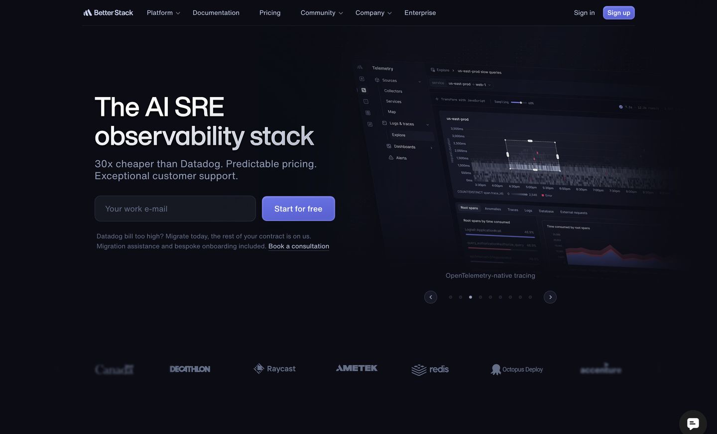
A sleek, dark developer-focused hero with high-contrast typography, an email capture field, and an angled telemetry dashboard showcase.
- Mood
- clinical
- Layout
- 2 col · split · balanced
- 01
comparison
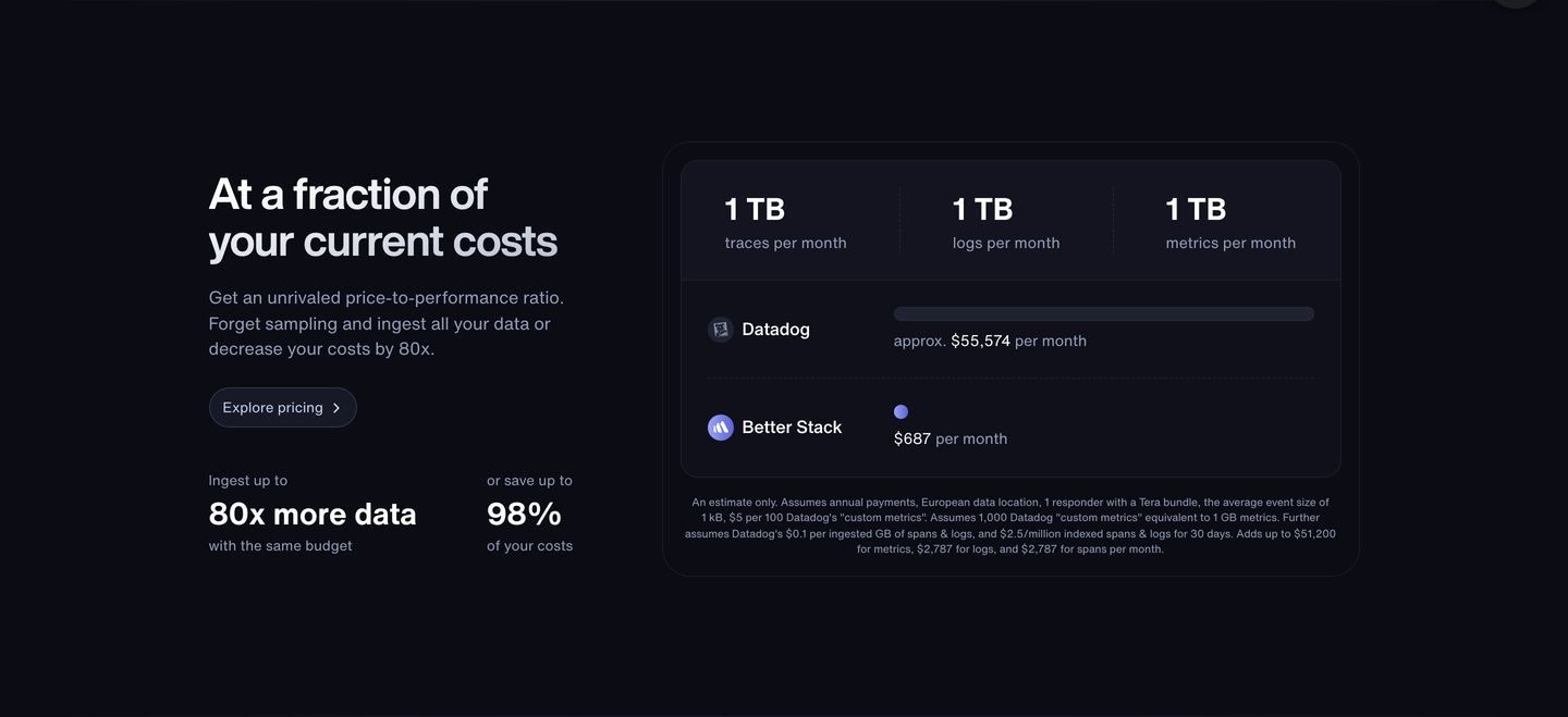
StrongA dark, highly structured comparative breakdown presenting massive cost savings through clean data visualisations and contrasting figures.
- Mood
- clinical + serene
- Layout
- 2 col · split · balanced
- 02
feature grid
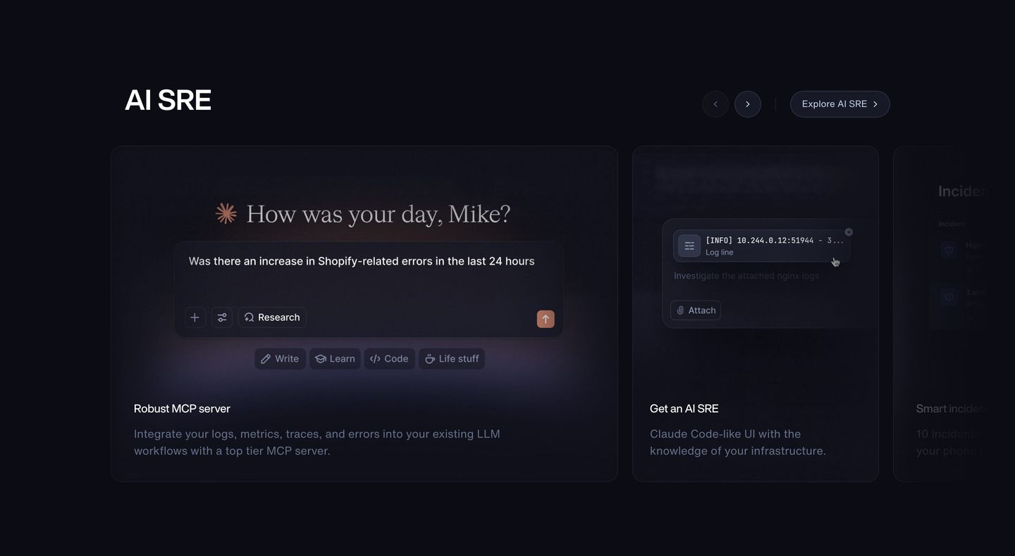
StrongA sleek dark-mode feature carousel displaying interactive chat mockups and developer tools with understated typography.
- Mood
- serene + mysterious
- Layout
- 3 col · grid · balanced
- 03
feature grid
StrongHigh-precision developer tooling carousel featuring dark-mode cards with detailed observability and tracing interface mockups.
- Mood
- clinical
- Layout
- 3 col · grid · balanced
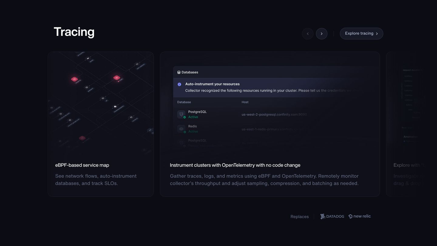
- 04
feature grid
Sleek dark-mode feature cards displaying incident response UI with subtle container borders and deep violet-toned backdrops.
- Mood
- clinical + serene
- Layout
- 2 col · grid · balanced
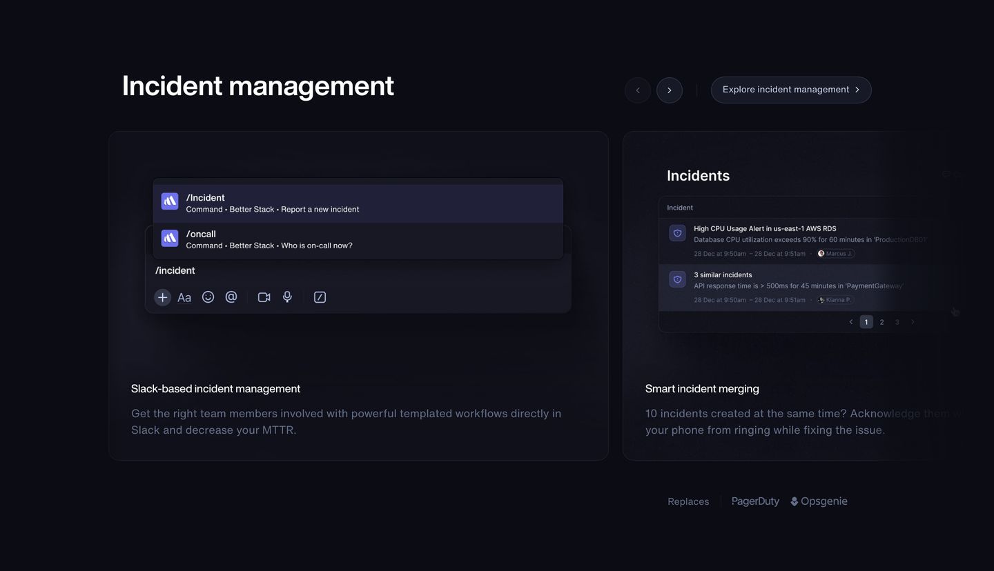
- 05
feature grid
Sleek dark feature carousel presenting diagnostic and uptime monitoring capabilities through high-fidelity product UI previews.
- Mood
- serene
- Layout
- 3 col · grid · balanced
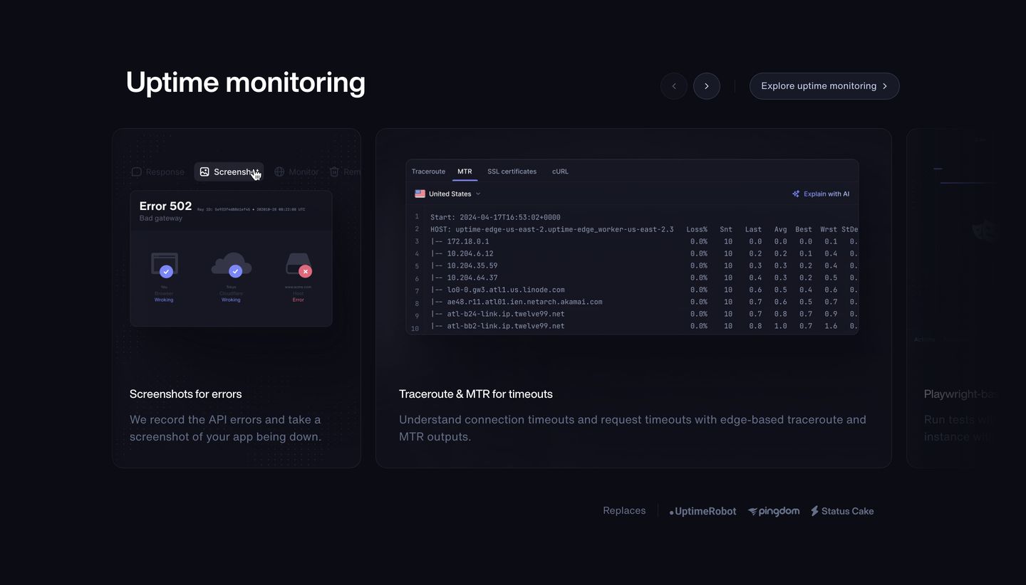
- 06
feature grid
Dark, precision-engineered developer interface showcasing product capabilities through interactive software card previews and carousel navigation.
- Mood
- clinical
- Layout
- 3 col · grid · balanced
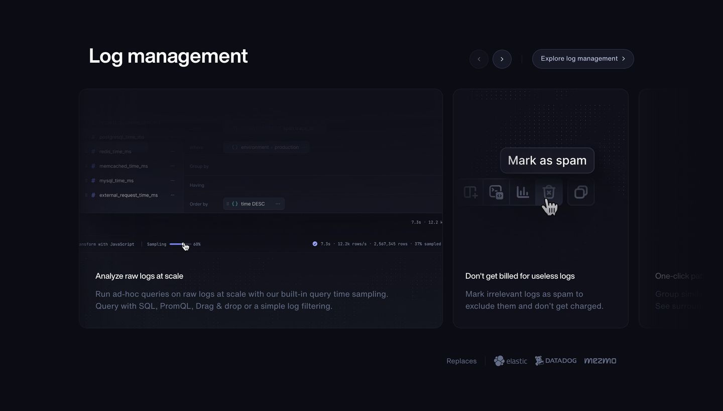
- 07
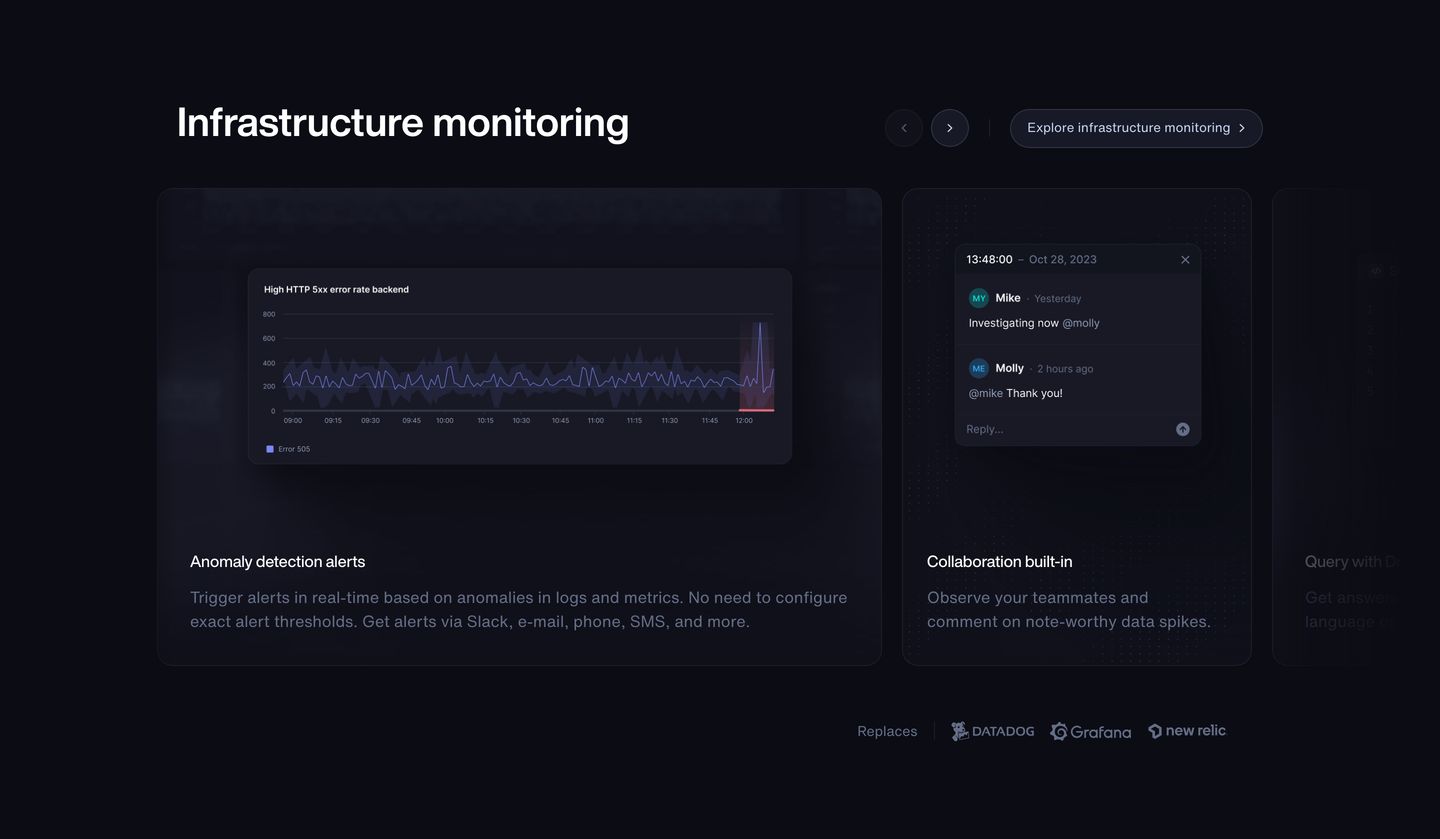
feature grid
Sleek, low-lit developer dashboard carousel presenting infrastructure monitoring capabilities with quiet technical precision.
- Mood
- clinical + serene
- Layout
- 3 col · stacked · balanced
- 08
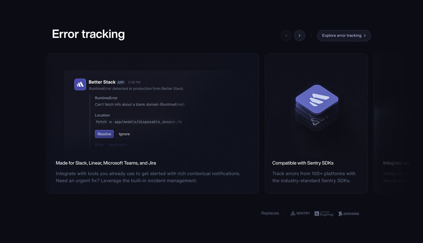
feature grid
Sleek dark-mode developer tools feature carousel showcasing error tracking integrations with polished product UI mockups.
- Mood
- clinical + serene
- Layout
- 3 col · grid · balanced
- 09
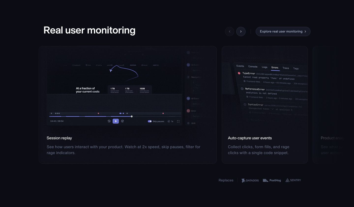
feature grid
A sleek, dark mode feature carousel presenting software UI mockups with precise developer-focused typography.
- Mood
- clinical + serene
- Layout
- 3 col · grid · balanced
- 10
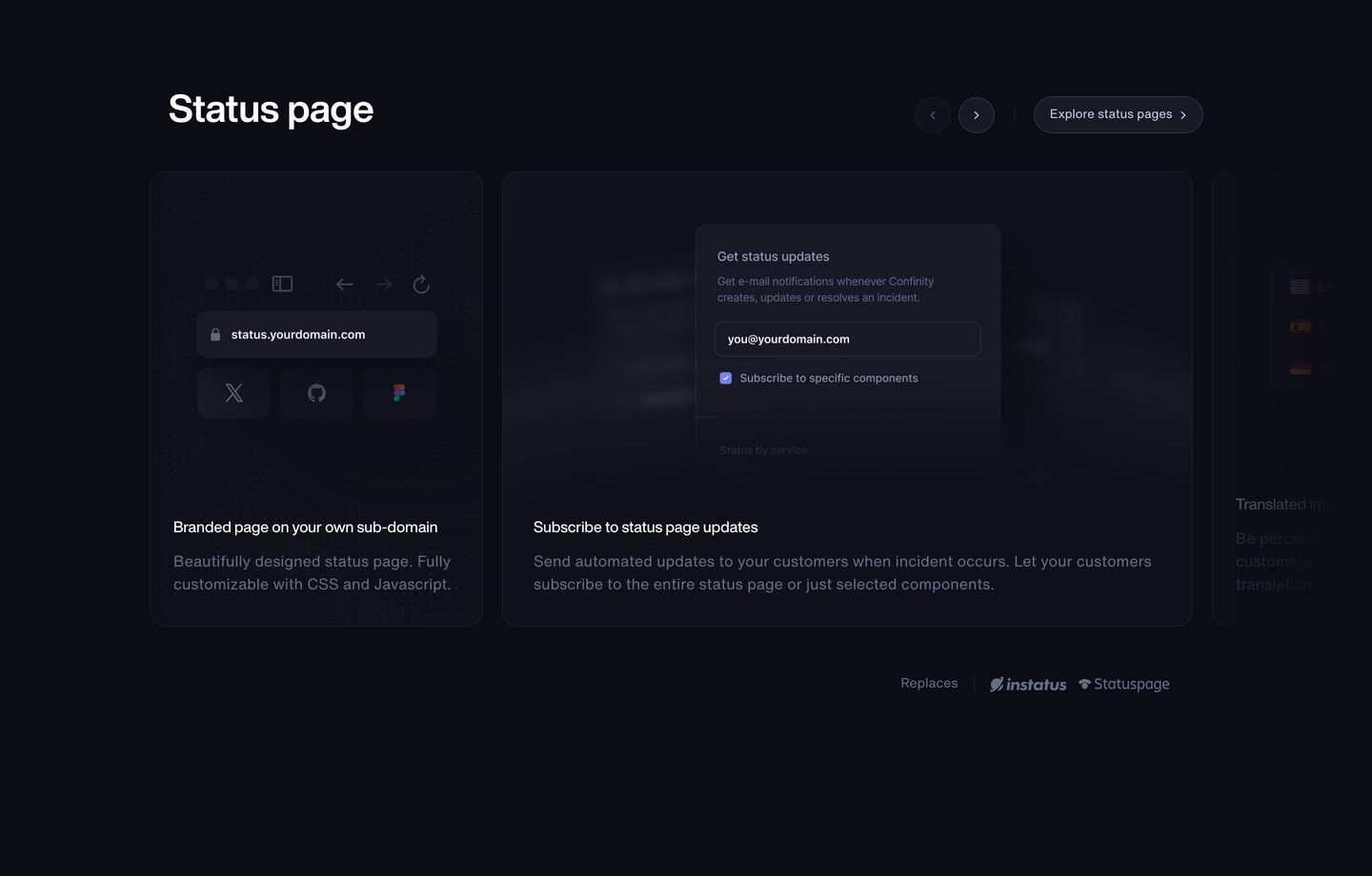
feature grid
Dark, sleek SaaS carousel presenting status page features through precise UI mockups and subdued typography.
- Mood
- clinical + serene
- Layout
- 3 col · grid · balanced
- 11
cta
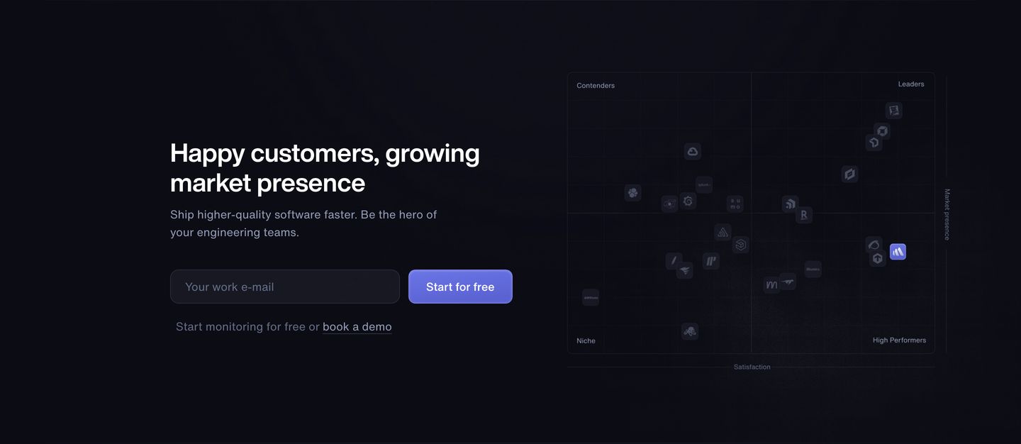
A dark, confident lead-capture section pairing a straightforward email signup form with a subtle market quadrant chart to signal industry leadership.
- Mood
- clinical
- Layout
- 2 col · split · balanced
- 12
testimonial
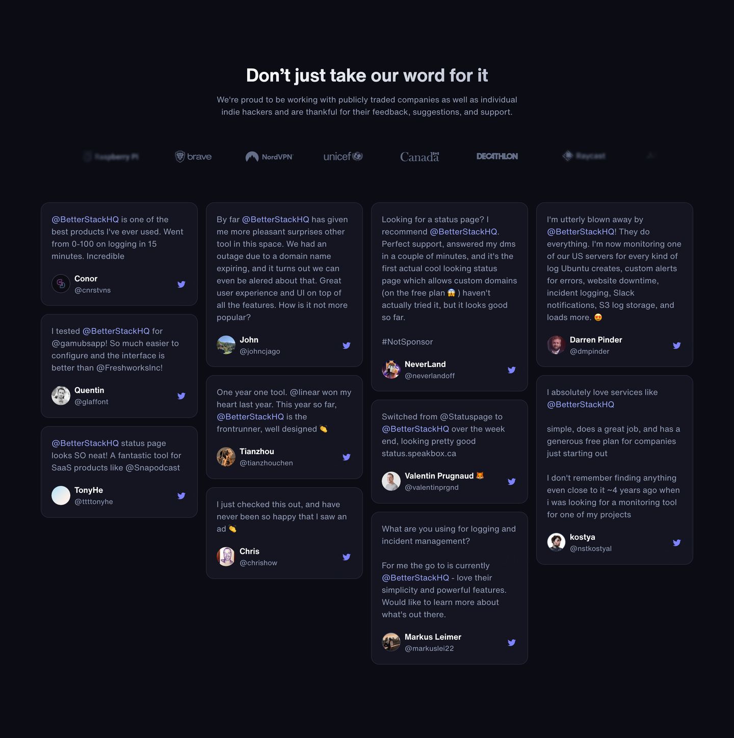
A clean, dark-mode wall of love combining a subtle monochrome logo strip with a dense four-column grid of user testimonials.
- Mood
- serene
- Layout
- 4 col · grid · dense
- 13
footer
A clean, dark multi-column SaaS footer with understated typography, structured sitemap links, and bottom metadata.
- Mood
- serene
- Layout
- 4 col · grid · balanced