
Lance
Fast, high-contrast, developer-first simplicity. A pitch-black base meets electric hot pink chat highlights and dark plum container cards, transforming tedious App Store bureaucracy into instant prompt-driven magic.
Take the vibe
Rated
6.5/ 10
From 7 analyzed sections. Two measured components and one judged by a model. Distinction is a rank within the library; the rest are scores in their own right.
- AI scorejudged
- 7.8
- Systemmeasured
- 4.9
- Distinctionmeasured
- 6.8
- on the grid
- 0%
- vertical rhythm
- 61%
- type on a scale
- 33%
- contrast passing AA
- 100%
- unlike the library
- 0.93
- model craft
- 7.1/10
- model deviation
- 2.7/10
Color
Background#101013
Text#ffffff
Accent#ff1f73
Surface#16171b
Muted#ff97c2
Typefaces
- Display
- Inter
- Body
- Inter
- Mono
- Geist Mono
- Source
- self_hosted
- Scale
- 12 · 13 · 14 · 15 · 16 · 18
Layout
- Grid
- —
- Container
- —
- Spacing base
- 4px
- Radius
- 8px · 16px
Capture
- Category
- ai
- Sections
- 7
- Captured
- 2026-09-15
- Rhythm
- dark x7
Type rules
- section eyebrows set in Geist Mono uppercase with pink tinted text
- hero and section headlines set in tight tracked Inter with sentence casing
- terminal commands and code snippets rendered in Geist Mono with subtle dark borders
Color rules
- vibrant hot pink #ff1f73 reserved exclusively for primary actions, prompt bubbles, and key status highlights
- dark plum and deep charcoal surfaces used interchangeably across cards on a black canvas
- subtle mint green #7fd9a0 used only for positive status badges and checkmarks
Voice rules
- lead with developer pain points resolved automatically
- use conversational prompt examples inside realistic UI previews
Holds it together
- every major capability must be shown via a simulated chat prompt or status card mockup
- use Geist Mono uppercase tracking for category headers above large sans-serif titles
- primary conversion buttons always wear full hot pink fill with rounded pill or soft-corner geometries
Contrast
text on background19.0:1 AAA
muted text on background9.5:1 AAA
text on surface17.9:1 AAA
muted text on surface8.9:1 AAA
accent on background5.2:1 AA
background on accent5.2:1 AA
Type, measured
- Body
- 15px / 1.63
- Measure
- 109 characters
- Display
- 60px / 1.04
- Tracking
- -0.03em display
- Scale ratio
- 1.41
Voice
- Tone
- declarative, pragmatic, confident
- Sentences
- short
- Person
- second
- Vocabulary
- technical
- Calls to action
- get, add, install
Built with
- Builder
- —
- Framework
- next
- Motion
- —
- WebGL
- —
- Nav
- top_bar, 4 items
- Length
- 6.2 screens
Sections in page order
- 00
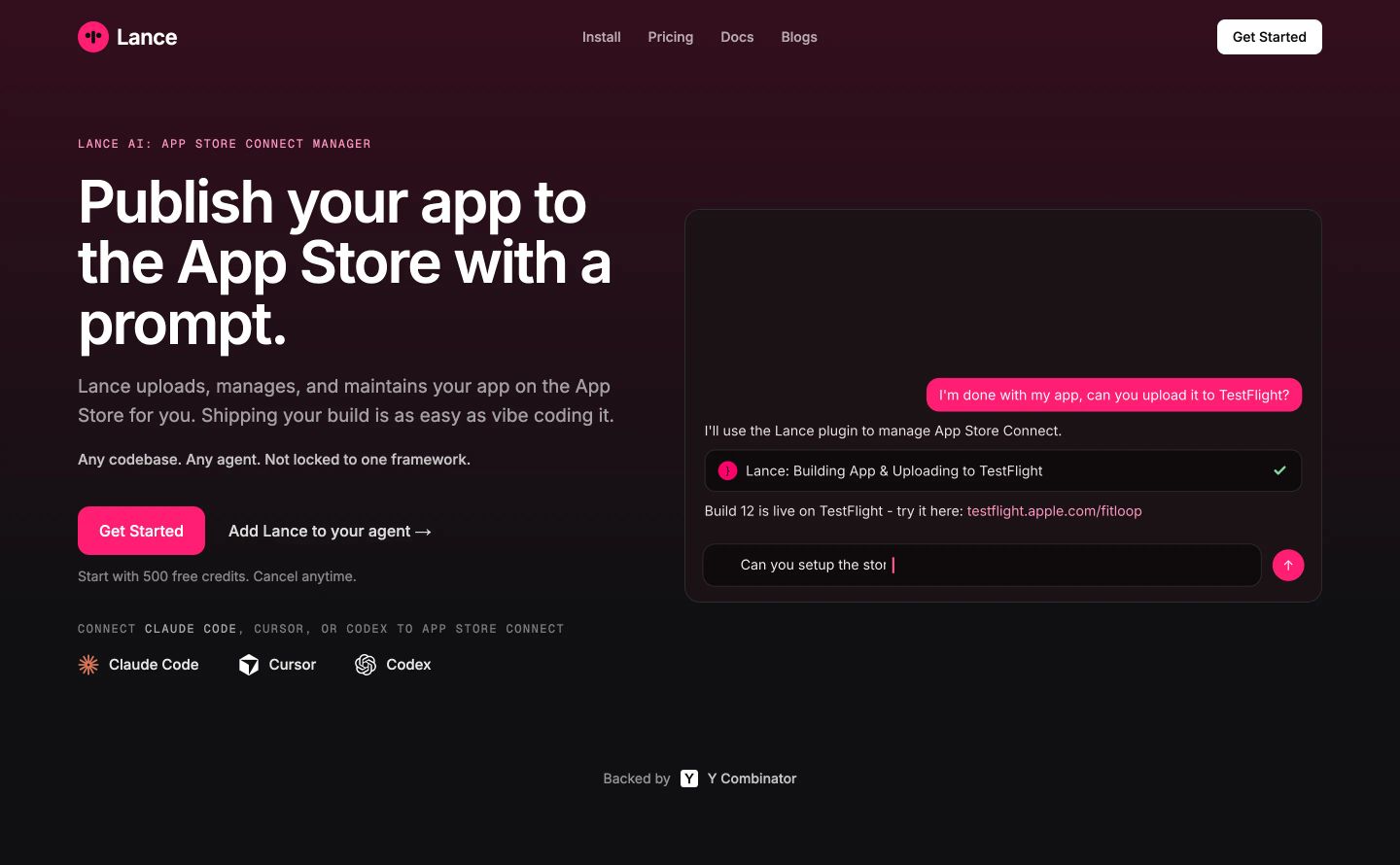
hero
StrongDark, confident developer-tool hero pairing bold typography with a chat mockup framed by a subtle magenta ambient glow.
- Mood
- serene
- Layout
- 2 col · split · balanced
- 01
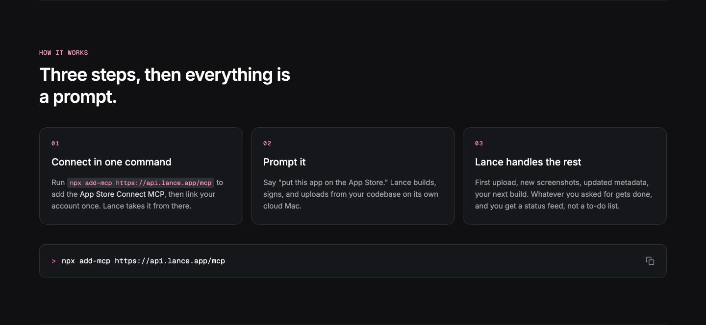
feature grid
Sleek dark-mode developer workflow breakdown featuring three numbered step cards and a copyable command prompt bar.
- Mood
- clinical + serene
- Layout
- 3 col · stacked · balanced
- 02
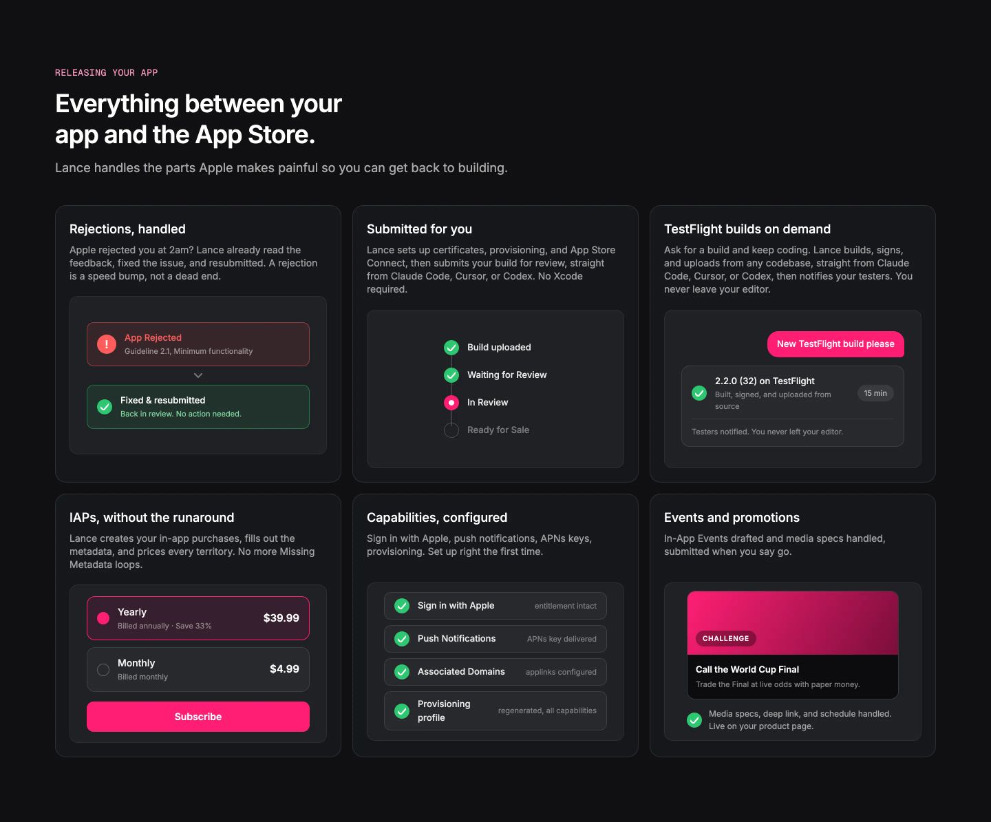
feature grid
StrongCrisp and reassuring developer tool feature grid presenting complex App Store workflows through structured, interactive-looking status cards.
- Mood
- clinical
- Layout
- 3 col · grid · balanced
- 03
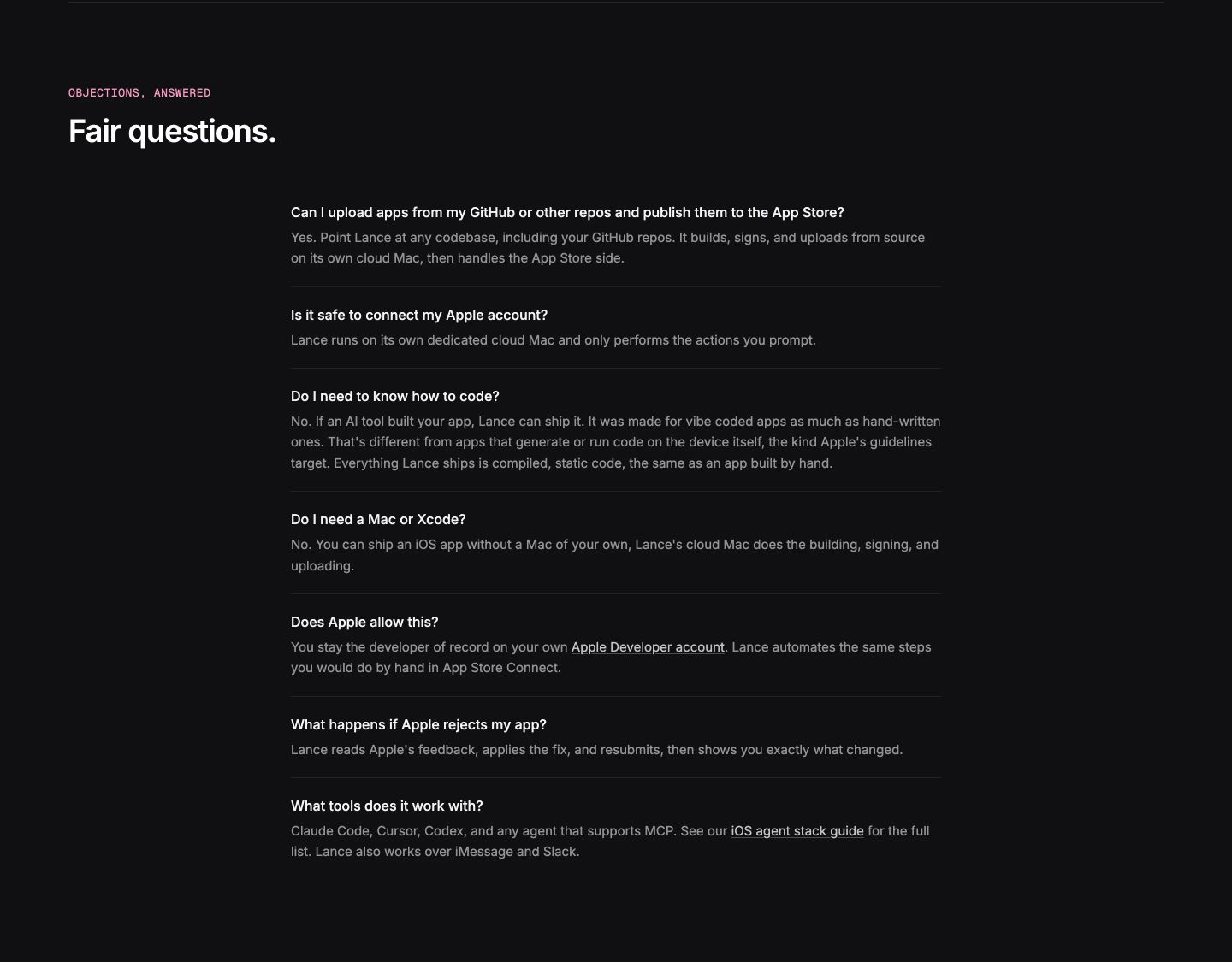
faq
A dark, highly disciplined typography-only FAQ section presenting direct technical answers with calm clarity.
- Mood
- clinical
- Layout
- 1 col · stacked · balanced
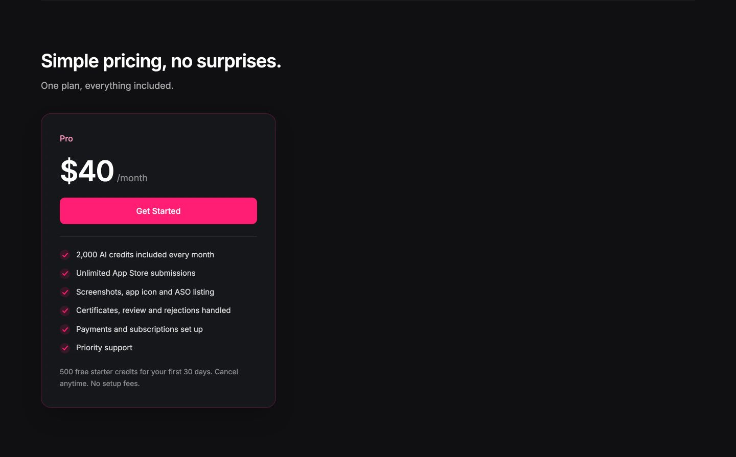
- 04
pricing
StrongClean, unhurried dark pricing card pushed to the left with an electric pink call to action.
- Mood
- serene
- Layout
- 1 col · asymmetric · airy
- 05
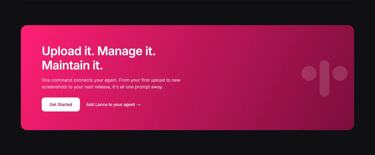
cta
A bold magenta gradient call-to-action card set against deep dark space with crisp white typography.
- Mood
- energetic
- Layout
- 2 col · split · balanced
- 06
footer
Minimalist dark footer with understated navigation links cleanly separated by a hairline divider.
- Mood
- clinical + serene
- Layout
- 2 col · stacked · airy



