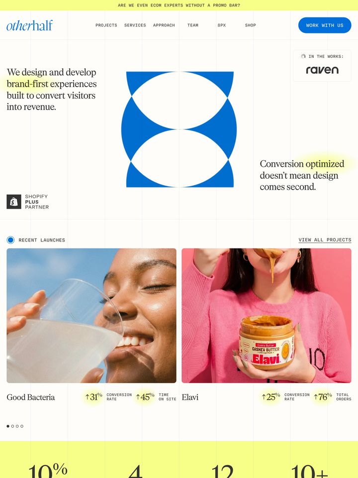
takeagander-com
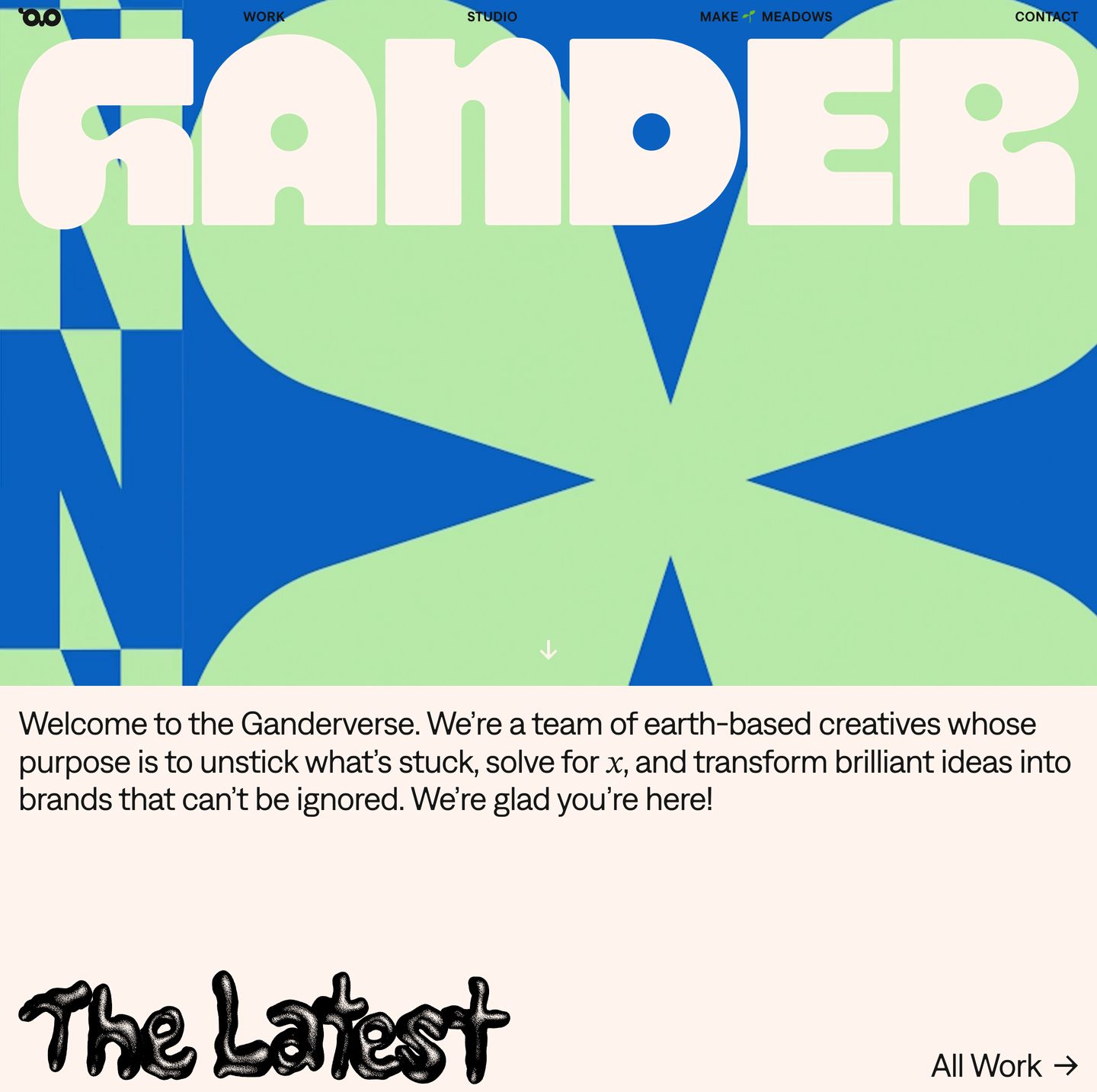
Playful, tactful, and unmistakably energetic. A warm peachy-cream canvas hosts saturated CPG packaging imagery, paired with oversized ink-trapped typography and textured hand-drawn section headers. Bold hero geometry and confident microcopy signal an unapologetic, design-forward studio.
Visit siteRated
7.2/ 10
From 7 analysed sections. Two measured components and one judged by a model. Distinction is a rank within the library; the rest are scores in their own right.
- AI scorejudged
- 8.7
- Systemmeasured
- 4.5
- Distinctionmeasured
- 9.5
- on the grid
- 28%
- vertical rhythm
- 29%
- type on a scale
- 75%
- contrast passing AA
- 50%
- unlike the library
- 0.31
- model craft
- 7.6/10
- model deviation
- 5.3/10
Colour
Background#fff4ed
Text#171717
Accent#fff4ed
Surface#171717
Muted#7d7d7d
Typefaces
- Display
- Denim INK SemiBold
- Body
- Denim INK Regular
- Mono
- —
- Source
- self_hosted
- Scale
- 18 · 24 · 43 · 115
Layout
- Grid
- —
- Container
- —
- Spacing base
- 4px
- Radius
- 0px
Capture
- Category
- agency
- Sections
- 7
- Captured
- 2026-08-30
- Rhythm
- mixed → light x4 → dark x2
Type rules
- display type tightly tracked at -0.03em with tight 1.15 line height
- body text set large at 24px with compact 37 character line measure
- section titles mixed between organic script graphics and ink-trapped grotesque
Colour rules
- warm peachy cream (#fff4ed) forms the primary canvas for content sections
- deep charcoal (#171717) anchors typography and the footer block
- high-saturation brand colors delivered strictly through case study imagery and hero graphic
Voice rules
- conversational copy with playful micro-moments
- first-person collective perspective ('we')
Holds it together
- pair custom tactile script headers with clean ink-trap grotesque typography
- use horizontal scrolling product showcases on a warm pale cream background
- bookend the site with massive, oversized brand letterforms in the hero and footer
- keep borders absent, letting full-bleed imagery and background shifts define containers
Contrast
text on background16.6:1 AAA
muted text on background3.8:1 AA Large
Type, measured
- Body
- 24px / 1.1
- Measure
- 37 characters
- Display
- 115px / 1.15
- Tracking
- -0.03em display
- Scale ratio
- 1.48
Voice
- Tone
- playful, irreverent, confident
- Sentences
- short
- Person
- first
- Vocabulary
- informal
- Calls to action
- follow, see, sign up
Built with
- Builder
- —
- Framework
- next
- Motion
- —
- WebGL
- —
- Nav
- sticky_top_bar, 6 items, sticky
- Length
- 5.8 screens
Sections in page order
3 marked strong · 7- 00
hero
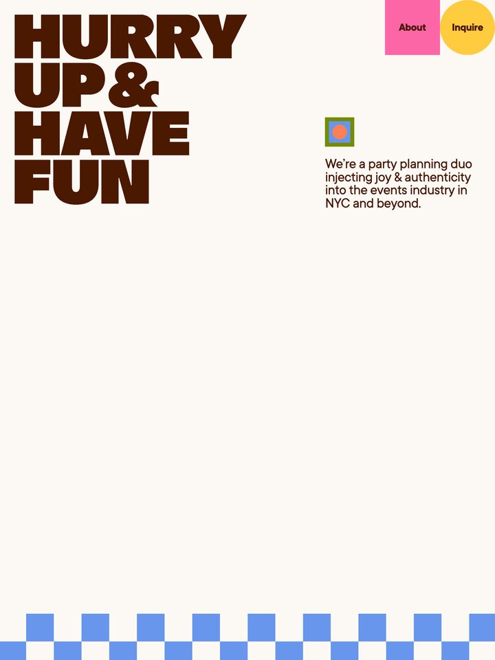
StrongLoud, playful agency hero with giant chunky display typography over electric lime and cobalt geometry followed by an irreverent studio intro.
- Mood
- playful + bold
- Layout
- 1 col · stacked · balanced
- 01
showcase
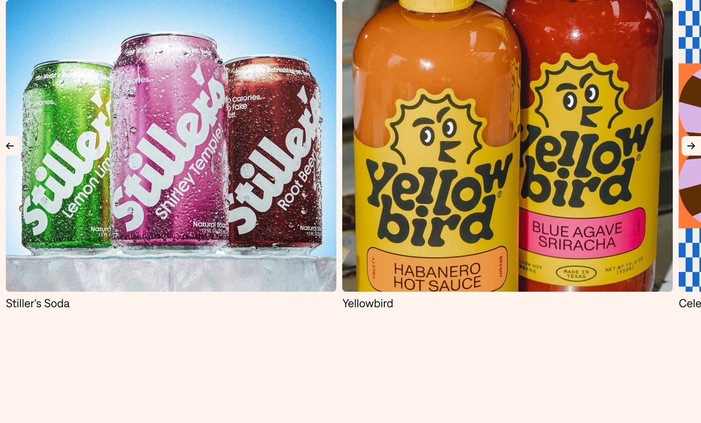
Punchy, saturated product showcase featuring bold CPG packaging photography inside a clean horizontal gallery.
- Mood
- playful + bold
- Layout
- 1 col · grid · balanced
- 02
statement
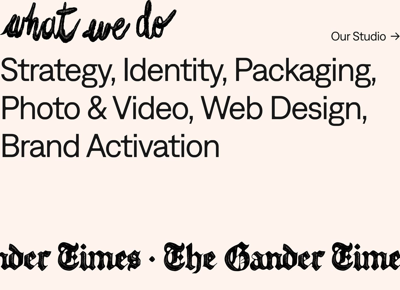
StrongWarm and tactile agency capability statement pairing expressive handwritten script with clean ink-trap grotesk type on a soft cream background.
- Mood
- warm + editorial
- Layout
- 1 col · stacked · airy
- 03
showcase
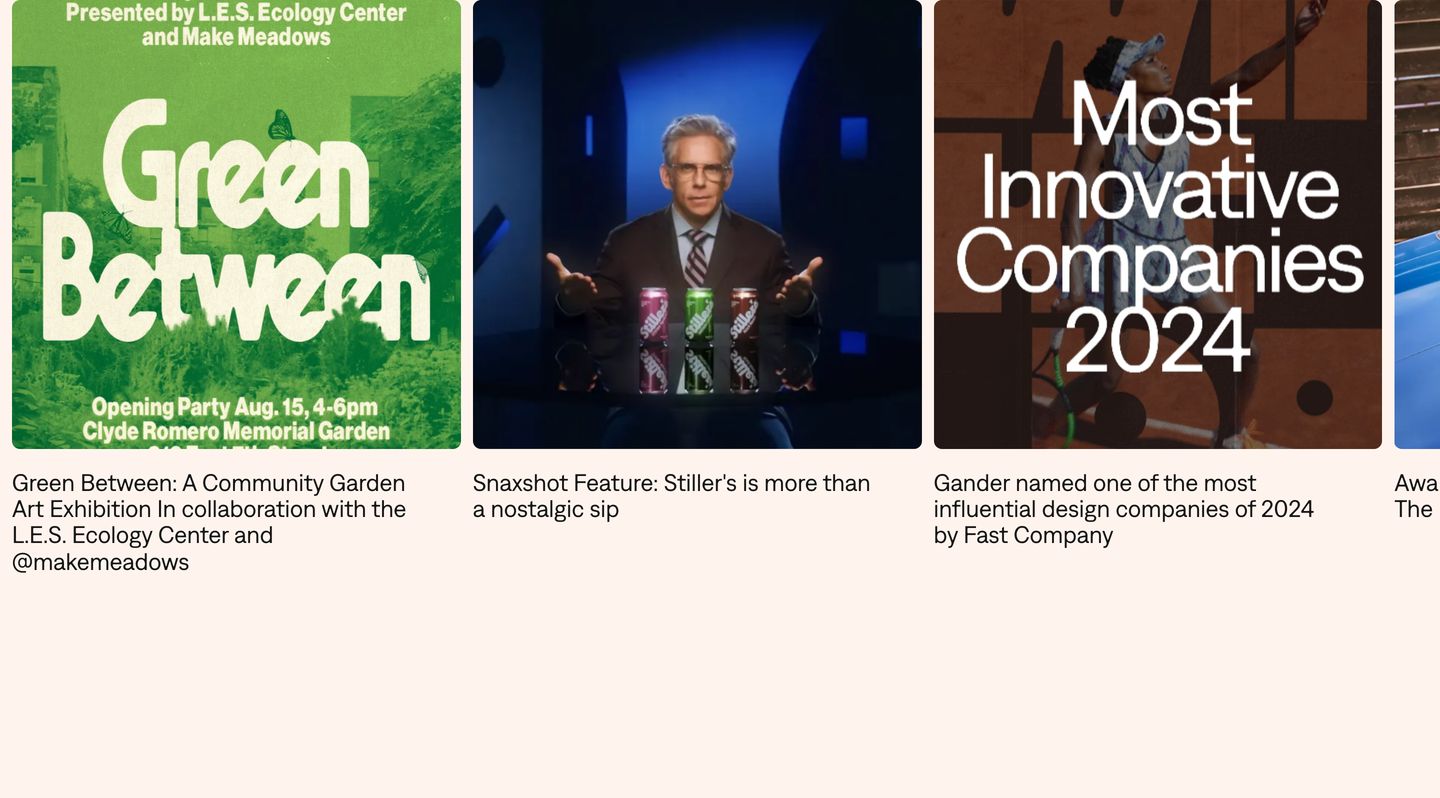
Clean, horizontal editorial showcase featuring rounded image cards with concise descriptive captions against a soft cream backdrop.
- Mood
- editorial + quiet
- Layout
- 1 col · grid · airy
- 04
cta
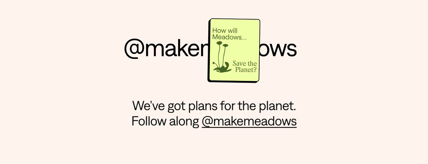
A warm, minimalist social callout featuring an illustrated card playfully interrupting bold typography on a soft cream background.
- Mood
- warm + playful
- Layout
- 24 col · centered · airy
- 05
footer
A clean dark three-column footer balancing crisp utilitarian typography with cheeky agency microcopy and a minimal newsletter input.
- Mood
- quiet + playful
- Layout
- 3 col · grid · balanced

- 06
footer
StrongMassive stylized wordmark dominating the footer with heavy, rounded custom letterforms in high contrast black and cream.
- Mood
- bold + playful
- Layout
- 6 col · full bleed · dense