Rated
7.0/ 10
From 10 analysed sections. Two measured components and one judged by a model. Distinction is a rank within the library; the rest are scores in their own right.
- AI scorejudged
- 9.8
- Systemmeasured
- 4.8
- Distinctionmeasured
- 4.8
- on the grid
- 24%
- vertical rhythm
- 55%
- type on a scale
- 55%
- contrast passing AA
- 60%
- unlike the library
- 0.22
- model craft
- 8.1/10
- model deviation
- 5.5/10
Colour
Background#ffffff
Text#000000
Accent#ddf94e
Surface#e3e3e3
Muted#76756f
Typefaces
- Display
- Saans
- Body
- Serrif
- Mono
- —
- Source
- self_hosted
- Scale
- 15 · 19 · 21 · 28 · 44 · 46
Layout
- Grid
- —
- Container
- —
- Spacing base
- 5px
- Radius
- 0px · 999px
Capture
- Category
- foundry
- Sections
- 10
- Captured
- 2026-08-30
- Rhythm
- grey → white x7 → grey x2
Type rules
- body text runs in serif at 76 characters per line with tight line height
- section display titles set in bold grotesk at massive scales up to 200px
Colour rules
- canvas remains pure white with neutral cool grey framing the top and bottom
- vibrant specimen backgrounds in acid yellow, neon pink, and bright red appear inside card bounds only
Voice rules
- state foundry philosophy in clean editorial sentences
- label specimens with typeface name and variant counts
Holds it together
- navigation and category filters must be styled as 1px black-stroked pill buttons
- feature modules pair 2-column grid cards with vibrant yellow illustrated glyph characters
- type specimen showcases alternate between full-width photographic posters and high-contrast dual-column cards
Contrast
text on background21.0:1 AAA
muted text on background4.6:1 AA
text on surface16.4:1 AAA
accent on background1.2:1 fail
background on accent1.2:1 fail
Type, measured
- Body
- 21px / 1.15
- Measure
- 76 characters
- Display
- 200px / 0.9
- Tracking
- -0.04em display
- Scale ratio
- 1.76
Voice
- Tone
- systematic, confident, playful
- Sentences
- short
- Person
- first
- Vocabulary
- technical
- Calls to action
- explore, visit, download, try, buy
Built with
- Builder
- —
- Framework
- —
- Motion
- —
- WebGL
- —
- Nav
- top_bar, 34 items
- Length
- 11.7 screens
Sections in page order
3 marked strong · 10- 00
nav
StrongA modular, pill-driven navigation header with tactile outlined buttons and clinical type-foundry precision.
- Mood
- clinical + raw
- Layout
- 1 col · stacked · dense

- 01
hero
A restrained type foundry header balancing a quiet serif manifesto and utility pills with a stark bold release heading.
- Mood
- editorial + quiet
- Layout
- 1 col · stacked · balanced

- 02
showcase
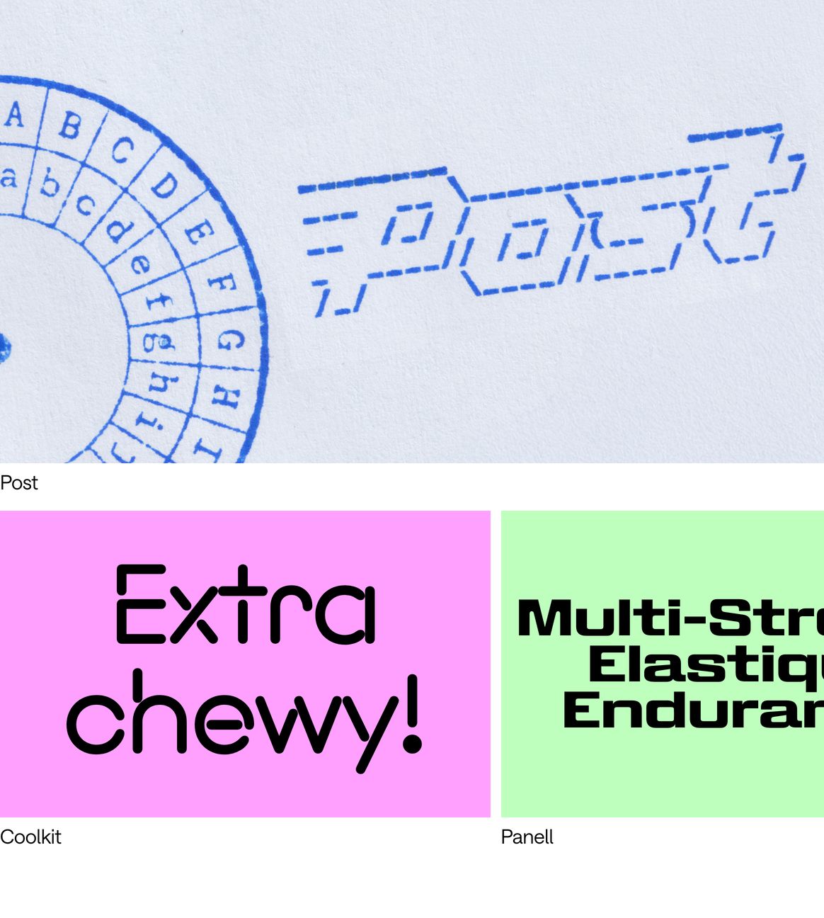
Tactile and playful graphic design showcase featuring colorful specimen tiles alongside stamped print artifacts.
- Mood
- playful + editorial
- Layout
- 2 col · grid · balanced
- 03
showcase
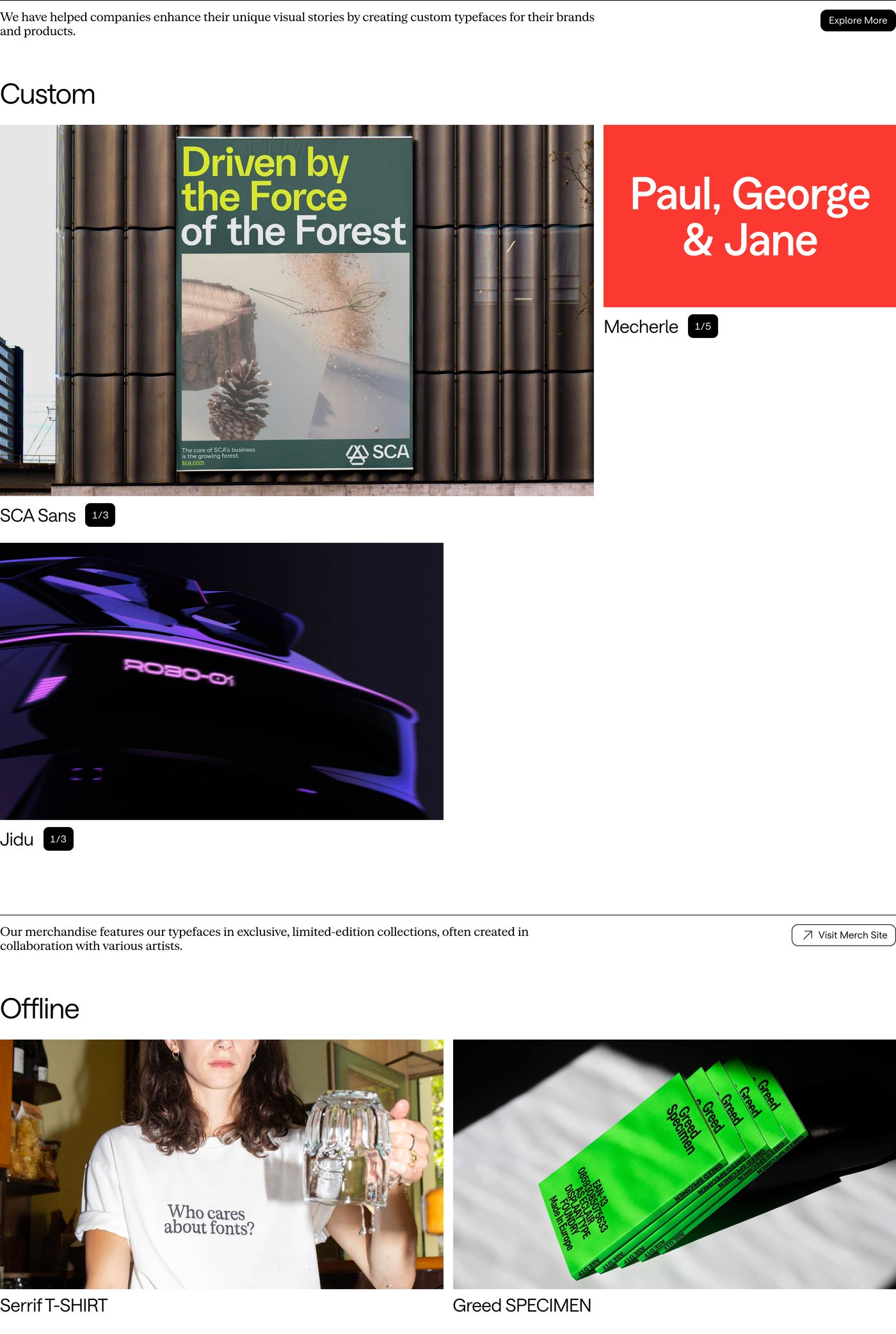
Clean Swiss-inspired foundry portfolio showcasing custom typefaces and merchandise across a structured editorial grid.
- Mood
- editorial + quiet
- Layout
- 2 col · grid · balanced
- 04
showcase
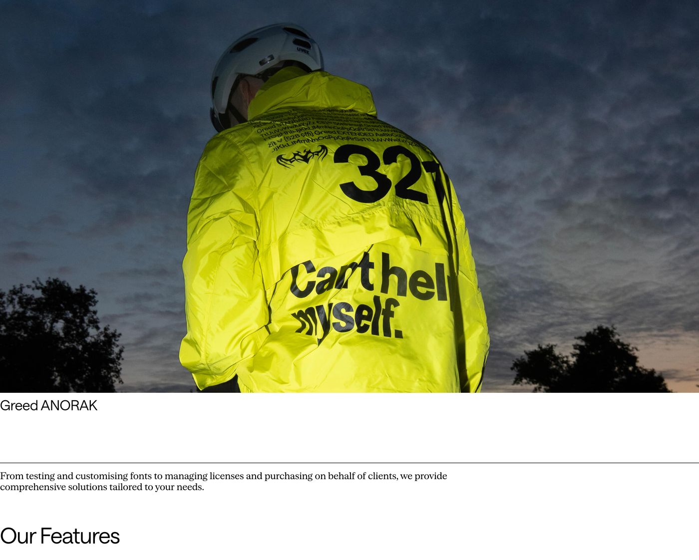
High-impact editorial showcase contrasting a moody, flash-lit neon jacket photograph with clean typographic hierarchy on stark white.
- Mood
- editorial + raw
- Layout
- 4 col · stacked · airy
- 05
feature grid
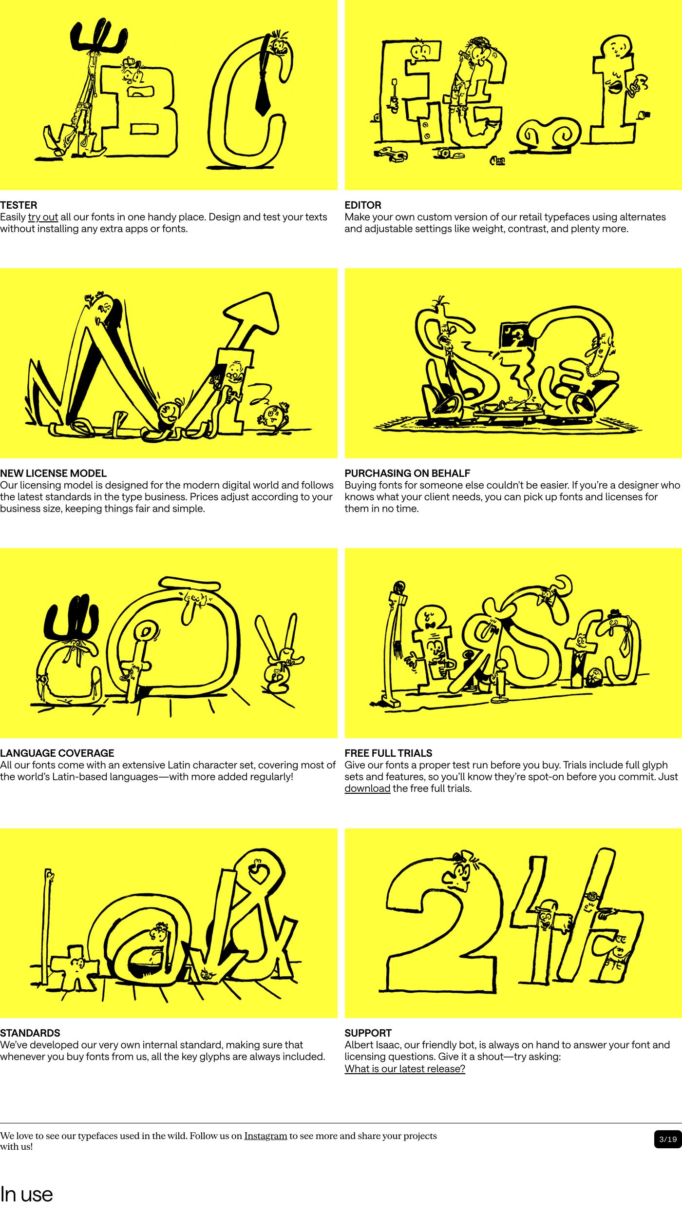
StrongPlayful comic-strip feature grid pairing lively yellow character illustrations with concise, sharp typography.
- Mood
- playful + editorial
- Layout
- 2 col · grid · balanced
- 06
showcase
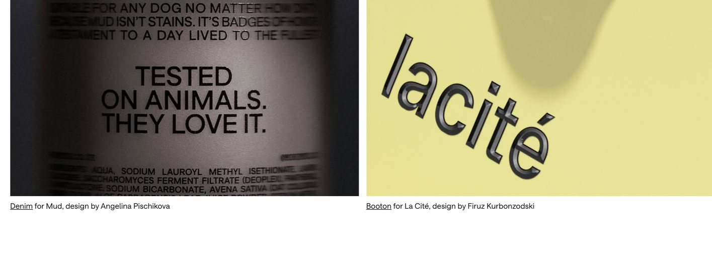
Minimalist editorial showcase pairing high-contrast tactile close-up typography photography with understated credit captions.
- Mood
- quiet + editorial
- Layout
- 2 col · split · balanced
- 07
showcase
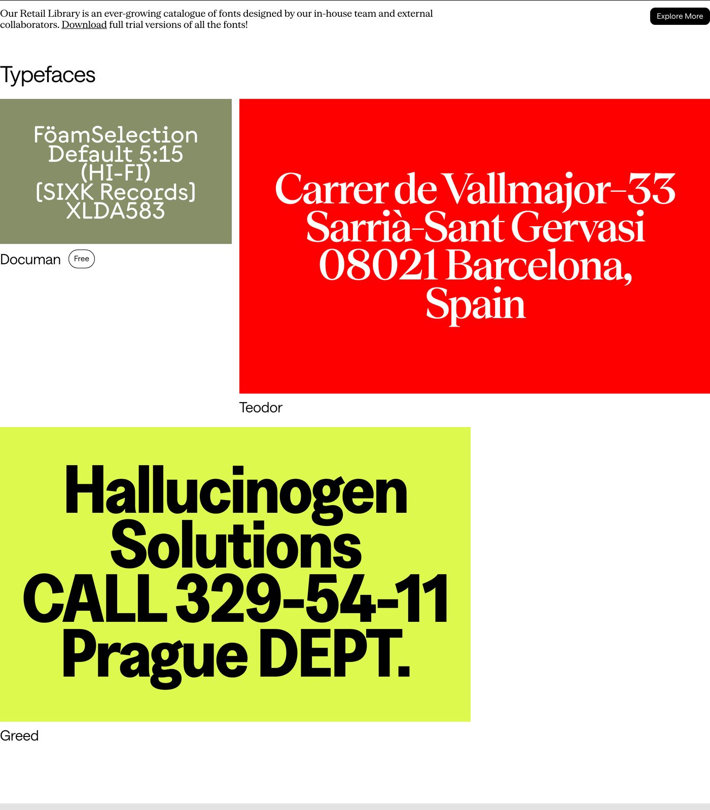
StrongHigh-contrast typography showcase featuring vibrant specimen cards in saturated red, muted olive, and acid yellow against stark white.
- Mood
- bold + editorial
- Layout
- 1 col · asymmetric · balanced
- 08
footer
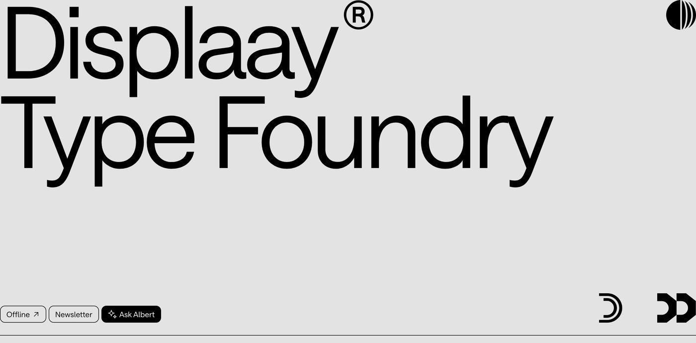
Massive, confident typographic branding occupies a pale grey footer grounded by tiny utilitarian navigation pills.
- Mood
- bold + quiet
- Layout
- 1 col · stacked · airy
- 09
footer
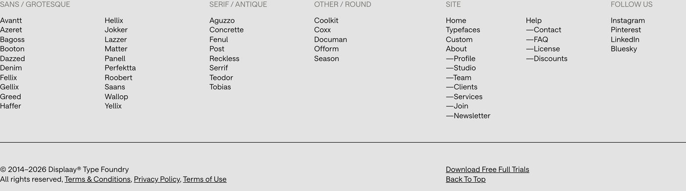
Systematic type foundry directory footer structured with Swiss precision on a cool grey ground.
- Mood
- clinical + quiet
- Layout
- 1 col · grid · dense