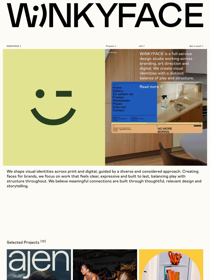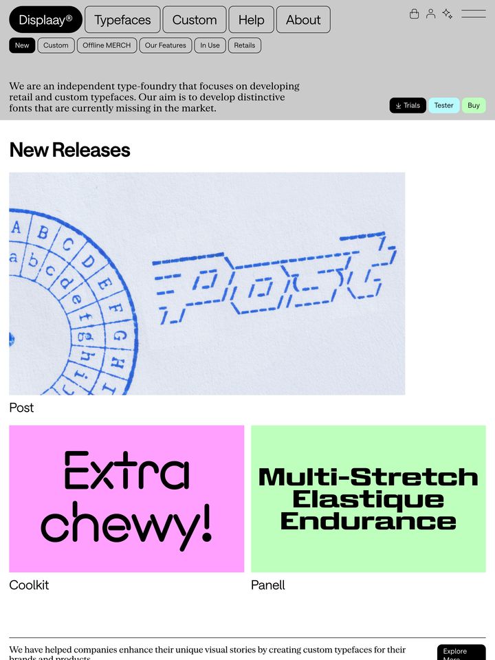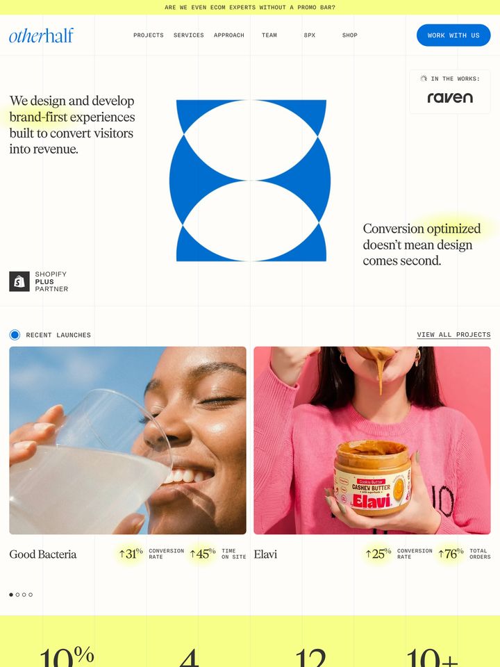
wearefamilystyle-com
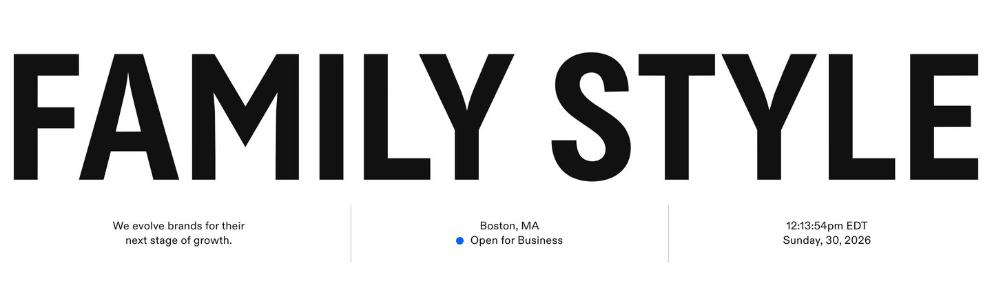
Swiss-inspired editorial minimalism with utilitarian structure. Massive grotesk typography pairs with airy cards and precise monospace metadata.
Visit siteRated
5.8/ 10
From 4 analysed sections. Two measured components and one judged by a model. Distinction is a rank within the library; the rest are scores in their own right.
- AI scorejudged
- 9.1
- Systemmeasured
- 3.2
- Distinctionmeasured
- 3.2
- on the grid
- 28%
- vertical rhythm
- 20%
- type on a scale
- 0%
- contrast passing AA
- 80%
- unlike the library
- 0.21
- model craft
- 7.8/10
- model deviation
- 5.8/10
Colour
Background#ffffff
Text#111111
Accent#0066ff
Surface#eae9e8
Muted#9c9b9a
Typefaces
- Display
- ABC Diatype Regular
- Body
- ABC Diatype Regular
- Mono
- Matter SemiMono Regular
- Source
- self_hosted
- Scale
- 16 · 24
Layout
- Grid
- —
- Container
- —
- Spacing base
- 10px
- Radius
- 0px
Capture
- Category
- studio
- Sections
- 4
- Captured
- 2026-08-30
- Rhythm
- white → dark → white → grey
Type rules
- body measure kept around 62 characters
- section eyebrows and status metadata set in uppercase mono
- display wordmark stretched across full viewport width
Colour rules
- primary background remains crisp white with warm grey surface cards
- vibrant accent colors reserved exclusively for status indicators and embedded client media
Voice rules
- clear descriptive project labels
- lead with strategic value proposition
Holds it together
- wrap portfolio items and testimonials in light neutral surface containers
- anchor live status and location metadata in monospace directly beneath the hero wordmark
- treat imagery as the primary source of color against monochrome layouts
Contrast
text on background18.9:1 AAA
muted text on background2.8:1 fail
text on surface15.6:1 AAA
accent on background4.8:1 AA
background on accent4.8:1 AA
Type, measured
- Body
- 24px / 1.42
- Measure
- 62 characters
- Display
- 24px / 1.42
- Tracking
- 0em display
- Scale ratio
- —
Voice
- Tone
- direct, understated, clarifying
- Sentences
- medium
- Person
- first
- Vocabulary
- precise
- Calls to action
- read
Built with
- Builder
- framer
- Framework
- —
- Motion
- gsap
- WebGL
- —
- Nav
- —
- Length
- 7 screens
Sections in page order
3 marked strong · 4- 00
hero
StrongHigh-impact typographic hero pairing an oversized grotesk wordmark with a clean Swiss information bar below.
- Mood
- bold + quiet
- Layout
- 12 col · stacked · airy
- 01
showcase
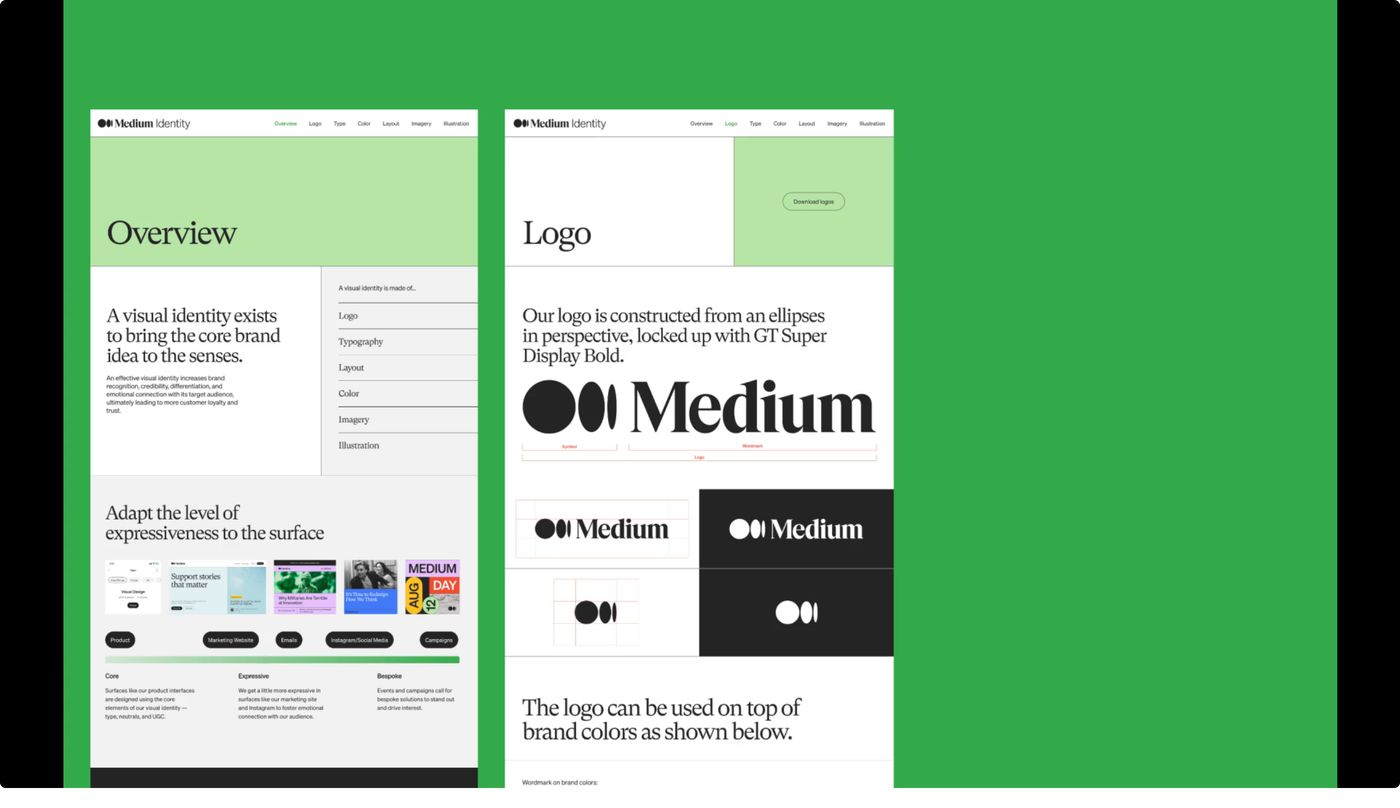
StrongA crisp, structured presentation of brand identity guidelines displayed side-by-side on a vivid green backdrop.
- Mood
- editorial + clinical
- Layout
- 1 col · centered · balanced
- 02
showcase
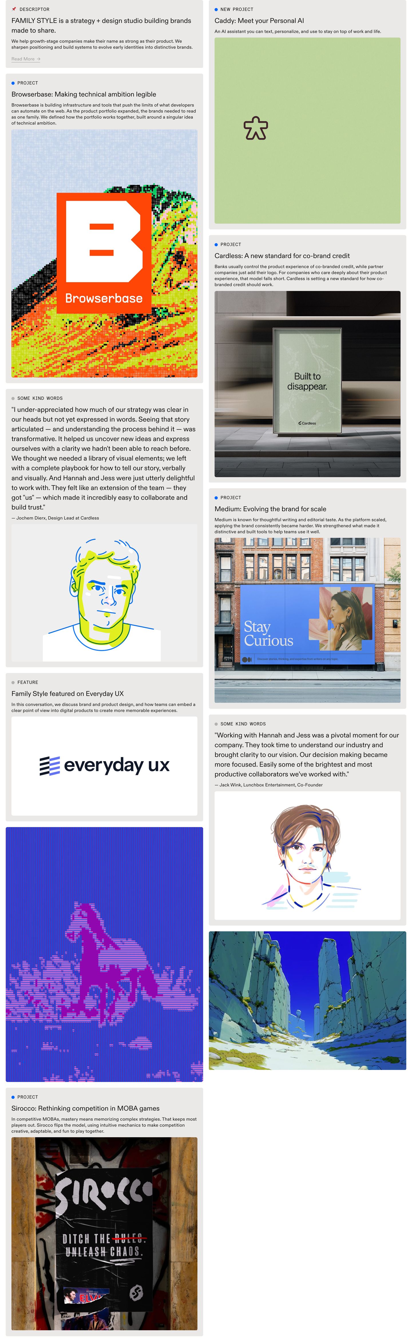
StrongA structured, quiet editorial portfolio grid blending project case studies, client testimonials, and studio insights inside soft grey content cards.
- Mood
- quiet + editorial
- Layout
- 1 col · grid · balanced
- 03
footer
Subtle minimalist footer featuring faint oversized geometric lettering behind clean utilitarian contact and social links.
- Mood
- quiet + raw
- Layout
- 6 col · grid · airy