
Microsoft Design
Contemplative and serene editorial atmosphere. Massive, light-weight sans-serif titles drift over vast warm-grey surfaces, creating an unhurried digital archive. Vibrant, tactile 3D imagery and UI vignettes sit in rounded cards to inject color without breaking the quiet museum tone.
Visit siteRated
7.4/ 10
From 8 analysed sections. Two measured components and one judged by a model. Distinction is a rank within the library; the rest are scores in their own right.
- AI scorejudged
- 9.3
- Systemmeasured
- 6.1
- Distinctionmeasured
- 5.1
- on the grid
- 22%
- vertical rhythm
- 51%
- type on a scale
- 70%
- contrast passing AA
- 100%
- unlike the library
- 0.70
- model craft
- 7.9/10
- model deviation
- 4.1/10
Colour
Background#ececea
Text#272727
Surface#e4e4e2
Muted#6a6a69
Typefaces
- Display
- Segoe UI Variable
- Body
- Segoe UI Variable
- Mono
- —
- Source
- self_hosted
- Scale
- 9 · 12 · 13 · 15 · 16 · 18
Layout
- Grid
- 3 columns
- Container
- 1280px
- Spacing base
- 4px
- Radius
- 16px · 24px
Capture
- Category
- media
- Sections
- 8
- Captured
- 2026-09-16
- Rhythm
- cream x3 → dark → cream x5
Type rules
- display type is set at extreme sizes in light weights with tight negative tracking
- all taxonomies and card metadata appear in small uppercase labels
- body text maintains airy line spacing against neutral surfaces
Colour rules
- structural canvas is strictly monochrome warm grey with no thematic background color
- chromatic color is strictly isolated within card graphics, illustrations, and avatar photography
Voice rules
- frame technical advances through humanistic and philosophical inquiry
- pair concise conceptual titles with short explanatory abstracts
Holds it together
- isolate all saturated color inside rounded media cards and artwork containers
- render hero and section titles in ultra-light display weights at scale
- use small uppercase metadata tags above article headlines to establish context
Contrast
text on background12.6:1 AAA
muted text on background4.6:1 AA
text on surface11.7:1 AAA
Type, measured
- Body
- 9px / 1.49
- Measure
- 156 characters
- Display
- 60px / 1.2
- Tracking
- -0.033em display
- Scale ratio
- 1.61
Voice
- Tone
- reflective, intellectual
- Sentences
- medium
- Person
- first
- Vocabulary
- specialised
- Calls to action
- explore, view, download, read
Built with
- Builder
- —
- Framework
- —
- Motion
- lenis, swiper
- WebGL
- —
- Nav
- top_bar, 36 items
- Length
- 13.7 screens
Mode
Sections in page order
- 00
hero
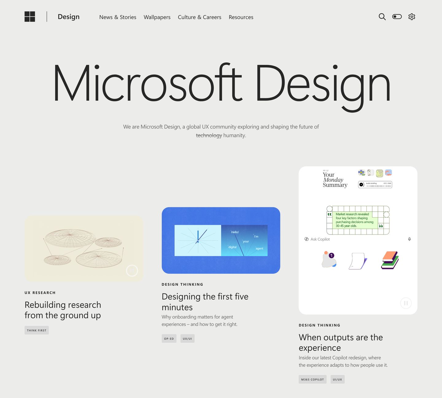
StrongQuiet, spacious editorial hero featuring an oversized light-weight title above an asymmetrical three-card grid on warm pale grey.
- Mood
- serene + contemplative
- Layout
- 3 col · stacked · airy
- 01
showcase
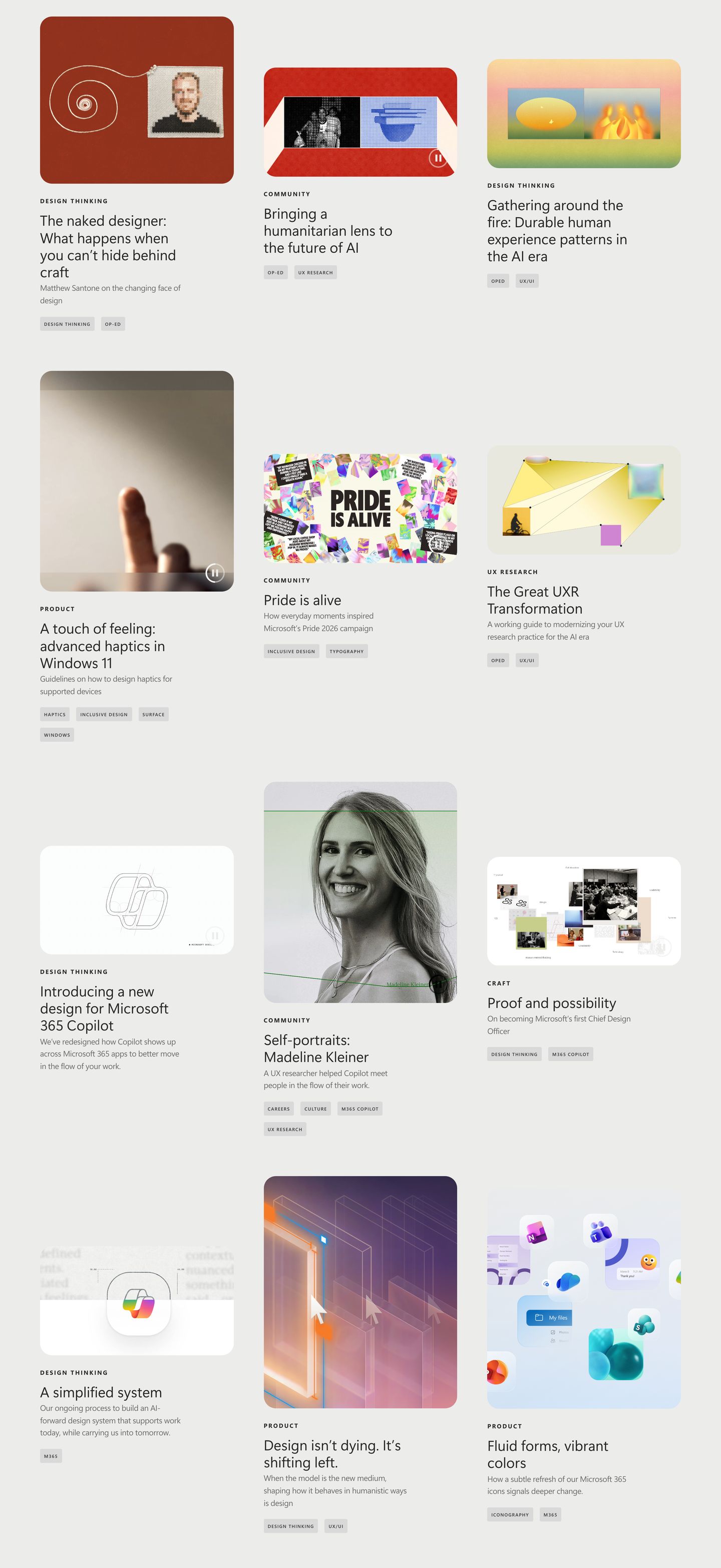
StrongAn expansive, thoughtful editorial showcase presenting design essays and case studies through varied multimedia cards across an unhurried modular grid.
- Mood
- contemplative + serene
- Layout
- 3 col · grid · balanced
- 02
video
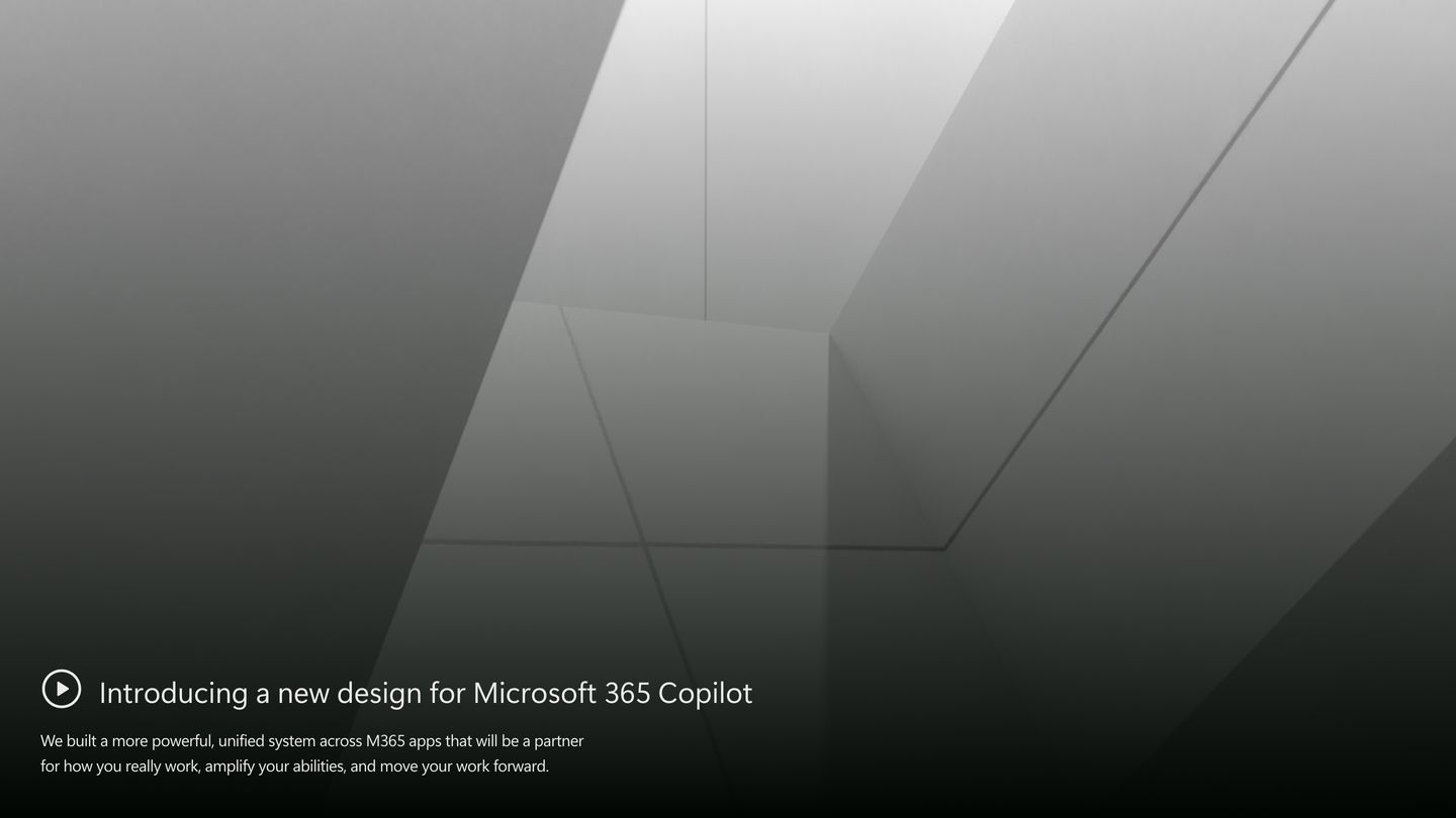
Monochromatic and quietly monumental, pairing soft architectural lighting with discreet lower-third text and a subtle play trigger.
- Mood
- serene + ethereal
- Layout
- 1 col · full bleed · airy
- 03
showcase
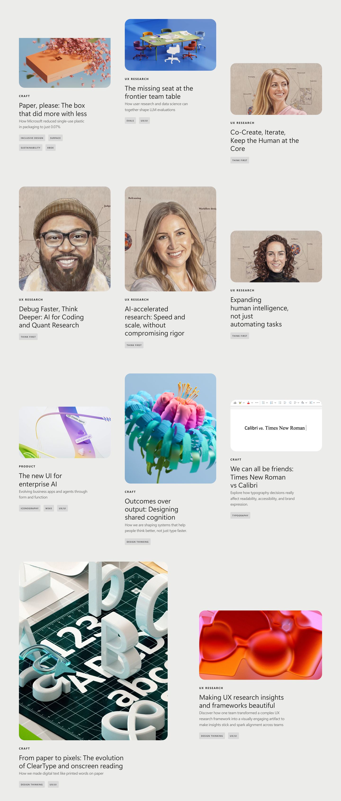
A spacious editorial masonry grid of design research case studies paired with expressive 3D visuals and illustrated portraits on a warm neutral canvas.
- Mood
- contemplative + serene
- Layout
- 3 col · grid · airy
- 04
showcase
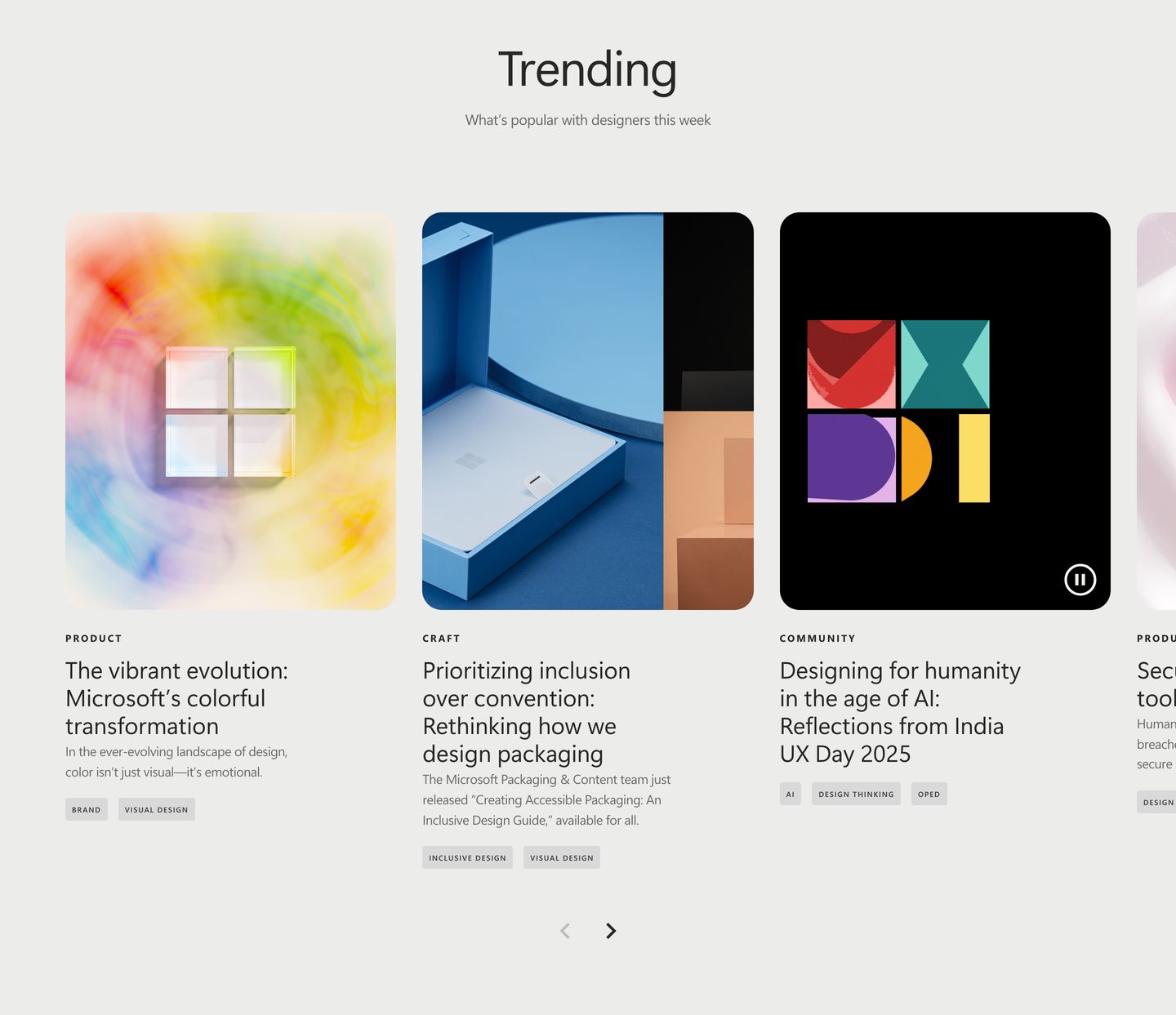
Clean, airy editorial carousel presenting design stories with rich visual thumbnails and subtle pill tags against a soft neutral background.
- Mood
- reassuring + serene
- Layout
- 4 col · grid · airy
- 05
team
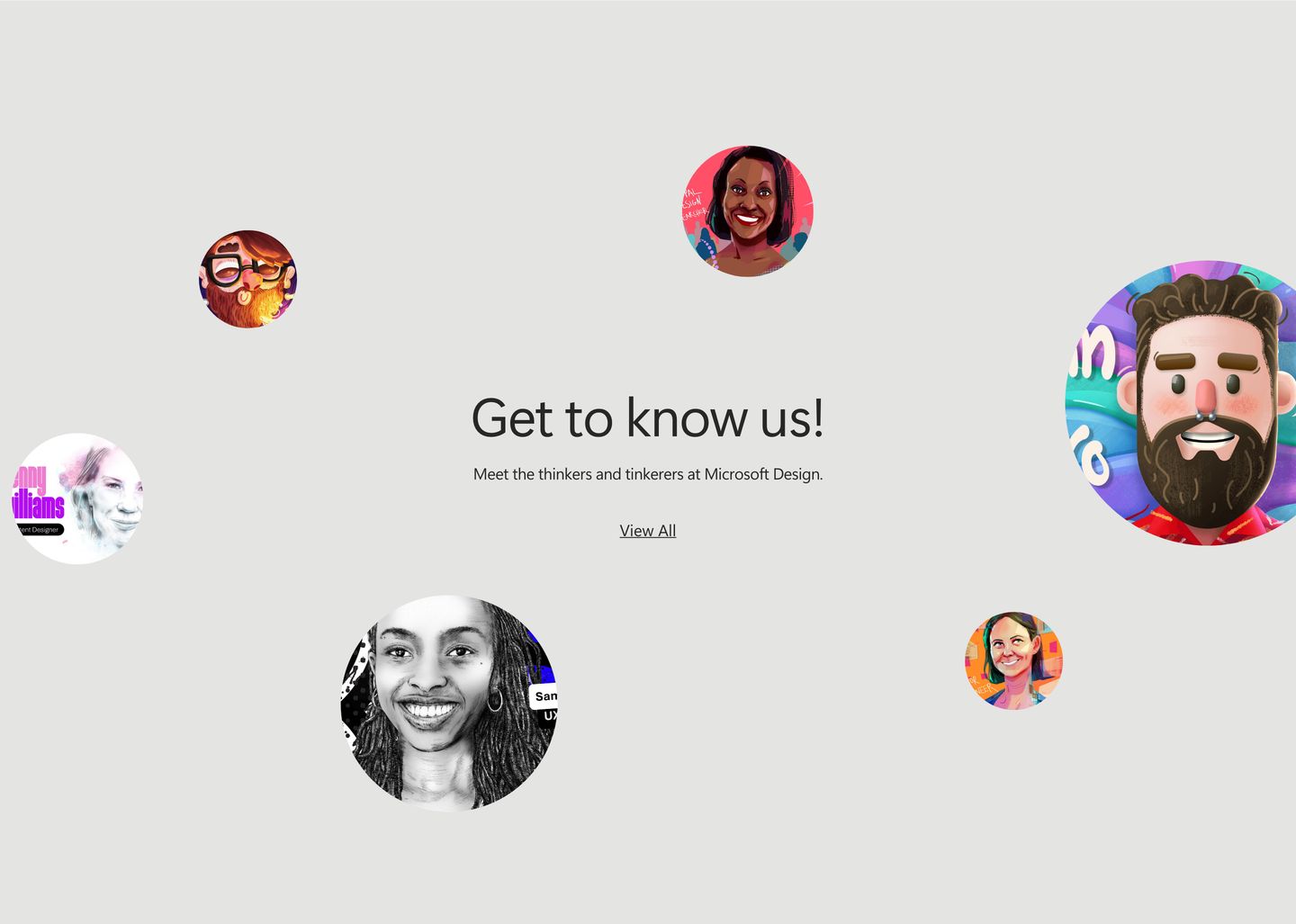
StrongCircular illustrated portraits float playfully around a minimalist centered team invitation against a soft neutral backdrop.
- Mood
- playful + whimsical
- Layout
- 1 col · centered · airy
- 06
feature grid
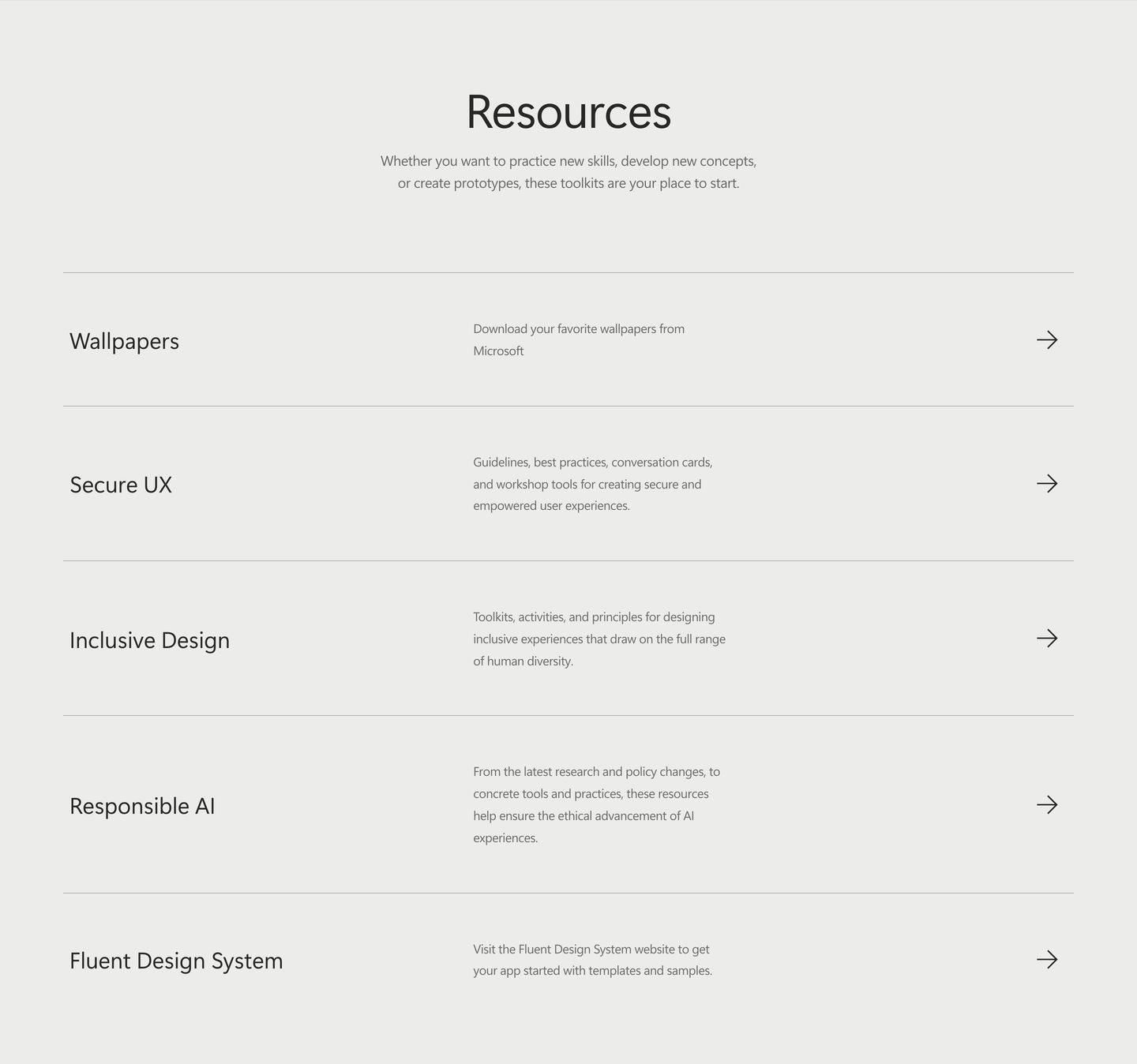
Spacious and quiet resource directory presented as an airy three-column list with fine divider lines and muted neutral tones.
- Mood
- serene + clinical
- Layout
- 3 col · stacked · airy
- 07
footer
A quiet, highly restrained corporate footer providing standard navigation links and social icons on an off-white field.
- Mood
- serene + reassuring
- Layout
- 2 col · split · airy



