The Launch Company
Nostalgic mid-century space program optimism meets modern digital craft. Warm cream backgrounds, halftone NASA mission imagery, and retro CRT monitor mockups evoke the excitement of a high-stakes launch, while red handwritten scribbles inject playful wit.
Visit siteRated
7.2/ 10
From 5 analysed sections. Two measured components and one judged by a model. Distinction is a rank within the library; the rest are scores in their own right.
- AI scorejudged
- 9.6
- Systemmeasured
- 5.6
- Distinctionmeasured
- 4.0
- on the grid
- 29%
- vertical rhythm
- 78%
- type on a scale
- 57%
- contrast passing AA
- 60%
- unlike the library
- 0.65
- model craft
- 8.0/10
- model deviation
- 5.4/10
Colour
Background#f6f5f2
Text#111110
Accent#d93a2b
Surface#fcfbf9
Muted#6b6a66
Typefaces
- Display
- Inter
- Body
- Inter
- Mono
- Doto
- Source
- self_hosted
- Scale
- 13 · 15 · 17 · 22 · 27 · 44
Layout
- Grid
- 16 columns
- Container
- 1270px
- Spacing base
- 4px
- Radius
- 12px · 24px · 9999px
Capture
- Category
- agency
- Sections
- 5
- Captured
- 2026-09-16
- Rhythm
- cream x2 → dark → cream x2 → dark
Type rules
- display headings set in large sentence-case Inter with tight negative tracking at -0.025em
- body copy maintained around 69 characters per line with generous 1.6 line-height
- handwritten accent notes styled in script typography for playful marginalia
Colour rules
- warm cream #f6f5f2 serves as the primary canvas across over 75% of the page
- deep charcoal #111110 provides grounded contrast in pill navigation, key buttons, and testimonial zones
- vibrant red #d93a2b is reserved strictly for handwritten notes and critical launch buttons
Voice rules
- pair bold business claims with self-aware conversational humor
- use first-person plural for agency personality and direct second-person for client prompts
Holds it together
- anchor vintage space launch and mission control halftone illustrations along section bottoms
- showcase case studies inside retro hardware enclosures, vintage CRT monitors, and physical product mockups
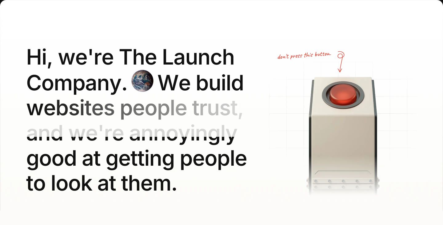
- punctuate UI moments with red handwritten notes and arrows to create conversational warmth
- house primary call-to-action buttons in full pill shapes with bold contrasting fills
Contrast
text on background17.3:1 AAA
muted text on background5.0:1 AA
text on surface18.3:1 AAA
accent on background4.2:1 AA Large
background on accent4.2:1 AA Large
Type, measured
- Body
- 17px / 1.6
- Measure
- 69 characters
- Display
- 68px / 1.03
- Tracking
- -0.025em display
- Scale ratio
- 1.41
Voice
- Tone
- confident, witty, conversational
- Sentences
- medium
- Person
- mixed
- Vocabulary
- plain
- Calls to action
- book, see, tell
Built with
- Builder
- —
- Framework
- next
- Motion
- lenis
- WebGL
- —
- Nav
- top_bar, 6 items
- Length
- 5.3 screens
Mode
Sections in page order
- 00
hero
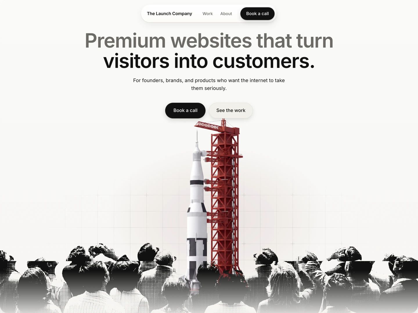
Clean, spacious hero pairing crisp modernist typography with a retro halftone rocket launch montage.
- Mood
- nostalgic + serene
- Layout
- 1 col · centered · airy
- 01
showcase
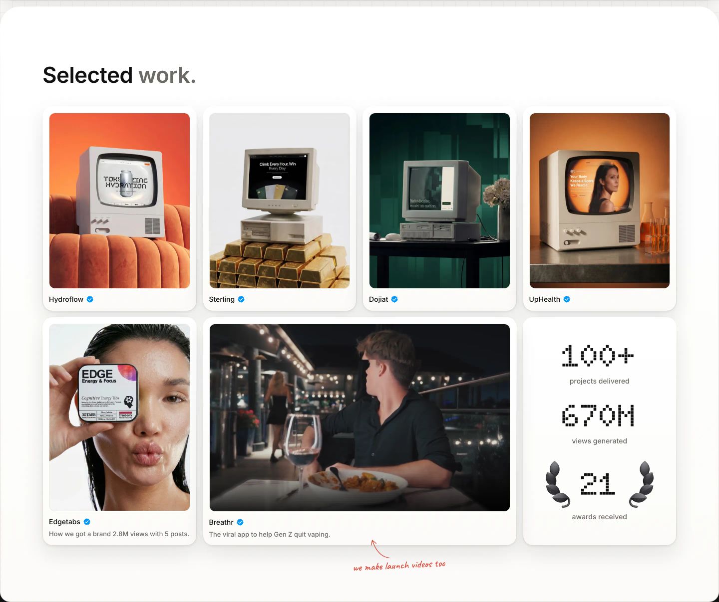
StrongA crisp showcase grid blending nostalgic retro-computing 3D renders with modern video and playful handwritten annotations.
- Mood
- nostalgic + playful
- Layout
- 4 col · grid · balanced
- 02
testimonial
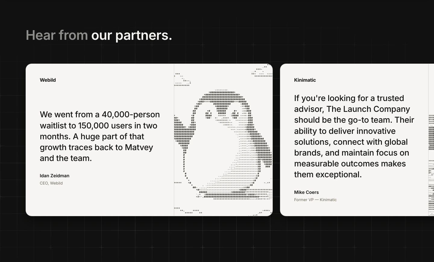
Crisp testimonial cards on a subtle dark grid, featuring ASCII art illustration alongside structured client endorsements.
- Mood
- reassuring
- Layout
- 2 col · grid · balanced
- 03
statement
StrongA cheeky introduction pairing punchy bold typography with a tactile 3D red button that begs to be clicked.
- Mood
- playful + whimsical
- Layout
- 2 col · split · airy
- 04
cta
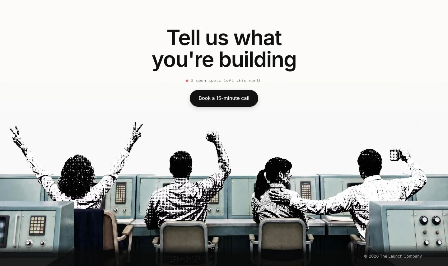
StrongAn expansive call to action pairing centered stark typography with a celebratory vintage mission-control halftone illustration.
- Mood
- joyful + nostalgic
- Layout
- 1 col · stacked · airy