Qount
Systematic, rigorous, and technologically assured. High-contrast dark bands frame clean daylight dashboards, using vivid fluorescent chartreuse accents to guide attention through complex financial workflows and risk intelligence metrics.
Take the vibe
Rated
5.0/ 10
From 13 analyzed sections. Two measured components and one judged by a model. Distinction is a rank within the library; the rest are scores in their own right.
- AI scorejudged
- 7.3
- Systemmeasured
- 3.6
- Distinctionmeasured
- 1.7
- on the grid
- 28%
- vertical rhythm
- 49%
- type on a scale
- 33%
- contrast passing AA
- 33%
- unlike the library
- 0.52
- model craft
- 6.9/10
- model deviation
- 2.8/10
Color
Background#ffffff
Text#000000
Accent#d9ff42
Surface#f0f0f0
Muted#8f8f8f
Typefaces
- Display
- —
- Body
- —
- Mono
- —
- Source
- —
- Scale
- 12 · 14 · 16 · 18 · 20 · 24
Layout
- Grid
- 24 columns
- Container
- 1095px
- Spacing base
- 8px
- Radius
- 8px · 16px
Capture
- Category
- saas
- Sections
- 13
- Captured
- 2026-09-10
- Rhythm
- dark x4 → white x3 → dark → white x2 → dark
Type rules
- display headlines set in sentence case with tight line height
- body copy constrained to 60 characters measure for maximum scannability
- metrics and data points displayed in bold high-contrast weights
Color rules
- fluorescent chartreuse (#d9ff42) reserved exclusively for primary action triggers and status tags
- deep dark surfaces (#1a1a1a) anchor the hero, AI spotlights, and CTA bands
- pure white (#ffffff) and cool grey (#f0f0f0) surface the majority of product workflow mockups
Voice rules
- lead with quantifiable practice performance outcomes
- pair workflow pain points directly with platform capabilities
Holds it together
- use chartreuse (#d9ff42) as a high-visibility badge and primary CTA fill across dark surfaces
- enclose feature metrics and platform tools in subtle rounded surface cards with hairline borders
- alternate deep charcoal hero and AI spotlight blocks with light analytical feature galleries
Contrast
text on background21.0:1 AAA
muted text on background3.2:1 AA Large
text on surface18.4:1 AAA
muted text on surface2.8:1 fail
accent on background1.1:1 fail
background on accent1.1:1 fail
Type, measured
- Body
- 18px / 1.56
- Measure
- 60 characters
- Display
- 48px / 1.17
- Tracking
- 0em display
- Scale ratio
- 1.28
Voice
- Tone
- analytical, declarative, authoritative
- Sentences
- medium
- Person
- second
- Vocabulary
- industry-specific
- Calls to action
- get, explore, watch, read
Built with
- Builder
- —
- Framework
- —
- Motion
- swiper
- WebGL
- —
- Nav
- top_bar, 20 items
- Length
- 15.2 screens
Sections in page order
- 00
hero
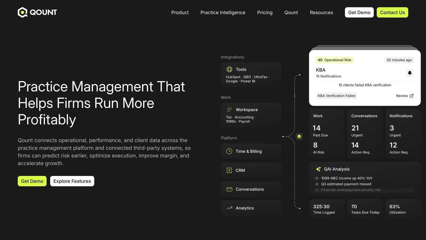
Sharp, high-contrast dark SaaS hero presenting practice management software through precise data cards and energetic lime accents.
- Mood
- clinical + serene
- Layout
- 2 col · split · balanced
- 01
logo bar
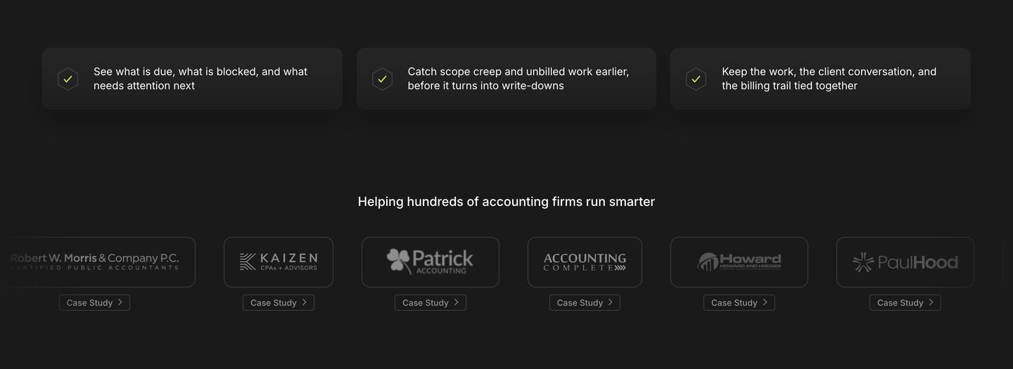
StrongA dark, reassuring trust section pairing three top benefit pills with a neat row of monochromatic client case study cards.
- Mood
- clinical
- Layout
- 6 col · stacked · balanced
- 02
comparison
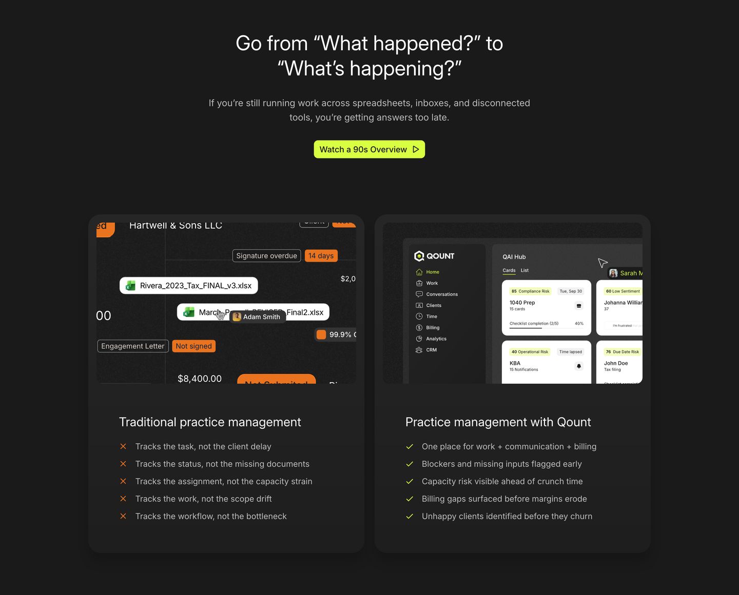
StrongA dark, structured SaaS comparison section contrasting outdated spreadsheet workflows with modern practice management through side-by-side UI cards.
- Mood
- clinical + serene
- Layout
- 2 col · grid · balanced
- 03
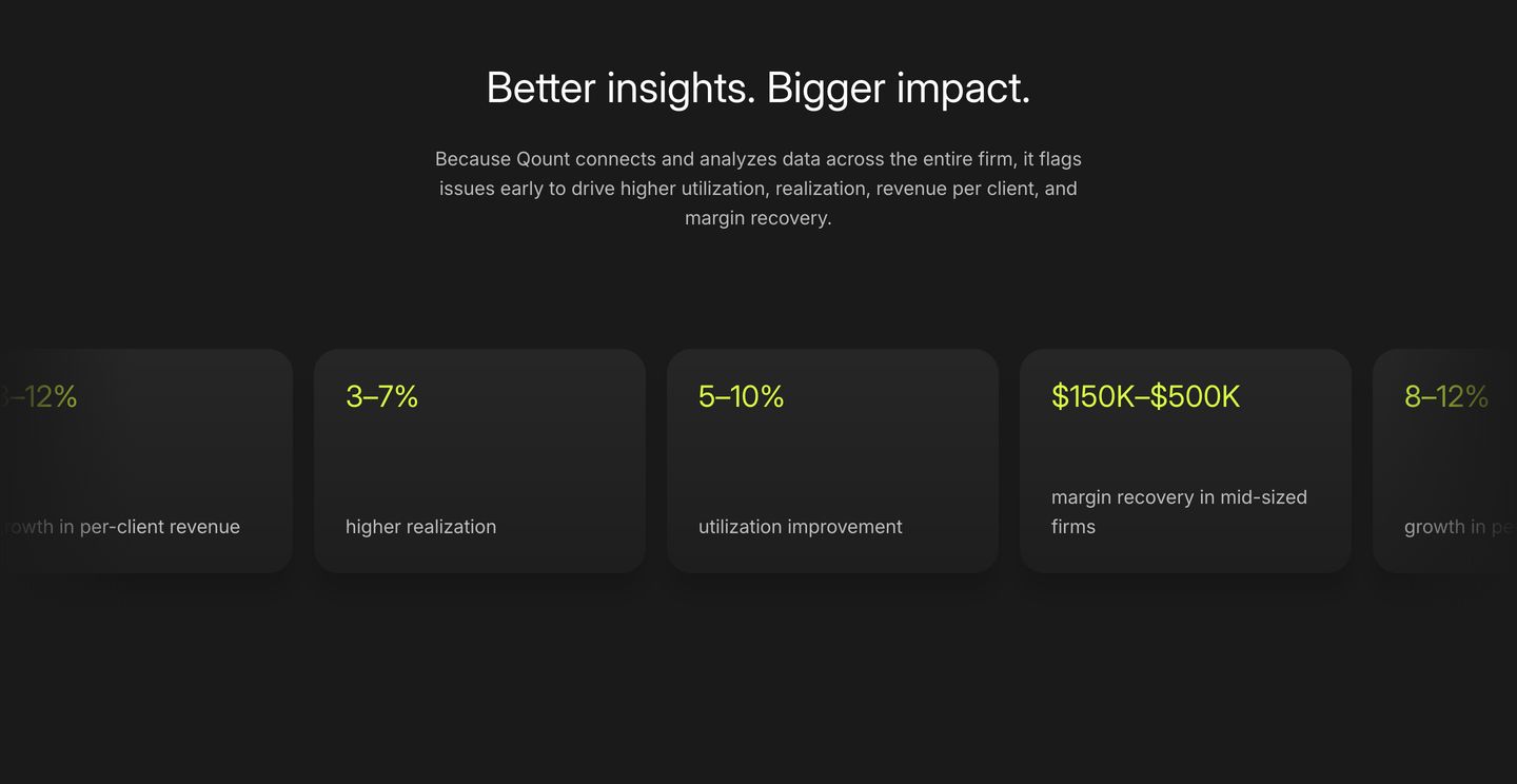
stats
Dark, confident metrics section presenting key performance statistics in rounded cards with vivid lime-yellow highlights.
- Mood
- clinical
- Layout
- 4 col · stacked · balanced
- 04
statement
Sparse and clinical split statement pairing a bold headline with a quiet explanatory note across vast white space.
- Mood
- clinical + serene
- Layout
- 2 col · split · airy
- 05
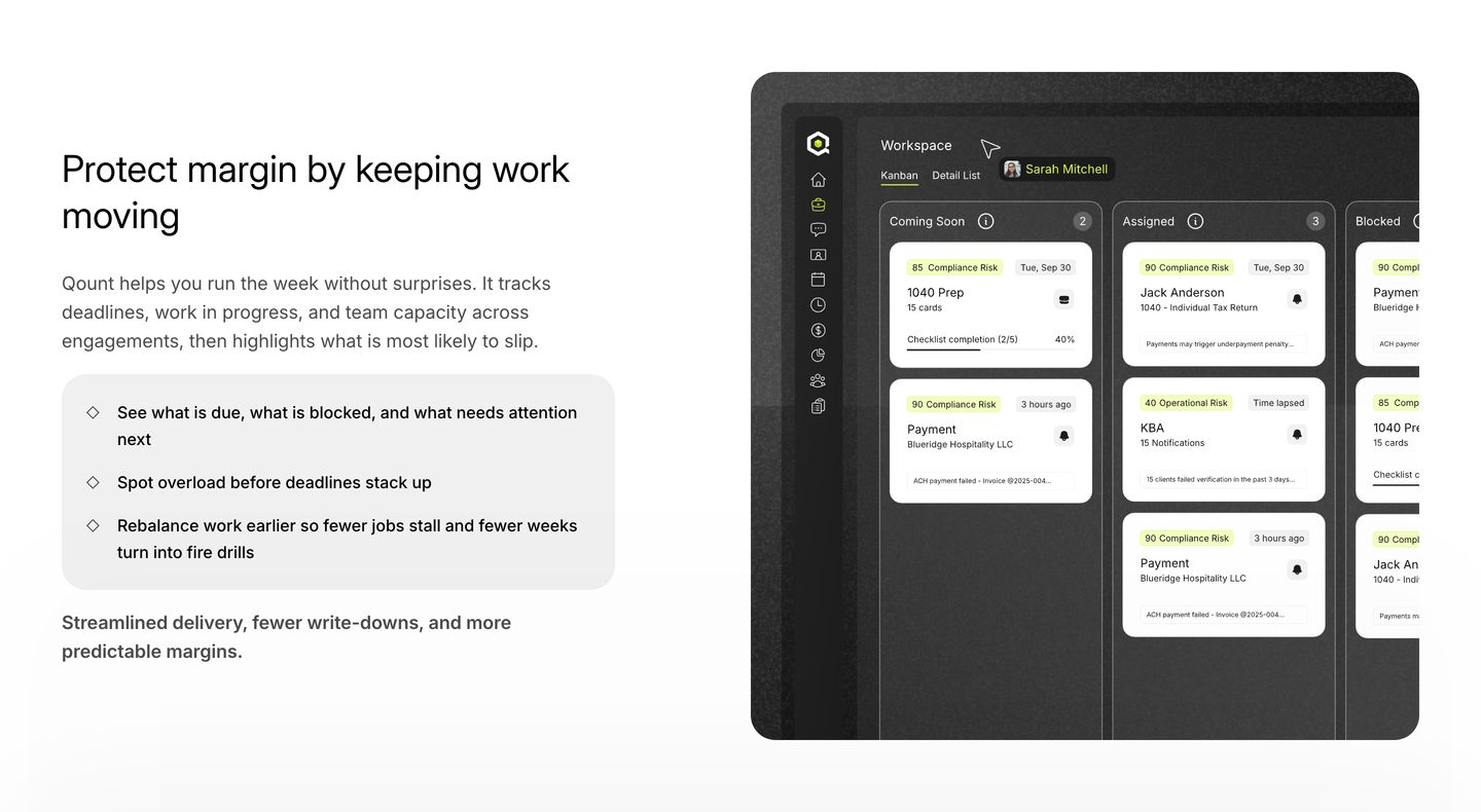
feature
A clean, reassuring product feature section pairing structured workflow copy with a dark-mode kanban dashboard mockup.
- Mood
- clinical
- Layout
- 2 col · split · balanced
- 06
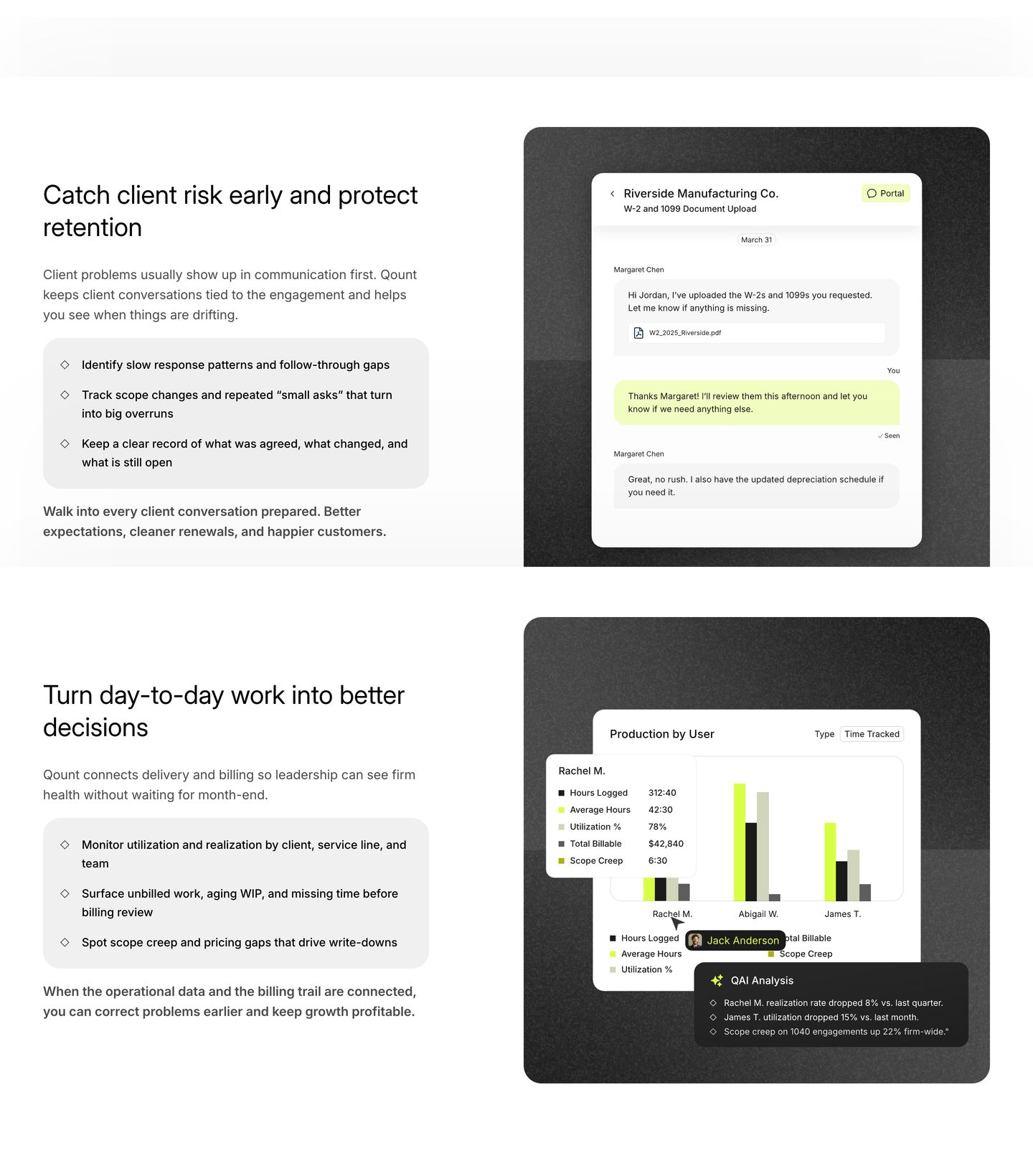
feature grid
Clean, systematic product feature breakdown pairing structured bulleted explanations with dark-framed application UI mockups.
- Mood
- clinical + serene
- Layout
- 2 col · split · balanced
- 07
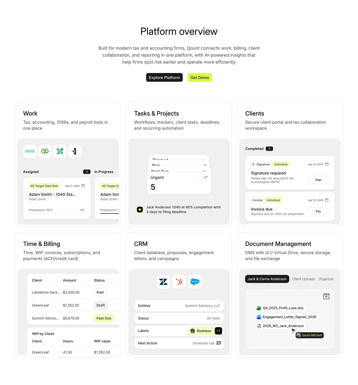
feature grid
A clean, structured six-card feature grid showcasing accounting and workflow modules through crisp product UI snippets.
- Mood
- clinical
- Layout
- 3 col · grid · balanced
- 08
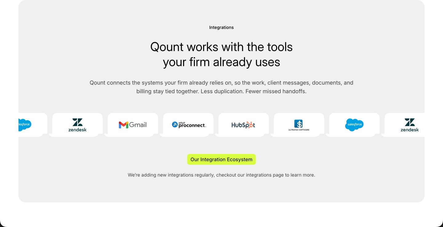
logo bar
A clean and airy corporate integration showcase featuring a horizontal band of app cards anchored by a vibrant neon pill button.
- Mood
- serene
- Layout
- 1 col · centered · airy
- 09
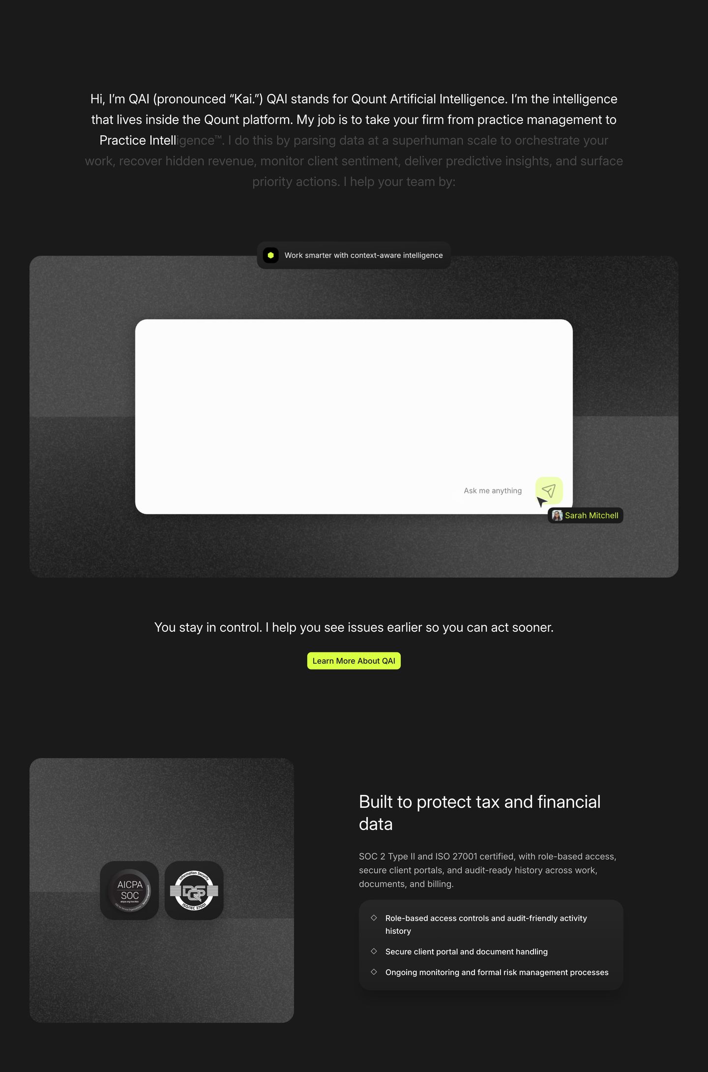
feature
StrongA dark, sleek product capability section presenting conversational AI and enterprise data security through textured cards and vibrant lime accents.
- Mood
- clinical
- Layout
- 2 col · stacked · balanced
- 10
testimonial
Clean, spacious testimonial carousel featuring video case studies with punchy lime metric callouts.
- Mood
- serene
- Layout
- 1 col · centered · airy

- 11
showcase
Clean corporate insight hub pairing a centered intro with an eclectic trio of editorial cards highlighted by sharp lime accents.
- Mood
- serene
- Layout
- 3 col · grid · balanced

- 12
footer
Dark structured closing section pairing an actionable demo card with a multi-column enterprise footer.
- Mood
- clinical
- Layout
- 5 col · stacked · balanced