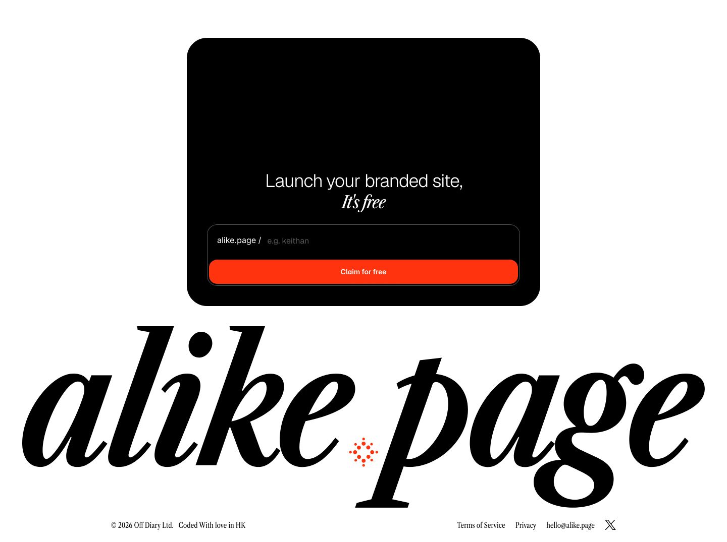
Alike
A stylish mix of dark-mode polish and editorial warmth. High-contrast italic serifs paired with minimalist sans-serif give creative authority, while electric red-orange accents and pill-shaped inputs drive quick onboarding action.
Take the vibe
Rated
7.1/ 10
From 4 analyzed sections. Two measured components and one judged by a model. Distinction is a rank within the library; the rest are scores in their own right.
- AI scorejudged
- 9.6
- Systemmeasured
- 6.3
- Distinctionmeasured
- 1.9
- on the grid
- 36%
- vertical rhythm
- 85%
- type on a scale
- 50%
- contrast passing AA
- 80%
- unlike the library
- 0.53
- model craft
- 8.0/10
- model deviation
- 5.0/10
Color
Background#000000
Text#ffffff
Accent#ff330f
Surface#ffffff
Muted#a3a3a3
Typefaces
- Display
- Libre Caslon Condensed
- Body
- Geist
- Mono
- —
- Source
- Scale
- 14 · 15 · 16 · 18 · 20 · 22
Layout
- Grid
- 16 columns
- Container
- 1100px
- Spacing base
- 4px
- Radius
- 12px · 24px · 9999px
Capture
- Category
- tools
- Sections
- 4
- Captured
- 2026-09-05
- Rhythm
- dark x3 → light x3
Type rules
- headlines mix italic condensed serif with geometric sans on alternate lines
- body text constrained to a measure of around 45 characters
- interactive input labels and helper tags use lowercase sans
Color rules
- pure red-orange #ff330f is reserved strictly for primary CTA buttons and the opening serif hook
- the page splits cleanly from deep black #000000 top sections into bright white #ffffff feature bento grids
- subtle muted body copy uses #a3a3a3 on dark backgrounds and dark charcoal on light surfaces
Voice rules
- lead with creator-centric culinary and publishing metaphors
- keep benefit descriptions under two sentences
Holds it together
- pair every primary display headline with an italic serif emphasis line
- embed domain claiming input boxes directly inside hero and bottom CTA cards
- separate full-width dark and light background blocks with a dithered pixel transition
Contrast
text on background21.0:1 AAA
muted text on background8.3:1 AAA
muted text on surface2.5:1 fail
accent on background5.7:1 AA
background on accent5.7:1 AA
Type, measured
- Body
- 16px / 1.4
- Measure
- 45 characters
- Display
- 72px / 1.2
- Tracking
- -0.014em display
- Scale ratio
- 1.46
Voice
- Tone
- playful, concise, creative
- Sentences
- short
- Person
- second
- Vocabulary
- plain
- Calls to action
- claim, launch, sign up
Built with
- Builder
- framer
- Framework
- —
- Motion
- —
- WebGL
- yes
- Nav
- top_bar, 3 items
- Length
- 8.2 screens
Sections in page order
- 00
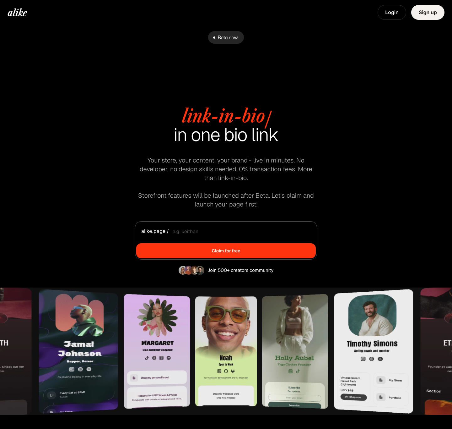
hero
StrongSleek pitch-black creator hero with vibrant red-orange typographic accents, a username claim input, and a curved carousel of creator profiles.
- Mood
- energetic + playful
- Layout
- 1 col · stacked · balanced
- 01
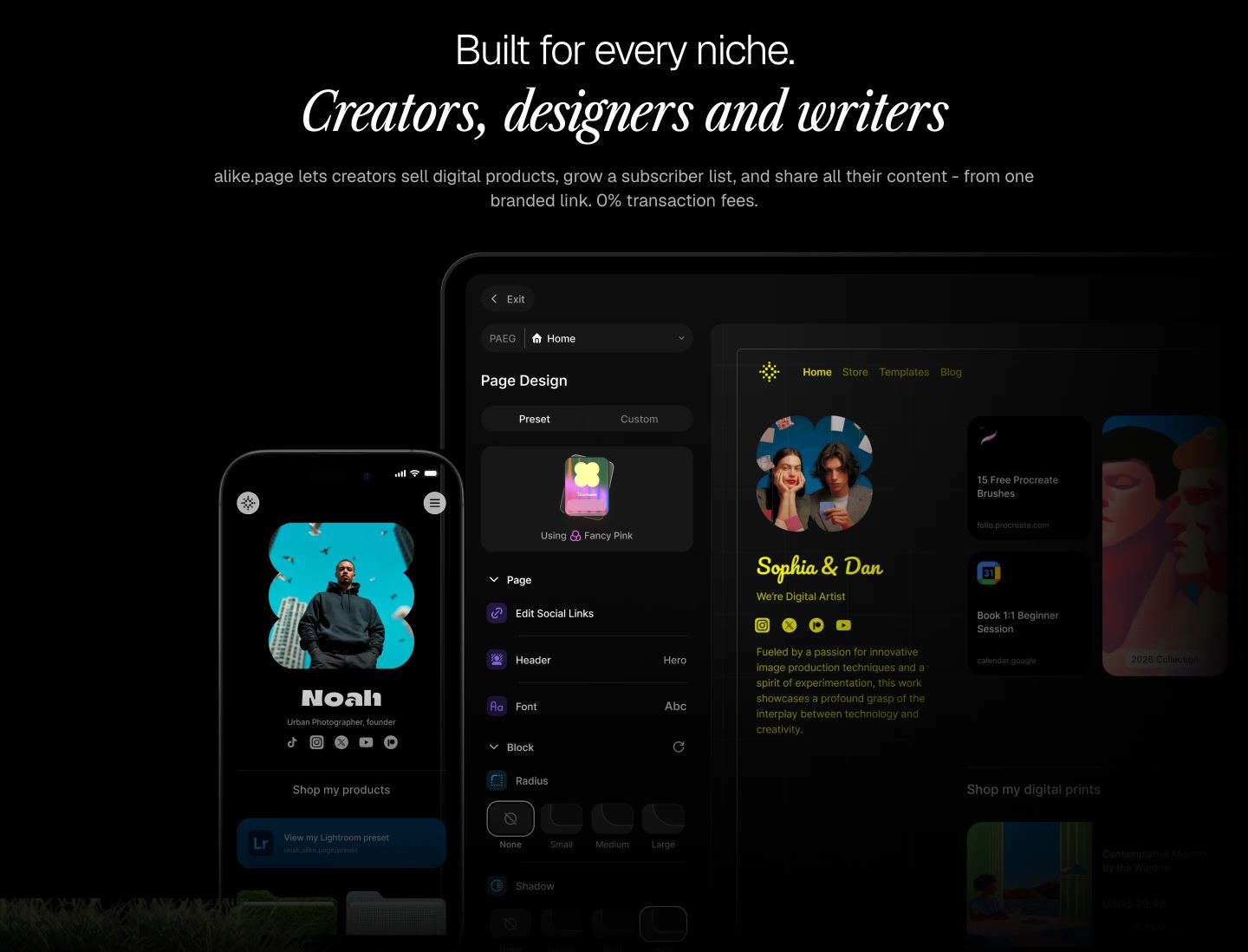
feature
Dark editorial feature section displaying layered device UI mockups beneath elegant italic serif typography.
- Mood
- luxurious + serene
- Layout
- 1 col · stacked · balanced
- 02
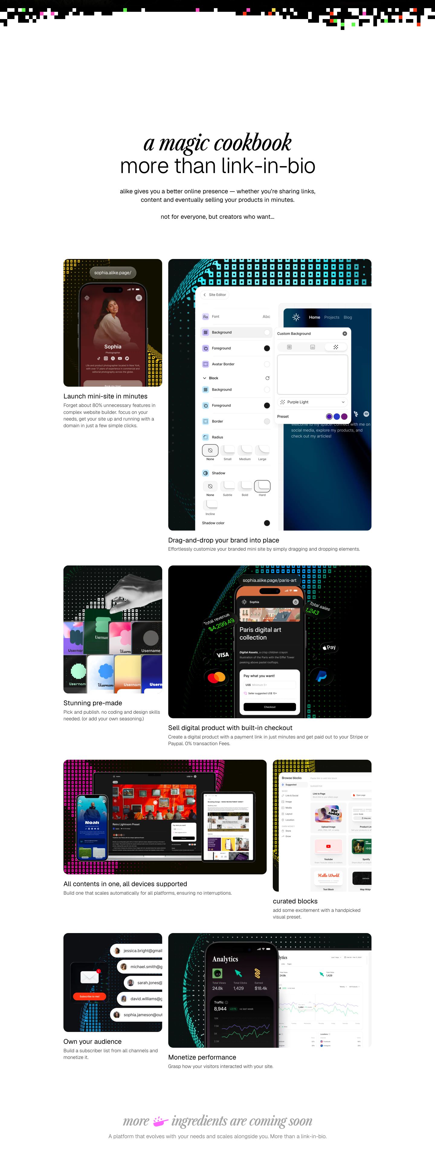
feature grid
StrongAn airy editorial showcase of creator-focused features presented through dark-mode UI mockups on a pristine white grid.
- Mood
- playful + serene
- Layout
- 2 col · grid · balanced
- 03
footer
StrongA stark, high-contrast footer combining a floating dark signup card with an enormous, elegant serif wordmark.
- Mood
- luxurious + serene
- Layout
- 1 col · stacked · airy