ToolKit
A playful digital specimen and brand system tool that pairs crisp editorial typography with vivid modular token grids. High-contrast typography controls invite immediate interaction at the top, while bright checkerboard blocks and dark case study panels establish a structured, utilitarian rhythm.
Take the vibe
Rated
6.7/ 10
From 8 analyzed sections. Two measured components and one judged by a model. Distinction is a rank within the library; the rest are scores in their own right.
- AI scorejudged
- 9.3
- Systemmeasured
- 4.9
- Distinctionmeasured
- 3.4
- on the grid
- 68%
- vertical rhythm
- 63%
- type on a scale
- 33%
- contrast passing AA
- 33%
- unlike the library
- 0.62
- model craft
- 7.9/10
- model deviation
- 4.9/10
Color
Background#ffffff
Text#000000
Accent#a6fe5a
Surface#ffffff
Muted#919191
Typefaces
- Display
- ABC Arizona Mix
- Body
- ABC Diatype
- Mono
- —
- Source
- self_hosted
- Scale
- 12 · 14 · 16 · 18 · 26 · 36
Layout
- Grid
- 12 columns
- Container
- 1392px
- Spacing base
- 4px
- Radius
- 0px · 4px · 100px
Capture
- Category
- tools
- Sections
- 8
- Captured
- 2026-09-16
- Rhythm
- white x5 → dark → white x2
Type rules
- display headlines set in ABC Arizona Mix at extreme scale with tight letter-spacing down to -0.04em
- body and system labels set in ABC Diatype at 16px with line-height 1.3 and 46 character measure
- pair display specimens directly with visible typographic slider and number input controls
Color rules
- stark white (#ffffff) canvas with high-contrast black (#000000) typography defines the primary layout
- vibrant saturated fills (#a6fe5a, #ff5720, #ff70d2, #6d07ee) reserved for checkerboard tokens, pricing tiles, and full-width CTA pills
Voice rules
- short imperative statements combining brand and web terminology
- explicit action-oriented CTA buttons with directional arrows
Holds it together
- feature live editable metric inputs directly above display specimen headlines
- render workflow steps in four bordered columns separated by vertical dotted hairline rules
- use saturated monochromatic card tiles to distinguish pricing tiers and interactive demo zones
- anchor the closing section with an oversized neon pill call-to-action button
Contrast
text on background21.0:1 AAA
muted text on background3.1:1 AA Large
text on surface21.0:1 AAA
muted text on surface3.1:1 AA Large
accent on background1.2:1 fail
background on accent1.2:1 fail
Type, measured
- Body
- 16px / 1.3
- Measure
- 46 characters
- Display
- 150px / 0.9
- Tracking
- -0.04em display
- Scale ratio
- 1.75
Voice
- Tone
- direct, instructive, pragmatic
- Sentences
- short
- Person
- second
- Vocabulary
- plain
- Calls to action
- build, try, buy, touch
Built with
- Builder
- —
- Framework
- —
- Motion
- —
- WebGL
- —
- Nav
- sticky_top_bar, 2 items, sticky
- Length
- 8.2 screens
Sections in page order
- 00
hero
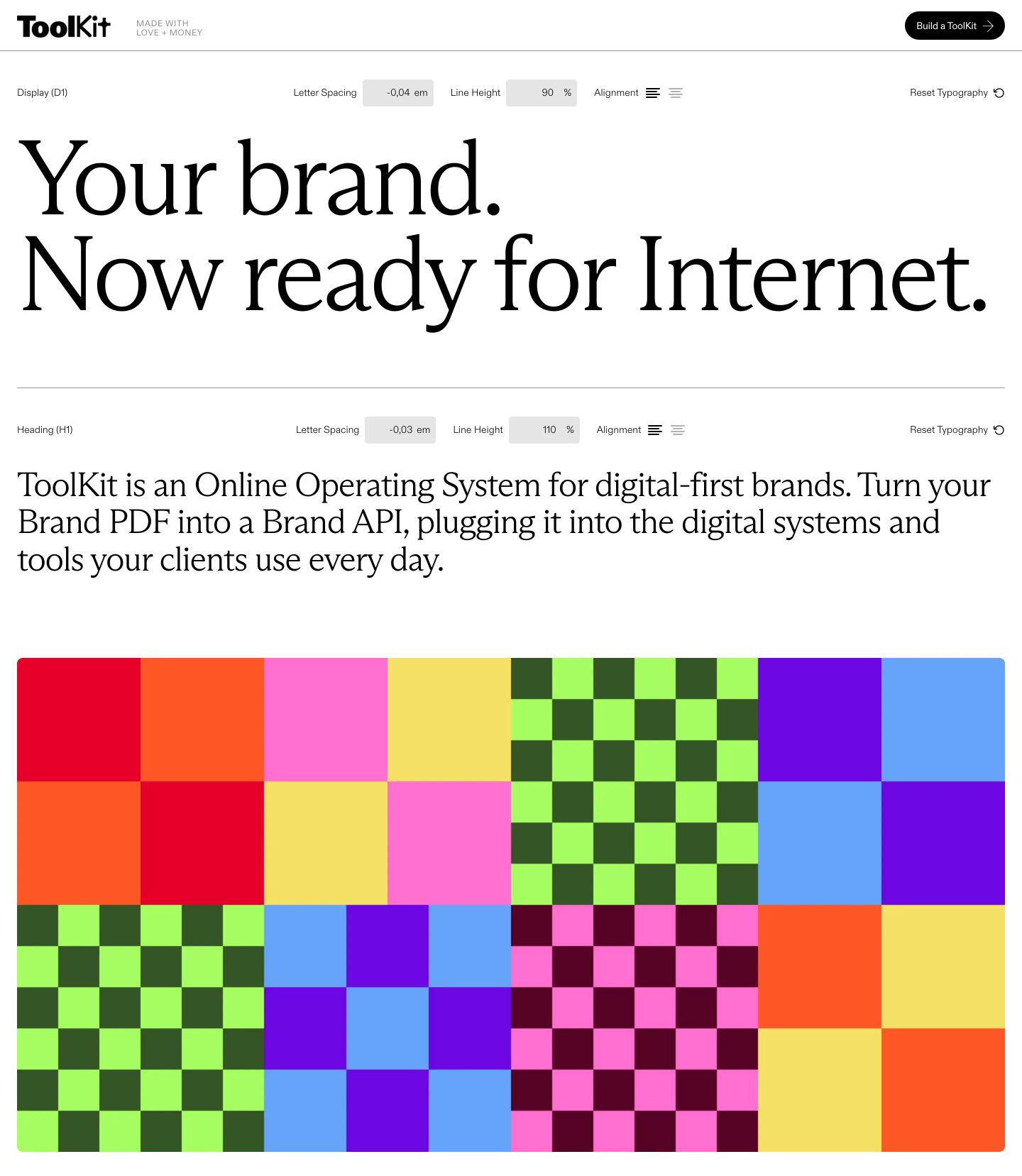
StrongCrisp editorial typography specimen hero integrated with live typesetting controls above a vibrant grid of geometric color blocks.
- Mood
- playful + clinical
- Layout
- 1 col · stacked · airy
- 01
hero
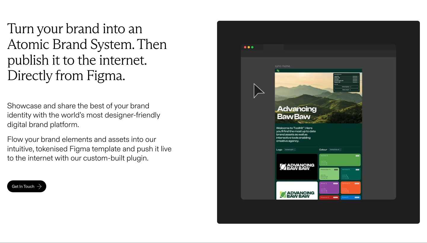
A clean, restrained editorial hero pairing refined serif typography with a dark product UI mockup on generous white space.
- Mood
- serene + clinical
- Layout
- 2 col · split · airy
- 02
feature grid
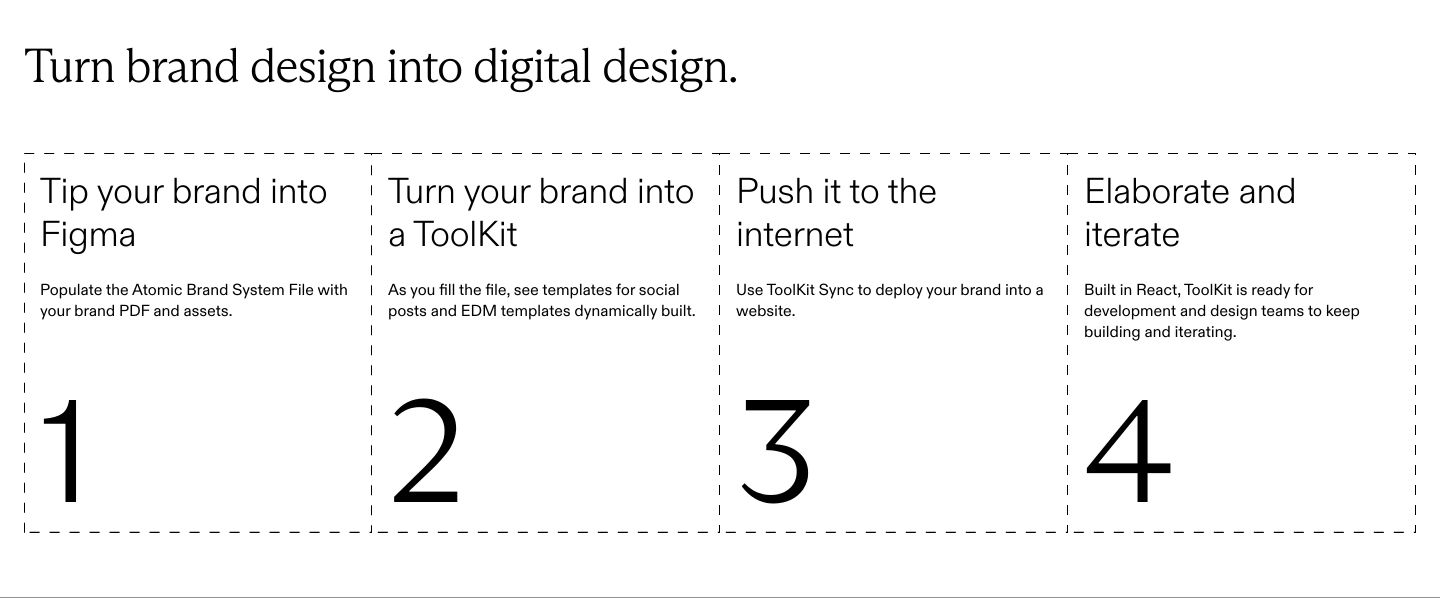
Minimal monochrome process grid structured with dashed blueprint lines and oversized step numerals.
- Mood
- clinical + serene
- Layout
- 4 col · grid · airy
- 03
logo bar
StrongClean, airy integration showcase pairing refined editorial typography with vibrant checkered geometric icons.
- Mood
- playful + serene
- Layout
- 5 col · grid · airy
- 04
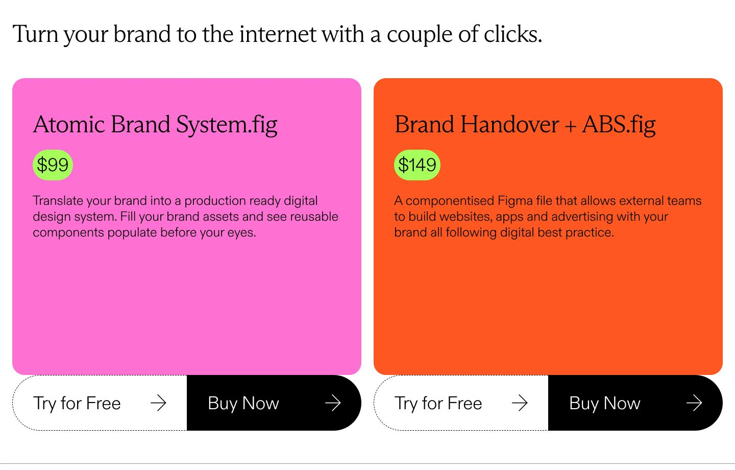
pricing
StrongHigh-voltage neon pricing cards featuring refined serif headings, punchy lime price badges, and attached dual action buttons.
- Mood
- playful + energetic
- Layout
- 2 col · grid · balanced
- 05
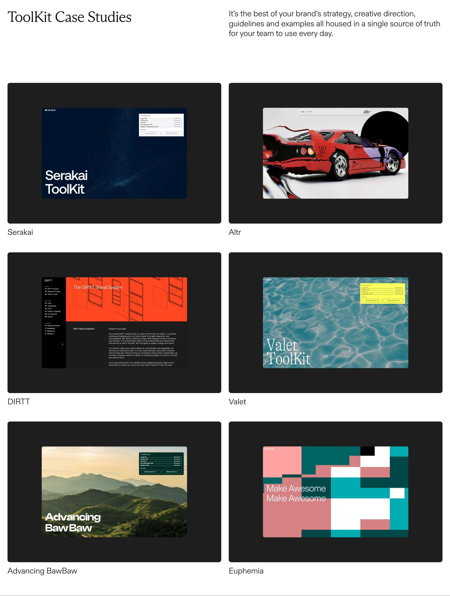
showcase
Clean and disciplined studio showcase presenting digital brand systems in an airy two-column grid of dark framed previews.
- Mood
- serene + clinical
- Layout
- 2 col · grid · airy
- 06
cta
Airy editorial call to action anchored by an oversized neon lime pill button.
- Mood
- energetic + playful
- Layout
- 2 col · stacked · airy
- 07
cta
A stark, restrained newsletter signup banner set against clean negative space with clinical Swiss clarity.
- Mood
- clinical + serene
- Layout
- 2 col · split · airy