Revone
Sleek, polished, and luminous. Pitch-black surfaces are illuminated by soft ambient indigo glows that frame crisp native macOS interface mockups. Rounded dark container cards and clean white typography produce a premium, focused software experience.
Take the vibe
Rated
7.4/ 10
From 7 analyzed sections. Two measured components and one judged by a model. Distinction is a rank within the library; the rest are scores in their own right.
- AI scorejudged
- 9.3
- Systemmeasured
- 6.3
- Distinctionmeasured
- 4.9
- on the grid
- 59%
- vertical rhythm
- 80%
- type on a scale
- 44%
- contrast passing AA
- 67%
- unlike the library
- 0.68
- model craft
- 7.9/10
- model deviation
- 3.3/10
Color
Background#000000
Text#ffffff
Accent#5f61ed
Surface#0d0d0d
Muted#9596ad
Typefaces
- Display
- Satoshi
- Body
- Satoshi
- Mono
- —
- Source
- Scale
- 12 · 14 · 16 · 20 · 30 · 40
Layout
- Grid
- 16 columns
- Container
- 1200px
- Spacing base
- 5px
- Radius
- 16px · 24px
Capture
- Category
- tools
- Sections
- 7
- Captured
- 2026-09-10
- Rhythm
- dark x8
Type rules
- display headlines use sentence case with tight negative tracking (-0.066em)
- body text maintains a comfortable 64-character measure at 16px with 1.6 line height
Color rules
- pure black (#000000) dominates the background with #0d0d0d for rounded card surfaces
- accent periwinkle-blue (#5f61ed) is reserved strictly for primary CTA pills, key icons, and luminous background glows
Voice rules
- lead with core utility in under six words
- pair concise headlines with single-sentence body explanations
Holds it together
- nest macOS product mockups inside dark rounded surface cards (#0d0d0d) on a solid black canvas
- use soft periwinkle-blue ambient backlights behind key showcase screenshots and the primary pricing card
- render primary download triggers as rounded pill buttons with the Apple icon
Contrast
text on background21.0:1 AAA
muted text on background7.2:1 AAA
text on surface19.4:1 AAA
muted text on surface6.7:1 AA
accent on background4.4:1 AA Large
background on accent4.4:1 AA Large
Type, measured
- Body
- 16px / 1.6
- Measure
- 64 characters
- Display
- 169px / 0.8
- Tracking
- -0.066em display
- Scale ratio
- 1.80
Voice
- Tone
- direct, minimal, confident
- Sentences
- short
- Person
- second
- Vocabulary
- plain
- Calls to action
- download, get
Built with
- Builder
- framer
- Framework
- —
- Motion
- —
- WebGL
- yes
- Nav
- top_bar, 5 items
- Length
- 11.2 screens
Sections in page order
- 00
hero
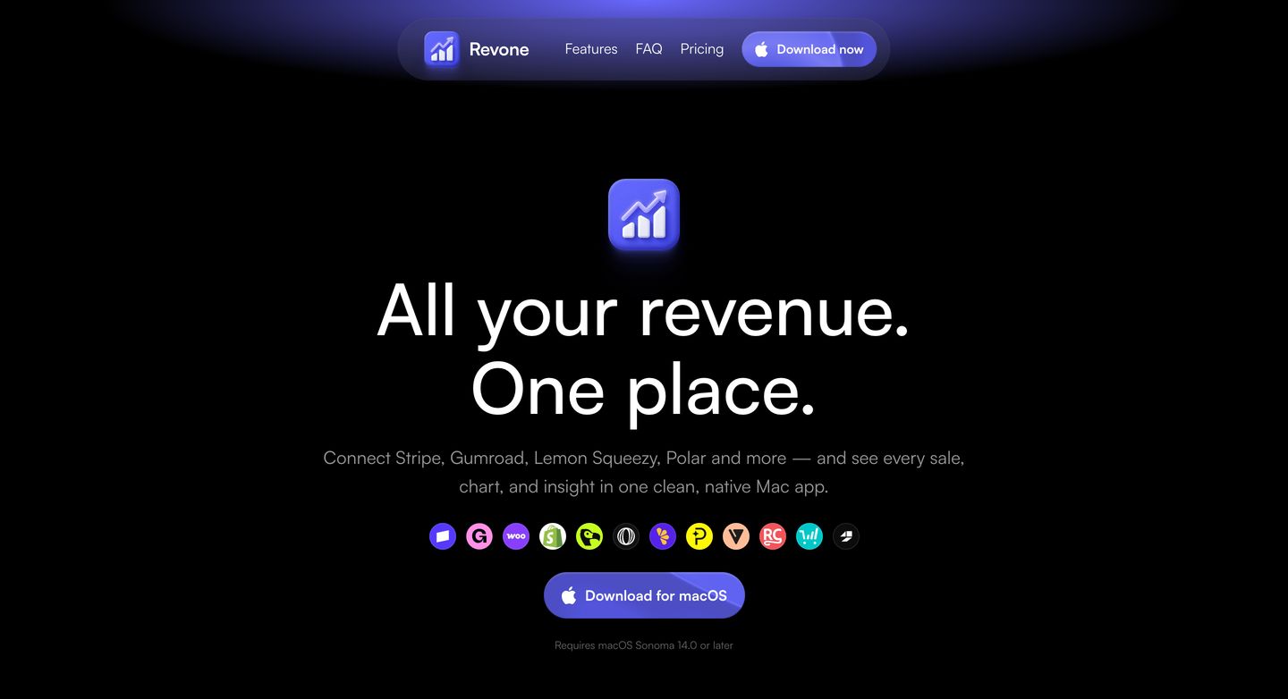
Dark, luminous Mac app hero focused around a glowing 3D icon, concise typography, and floating pill navigation.
- Mood
- serene + ethereal
- Layout
- 1 col · centered · airy
- 01
feature
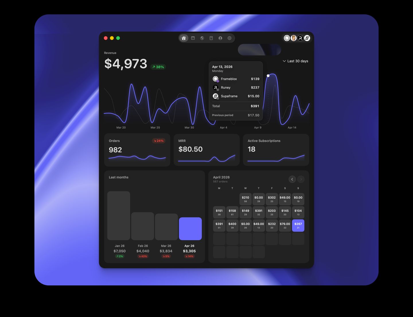
StrongA sleek dark analytics dashboard floats over a luminous cobalt blue abstract gradient backdrop.
- Mood
- ethereal + clinical
- Layout
- 1 col · centered · airy
- 02
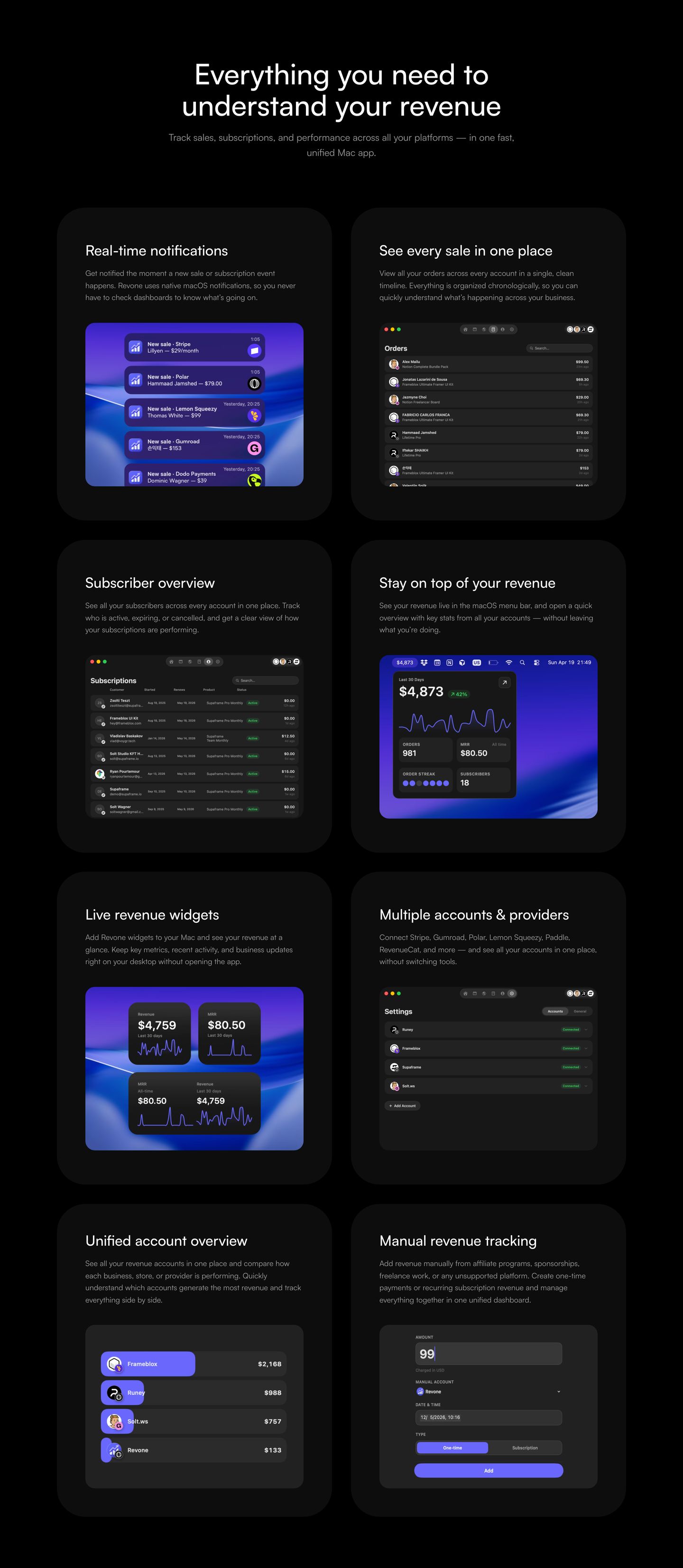
feature grid
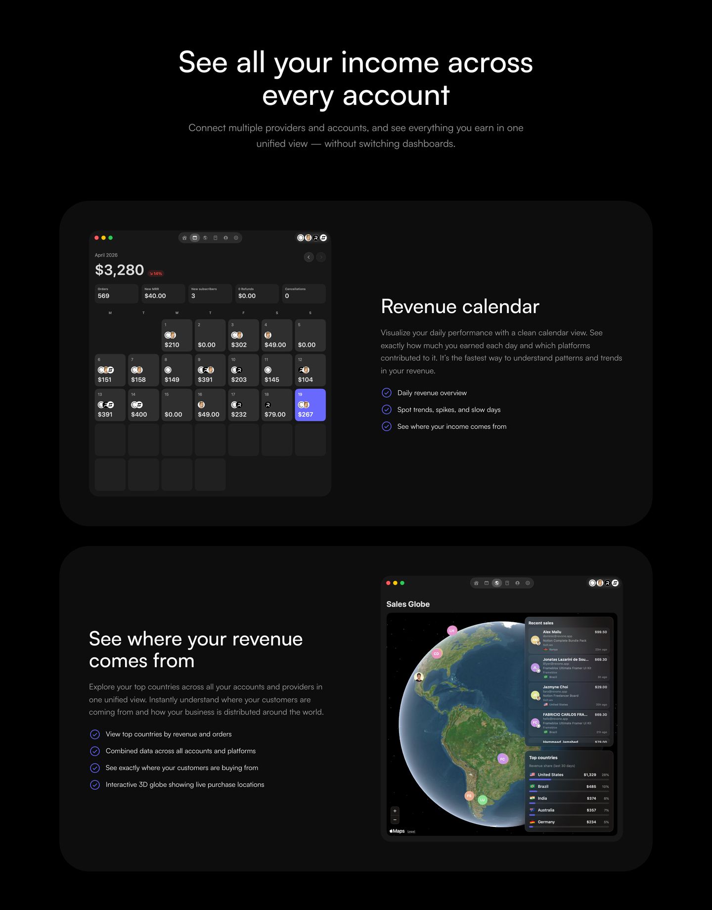
Sleek dark-mode feature cards presenting analytical dashboards with precise typography and realistic UI mockups.
- Mood
- clinical + serene
- Layout
- 2 col · stacked · balanced
- 03
feature grid
Sleek dark macOS utility showcase presenting polished software interface cards across a two-column grid.
- Mood
- serene
- Layout
- 2 col · grid · balanced
- 04
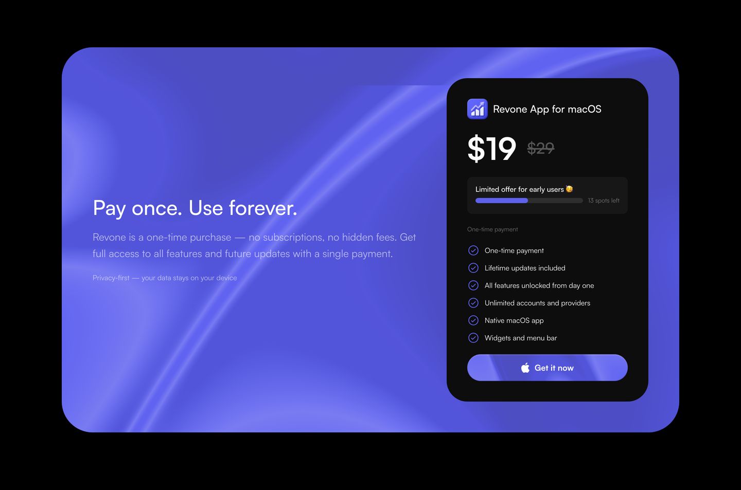
pricing
StrongA polished dark pricing card floats over an ethereal violet gradient mesh, presenting a straightforward lifetime purchase offer.
- Mood
- serene
- Layout
- 2 col · split · airy
- 05
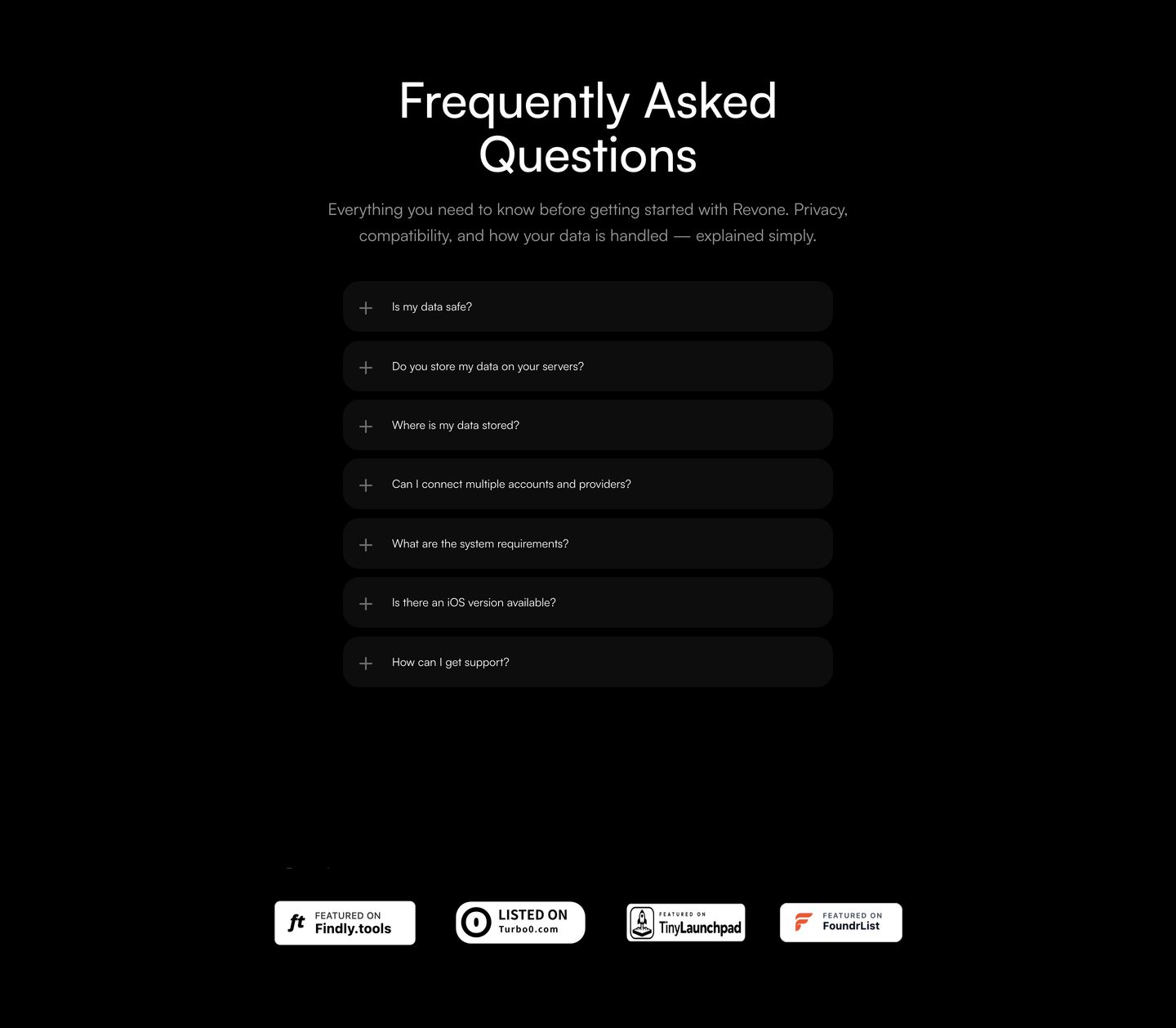
faq
A dark, disciplined FAQ stack anchored by clean rounded accordions and understated trust badges below.
- Mood
- serene
- Layout
- 1 col · stacked · airy
- 06
footer
StrongA polished dark-mode footer illuminated by sweeping blue light streaks and anchored by a massive outlined watermark logotype.
- Mood
- ethereal + serene
- Layout
- 5 col · grid · airy