Ten years
A disciplined, museum-grade editorial retrospective. An uncompromising pitch-black canvas gives immense weight to oversized neo-grotesque typography, punctuated at chapter breaks by saturated full-bleed color blocks and minimalist contour illustrations.
Take the vibe
Rated
7.8/ 10
From 14 analyzed sections. Two measured components and one judged by a model. Distinction is a rank within the library; the rest are scores in their own right.
- AI scorejudged
- 9.9
- Systemmeasured
- 7.9
- Distinctionmeasured
- 1.4
- on the grid
- 71%
- vertical rhythm
- 80%
- type on a scale
- 64%
- contrast passing AA
- 100%
- unlike the library
- 0.51
- model craft
- 8.1/10
- model deviation
- 5.7/10
Color
Background#000000
Text#ffffff
Accent#00c2ab
Surface#00050a
Muted#bababa
Typefaces
- Display
- TWK Everett
- Body
- TWK Everett
- Mono
- —
- Source
- self_hosted
- Scale
- 14 · 16 · 20 · 22 · 24 · 32
Layout
- Grid
- 12 columns
- Container
- 1312px
- Spacing base
- 4px
- Radius
- 0px
Capture
- Category
- agency
- Sections
- 14
- Captured
- 2026-09-16
- Rhythm
- dark x12
Type rules
- display headlines scale up to 140px in sentence or lowercase
- body text set at 22px with narrow measure around 40 characters
- chapter headers and timeline anchors enclosed in uppercase brackets
Color rules
- deep black background dominates 90 percent of the experience
- each chapter opens with a vibrant solid color block featuring line illustrations
- body text uses muted grey with pure white reserved for key assertions and display type
Voice rules
- written in reflective first-person plural recounting agency milestones
- bracketed timeline metadata for structural context
Holds it together
- open each retrospective chapter with a saturated solid-color banner paired with line drawings
- split editorial narrative copy into multi-column layouts with tight column measures
- anchor timeline transitions with bracketed metadata and thin hairline horizontal dividers
Contrast
text on background21.0:1 AAA
muted text on background10.8:1 AAA
text on surface20.5:1 AAA
muted text on surface10.6:1 AAA
accent on background9.3:1 AAA
background on accent9.3:1 AAA
Type, measured
- Body
- 22px / 1.4
- Measure
- 40 characters
- Display
- 140px / 1.5
- Tracking
- 0em display
- Scale ratio
- 1.59
Voice
- Tone
- reflective, authoritative, precise
- Sentences
- medium
- Person
- first
- Vocabulary
- technical
- Calls to action
- lire, rejoindre
Built with
- Builder
- —
- Framework
- —
- Motion
- lenis
- WebGL
- —
- Nav
- top_bar, 2 items
- Length
- 35.9 screens
Sections in page order
- 00
hero
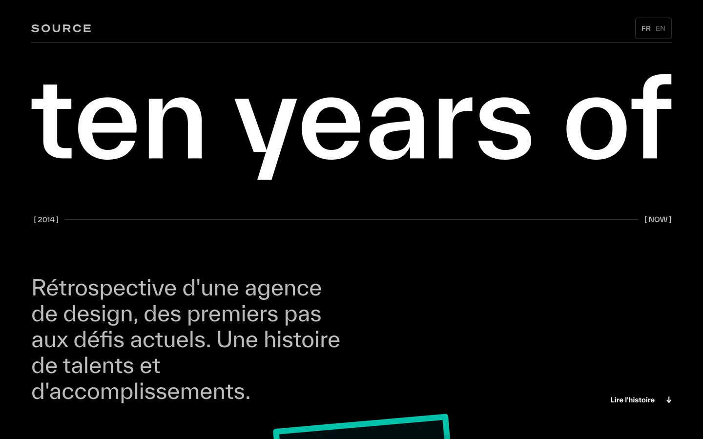
Monolithic lowercase typography and a stark timeline rule anchor this agency retrospective hero with quiet, deliberate confidence.
- Mood
- serene + nostalgic
- Layout
- 2 col · stacked · airy
- 01
statement
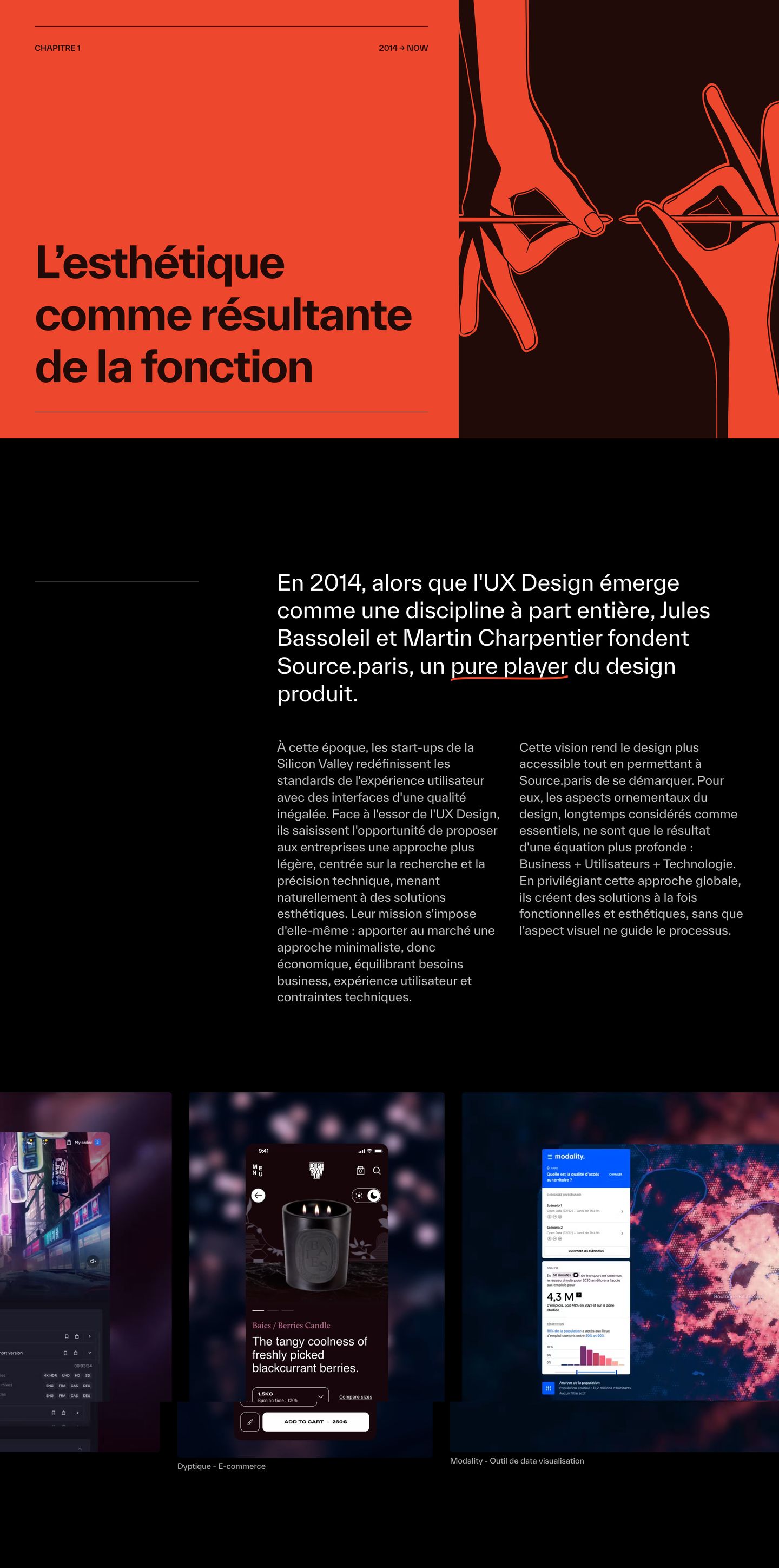
StrongBold vermilion and black editorial chapter opener pairing stark technical illustration with thoughtful design philosophy and mobile showcases.
- Mood
- serene + energetic
- Layout
- 2 col · stacked · balanced
- 02
feature
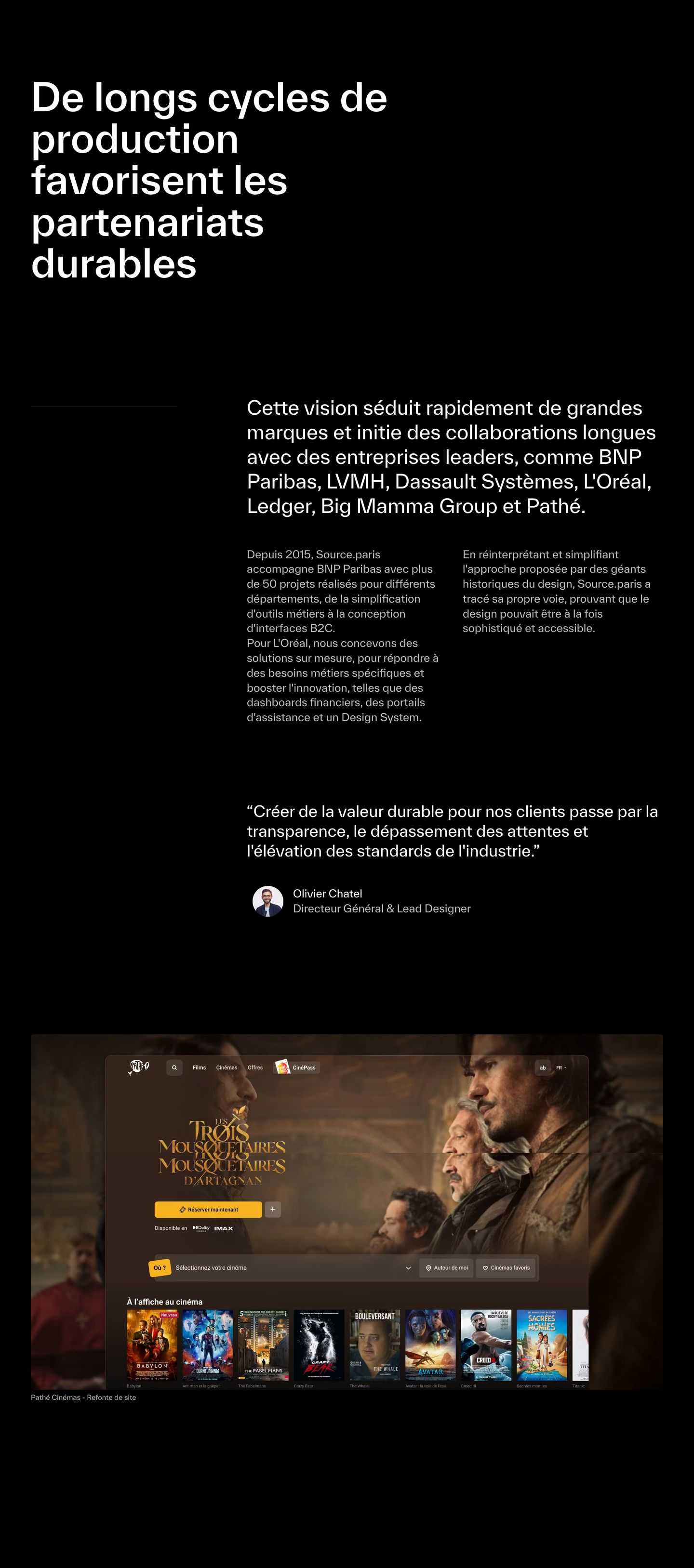
An austere, dark editorial composition pairing heavy typography and narrative client proof with a cinematic project preview.
- Mood
- luxurious + serene
- Layout
- 2 col · asymmetric · airy
- 03
feature
Structured editorial chapter band pairing a vibrant cobalt blue title card with clean multi-column text and documentary photography.
- Mood
- serene
- Layout
- 2 col · stacked · airy
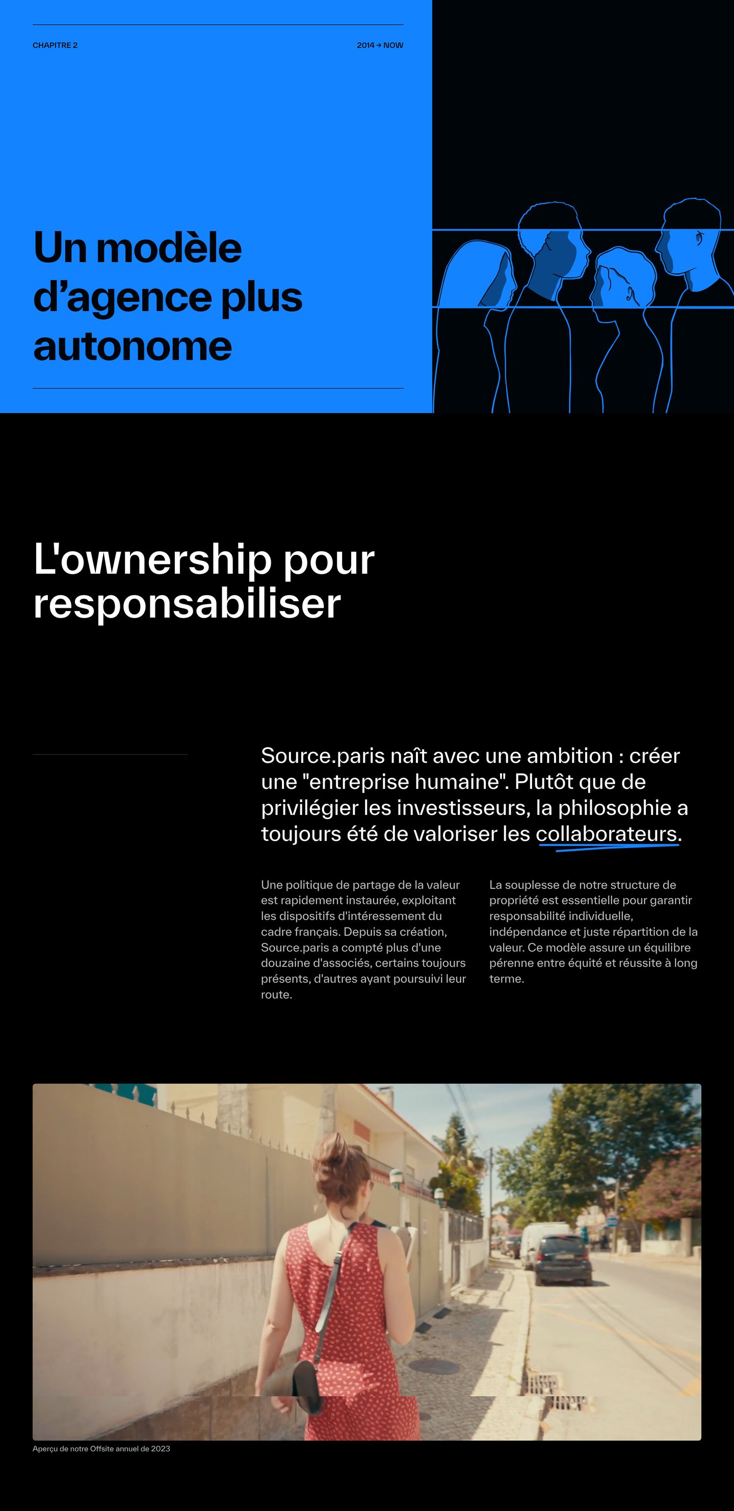
- 04
feature
Dark editorial agency layout pairing stark typography and candid workplace photography with a delicate hand-drawn word highlight.
- Mood
- serene
- Layout
- 2 col · asymmetric · airy
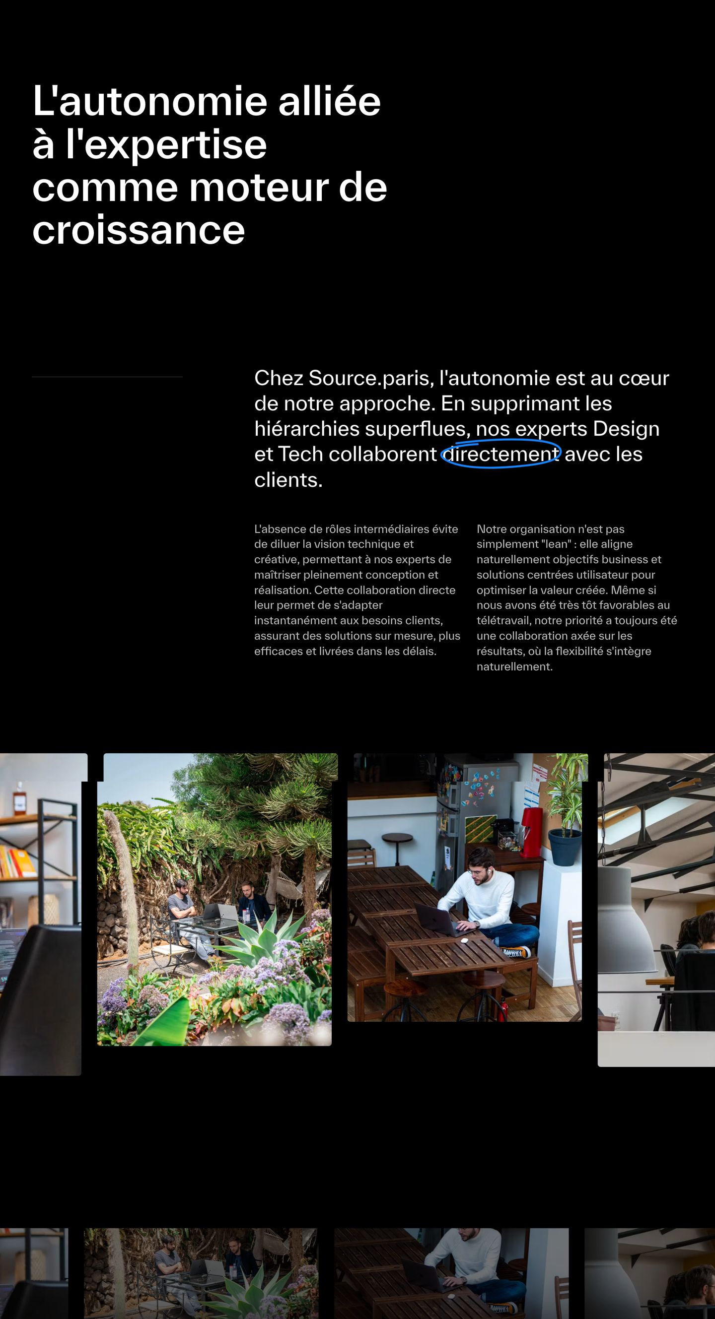
- 05
feature
Bold editorial chapter section combining a vibrant cyan header block, dynamic line-art figures, and crisp narrative stats against a deep black canvas.
- Mood
- energetic
- Layout
- 2 col · asymmetric · airy
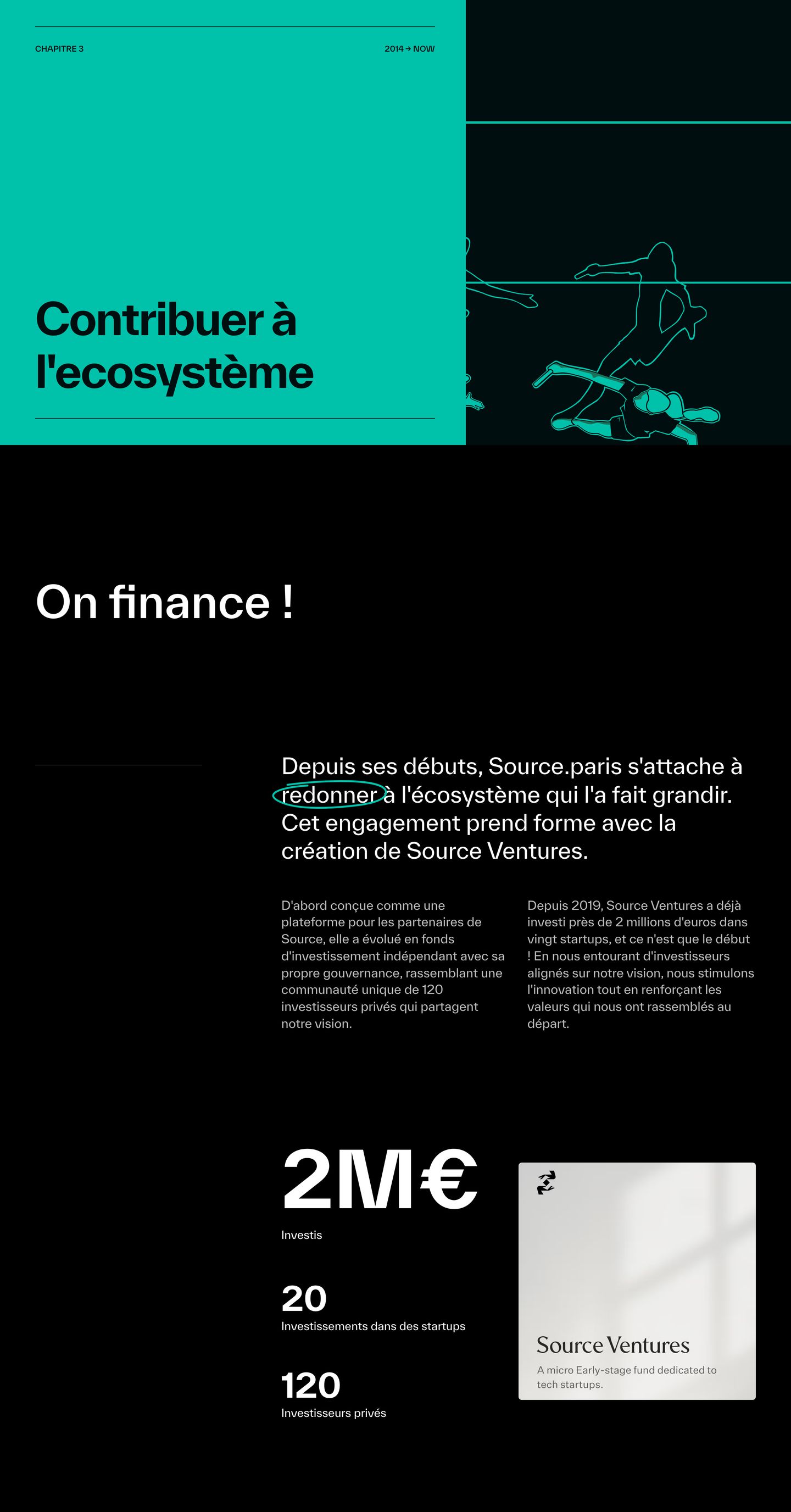
- 06
showcase
Dark minimal presentation displaying curated design tools and resources in clean, pale-tinted cards beneath sharp modern typography.
- Mood
- serene
- Layout
- 3 col · stacked · airy
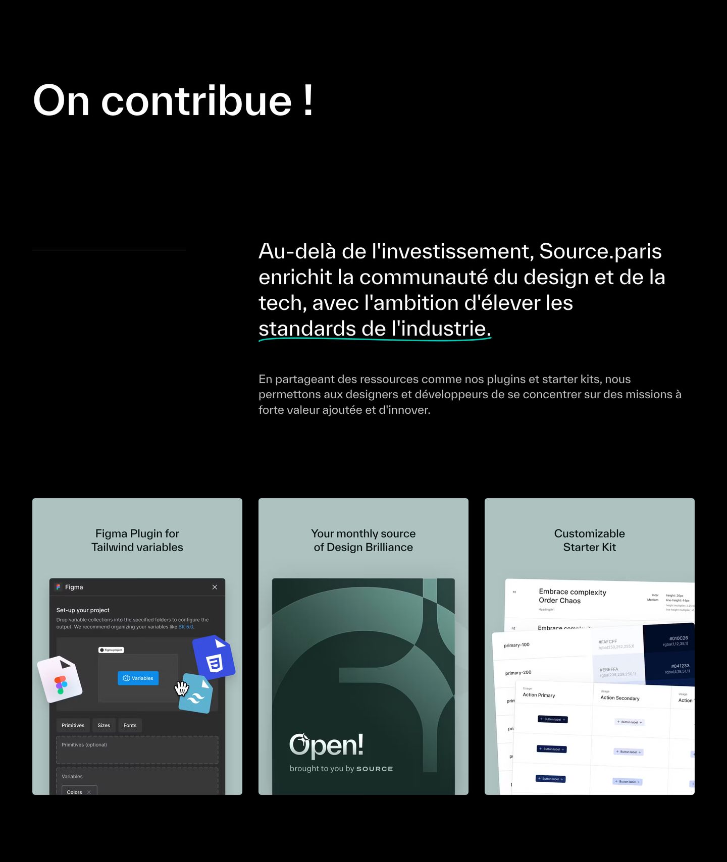
- 07
statement
Stark black editorial statement section featuring crisp typography with a playful hand-drawn accent loop over documentary media cards.
- Mood
- organic + playful
- Layout
- 2 col · stacked · airy
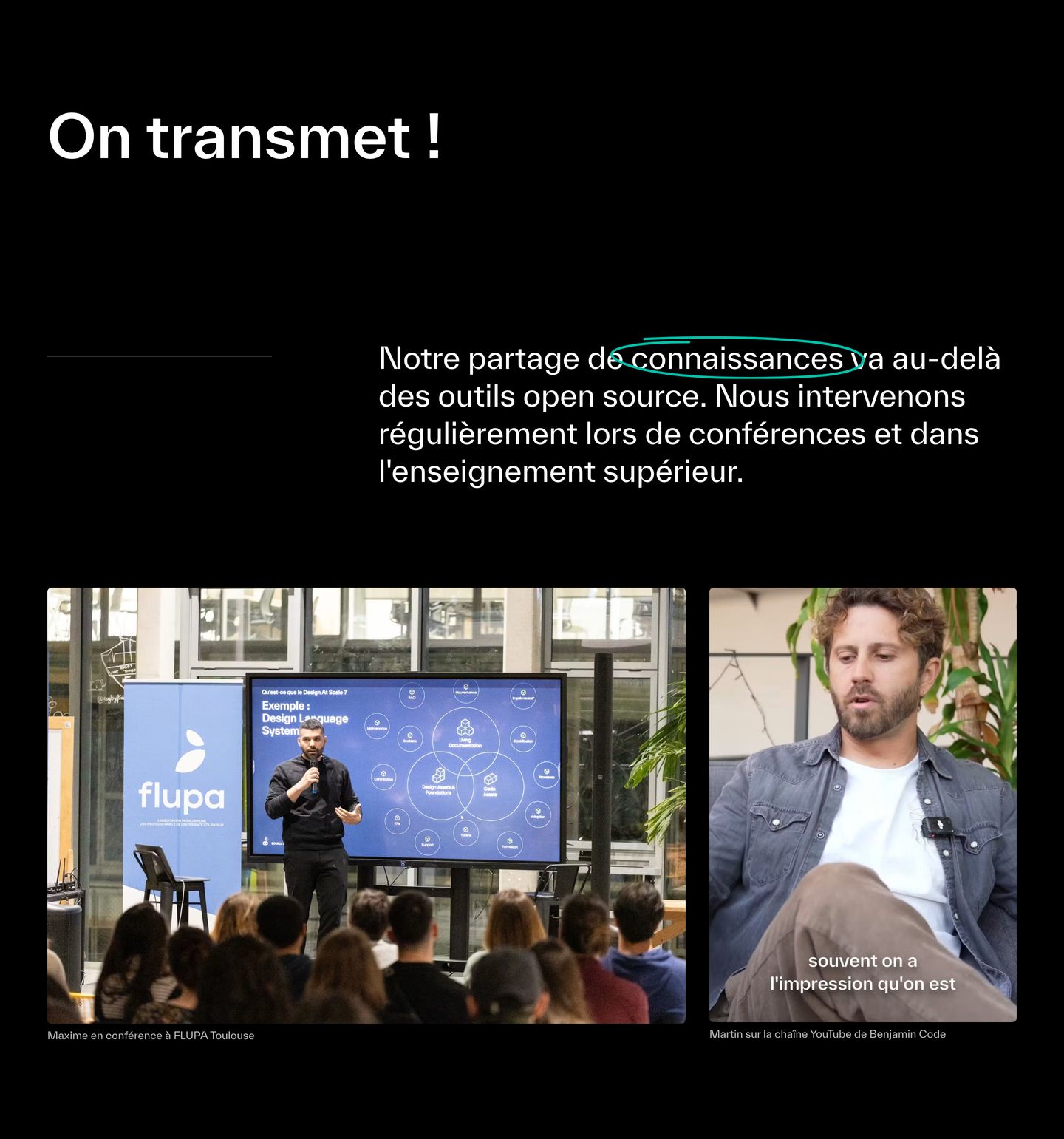
- 08
feature
A refined editorial chapter block pairing sage green line illustration with structured multi-column case study reflection.
- Mood
- serene
- Layout
- 2 col · stacked · airy
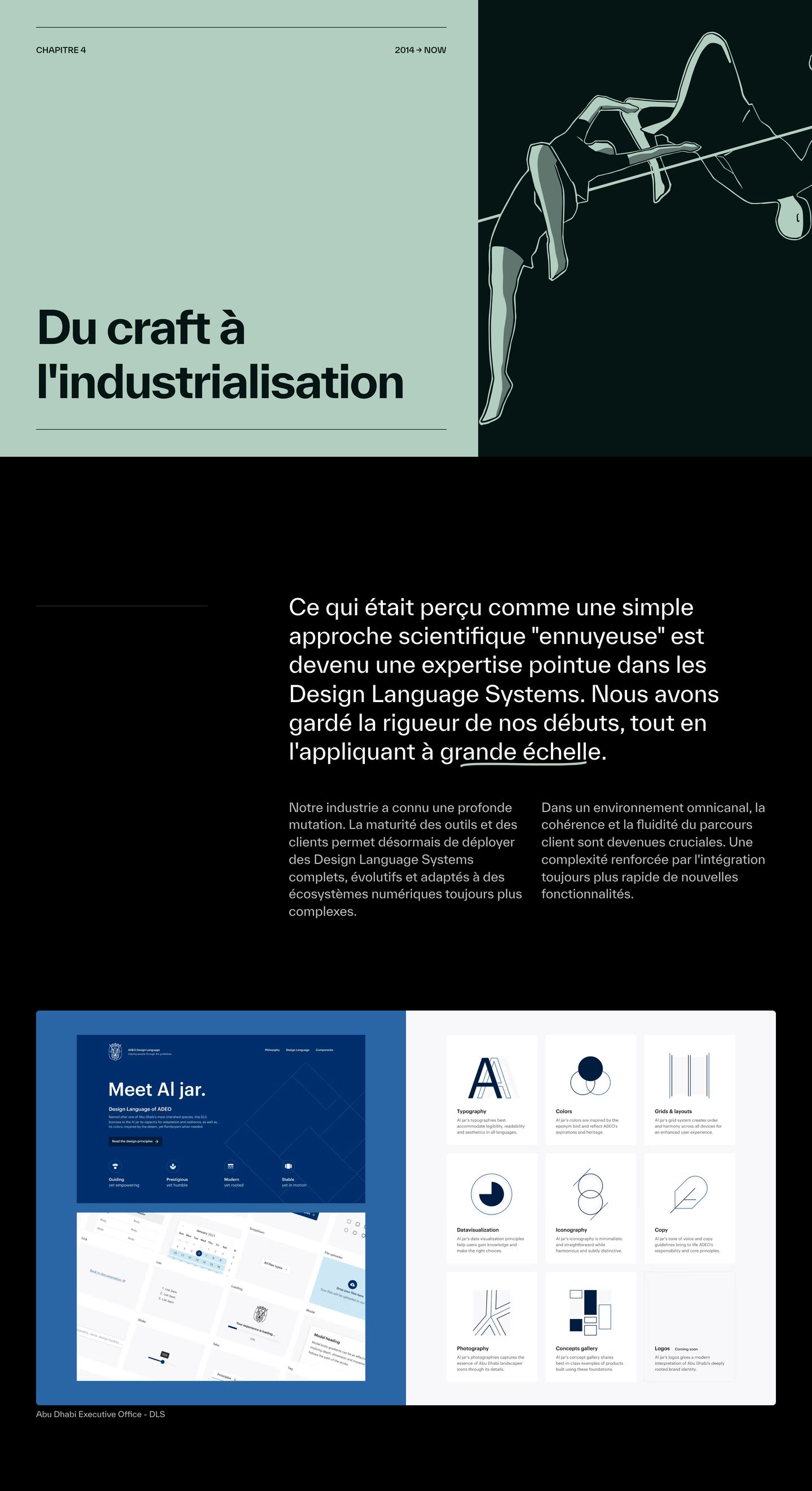
- 09
feature
A stark, dark editorial case study breakdown featuring refined Swiss typography, rigorous whitespace, and a high-contrast green metric card.
- Mood
- clinical + serene
- Layout
- 2 col · asymmetric · airy
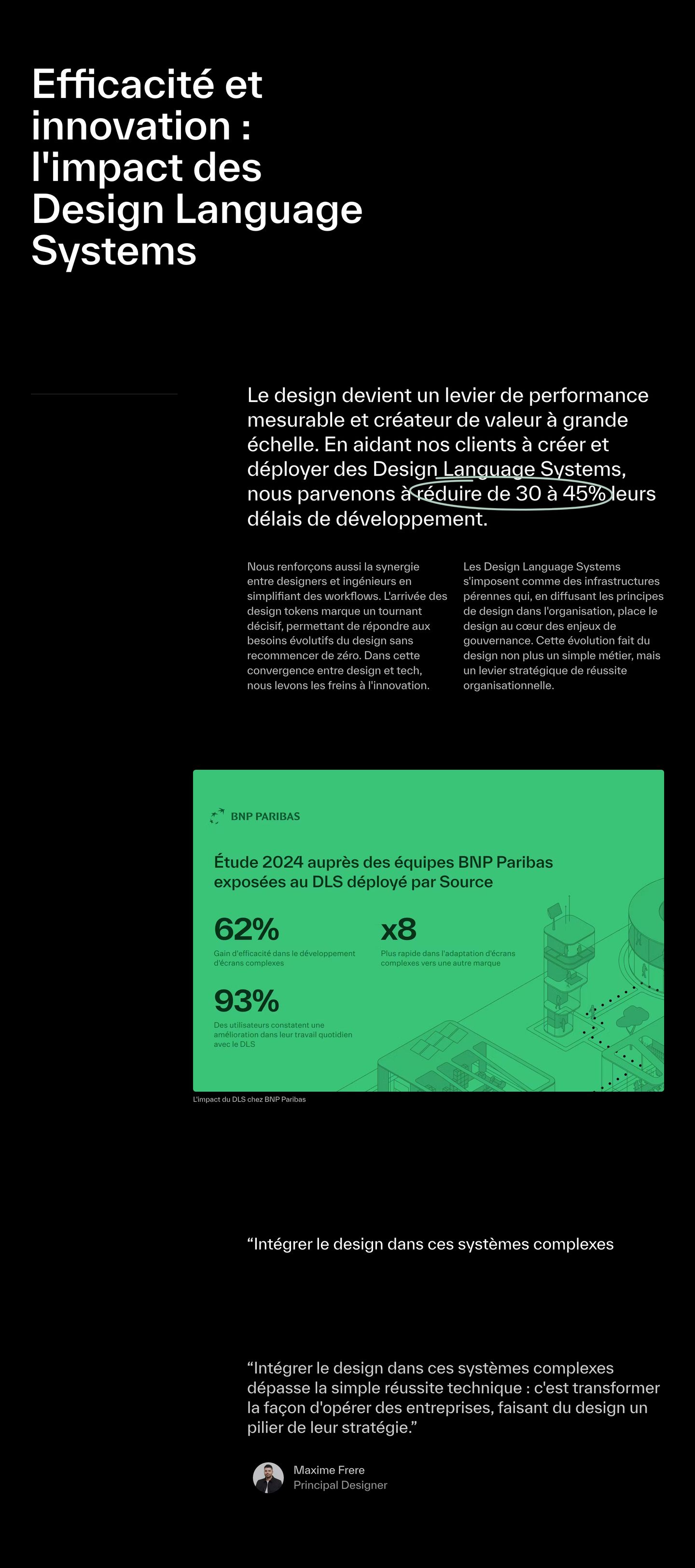
- 10
feature
StrongSurreal editorial chapter break merging a bold cyan header band, futuristic linework illustration, and multi-column AI design case studies.
- Mood
- serene + mysterious
- Layout
- 3 col · stacked · balanced
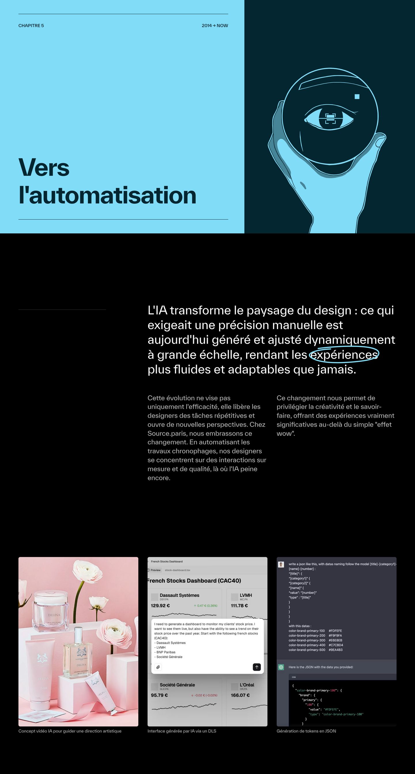
- 11
statement
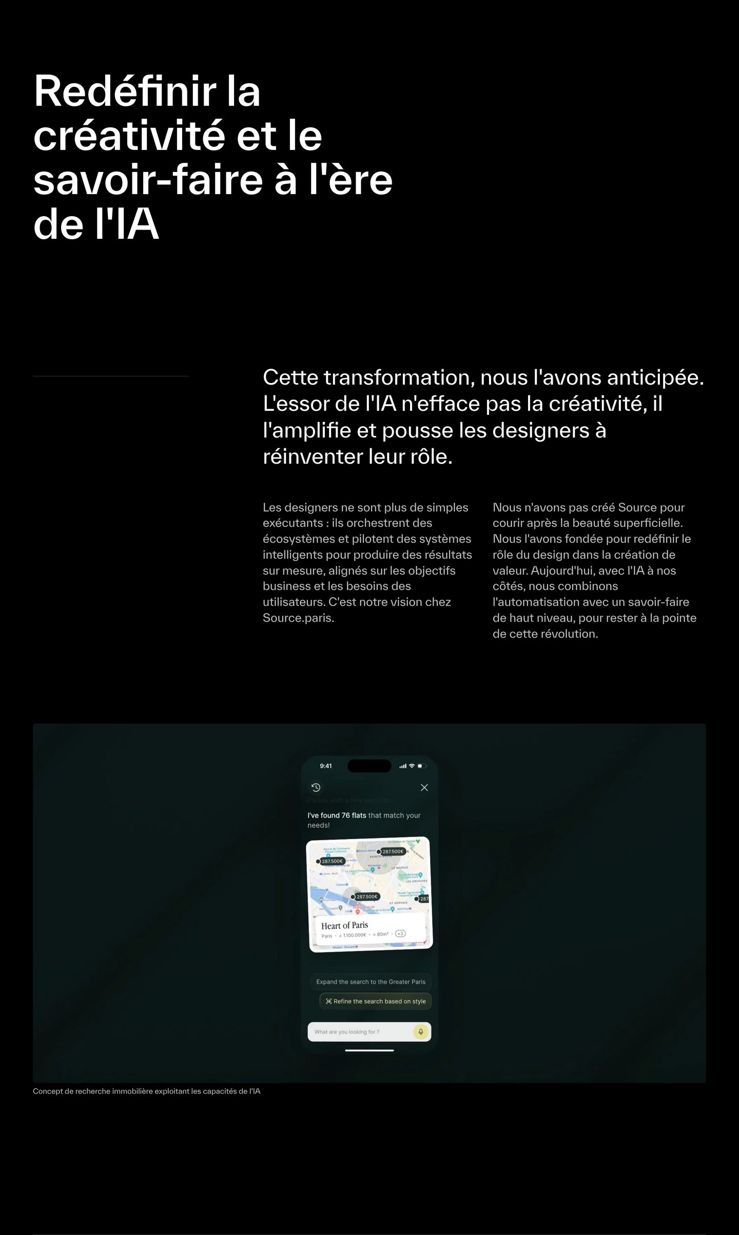
A stark, editorial manifesto in monochrome Swiss typography paired with an understated mobile UI concept.
- Mood
- serene + luxurious
- Layout
- 2 col · stacked · airy
- 12
statement
A stark, quiet typographic manifesto in clean grotesque type floating against pure black.
- Mood
- serene
- Layout
- 1 col · stacked · airy
- 13
footer
StrongBold, minimalist closing footer anchored by massive stark typography and precise editorial framing against pure black.
- Mood
- serene + clinical
- Layout
- 4 col · stacked · airy