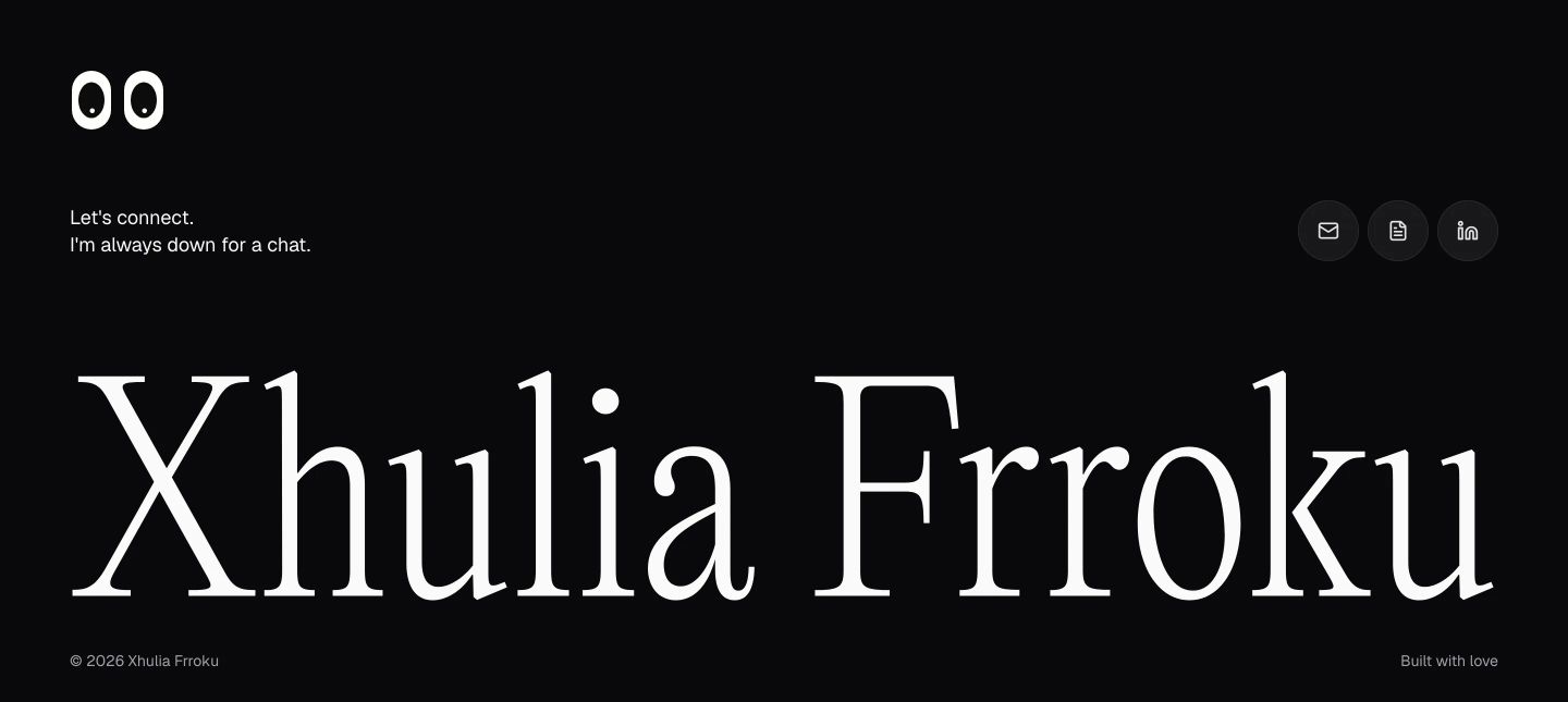
Xhulia
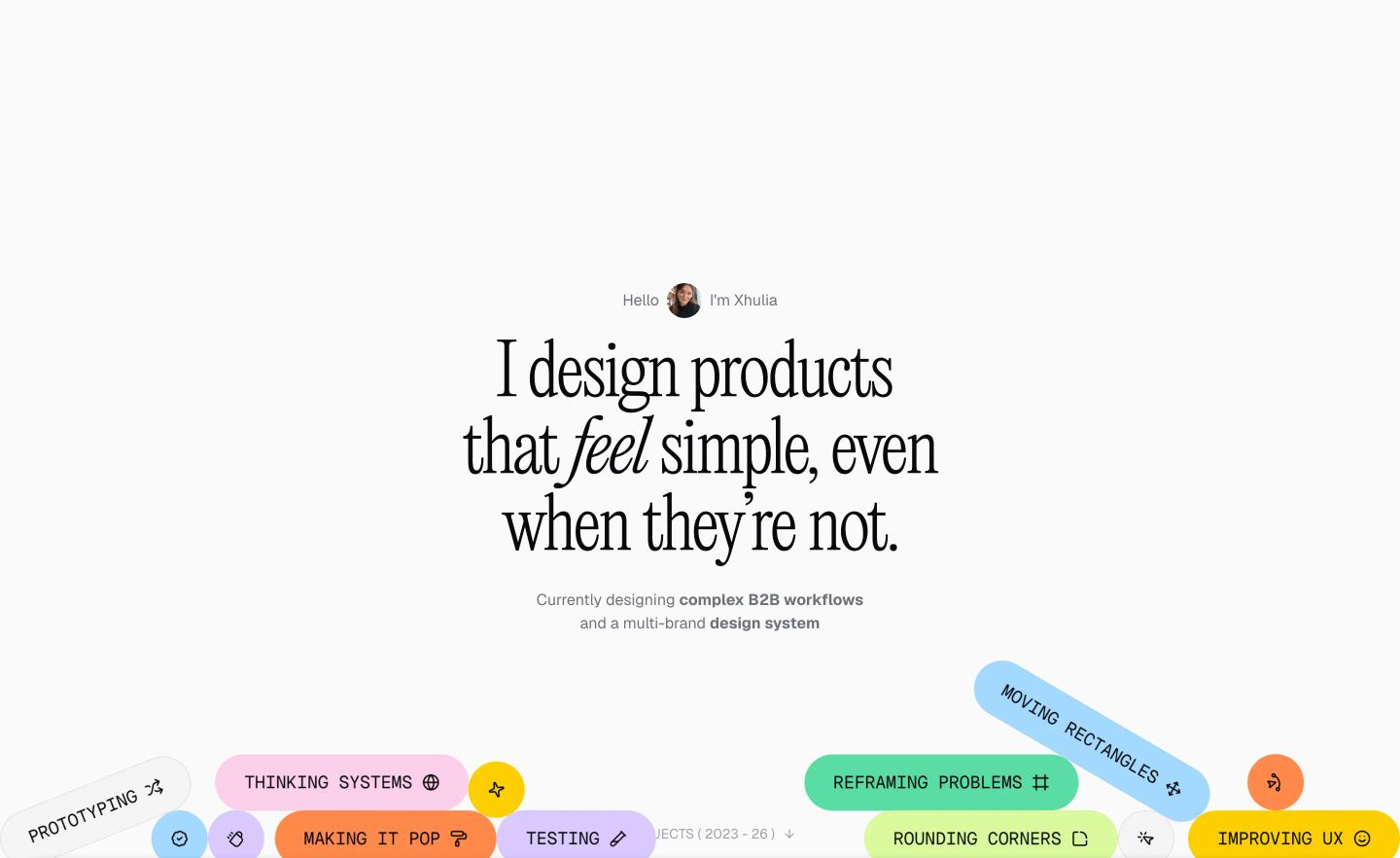
Airy, thoughtful, and lightly irreverent. Expansive off-white layouts and oversized ultralight serif typography deliver calm portfolio sophistication, punctuated by colorful, tilted pill badges that inject design humor. The journey culminates in a striking, monolithic black footer.
Rated
7.8/ 10
From 7 analysed sections. Two measured components and one judged by a model. Distinction is a rank within the library; the rest are scores in their own right.
- AI scorejudged
- 9.6
- Systemmeasured
- 7.0
- Distinctionmeasured
- 4.4
- on the grid
- 52%
- vertical rhythm
- 63%
- type on a scale
- 100%
- contrast passing AA
- 67%
- unlike the library
- 0.66
- model craft
- 8.0/10
- model deviation
- 5.0/10
Colour
Typefaces
- Display
- PP Editorial New Ultralight
- Body
- Geist
- Mono
- Geist Mono
- Source
- Scale
- 14 · 16 · 18 · 28 · 40 · 72
Layout
- Grid
- 24 columns
- Container
- 1360px
- Spacing base
- 4px
- Radius
- 8px · 12px · 24px · 9999px
Capture
- Category
- portfolio
- Sections
- 7
- Captured
- 2026-09-05
- Rhythm
- light x6 → dark
Type rules
- ultralight serif reserved for hero statement and full-width footer nameplate
- case study headlines in medium grotesque with single-line metadata bullets below
- all floating tag pills set in uppercase mono with accompanying iconography
Colour rules
- light background dominates the entire narrative until a sudden solid dark footer
- multi-colour pastel fills are restricted to interactive pills and mockup backdrops
Voice rules
- case study titles articulate tangible business impact rather than project names
- metric bullet strings highlight quantifiable results
Holds it together
- emphasize one verb in the hero display headline using an italicized serif cut
- scatter floating, angled pill tags with pastel fills across the hero footer boundary
- format project outcomes as bullet-separated metric rows beneath each case study title
- switch to a stark black container for the final footer contact block
Contrast
Type, measured
- Body
- 16px / 1.5
- Measure
- 160 characters
- Display
- 234px / 1.1
- Tracking
- 0em display
- Scale ratio
- 1.96
Voice
- Tone
- candid, confident, pragmatic
- Sentences
- medium
- Person
- first
- Vocabulary
- plain
- Calls to action
- view, connect
Built with
- Builder
- framer
- Framework
- —
- Motion
- —
- WebGL
- —
- Nav
- —
- Length
- 6.7 screens
Sections in page order
- 00
hero
StrongClean and airy portfolio hero combining refined editorial serif typography with a cluster of vibrant, playful skill pills.
- Mood
- playful + serene
- Layout
- 1 col · centered · airy
- 01
hero
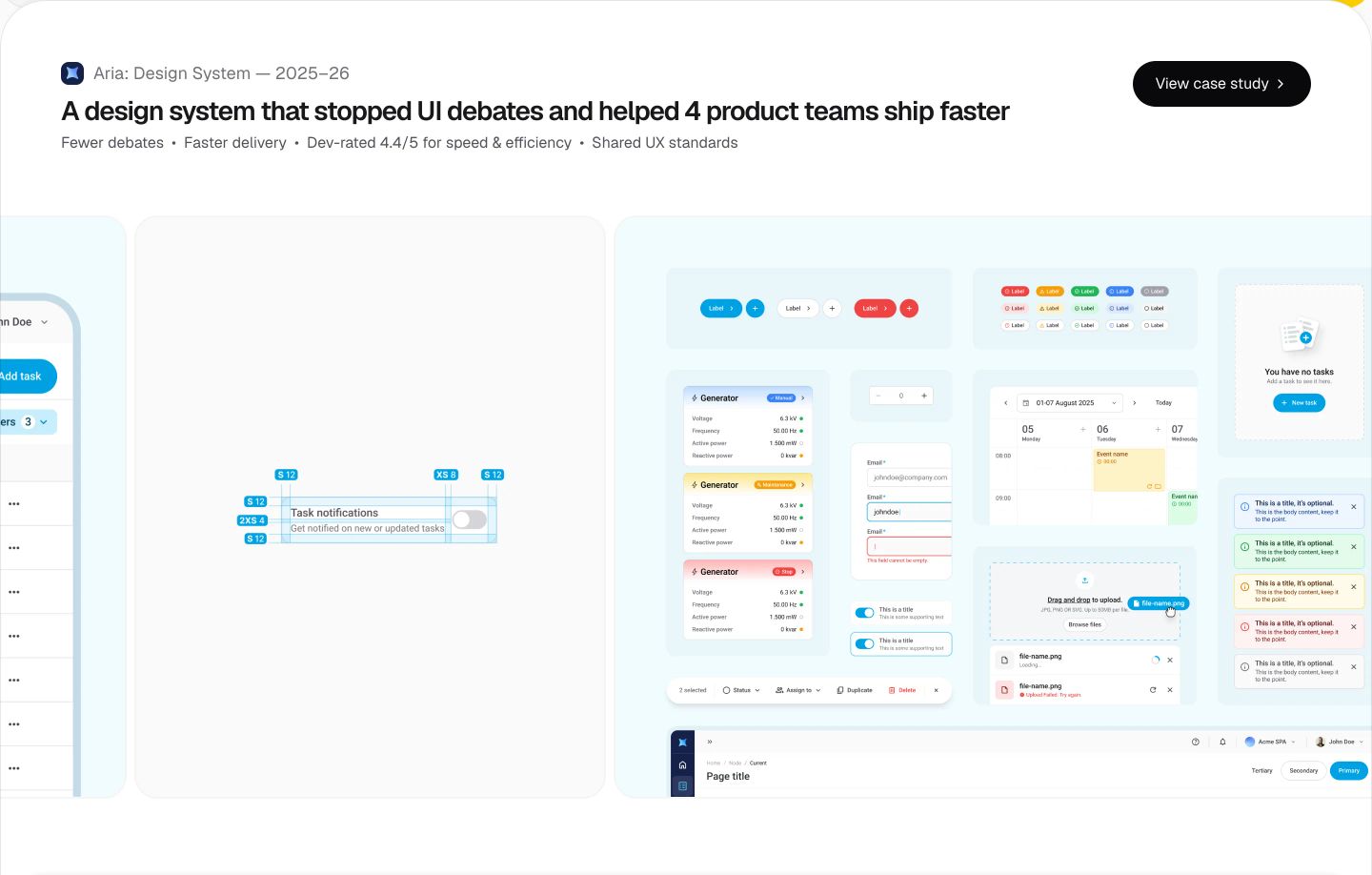
Crisp and methodical design system hero showcasing modular UI component sheets across a luminous canvas.
- Mood
- clinical + reassuring
- Layout
- 2 col · stacked · balanced
- 02
showcase
Crisp case study card featuring floating angled product UI mockups with quiet typographic hierarchy and pill CTA.
- Mood
- reassuring + clinical
- Layout
- 1 col · stacked · airy

- 03
showcase
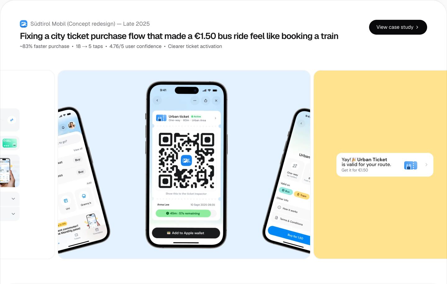
Clean and focused case study showcase with floating smartphone UI mockups highlighting UX improvements on a subtle neutral background.
- Mood
- reassuring + serene
- Layout
- 3 col · stacked · balanced
- 04
showcase
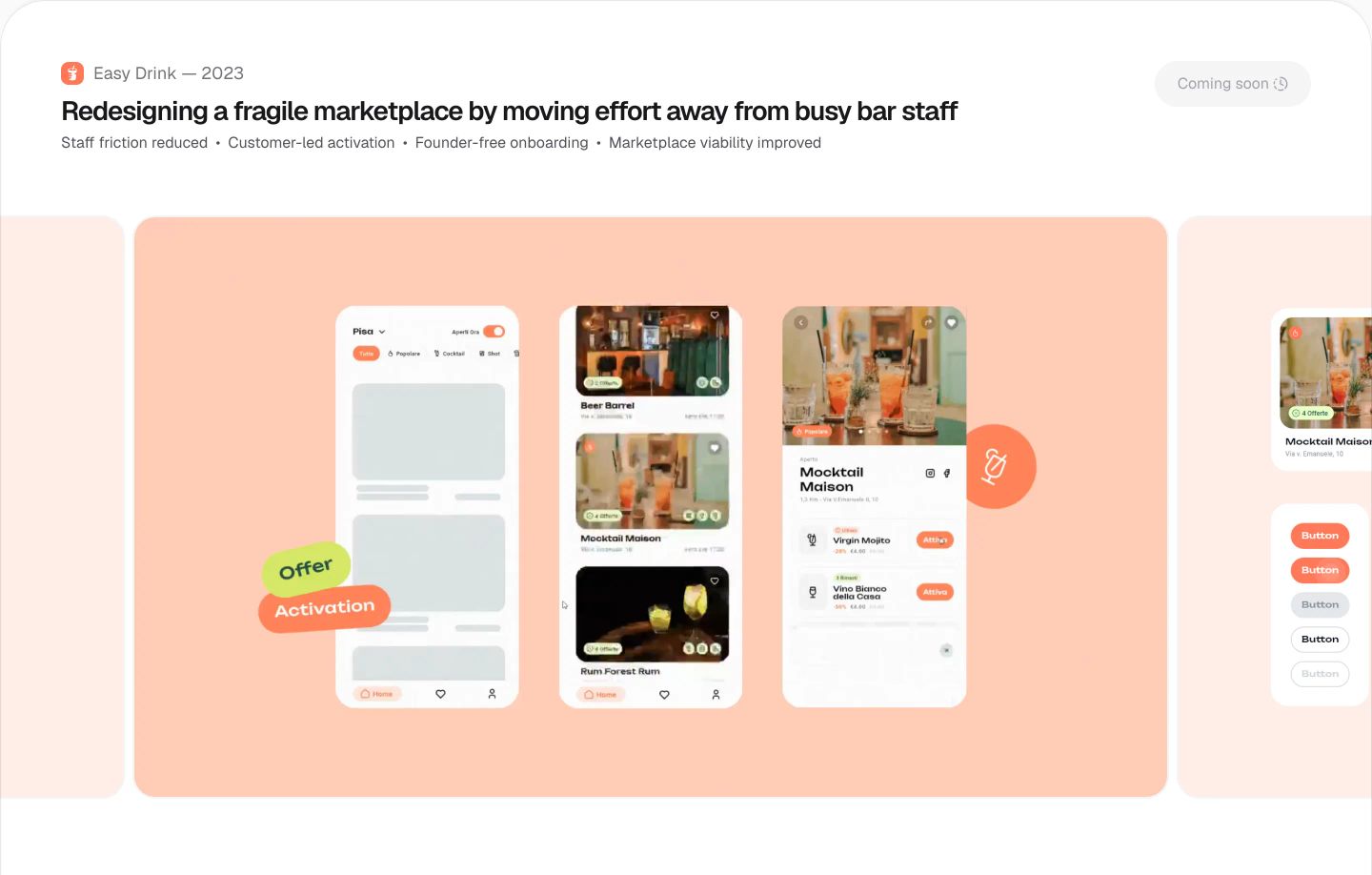
Clean, airy case study presentation displaying mobile interface mockups across a carousel of warm rounded cards.
- Mood
- reassuring + serene
- Layout
- 1 col · stacked · airy
- 05
cta
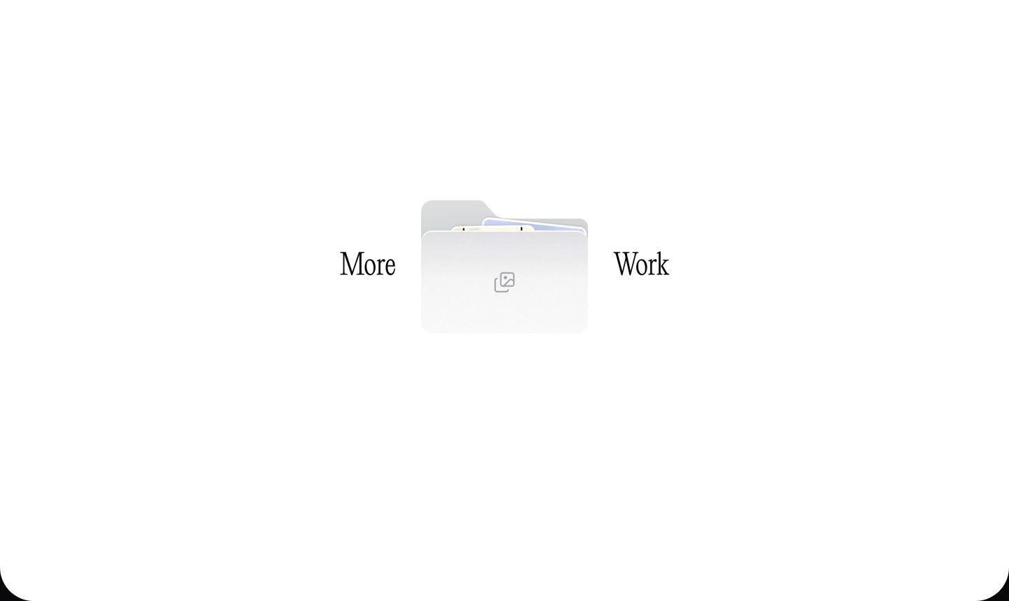
StrongVast white canvas centered on an elegant serif headline split by a soft folder graphic inviting further exploration.
- Mood
- serene + playful
- Layout
- 1 col · centered · airy
- 06
footer
StrongA stark, quiet dark footer dominated by an oversized editorial serif signature and understated conversational contact links.
- Mood
- serene + playful
- Layout
- 2 col · stacked · airy