Crazyui
Editorial elegance meets pragmatic UI craft. Delicate serif typography anchors spacious, stone-tinted surfaces that feel like a high-end design atelier. Rounded pills and clean preview cards keep the experience light, calm, and effortlessly functional.
Rated
7.1/ 10
From 7 analysed sections. Two measured components and one judged by a model. Distinction is a rank within the library; the rest are scores in their own right.
- AI scorejudged
- 9.6
- Systemmeasured
- 5.6
- Distinctionmeasured
- 3.5
- on the grid
- 35%
- vertical rhythm
- 65%
- type on a scale
- 40%
- contrast passing AA
- 83%
- unlike the library
- 0.62
- model craft
- 8.0/10
- model deviation
- 3.6/10
Colour
Typefaces
- Display
- Canela Text Trial Light
- Body
- Inter
- Mono
- —
- Source
- Scale
- 12 · 14 · 15 · 16 · 20 · 24
Layout
- Grid
- 24 columns
- Container
- 1376px
- Spacing base
- 8px
- Radius
- 8px · 16px · 999px
Capture
- Category
- tools
- Sections
- 7
- Captured
- 2026-09-06
- Rhythm
- warm off-white → light warm grey → warm off-white → light warm grey → warm off-white
Type rules
- display headlines rendered in light-weight serif with -0.017em letter spacing
- body text set at 16px with 1.5 line height across a narrow 45-character measure
- metadata tags and UI badges use small regular sans-serif
Colour rules
- warm stone backgrounds create a calm neutral field without pure stark whites
- pure black is reserved strictly for interactive CTA pills, badge accents, and high-emphasis headers
Voice rules
- keep headlines under 8 words in sentence case
- lead CTA buttons with single action verbs
Holds it together
- render top-level section titles in Canela Text Trial Light with sentence casing
- enclose primary actions and filters in high-contrast pill-shaped buttons
- present component templates inside minimal rounded cards with generous padding and muted metadata labels
Contrast
Type, measured
- Body
- 16px / 1.5
- Measure
- 45 characters
- Display
- 48px / 1.2
- Tracking
- -0.017em display
- Scale ratio
- 1.32
Voice
- Tone
- curated, direct, calm
- Sentences
- short
- Person
- second
- Vocabulary
- plain
- Calls to action
- explore, get, view
Built with
- Builder
- framer
- Framework
- —
- Motion
- —
- WebGL
- —
- Nav
- top_bar, 6 items
- Length
- 7.5 screens
Sections in page order
- 00
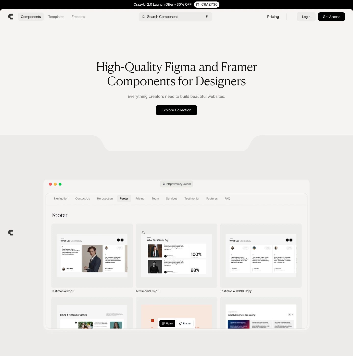
hero
A calm, warm-toned design library hero anchored by an elegant serif headline and a soft-edged application mockup.
- Mood
- serene + luxurious
- Layout
- 1 col · centered · airy
- 01
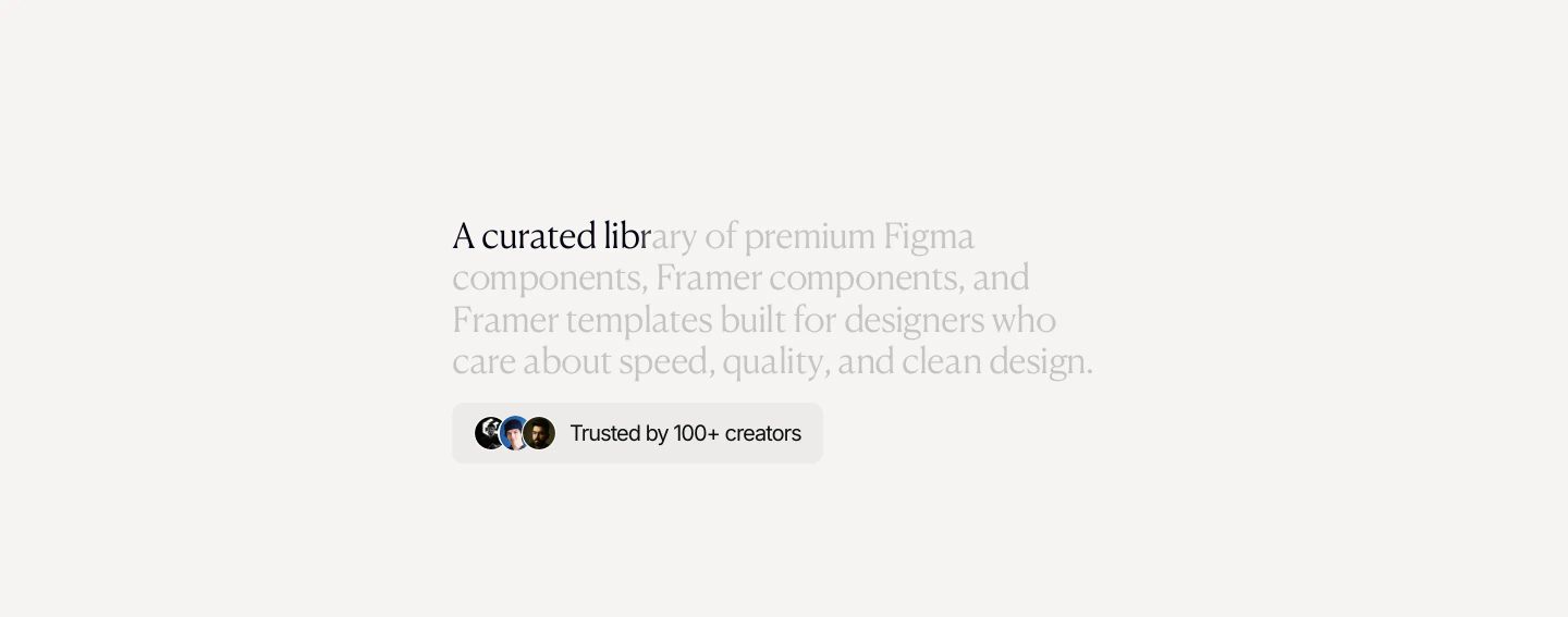
hero
StrongQuiet, understated typographic hero with soft warm minimalism and delicate editorial restraint.
- Mood
- serene + luxurious
- Layout
- 1 col · stacked · airy
- 02
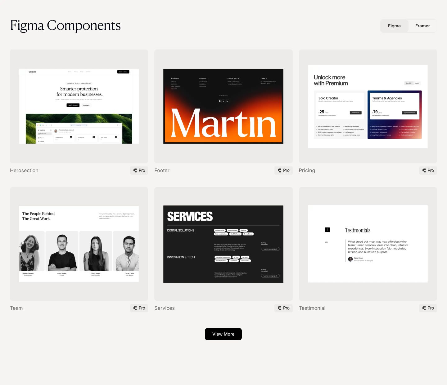
showcase
An airy and elegant component library grid showcasing UI design blocks against a warm off-white canvas with tasteful pill badges.
- Mood
- serene + clinical
- Layout
- 3 col · grid · balanced
- 03
showcase
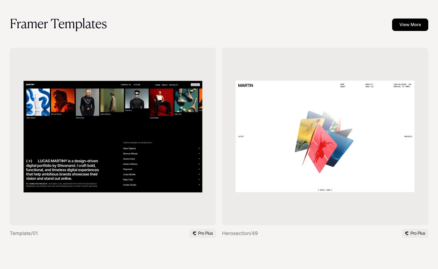
A refined, airy template showcase presenting web design previews within softly rounded cards against a warm light backdrop.
- Mood
- serene + luxurious
- Layout
- 2 col · grid · airy
- 04
statement
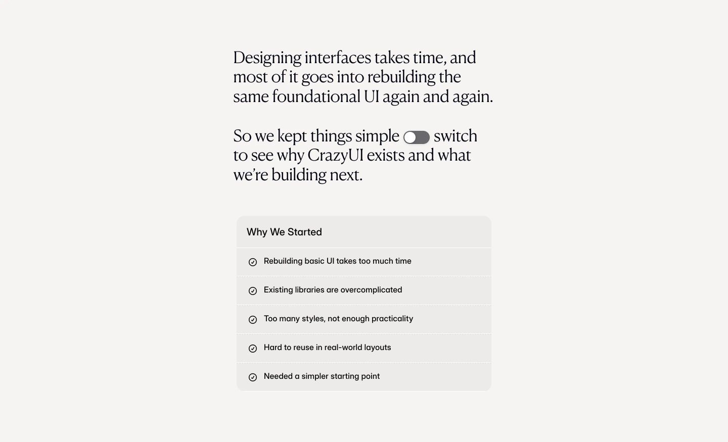
StrongA calm, editorial statement section pairing elegant serif narrative copy with an inline toggle switch and an understated checklist card.
- Mood
- contemplative + serene
- Layout
- 1 col · stacked · airy
- 05
pricing
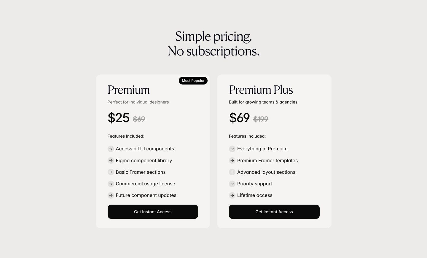
Quiet, restrained two-tier pricing cards in warm cream with refined serif typography.
- Mood
- serene + luxurious
- Layout
- 2 col · grid · airy
- 06
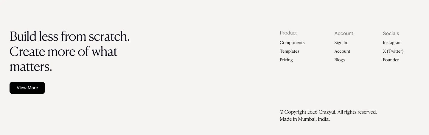
footer
StrongQuiet, spacious editorial footer balancing a literary serif headline and pill button with cleanly spaced navigation columns.
- Mood
- serene + luxurious
- Layout
- 4 col · split · airy