primeintellect-ai
Engineered and deeply clinical. Monochromatic dark interfaces layered with precise hairline wireframe grids, monospaced metadata indices, and terminal prompts create the feeling of a sovereign high-performance computing terminal.
Visit siteRated
6.5/ 10
From 16 analysed sections. Two measured components and one judged by a model. Distinction is a rank within the library; the rest are scores in their own right.
- AI scorejudged
- 9.3
- Systemmeasured
- 5.7
- Distinctionmeasured
- 0.5
- on the grid
- 22%
- vertical rhythm
- 58%
- type on a scale
- 46%
- contrast passing AA
- 100%
- unlike the library
- 0.15
- model craft
- 7.9/10
- model deviation
- 4.7/10
Colour
Background#0e0e0e
Text#ffffff
Accent#85ed75
Surface#161616
Muted#999999
Typefaces
- Display
- Geist
- Body
- Geist
- Mono
- ABC Favorit Mono
- Source
- self_hosted
- Scale
- 9 · 10 · 11 · 12 · 13 · 14
Layout
- Grid
- —
- Container
- —
- Spacing base
- 4px
- Radius
- 0px · 2px
Capture
- Category
- ai
- Sections
- 16
- Captured
- 2026-08-30
- Rhythm
- dark x4 → mixed → dark x11
Type rules
- display headlines rendered in sentence case at 36px with tight line height
- technical labels, indices, and figure titles set in uppercase monospaced type
- body text runs to a 56-character measure
Colour rules
- background rests strictly on deep black #0e0e0e with 1px structural borders in #202020
- terminal green accents (#85ed75) reserved for shell prompts and live data indicators
Voice rules
- lead feature headers with numbered indices or layer tags
- keep explanatory descriptions strictly under three sentences
Holds it together
- structure technical features into structured grid cells numbered with indices (01, 1.1, FIG.1)
- display terminal commands alongside primary action buttons for developer immediacy
- pair architectural diagrams and schematics directly with low-contrast technical spec lists
Contrast
text on background19.3:1 AAA
muted text on background6.8:1 AA
text on surface18.1:1 AAA
accent on background13.2:1 AAA
background on accent13.2:1 AAA
Type, measured
- Body
- 22px / 1.08
- Measure
- 56 characters
- Display
- 36px / 1.1
- Tracking
- 0em display
- Scale ratio
- 1.13
Voice
- Tone
- clinical, technical, authoritative
- Sentences
- short
- Person
- second
- Vocabulary
- technical
- Calls to action
- start, book, create, run, explore
Built with
- Builder
- —
- Framework
- next
- Motion
- —
- WebGL
- —
- Nav
- top_bar, 4 items
- Length
- 12 screens
Sections in page order
3 marked strong · 16- 00
hero
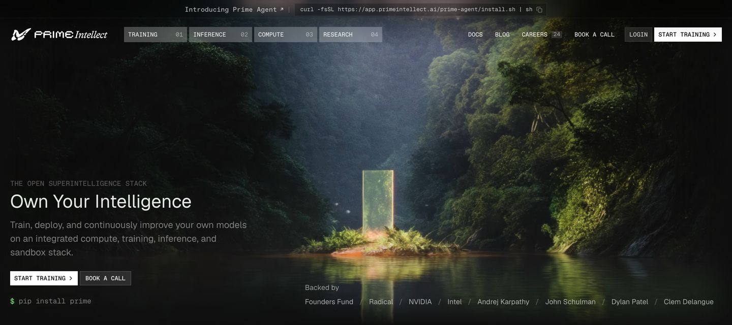
Cinematic and mysterious developer hero pairing a glowing monolith landscape with sharp, technical infrastructure typography.
- Mood
- dreamy + clinical
- Layout
- 1 col · full bleed · balanced
- 01
logo bar
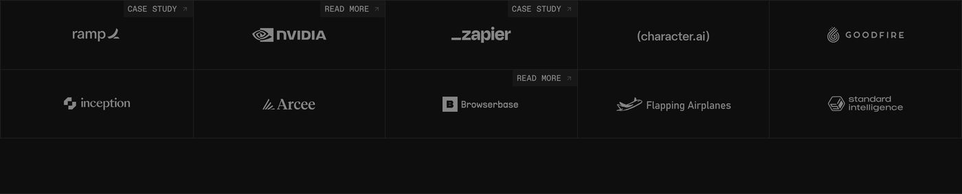
StrongA dark, precise grid of customer logos framed by thin borders with technical monospaced case study tags.
- Mood
- clinical + quiet
- Layout
- 5 col · grid · balanced
- 02
feature
Minimalist dark banner combining stark developer typography with a deep, curved digital grid visual.
- Mood
- clinical + raw
- Layout
- 12 col · full bleed · airy

- 03
feature grid
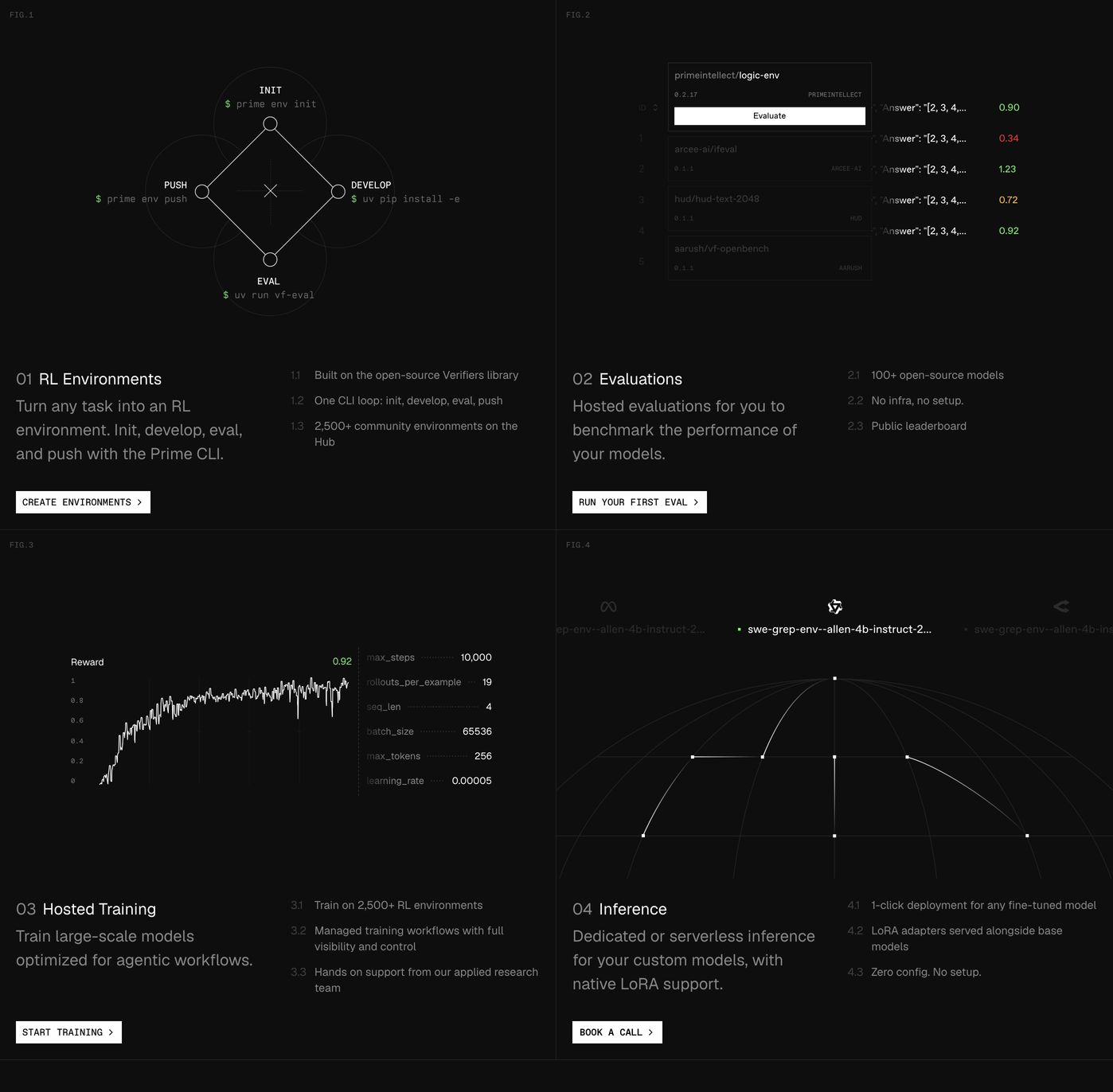
StrongA dark, highly engineered 2x2 grid pairing delicate technical wireframe schematics with structured product feature specs.
- Mood
- clinical + raw
- Layout
- 2 col · grid · dense
- 04
testimonial
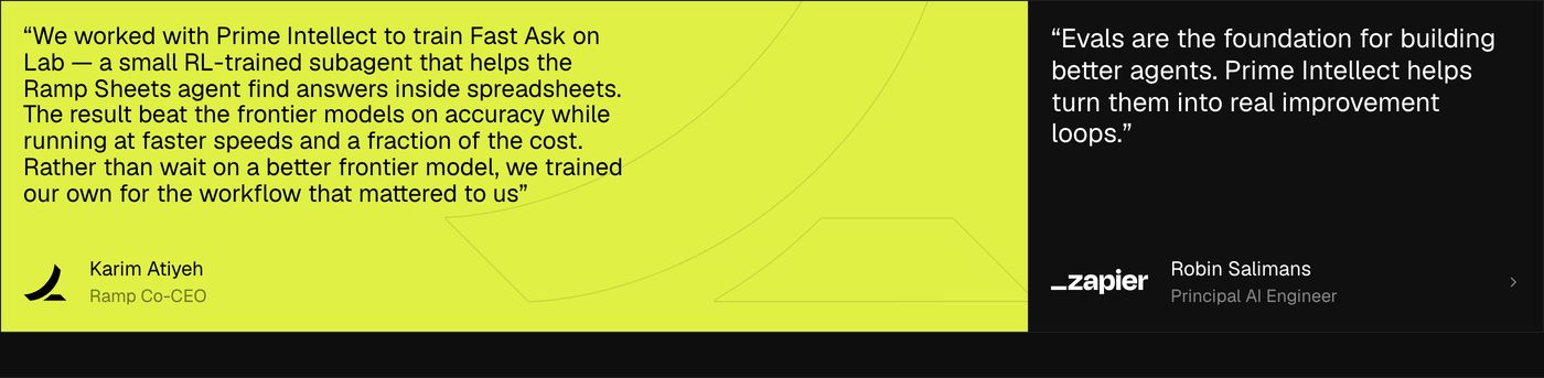
StrongHigh-voltage testimonial section pairing an electric yellow feature card with a stark dark panel for technical customer endorsements.
- Mood
- bold + clinical
- Layout
- 3 col · grid · balanced
- 05
feature
A dark, clinical developer platform showcase pairing crisp typographic copy with a dense grid of open-source repository cards.
- Mood
- clinical + raw
- Layout
- 2 col · split · dense

- 06
feature grid
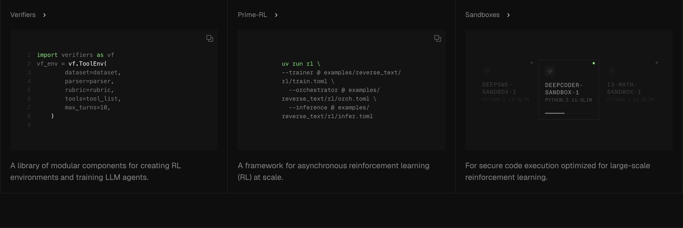
A precise, technical three-column feature grid showcasing terminal code samples and developer tooling on an ultra-dark background.
- Mood
- clinical + quiet
- Layout
- 3 col · grid · balanced
- 07
feature
A stark, low-slung banner pairing dense digital green point-cloud graphics with sharp, utilitarian developer-grade typography.
- Mood
- clinical + raw
- Layout
- 8 col · split · airy

- 08
feature
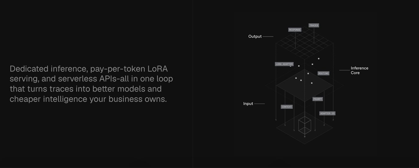
A dark, highly technical split section pairing low-contrast explanatory copy with an intricate wireframe architecture diagram.
- Mood
- clinical + quiet
- Layout
- 12 col · split · balanced
- 09
feature grid
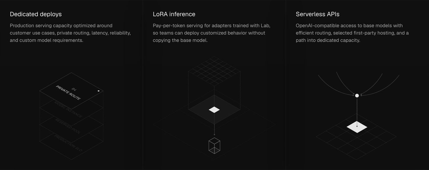
A precise, dark three-column technical feature section pairing restrained typography with delicate isometric wireframe diagrams.
- Mood
- clinical + quiet
- Layout
- 3 col · grid · balanced
- 10
feature
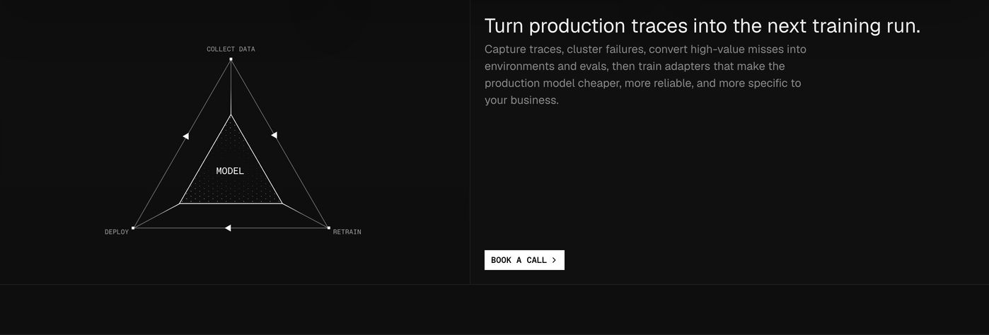
Minimalist and clinical dark split layout balancing a geometric vector process diagram with clear, restrained technical copy.
- Mood
- clinical + quiet
- Layout
- 12 col · split · airy
- 11
feature
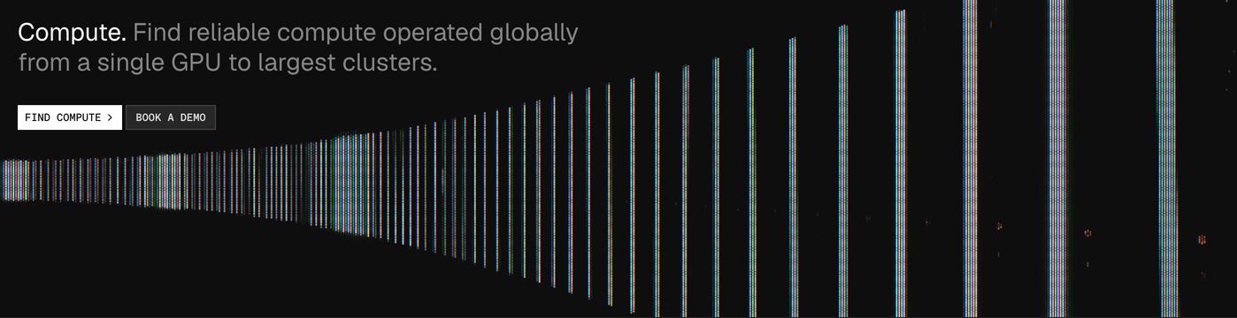
A stark dark infrastructure banner pairing clean technical typography with a receding perspective grid of chromatic scanlines.
- Mood
- clinical + raw
- Layout
- 6 col · asymmetric · balanced
- 12
feature
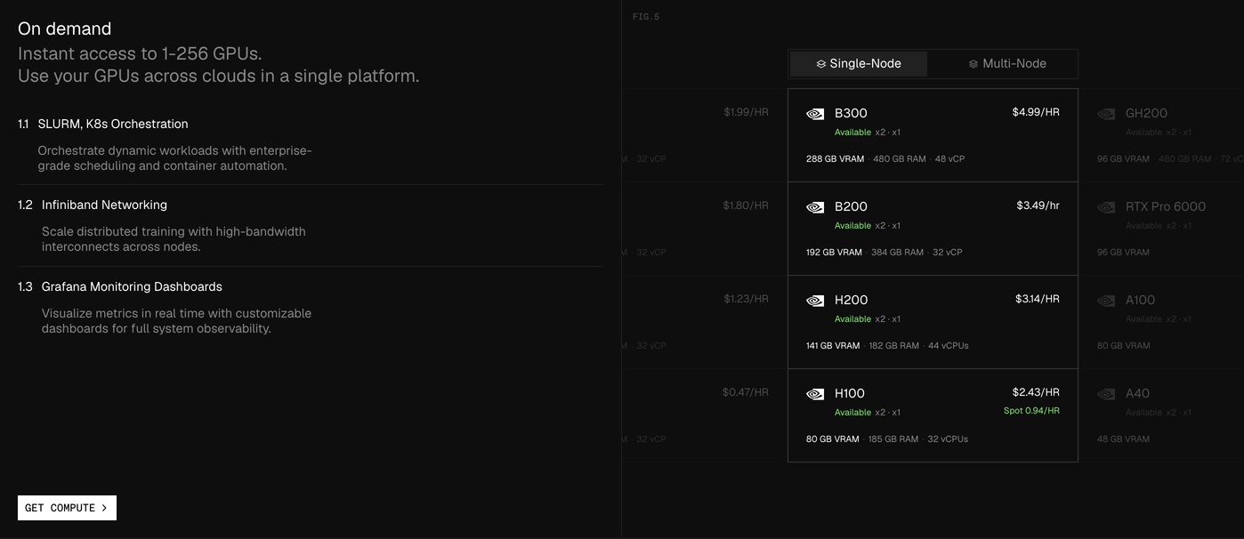
Dense, dark infrastructure feature section combining numbered technical capabilities with an interactive GPU pricing and availability table.
- Mood
- clinical + raw
- Layout
- 2 col · split · dense
- 13
feature
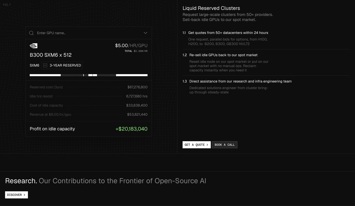
Technical dark-mode feature section pairing an interactive GPU economics calculator with structured, numbered infrastructure specifications.
- Mood
- clinical + raw
- Layout
- 2 col · split · dense
- 14
showcase
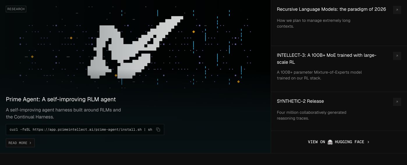
Clinical dark research showcase pairing a pixelated abstract visual and copyable terminal command with stacked publication links.
- Mood
- clinical + raw
- Layout
- 2 col · split · balanced
- 15
showcase
An austere dark research header with minimal text and a high-contrast utility button anchored to the top edges.
- Mood
- clinical + quiet
- Layout
- 3 col · split · airy

More like this
by shared mood