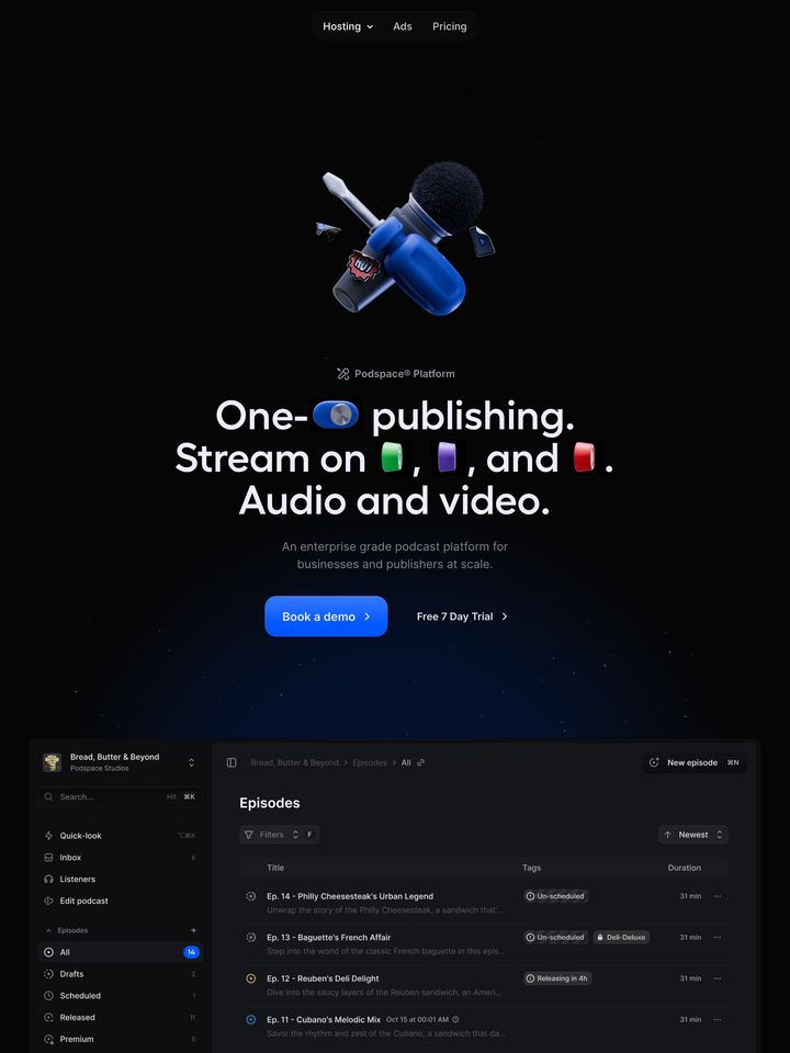
polar-sh
Engineered, clinical, and uncompromisingly minimal. Deep obsidian tones and crisp white typography create an atmosphere of severe architectural precision. Ultra-clean wireframe diagrams and stark two-column layouts make complex billing infrastructure feel mathematically solved.
Visit siteColour
Background#090909
Text#ffffff
Accent#00bc7d
Surface#111111
Muted#858585
Typefaces
- Display
- PP Neue Montreal
- Body
- PP Neue Montreal
- Mono
- GeistMono
- Source
- self_hosted
- Scale
- 12 · 14 · 16 · 20 · 24 · 30
Layout
- Grid
- 2 columns
- Container
- 1296px
- Spacing base
- 4px
- Radius
- 9999px · 8px
Capture
- Category
- other
- Sections
- 20
- Captured
- 2026-08-30
- Rhythm
- dark throughout with subtle alternating black and near-black panels
Type rules
- display headlines use sentence case in clean grotesk with low line-height
- body text runs at a narrow measure of around 40 characters in muted grey (#858585)
Colour rules
- deep near-black backgrounds (#090909) dominate the page with dark slate surfaces (#111111) for cards
- white text is reserved for primary headers, with secondary text held in muted grey (#858585)
Voice rules
- lead with infrastructure concepts like tokens and metering
- pair bold conceptual headlines with dimmed descriptive sublines
Holds it together
- use asymmetric two-column splits with section labels pinned to the left column
- illustrate technical concepts using minimalist monochrome line graphics and wireframe UI components
- render primary CTAs as white pill buttons with dark text, keeping other actions text-only with arrow glyphs
Contrast
text on background19.9:1 AAA
muted text on background5.4:1 AA
text on surface18.9:1 AAA
accent on background8.1:1 AAA
background on accent8.1:1 AAA
Type, measured
- Body
- 20px / 1.38
- Measure
- 40 characters
- Display
- 72px / 1
- Tracking
- 0em display
- Scale ratio
- 1.38
Voice
- Tone
- precise, engineered, authoritative
- Sentences
- medium
- Person
- second
- Vocabulary
- technical
- Calls to action
- get, apply
Built with
- Builder
- —
- Framework
- next
- Motion
- —
- WebGL
- yes
- Nav
- top_bar, 3 items
- Length
- 14.9 screens
Sections in page order
20- 00
hero
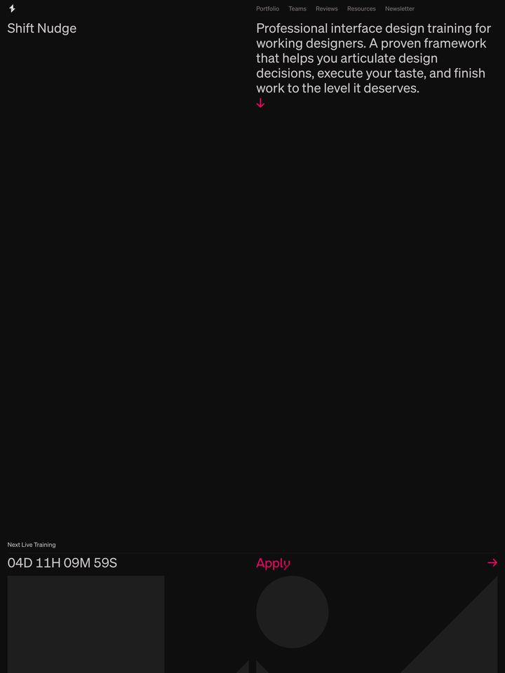
Stark and restrained dark hero dominated by vast negative space and crisp typography.
- Mood
- clinical + quiet
- Layout
- 1 col · stacked · airy

- 01
feature grid
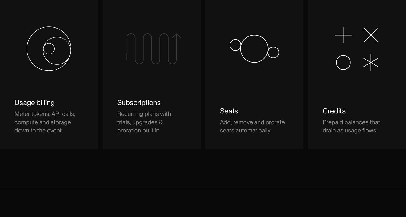
Precise four-column feature grid pairing minimalist line-drawn geometric diagrams with concise infrastructure billing descriptions on deep black panels.
- Mood
- clinical + quiet
- Layout
- 4 col · grid · balanced
- 02
statement
A stark and restrained dark statement section using precise typography to introduce platform capabilities with editorial poise.
- Mood
- quiet + clinical
- Layout
- 2 col · split · airy

- 03
feature grid
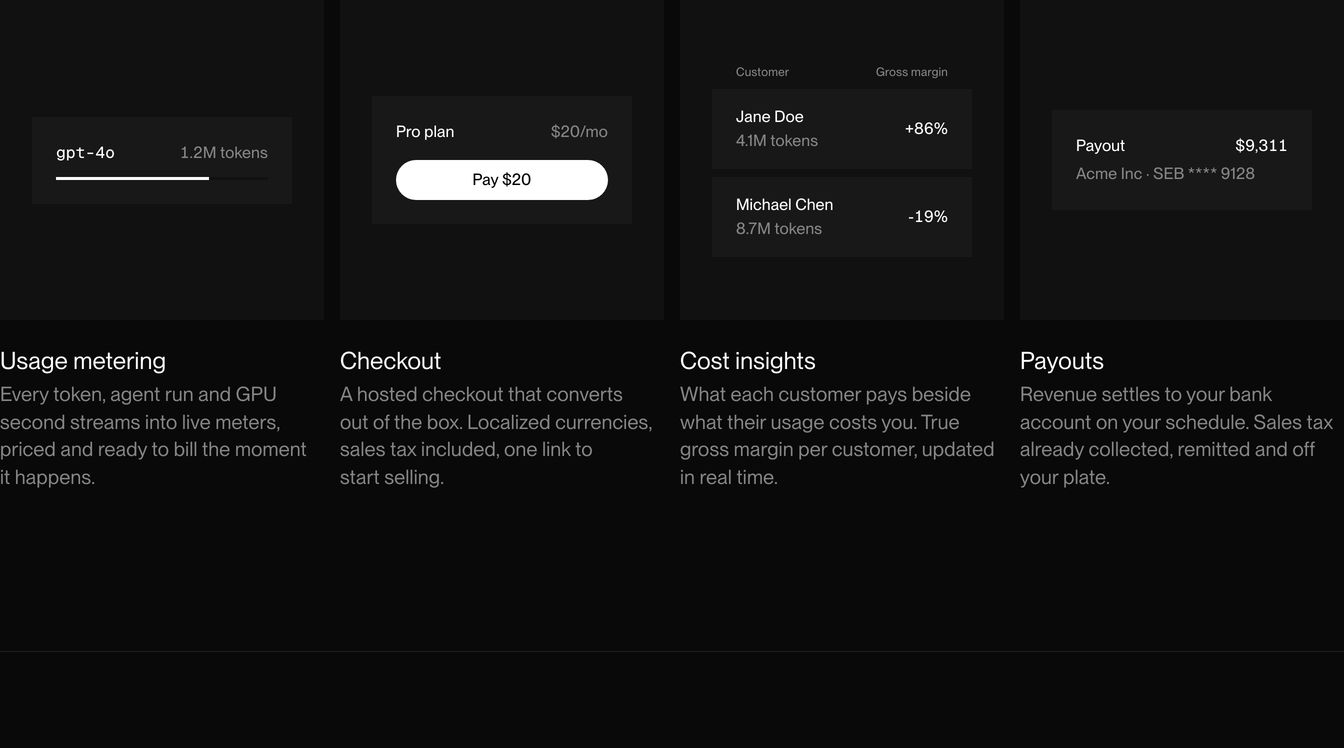
A dark, highly engineered feature grid pairing compact micro-UI data components with crisp, restrained copy.
- Mood
- clinical + quiet
- Layout
- 4 col · grid · balanced
- 04
statement
Minimalist black statement section using a strict two-column typographic grid with muted secondary text.
- Mood
- clinical + quiet
- Layout
- 2 col · split · airy

- 05
feature grid
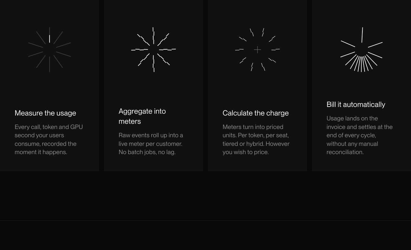
Monochrome four-column technical workflow with precise, minimalist radial line graphics illustrating stages of usage billing.
- Mood
- clinical + quiet
- Layout
- 4 col · grid · airy
- 06
feature
Stark, ultra-minimalist two-column text layout bathed in deep black with precise typographic hierarchy.
- Mood
- quiet + clinical
- Layout
- 2 col · split · airy

- 07
feature
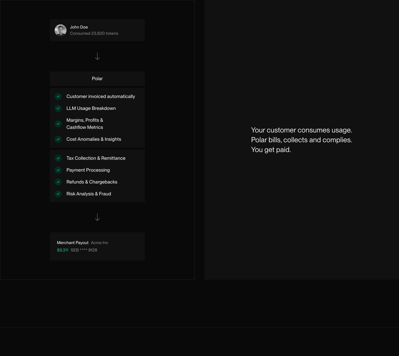
Austere, engineered dark-mode split section detailing an automated billing pipeline beside succinct three-line value copy.
- Mood
- clinical + quiet
- Layout
- 2 col · split · airy
- 08
statement
Sparse, high-contrast dark section with razor-sharp typography organized across an asymmetric two-column split.
- Mood
- clinical + quiet
- Layout
- 2 col · split · airy

- 09
testimonial
Quiet, minimal dark header introducing testimonials with stark contrast and clean Swiss-inspired typography.
- Mood
- quiet + clinical
- Layout
- 4 col · split · airy

- 10
logo bar
A restrained dark grid presenting monochrome partner logos with understated, clinical precision.
- Mood
- quiet + clinical
- Layout
- 4 col · grid · balanced
- 11
testimonial
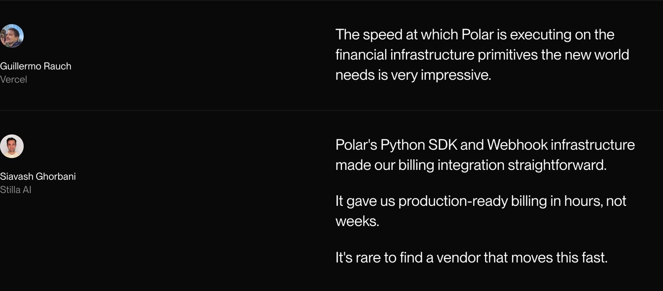
Minimal dark testimonial rows pairing small avatar attribution with crisp white statements against a stark black background.
- Mood
- quiet + clinical
- Layout
- 2 col · split · balanced
- 12
testimonial
A minimalist dark endorsement split into author details and a spacious, highly legible quote block.
- Mood
- quiet + clinical
- Layout
- 2 col · split · airy

- 13
testimonial
Minimalist and quiet dark testimonial featuring an unadorned horizontal split between the avatar attribution and crisp pull quote.
- Mood
- quiet + clinical
- Layout
- 2 col · split · airy

- 14
pricing
Minimalist dark pricing header featuring generous negative space, clean typography, and pill-shaped dual action buttons.
- Mood
- quiet + clinical
- Layout
- 12 col · split · airy

- 15
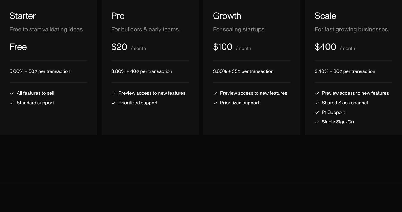
pricing
A restrained, monochromatic four-column pricing grid with crisp typography and subtle vertical rules.
- Mood
- clinical + quiet
- Layout
- 4 col · grid · balanced
- 16
cta
Minimalist dark section with understated typographic contrast offering a startup program alongside a compact pill CTA.
- Mood
- quiet + clinical
- Layout
- 4 col · split · airy

- 17
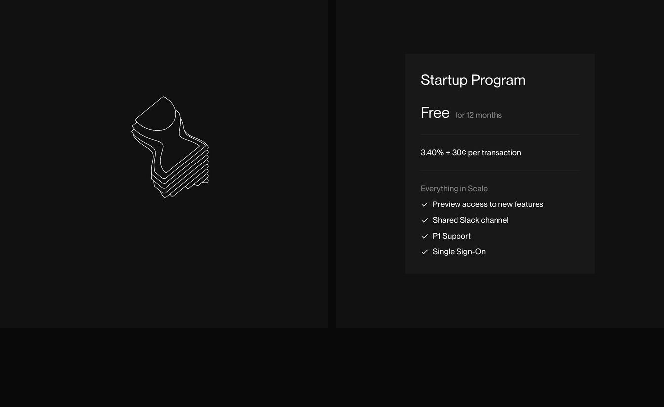
pricing
A quiet, dark pricing tier card set with refined typography alongside a delicate isometric wireframe illustration.
- Mood
- quiet + clinical
- Layout
- 2 col · split · airy
- 18
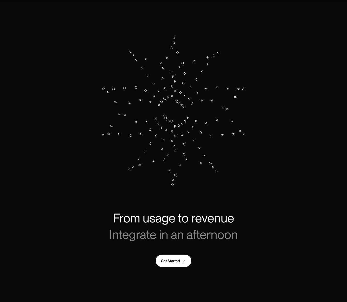
cta
Deep black void anchored by an intricate radial typographic snowflake above quiet, confident closing CTA copy.
- Mood
- quiet + clinical
- Layout
- 12 col · centered · airy
- 19
footer
A quiet, pitch-black minimalist footer with crisp typographic hierarchy and generous negative space.
- Mood
- quiet + clinical
- Layout
- 1 col · grid · airy