Pangram Pangram
Vibrant, typographic, and designer-first. Large rounded billboard cards showcase typeface personalities against rich full-bleed imagery, while crisp specimen grids invite hands-on exploration. Bright red and amber status pills pop against an otherwise disciplined black-on-white layout.
Rated
7.9/ 10
From 8 analysed sections. Two measured components and one judged by a model. Distinction is a rank within the library; the rest are scores in their own right.
- AI scorejudged
- 9.8
- Systemmeasured
- 5.5
- Distinctionmeasured
- 8.4
- on the grid
- 32%
- vertical rhythm
- 71%
- type on a scale
- 50%
- contrast passing AA
- 67%
- unlike the library
- 1.14
- model craft
- 8.1/10
- model deviation
- 4.9/10
Colour
Typefaces
- Display
- Neue Montreal
- Body
- Neue Montreal
- Mono
- —
- Source
- self_hosted
- Scale
- 12 · 14 · 16 · 18 · 20 · 22
Layout
- Grid
- 12 columns
- Container
- 1260px
- Spacing base
- 8px
- Radius
- 24px · 999px
Capture
- Category
- foundry
- Sections
- 8
- Captured
- 2026-09-05
- Rhythm
- light x4 → dark → light x2 → dark → light
Type rules
- display font names rendered oversized up to 145px in sentence case
- specimen pangrams set at 22px body type with 94 character line measure to test glyph rhythm
- status pills and meta tags set in compact sans-serif labels
Colour rules
- canvas is predominantly light grey and off-white (#fafafa and #ededed) so typographic artwork leads
- vivid red-orange (#ff2f00) and amber (#ffb700) reserved exclusively for status badges and primary CTA pills
- full-bleed black container (#000000) used as a high-contrast break for the value proposition
Voice rules
- short evocative descriptors for each typeface family
- clear two-word action CTAs on pill buttons
Holds it together
- enclose hero font releases within rounded container cards overlaid with paired pill action buttons
- mark release status with saturated pill badges floating above display headlines
- organize font catalog into a modular multi-column card grid with live pangrams and oversized glyph initials
- interrupt the neutral grid rhythm with a solid black statement section and horizontal image carousels
Contrast
Type, measured
- Body
- 22px / 1.3
- Measure
- 94 characters
- Display
- 145px / 1
- Tracking
- 0em display
- Scale ratio
- 1.60
Voice
- Tone
- declarative, confident, curated
- Sentences
- short
- Person
- first
- Vocabulary
- specialized
- Calls to action
- explore, try, check, view, learn
Built with
- Builder
- —
- Framework
- —
- Motion
- swiper
- WebGL
- —
- Nav
- top_bar, 5 items
- Length
- 9.2 screens
Sections in page order
- 00
hero
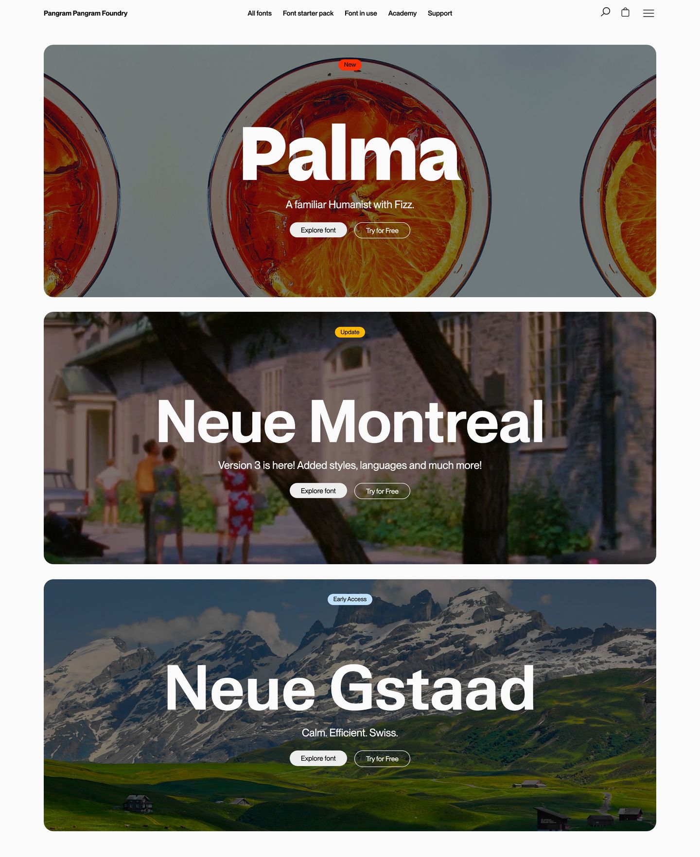
StrongBold, punchy type foundry hero featuring stacked rounded photo banners showcasing individual typefaces with confident oversized lettering.
- Mood
- energetic + playful
- Layout
- 1 col · stacked · dense
- 01
showcase
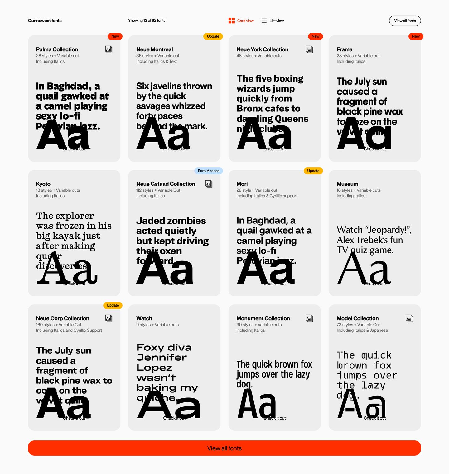
A crisp, precision-engineered typeface foundry showcase presenting specimen cards in an orderly Swiss modular grid.
- Mood
- clinical + serene
- Layout
- 4 col · grid · balanced
- 02
showcase
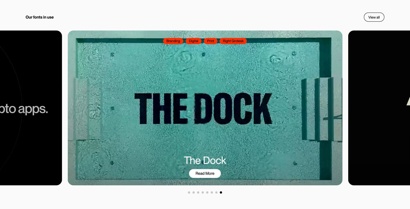
A clean type foundry showcase carousel spotlighting real-world font applications with rounded preview cards and high-contrast orange tag pills.
- Mood
- clinical + serene
- Layout
- 3 col · stacked · balanced
- 03
cta
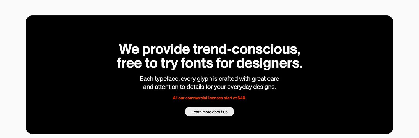
A stark, rounded black card presenting a foundry manifesto and call to action with quiet typographic restraint.
- Mood
- serene
- Layout
- 1 col · centered · balanced
- 04
logo bar
A clean and reassuring social proof logo bar presenting prominent brand marks in soft rounded cards.
- Mood
- reassuring
- Layout
- 6 col · stacked · balanced

- 05
showcase
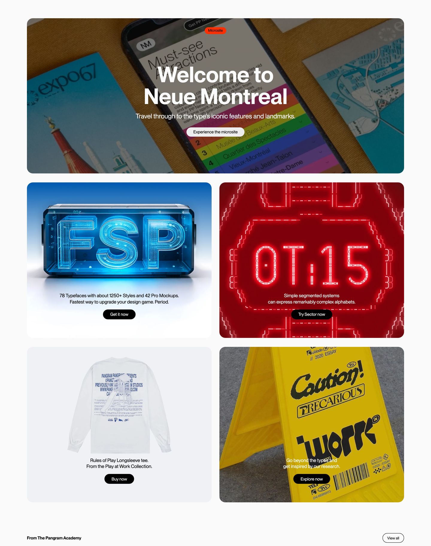
StrongDynamic multi-card showcase featuring bold typographic mockups and 3D objects arranged in a rounded grid.
- Mood
- playful + energetic
- Layout
- 2 col · grid · balanced
- 06
showcase
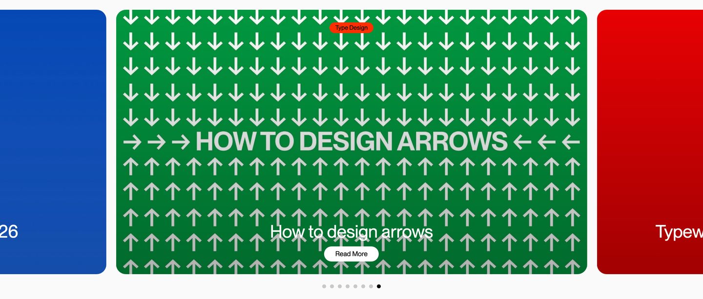
StrongA bold, graphic editorial carousel featuring high-contrast saturated cards celebrating typography design guides.
- Mood
- playful + energetic
- Layout
- 3 col · centered · balanced
- 07
footer
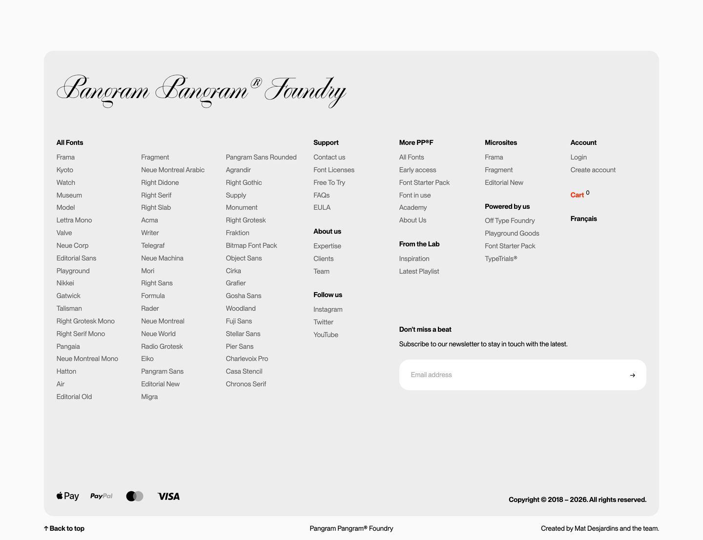
A quiet, meticulous type foundry footer organizing an extensive font directory alongside newsletter capture inside an elevated rounded card.
- Mood
- serene + clinical
- Layout
- 7 col · grid · balanced