Midu Studio Website
Atmospheric, sleek, and precision-driven. Giant sentence-case display typography emerges from deep pitch-black space backlit by intense red diffused airbrush blooms. A sudden, high-contrast light surface band interrupts the nocturnal canvas to ground technical capabilities.
Rated
7.8/ 10
From 8 analysed sections. Two measured components and one judged by a model. Distinction is a rank within the library; the rest are scores in their own right.
- AI scorejudged
- 9.6
- Systemmeasured
- 5.7
- Distinctionmeasured
- 8.2
- on the grid
- 24%
- vertical rhythm
- 54%
- type on a scale
- 50%
- contrast passing AA
- 100%
- unlike the library
- 1.13
- model craft
- 8.0/10
- model deviation
- 4.8/10
Colour
Typefaces
- Display
- Switzer Medium
- Body
- Switzer Regular
- Mono
- —
- Source
- Scale
- 12 · 14 · 16 · 18 · 20 · 24
Layout
- Grid
- 16 columns
- Container
- 900px
- Spacing base
- 4px
- Radius
- 12px · 24px · 999px
Capture
- Category
- agency
- Sections
- 8
- Captured
- 2026-09-04
- Rhythm
- dark x4 → light → dark x3
Type rules
- display headlines set tight with negative tracking and sentence case
- body copy maintained at roughly 53 characters per line for maximum readability
- secondary supporting paragraphs set in regular weight at muted opacity
Colour rules
- deep black background dominates over 85 percent of the layout
- vibrant red gradients confined exclusively to ambient graphic glow masks
- a single stark white section interrupts the dark canvas to spotlight tool capabilities
Voice rules
- lead with brief, definitive claims before expanding in secondary text
- pair studio capability labels with transparent business metrics
Holds it together
- anchor the top and bottom of the page with oversized branded lettering beneath glowing red ambient gradients
- use pill-shaped floating containers with rounded corners for top navigation and call-to-action buttons
- isolate tools and capabilities within a contrasting full-width light container to reset visual momentum
Contrast
Type, measured
- Body
- 16px / 1.3
- Measure
- 53 characters
- Display
- 84px / 1
- Tracking
- -0.04em display
- Scale ratio
- 1.51
Voice
- Tone
- confident, direct, refined
- Sentences
- short
- Person
- first
- Vocabulary
- plain
- Calls to action
- explore, get in touch, view, see
Built with
- Builder
- framer
- Framework
- —
- Motion
- lenis
- WebGL
- —
- Nav
- —
- Length
- 12.6 screens
Sections in page order
- 00
hero
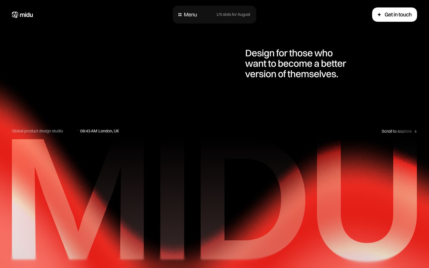
StrongDeep black atmosphere anchored by massive glowing red gradient typography and restrained, confident studio positioning.
- Mood
- mysterious + luxurious
- Layout
- 2 col · asymmetric · airy
- 01
hero
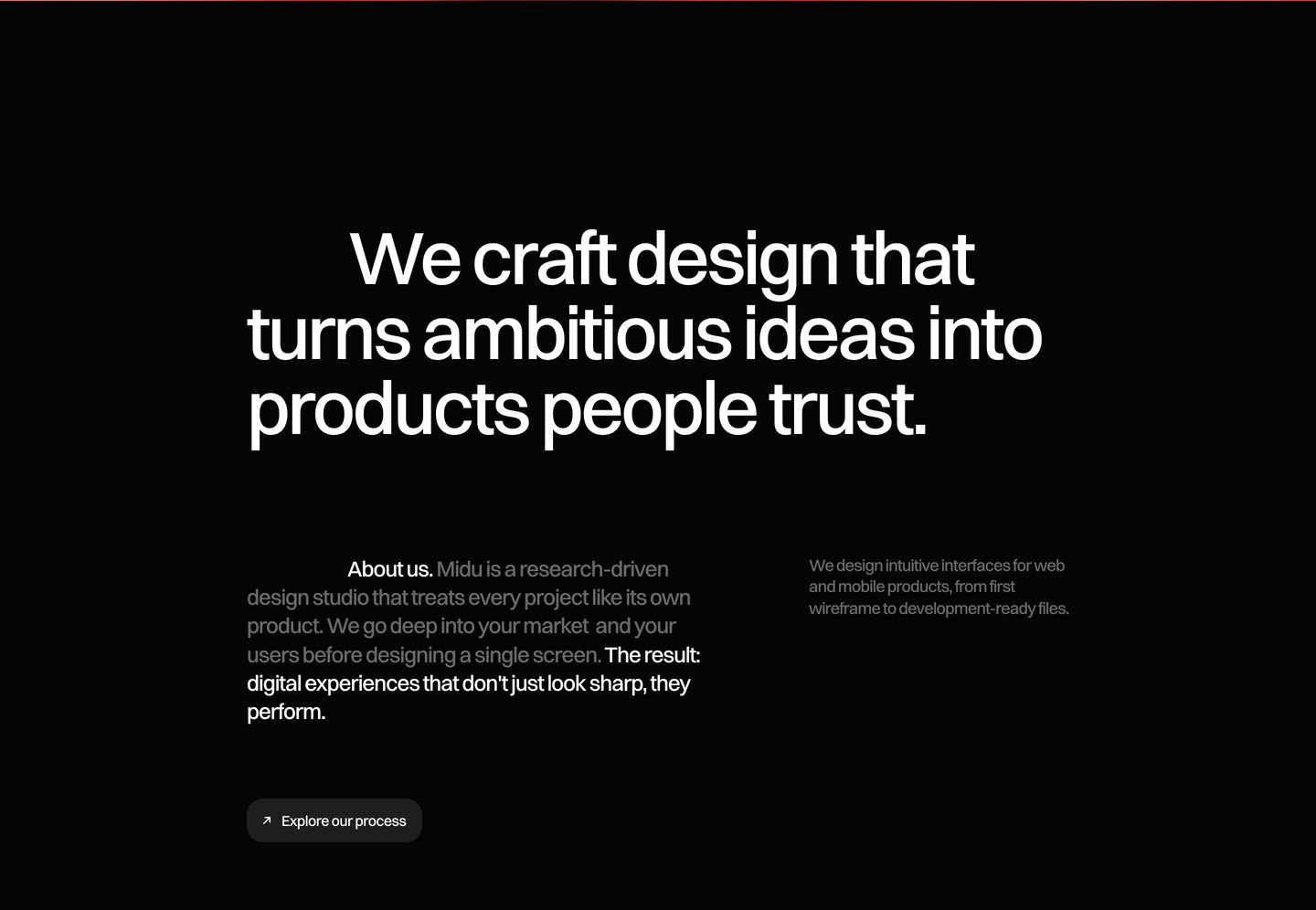
Austere, high-contrast dark hero relying strictly on balanced grotesque typography and generous whitespace to convey studio authority.
- Mood
- serene + clinical
- Layout
- 2 col · stacked · airy
- 02
feature
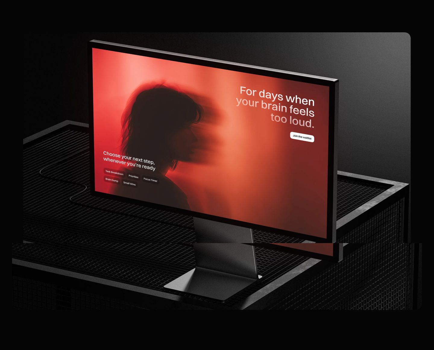
StrongA moody 3D monitor mockup glowing with intense crimson light against a dark industrial setting.
- Mood
- contemplative + mysterious
- Layout
- 1 col · centered · airy
- 03
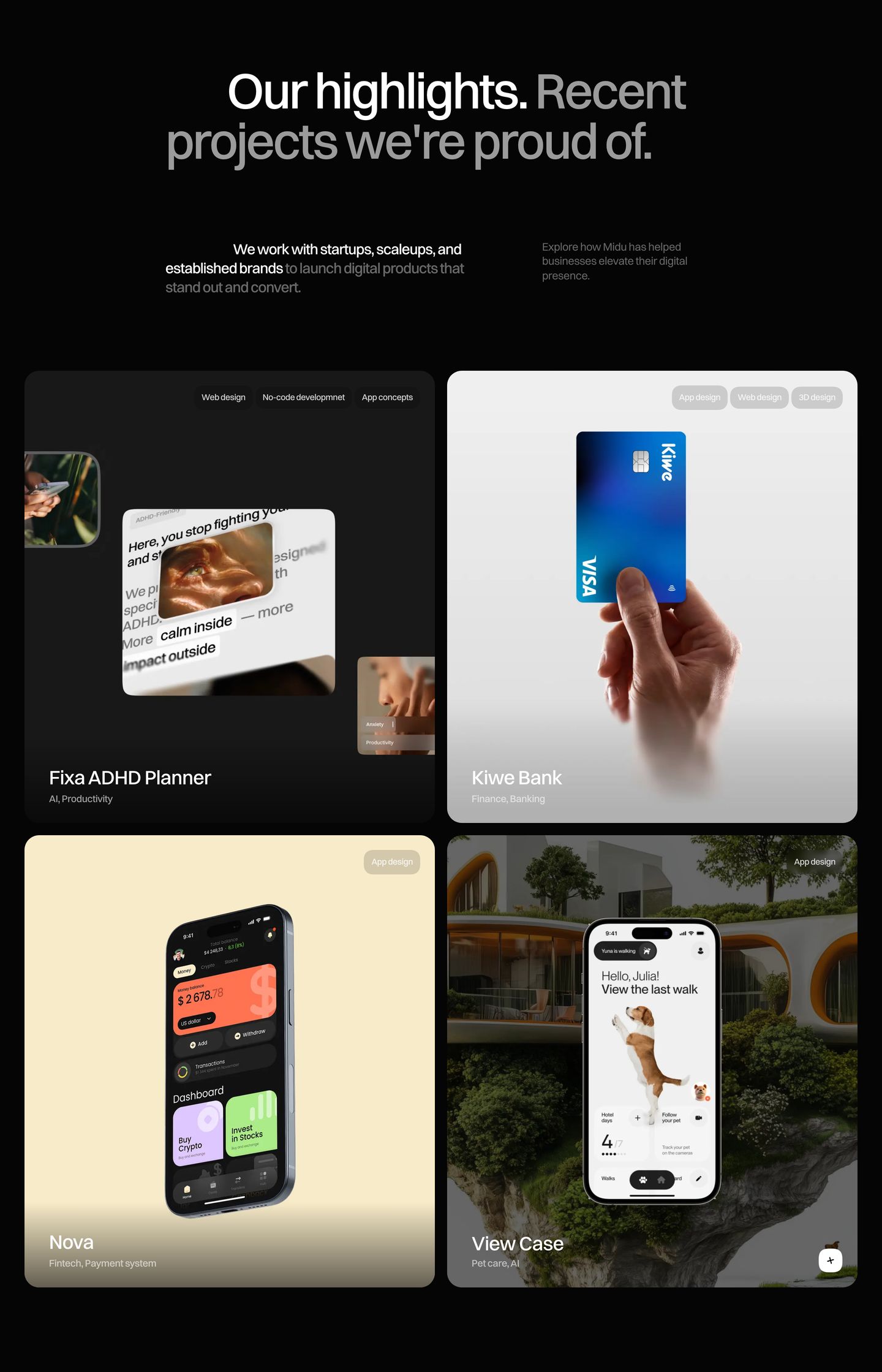
showcase
A sleek dark agency portfolio showcase presenting digital product case studies in rounded cards with tactile UI mockups.
- Mood
- serene + luxurious
- Layout
- 2 col · grid · balanced
- 04
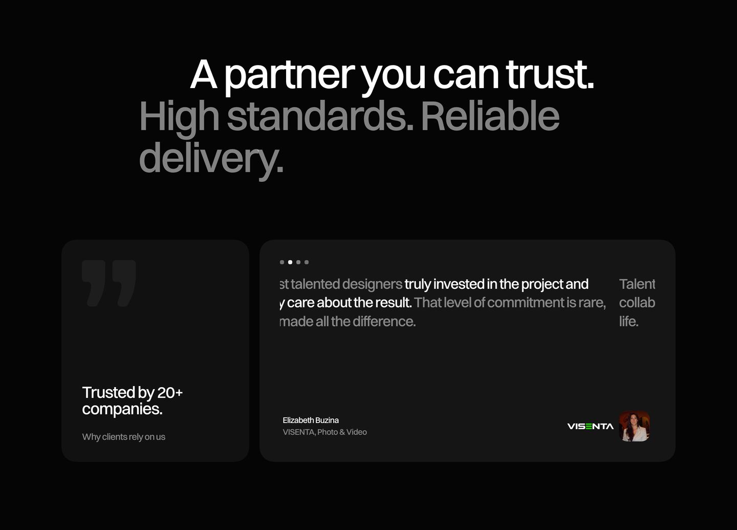
testimonial
Understated dark social proof section pairing clean headline typography with rounded testimonial cards for a calm, trustworthy presence.
- Mood
- reassuring + serene
- Layout
- 2 col · stacked · balanced
- 05
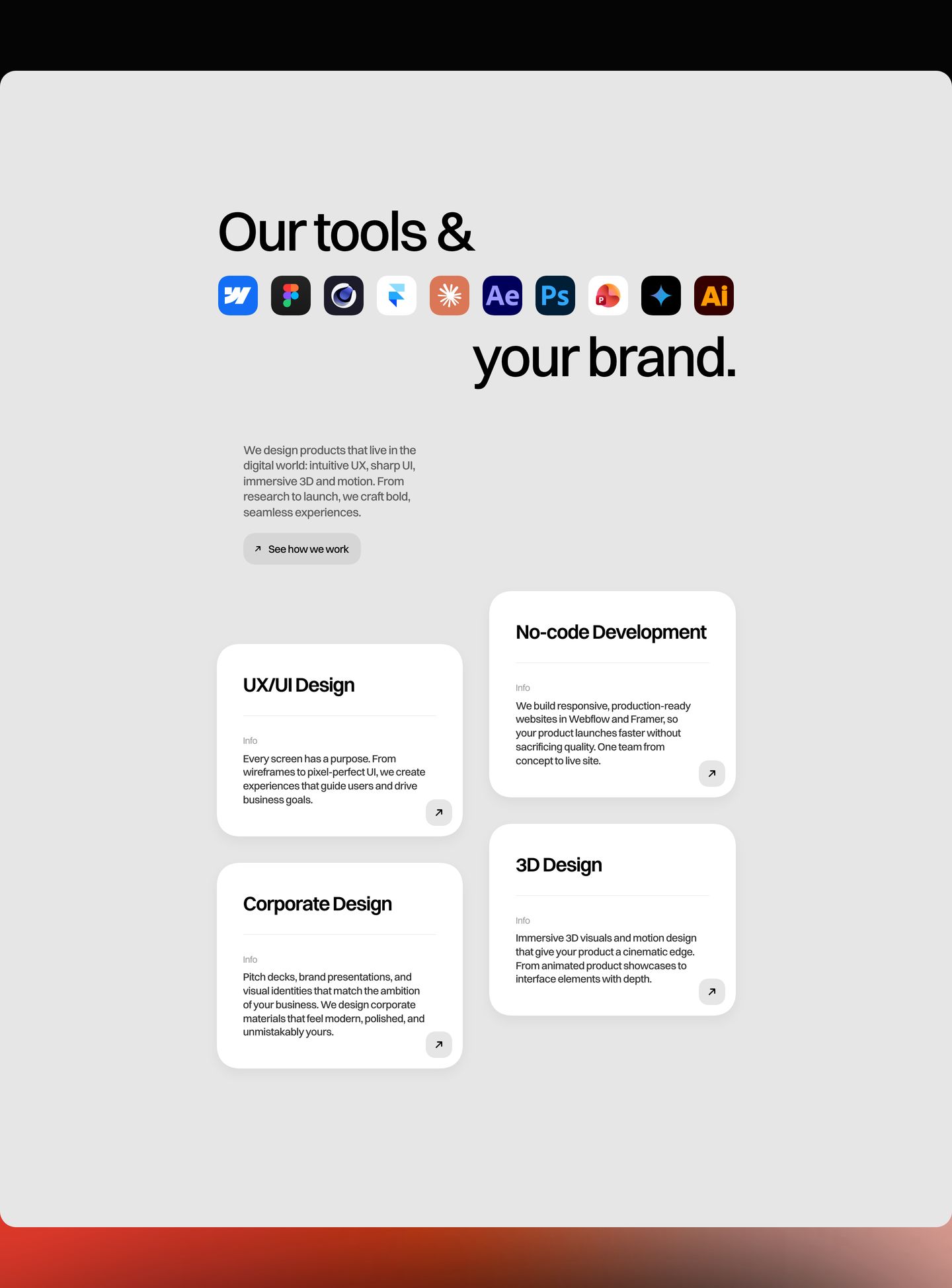
feature grid
Airy light-mode capabilities grid featuring rounded service cards offset beneath a typographic headline integrated with colorful software badges.
- Mood
- serene + playful
- Layout
- 2 col · asymmetric · airy
- 06
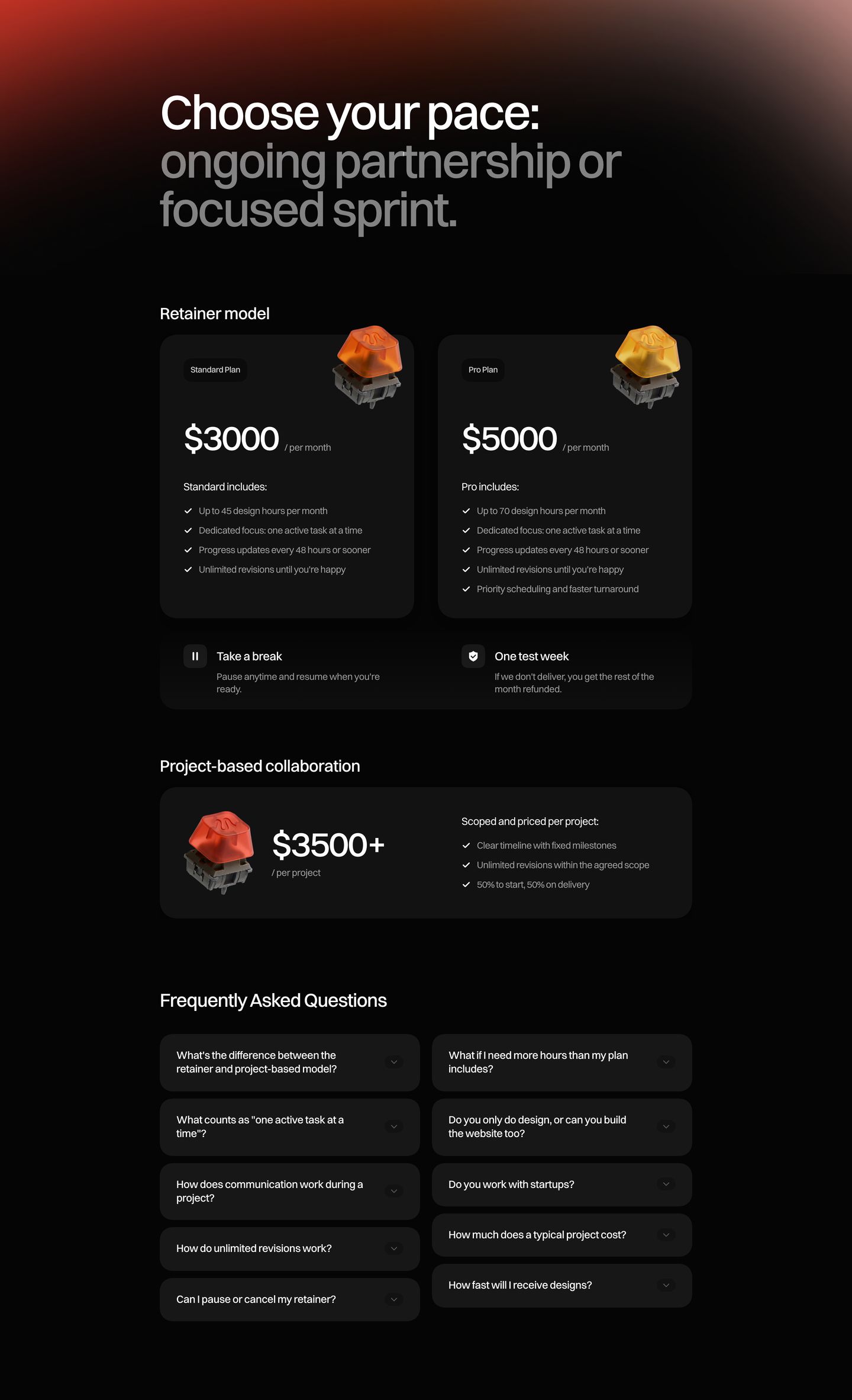
pricing
Sleek dark-mode pricing suite pairing tactile 3D mechanical switch artifacts with balanced tier cards and accordion FAQ.
- Mood
- luxurious + reassuring
- Layout
- 2 col · stacked · balanced
- 07
footer
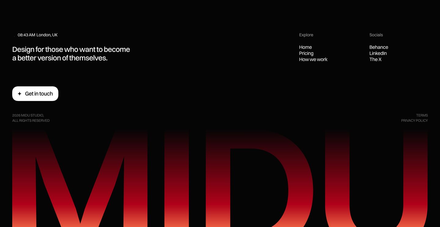
StrongDramatic dark agency footer anchored by a massive glowing red brandmark cropped along the bottom edge.
- Mood
- luxurious + mysterious
- Layout
- 3 col · grid · airy