Revone
Polished and technical macOS utility aesthetic. Dark OLED backgrounds and precise dashboard previews are highlighted with soft indigo and violet glow gradients.
Visit siteColour
Typefaces
- Display
- Satoshi
- Body
- Satoshi
- Mono
- —
- Source
- Scale
- 12 · 14 · 16 · 20 · 30 · 40
Layout
- Grid
- —
- Container
- —
- Spacing base
- 5px
- Radius
- 12px · 24px
Capture
- Category
- tools
- Sections
- 9
- Captured
- 2026-08-29
- Rhythm
- dark x5 → mixed → dark x3
Type rules
- display typography set tightly with negative tracking in sentence case
- body text constrained to around 64 characters per line for readability
Colour rules
- deep pure black grounds the majority of layouts with subtle near-black surface cards
- vibrant purple #5f61ed is reserved strictly for primary actions, subtle glows, and the key pricing callout
Voice rules
- concise headers focused on utility
- straightforward macOS-native feature descriptions
Holds it together
- pair every complex product screenshot with clean, minimal left-aligned copy and bullet points
- use smooth rounded dark cards against a solid black backdrop to structure feature grids
- break uniform dark sections with a singular high-impact accent colored container for conversion
Contrast
Type, measured
- Body
- 16px / 1.6
- Measure
- 64 characters
- Display
- 169px / 0.8
- Tracking
- -0.066em display
- Scale ratio
- 1.80
Voice
- Tone
- direct, refined
- Sentences
- medium
- Person
- second
- Vocabulary
- product-focused
- Calls to action
- download, get
Built with
- Builder
- framer
- Framework
- —
- Motion
- —
- WebGL
- yes
- Nav
- top_bar, 5 items
- Length
- 11.2 screens
Sections in page order
3 marked strong · 9- 00
hero
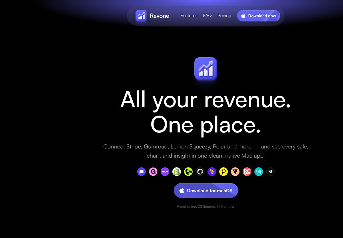
Sleek, centered dark-mode app hero with glowing purple atmospheric accents, a 3D icon, and a crisp suite of integration badges.
- Mood
- bold + dreamy
- Layout
- 16 col · centered · airy
- 01
feature
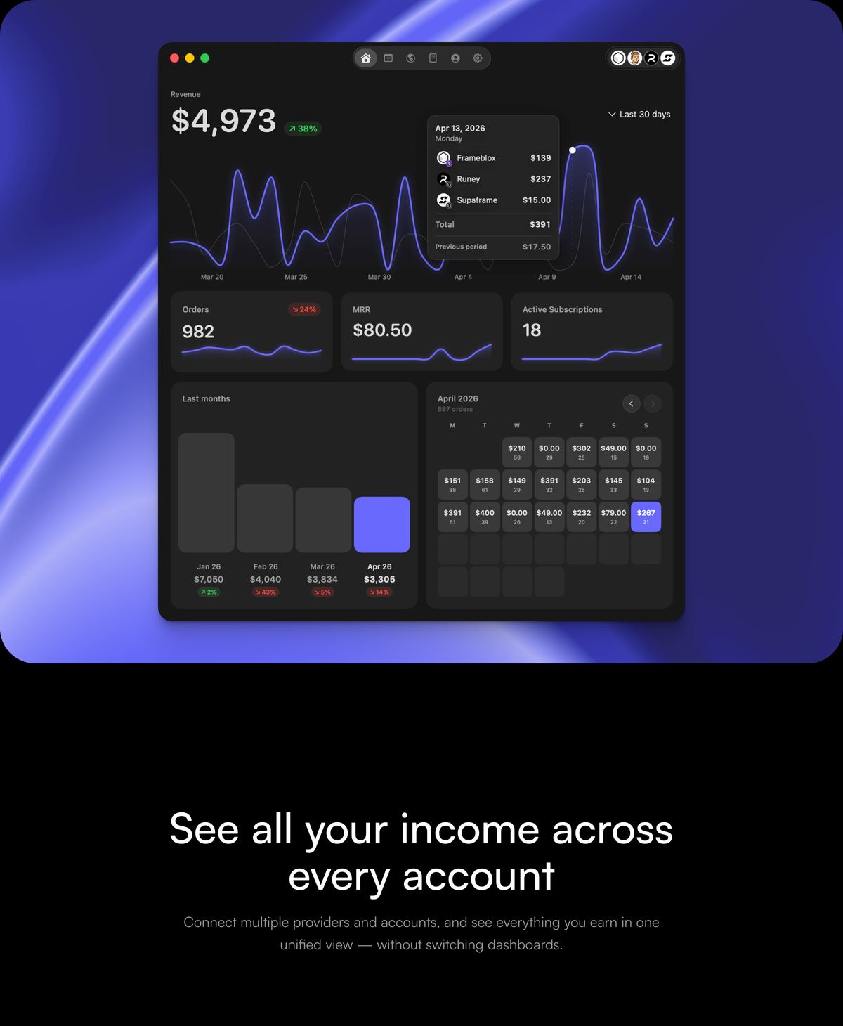
StrongA sleek dark-mode analytics dashboard floats above a luminous violet gradient, anchored by clean centered product copy.
- Mood
- clinical + dreamy
- Layout
- 12 col · stacked · airy
- 02
feature
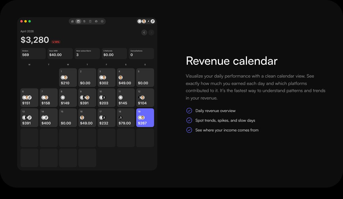
Sleek and precise dark-mode feature showcase pairing an intricate calendar analytics mockup with understated explanatory copy.
- Mood
- clinical + quiet
- Layout
- 16 col · split · balanced
- 03
feature
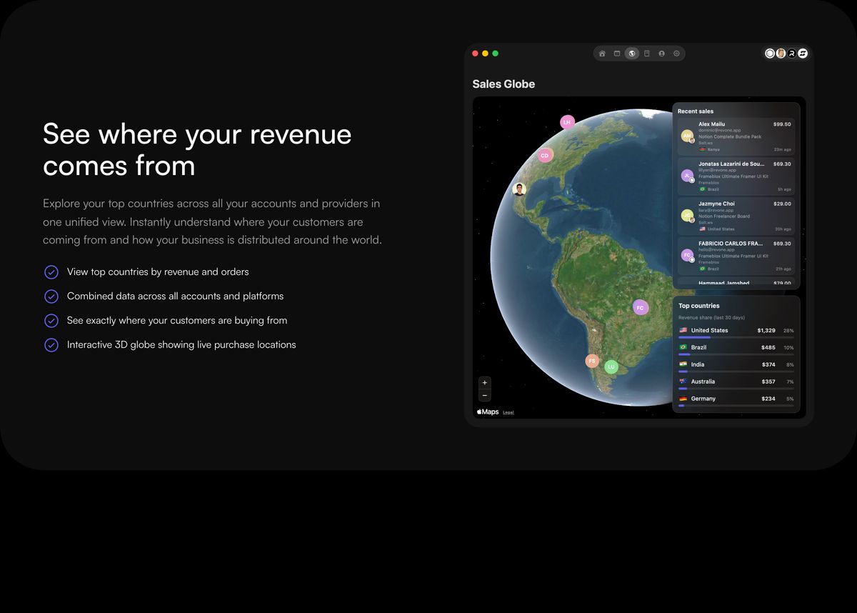
Sleek dark-mode feature showcase pairing structured bullet points with an illuminated 3D interactive sales globe interface.
- Mood
- clinical + quiet
- Layout
- 12 col · split · balanced
- 04
feature grid
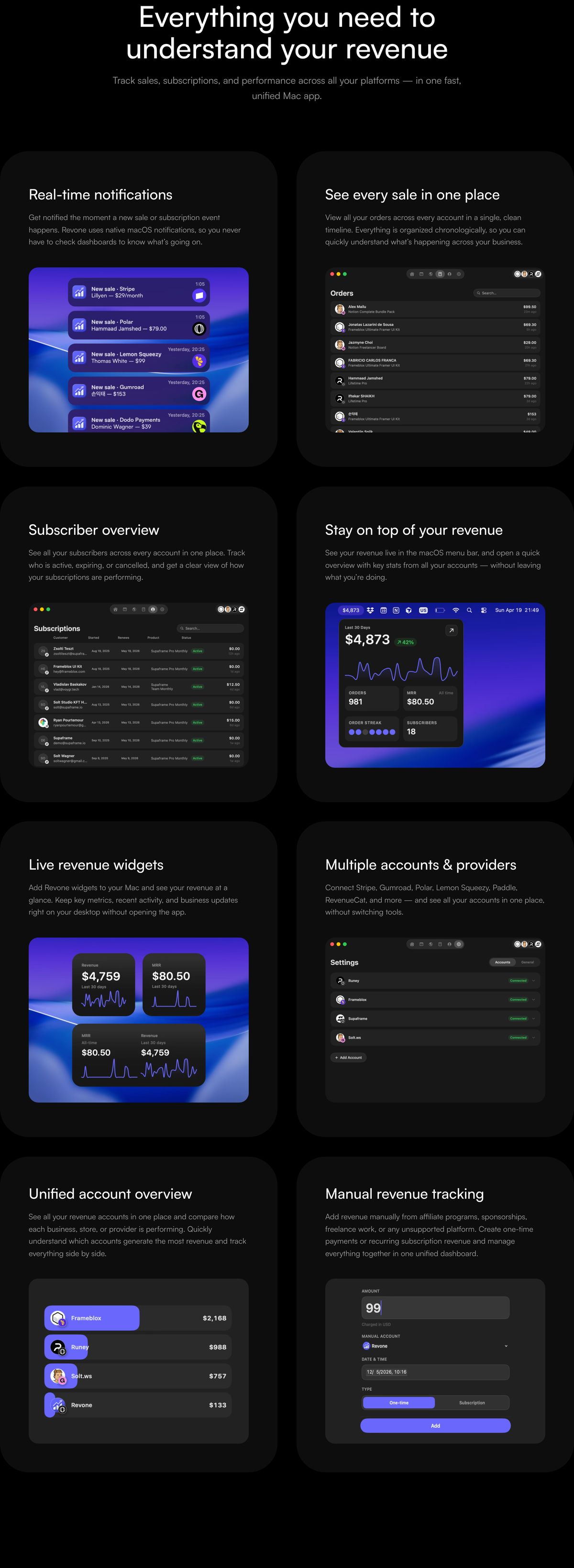
StrongCrisp dark-mode product feature grid pairing sleek macOS UI snippets with vibrant purple-blue accents on deep black cards.
- Mood
- clinical + quiet
- Layout
- 2 col · grid · balanced
- 05
pricing
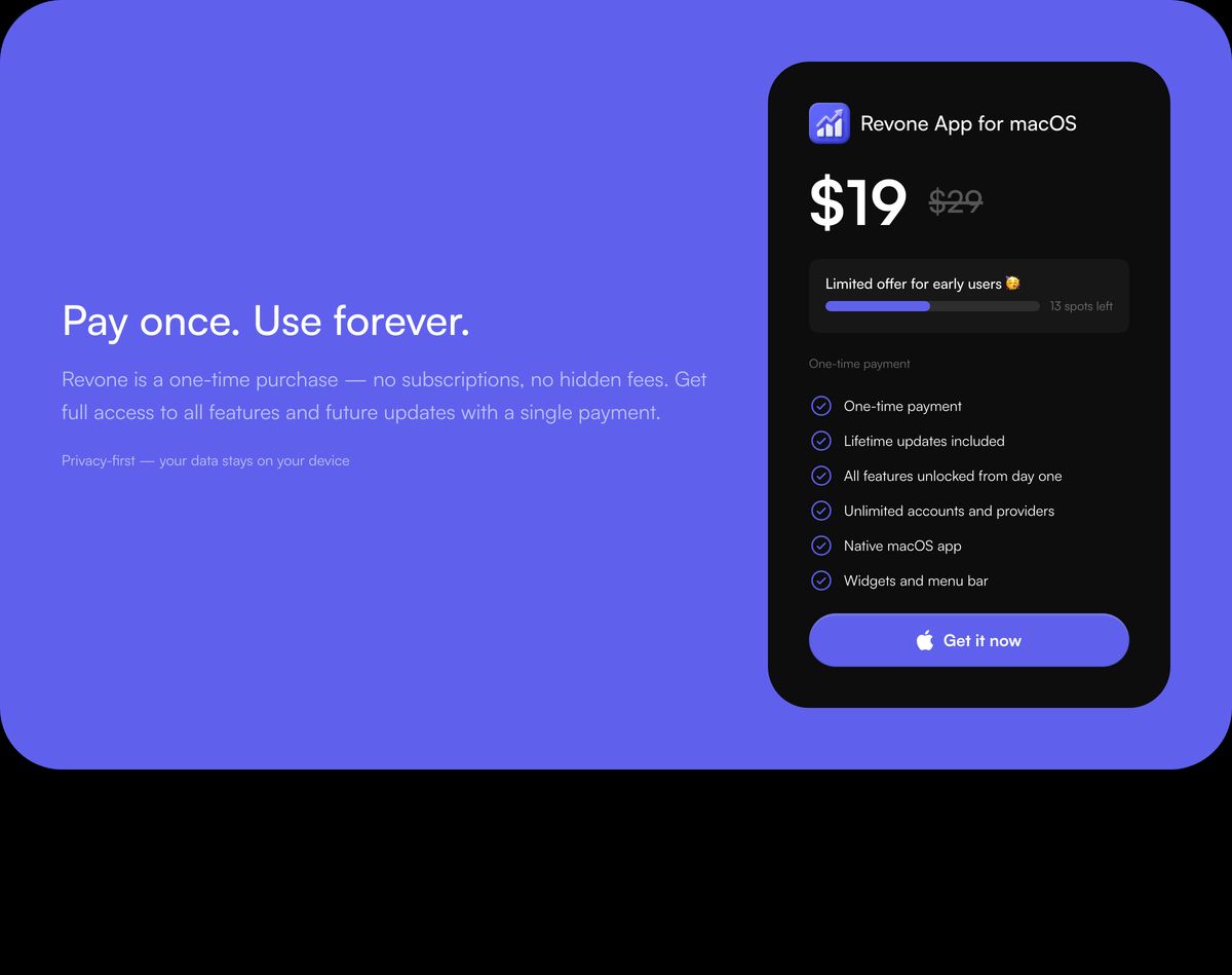
Vibrant purple pricing callout featuring bold value proposition copy beside a floating dark macOS checkout card.
- Mood
- bold + playful
- Layout
- 2 col · split · balanced
- 06
faq
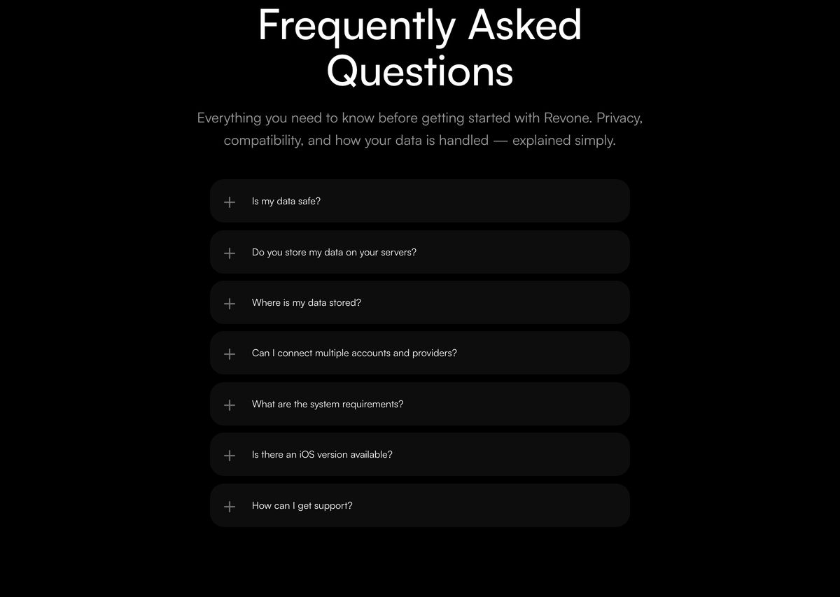
A restrained dark-mode FAQ section featuring stacked pill-shaped accordion rows beneath a centered geometric headline.
- Mood
- quiet + clinical
- Layout
- 6 col · centered · balanced
- 07
logo bar
Minimal dark badge strip displaying third-party directory listings against a stark black background.
- Mood
- quiet + clinical
- Layout
- 15 col · stacked · airy

- 08
footer
StrongA sleek, dark SaaS footer featuring detailed multi-column links anchored by a massive outlined brand watermark over a gentle purple glow.
- Mood
- quiet + dreamy
- Layout
- 12 col · grid · balanced