jarcos-work
Austere and brutally confident. The site operates like an architectural monograph, opening on a stark white canvas before plunging into pitch black. Huge edge-to-edge typography frames dense, structured multi-column lists and punchy visual project cards.
Visit siteRated
6.6/ 10
From 6 analysed sections. Two measured components and one judged by a model. Distinction is a rank within the library; the rest are scores in their own right.
- AI scorejudged
- 8.9
- Systemmeasured
- 4.8
- Distinctionmeasured
- 4.6
- on the grid
- 47%
- vertical rhythm
- 47%
- type on a scale
- 0%
- contrast passing AA
- 100%
- unlike the library
- 0.22
- model craft
- 7.7/10
- model deviation
- 5.3/10
Colour
Background#000000
Text#ffffff
Accent#ffffff
Surface#ffffff
Muted#808080
Typefaces
- Display
- Inter Display
- Body
- Inter Display
- Mono
- —
- Source
- self_hosted
- Scale
- 12 · 24
Layout
- Grid
- —
- Container
- —
- Spacing base
- 8px
- Radius
- 0px
Capture
- Category
- portfolio
- Sections
- 6
- Captured
- 2026-08-30
- Rhythm
- light x2 → dark x4
Type rules
- body set at 24px with tight negative letter spacing (-0.01em) and max measure around 57 characters
- structural headers and logotypes span full edge-to-edge widths in heavy bold uppercase
Colour rules
- strict monochromatic palette of pure black and white with muted grey (#808080) for body lists and secondary data
- vibrant color is strictly isolated within the visual case study thumbnails
Voice rules
- state professional credibility through plain facts and client lists without hyperbole
- keep interactive prompts conversational and concise
Holds it together
- bookend the experience with massive edge-to-edge wordmarks in pure black and white
- confine all accent and chromatic color entirely to project portfolio imagery
- organize metadata, clients, and capabilities into rigid, multi-column list structures using muted grey text
Contrast
text on background21.0:1 AAA
muted text on background5.3:1 AA
accent on background21.0:1 AAA
background on accent21.0:1 AAA
Type, measured
- Body
- 24px / 1.3
- Measure
- 57 characters
- Display
- 24px / 1.3
- Tracking
- -0.01em display
- Scale ratio
- —
Voice
- Tone
- restrained, matter-of-fact, authoritative
- Sentences
- short
- Person
- first
- Vocabulary
- curated
- Calls to action
- pop, read
Built with
- Builder
- framer
- Framework
- —
- Motion
- —
- WebGL
- —
- Nav
- —
- Length
- 5.4 screens
Sections in page order
3 marked strong · 6- 00
hero
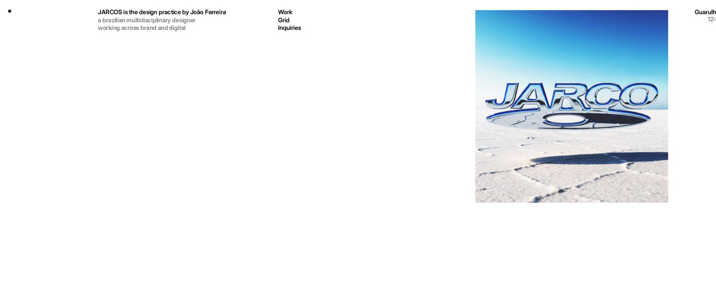
StrongAn ultra-sparse, quiet studio header balancing delicate typography against an offset square image of chrome lettering over a desert landscape.
- Mood
- quiet + nostalgic
- Layout
- 1 col · asymmetric · airy
- 01
hero
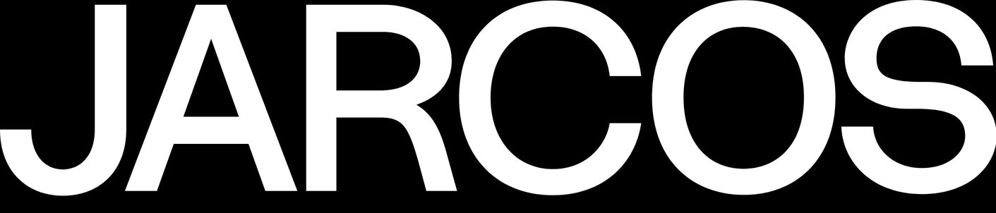
An ultra-bold, starkly minimal black logotype commanding the entire horizontal span of a pure white canvas.
- Mood
- bold + quiet
- Layout
- 6 col · centered · airy
- 02
statement
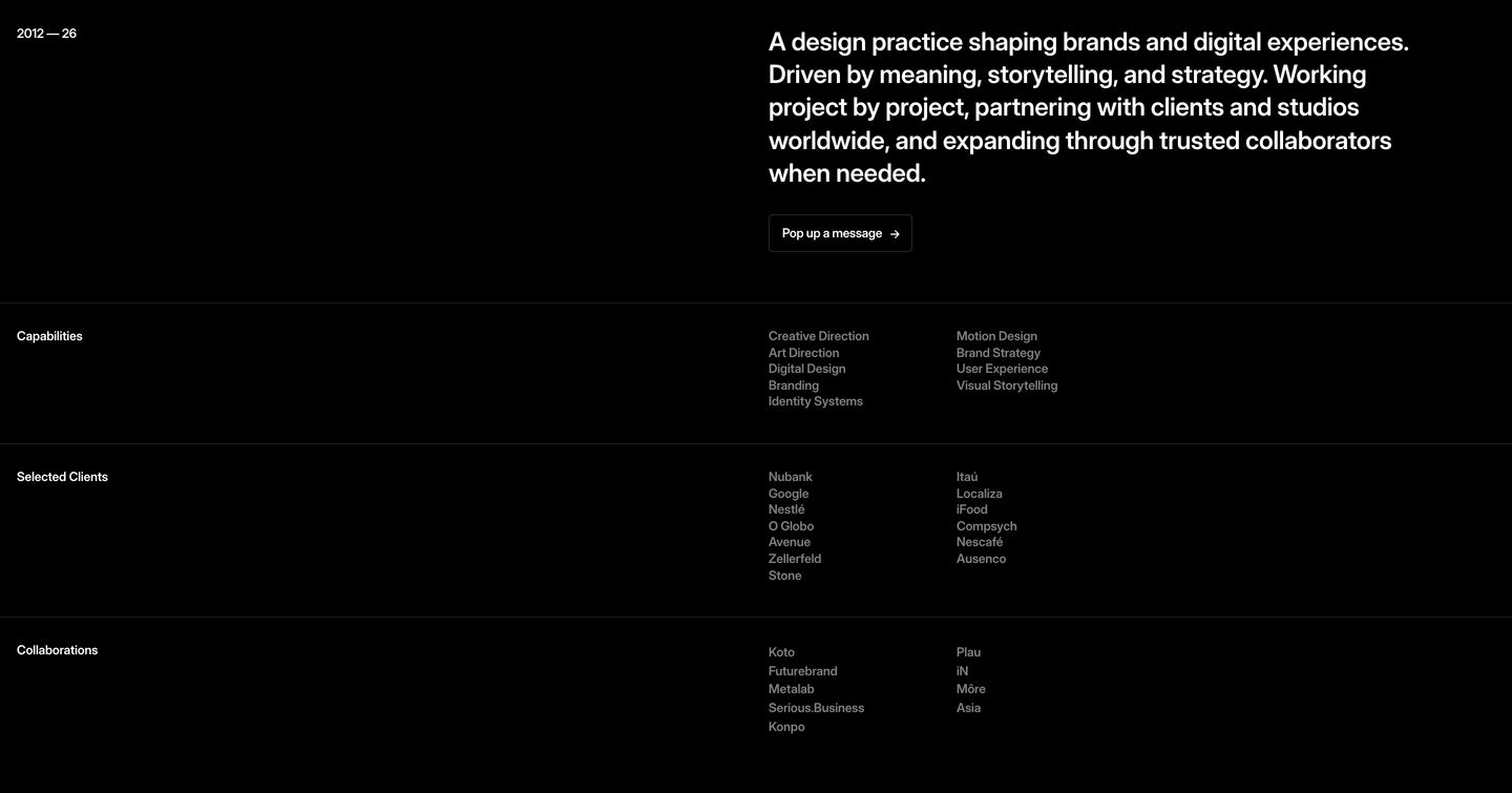
StrongAustere, pitch-black design studio statement pairing precise typographic hierarchy with structured multi-column capability lists.
- Mood
- quiet + editorial
- Layout
- 2 col · grid · airy
- 03
showcase
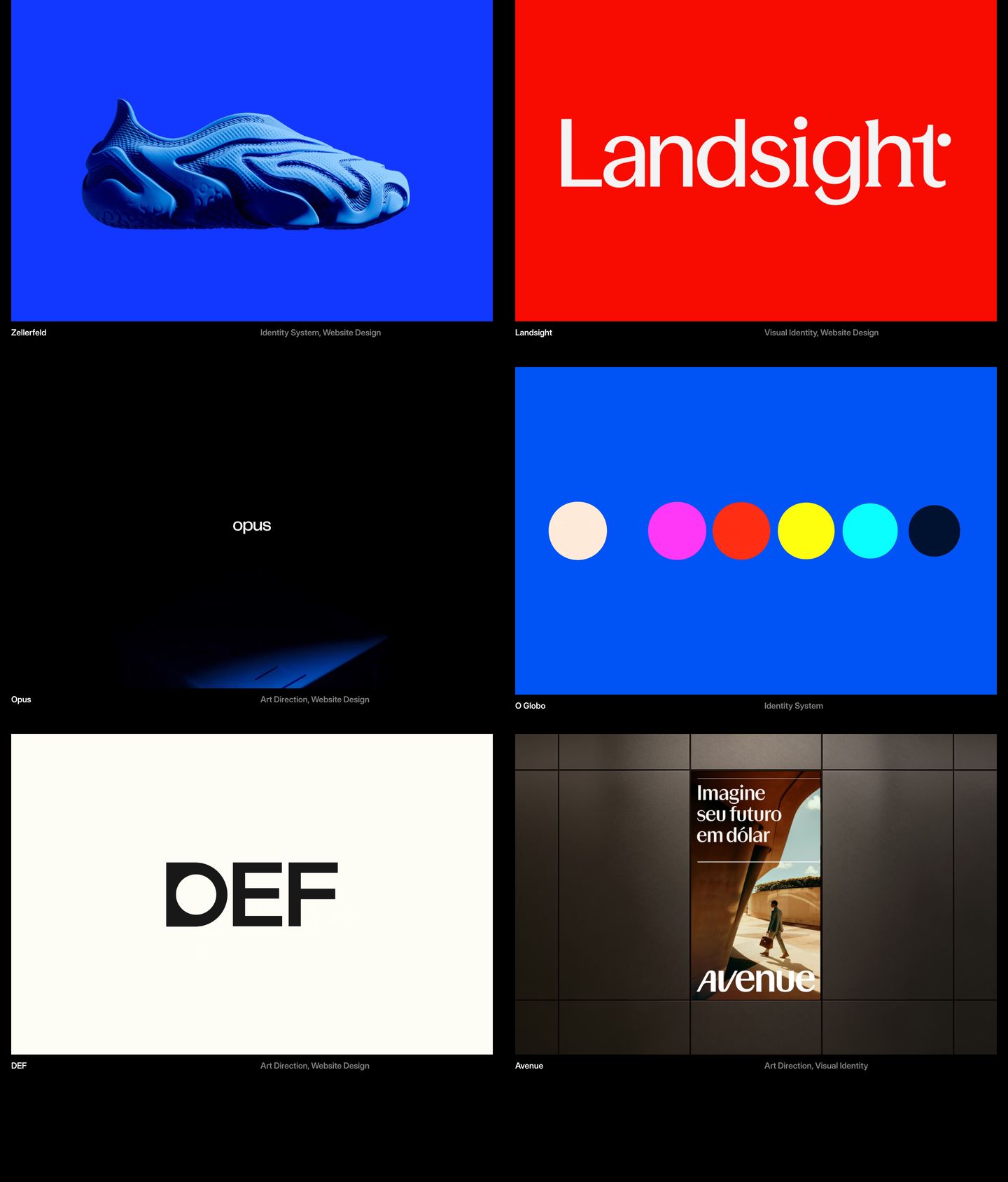
A bold, high-contrast portfolio grid presenting six visual case studies with hyper-minimal captions on a pitch black canvas.
- Mood
- bold + editorial
- Layout
- 2 col · grid · balanced
- 04
footer
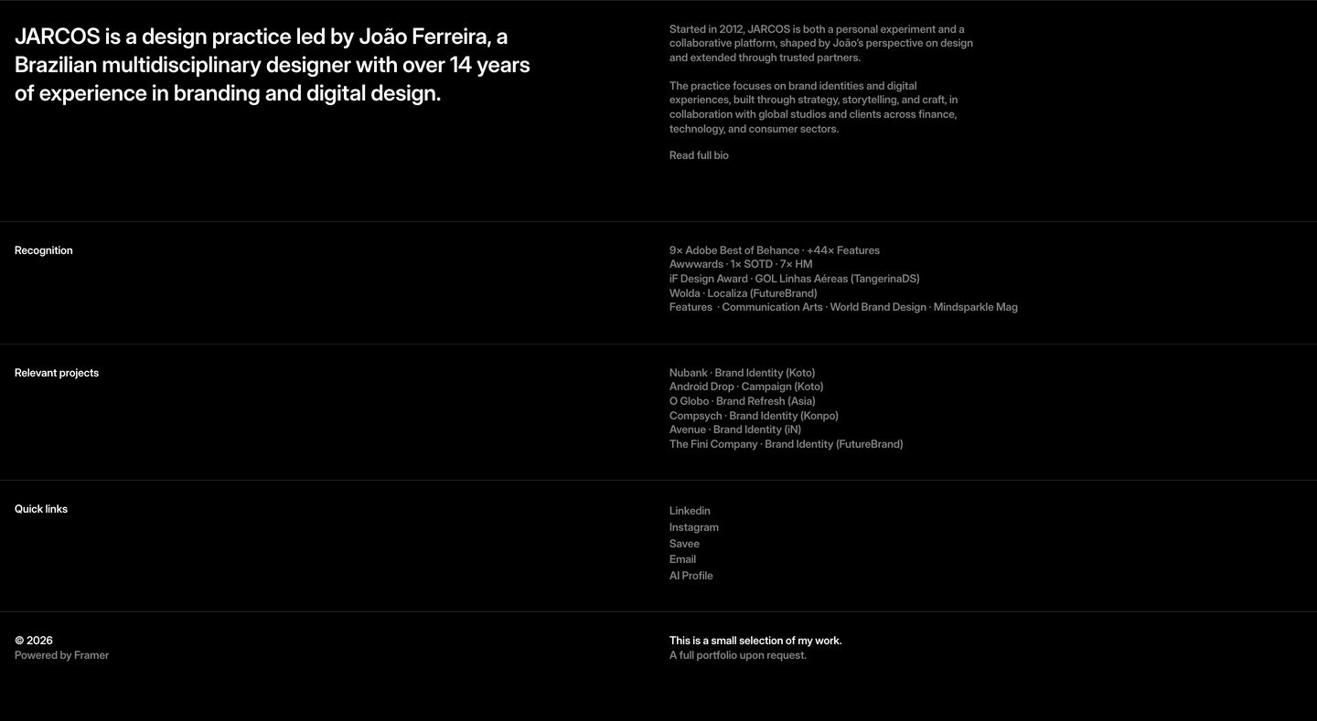
StrongQuiet, starkly minimal dark index and bio section structured with fine horizontal rules and rigorous typography.
- Mood
- quiet + clinical
- Layout
- 4 col · grid · balanced
- 05
statement
Monolithic, high-contrast black and white section dominated by an edge-to-edge uppercase wordmark.
- Mood
- bold + quiet
- Layout
- 1 col · full bleed · dense