digitalflagship-com
High-impact, confident digital agency presence powered by monumental condensed typography on a midnight field. Neon lime accents electrify key calls to action and performance stats, while vibrant floating client cards break the rigid typographic framework.
Visit siteColour
Background#060616
Text#ffffff
Accent#c1fd3a
Surface#383845
Muted#82828a
Typefaces
- Display
- rama-gothic-m
- Body
- Saans
- Mono
- —
- Source
- adobe
- Scale
- 8 · 12 · 14 · 16 · 22 · 48
Layout
- Grid
- —
- Container
- —
- Spacing base
- 5px
- Radius
- 9999px
Capture
- Category
- other
- Sections
- 14
- Captured
- 2026-08-30
- Rhythm
- dark x14
Type rules
- display typography set uppercase in heavy condensed gothic up to 360px
- body text set in Saans at 16px with narrow measure averaging 37 characters
Colour rules
- background remains uniform deep obsidian #060616 across the entire page
- high-voltage lime #c1fd3a reserved exclusively for action pills, primary metrics, and key taxonomy highlights
Voice rules
- headlines strictly uppercase and condensed
- services presented as continuous slash-separated taxonomy
Holds it together
- headline scale pushes viewport boundaries using ultra-condensed woodblock proportions
- lime accent appears only on primary pill buttons, percentage metrics, and service lists
- maintain full dark mode continuity with no light theme section inversions
Contrast
text on background20.1:1 AAA
muted text on background5.3:1 AA
text on surface11.5:1 AAA
accent on background16.6:1 AAA
background on accent16.6:1 AAA
Type, measured
- Body
- 16px / 1.5
- Measure
- 37 characters
- Display
- 360px / 0.8
- Tracking
- 0em display
- Scale ratio
- 2.18
Voice
- Tone
- declarative, confident
- Sentences
- short
- Person
- first
- Vocabulary
- plain
- Calls to action
- work, explore, get
Built with
- Builder
- —
- Framework
- —
- Motion
- swiper
- WebGL
- —
- Nav
- top_bar, 18 items
- Length
- 9.6 screens
Sections in page order
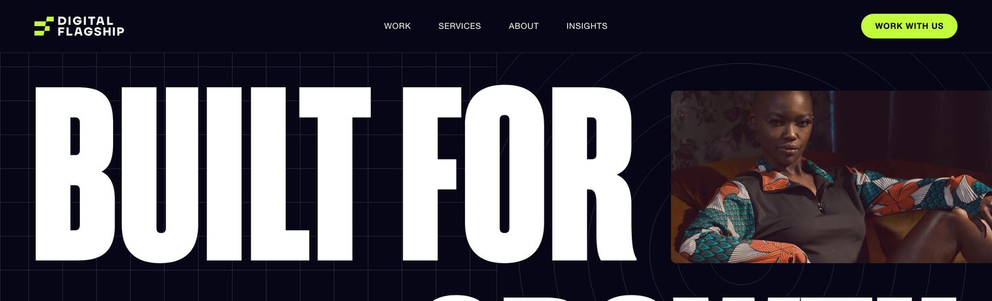
14- 00
hero
Aggressive, high-contrast dark hero pairing gigantic condensed display type with technical background grid lines and an embedded media card.
- Mood
- bold + clinical
- Layout
- 1 col · asymmetric · balanced
- 01
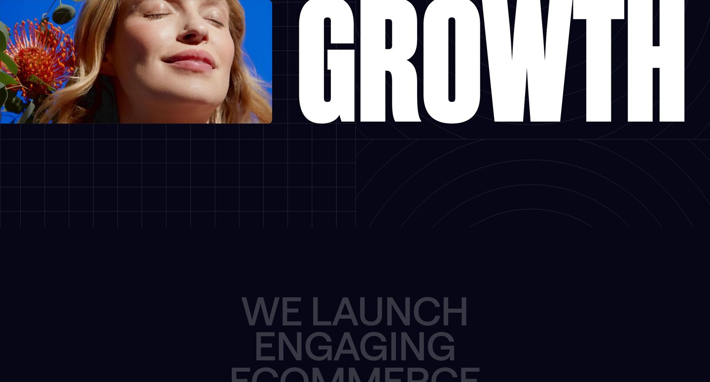
hero
High-contrast dark hero pairing an ultra-tall condensed title with a bright photographic inset and faint technical grid textures.
- Mood
- bold + editorial
- Layout
- 1 col · asymmetric · balanced
- 02
statement
Ghosted, oversized uppercase typography creates a quiet and atmospheric tonal layer across a deep obsidian field.
- Mood
- quiet + bold
- Layout
- 1 col · centered · airy

- 03
showcase
Moody, high-impact agency showcase layering vibrant client media cards over massive, low-contrast background typography.
- Mood
- bold + editorial
- Layout
- 16 col · asymmetric · dense

- 04
showcase
Atmospheric dark statement section pairing enormous low-contrast typography with framed client thumbnail cards.
- Mood
- bold + quiet
- Layout
- 12 col · grid · balanced

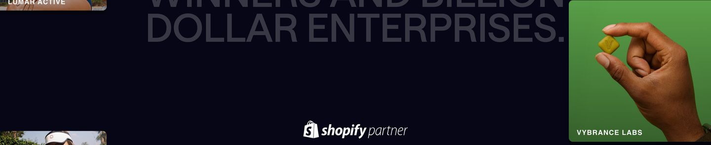
- 05
showcase
A sleek dark portfolio strip anchored by a central partner badge beneath ghostly, oversized statement typography and vibrant product photography cards.
- Mood
- bold
- Layout
- 12 col · grid · balanced
- 06
showcase
A dark, restrained transitional strip flanking a central partner badge with minimal photography preview cards.
- Mood
- quiet + clinical
- Layout
- 6 col · asymmetric · airy

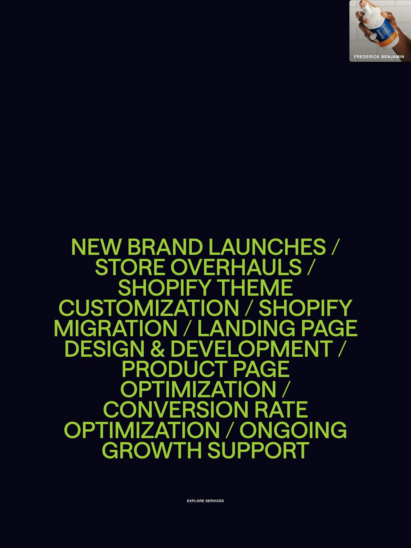
- 07
statement
Monolithic, centered lime typography floating in deep void-like darkness delivers an intense, list-like statement of services.
- Mood
- bold + raw
- Layout
- 1 col · centered · airy
- 08
showcase
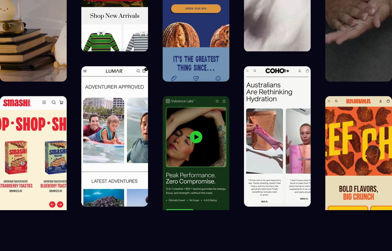
A dark showcase displaying a staggered multi-column wall of mobile ecommerce screens and video snippets.
- Mood
- bold + playful
- Layout
- 16 col · grid · dense
- 09
statement
Monolithic condensed headline dominating a deep black field with sheer scale and stark contrast.
- Mood
- bold + raw
- Layout
- 1 col · centered · airy
- 10
showcase
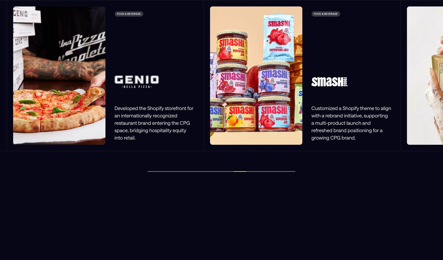
Deep navy client case study carousel pairing vibrant food photography cards with structured typographic metadata and a sleek progress slider.
- Mood
- quiet + editorial
- Layout
- 1 col · grid · balanced
- 11
stats
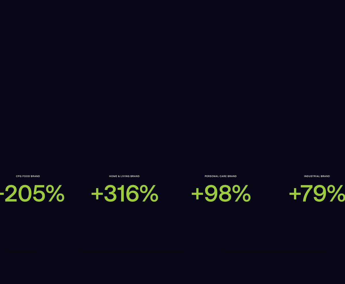
A stark dark section spotlighting high-contrast lime green growth metrics with tiny uppercase labels.
- Mood
- bold + clinical
- Layout
- 4 col · grid · airy
- 12
cta
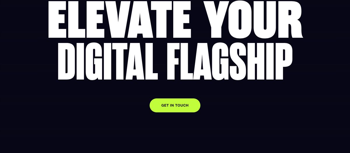
Stark, high-impact dark CTA dominated by oversized condensed woodblock typography and a neon pill button.
- Mood
- bold
- Layout
- 12 col · centered · airy
- 13
footer
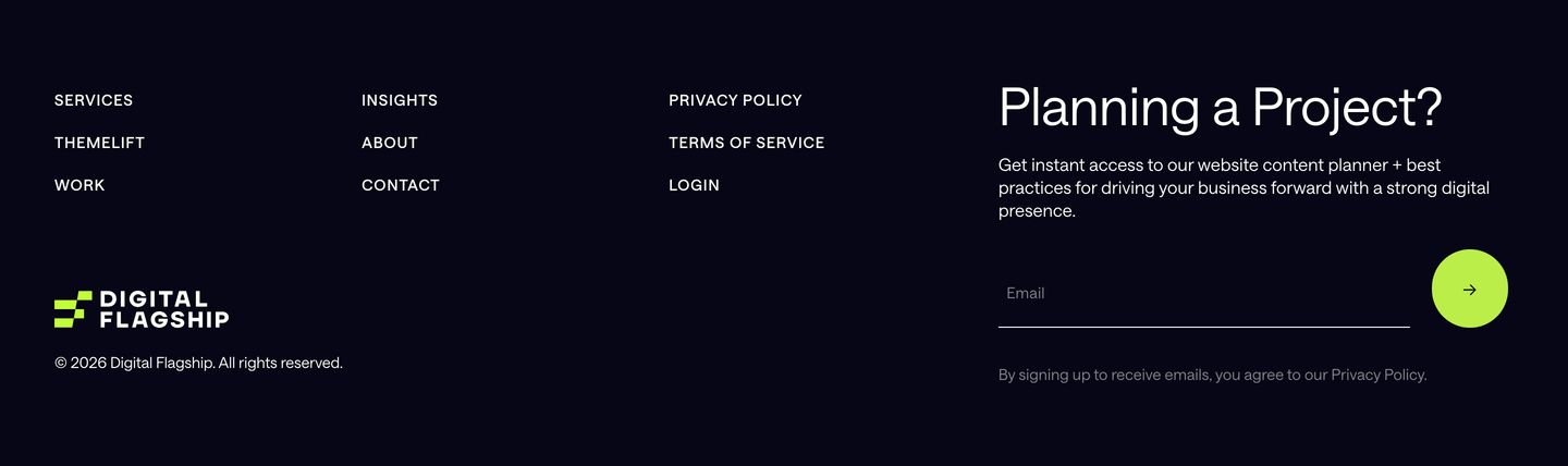
A clean, dark studio footer pairing structured typographic navigation columns with a high-contrast email capture form anchored by a neon circular submit button.
- Mood
- quiet
- Layout
- 1 col · split · airy