Bureau Dimanche
Airy, restrained, and deeply personal. Crisp Swiss grotesque typography floats in expansive white space, punctuated by pill-shaped badges and intimate editorial storytelling.
Visit site ↗Colour
Background#fafafa
Text#000000
Accent#21b30b
Surface#ffffff
Muted#828282
Typefaces
- Display
- Switzer
- Body
- Switzer
- Mono
- —
- Source
- Scale
- 12 · 14 · 16 · 18 · 22 · 32
Layout
- Grid
- —
- Container
- —
- Spacing base
- 4px
- Radius
- 12px · 24px · 999px
Capture
- Category
- studio
- Sections
- 9
- Captured
- 2026-08-27
- Rhythm
- light x8 → dark
Type rules
- display headlines set in Switzer with tight negative tracking at -0.03em
- body text set at 22px with a 58-character measure for optimal editorial reading
Colour rules
- background alternates between clean white #ffffff and subtle light grey #fafafa
- green accent #21b30b is reserved strictly for live availability status pills
Voice rules
- first-person founder narrative blending marketing strategy with creative direction
- transparent pricing with plain-language package descriptions
Holds it together
- interactive elements and status badges are rendered as full-pill containers
- body copy remains unconstrained by dense grids to preserve generous editorial breathing room
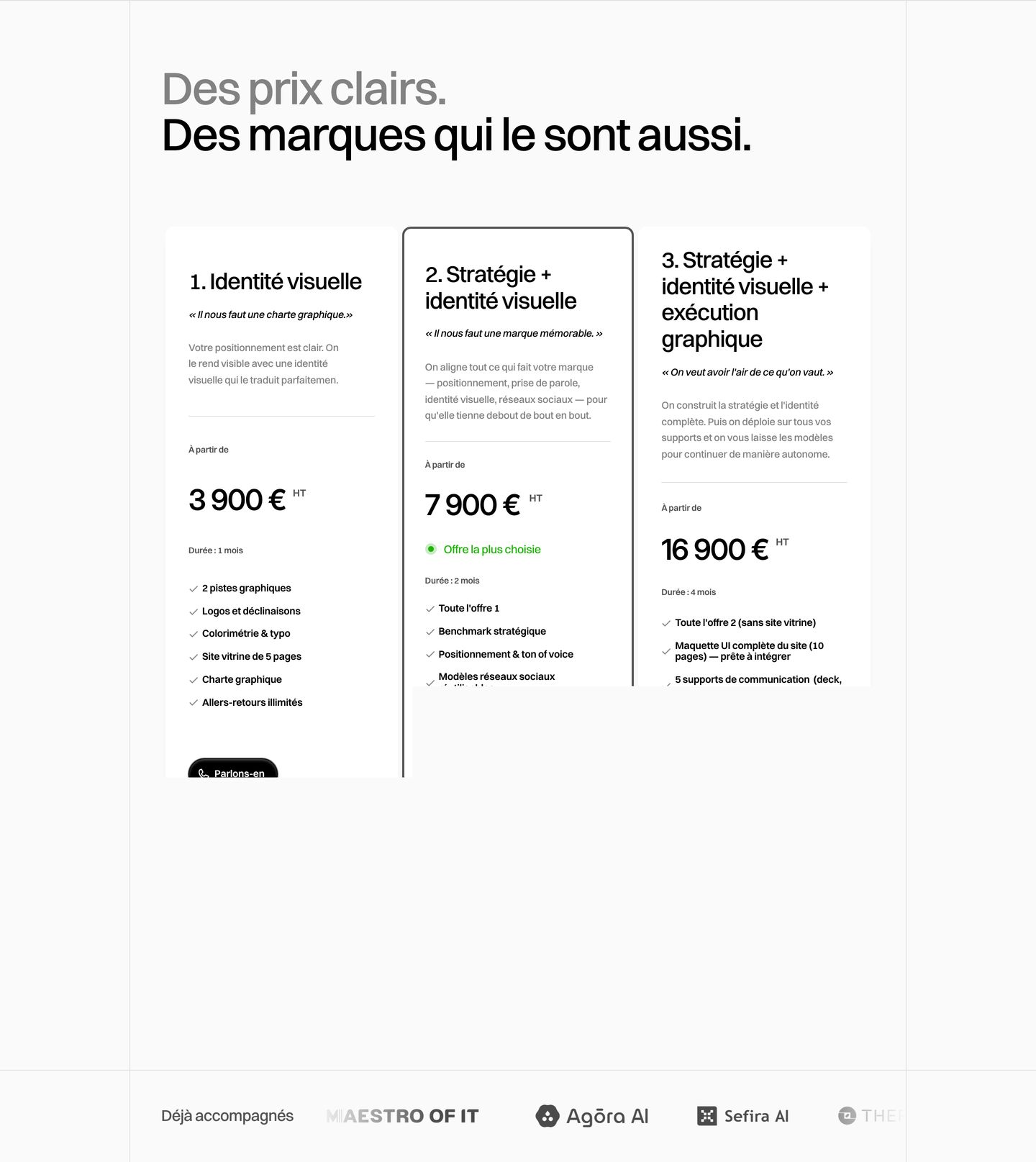
- transparent pricing and deliverables are displayed in crisp multi-column cards
Contrast
text on background20.1:1 AAA
muted text on background3.7:1 AA Large
text on surface21.0:1 AAA
accent on background2.7:1 fail
background on accent2.7:1 fail
Type, measured
- Body
- 22px / 1.4
- Measure
- 58 characters
- Display
- 72px / 0.95
- Tracking
- -0.03em display
- Scale ratio
- 1.35
Voice
- Tone
- direct, personal, candid
- Sentences
- medium
- Person
- first
- Vocabulary
- plain
- Calls to action
- réserver, voir, parler
Built with
- Builder
- framer
- Framework
- —
- Motion
- lenis
- WebGL
- —
- Nav
- top_bar, 1 items
- Length
- 9.7 screens
Colour, by area
accent on container, text#2b2b2b 0%#fafafa 0%#ffffff 0%#000000 0%#dedede 0%#21b30b 0%
Sections in page order
3 strongest marked · 9- 00
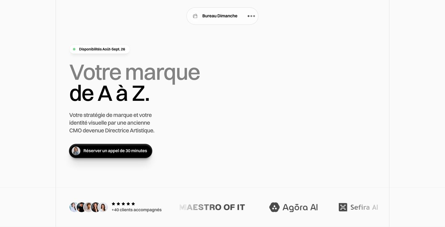
hero
Clean, airy design studio hero with expansive white space, precise Swiss sans-serif typography, and subtle pill-shaped interface elements.
- Mood
- quiet
- Layout
- 11 col · stacked · airy
- 01
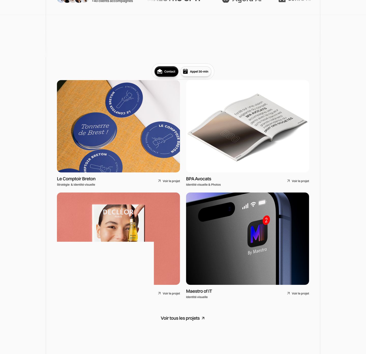
showcase
Clean minimal portfolio grid presenting selected studio case studies with crisp typography and subtle card framing.
- Mood
- quiet + editorial
- Layout
- 16 col · grid · balanced
- 02
testimonial
A solitary avatar and minimal attribution floating inside a massive sea of stark white space.
- Mood
- quiet
- Layout
- 13 col · centered · airy

- 03
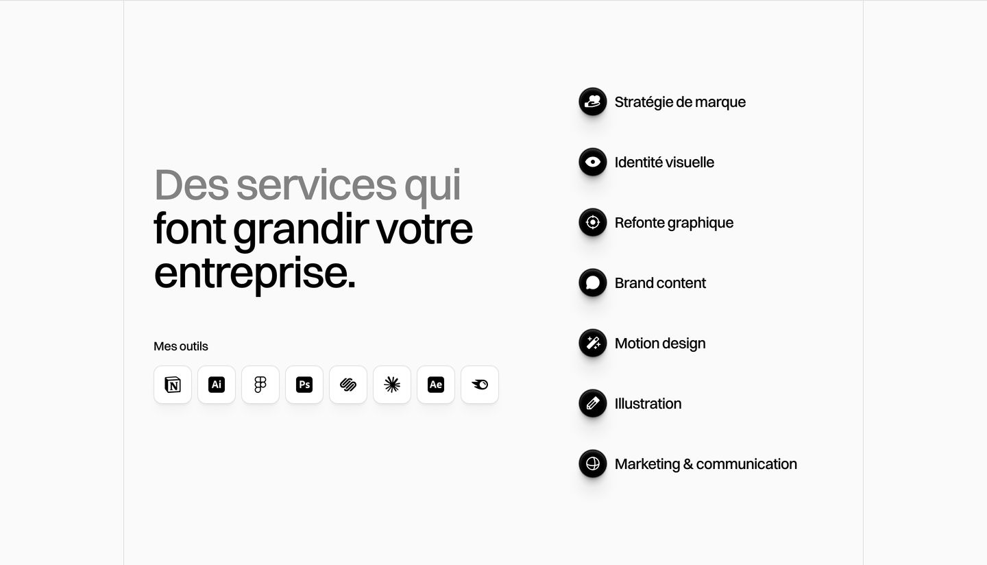
feature
StrongestAn airy monochrome service overview pairing sharp grotesque typography with tactile, soft-shadowed icon pills.
- Mood
- quiet + clinical
- Layout
- 15 col · split · airy
- 04
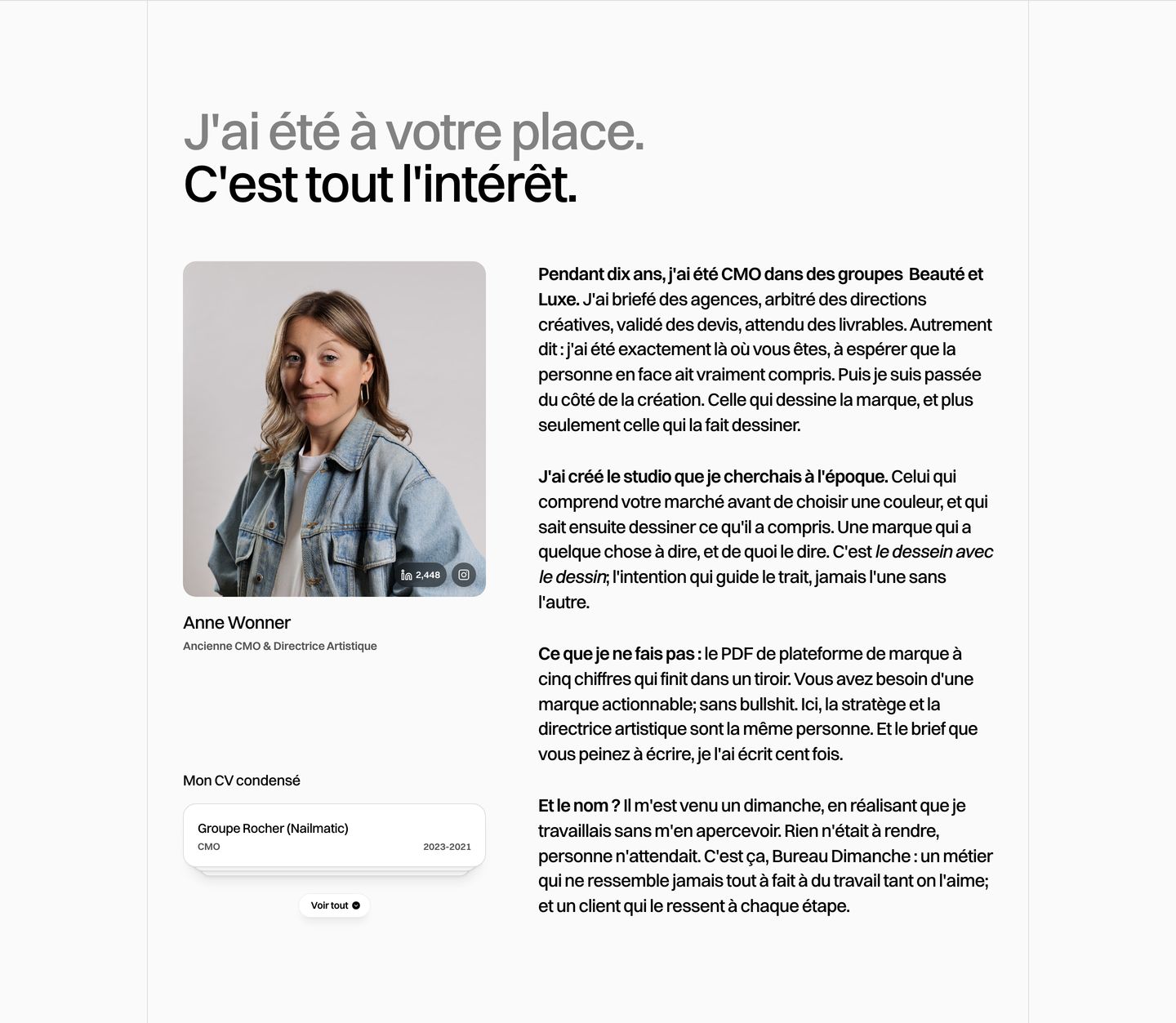
team
StrongestA clean, editorial founder profile section pairing a direct personal narrative with a warm portrait and a compact experience card.
- Mood
- editorial + quiet
- Layout
- 16 col · split · balanced
- 05
pricing
Clean, highly structured pricing grid with crisp Swiss typography and precise hierarchy on a light canvas.
- Mood
- clinical + bold
- Layout
- 3 col · grid · balanced
- 06
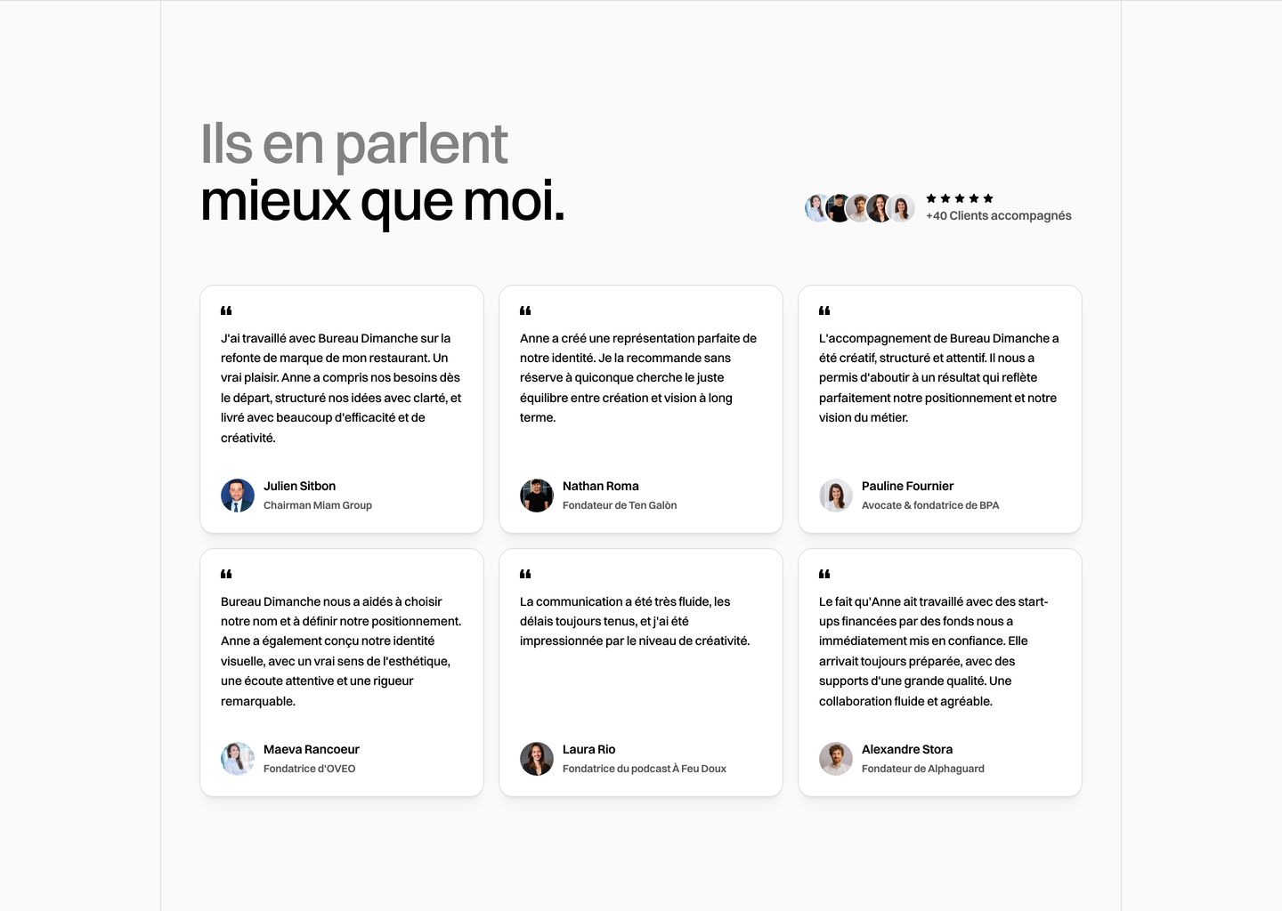
testimonial
Clean, restrained testimonial grid featuring soft-bordered quote cards alongside a concise social proof badge.
- Mood
- quiet
- Layout
- 3 col · grid · balanced
- 07
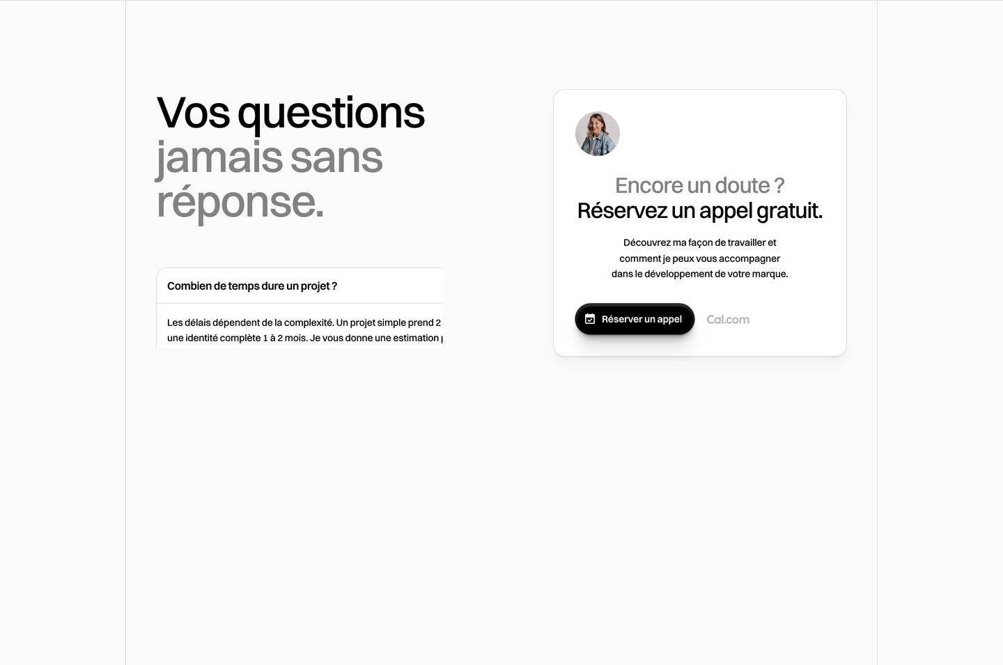
faq
StrongestAn airy and minimalist FAQ section pairing high-contrast typography with a clean floating booking card.
- Mood
- quiet
- Layout
- 2 col · split · airy
- 08
statement
Minimalist and quiet dark transition section with stark monochromatic left-aligned typography.
- Mood
- quiet + raw
- Layout
- 1 col · stacked · airy