Designed by Paul
Aggressive typographic confidence meets stark Swiss editorial discipline. Dominated by a deep charcoal background, colossal condensed uppercase headlines, and high-contrast monochrome imagery. Vibrant color is strictly confined within project mockups.
Rated
7.4/ 10
From 9 analysed sections. Two measured components and one judged by a model. Distinction is a rank within the library; the rest are scores in their own right.
- AI scorejudged
- 9.6
- Systemmeasured
- 7.6
- Distinctionmeasured
- 0.3
- on the grid
- 46%
- vertical rhythm
- 86%
- type on a scale
- 71%
- contrast passing AA
- 100%
- unlike the library
- 0.45
- model craft
- 8.0/10
- model deviation
- 4.6/10
Colour
Typefaces
- Display
- PP Right Grotesk Tight Bold
- Body
- PP Neue Montreal Regular
- Mono
- —
- Source
- self_hosted
- Scale
- 16 · 20 · 32 · 40 · 80 · 200
Layout
- Grid
- 8 columns
- Container
- 1360px
- Spacing base
- 10px
- Radius
- 0px
Capture
- Category
- portfolio
- Sections
- 9
- Captured
- 2026-09-04
- Rhythm
- dark x8
Type rules
- display headers set in ultra-tight uppercase condensed grotesk with minimal leading
- body text set at 47 characters per line with 0.05em letter spacing
Colour rules
- pure monochrome interface with white type on deep charcoal #141414 background
- chromatic color restricted entirely to project mockups and artwork assets
Voice rules
- all headlines in tight uppercase condensed typography
- first-person direct editorial statements
Holds it together
- render all section titles in massive condensed uppercase sans-serif stretched across grid columns
- keep UI chrome purely monochrome without background surface color shifts
- organize capabilities and accolades into columnar Swiss-style data lists
- treat personal photography with high-contrast desaturated black-and-white tones
Contrast
Type, measured
- Body
- 20px / 1.2
- Measure
- 47 characters
- Display
- 200px / 0.8
- Tracking
- 0em display
- Scale ratio
- 1.78
Voice
- Tone
- confident, direct, declarative
- Sentences
- short
- Person
- first
- Vocabulary
- technical
- Calls to action
- visit, send
Built with
- Builder
- framer
- Framework
- —
- Motion
- —
- WebGL
- —
- Nav
- top_bar, 4 items
- Length
- 16.1 screens
Sections in page order
- 00
hero
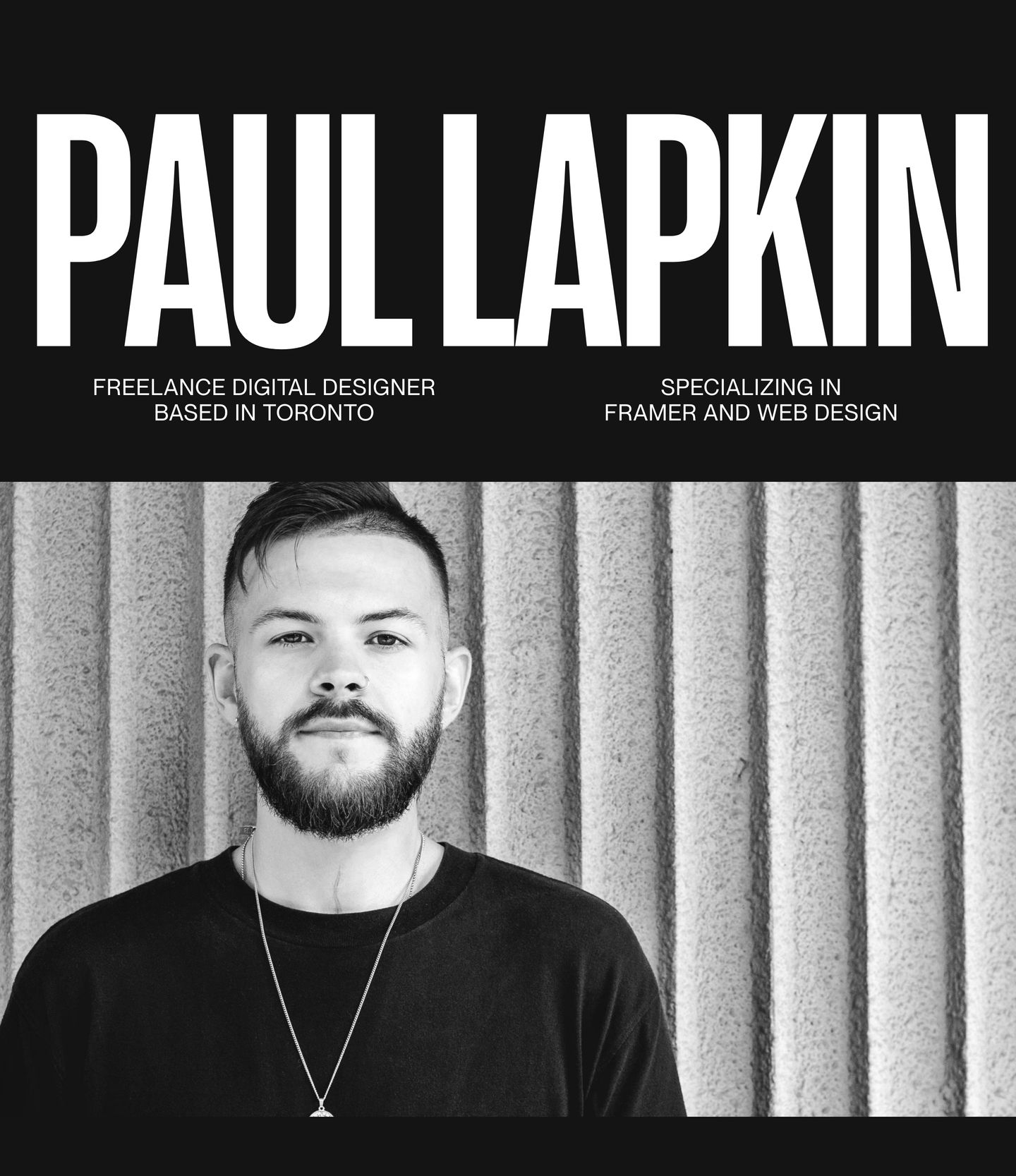
Monochrome portfolio hero pairing massive condensed typography with a high-contrast black-and-white portrait.
- Mood
- gritty
- Layout
- 2 col · stacked · balanced
- 01
showcase
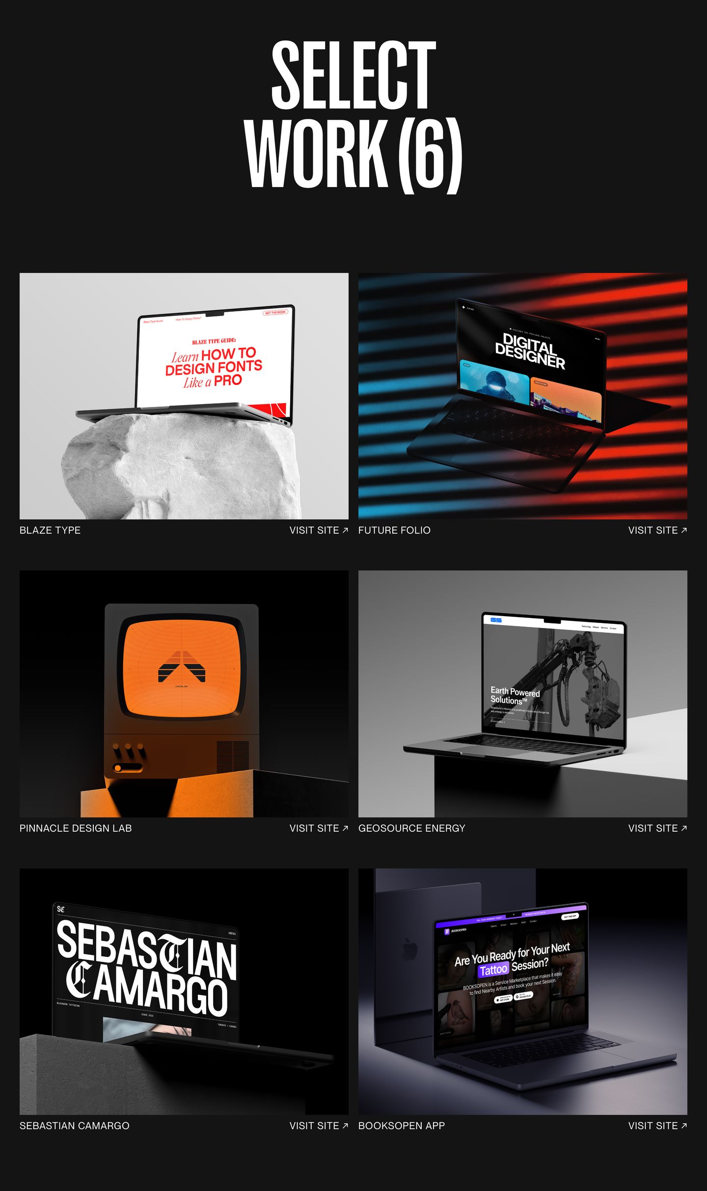
Monumental condensed uppercase typography anchors a dark, high-contrast portfolio showcase of web design projects presented in custom 3D studio mockups.
- Mood
- luxurious
- Layout
- 2 col · grid · balanced
- 02
team
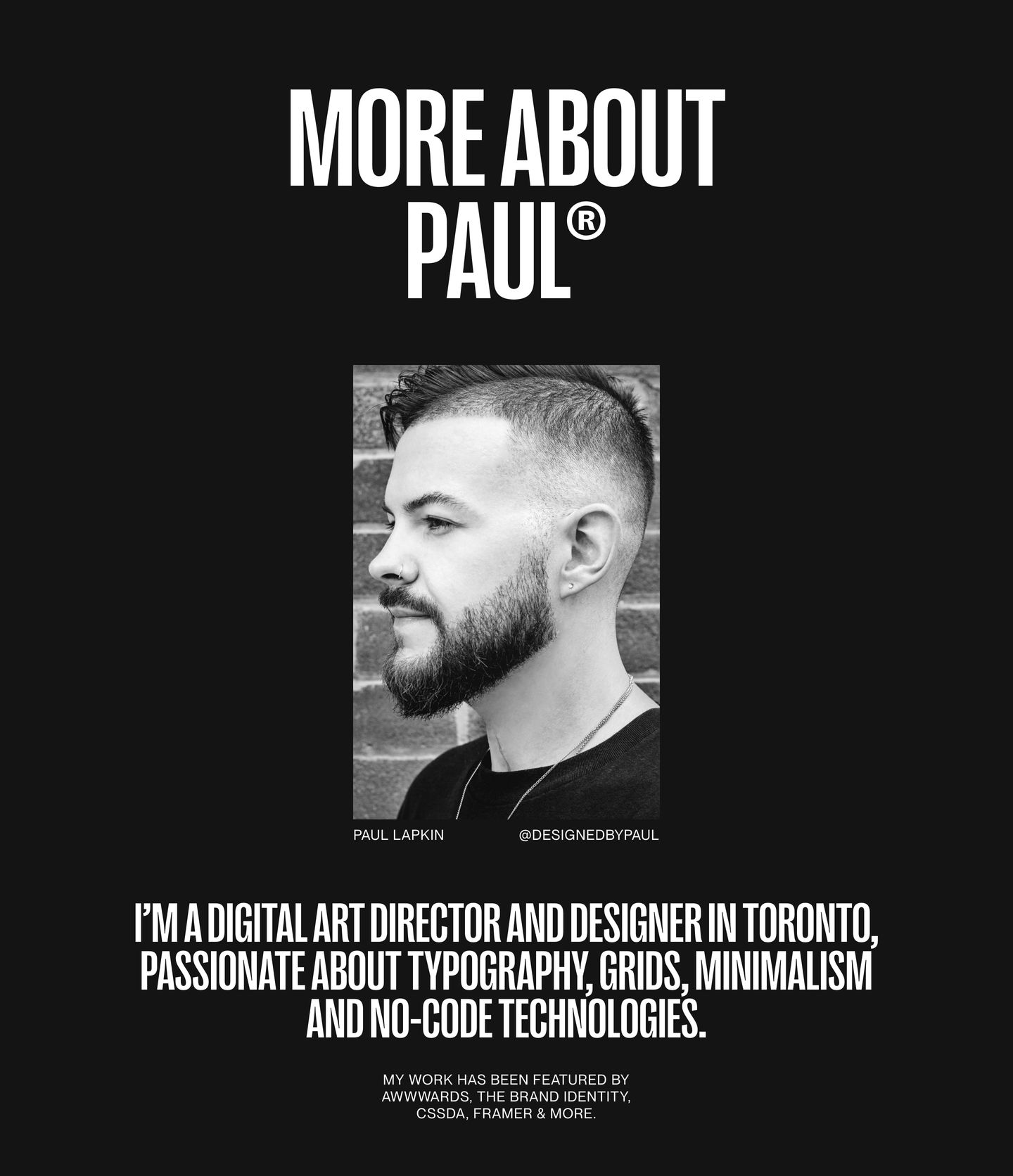
Monochrome personal introduction pairing high-contrast condensed uppercase typography with a centered black-and-white portrait.
- Mood
- contemplative + gritty
- Layout
- 1 col · stacked · balanced
- 03
showcase
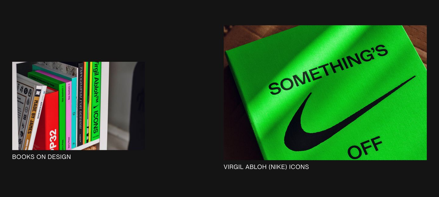
StrongMinimalist dark showcase pairing asymmetric crops of design books with understated uppercase captions.
- Mood
- luxurious + contemplative
- Layout
- 2 col · asymmetric · airy
- 04
statement
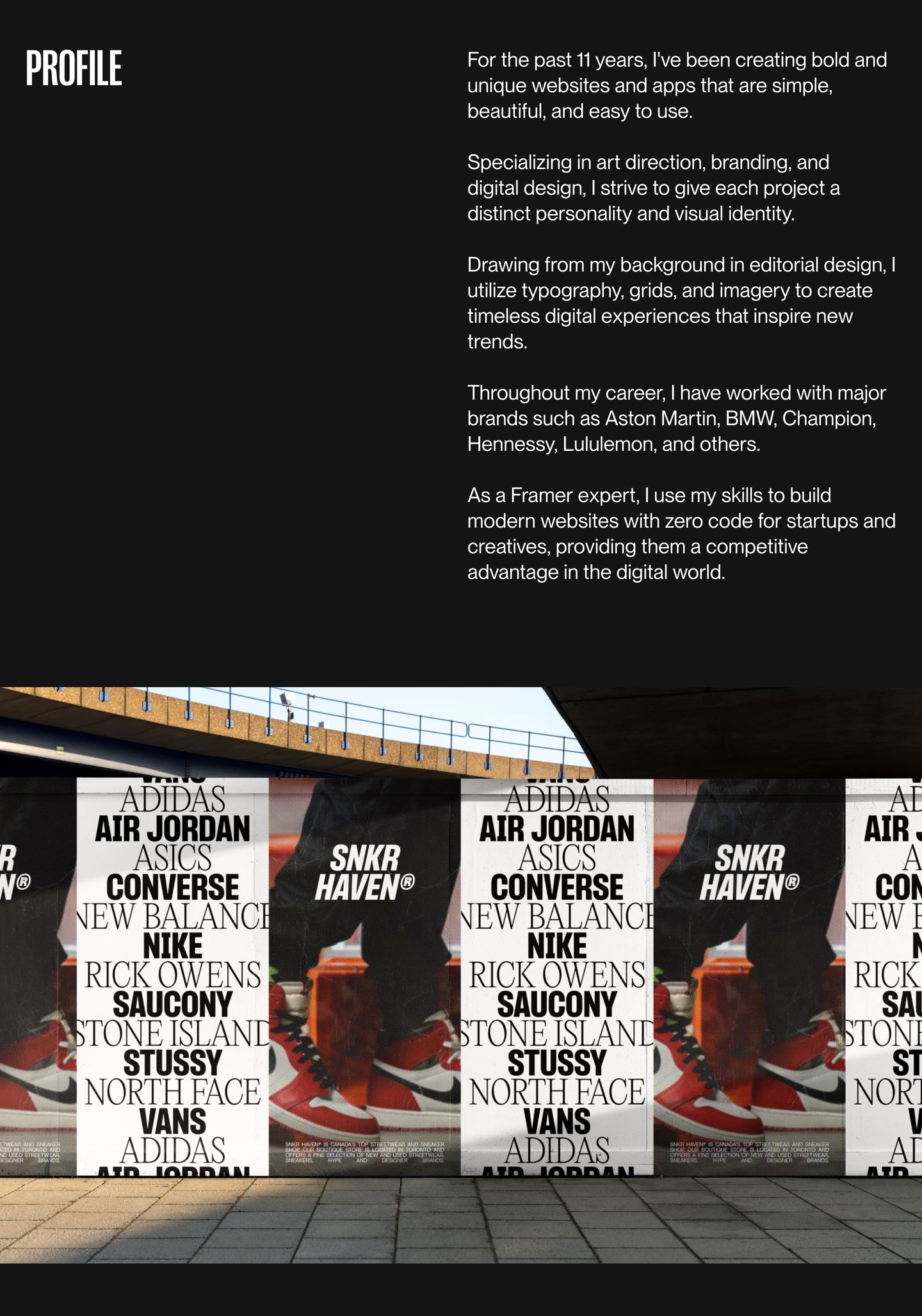
A stark, dark editorial bio pairing generous negative space and crisp typography with an urban billboard mockup.
- Mood
- contemplative + gritty
- Layout
- 2 col · split · airy
- 05
feature grid
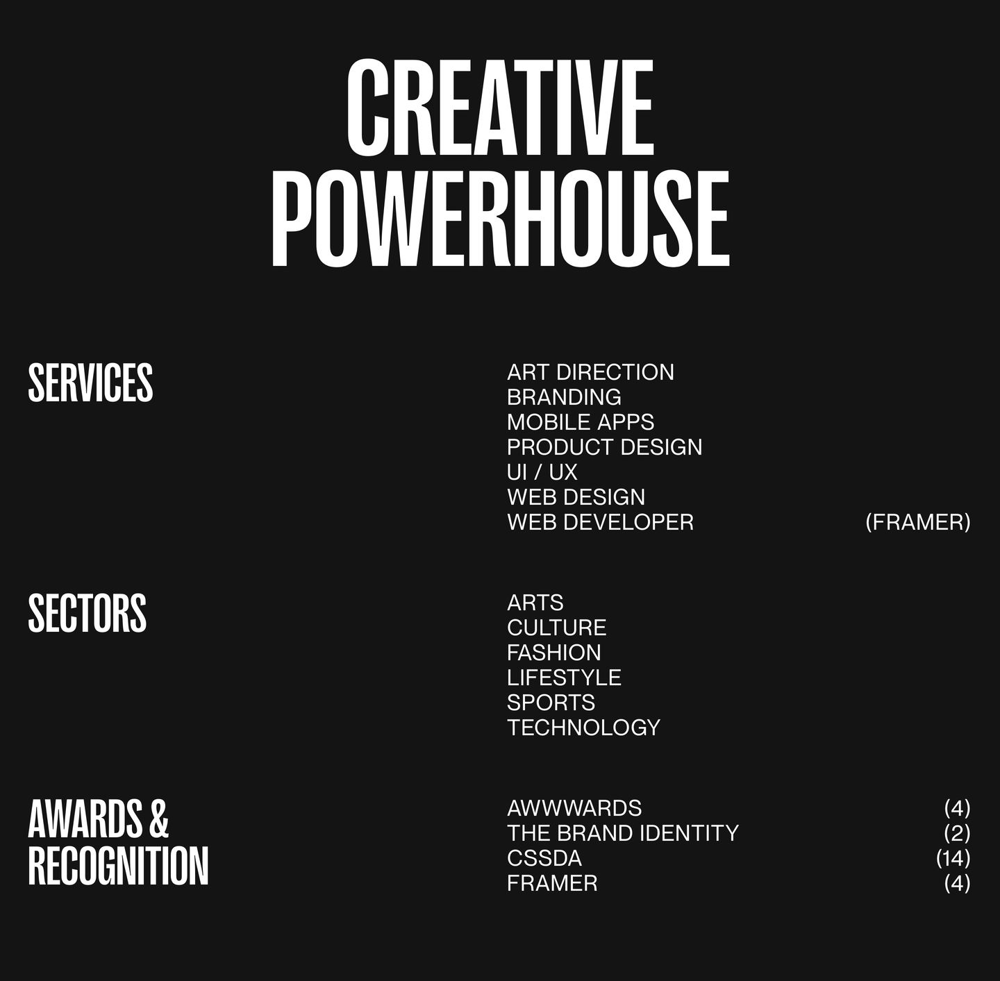
StrongSevere dark typography-only credentials and capabilities grid built with stark high-contrast uppercase lettering.
- Mood
- luxurious + rebellious
- Layout
- 3 col · grid · airy
- 06
testimonial
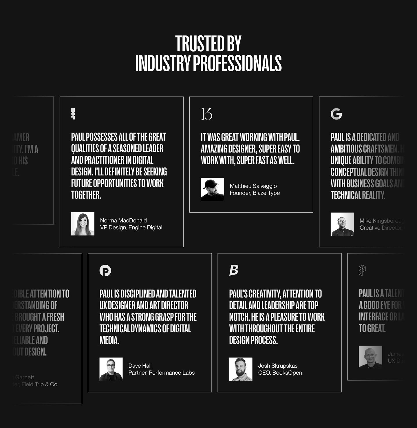
StrongA stark dark-mode testimonial grid combining sharp outlined cards, high-impact condensed uppercase typography, and monochrome portrait headshots.
- Mood
- reassuring
- Layout
- 4 col · grid · balanced
- 07
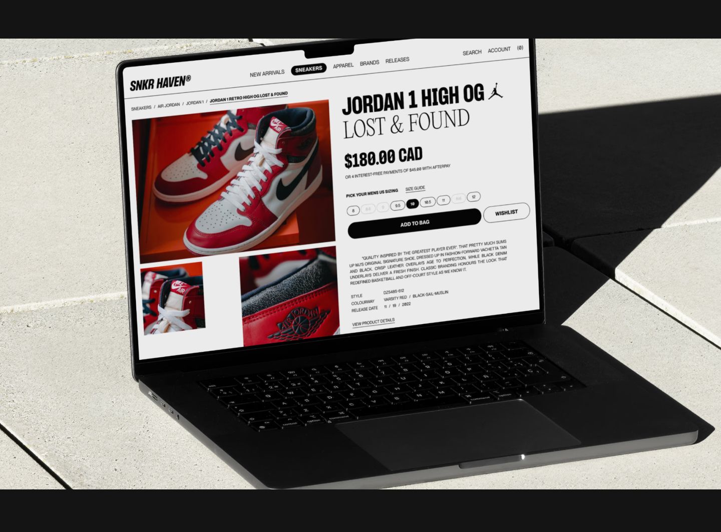
showcase
A crisp digital e-commerce mockup rendered on a laptop resting on sunlit architectural stone.
- Mood
- grounded
- Layout
- 1 col · centered · airy
- 08
cta
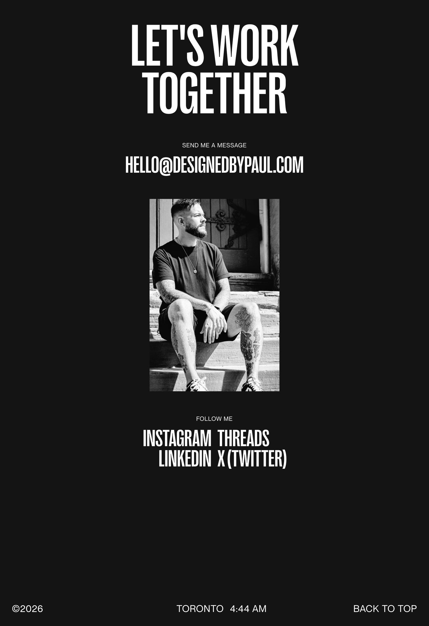
A stark, high-contrast monochrome contact section anchored by a gritty documentary portrait and bold condensed typography.
- Mood
- gritty
- Layout
- 1 col · stacked · airy