airborne-studio
Uncompromising, assertive, and strategic. Massive grotesque display typography and stark contrast create authority, while minimalist case study cards showcase precise commercial outcomes.
Visit siteRated
6.6/ 10
From 8 analysed sections. Two measured components and one judged by a model. Distinction is a rank within the library; the rest are scores in their own right.
- AI scorejudged
- 9.1
- Systemmeasured
- 5.0
- Distinctionmeasured
- 3.8
- on the grid
- 23%
- vertical rhythm
- 57%
- type on a scale
- 58%
- contrast passing AA
- 60%
- unlike the library
- 0.21
- model craft
- 7.8/10
- model deviation
- 5.1/10
Colour
Background#191919
Text#fbf4e6
Accent#404cd6
Surface#2c2c2c
Muted#b8b0a1
Typefaces
- Display
- neue-haas-grotesk-display
- Body
- neue-haas-grotesk-display
- Mono
- gravity
- Source
- adobe
- Scale
- 11 · 13 · 14 · 16 · 18 · 20
Layout
- Grid
- —
- Container
- —
- Spacing base
- 4px
- Radius
- 4px · 12px
Capture
- Category
- agency
- Sections
- 8
- Captured
- 2026-08-30
- Rhythm
- dark x7 → cream
Type rules
- display headlines set in all-caps Grotesk with tight line height (0.8)
- body measure kept strictly under 85 characters for legibility
Colour rules
- deep carbon-black ground with warm off-white typography across all primary storytelling sections
- electric blue reserved exclusively for interactive floating badges and key actions
Voice rules
- lead with commercial outcomes over design craft
- use short, punchy declarative assertions
Holds it together
- use massive uppercase grotesque headlines with sub-1.0 line height for primary section anchors
- pair case study titles with tangible business metric proof points
- anchor interactive actions with high-contrast circular floating badges
Contrast
text on background16.1:1 AAA
muted text on background8.2:1 AAA
text on surface12.8:1 AAA
accent on background2.7:1 fail
background on accent2.7:1 fail
Type, measured
- Body
- 20px / 1.4
- Measure
- 81 characters
- Display
- 132px / 0.8
- Tracking
- 0em display
- Scale ratio
- 1.60
Voice
- Tone
- authoritative, direct, strategic
- Sentences
- short
- Person
- second
- Vocabulary
- plain
- Calls to action
- discover, start, see
Built with
- Builder
- —
- Framework
- next
- Motion
- lenis
- WebGL
- —
- Nav
- top_bar, 3 items
- Length
- 15.1 screens
Sections in page order
3 marked strong · 8- 00
hero
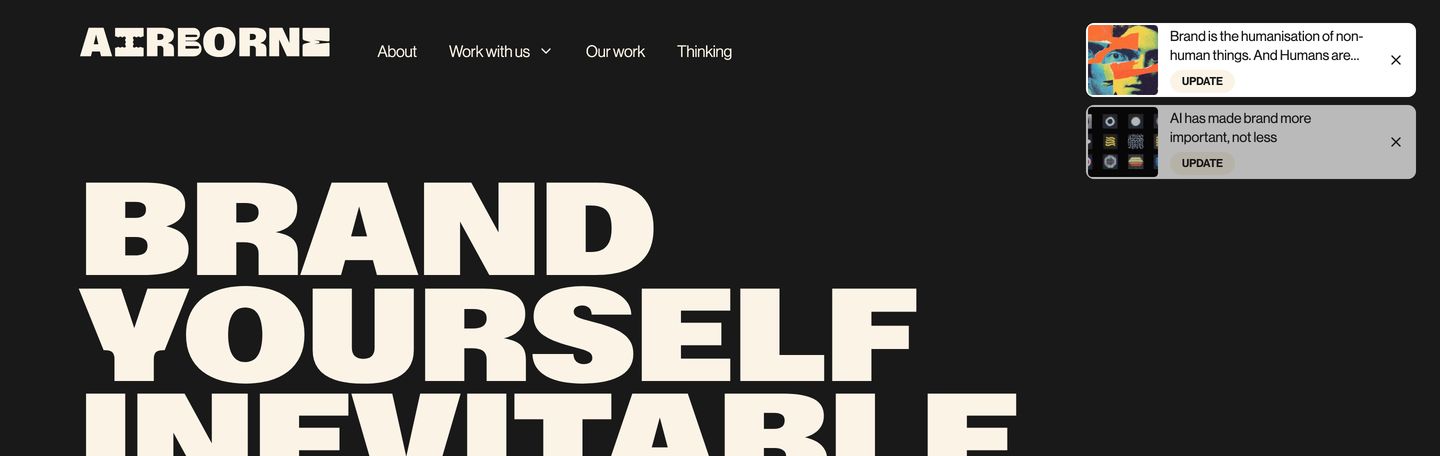
Massive high-contrast typography commands a dark canvas punctuated by minimalist floating update cards.
- Mood
- bold + editorial
- Layout
- 1 col · stacked · balanced
- 01
hero
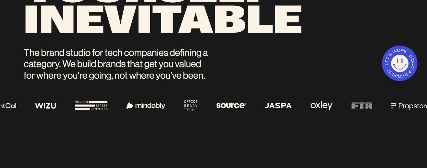
High-impact dark hero anchored by massive bold grotesque typography, crisp studio positioning, and a vibrant circular badge.
- Mood
- bold
- Layout
- 1 col · stacked · dense
- 02
video
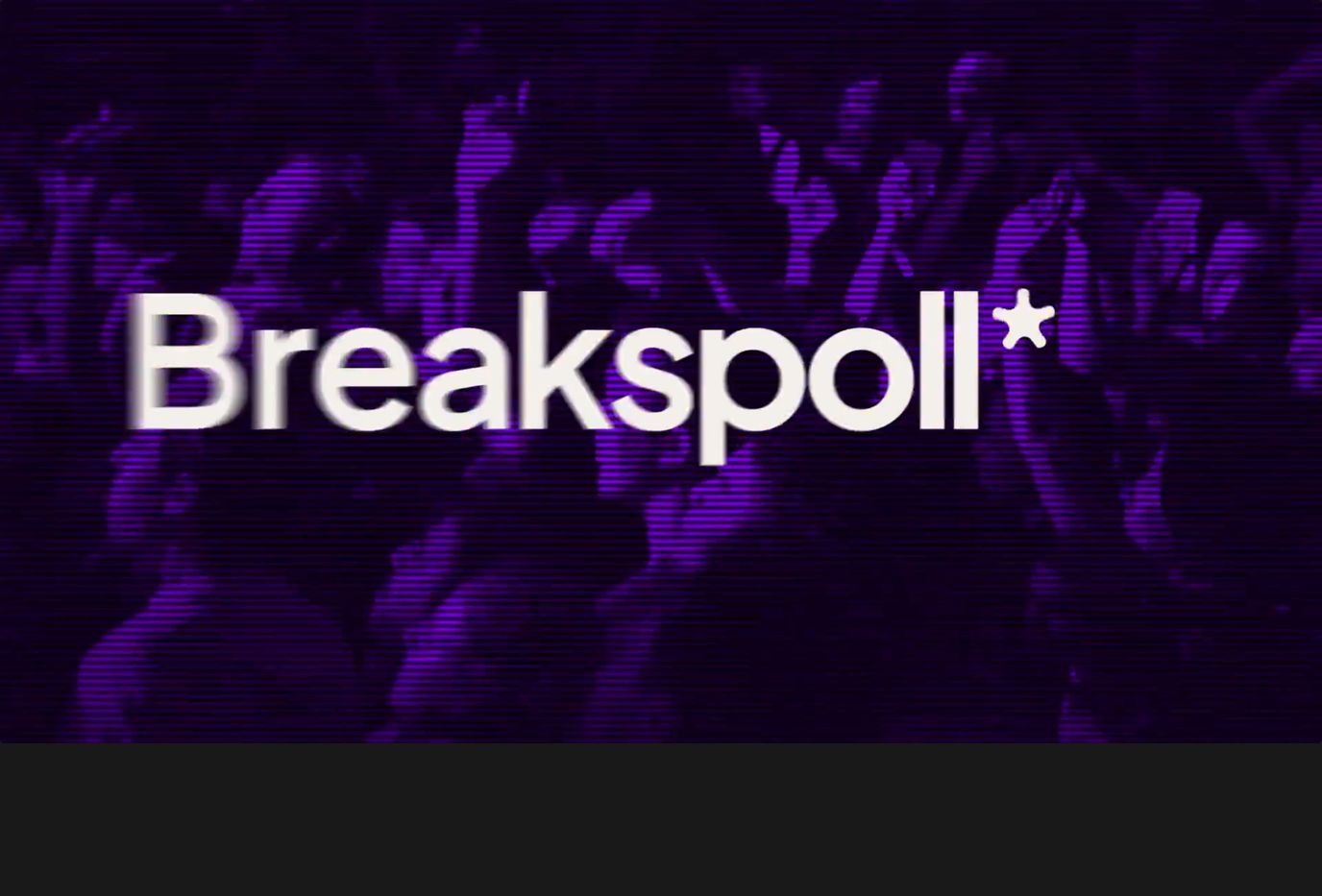
StrongAtmospheric full-bleed video section with purple CRT scanline raster effects and bold rave branding.
- Mood
- nostalgic + bold
- Layout
- 1 col · full bleed · airy
- 03
statement
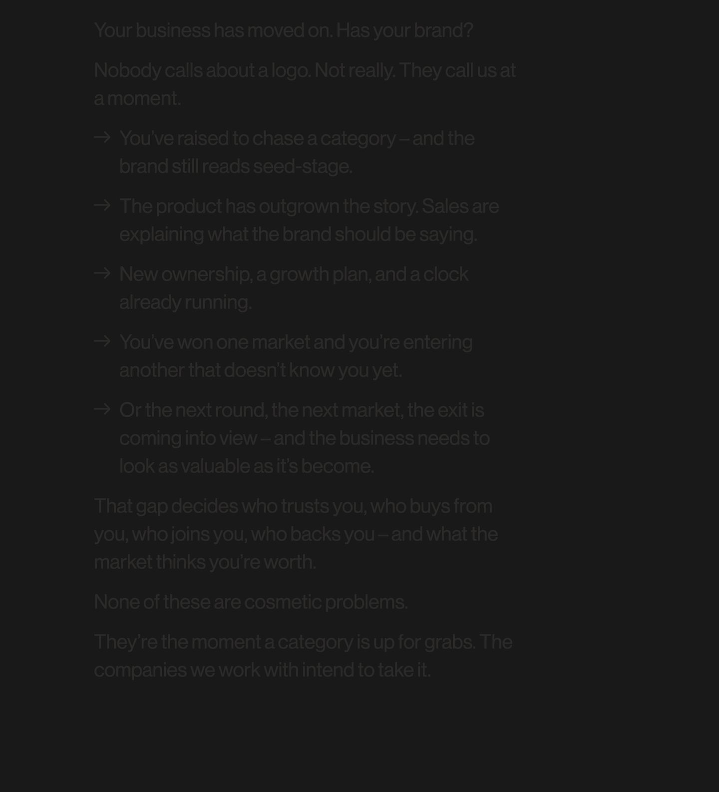
Sombre and low-contrast typographic manifesto on a dark background creating an intimate, focused editorial rhythm.
- Mood
- quiet + editorial
- Layout
- 1 col · stacked · airy
- 04
showcase
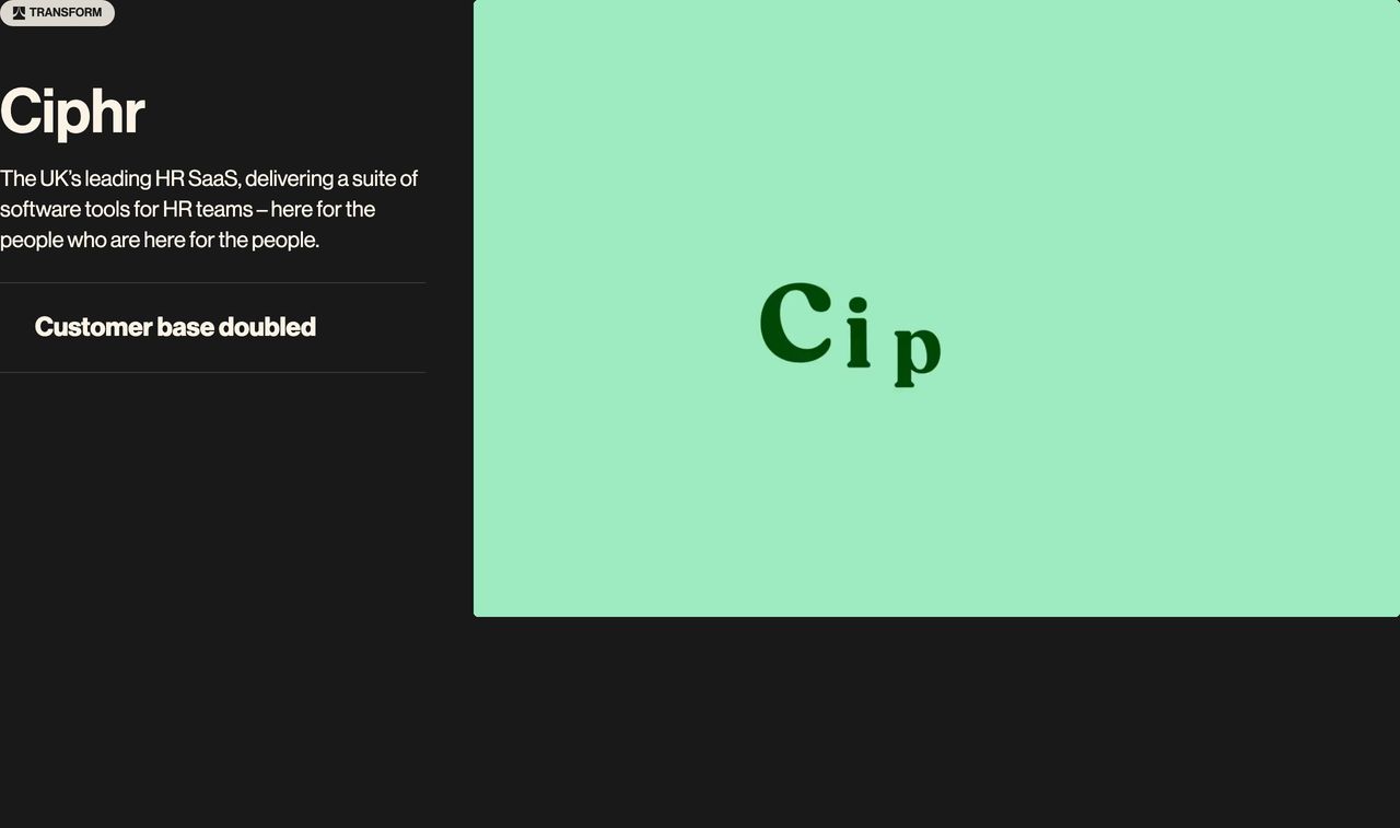
StrongA stark, asymmetric case study feature pairing pitch-black editorial typography with an expansive mint-green graphic viewport.
- Mood
- bold + editorial
- Layout
- 16 col · split · airy
- 05
showcase
A minimalist split case study showcase pairing stark white typography against deep black beside an expansive cream media card.
- Mood
- quiet + editorial
- Layout
- 2 col · split · airy
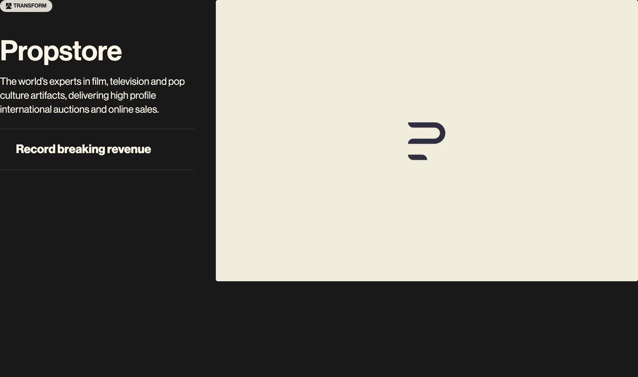
- 06
showcase
StrongMinimalist dark case study showcase pairing stark Swiss typography on the left with an abstract motion graphic on the right.
- Mood
- quiet + bold
- Layout
- 1 col · split · airy
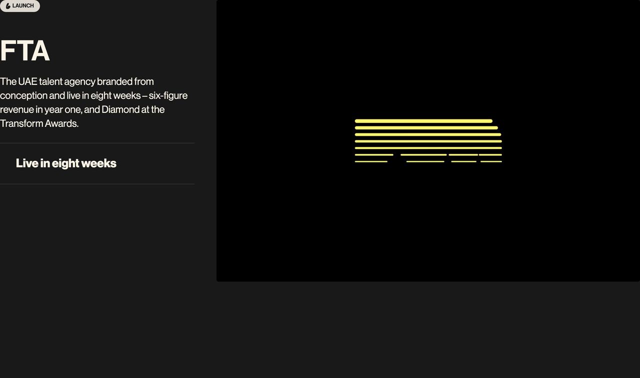
- 07
showcase
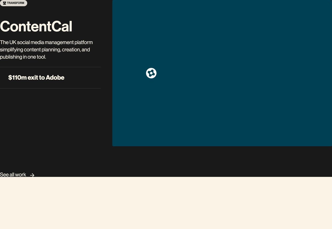
A crisp, high-contrast dark case study feature pairing a bold corporate exit metric with an expansive video viewport.
- Mood
- bold + clinical
- Layout
- 2 col · split · balanced