Neon
Precise, dark, and luminous. High-contrast white typography rests against deep black backgrounds bathed in glowing green phosphor streaks, interrupted by mint-toned light panels for high-trust metrics.
Take the vibe
Rated
7.6/ 10
From 10 analyzed sections. Two measured components and one judged by a model. Distinction is a rank within the library; the rest are scores in their own right.
- AI scorejudged
- 9.4
- Systemmeasured
- 6.4
- Distinctionmeasured
- 5.5
- on the grid
- 26%
- vertical rhythm
- 79%
- type on a scale
- 50%
- contrast passing AA
- 100%
- unlike the library
- 0.76
- model craft
- 7.9/10
- model deviation
- 4.1/10
Color
Background#000000
Text#ffffff
Accent#e4f1eb
Surface#151617
Muted#94979e
Typefaces
- Display
- Inter
- Body
- Inter
- Mono
- GeistMono
- Source
- self_hosted
- Scale
- 10 · 11 · 12 · 13 · 14 · 15
Layout
- Grid
- 3 columns
- Container
- 1024px
- Spacing base
- 4px
- Radius
- 4px · 8px · 9999px
Capture
- Category
- tools
- Sections
- 10
- Captured
- 2026-09-11
- Rhythm
- dark x4 → light → dark x3 → light → dark x2
Type rules
- display headlines set in Inter with tight negative tracking at -0.04em
- technical sub-labels and eyebrow tags set in GeistMono uppercase
- body measure limited to 76 characters per line
Color rules
- predominantly deep black background with glowing green phosphor light art
- full-width pale mint panels interrupt the dark flow for proof and metrics
Voice rules
- lead with architecture and backend capability claims
- pair high-level capabilities with concrete CLI commands and code snippets
Holds it together
- pair large sentence-case headlines with monospace uppercase category tags
- use full-width pale mint panels to break prolonged dark narrative sections
- ground abstract infrastructure claims with terminal interactive UI snippets
Contrast
text on background21.0:1 AAA
muted text on background7.2:1 AAA
text on surface18.1:1 AAA
muted text on surface6.2:1 AA
accent on background18.1:1 AAA
background on accent18.1:1 AAA
Type, measured
- Body
- 13px / 1
- Measure
- 76 characters
- Display
- 80px / 1
- Tracking
- -0.04em display
- Scale ratio
- 1.58
Voice
- Tone
- declarative, confident
- Sentences
- short
- Person
- second
- Vocabulary
- plain
- Calls to action
- start, read, init
Built with
- Builder
- —
- Framework
- next
- Motion
- —
- WebGL
- —
- Nav
- top_bar, 29 items
- Length
- 10.4 screens
Sections in page order
- 00
hero
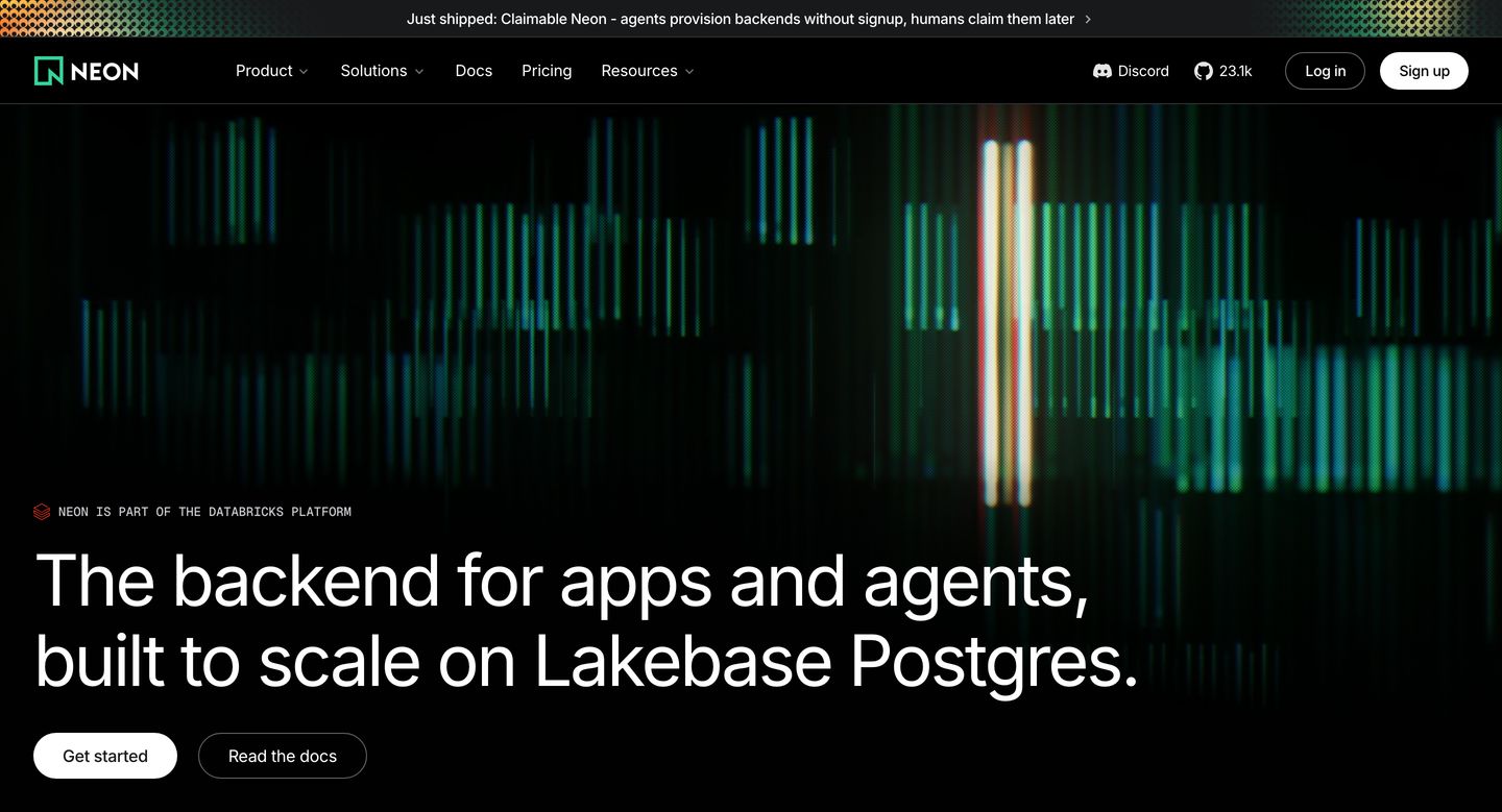
A deep black developer platform hero radiating luminous vertical light pulses behind crisp, modern typography.
- Mood
- ethereal + mysterious
- Layout
- 1 col · stacked · balanced
- 01
feature grid
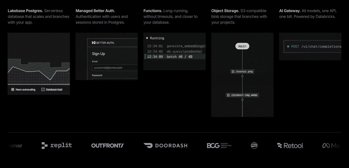
StrongA pitch-black developer tools feature grid pairing scanline-textured terminal mockups with a monochrome client logo bar.
- Mood
- mysterious + nostalgic
- Layout
- 5 col · grid · dense
- 02
feature
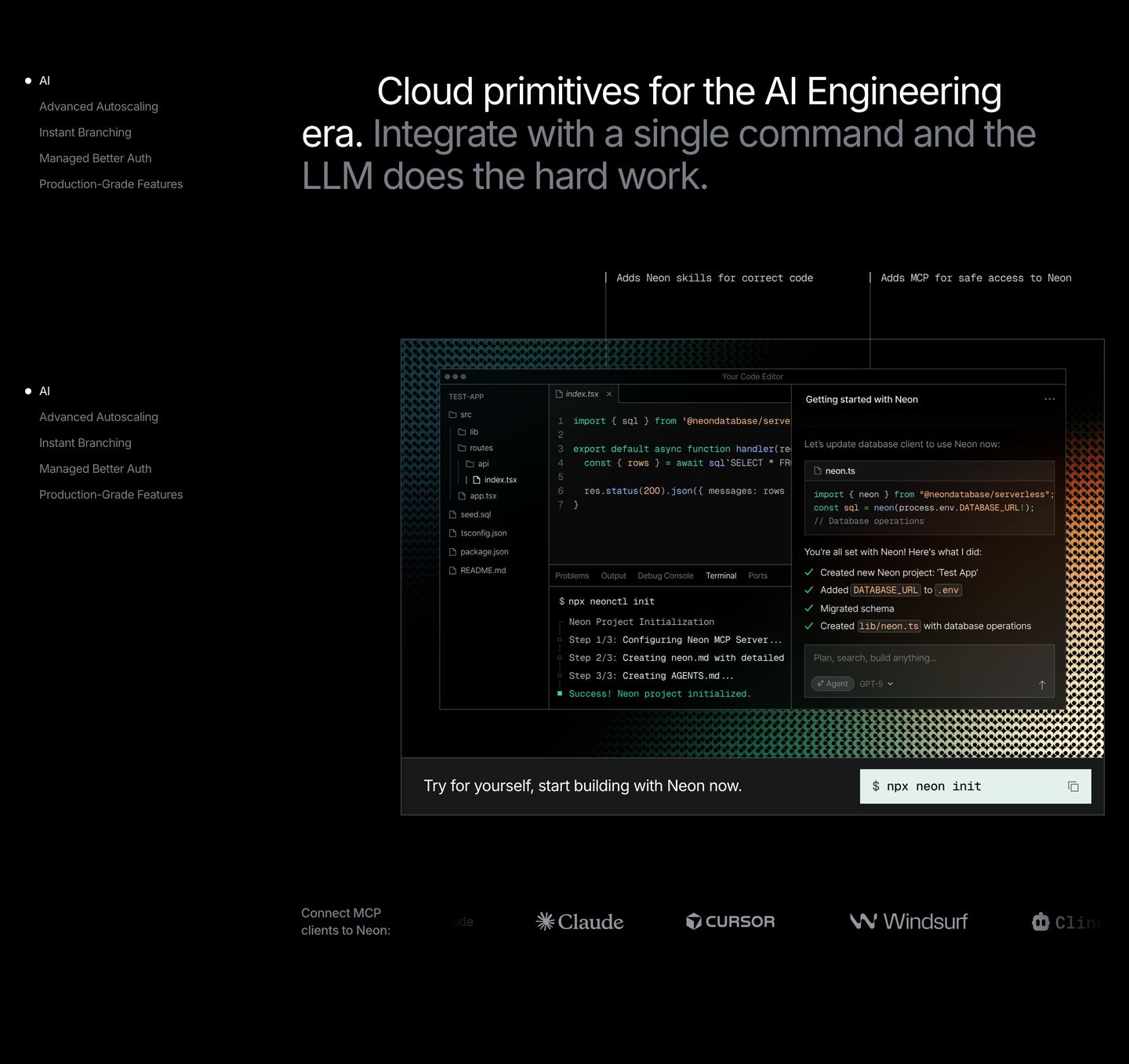
Technical dark-mode product showcase presenting an annotated IDE interface surrounded by minimal typography and a subtle textured pattern.
- Mood
- clinical
- Layout
- 2 col · split · balanced
- 03
feature
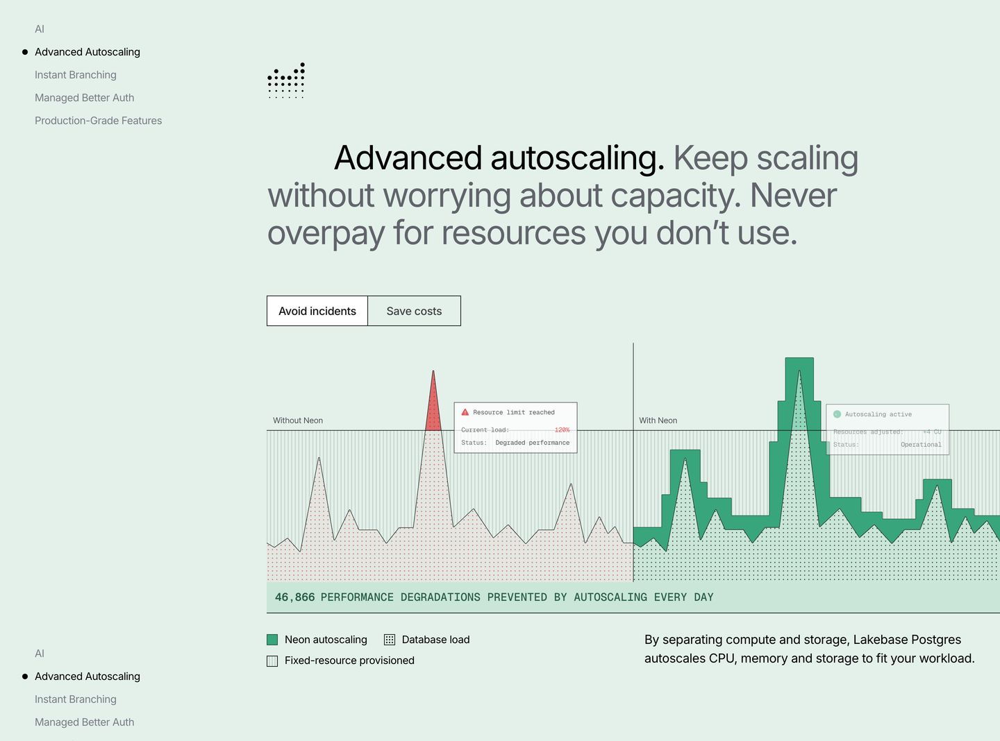
StrongA precise, mint-tinted technical feature breakdown contrasting infrastructure performance with and without autoscaling.
- Mood
- clinical + serene
- Layout
- 2 col · split · balanced
- 04
feature
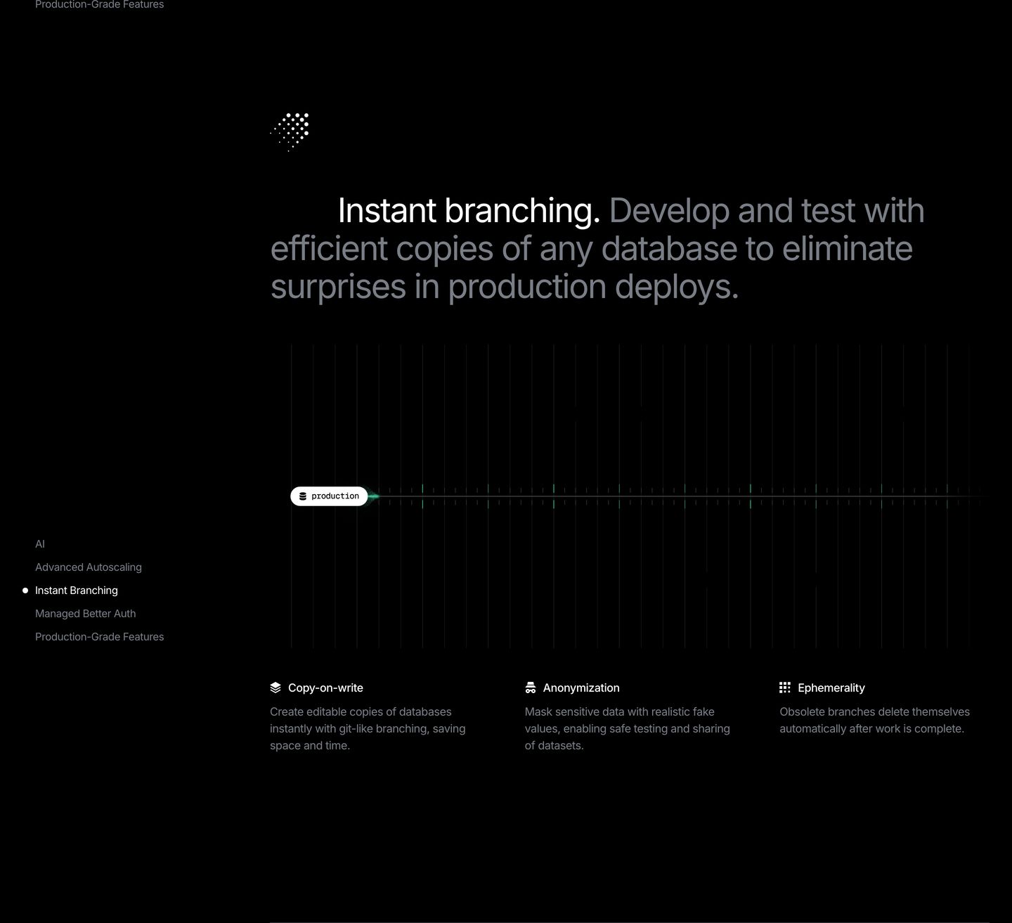
Dark, precise technical feature showcase with stark monochrome contrast and clean developer-tool aesthetics.
- Mood
- clinical
- Layout
- 3 col · asymmetric · airy
- 05
feature
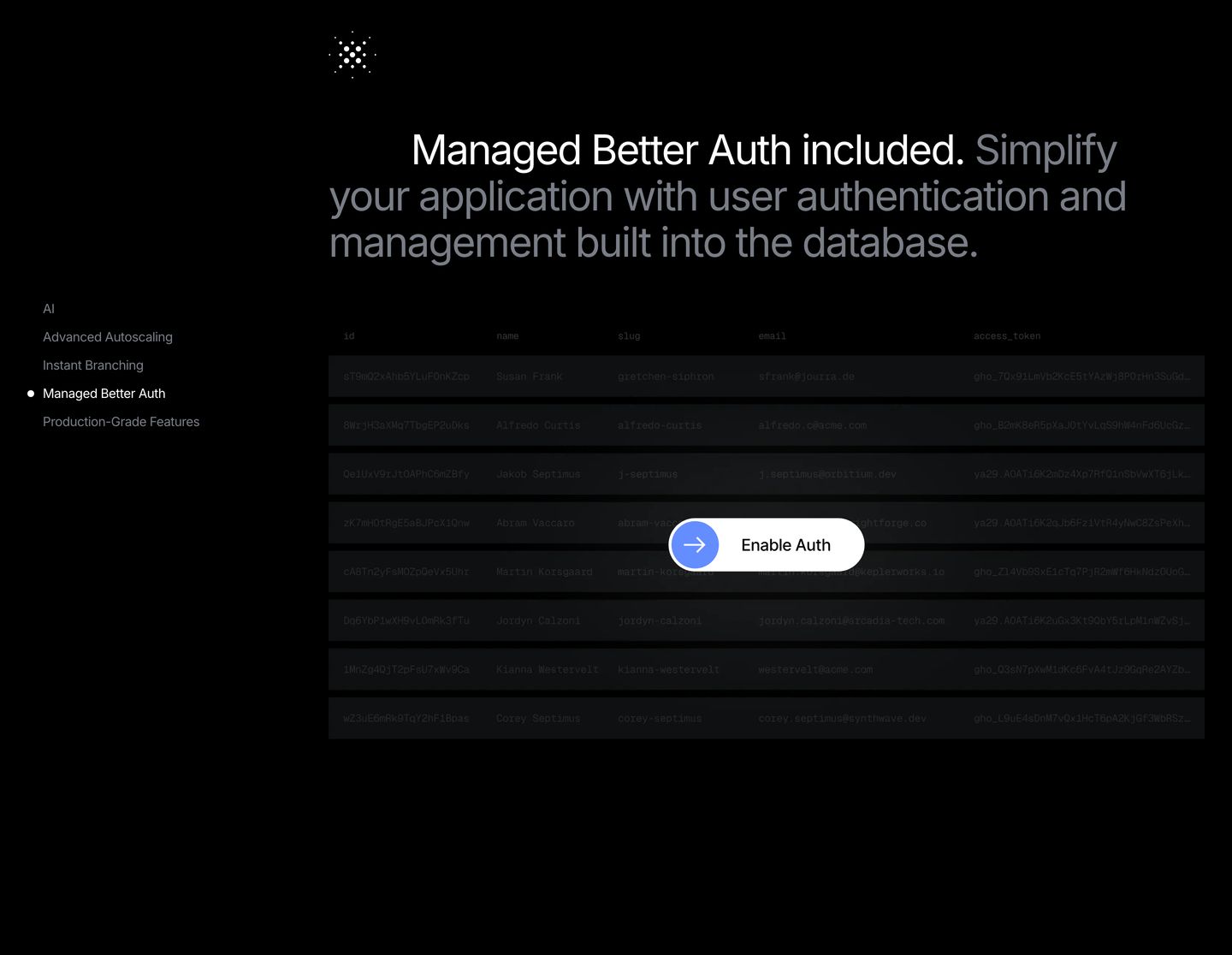
Dark technical feature display pairing a dimmed database schema table with a high-contrast action pill.
- Mood
- clinical + serene
- Layout
- 2 col · split · balanced
- 06
feature grid
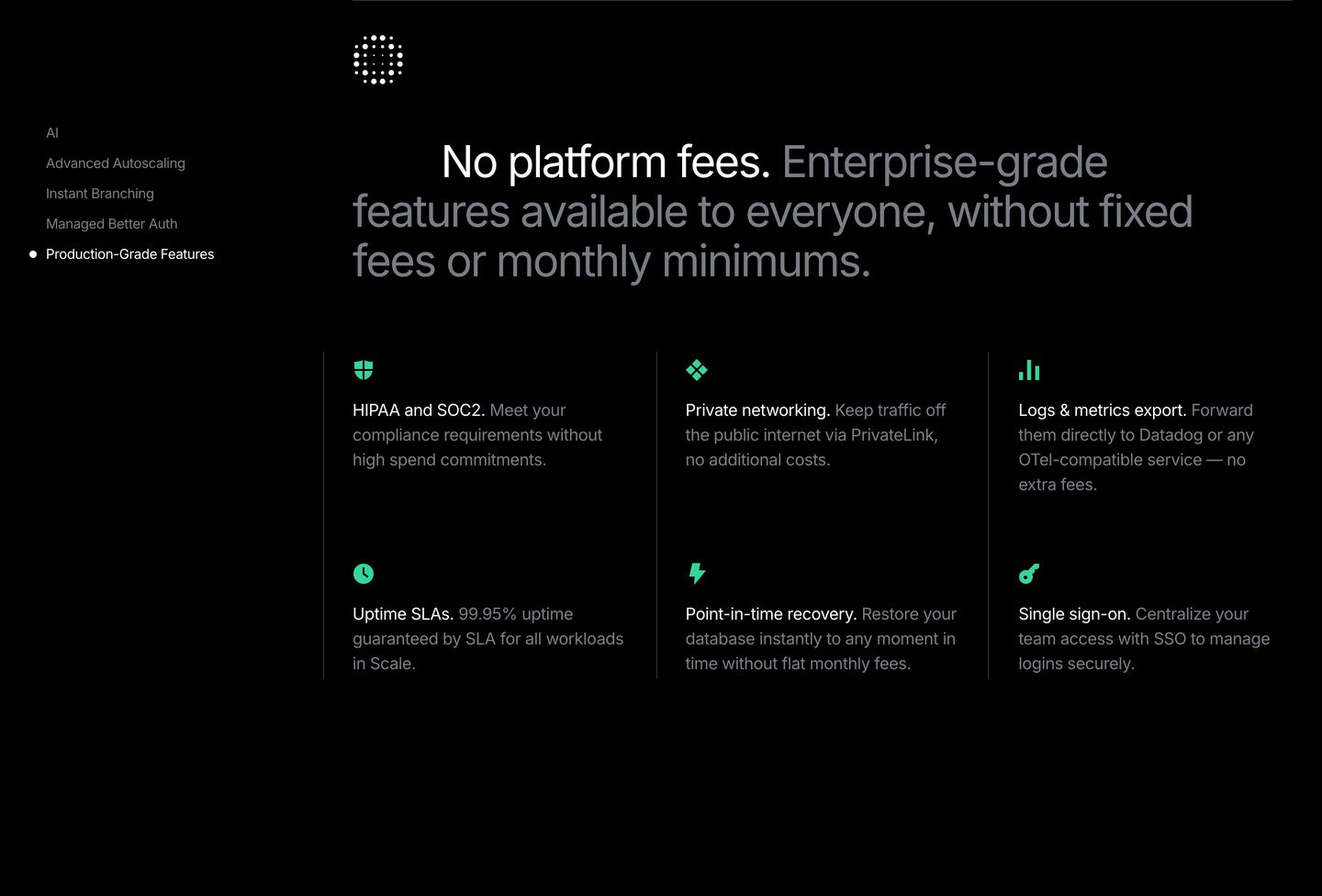
Pitch-black developer feature grid pairing high-contrast typography with subtle green iconography and thin hairline dividers.
- Mood
- clinical + serene
- Layout
- 3 col · grid · balanced
- 07
statement
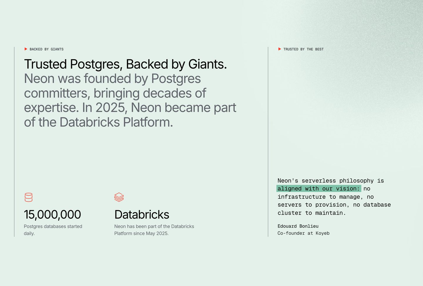
Clean pale mint split section pairing authoritative database scale metrics with a monospaced customer testimonial.
- Mood
- clinical
- Layout
- 2 col · split · airy
- 08
cta
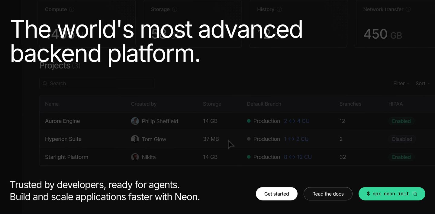
StrongHigh-contrast dark closing section pairing bold declarative typography over a dimmed product dashboard with developer-focused quickstart actions.
- Mood
- clinical + serene
- Layout
- 2 col · stacked · balanced
- 09
footer
A dark, utilitarian developer platform footer organised into precise multi-column navigation links alongside legal disclosures and a live status indicator.
- Mood
- clinical + serene
- Layout
- 5 col · grid · dense