Zoah
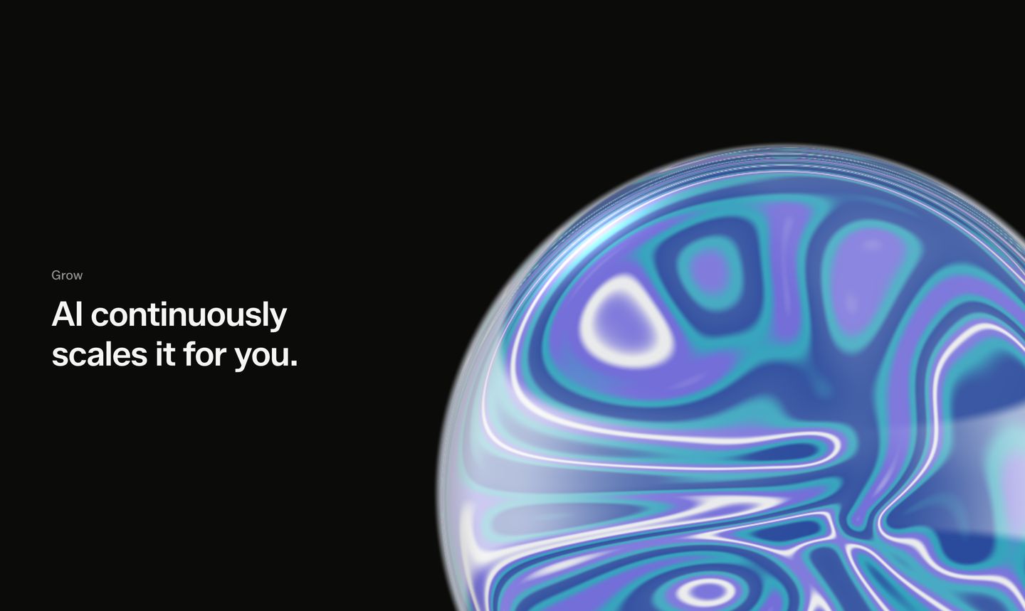
Futuristic yet grounded in software craftsmanship. A warm off-white canvas and tight sans-serif typography frame a monolithic dark viewport containing iridescent, liquid-chrome 3D geometry.
Visit siteRated
6.6/ 10
From 9 analysed sections. Two measured components and one judged by a model. Distinction is a rank within the library; the rest are scores in their own right.
- AI scorejudged
- 8.6
- Systemmeasured
- 5.6
- Distinctionmeasured
- 3.1
- on the grid
- 34%
- vertical rhythm
- 44%
- type on a scale
- 67%
- contrast passing AA
- 80%
- unlike the library
- 0.60
- model craft
- 7.6/10
- model deviation
- 2.7/10
Colour
Background#f6f6f5
Text#000000
Accent#0b0b0a
Surface#ffffff
Muted#868685
Typefaces
- Display
- Zalando Sans
- Body
- Zalando Sans
- Mono
- —
- Source
- Scale
- 13 · 14 · 16 · 20 · 48 · 68
Layout
- Grid
- 16 columns
- Container
- 1048px
- Spacing base
- 4px
- Radius
- 8px · 16px · 999px
Capture
- Category
- ai
- Sections
- 9
- Captured
- 2026-09-16
- Rhythm
- cream → dark → cream x8
Type rules
- display type is set in sentence case with negative tracking (-0.022em)
- body text maintains an 81-character measure at 20px with muted secondary grey
Colour rules
- canvas is soft off-white (#f6f6f5) punctuated by a single deep-black (#0b0b0a) showcase section
- buttons use full black pills with subtle edge-glow gradients for focus
Voice rules
- headlines state core product abilities plainly without superlative buzzwords
- subtitles explain workflow value in two balanced sentences
Holds it together
- nest interactive product demonstrations inside rounded dark containers on an otherwise light canvas
- use pill badges in sentence case for section categorization and feature eyebrows
- accompany multi-column cards with hairline borders and minimal icon headers
Contrast
text on background19.4:1 AAA
muted text on background3.4:1 AA Large
text on surface21.0:1 AAA
accent on background18.2:1 AAA
background on accent18.2:1 AAA
Type, measured
- Body
- 20px / 1.3
- Measure
- 81 characters
- Display
- 68px / 1
- Tracking
- -0.022em display
- Scale ratio
- 1.36
Voice
- Tone
- declarative, precise, confident
- Sentences
- medium
- Person
- second
- Vocabulary
- plain
- Calls to action
- start, explore
Built with
- Builder
- —
- Framework
- —
- Motion
- —
- WebGL
- yes
- Nav
- top_bar, 24 items
- Length
- 9.8 screens
Mode
Sections in page order
- 00
hero
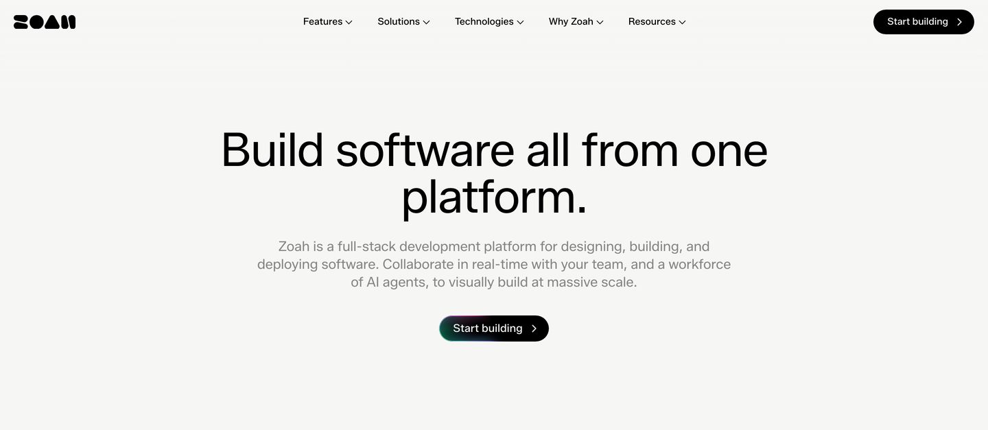
An airy, minimalist hero with centered monochromatic typography and a glowing dark pill button.
- Mood
- serene + clinical
- Layout
- 1 col · centered · airy
- 01
hero
A deep black void anchored by an iridescent, liquid-textured 3D sphere and quiet, confident typography.
- Mood
- ethereal + serene
- Layout
- 2 col · split · airy
- 02
logo bar
A clean, understated logo bar establishing early access credibility with monochrome tech brand marks on a warm off-white canvas.
- Mood
- reassuring + serene
- Layout
- 1 col · stacked · airy

- 03
feature grid
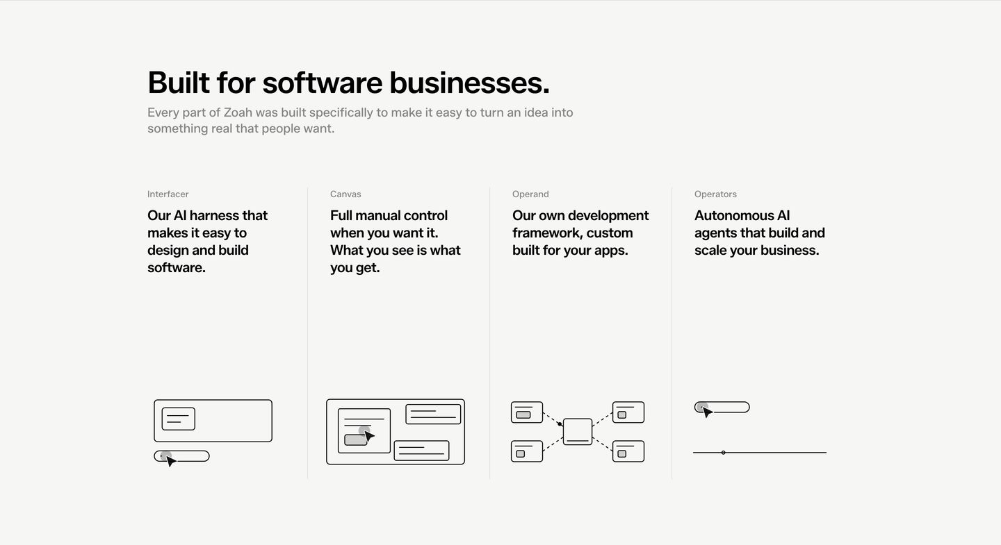
A four-column technical feature grid pairing sparse line-art UI diagrams with disciplined Swiss-style typographic hierarchy.
- Mood
- clinical + serene
- Layout
- 4 col · grid · airy
- 04
feature
A calm, minimalist feature section pairing stacked metrics with a live activity card on a warm off-white canvas.
- Mood
- serene + reassuring
- Layout
- 2 col · split · airy
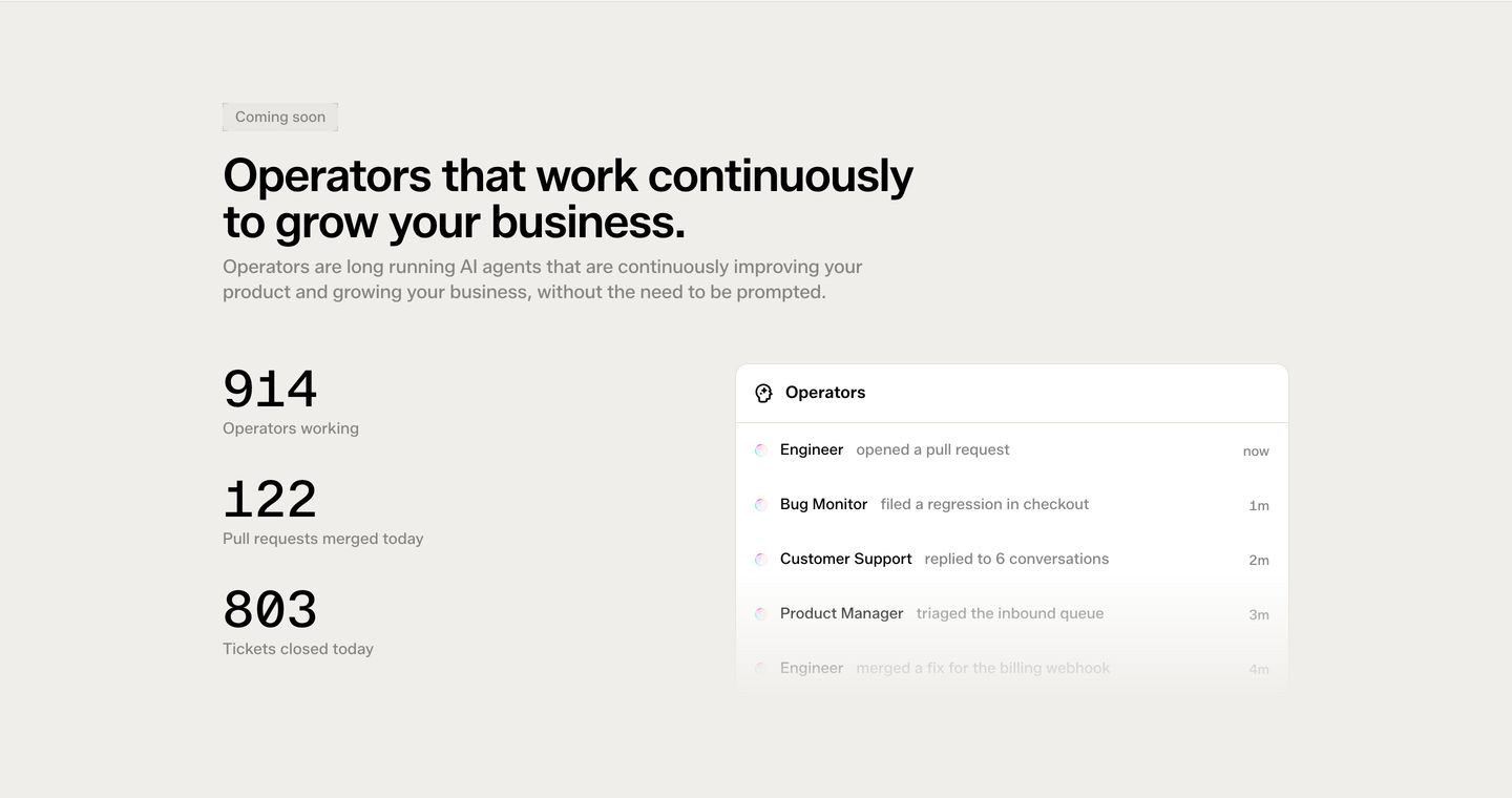
- 05
feature grid
Minimalist four-column feature grid presenting product differentiators through clean cards topped with tactile, dark keycap-style icons.
- Mood
- clinical + reassuring
- Layout
- 4 col · grid · airy
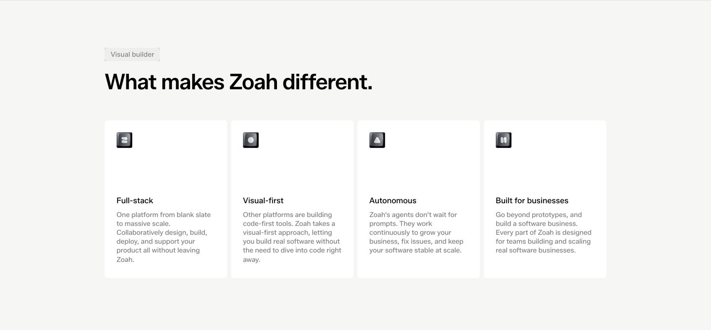
- 06
feature grid
Clean, systematic SaaS feature grid with a warm neutral background, hairline card borders, and uniform interactive pill links.
- Mood
- clinical + reassuring
- Layout
- 3 col · grid · balanced
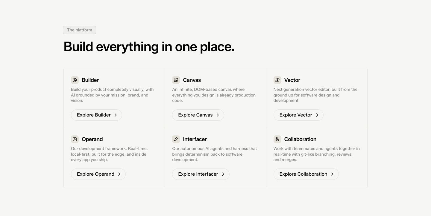
- 07
cta
An ultra-minimal call-to-action strip with generous whitespace, centered typography, and a single black pill button.
- Mood
- serene + clinical
- Layout
- 1 col · centered · airy

- 08
footer
A calm, minimal footer anchored by an abstract geometric logomark and structured navigation columns in muted grey.
- Mood
- serene
- Layout
- 4 col · grid · airy