Studio Herrstrom
High-end editorial minimalism built on pure black surfaces and strict hairline framing. Large serif headlines create stark contrast against rich campaign photography.
Visit siteColour
Typefaces
- Display
- SH-MIX
- Body
- SH-SANS
- Mono
- —
- Source
- self_hosted
- Scale
- 9 · 10 · 14 · 15 · 22 · 28
Layout
- Grid
- 12 columns
- Container
- 1440px
- Spacing base
- 8px
- Radius
- 0px
Capture
- Category
- studio
- Sections
- 8
- Captured
- 2026-08-29
- Rhythm
- dark throughout
Type rules
- display type always uppercase and set tight
- metadata labels set in low-contrast muted grey at small scales
Colour rules
- monochrome foundation letting portfolio media provide all color
- hairline white borders define layout structure on pure black
Voice rules
- frame studio work through cultural impact
- keep metadata labels brief and descriptive
Holds it together
- divide visual cells with 1px solid hairline borders and zero gutter
- pair tight uppercase display headings with short summary paragraphs
- position category tags and arrows at opposite edges of each cell
Contrast
Type, measured
- Body
- 15px / 1.1
- Measure
- 85 characters
- Display
- 64px / 0.9
- Tracking
- -0.016em display
- Scale ratio
- 1.44
Voice
- Tone
- confident, editorial, direct
- Sentences
- medium
- Person
- first
- Vocabulary
- elevated
- Calls to action
- view, join, review
Built with
- Builder
- —
- Framework
- —
- Motion
- —
- WebGL
- —
- Nav
- sticky_top_bar, 10 items, sticky
- Length
- 7.4 screens
Sections in page order
3 marked strong · 8- 00
hero
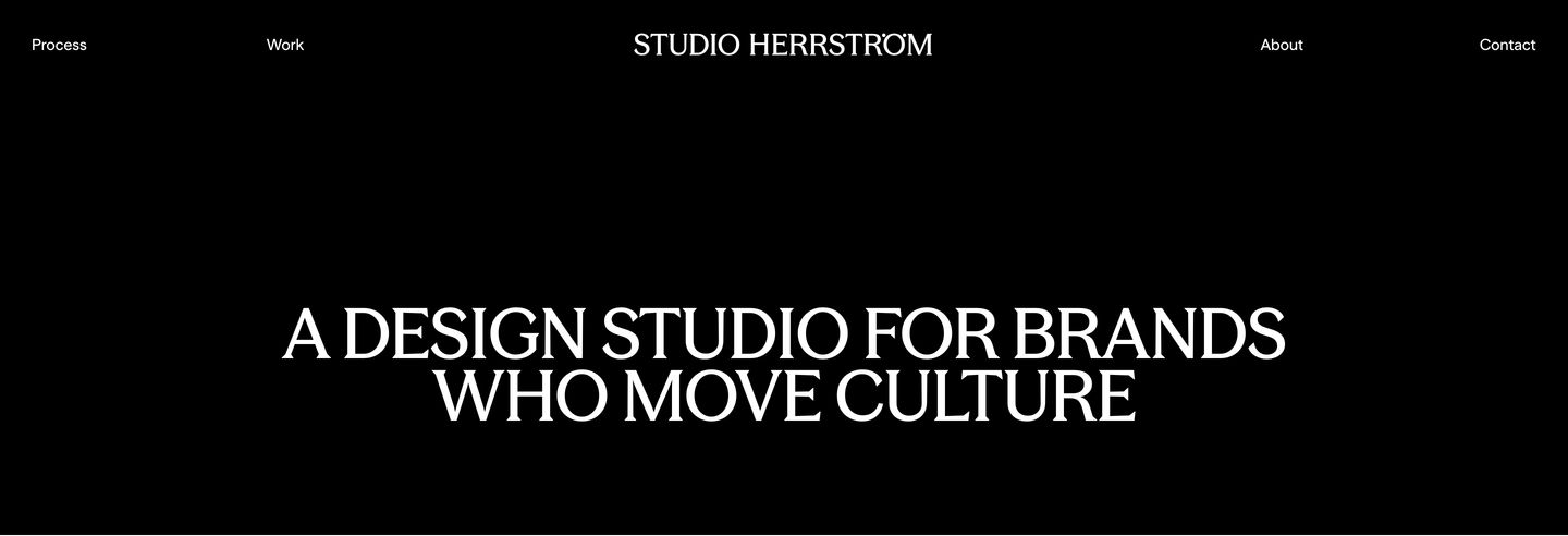
StrongAustere, pitch-black studio hero punctuated solely by an expansive, elegant uppercase statement and minimal corner navigation.
- Mood
- quiet + editorial
- Layout
- 13 col · stacked · airy
- 01
showcase
Sleek agency showcase pairing vibrant campaign visuals with stark black portfolio case study panels.
- Mood
- editorial + bold
- Layout
- 16 col · grid · balanced

- 02
showcase
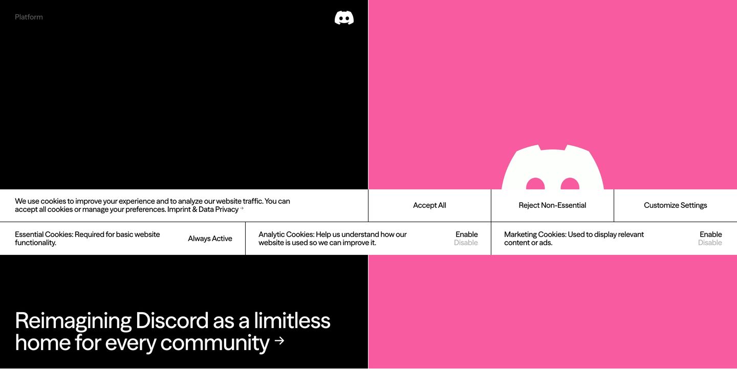
High-contrast split layout contrasting deep black and saturated magenta with a structured grid overlay.
- Mood
- bold + playful
- Layout
- 12 col · split · balanced
- 03
showcase
A stark split-screen editorial showcase pairing an expressive doodle-annotated portrait with minimalist typography against deep black negative space.
- Mood
- editorial + bold
- Layout
- 13 col · split · airy

- 04
showcase
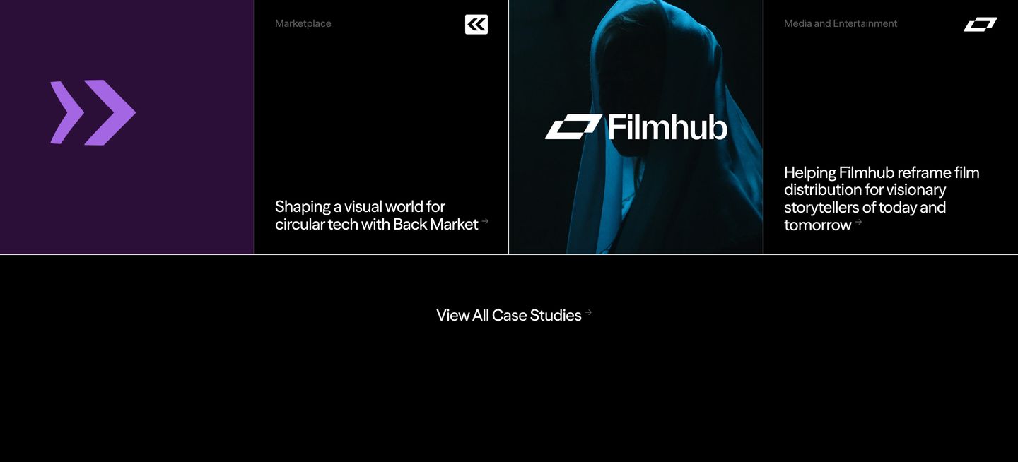
A quiet, dark-mode case study grid separated by sharp hair-thin lines and subtle photography.
- Mood
- quiet + editorial
- Layout
- 12 col · grid · airy
- 05
feature grid
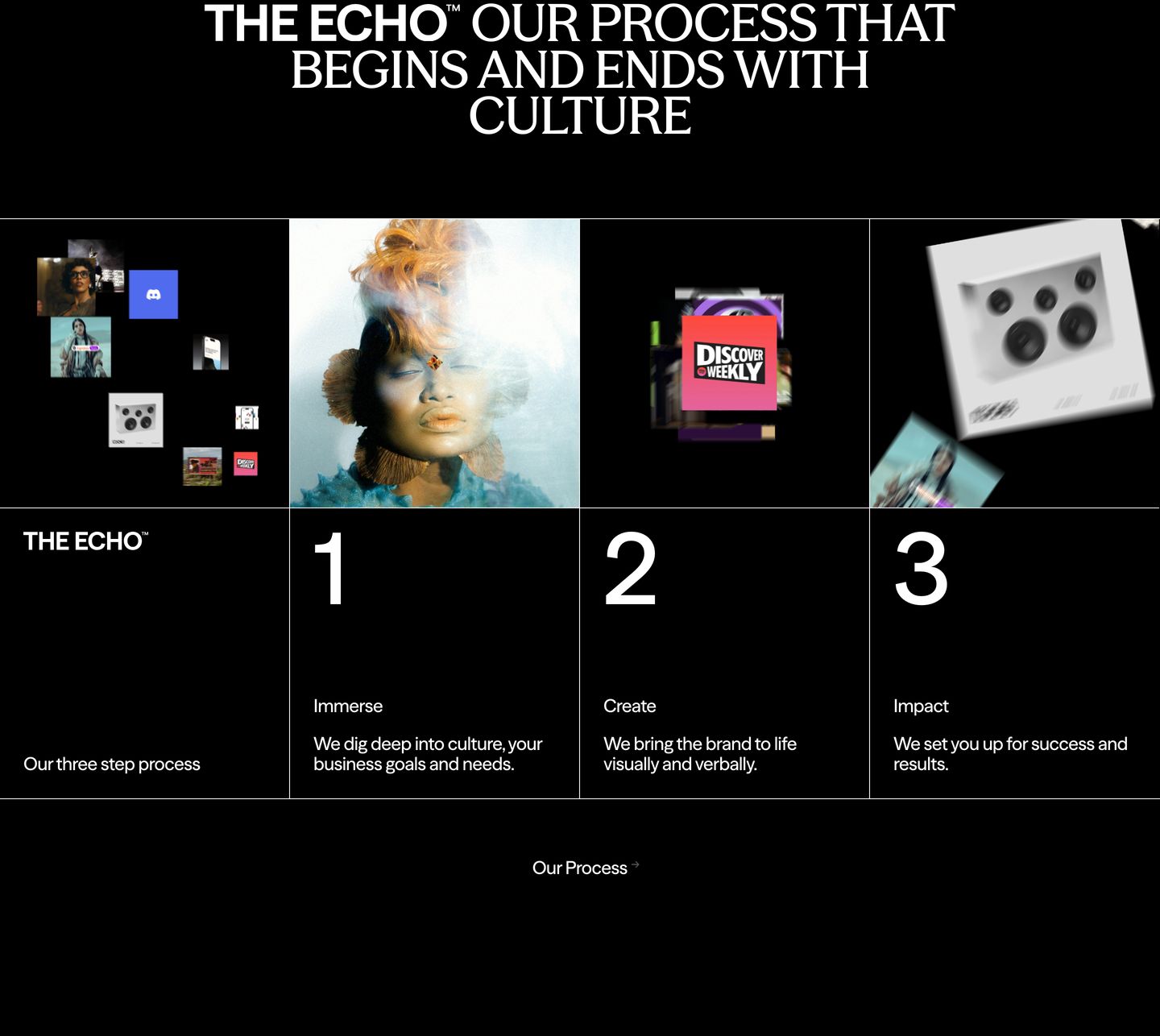
StrongMonochrome editorial grid showcasing a three-step creative process through numbered cells and floating visual assets against a pure black background.
- Mood
- editorial + bold
- Layout
- 12 col · grid · balanced
- 06
showcase
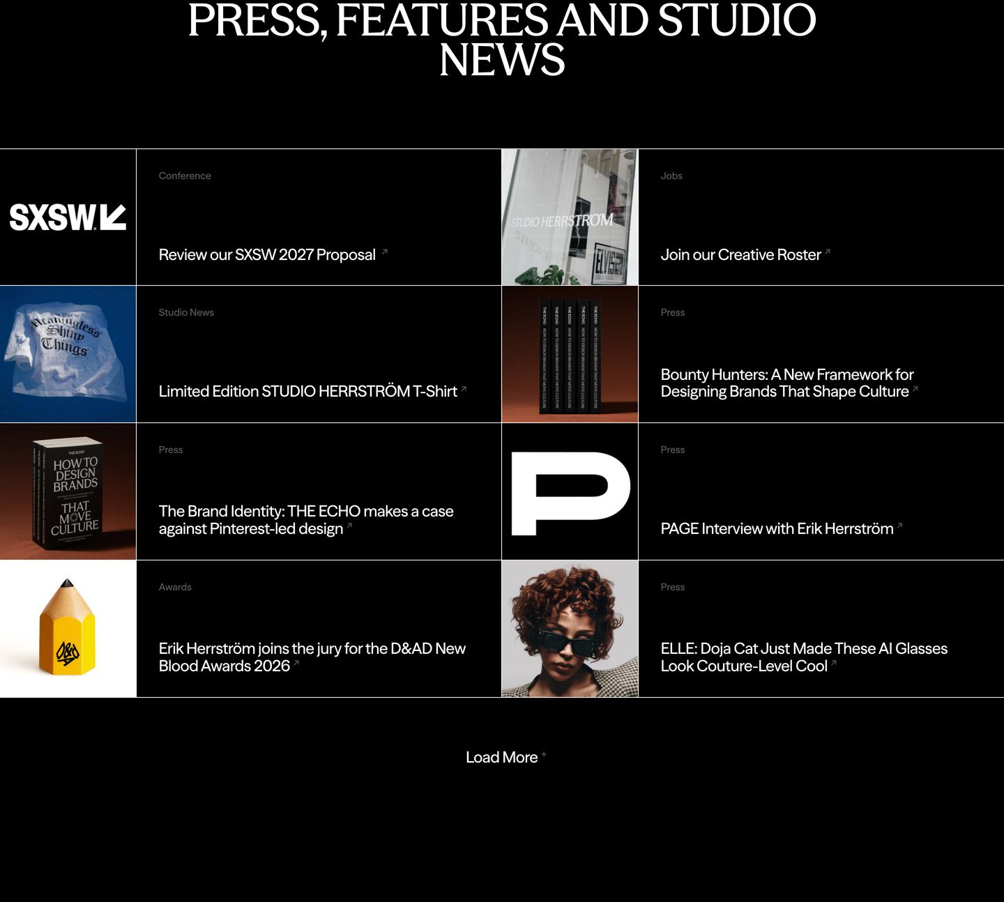
A disciplined, dark editorial news grid alternating square imagery and metadata across a strict Swiss-inspired table layout.
- Mood
- editorial + clinical
- Layout
- 4 col · grid · balanced
- 07
footer
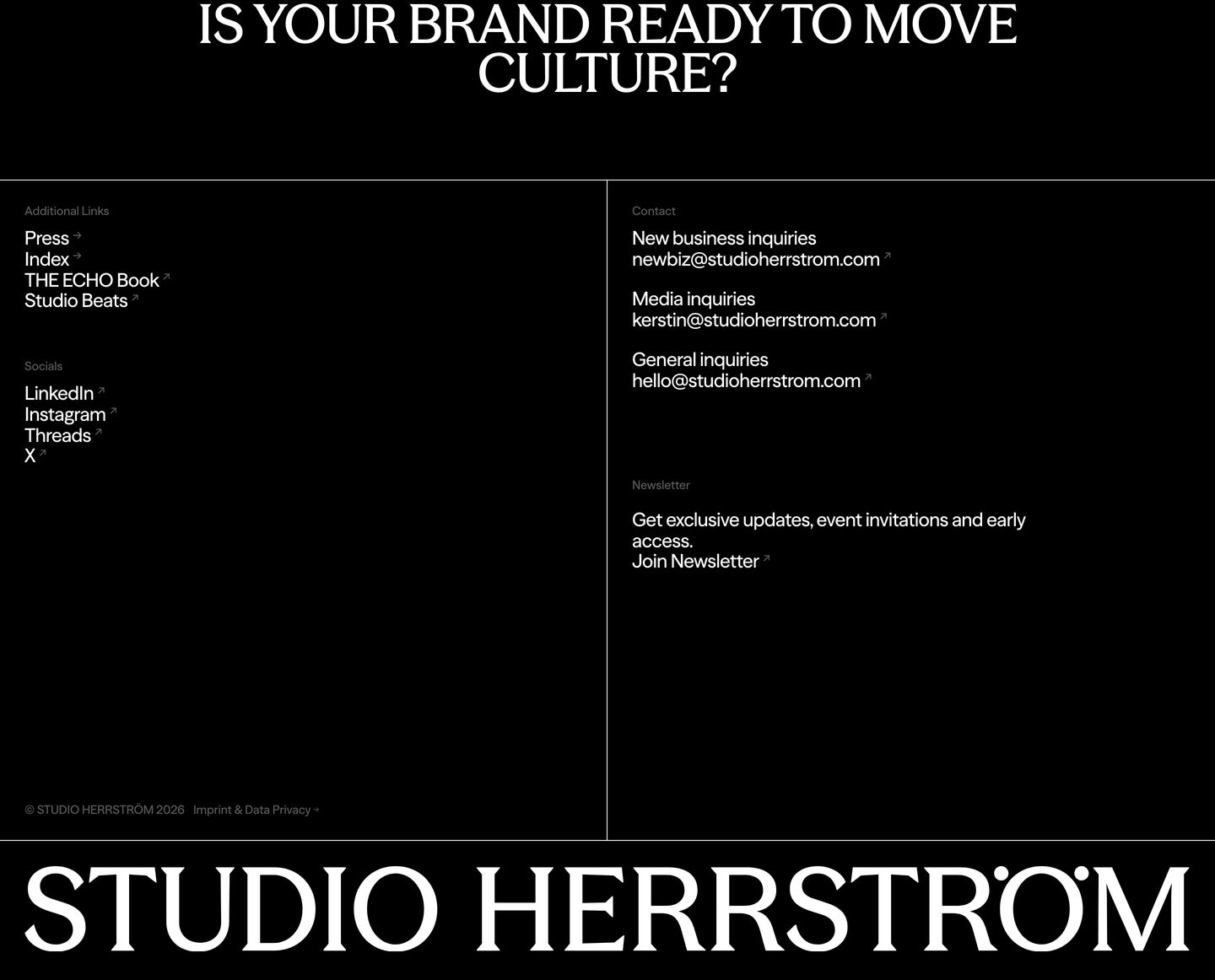
StrongA stark black editorial footer framed by crisp structural grid lines, large question typography, and an oversized bottom wordmark.
- Mood
- editorial + bold
- Layout
- 13 col · grid · airy