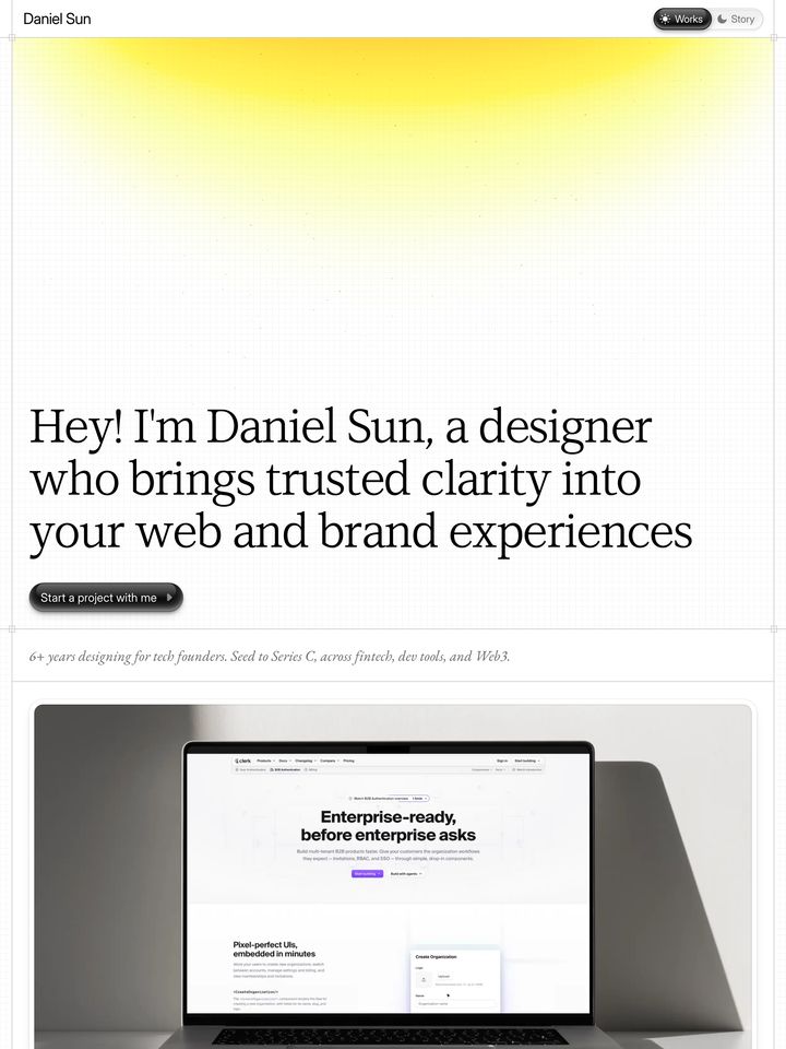
Rated
6.8/ 10
From 8 analysed sections. Two measured components and one judged by a model. Distinction is a rank within the library; the rest are scores in their own right.
- AI scorejudged
- 8.5
- Systemmeasured
- 4.9
- Distinctionmeasured
- 6.8
- on the grid
- 19%
- vertical rhythm
- 73%
- type on a scale
- 45%
- contrast passing AA
- 60%
- unlike the library
- 0.25
- model craft
- 7.5/10
- model deviation
- 4.3/10
Colour
Background#f7f7f7
Text#000000
Accent#ff0000
Surface#ffffff
Muted#000000
Typefaces
- Display
- Neue-Haas-Grotesk-Display
- Body
- Neue-Haas-Grotesk-Text
- Mono
- —
- Source
- self_hosted
- Scale
- 12 · 13 · 15 · 16 · 17 · 24
Layout
- Grid
- —
- Container
- —
- Spacing base
- 10px
- Radius
- 20px
Capture
- Category
- tools
- Sections
- 8
- Captured
- 2026-08-30
- Rhythm
- off-white → white → off-white → white x3 → cream → dark
Type rules
- display headlines set in massive tightly tracked uppercase grotesque
- body text runs at a narrow measure averaging 34 characters per line
Colour rules
- canvas is predominantly crisp off-white and pure white with high-contrast black text
- saturated red is isolated to floating primary action badges
- blueprint blue is reserved strictly for interface bounding boxes and technical indicators
Voice rules
- terse declarative headlines highlighting developer freedom
- links prefixed with directional arrows
Holds it together
- divide major sections using structural quadrant borders and visible layout bounding boxes
- confine pure red (#ff0000) strictly to high-priority circular conversion triggers
- frame modular features within rounded bento cards enclosing stark geometric vector iconography
Contrast
text on background19.6:1 AAA
muted text on background19.6:1 AAA
text on surface21.0:1 AAA
accent on background3.7:1 AA Large
background on accent3.7:1 AA Large
Type, measured
- Body
- 17px / 1.45
- Measure
- 34 characters
- Display
- 300px / 0.76
- Tracking
- -0.048em display
- Scale ratio
- 2.05
Voice
- Tone
- precise, confident, technical
- Sentences
- short
- Person
- second
- Vocabulary
- plain
- Calls to action
- start, explore, learn
Built with
- Builder
- —
- Framework
- —
- Motion
- —
- WebGL
- —
- Nav
- —
- Length
- 8.3 screens
Sections in page order
3 marked strong · 8- 00
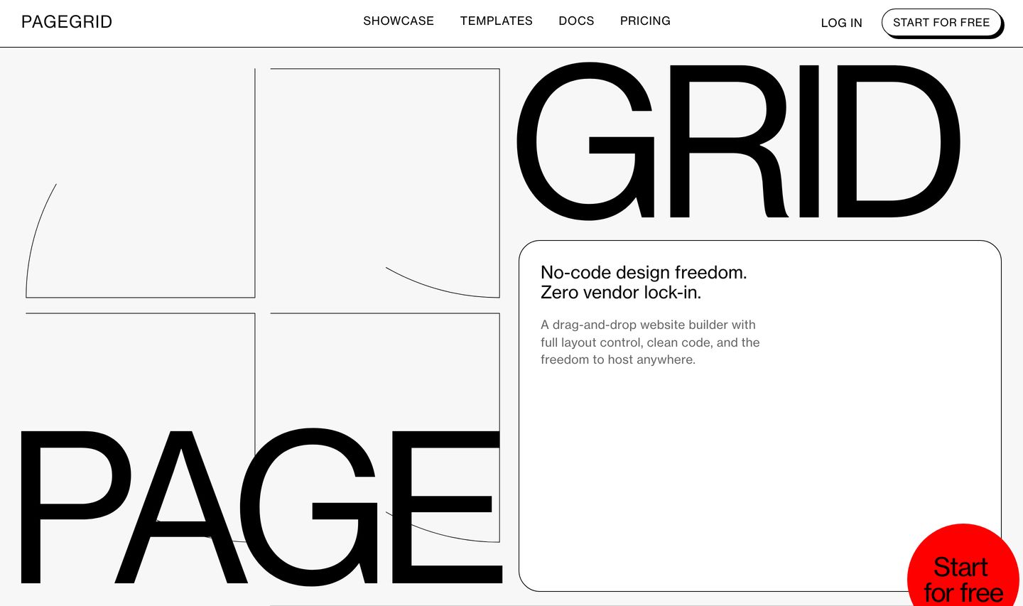
hero
StrongExposed architectural grid layout breaking the brand name across quadrants with strict Swiss modernist typography and a punchy red circular CTA.
- Mood
- raw + clinical
- Layout
- 1 col · grid · airy
- 01
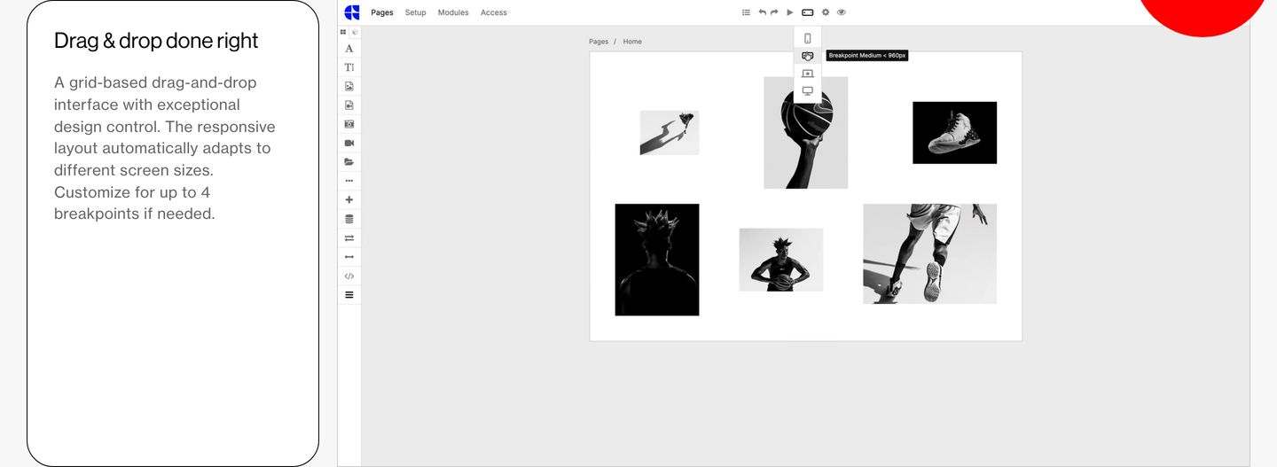
feature
A crisp, clinical product feature display pairing structured explanatory copy with an interactive-looking canvas editor workspace.
- Mood
- clinical + quiet
- Layout
- 2 col · split · balanced
- 02
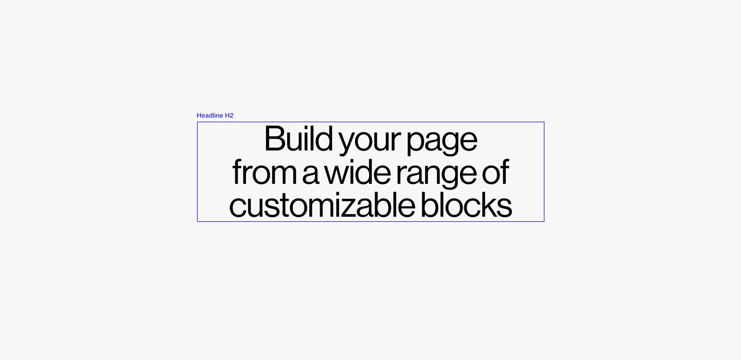
statement
Stark blueprint-like wireframe layout framing large centered Swiss grotesque typography with visible structural bounding lines.
- Mood
- raw + clinical
- Layout
- 1 col · centered · airy
- 03
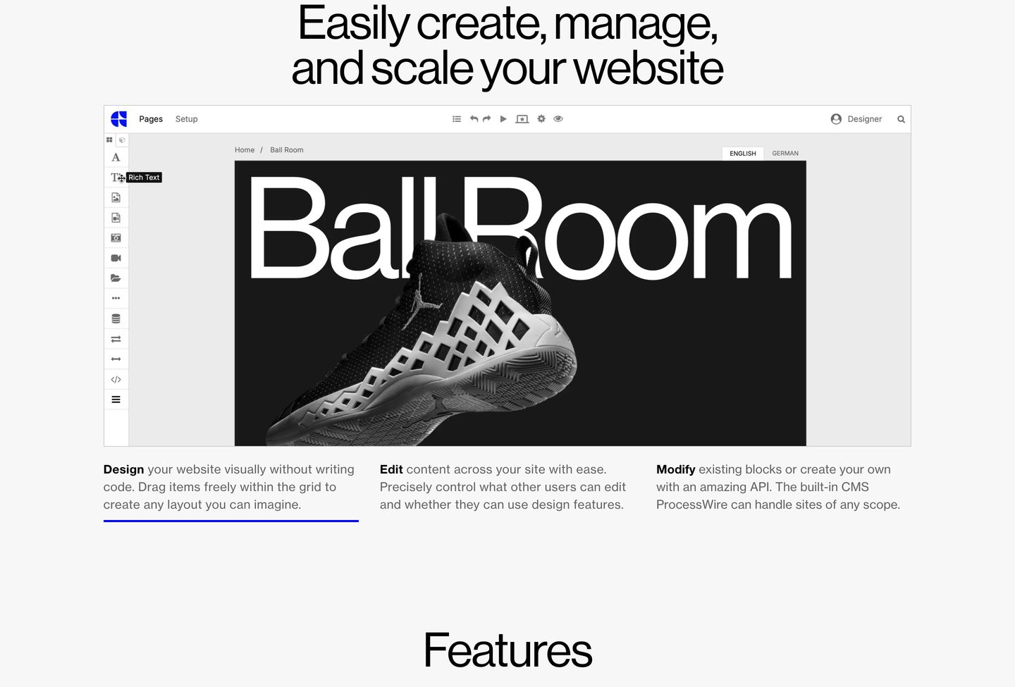
feature
A crisp, Swiss-styled product UI showcase framed by tightly tracked grotesque typography and restrained three-column explanatory copy.
- Mood
- clinical + quiet
- Layout
- 1 col · stacked · balanced
- 04
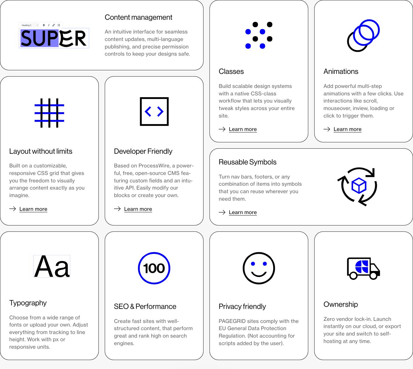
feature grid
StrongClean and modular Swiss-style bento grid of feature cards pairing concise copy with stark geometric icons.
- Mood
- clinical + quiet
- Layout
- 4 col · grid · balanced
- 05
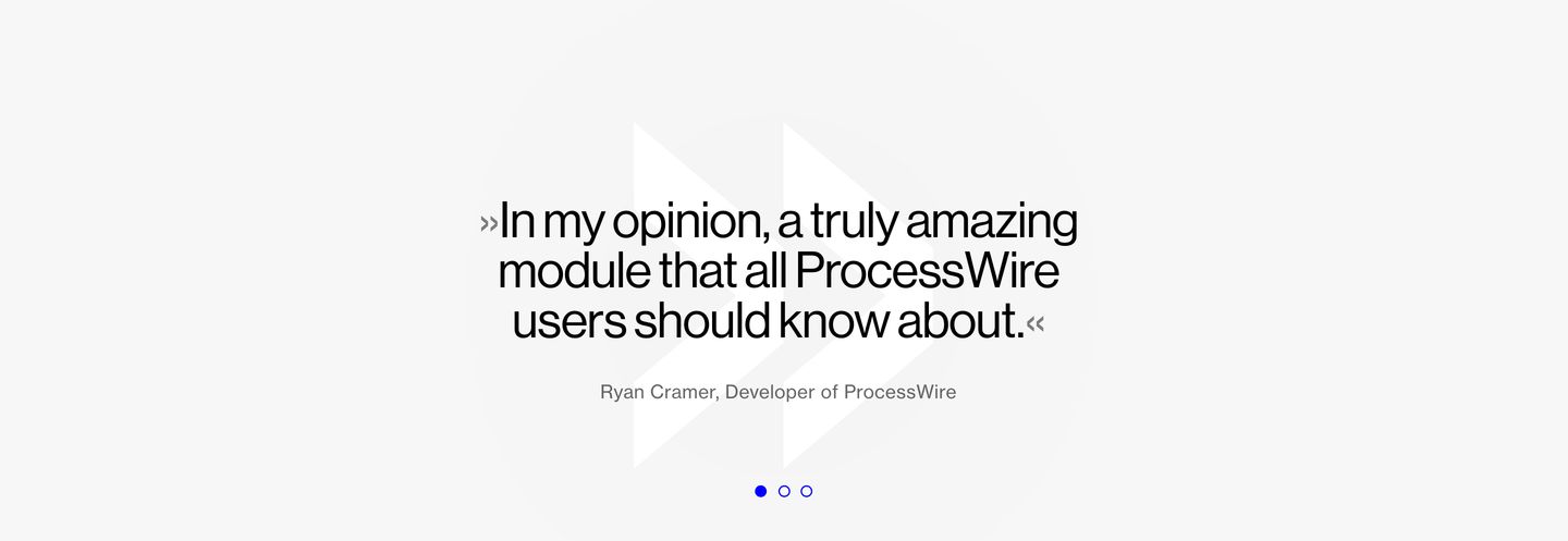
testimonial
Clean and quiet testimonial slider featuring large Swiss grotesk quote text over a subtle geometric background.
- Mood
- quiet + clinical
- Layout
- 1 col · centered · airy
- 06
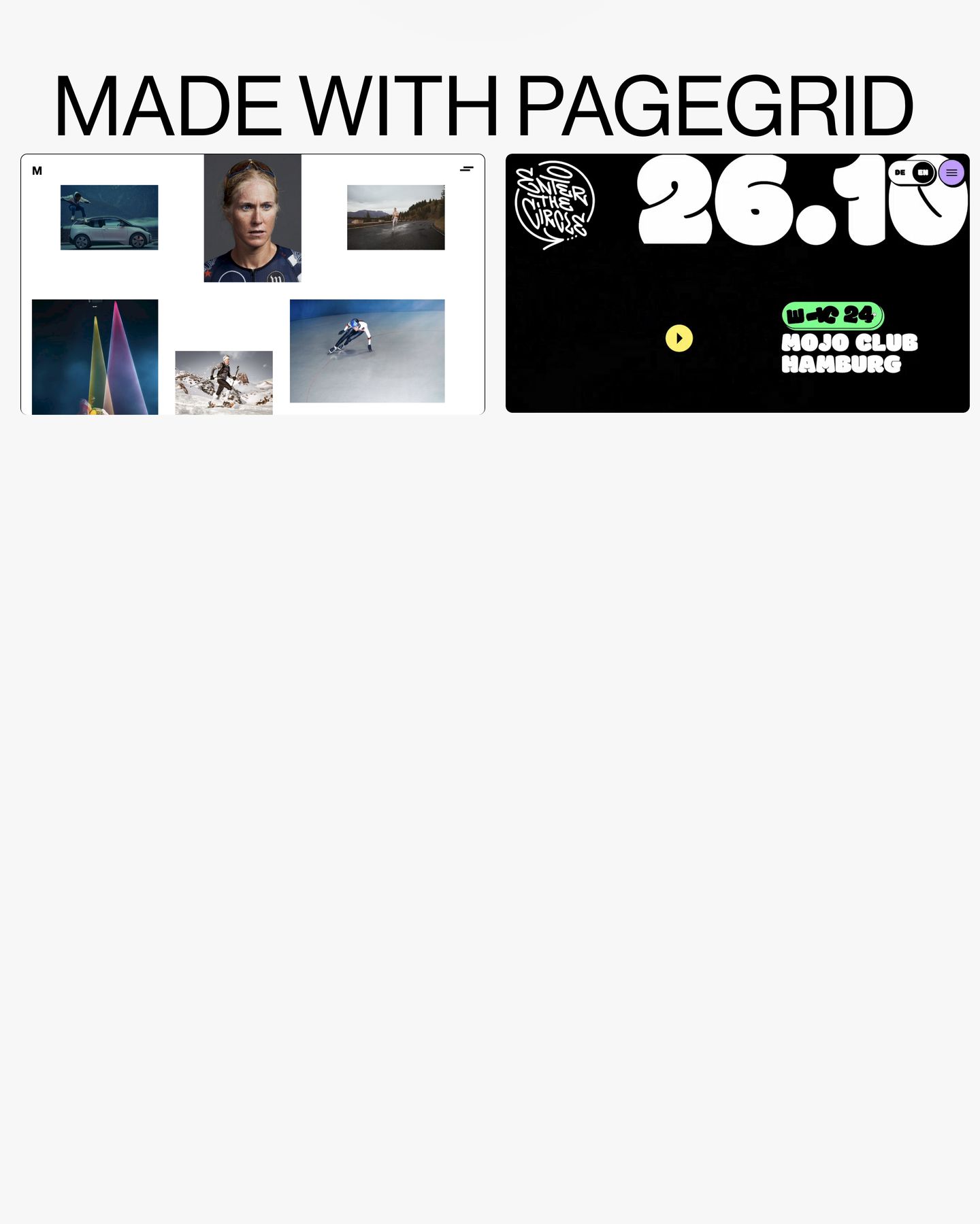
showcase
A minimal showcase section featuring an oversized uppercase headline above high-contrast website preview frames on a soft off-white canvas.
- Mood
- editorial + bold
- Layout
- 1 col · grid · airy
- 07
cta
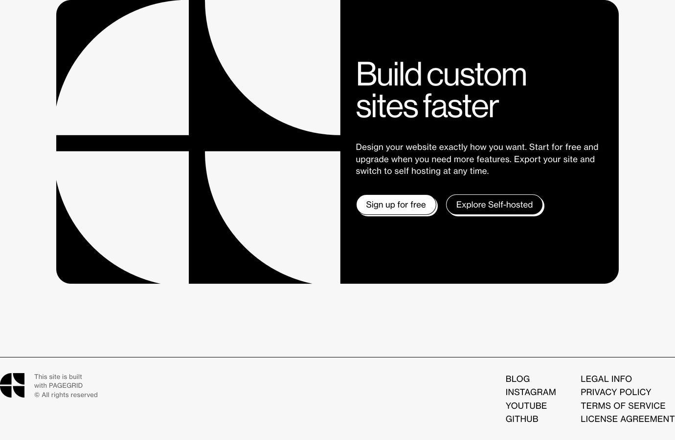
StrongBold monochrome call-to-action card pairing sharp geometric quadrant artwork with disciplined Swiss typography.
- Mood
- bold + clinical
- Layout
- 1 col · split · balanced
More like this
by shared mood